Gabriel Hashimoto - Brand Identity
Mayara Marcondes
Gabriel Hashimoto Brand Identity
Date: 2020
Deliverables: Visual Identity
This project consists on the creation of a visual identity for the UX and UI designer, Gabriel Hashimoto, whose motivation is to contribute to the improvement of the users' experience in digital media, the updating of the world view online and the creation of relationships and emotions with immersive experiences through the creation and development of high-fidelity prototypes for desktop, tablet and mobile devices, helping to transform innovative ideas into real interfaces.
Concept
The whole project was based on the vision that the brand would be the solution for those who do not want more of the same, something common. This, together with the brand's personality, led the identity to express differentiation in all possible aspects.
Symbol
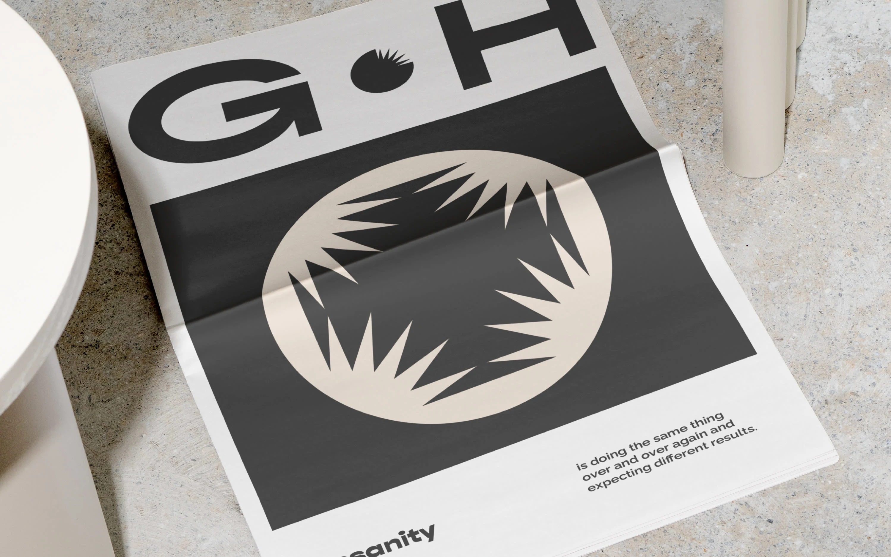
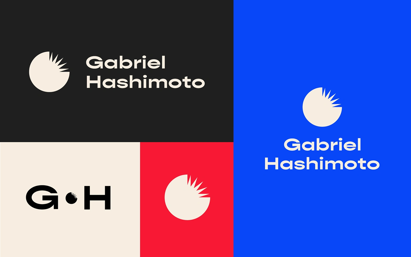
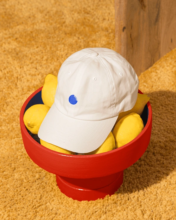
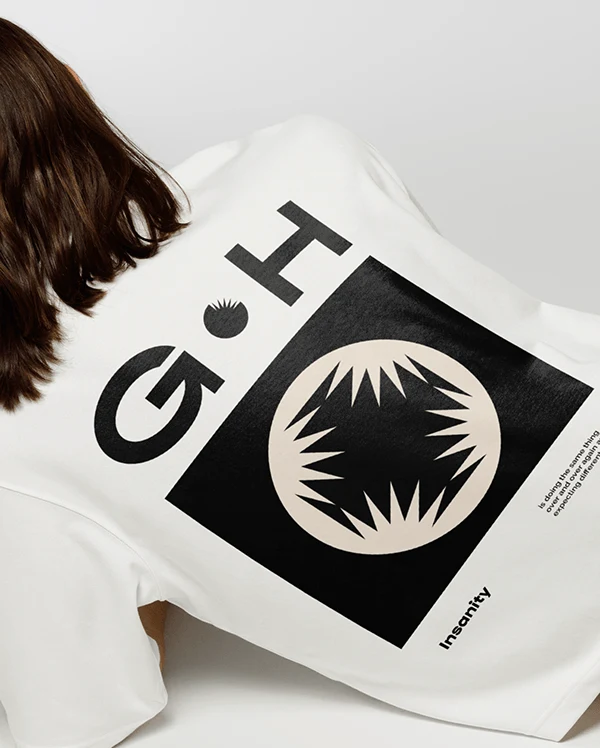
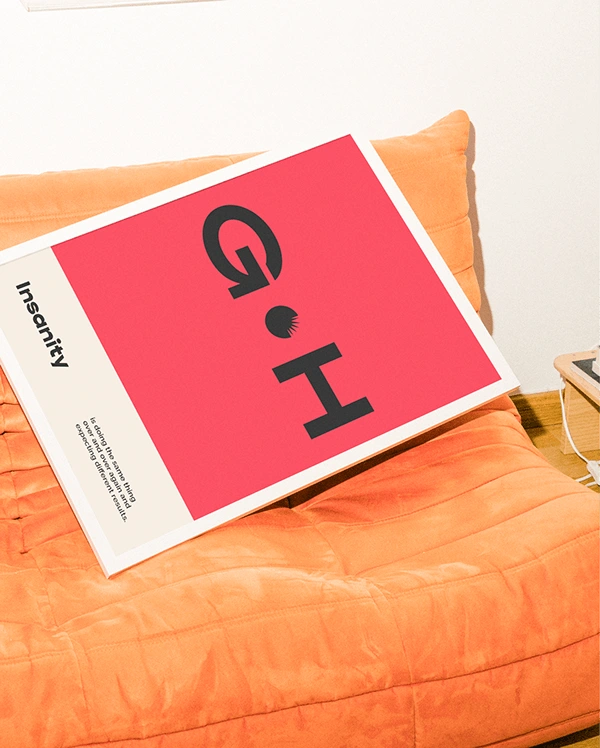
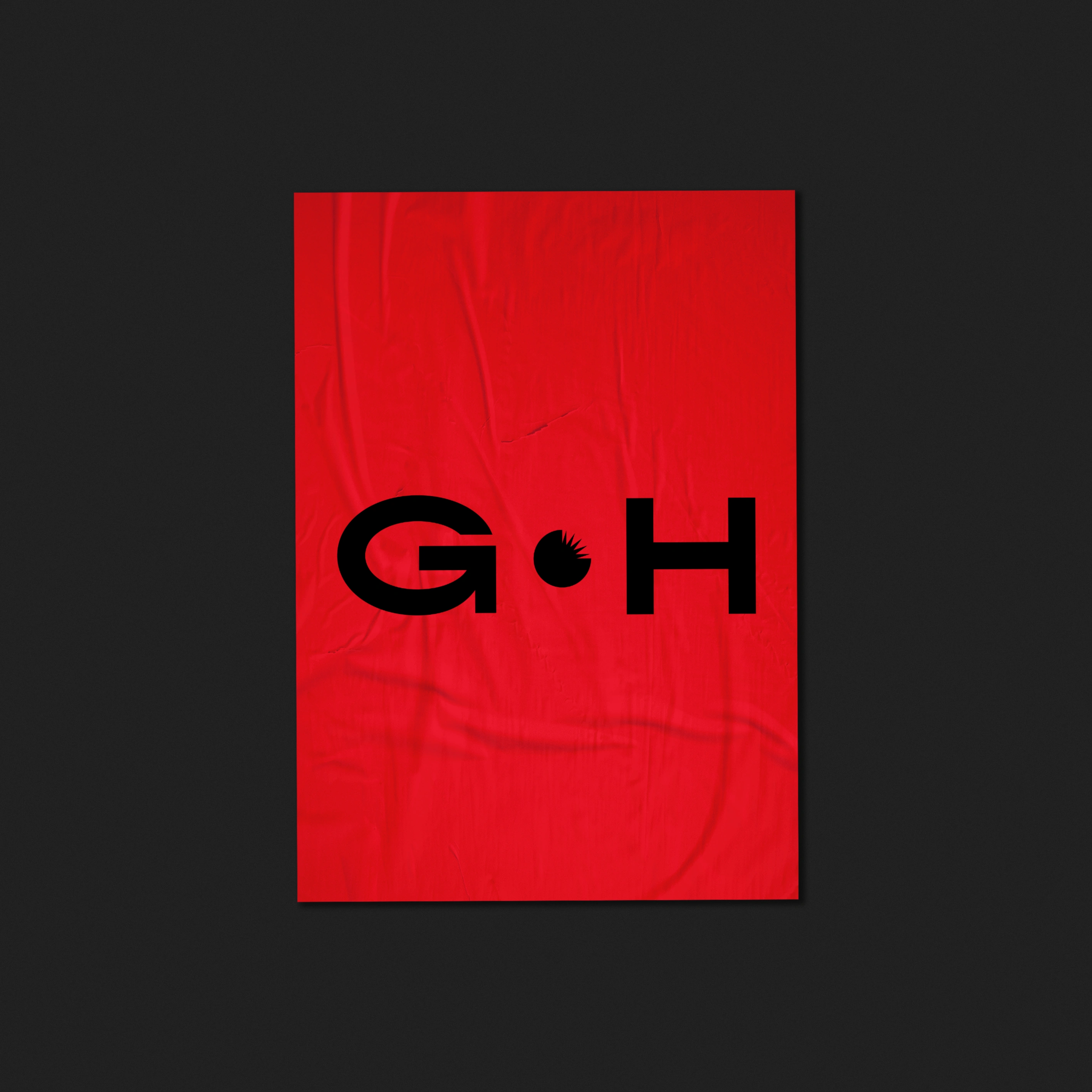
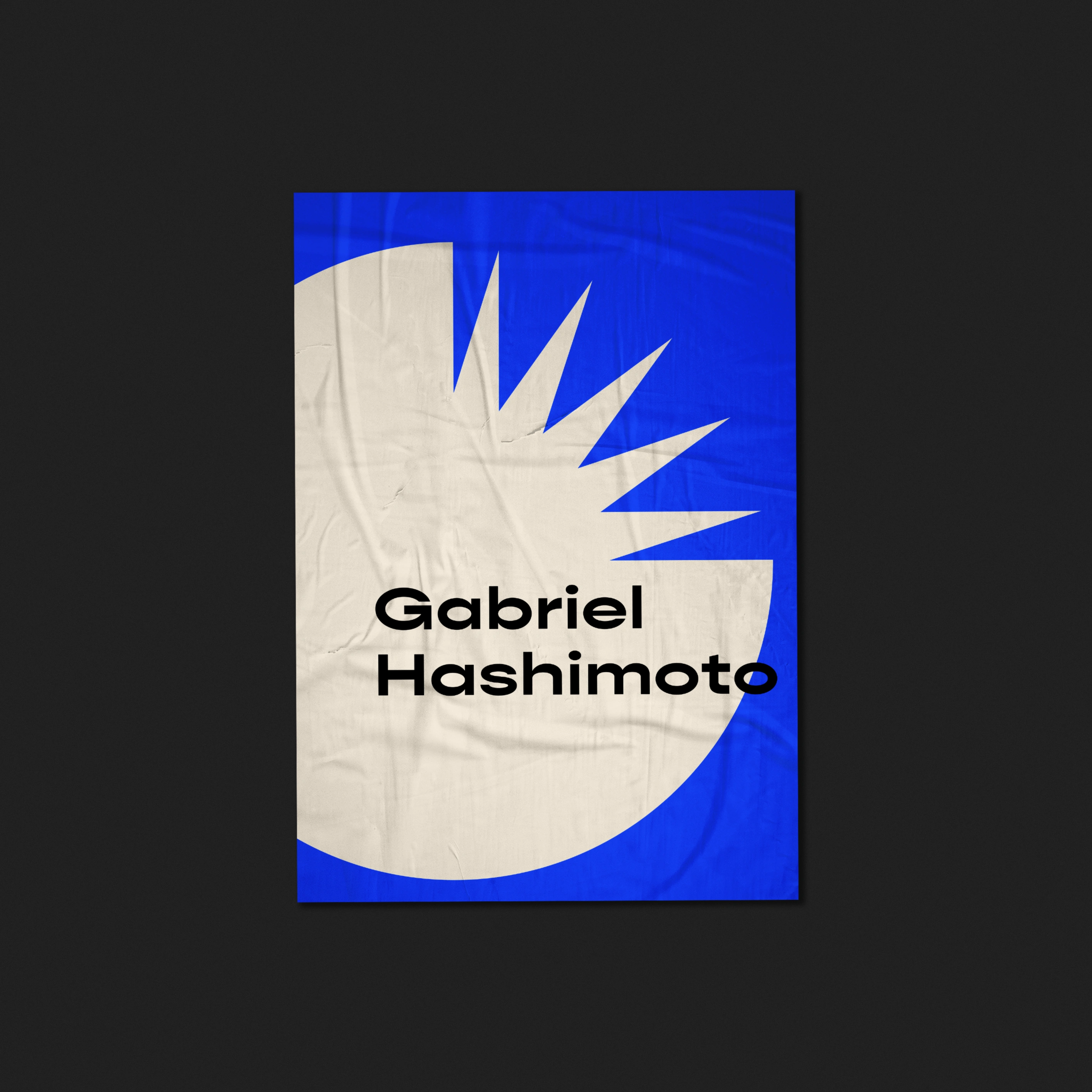
The symbol was developed with the idea of “breaking cycles”, and based on the phrase by Albert Einstein: “Insanity is doing the same thing over and over again and expecting different results”. The brand does not want to be known for doing what is already done, it wants to reach out to break the idea of “another interface designer”. Therefore, the circle represents what is already done today, the points at the top right represent the explosion of the cycle that the brand offers, the destruction of the common to make room for innovative ideas.
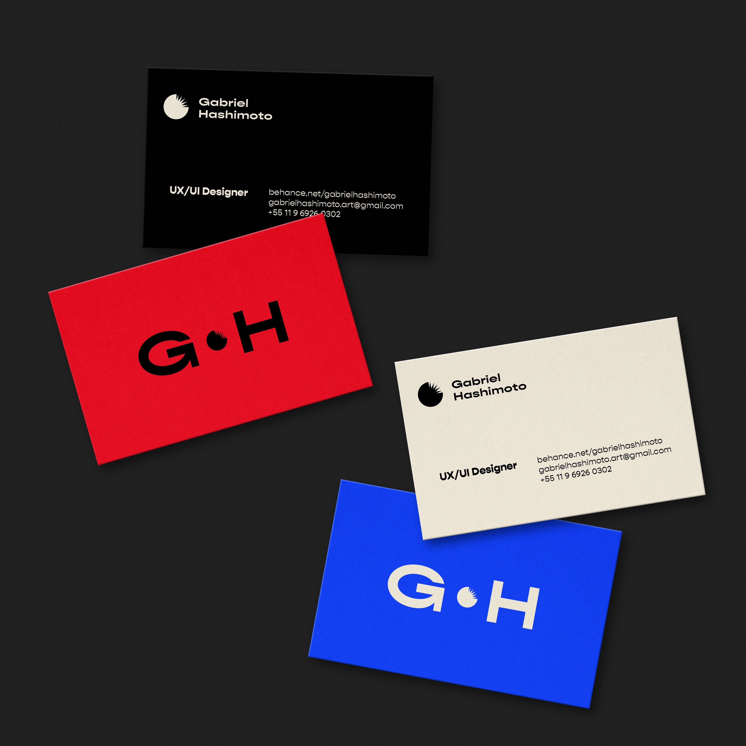
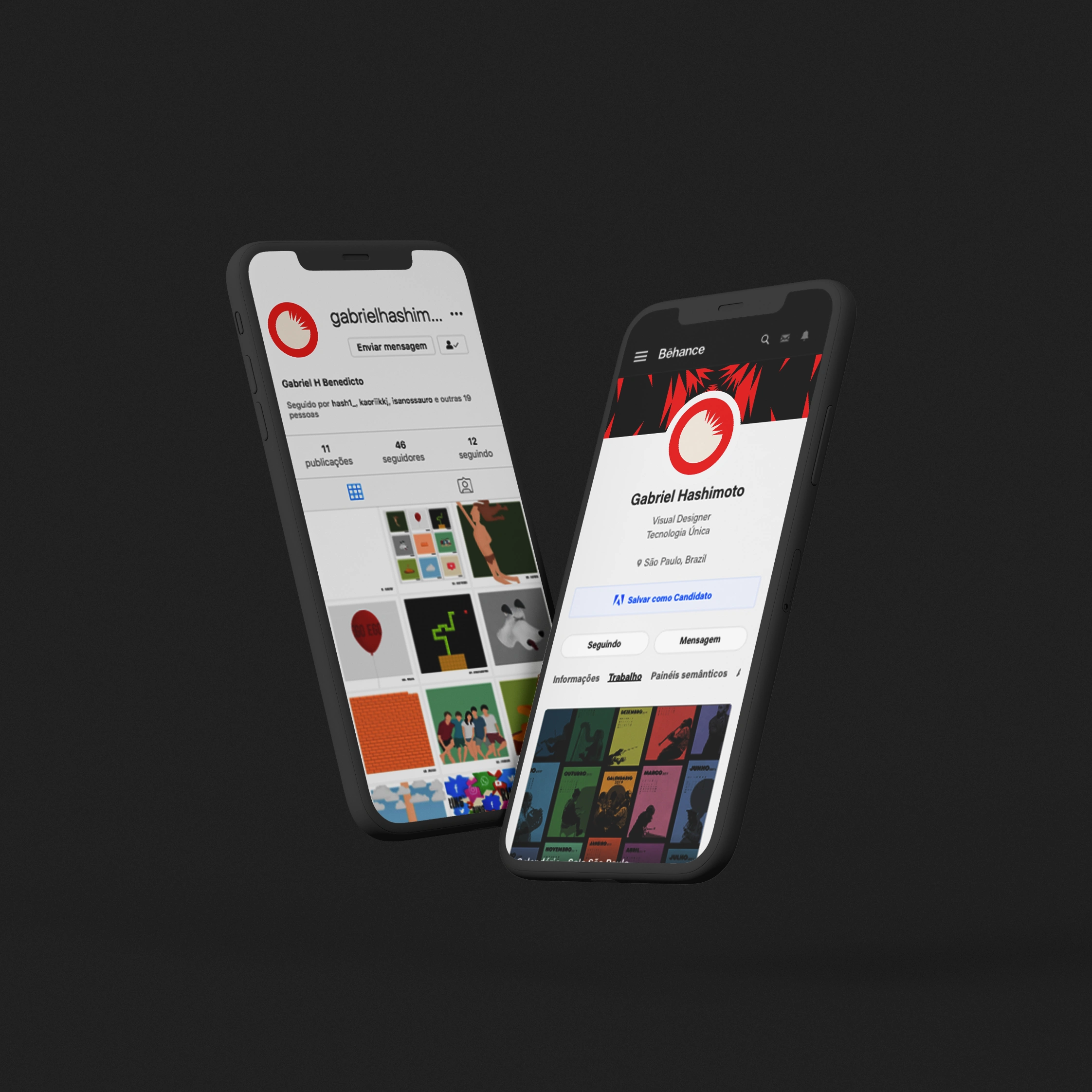
The round part of the circle also refers to a "G" and because it is easy to fix and identify, the symbol can be easily applied to different social networks and the website, the main points of contact for the brand.
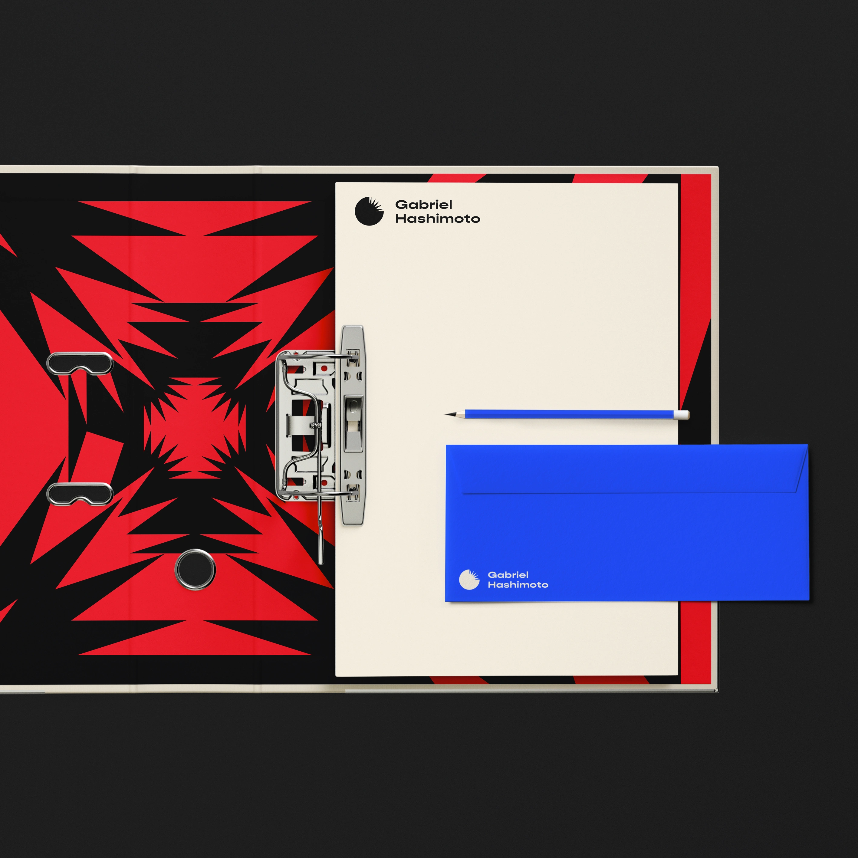
Additional elements
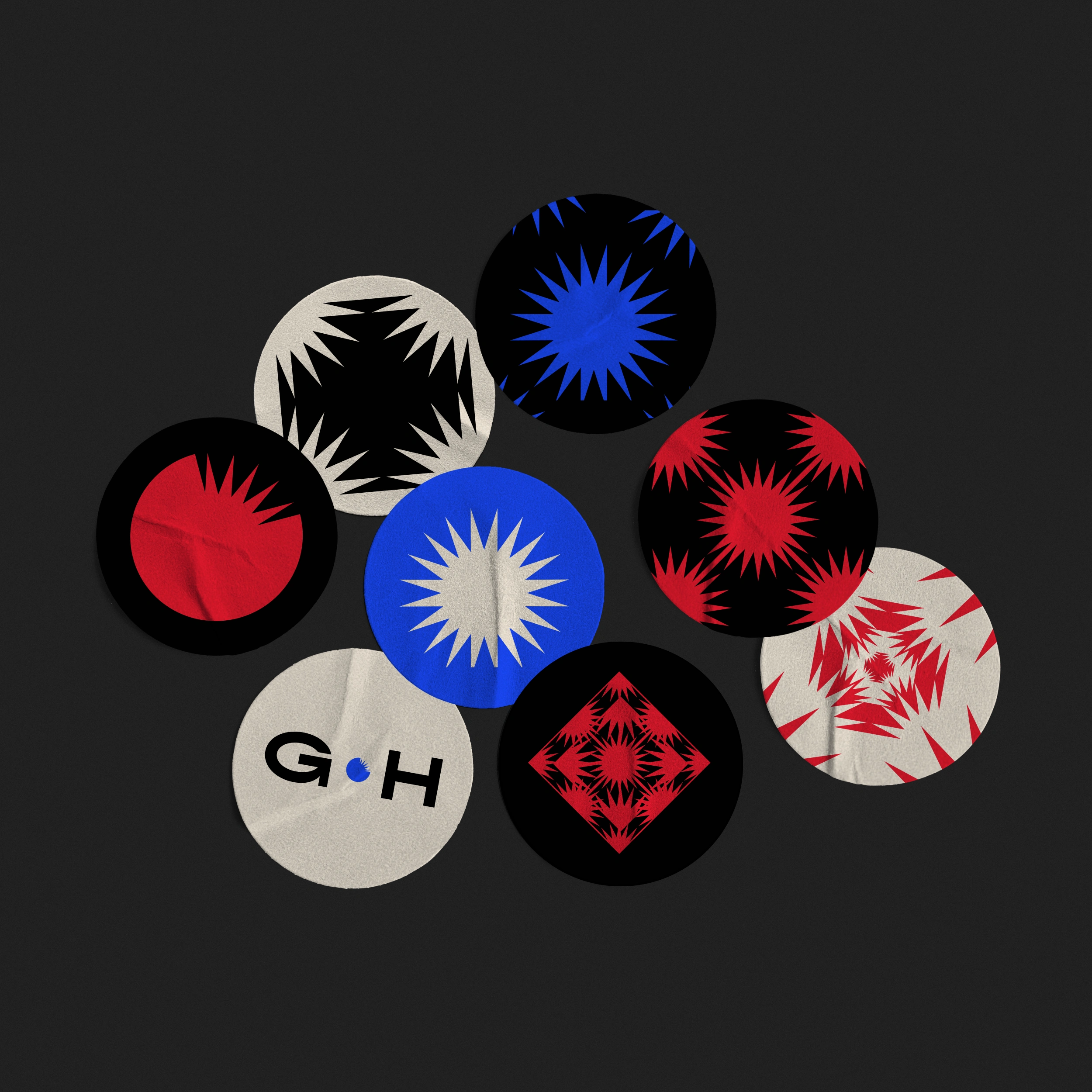
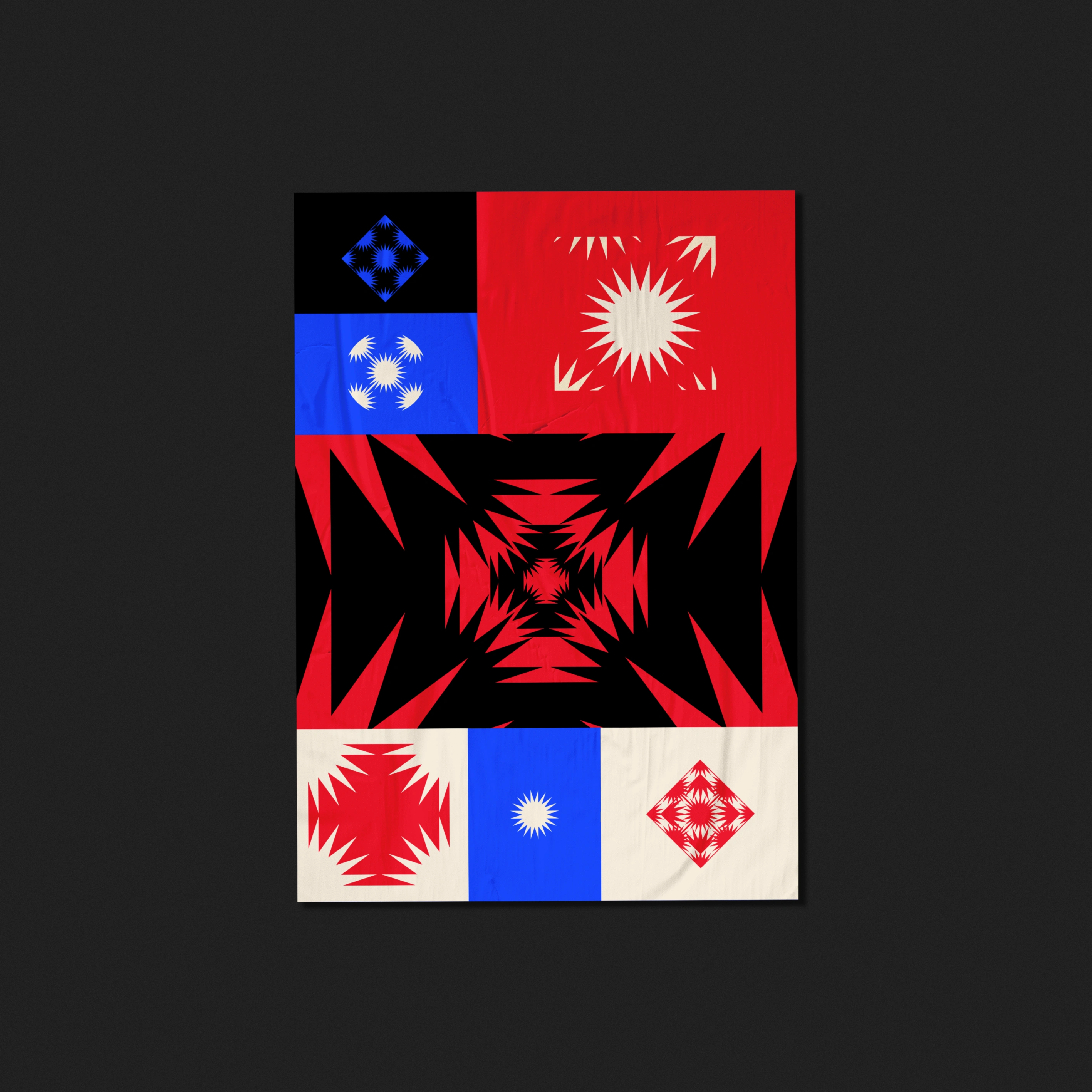
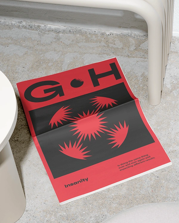
The visual elements consist of different shapes that emerged from the dismemberment of the logo and were inspired by Op-Art for causing visual discomfort. The elements also express the idea of boldness and rebellion for not being afraid to use aggressive and pointed forms, and, moreover, incite curiosity through those who observe them.
Request a quote proposal: mayaramarcondes.design@gmail.com
LinkedIn
Like this project
Posted Sep 7, 2025
Visual identity project developed for a UX / UI designer that seeks to differentiate itself in the market through a bold brand.