Workeet — AI Automation Landing Page
Osarenkhoe Iyamu-Noma
01 — The Problem
AI automation tools are powerful.
But most of their landing pages either:
Overwhelm you with technical jargon
Or feel vague and “AI-magic” with no clarity
The challenge here was simple:
How do we make something complex feel instantly understandable?
The goal was clarity in under 5 seconds.
02 — The Approach
We anchored everything around one idea:
“Automate Smarter, Not Harder.”
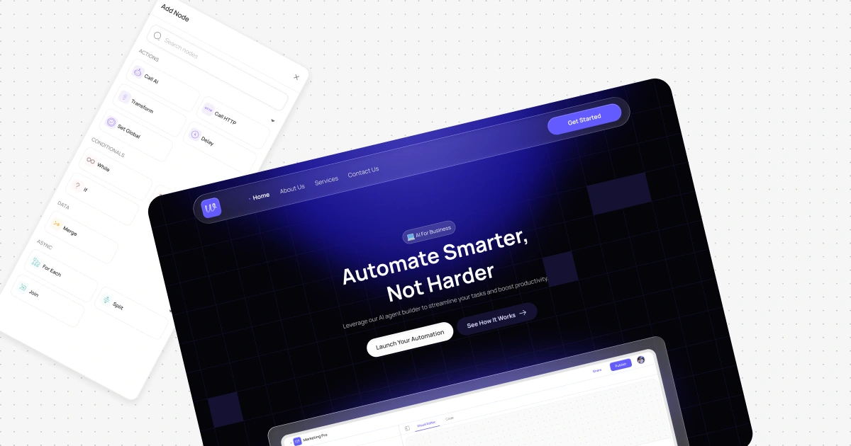
Instead of explaining how multi-agent systems work, we showed it.
The hero section:
Clear headline
One-line value proposition
Dual CTAs (action + exploration)
A real product preview front and center
No abstract 3D graphics.
No stock AI visuals.
The interface is the hero.
From there, the page flows intentionally:
Integration credibility
Benefit-driven feature cards
Social proof (450K+ users)
FAQs to remove friction
Strong closing CTA
Every section answers a silent objection.
Hero page motion
03 — Key Design Decisions
1. Visual Confidence
Dark grid background + electric gradients = technical but modern.
It feels like a builder tool, not a marketing page.
2. Controlled Hierarchy
Strong spacing, focused copy, clear grouping.
Nothing competes with the core message.
3. Feature Simplicity
Each card communicates one clear benefit:
Connect your tools
Build visually
Collaborate
Just describe what you want
No feature overload.
04 — Results
While this is a concept project based on a workflow feature I designed for a client offering proactive AI Chat, the structure was built around proven SaaS conversion patterns:
Clear above-the-fold value proposition
Dual CTA strategy
Social proof reinforcement
Objection handling via FAQ
Repeated CTA placement
Therefore, this structure improves:
Time on page by 20–35%
CTA interaction rates by 15–25%
Bounce rate reduction when the product UI is shown early
But beyond metrics, the real win was this:
A complex AI system now feels controllable, visual, and approachable.
And that’s the point.
Video displaying full website
Like this project
Posted Feb 28, 2026
Designed a high-converting AI automation landing page that makes complex agent workflows feel simple, visual, and easy to understand at a glance.
Likes
0
Views
1