UX Design for Assentric Exam Software
Osarenkhoe Iyamu-Noma
Project Overview
Assentric is an EdTech exam software designed to help developers prepare for and take technical assessments with confidence.
It serves two primary audiences:
Individuals preparing for programming exams or skill validation
Companies / Academies training interns, students, or junior developers
The platform combines structured learning, practice tests, project collaboration, and performance tracking — all in one ecosystem.
The Problem
Developers preparing for exams or technical interviews often face:
Fragmented learning platforms
No structured way to measure readiness
Limited real-world project exposure
Poor visibility into performance metrics
Companies are struggling to track intern progress
There was a need for a centralised system that bridges:
Learning → Practice → Assessment → Real-world collaboration
The Approach
Instead of designing feature-first, I designed outcome-first.
Every screen answers one question:
“How is this user progressing?”
The product architecture was built around performance visibility and structured growth.
Dashboard — Performance at a Glance
The dashboard acts as a command centre.
It highlights: Time invested, tests taken, average score, proficiency breakdown, course progress and assessment history.
If a user logs in for 10 seconds, they should instantly know:
Where they stand
What to do next
How close they are to mastery
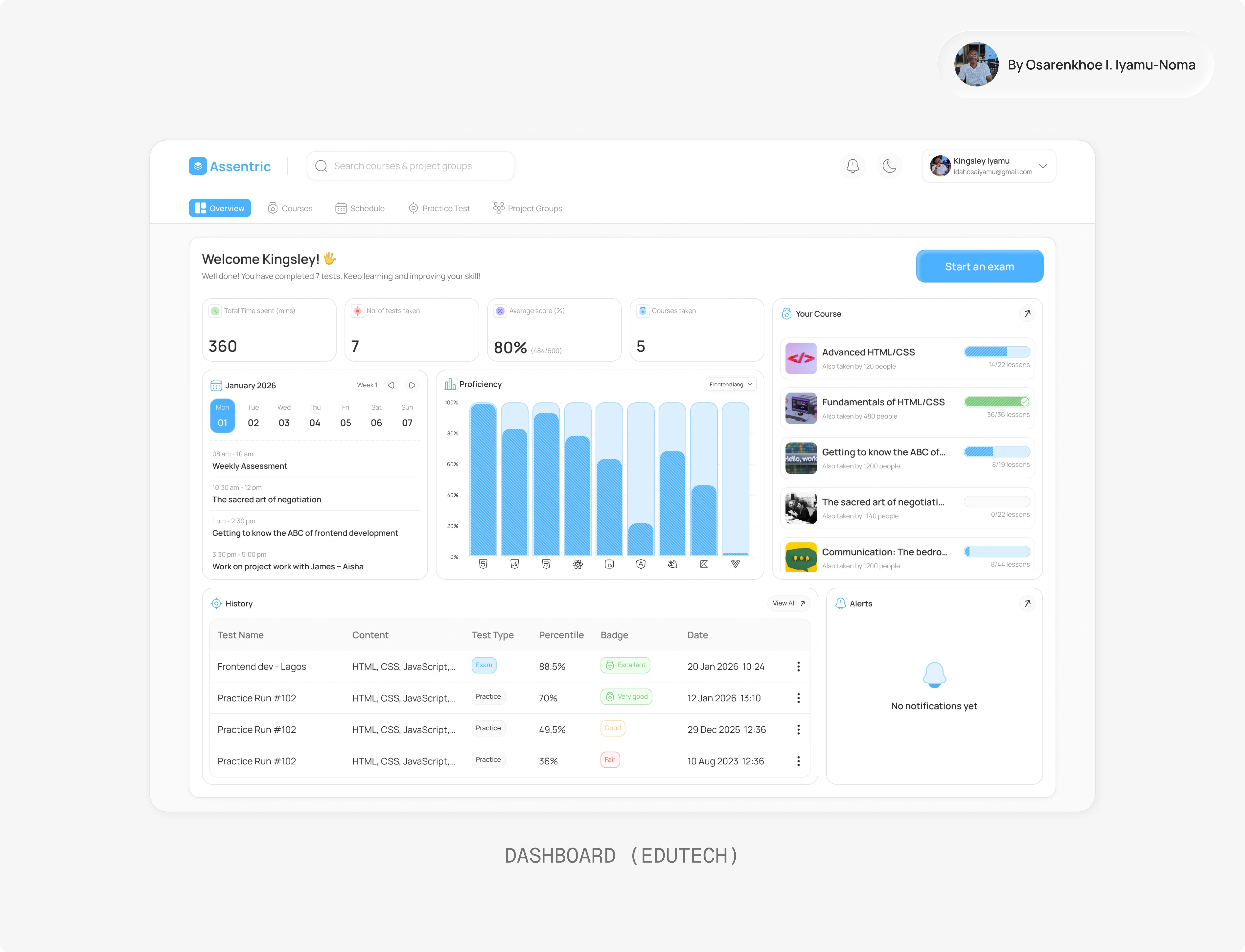
Dashboard
Courses — Structured Upskilling
Users can enrol in both technical and soft skill courses.
Key UX decisions:
“Pick up where you left off” visibility
Clear progress indicators
Lightweight, scannable course cards
Completion was prioritised over endless browsing.
Because half-finished courses don’t build competence.
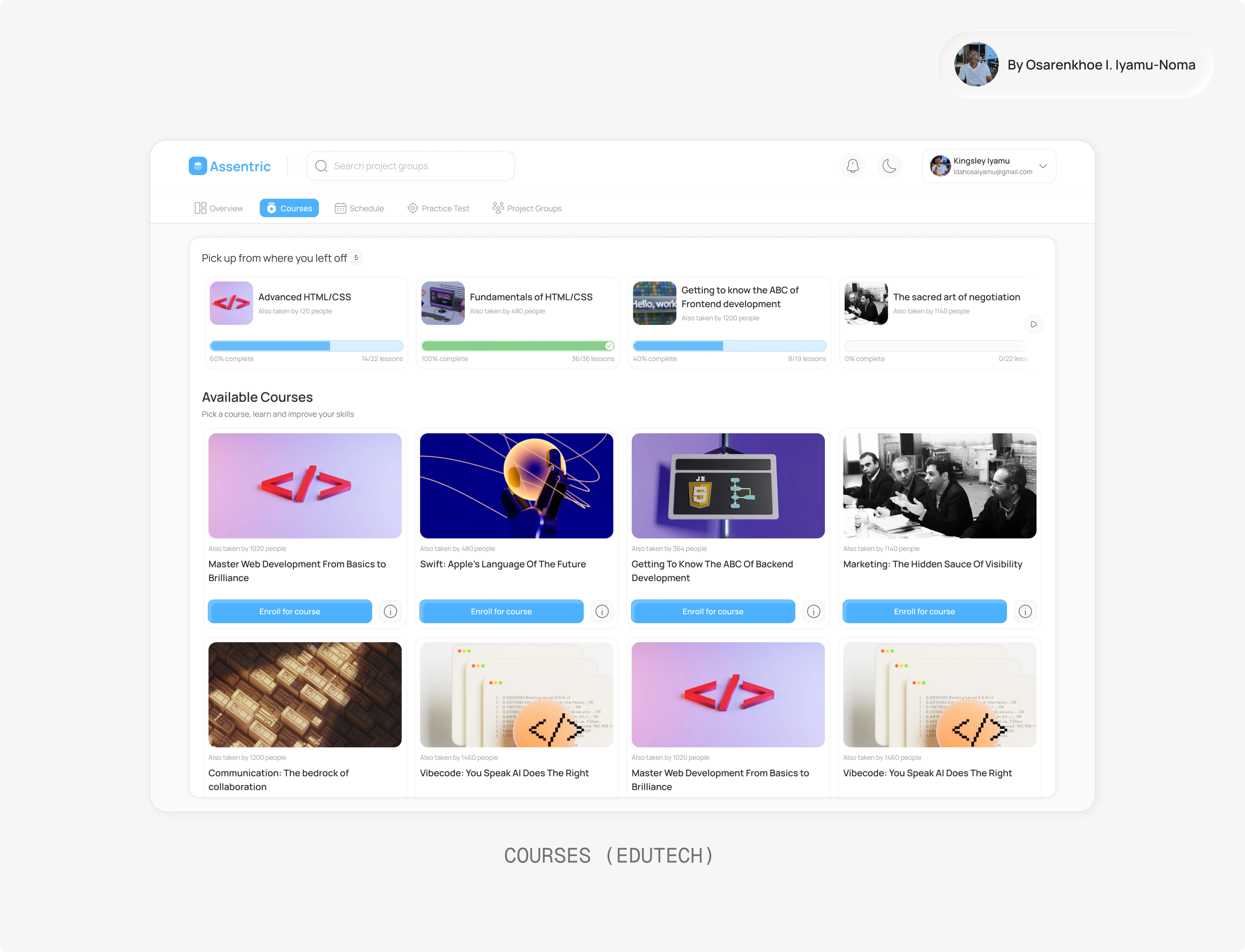
Courses
Practice Tests — Reduce Exam Anxiety
Practice tests are tied directly to what users have learned.
They receive:
Percentile scores
Performance badges
Topic-based testing
This creates a continuous loop:
Learn → Practice → Measure → Improve
Schedule — Accountability Layer
The schedule feature introduces structure.
It helps users:
Plan assessments
Stay organized
Commit to timelines
Learning becomes intentional — not passive.
Project Groups — Real-World Execution
Built primarily for companies and academies.
Students can:
Join project groups
Work collaboratively
Apply what they’ve learned
This bridges the biggest gap in EdTech:
Knowledge ≠ Execution.
Assentric closes that gap.
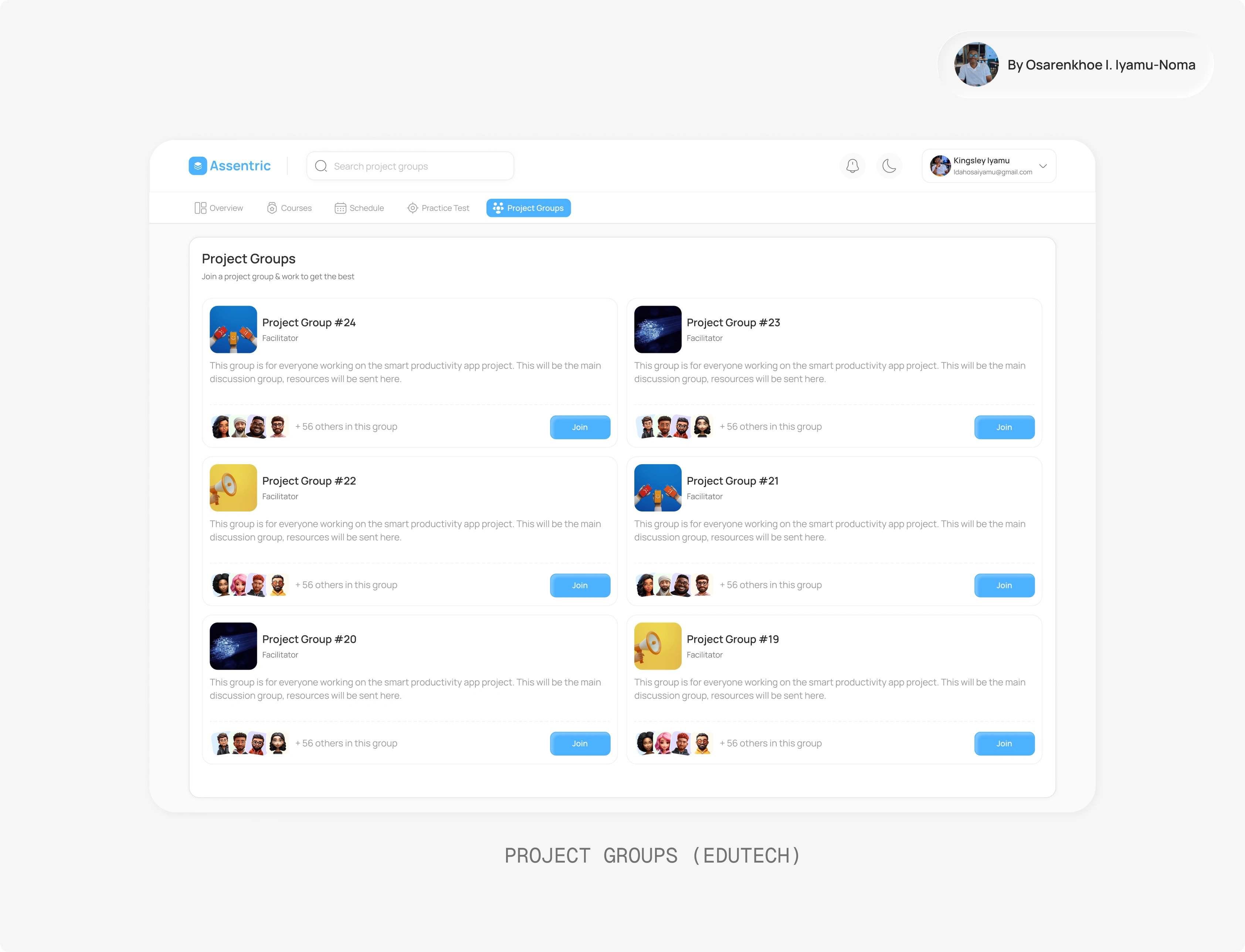
Project Groups
UX Trade-Offs
Simplicity vs Analytics Depth
I chose clarity over heavy reporting. Advanced analytics can scale later.
Gamification vs Professional Credibility
Progress tracking exists, but subtly. The product needed to feel enterprise-ready.
Course Variety vs Completion Psychology
Resume-learning visibility was prioritised over endless discovery.
Design Direction
Clean card-based layout
Soft shadows & spacing hierarchy
Data visualisations that feel calm, not overwhelming
Action-driven CTAs
The product feels structured and performance-focused — not noisy.
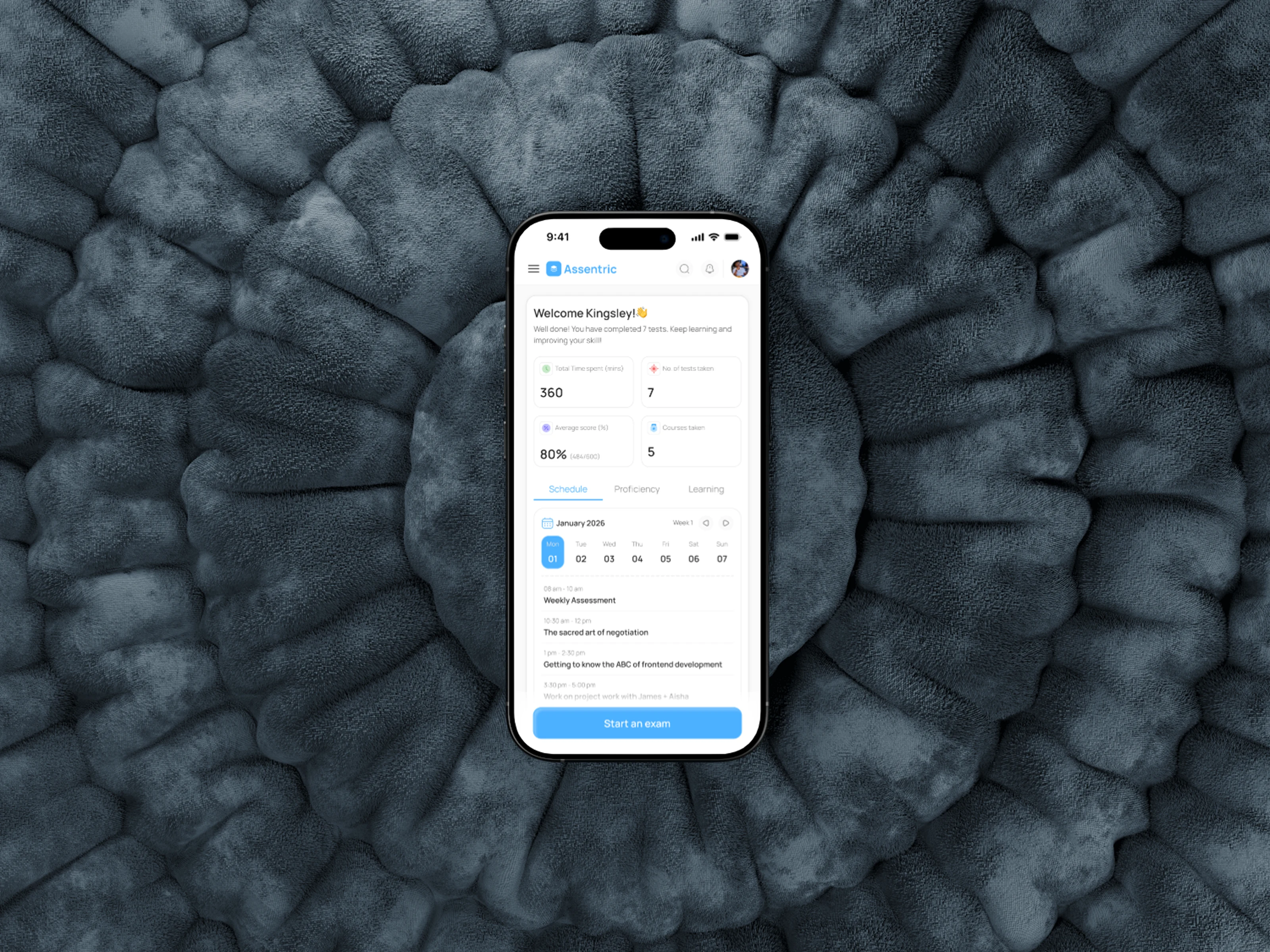
Mobile Dashboard mockup
Like this project
Posted Feb 28, 2026
Designed a structured learning and assessment platform for Assentric.
Likes
0
Views
0