Vitame – Brand & Packaging Design

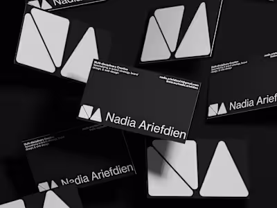
Nadia Ariefdien


Vitame – Brand & Packaging Design
Cold-pressed Juice Brand
"Vitame is a cold-pressed juice brand inspired by the power of nature. Using fresh, nutrient-rich ingredients, Vitame creates energizing juices crafted to bring health, flavour, and vitality to your daily routine."— Brief by @designerbriefs on Instagram
The Vitame brand identity is a celebration of the vibrancy and freshness of its cold-pressed juices. The design is characterized by a bold, minimalist aesthetic that uses bright, vibrant colors to represent the brand's commitment to using only the freshest, most nutritious fruits and vegetables. The simple, clean lines of the typography and logo reflect the purity of the product, while the bold color palette conveys a sense of energy and vitality.
Brand Name: Vitame
Industry: Food & Drink
Services: Brand Design, Packaging Design, 3D Modelling & Animation, & Social Media Design
The Logo
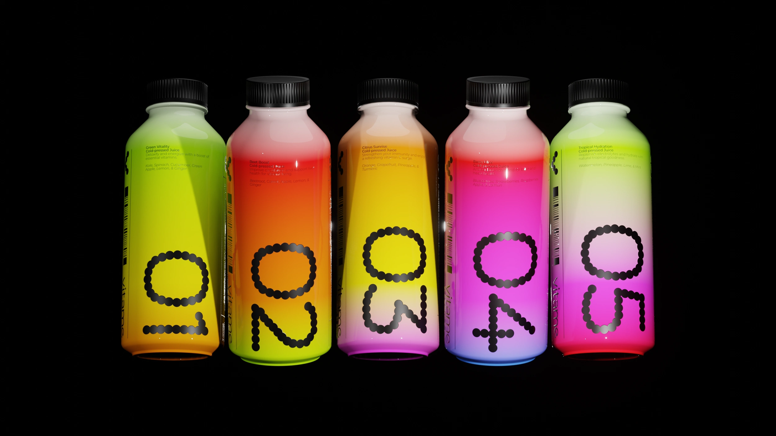
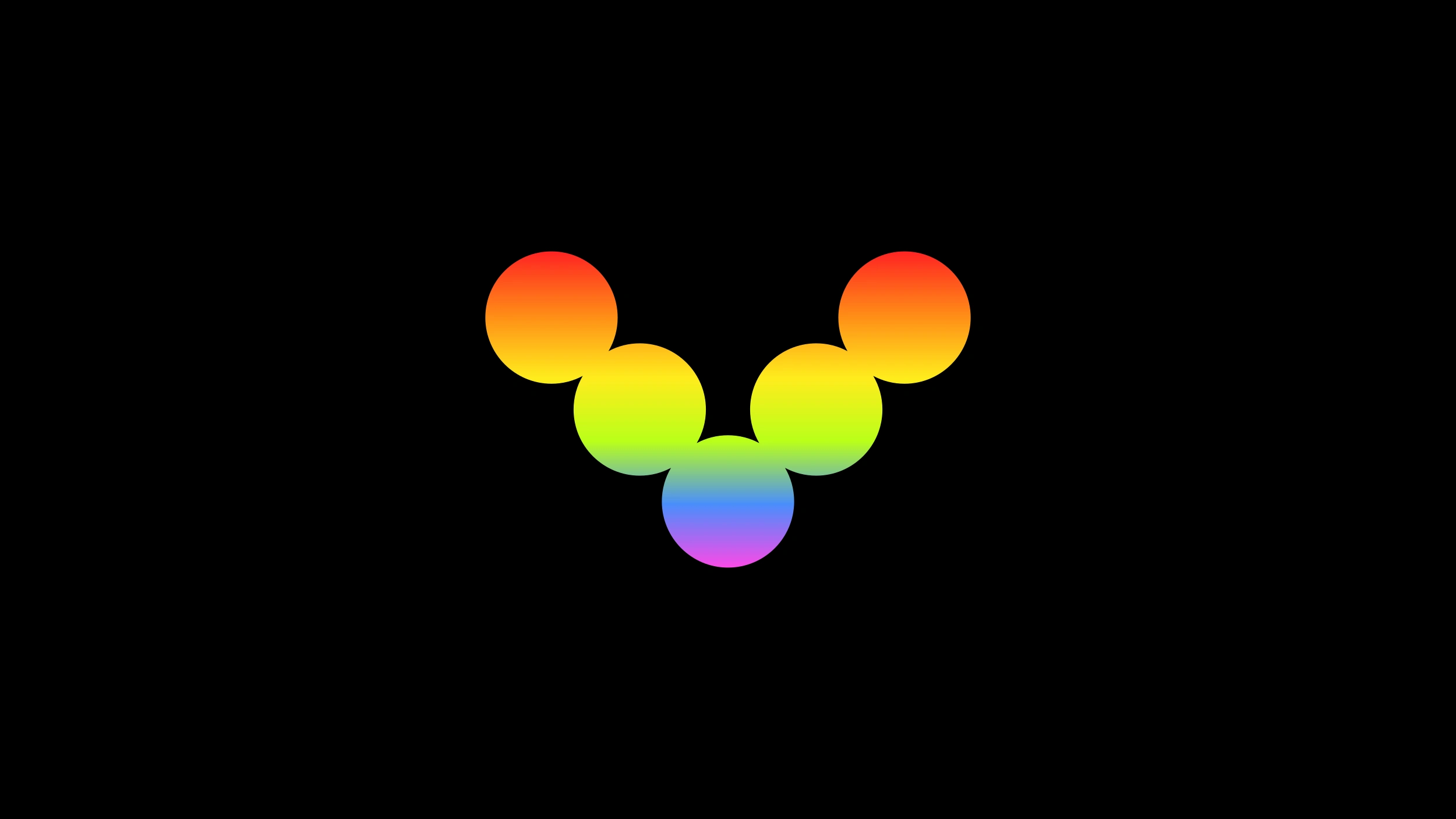
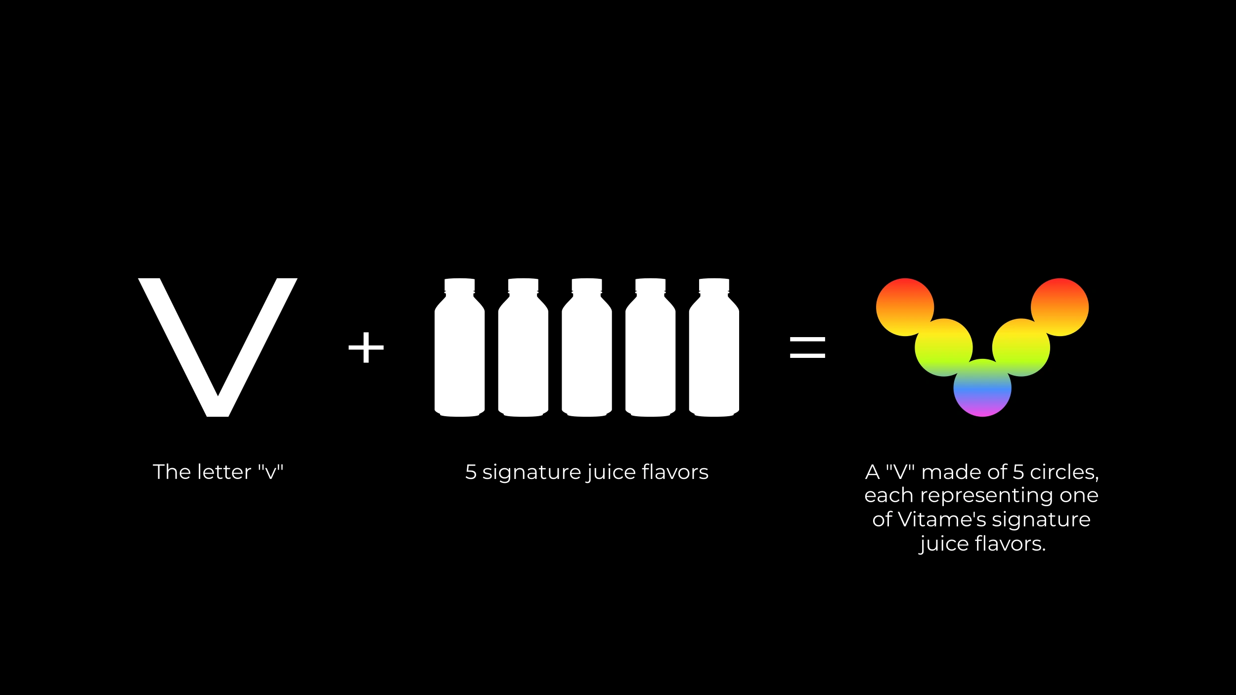
The Vitame logo is designed with a bold, minimalist aesthetic, it features a distinctive graphic mark composed of five circles, artfully arranged to form the letter "V." This "V" directly references "Vitame," serving as an immediate visual identifier for the brand. Beyond its direct phonetic link, the five circles hold deeper symbolic meaning. Each circle represents one of Vitame's five signature cold-pressed juice flavors. The clean lines and simple geometric shapes reflect the purity of Vitame's cold-pressed juices. The logo's strong visual presence is both memorable and modern, perfectly setting the stage for a brand celebrated for its energizing and vitalizing products.
Color & Typography
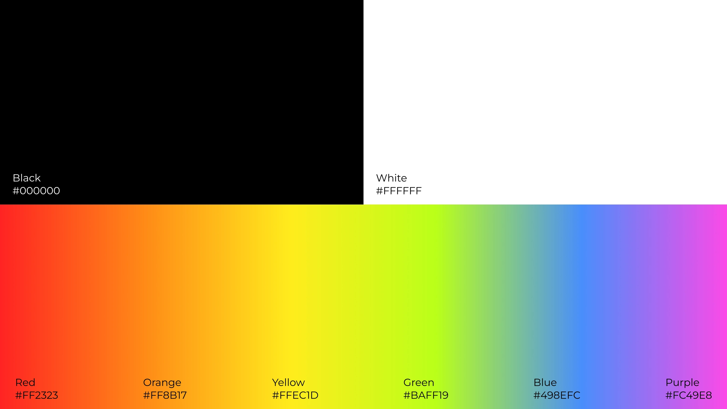
The brand's designs predominantly feature a stark black background, creating a dramatic and sophisticated stage that allows the product and other elements to truly pop. White is strategically employed for text and subtle details, ensuring optimal readability and a clean aesthetic.
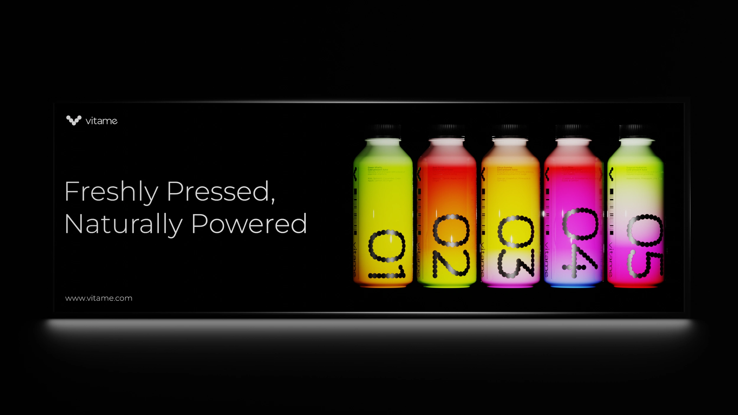
Adding a dynamic layer to this foundation is a lively spectrum of six vibrant colors: Red (#FF2323), Orange (#FF8B17), Yellow (#FFEC1D), Green (#BAFF19), Blue (#498EFC), and Purple (#FC49E8). These bright, fresh tones are directly inspired by the natural ingredients found in Vitame's cold-pressed juices and are typically presented in smooth, energetic gradients. These gradients beautifully wrap around product imagery and other graphic elements, conveying a sense of health, flavor, and vitality.
For its typography, Vitame exclusively uses Montserrat as its primary typeface. This clean, geometric sans-serif font was chosen for its modern aesthetic, excellent readability, and versatile range of weights. The brand primarily utilizes the "Light" weight for most body text and general information, which contributes to the minimalist and airy feel of the designs. Where emphasis or stronger presence is required, the "Regular" weight of Montserrat is strategically employed. This thoughtful use of different weights within the same typeface ensures a consistent and cohesive visual voice, maintaining clarity and reinforcing the brand's pure and uncomplicated nature.
Packaging
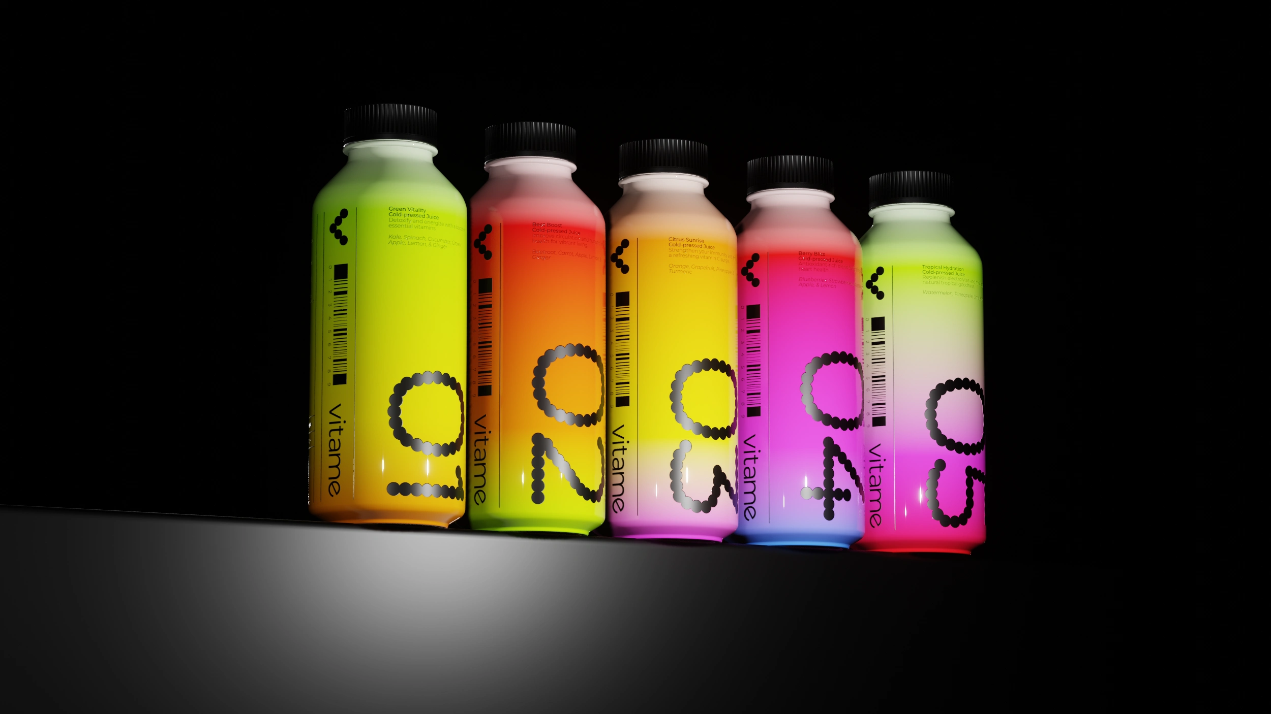
Vitame's packaging design is a direct extension of its commitment to natural vitality and fresh ingredients, transforming each bottle into a visually compelling representation of the juice within. The juices are elegantly presented in sleek glass bottles with a premium glossy finish, designed not only for aesthetic appeal but also to convey the quality of the cold-pressed product. A key feature of the packaging is the use of distinct, vibrant gradient variations on each bottle, with every gradient thoughtfully crafted to represent the specific flavor profile of the juice it contains. This approach creates an intuitive and visually delightful connection between the packaging and the fresh ingredients.
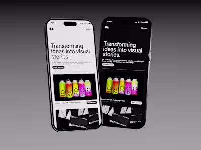
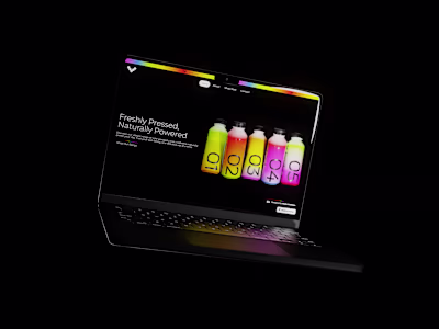
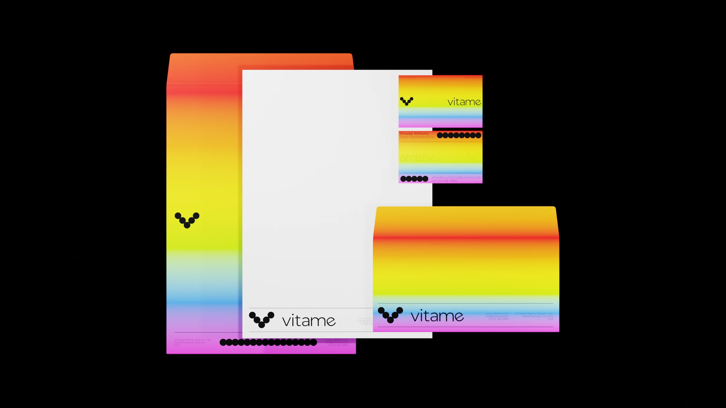
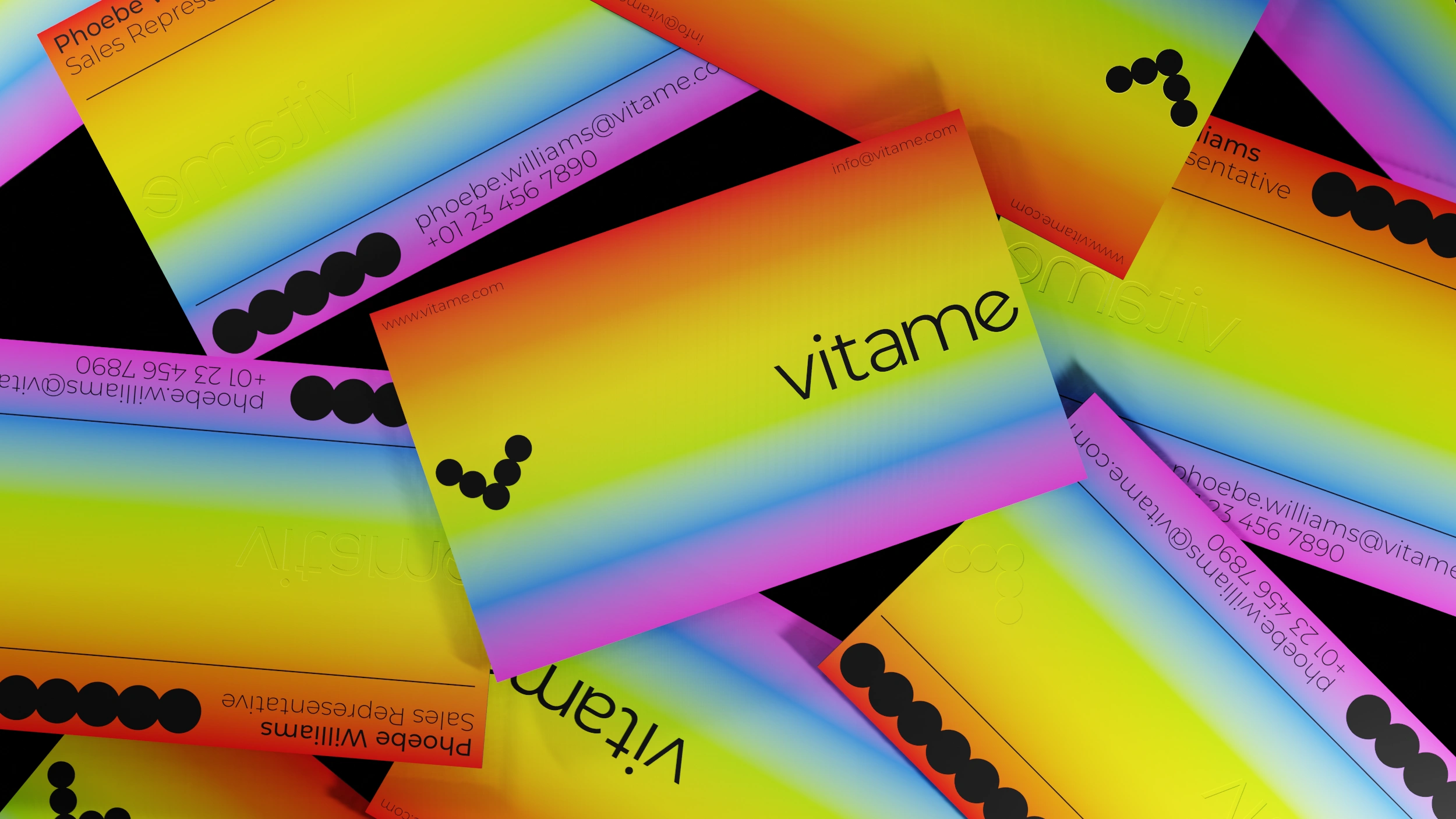
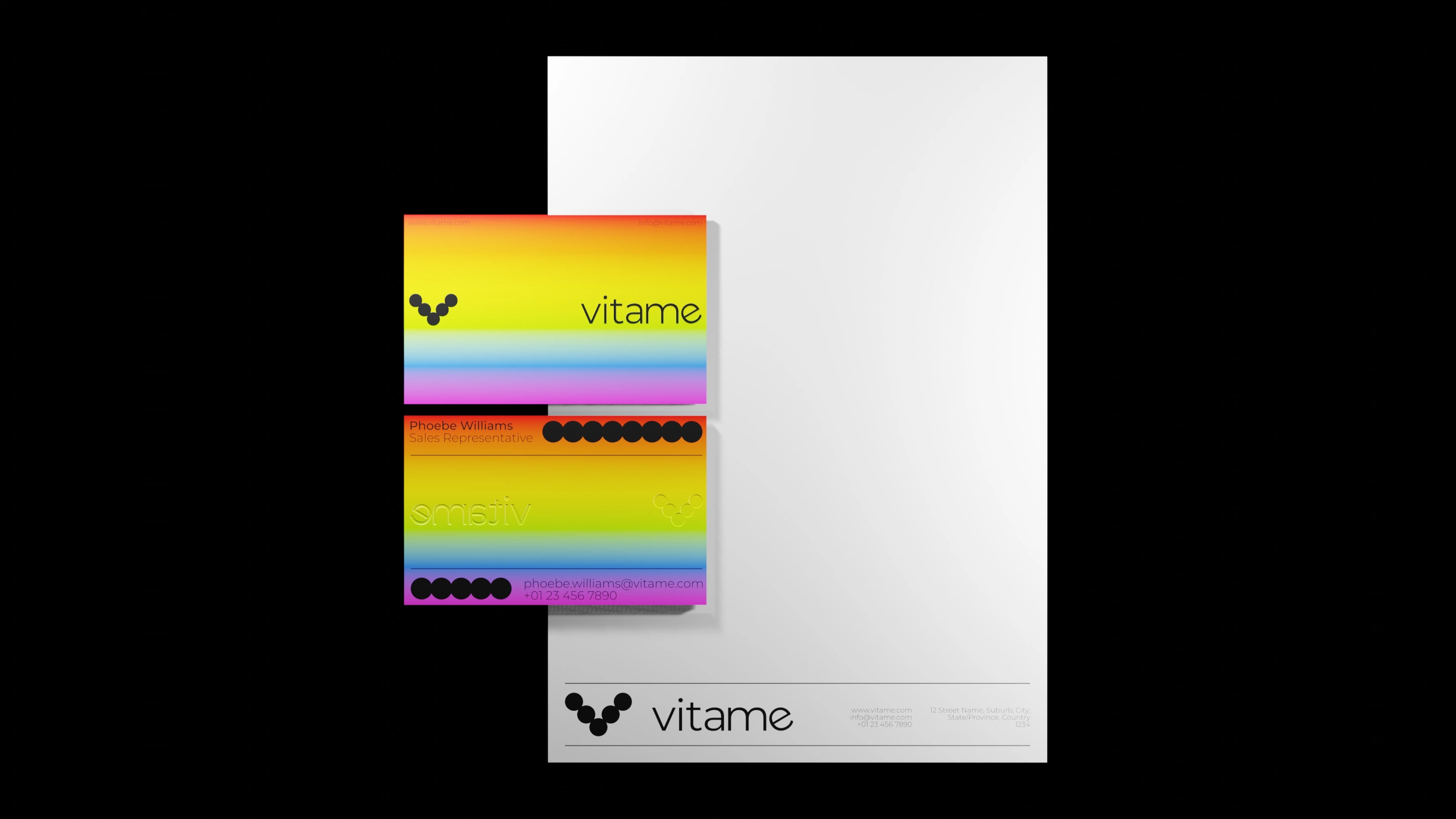
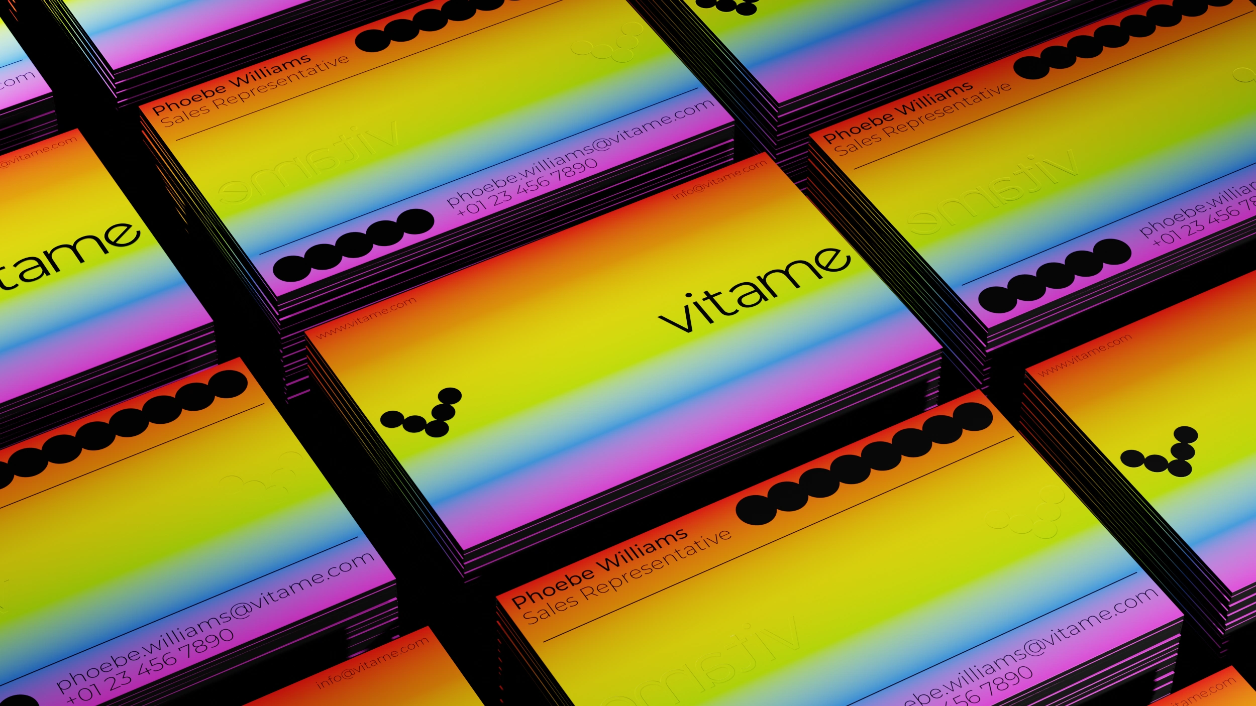
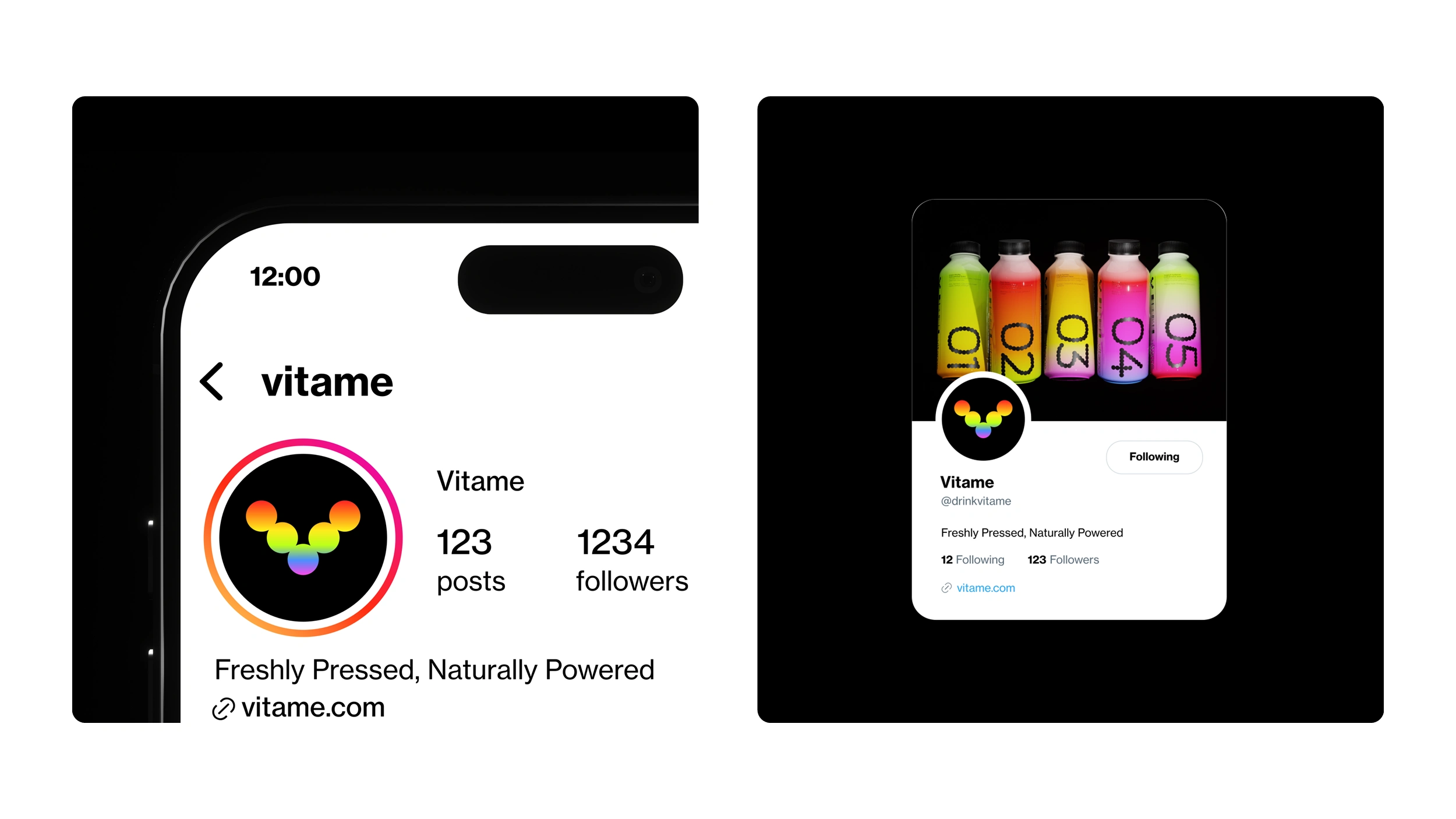
Mockups
This section showcases the comprehensive visual identity system for Vitame, demonstrating how the core branding elements—the distinctive logo, vibrant color palette, and refined typography—seamlessly integrate across diverse touchpoints. Through a series of compelling mockups, you'll see the brand's cohesive and energetic presence across various applications.
Like this project
Posted Jul 10, 2025
The Vitame brand identity is characterized by a bold, minimalist aesthetic that uses vibrant colors to convey a sense of energy and vitality.