Nadia Ariefdien – Brand Design

Nadia Ariefdien


Nadia Ariefdien – Brand Identity Design
Personal Brand Design
For my personal brand, I created a cohesive visual identity, website, social media designs, and print stationery designs (business cards, letterheads, contracts, etc.). My aim was to create a professional visual style that is characterized by a minimalist aesthetic, classic sans-serif typefaces, and a simple monochrome color palette. My goal for this project was to create a visual style that represents the unique blend of creativity and meticulous attention to detail that characterizes my work.
Client: Nadia Ariefdien
Industry: Graphic & Web Design
Services: Brand Design, Content Creation, & Social Media Design

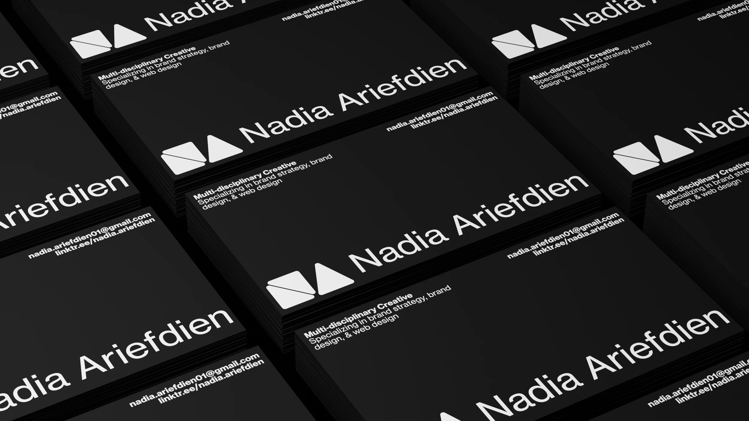
The Logo
I aimed to create a versatile logo that embodies professionalism and creative precision. The result was a striking, minimalist design that comprises a clean, classic sans-serif typeface paired with a distinctive geometric icon. This icon is formed by three triangles that have been strategically placed to spell my initials (NA). The arrangement of these shapes creates a sense of balance and subtle dynamism, reinforcing a minimalist aesthetic and timeless elegance.
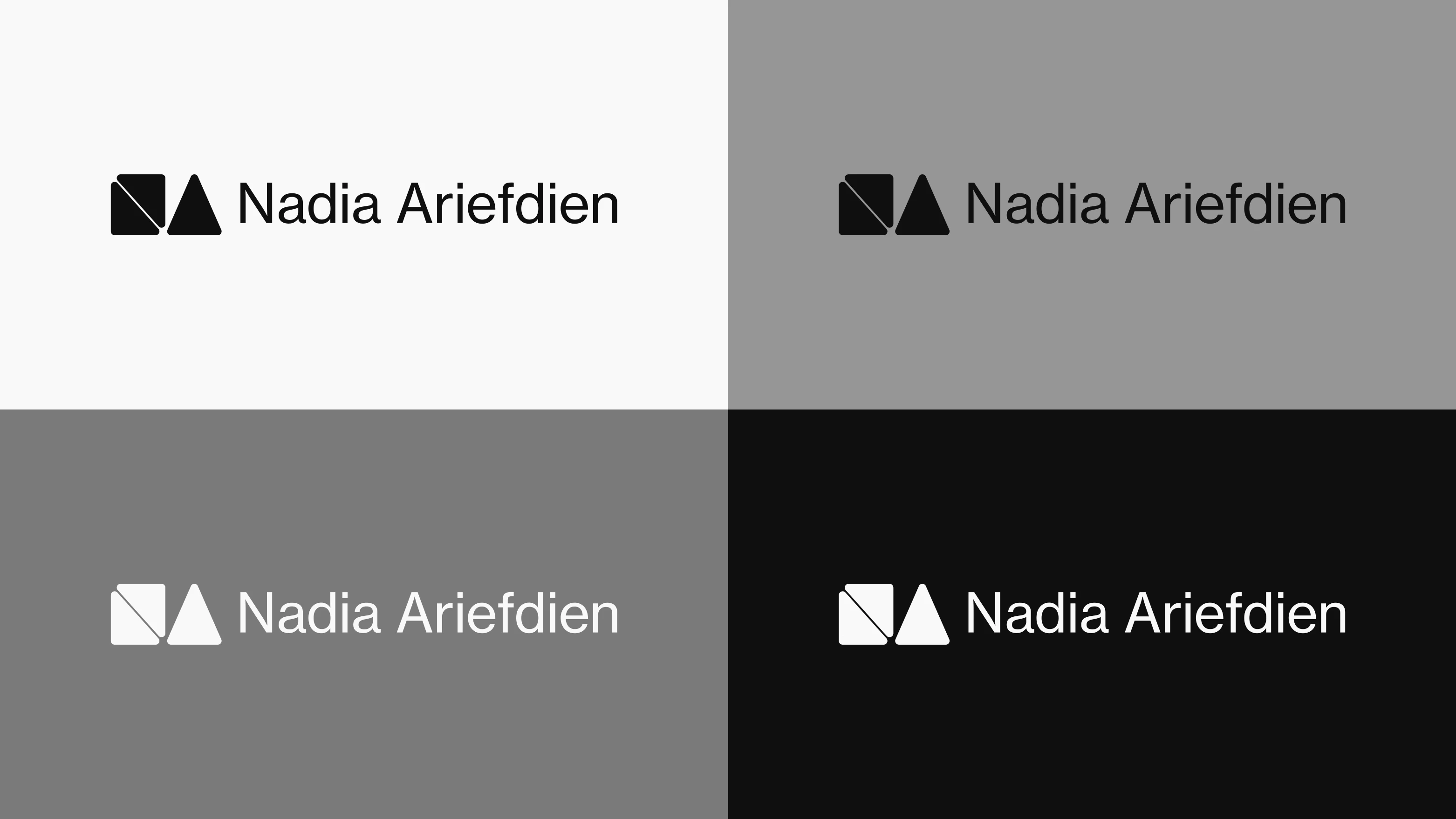
Color & Typography
My personal brand's visual identity is crafted around principles of timeless simplicity, primarily expressed through a monochrome color palette and classic sans-serif typography. The choice of a black and white color scheme is central to my brand's aesthetic. This stripped-back, high-contrast approach is intentionally minimalist, allowing for clarity and focus without distraction. Black conveys sophistication, professionalism, and strength, while white represents purity, modernity, and space. Together, they create a sharp, elegant visual experience that is not only inherently timeless but also exceptionally versatile. This classic combination ensures that my brand maintains a professional and refined look across all platforms, while allowing my diverse design work to take center stage without being overpowered. Complementing the monochrome palette, my brand's typography utilizes a classic sans-serif typeface. This underscores my brand's commitment to clean lines, readability, and a modern aesthetic. Sans-serif typefaces are inherently clear and unornamented, making them highly legible across all applications. Beyond its aesthetic qualities, the simplicity of this sans-serif typeface, much like the color palette, contributes to the overall versatility of my brand. It ensures that text is easy to consume, allowing the visual impact of my design projects to remain the primary focus, while still conveying a strong sense of professionalism and elegance.
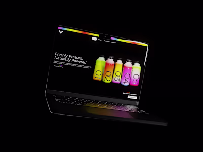
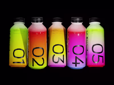
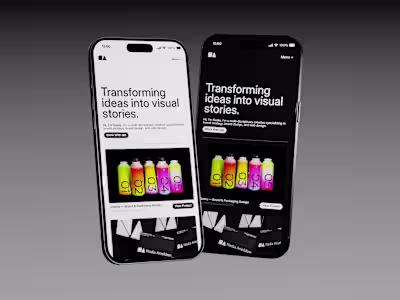
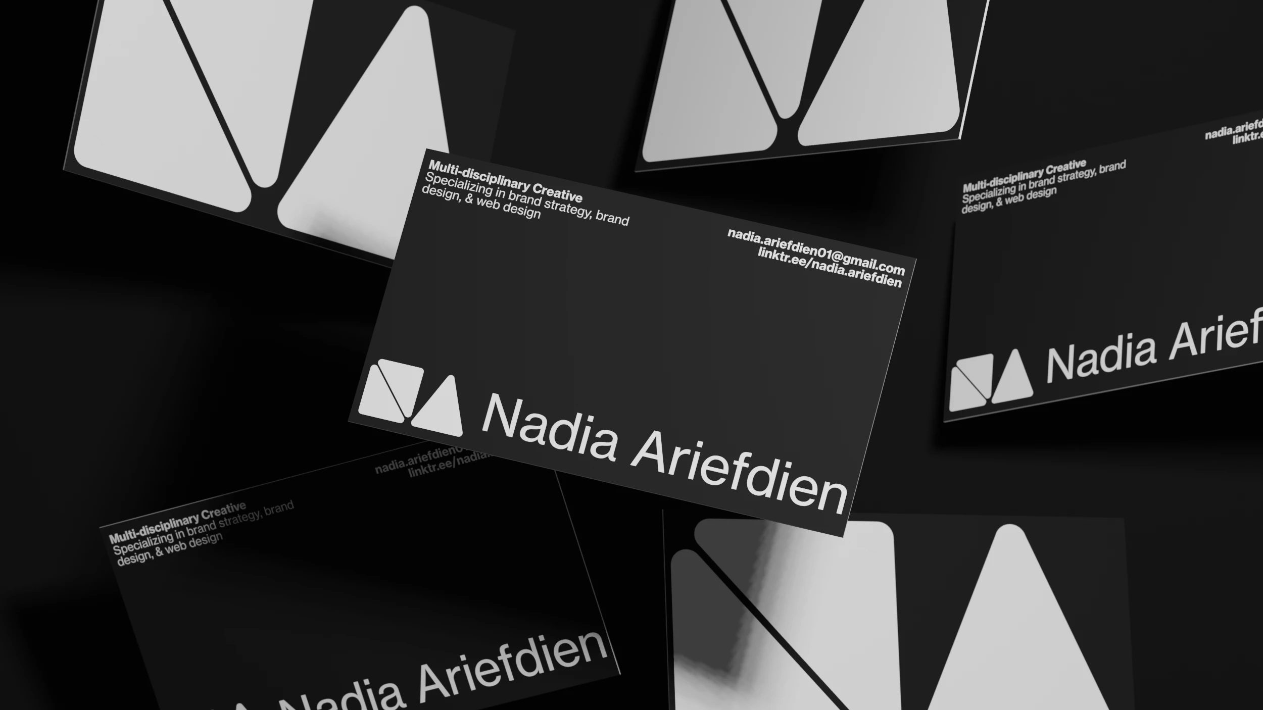
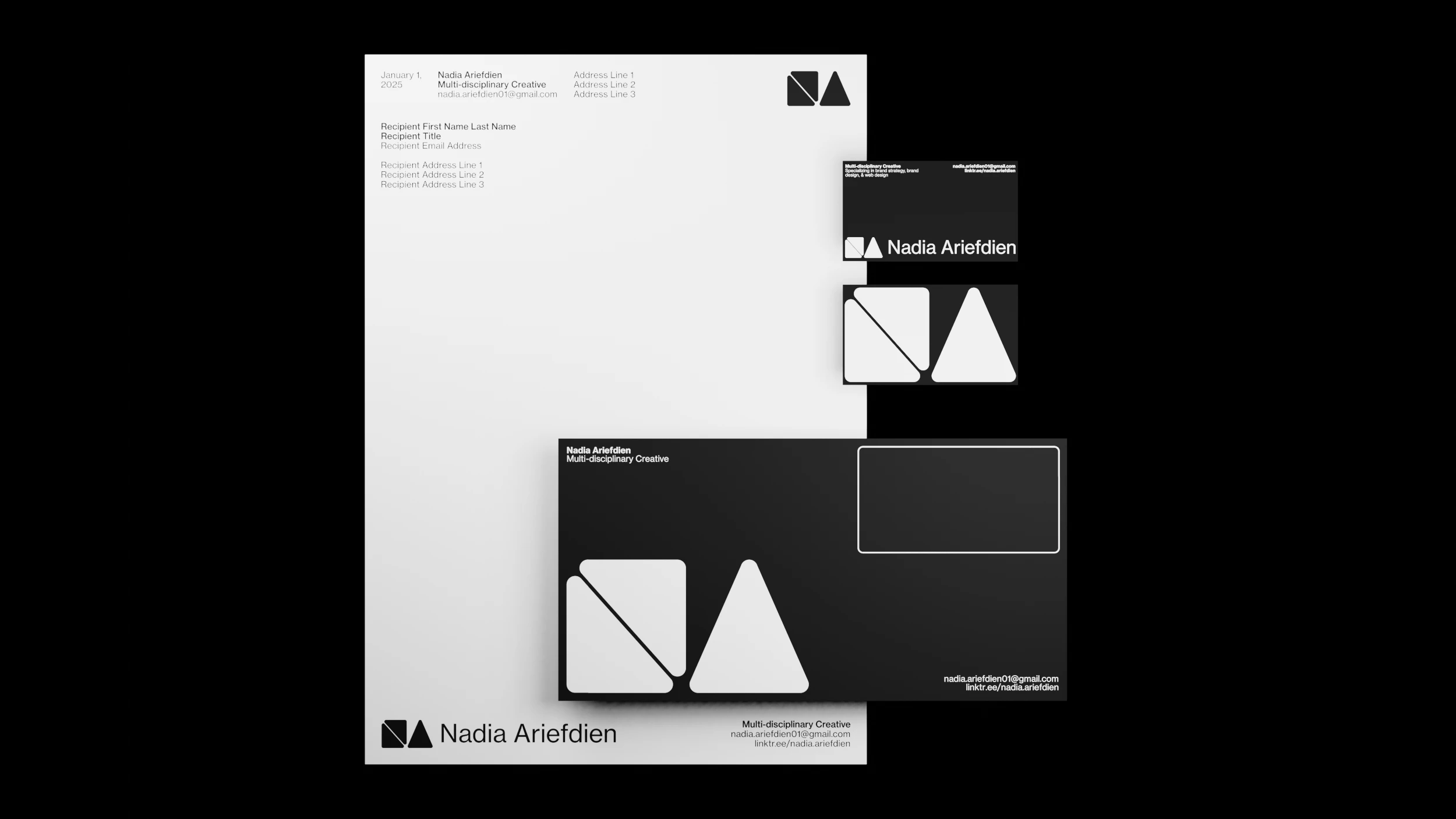
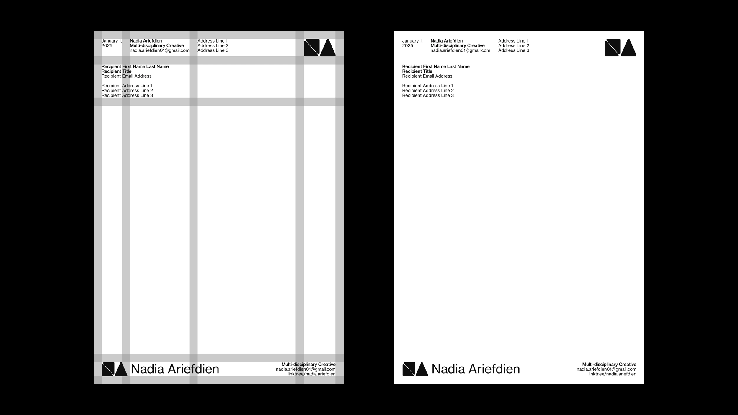
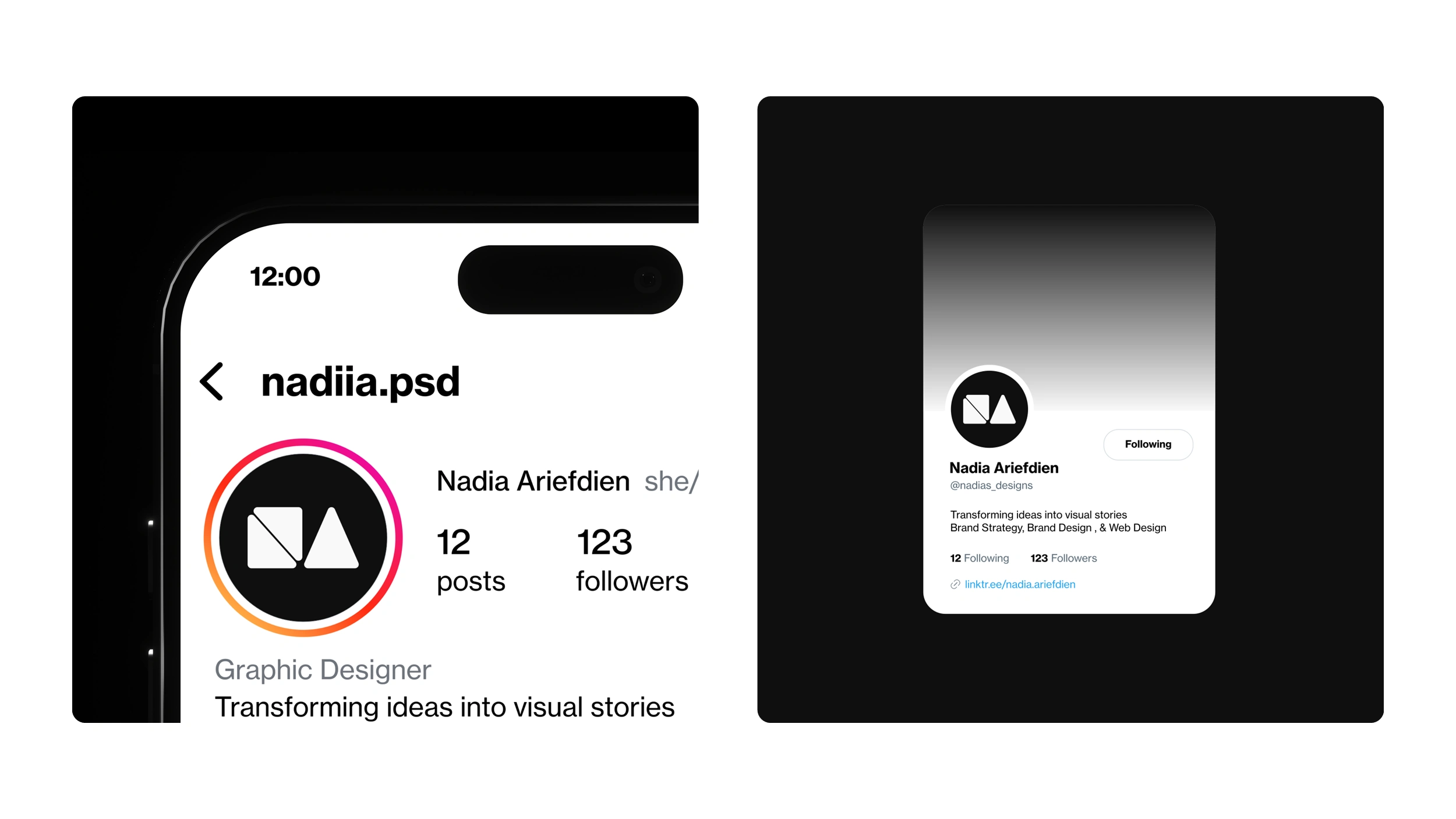
Bringing It Together
This section brings my brand to life, showcasing how the foundational elements—my distinctive logo, the minimalist black and white color palette, and the elegant sans-serif typography—harmoniously converge across various applications. Through a series of carefully selected mockups, you'll see the brand's cohesive visual identity in action, demonstrating its versatility and consistent professional appeal. Each example highlights how these elements work together to create a strong, impactful presence.
Like this project
Posted Jul 10, 2025
For my personal brand, I created a cohesive and professional visual identity that represents my unique blend of creativity and meticulous attention to detail.