BRAND DESIGN - SMOCCA
SMOCCA - Online Medical Fashion Boutique
Project Overview
Client: SMOCCA
Industry: Medical Apparel (Fashionable Printed Medical Scrubs)
Project Brief: The client required a logo design that would visually communicate their involvement in the medical industry while maintaining a fashionable, professional, and simple aesthetic. The logo needed to be versatile enough to be used across various branding materials and be instantly recognizable.
Design Objectives
Industry Representation: The logo should incorporate elements that signify the medical industry.
Simplicity and Professionalism: The design should be clean and professional.
Modern Aesthetic: The logo should have a contemporary look, suitable for a fashion-forward brand.
Brand Identity: It should reflect the brand name 'SMOCCA' in a distinctive manner.
Design Solution
Concept Development
Initial Ideas: Use of medical symbols such as stethoscopes, crosses, or heartbeat lines.
Incorporating elements of fashion to signify the stylish aspect of the scrubs.
Combining these elements in a minimalistic and modern design.
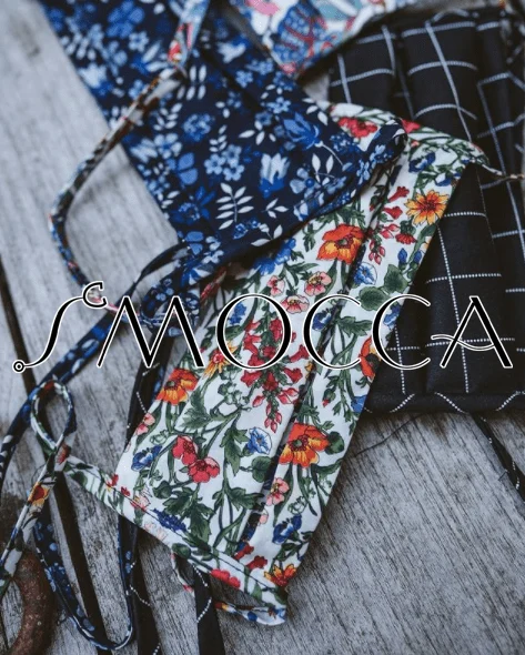
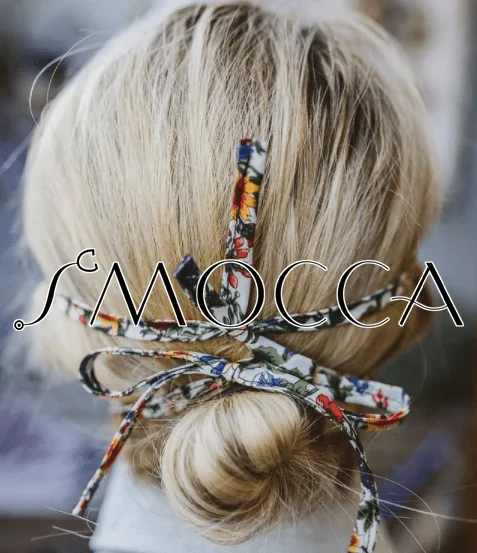
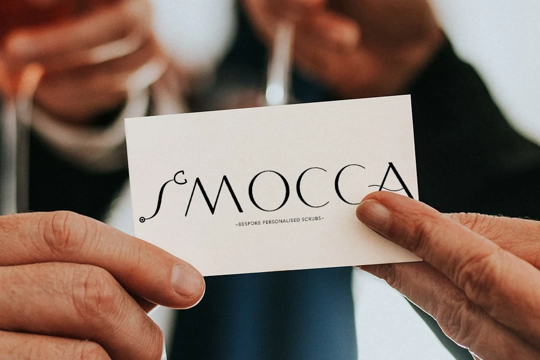
Chosen Concept: The final concept involved integrating a stethoscope into the brand name. The 'S' in 'SMOCCA' would be formed by the tubing of a stethoscope, effectively merging the medical and fashion elements in a simple and elegant way.
Logo Design
Typography - Font: A modern font with a mix of thin and thick strokes was chosen to convey sophistication and style.
Styling: The font's mixed weight creates visual interest and reflects the dynamic nature of the brand.
Illustration Element: Stethoscope Integration: The stethoscope forming the 'S' in 'SMOCCA' directly links the logo to the medical field.
Design Execution: The stethoscope is designed to be sleek and subtle, ensuring it blends seamlessly with the text without overpowering it.
Color Scheme - Primary Color: Black
Black was chosen for its timeless and professional appeal. It provides strong contrast and makes the logo versatile for various applications.
Final Logo Design
Visual Description
Text: The word 'SMOCCA' is in all caps, using the selected modern font.
Stethoscope 'S': The first letter 'S' is creatively formed by the tubing of a stethoscope, with the earpieces subtly extending from the top curve of the 'S'.
Color: Entire logo in black, providing a clean and polished look.
Application Versatility: The logo is designed to be scalable and can be used across different mediums, including:
Business cards
Uniform tags
Website
Marketing materials (flyers, brochures, social media)
Consistency:
The use of black ensures consistency across different backgrounds and mediums, maintaining the logo’s integrity and recognizability.
Results
The final logo successfully meets the project objectives:
Industry Representation: The stethoscope clearly links the logo to the medical field.
Simplicity and Professionalism: The minimalist design and modern font convey professionalism.
Modern Aesthetic: The sleek integration of the stethoscope and the mixed-weight font create a contemporary and stylish look.
Brand Identity: The logo is distinctive and memorable, effectively representing SMOCCA’s brand identity.
Conclusion
The SMOCCA logo design project showcases how thoughtful integration of industry-specific elements with modern design principles can create a strong, professional, and stylish brand identity. The final logo not only meets the client’s brief but also stands out in the competitive market of fashionable medical apparel.
Like this project
Posted Jun 13, 2024
Fashionable printed medical scrubs business. To design a logo which incorporated an illustration element which showed what industry.
Likes
2
Views
15

