Built with Framer
Blur It Website Redesign
Clinton Ojobor
Overview
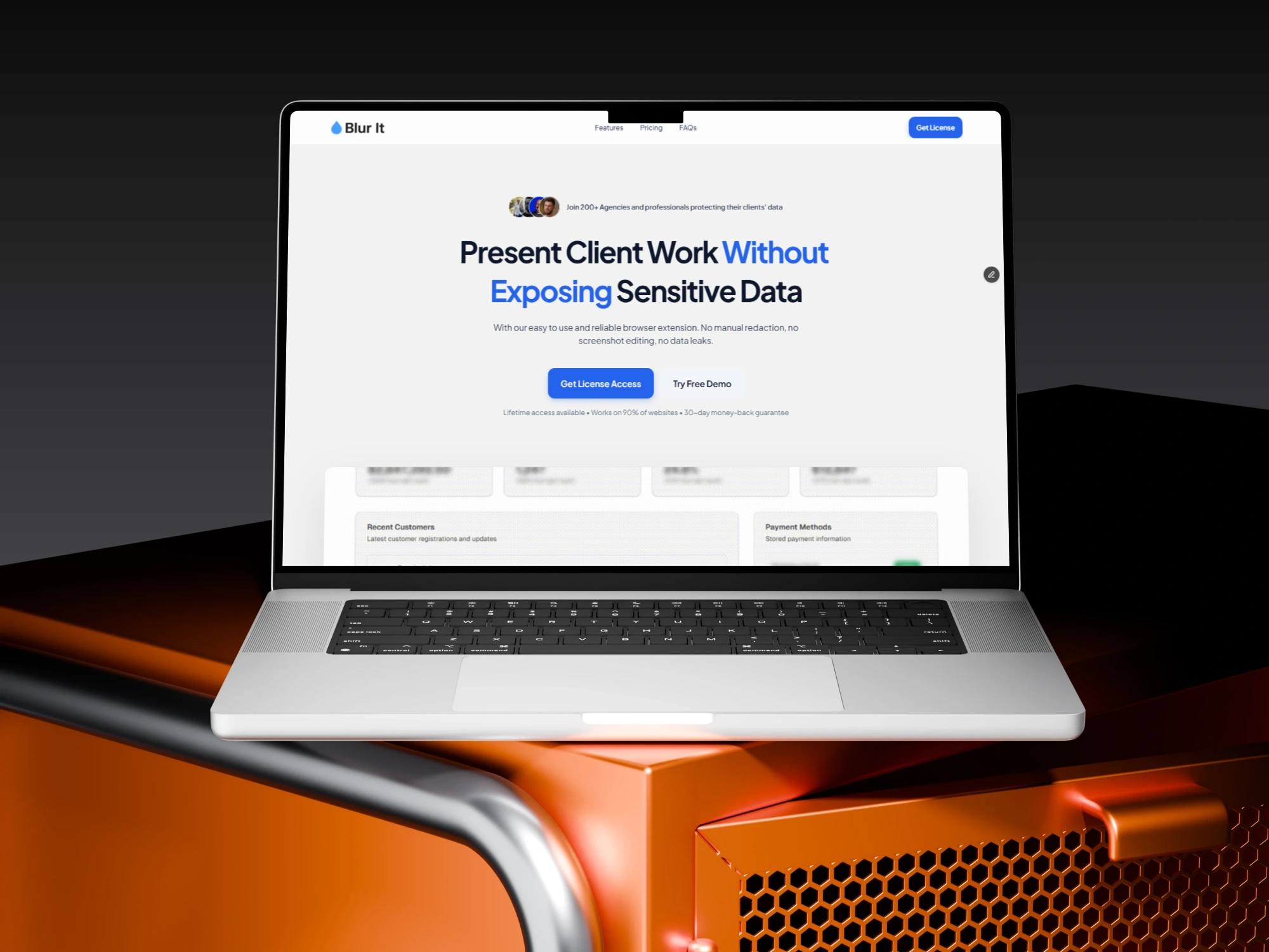
Blur It is a browser extension built for founders, agencies, sales teams, and recruiters. It allows users to instantly blur sensitive data (like revenue numbers, emails, or candidate names) during live presentations and screen recordings.
While the product itself was robust and fully functional, the original website didn't fully reflect the tool's capabilities. It focused heavily on technical features, missing the opportunity to connect with the high-stakes needs of professional users.
Goal of the Project
The objective was to take an existing, functional tool and elevate its web presence to a premium commercial standard in just 3 days.
I aimed to shift the brand perception from a "useful utility" to an "essential security asset." Specifically, the goals were:
Elevate Brand Authority: Move away from generic templates to a custom, trust-driven identity.
Shift Messaging Strategy: Pivot from explaining how it works to selling why it matters.
Optimize Conversion: creating a frictionless path to purchase by removing decision fatigue.
Challenges
Despite having a working product, the original V1 design created friction in three specific areas:
The "Generic" Barrier: The original site used standard
Inter typography and an Orange accent color. While functional, it lacked the distinct personality and stability associated with professional data security tools.The "Feature" Trap: The copy focused on the mechanics (e.g., "Draw rectangles to blur"). This forced users to do the mental work of figuring out the use case, rather than seeing the value immediately.
The Visualization Gap: The site relied on icon grids to list capabilities. This required users to read text to understand the tool, rather than seeing the workflow in action.
Solution & Outcome
I executed a comprehensive redesign focusing on User Psychology and Visual Storytelling.
The Solutions:
Visual Rebranding: I overhauled the style guide, introducing Royal Blue (
#2563EB) to signal stability and trust. I paired this with Plus Jakarta Sans to give the UI a modern, geometric tech feel that stands out from standard templates.From "List" to "Workflow": I replaced the static icon grid with a Zig-Zag layout featuring high-fidelity product screenshots. This visually demonstrates the user journey: Toolbar (Trigger) → Gmail (Action) → Pattern Detection (Automation).
Pricing Psychology: I restructured the pricing model using a "Decoy & Anchor" strategy. By positioning the Yearly plan ($4.99) alongside the Lifetime plan ($9.99), I made the Lifetime License appear as the obvious, high-value choice.
The Outcome: This redesign successfully repositioned Blur It from a simple browser add-on to a polished SaaS product. By focusing on Outcomes (preventing data leaks) rather than Features (blurring text), the new site effectively handles user objections and builds the necessary trust for a paid license.
Check out the live site here:
Like this project
Posted Dec 9, 2025
I redesigned my privacy tool into a professional brand. Leveraged visual storytelling and pricing psychology to build trust and drive sales.
Likes
1
Views
10
Timeline
Nov 21, 2025 - Dec 24, 2025