Surco Visual Identity

Bruno Fernandez


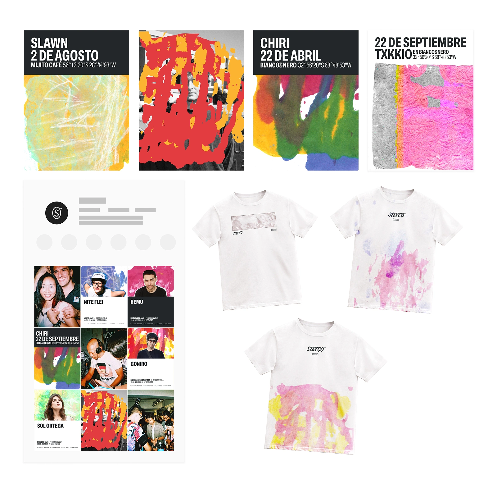
Surco — Visual identity
Surco is a nomadic production company dedicated to creating House music sets in unique locations. Its visual identity explores materiality within electronic music, inspired by the dual meaning of its name—the groove of a vinyl record and the furrow in the earth.
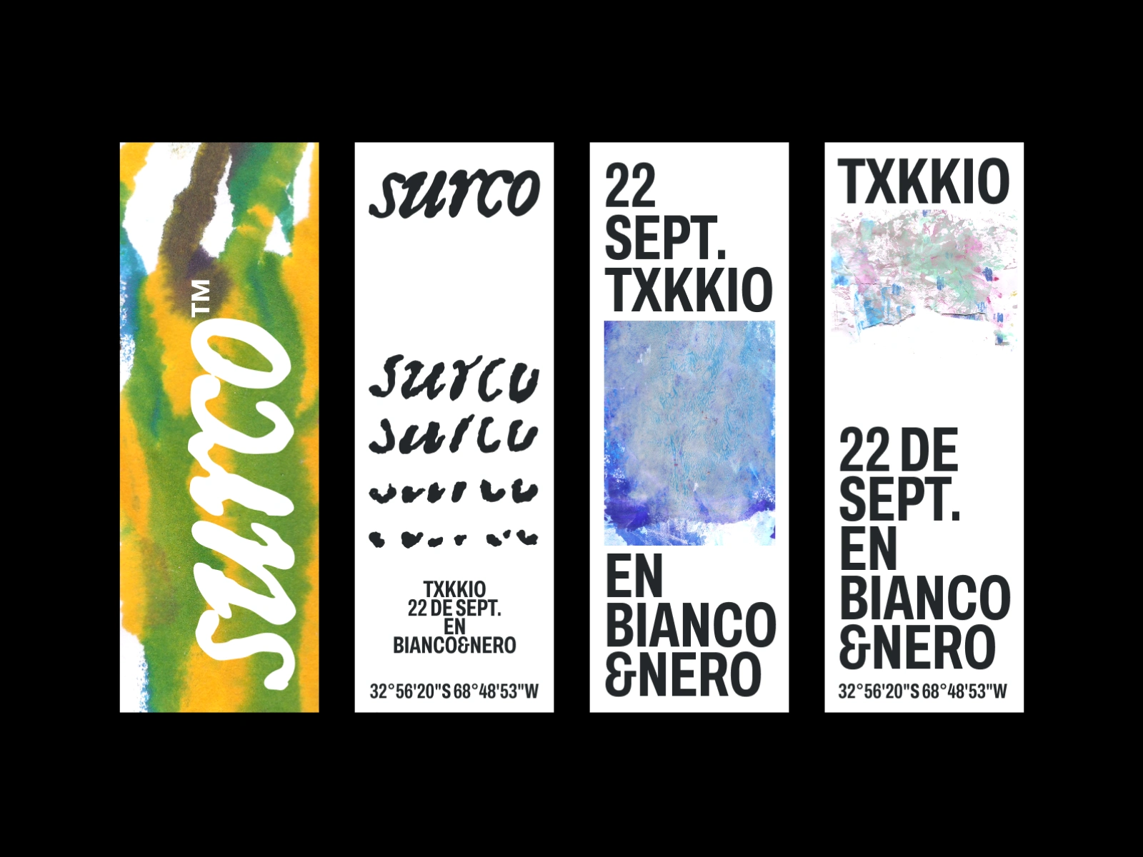
Distancing itself from the genre's typically cold and technological aesthetic, the brand fuses painterly textures with typographic rigor, proposing a return to the origin and embracing organic human imperfection as a visual language.
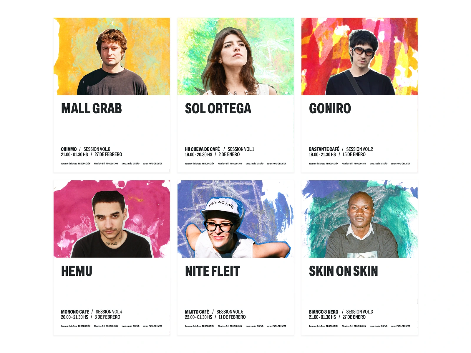
The system breaks a fundamental convention of graphic design: the absence of a coded color palette. The only solid (hexadecimal) colors are white and grey, serving as a neutral support. All remaining color is not flat ink, but matter; it comes exclusively from the painterly textures, making exact repetition impossible and giving the brand an unusual organic vitality.
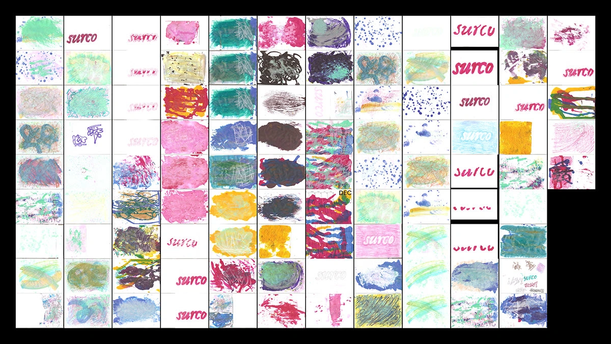
Over 80 illustrations were made by hand and latter scanned to be used as part of the visual identity.
Thank you for your time!
Bruno.
Like this project
Posted Mar 25, 2026
Surco explores electronic music’s materiality, inspired by the dual meaning of its name: the groove of a vinyl record and the furrow in the earth’s soil.