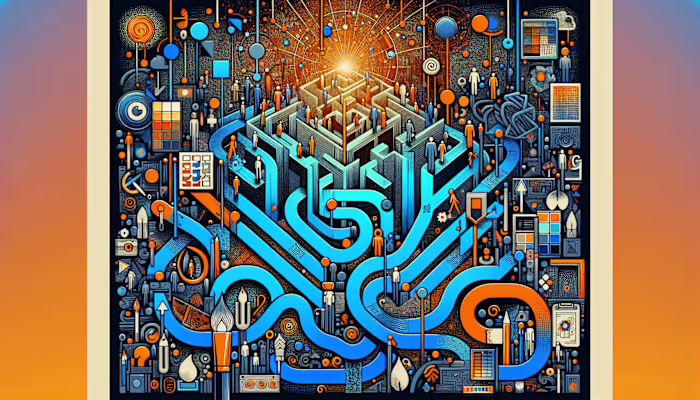
Graphic Designer Portfolios: What Really Matters Beyond Aesthetics
Randall Carter

Graphic Designer Portfolios: What Really Matters Beyond AestheticsWhy Portfolios Are More Than Pretty Pictures1. Clear Goals2. Visual Storytelling3. Tangible OutcomesBreaking Down Essential Elements1. Brand Consistency2. Usability Focus3. AdaptabilityThe Power of Process and Transparency1. Phase-by-Phase Previews2. Client Collaboration3. Ethical TouchesProving Value to Clients and Hiring Teams1. Project Highlights2. Feedback and Testimonials3. Efficiency Under ConstraintsShaping Your Signature Style1. Balancing Innovation and Clarity2. Personal Brand Elements3. Audience AlignmentFAQs About Graphic Designer PortfoliosWhat if I work in multiple design niches?Should I prioritize client testimonials or data metrics?Can I maintain a consistent style and still be flexible for different clients?Where Style And Substance Connect
Graphic Designer Portfolios: What Really Matters Beyond Aesthetics
When I started freelancing, I thought my portfolio needed to look like a glossy magazine spread. Clean grids, perfect color palettes, polished mockups. I spent hours tweaking thumbnails and obsessing over hover states.
But after a few years—and a lot of client feedback—I realized something: no one hires you just because your colors are nice. They hire you because you solve problems. Because your work has a point, and that point connects with what they care about.
Now, when I review or build portfolios (my own included), I look way beyond the visuals. A strong portfolio isn’t just pretty—it explains, reveals, and proves. It gives people a reason to trust you with their project.
Why Portfolios Are More Than Pretty Pictures
Aesthetics grab attention, but they don’t hold it. A portfolio built only on visual appeal feels shallow once you click through a few projects. It’s the story, structure, and impact behind each piece that creates lasting interest.
Design is communication. Without context, even the best-looking work becomes decoration. When a portfolio includes explanations, decisions, and outcomes, it becomes something people can actually evaluate.
1. Clear Goals
Each project should make it obvious what the goal was. Whether it was increasing app sign-ups or refreshing an old brand, the objective sets the tone for everything that follows.
When clients or hiring managers can immediately understand what you were trying to achieve, they begin to see how your thinking aligns with their needs.
"If your portfolio doesn’t say why you did something, all they see is what you did."
2. Visual Storytelling
A good portfolio shows how a project unfolded—not just how it ended. Small things like early sketches, wireframes, or even a short caption on what changed between v1 and v5 tell a lot about how you think.
Simple storytelling helps people follow your decisions. It also shows that you’re not just a decorator—you’re a designer with a process.
👀 Seeing the messy middle is often more revealing than the polished final.
3. Tangible Outcomes
Clients want to know what your work actually did. Did the redesign help boost sales? Did it reduce bounce rates? Did it make onboarding easier?
Even if you don't have exact numbers, quoting user reactions, client feedback, or project results adds credibility. It shows how your design translated into real-world value.
A pretty picture might get saved to Pinterest. A thoughtful, outcome-driven project gets saved to someone’s shortlist.
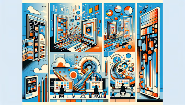
Breaking Down Essential Elements
Graphic designer portfolios are often evaluated as much for how they communicate structure and intent as for how they look. Visual style alone doesn’t tell the full story. What matters is how the portfolio reflects a designer’s ability to think across systems—brand identity, usability, and contextual flexibility.
1. Brand Consistency
A consistent use of color, typography, and imagery across portfolio projects signals attention to detail. It also helps viewers connect your work with a clear personality or style. For example, using the same type family across case studies, maintaining a defined color theme, or applying a uniform layout structure builds subconscious trust.
“If your portfolio looks like it was designed by five different people, they’ll wonder who they’re hiring.”
Prospective collaborators often interpret design consistency as a reflection of reliability. They don’t just see a visual pattern—they read it as a sign you can deliver predictable quality across multiple projects.
2. Usability Focus
Portfolios that include UX testing results, user flows, or research insights make it easier for clients to understand how design decisions were informed. Even a simple annotation like “Tested with 5 users; 3 found the button unclear” shows that your choices are based on more than instinct.
This doesn’t require sacrificing creativity. A friendly interface—with legible text, clear navigation, and responsive layouts—keeps users engaged while still allowing room for unique visual expression. Adding hover states, scroll-based transitions, or interactive prototypes can strike that balance without overwhelming the viewer.
🧪 A/B tests, heatmaps, or user journaling are small touches that quietly show rigorous thinking.
3. Adaptability
Design work that spans both digital and print formats—or mobile and desktop—shows that you understand constraints. A logo used across packaging, social media, and motion graphics demonstrates scalability. Showing how a layout behaves on different screen sizes or how a color system adjusts in various lighting conditions adds context.
Portfolios accessed in 2025 are often first viewed on mobile. Demonstrating how your work adapts for different devices, user behaviors, or cultural frameworks (like RTL languages or accessibility adjustments) helps people visualize how your designs translate beyond the screen.
🌍 One project adapted for multiple markets says more about versatility than ten unrelated mockups.
The Power of Process and Transparency
Portfolios that reveal how work is made offer more insight than portfolios that only show what was made. The steps between the brief and the final solution create a picture of how a designer thinks. Without that transparency, the work becomes disconnected from its context.
Process visibility also helps differentiate between styling and problem-solving. A portfolio that documents how decisions were made gives hiring teams more to evaluate than just the visuals.
1. Phase-by-Phase Previews
Including raw sketches, wireframes, or moodboards helps viewers understand how a project evolved. Early concepts illustrate how ideas began, while mid-stage iterations show how those ideas were challenged, adjusted, or discarded. These artifacts don’t need to be perfect—they need to be real.
Each version of a project can be shown side-by-side with notes on what changed and why. For example, explaining how a navigation menu was restructured after user testing, or why a color palette was revised for accessibility. This sequencing makes the final result easier to understand.
A polished mockup tells you what the designer likes. A wireframe with notes tells you how the designer thinks.
2. Client Collaboration
Portfolios that include feedback loops make it easier to assess communication habits. Screenshots of annotated PDFs, Slack threads, or workshop notes can show how feedback was received and applied. Even a single sentence explaining how a client’s input shifted the direction of a layout can be enough.
Showing these interactions demonstrates the ability to work with others, not just for them. Collaborative documentation also reveals whether the designer adjusts their process based on stakeholder input or user research.
Projects that include timestamps or version labels ("v2 after stakeholder review") help establish a clear timeline of decisions.
3. Ethical Touches
Some portfolios now include details about design ethics. This might show up as a user testing summary that includes accessibility notes, or a case study that briefly mentions sustainable printing choices.
Designers sometimes include a short section called “Process Ethics” at the end of a project. This might note color contrast ratios, non-binary user representation in personas, or disclosure of AI-generated assets.
💬 One designer included a post-it note in a prototype that read “This version failed every contrast check 😭”—which said more about awareness than any polished chart could.
Ethical design isn’t always visible in the visuals. Portfolios that mention it create a fuller picture of how values influence the process.
Proving Value to Clients and Hiring Teams
Portfolios created in 2025 are no longer viewed as curated galleries of finished work. Hiring teams and clients are often looking through the lens of return on investment, decision-making, and constraint navigation. They want to understand what problems were solved, how they were approached, and what results followed.
Portfolios that only show visuals leave gaps. Portfolios that explain the context behind those visuals give decision-makers the information they need to evaluate fit, not just style.
1. Project Highlights
Each project should begin with a short explanation of the original challenge. This might be a business metric, user behavior, or content gap—anything that shaped the scope of the work. Avoid generic project titles like “Landing Page Design” without explaining what the landing page needed to achieve.
For example:
Problem: Conversion rate dropped 28% on mobile between Q2 and Q3
Objective: Redesign checkout flow with fewer taps and clearer CTA hierarchy
Result: 19% increase in completed mobile checkouts within 30 days of launch
Another:
Problem: Graphic Designers for Charity needed to appeal to Gen Z donors
Objective: Refresh identity without alienating long-term supporters
Result: 2x increase in social shares and 1.5x boost in small recurring donations
“Make the problem visible. Otherwise, it just looks like you like gradients.”
2. Feedback and Testimonials
Direct quotes from clients, stakeholders, or even users help reinforce the value of your work. These don’t need to be long or overly formal. They can come from emails, Slack messages, or post-launch reviews.
Examples:
“This is exactly what we couldn’t articulate but hoped for.”
—Client, education platform redesign
“Our team has been referencing this UI pattern in three other products.”
—Product lead, internal tools suite
Even a simple line like, “Client signed off after the second round—first time that’s happened in 12 projects,” communicates process efficiency without having to say it directly.
Testimonials placed at the end of case studies—rather than in a separate section—help keep context intact. They don’t interrupt narrative flow and feel less promotional.
3. Efficiency Under Constraints
Constraints are common: tight deadlines, limited budgets, unclear briefs, outdated assets, or lack of access to end users. Showing how you worked within—or around—those constraints helps others understand your approach under pressure.
Examples of project context:
Delivered MVP UI kit in 4 days using a pre-set design system
Worked without access to user personas, created temporary audience assumptions from analytics
Budget only allowed for 1 round of revisions, prioritized wireframe clarity to avoid rework
“Constraints aren’t the problem. How you respond to them is the portfolio.”
These are not excuses—they are part of the project reality. Explaining them gives your work dimension. It also shows how you make decisions when not everything is ideal.
Shaping Your Signature Style
Creativity plays a central role in portfolio design, but without functionality, it loses clarity. Decorative choices that lack purpose often distract from the message or confuse the viewer. In 2025, portfolios that blend experimentation with usability are easier to navigate and more memorable.
1. Balancing Innovation and Clarity
Unconventional layouts, interactive elements, or motion design can add interest, but if users struggle to find the navigation or identify the project purpose, the impact is diluted. Innovation does not require complexity—it often appears in how effectively a design solves a problem without calling attention to itself.
Quick pointers for selecting an appropriate art direction:
Use no more than two typefaces across your portfolio to maintain cohesion
Choose interactive features that support storytelling (e.g., scroll-based animations over hover-only navigation)
Keep color contrast above WCAG AA standards, even in experimental layouts
Apply motion graphics only where they clarify transitions or interactions
Avoid dark mode-only portfolios unless the work itself supports that tone
"If it takes more than 5 seconds to figure out where to click, it's not cutting-edge—it's confusing."
2. Personal Brand Elements
Personal branding in a portfolio is often subtle. It can appear through a recurring accent color, a hand-drawn icon set, or a consistent grid structure. These elements aren’t loud, but they are consistent. Viewers begin to associate them with the designer’s identity.
A brand mark or logotype that appears in the site footer, favicon, or PDF resume creates recognition. Using the same color palette across your site, case study thumbnails, and social media banners reinforces cohesion without repeating content.
Authenticity is communicated through consistency. Portfolios that reflect the designer’s visual voice—without mimicking trending styles—stand out without needing to be stated as “unique.”
🖌️ A sketchy underline on headings, used across all case studies, becomes more recognizable than a flashy homepage animation.
3. Audience Alignment
Design choices that ignore the end viewer often result in mismatched tone or misunderstood intent. A portfolio aimed at hiring managers in fintech will differ in tone and structure from one targeting boutique fashion brands. The difference is not just visual—it includes copy tone, content hierarchy, and example selection.
Ways to align visuals with audience expectations:
Use industry-relevant terminology in case study summaries (e.g., “conversion funnel” vs. “visual identity”)
Select hero projects that mirror the viewer’s sector or design needs
Localize color choices, typography, or iconography when targeting regional markets
Adjust writing tone to match viewer preferences—formal for enterprise, conversational for startups
Avoid niche references or humor when presenting to generalist hiring teams
"If your audience doesn’t get the reference, it’s not clever—it’s noise."
Understanding who the portfolio is for, and making design decisions based on that context, shapes how the work is received. It moves the portfolio from being a personal gallery to a functional communication tool.
FAQs About Graphic Designer Portfolios
What if I work in multiple design niches?
Separate them clearly. Group related projects under labeled sections like “Brand Identity,” “UX/UI,” or “Editorial Design.” This helps viewers scan for what’s relevant to them without guessing.
Avoid mixing styles across unrelated projects. If you include a minimalist fintech dashboard next to an illustrated children’s book, explain the context or separate them visually. Thematic segmentation using navigation tabs or visual dividers works better than relying on viewers to interpret the differences.
“If your portfolio feels like five people made it, it’s probably not saying what you think it is.”
Some Design Freelancers create duplicate versions of their portfolio for different audiences. That’s not essential, but it reduces friction when applying to specialized roles.
Should I prioritize client testimonials or data metrics?
Both types of feedback serve different purposes. Testimonials provide qualitative insight into collaboration and communication. Metrics show measurable impact.
Use testimonials when the client or user expresses a specific reaction, such as how your design solved a problem or exceeded expectations. Avoid generic praise like “great to work with”—it adds little context.
Use metrics when outcomes are trackable. Include specifics like “30% increase in product sign-ups” or “reduced onboarding time from 90 to 45 seconds.” If there’s no data available, descriptive outcomes like “streamlined navigation for elderly users” still provide clarity.
Combine both when possible:
“The new layout reduced support tickets by 22%.”
“Clients found the redesign intuitive and cleaner.” —Customer support lead
Neither format is more important on its own. They answer different questions.
Can I maintain a consistent style and still be flexible for different clients?
Yes, if consistency is based on design approach, not just visual style. For example, using a structured process or keeping typography accessible across projects shows consistency without repeating the same aesthetic.
A personal style can exist in how you solve problems, how you structure information, or how you present case studies—not only in color palettes or grids. Viewers often recognize a designer’s point of view through their decision-making, not just their visuals.
“Your voice is in how you think, not just how you decorate.”
Flexibility can be shown through range. Consistency can be shown through logic. These don’t conflict unless the portfolio relies on surface-level trends.
Where Style And Substance Connect
Portfolios that combine aesthetic precision with functional clarity are more likely to hold attention. Visual design on its own presents a surface. When paired with structured storytelling, contextual detail, and documented outcomes, it becomes a multi-layered record of thought and execution.
Projects that show how visual ideas emerged in response to defined challenges—whether that’s improving user onboarding or aligning with a specific audience—offer more than a style showcase. They outline a designer’s reasoning and adaptability, which are more durable indicators of fit than any particular color palette or layout convention.
“It’s not the font choice—they’re trying to see how you made decisions under pressure.”
Consistency in tone, structure, and hierarchy helps viewers move through a portfolio without friction. When each case study follows a similar rhythm—problem, process, result—it creates continuity. This allows visual variation to stand out without creating confusion.
Portfolios that apply small interaction details—hover states, scroll effects, or feedback animations—to support rather than distract from content tend to be easier to navigate. These details signal technical awareness without becoming the focus.
On mobile, where most portfolios are now viewed first, clarity and loading speed often matter more than experimental layouts. Text that sits too close to the edge, or case studies buried under animations, tends to be skipped.
Some designers include a short line on their homepage like:
“This portfolio was built using Webflow, optimized for mobile, and audited for contrast accessibility.”
That single sentence communicates tool familiarity, platform awareness, and user consideration without needing a full explanation elsewhere.
Subtle visual branding—like a repeating accent color across project dividers, or a consistent caption style—helps create cohesion without forcing a rigid aesthetic. The portfolio’s structure becomes part of the identity.
As of April 14, 2025, portfolios that reflect both visual design and systems thinking are more aligned with hiring expectations. The projects inside don’t need to be flashy, but they do need to show how the designer thinks, solves, and adapts.
“A good portfolio looks great. A strong one explains why it had to.”
Like this project
Posted Apr 14, 2025
Graphic Designer Portfolios: What Really Matters Beyond Aesthetics—showcase process, outcomes, and strategy to stand out beyond visual appeal.