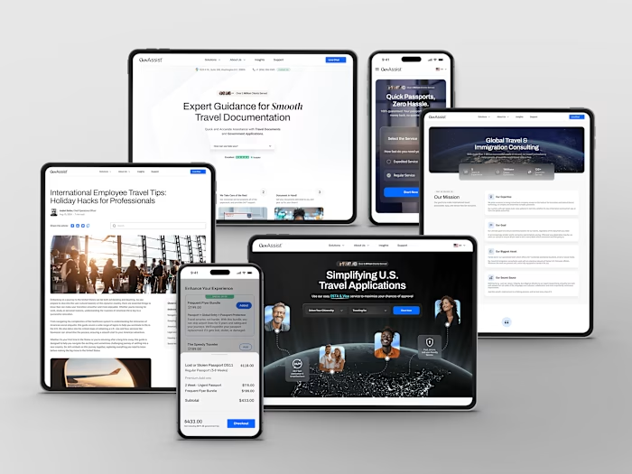
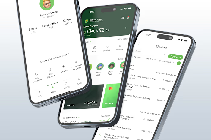
Cart Redesign: Enhancing Conversions Through Cognitive Biases
I undertook the GovAssist cart redesign project to streamline the checkout process and maximize conversion rates. This redesign aimed to create a seamless user experience while encouraging customers to engage with higher-value products and services.
By understanding user behaviors and integrating strategic psychological and cognitive biases, the goal was to not only simplify the purchasing process but also subtly influence users to spend more, increasing the average order value and overall revenue.
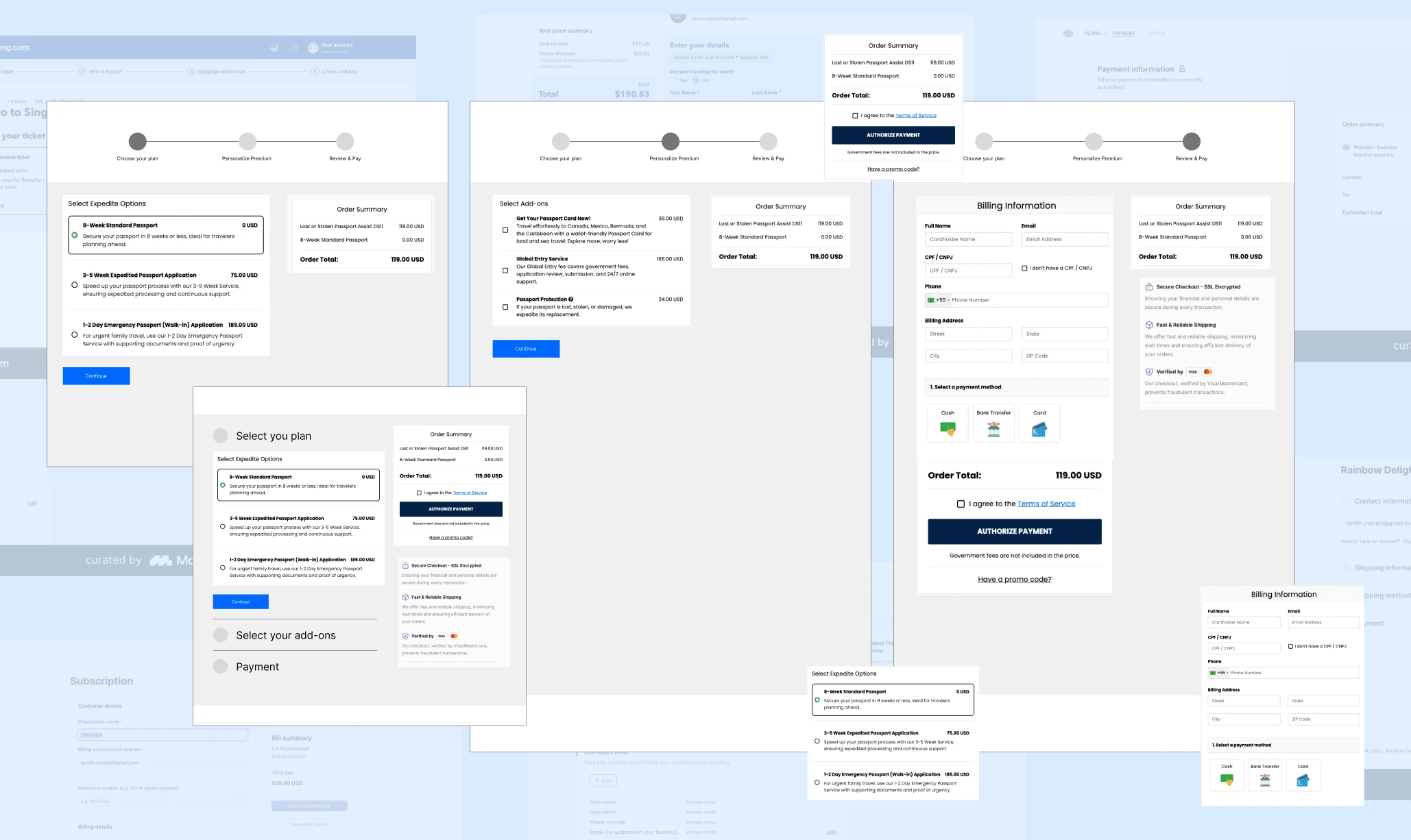
Old Cart Interface
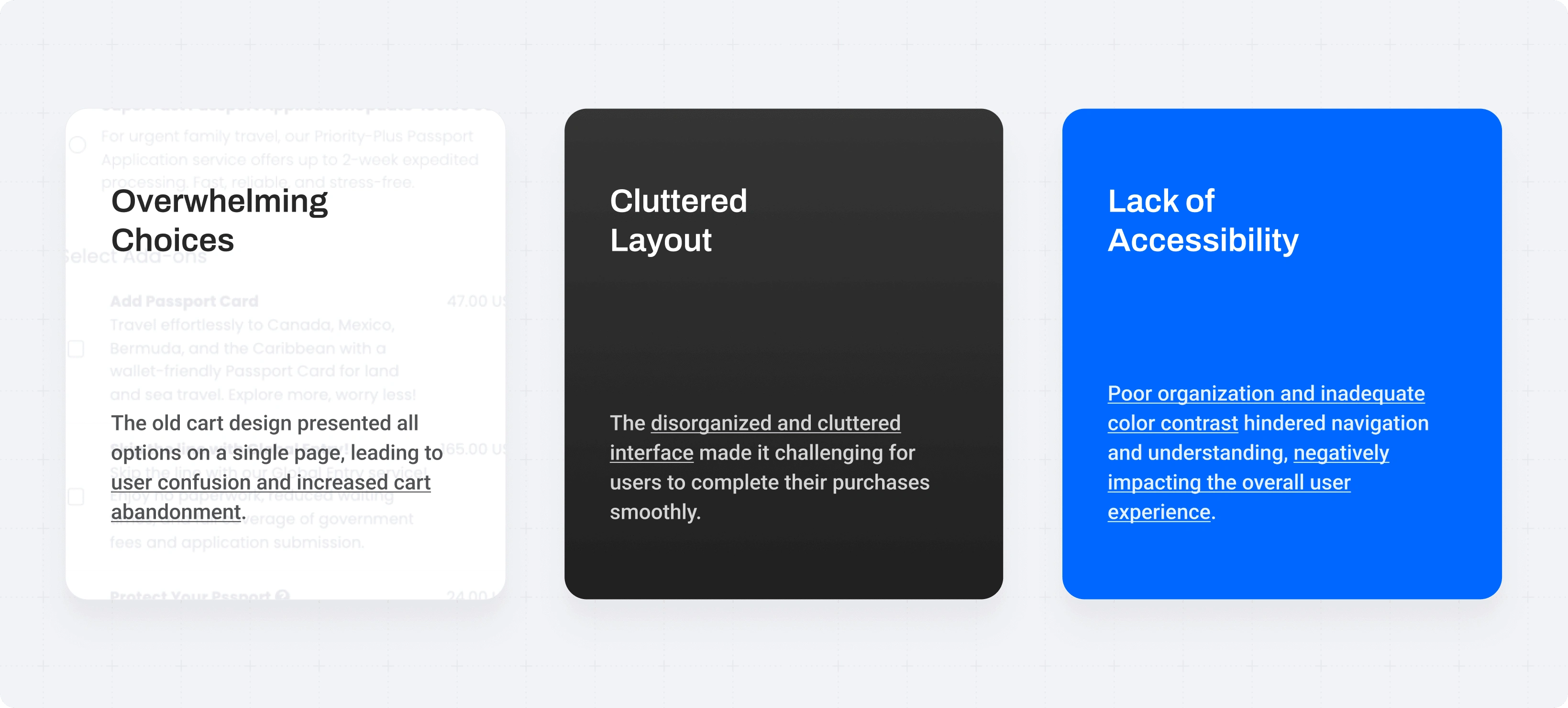
The old cart design at GovAssist presented all options on a single page, overwhelming users with too many choices and causing confusion, which often led to cart abandonment.
The cluttered layout, coupled with a lack of consideration for accessibility, further hindered the purchasing process. Important information was poorly organized, and the color scheme did not provide adequate contrast, making it difficult for users to navigate and understand their options.
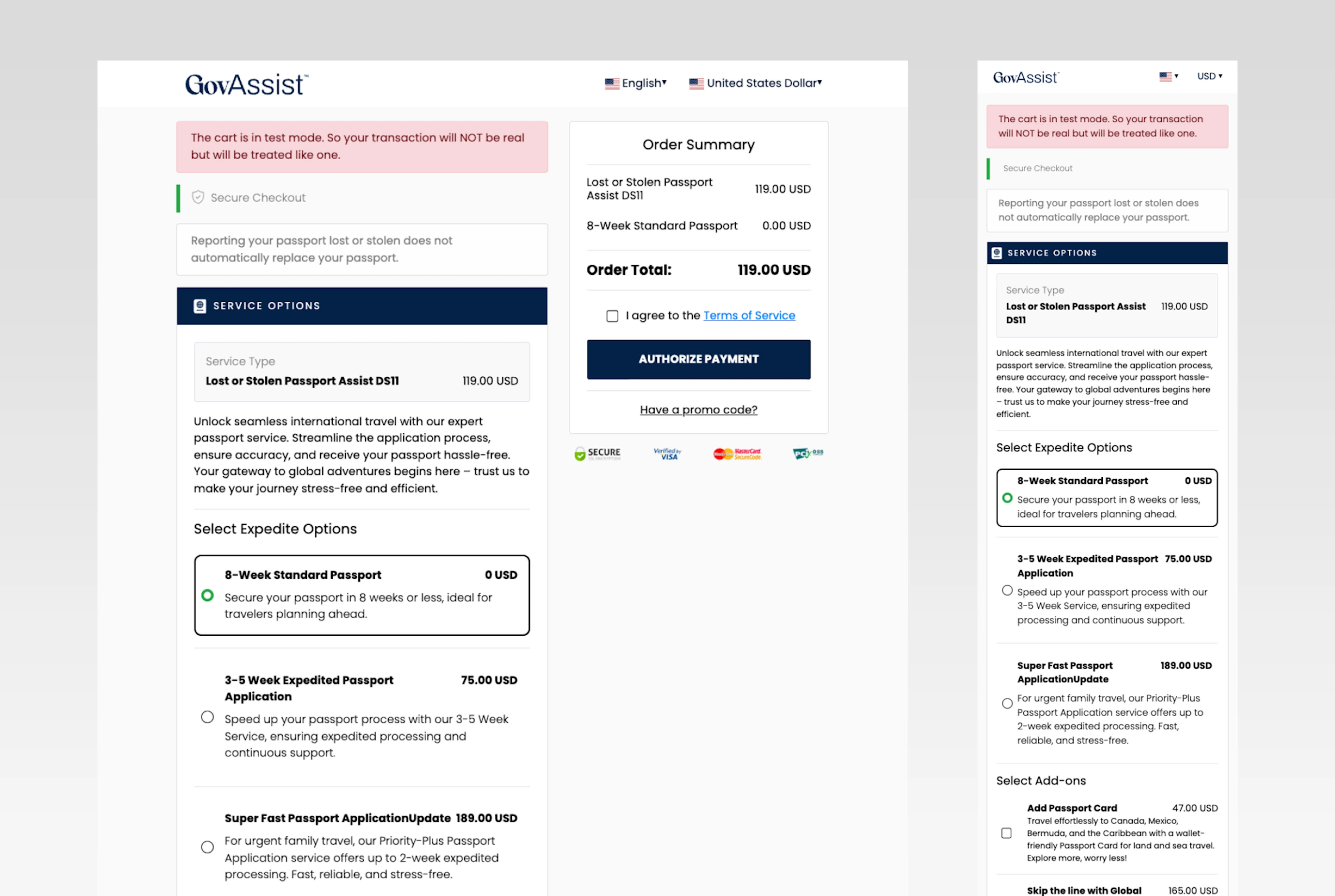
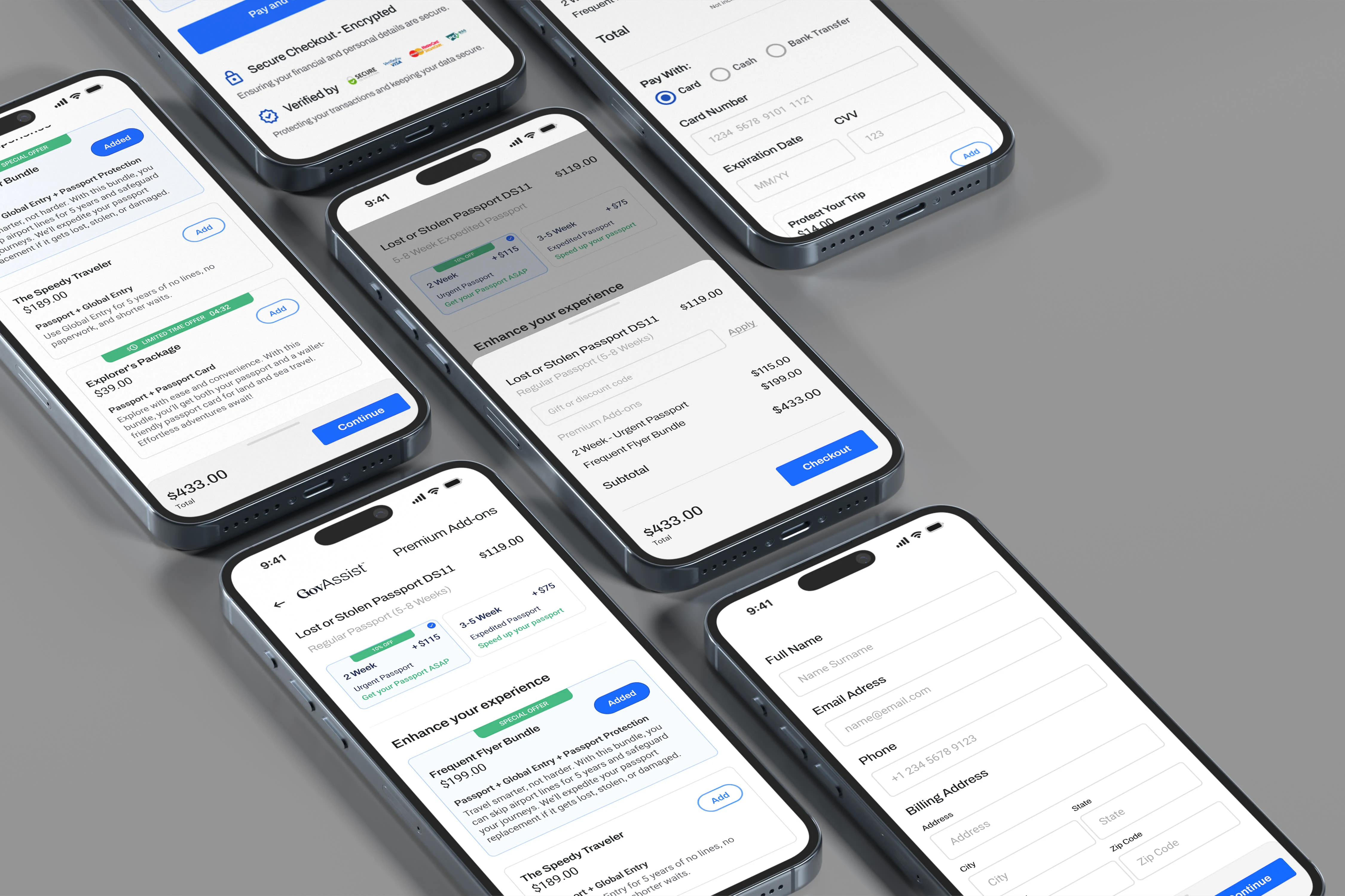
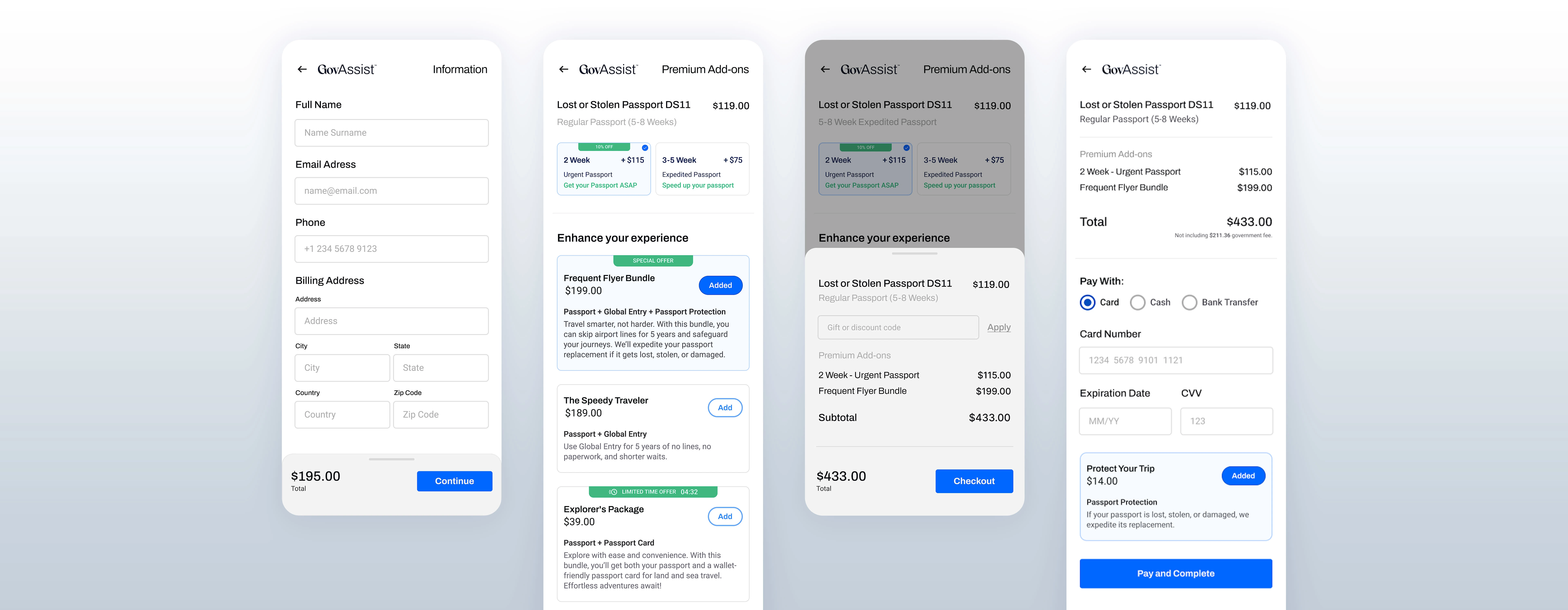
My role was to enhance the user experience by redesigning the cart to reduce the number of steps needed to complete a purchase.
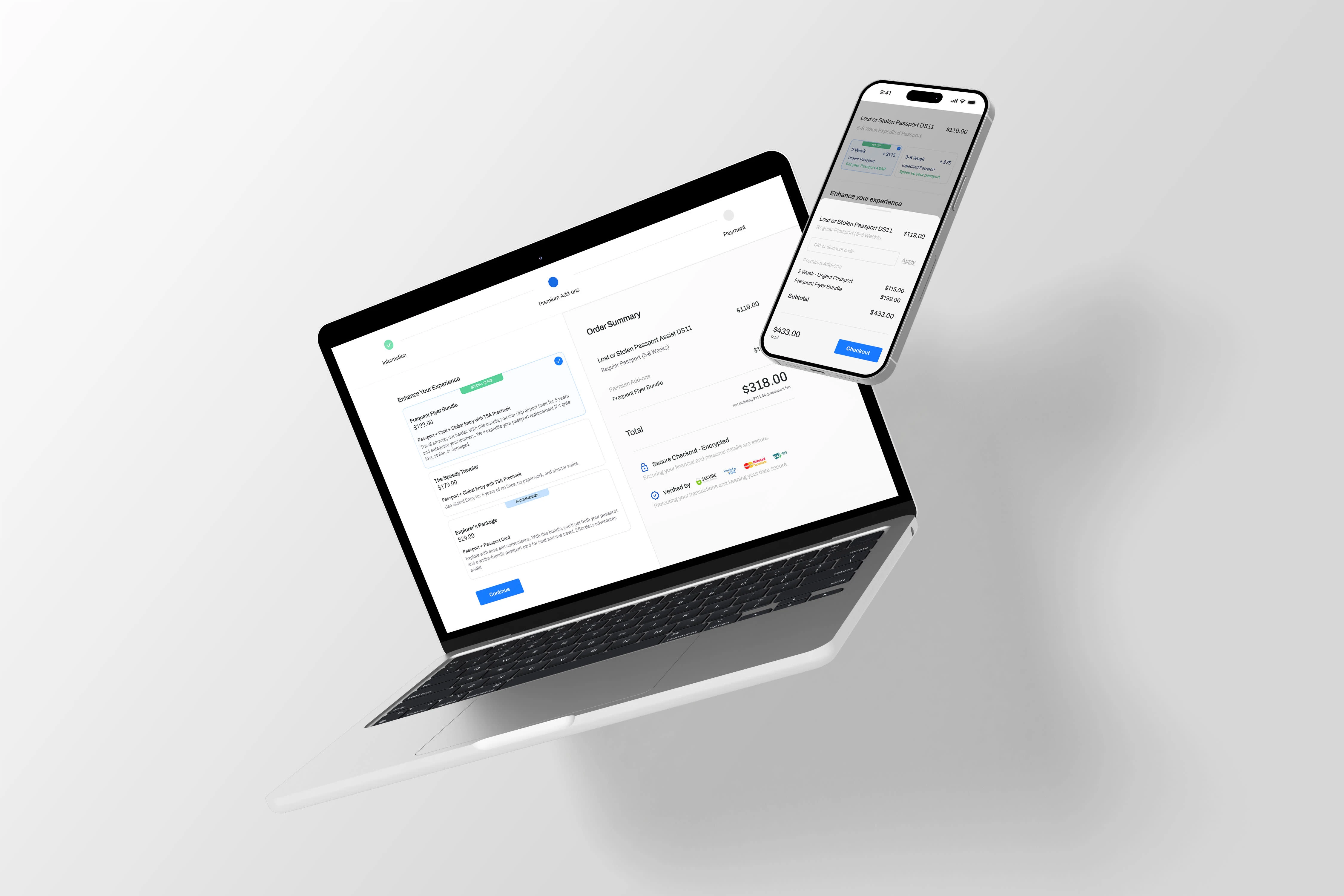
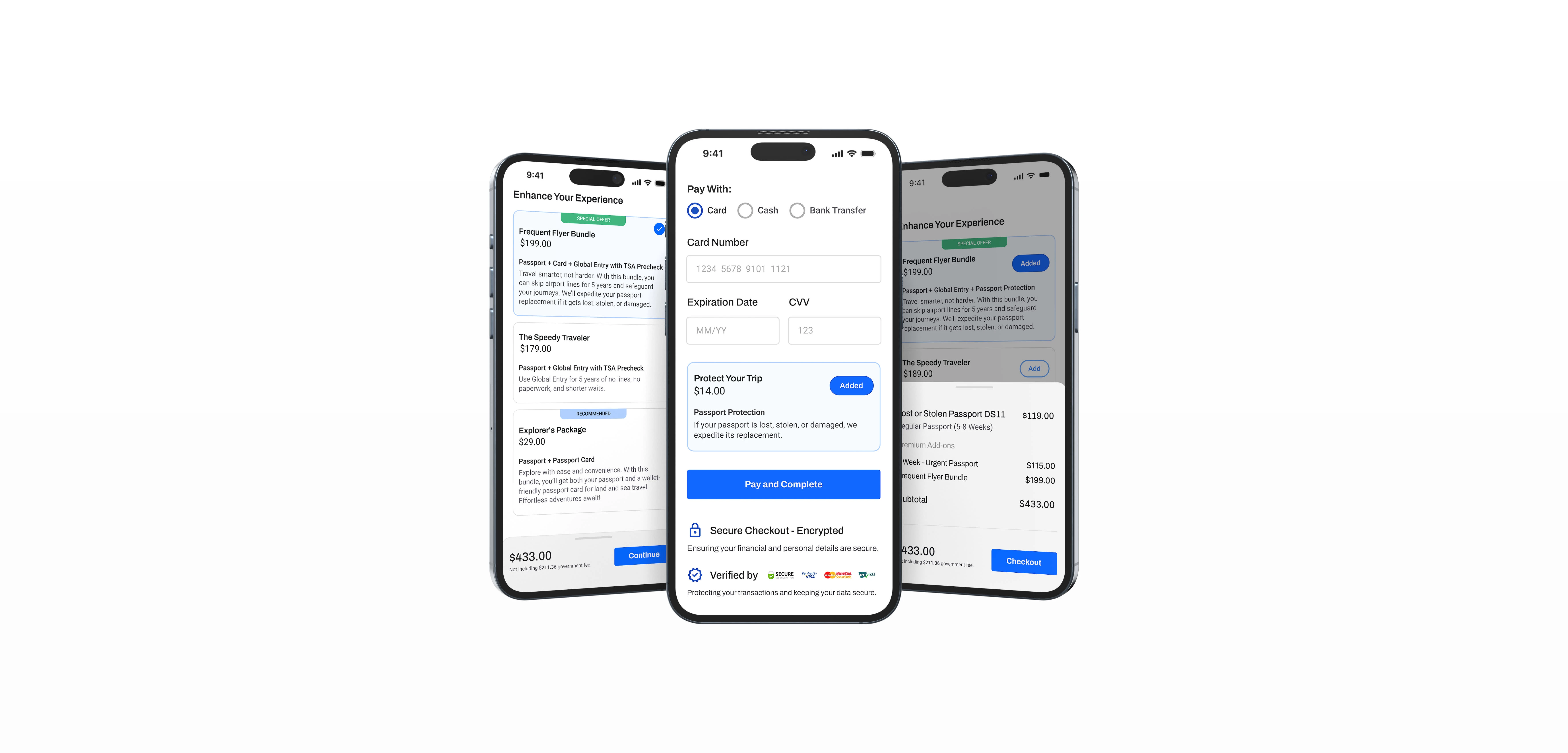
I focused on creating a more intuitive and streamlined process with accessible buttons, a color palette with high contrast for better readability, and an overall improvement in the cart’s visual quality.
This approach not only simplified the purchasing experience but also ensured that it was accessible and user-friendly for all customers.
Study Process
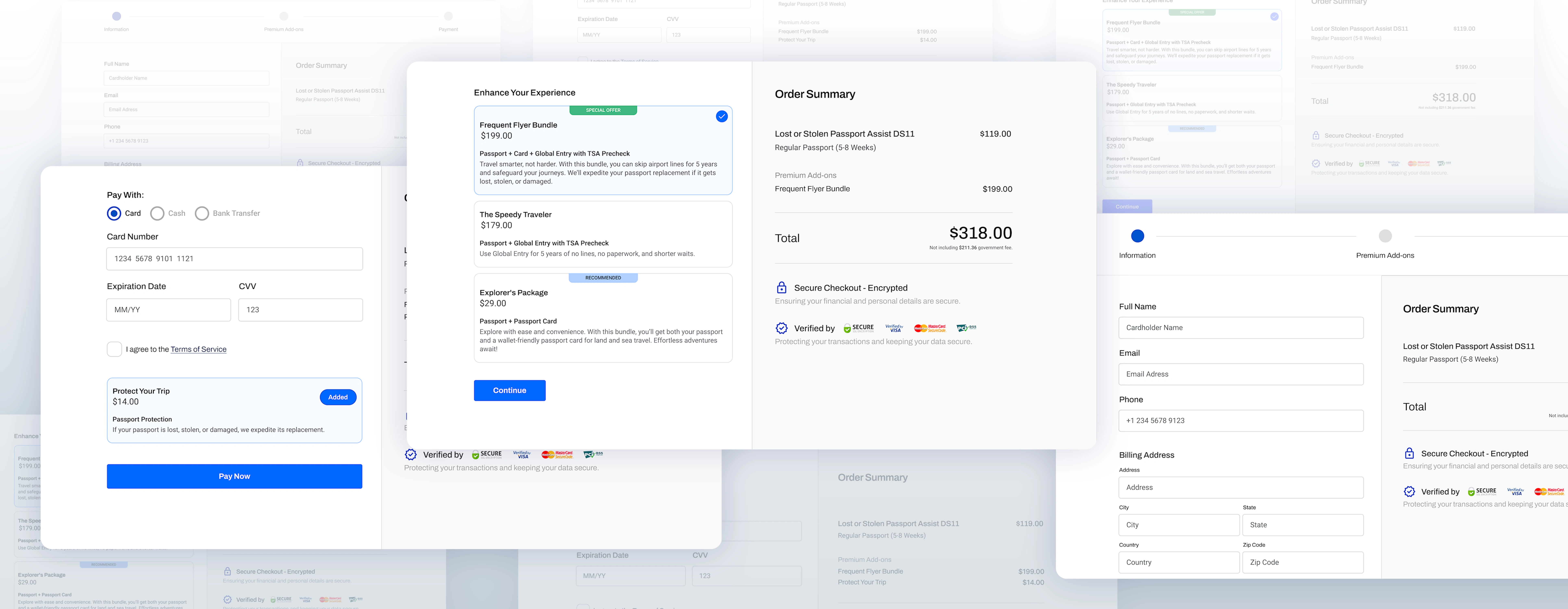
The project began with a detailed analysis of the existing checkout flow, identifying pain points that led to cart abandonment or decreased user engagement. I conducted competitor research and reviewed user feedback to understand common frustrations and desires in the online checkout experience. With this data, I developed a new design that integrated psychological principles like Anchoring, Decoy Effect, and Scarcity, ensuring that each element of the cart and checkout flow was optimized for conversion and user satisfaction.
Psychological and Cognitive Biases Applied:
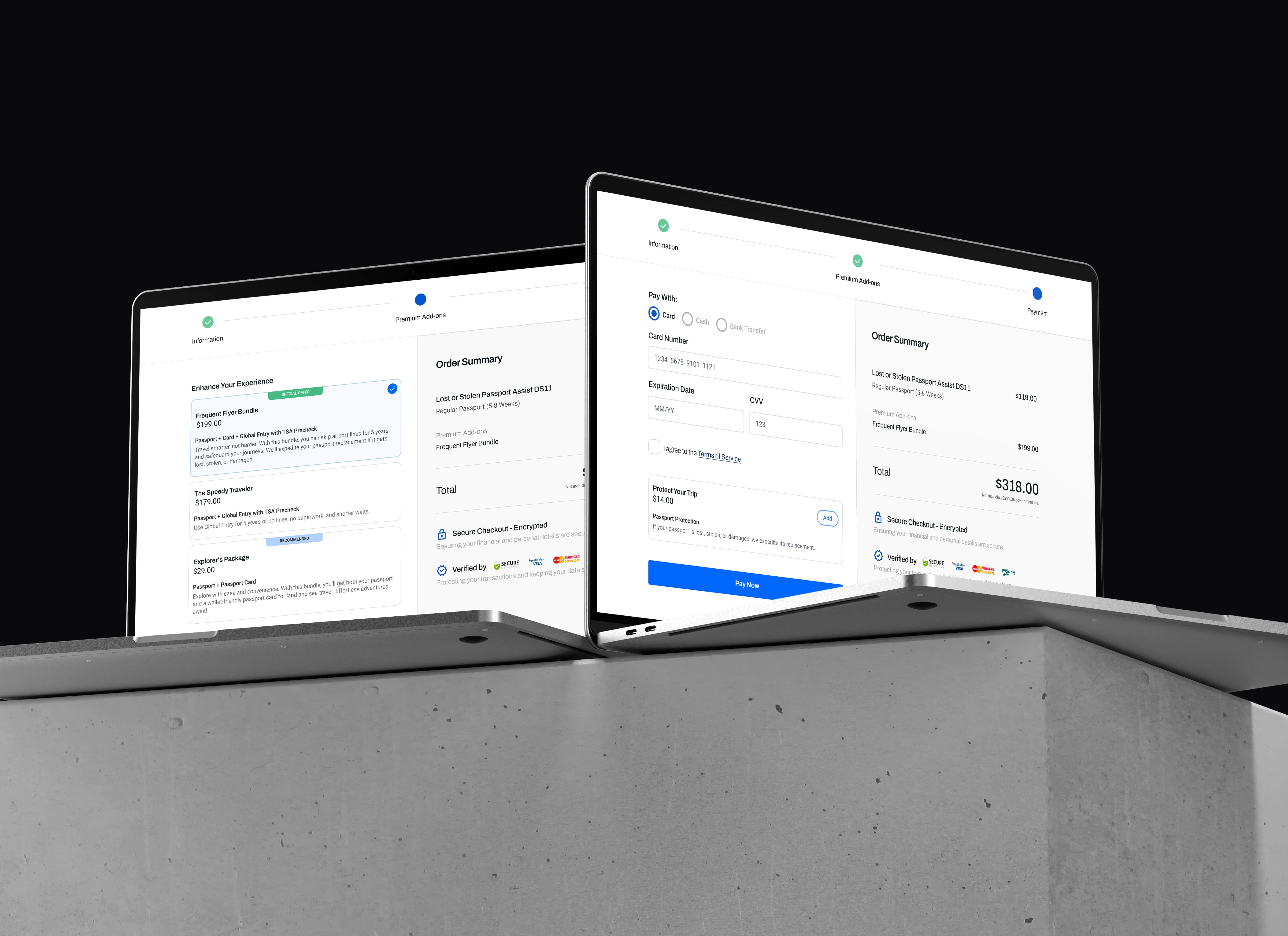
Anchoring: Displayed higher-priced bundles first to make the lower-priced options appear more attractive.
Decoy Effect: Introduced a mid-tier option to make premium bundles seem more valuable.
Scarcity: Utilized limited-time offers to create urgency and boost appeal.
Loss Aversion: Highlighted potential losses (like time and security) without specific add-ons to increase their perceived necessity.
Social Proof: Showcased the popularity of premium bundles to influence user decisions.
Impact and Results
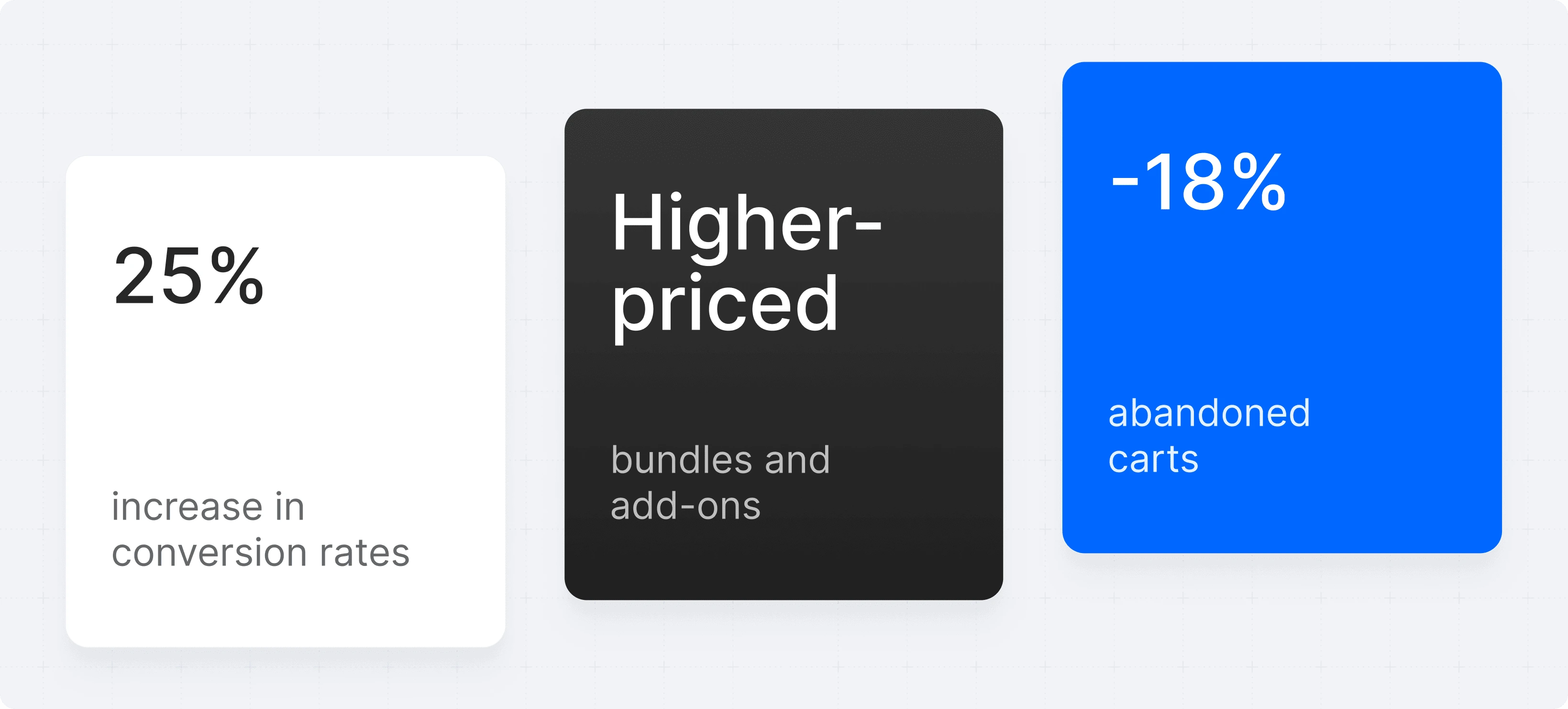
The redesigned cart and checkout process significantly improved user engagement, resulting in a 25% increase in conversion rates. The strategic use of cognitive biases led to a notable increase in the average order value, as customers were more inclined to choose higher-priced bundles and add-ons. Additionally, the application of loss aversion and scarcity tactics effectively minimized cart abandonment rates by 18%.
Conclusion
This project not only enhanced the overall user experience for GovAssist’s customers but also demonstrated the powerful impact of psychological strategies in e-commerce. By aligning the design with user psychology, the redesign successfully drove higher sales and fostered stronger customer satisfaction.
Like this project
Posted Sep 3, 2024
Leveraging Psychology to Boost Sales and User Engagement

