Brand Design for Spiritual & Community Brand

Victor Elera


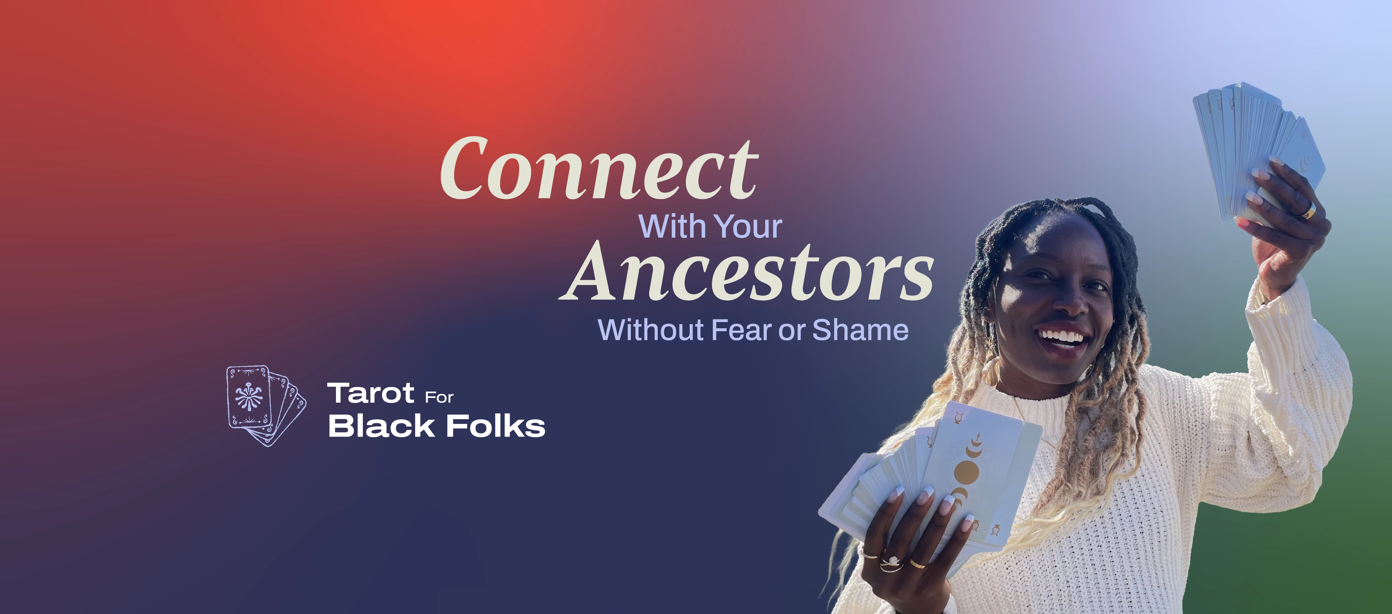
Atima came to me with one clear line drawn in the sand: she did not want her brand to look like every other spiritual brand out there.
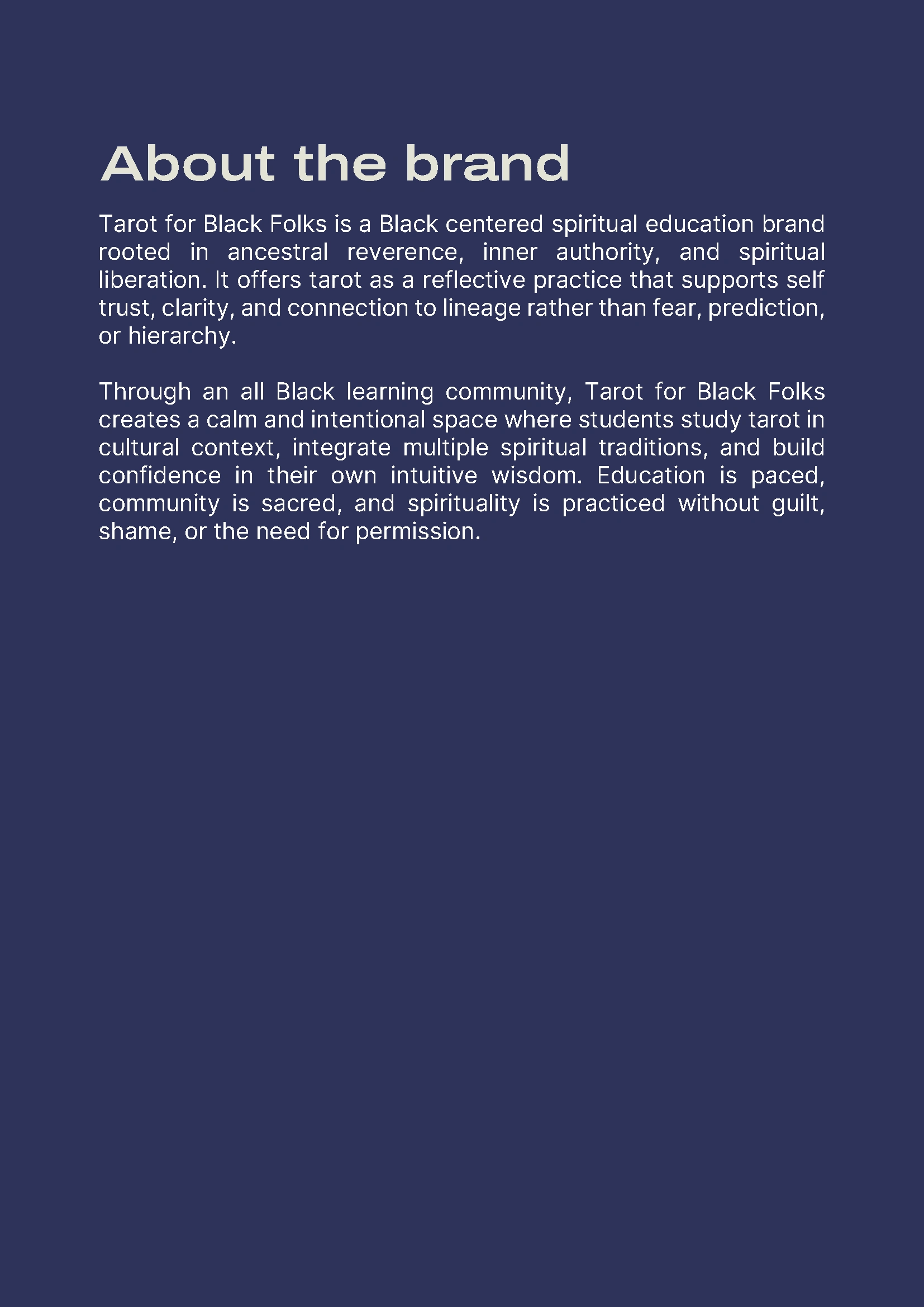
She'd founded Tarot for Black Folks as a Black-centered spiritual education platform a space rooted in ancestral reverence, inner authority, and spiritual liberation. She teaches tarot as a reflective practice, not a party trick or a prediction machine. Through an all-Black learning community, her students study tarot in cultural context, blend multiple spiritual traditions, and build trust in their own intuition without guilt, shame, or having to ask anyone's permission first.
The problem was, almost every visual reference in this space looks the same: mystic purples, glowing moons, crystal-ball gradients, the same tired occult clip art recycled across a thousand Etsy shops.
Honestly, none of that was going to represent what Atima was actually building. I knew from the first conversation that the brief wasn't "make it feel spiritual"
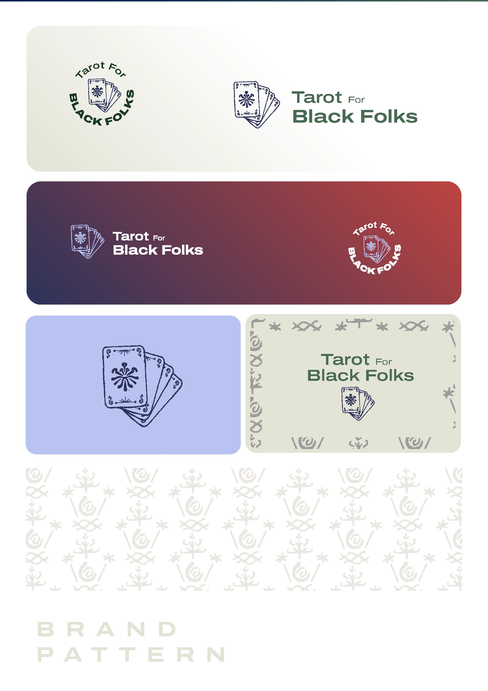
I kept coming back to the four suits of the tarot Wands, Swords, Cups, Pentacles -fire, air, water, earth. Instead of illustrating them as four separate little icons the way most tarot brands do, I fused them into a single radiating symbol, drawn by hand, paired with a sketched set of tarot cards fanned out like a dealt hand.
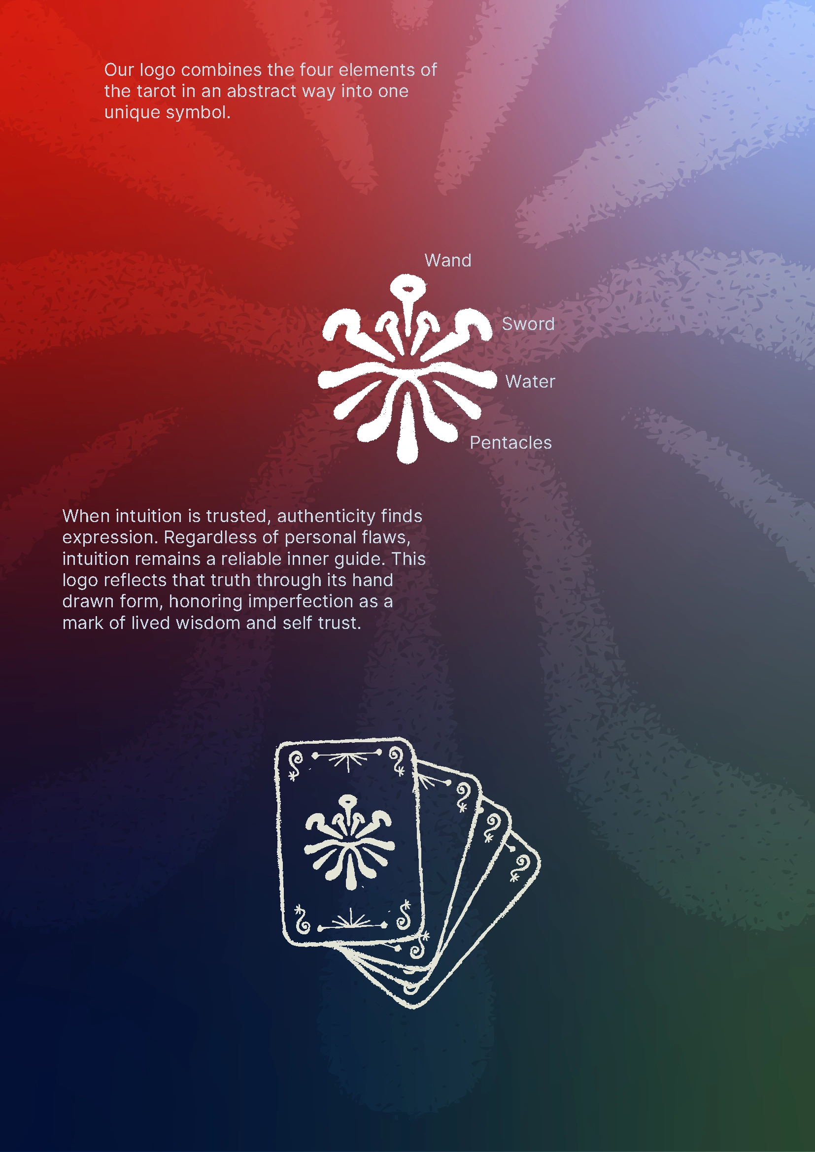
The hand-drawn line quality wasn't just a style choice, it was the whole thesis of the brand, visually. Atima's philosophy is that when you trust your intuition, authenticity finds its own expression, flaws and all. So I let the logo be imperfect on purpose. The slightly uneven lines, the human wobble in the strokes, That's the point. It reads as lived wisdom instead of a sterile vector file, and it immediately set the brand apart from the airbrushed, overly polished look so much of this category defaults to.

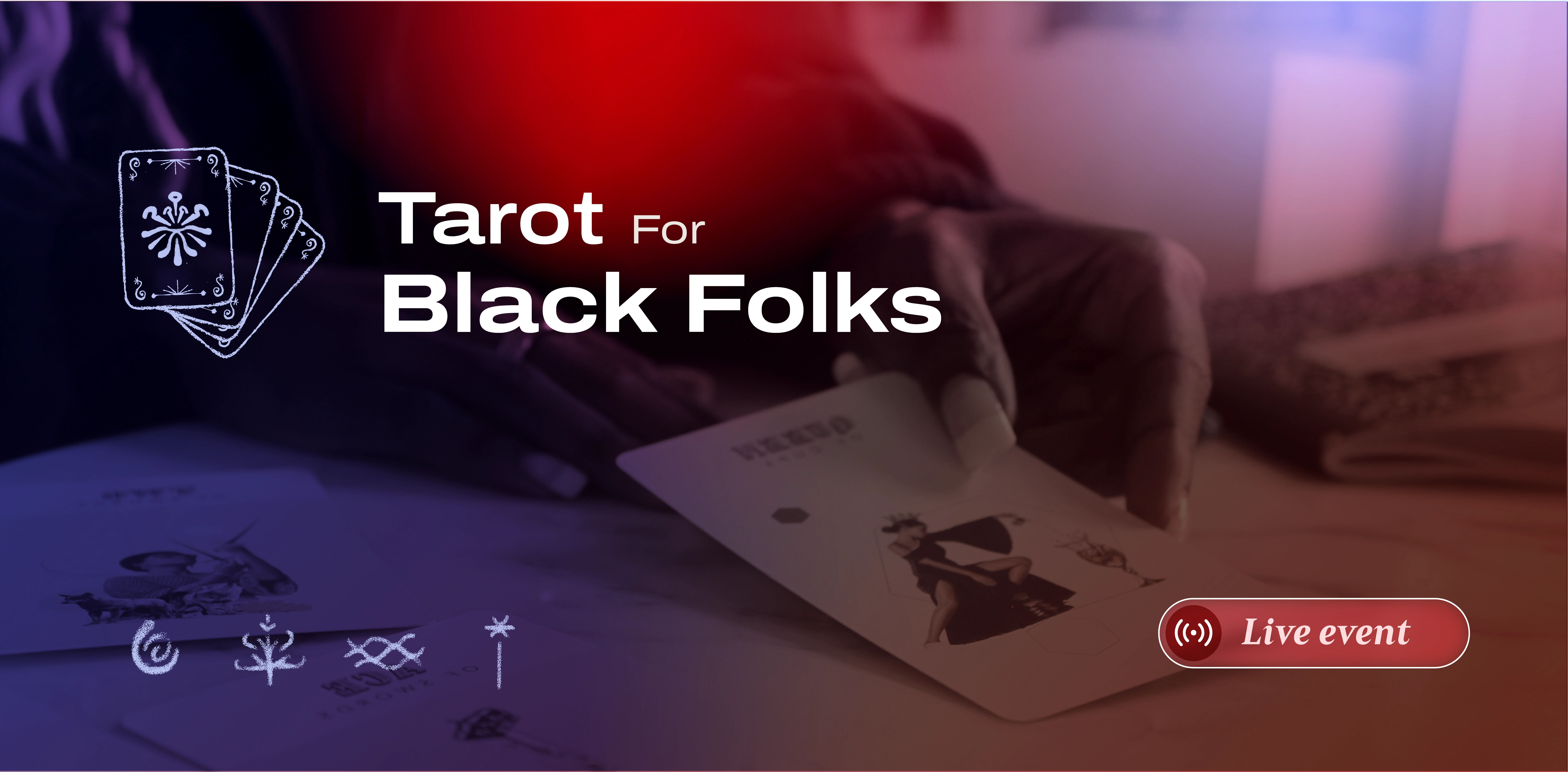
Alongside the primary mark, I built out a small family of secondary symbols, a coiled spiral, a rooted tree form, a woven infinity-like knot, and a star-tipped staff pulling from ancestral and nature-based imagery rather than generic witchy iconography.
Brand Skool Assets
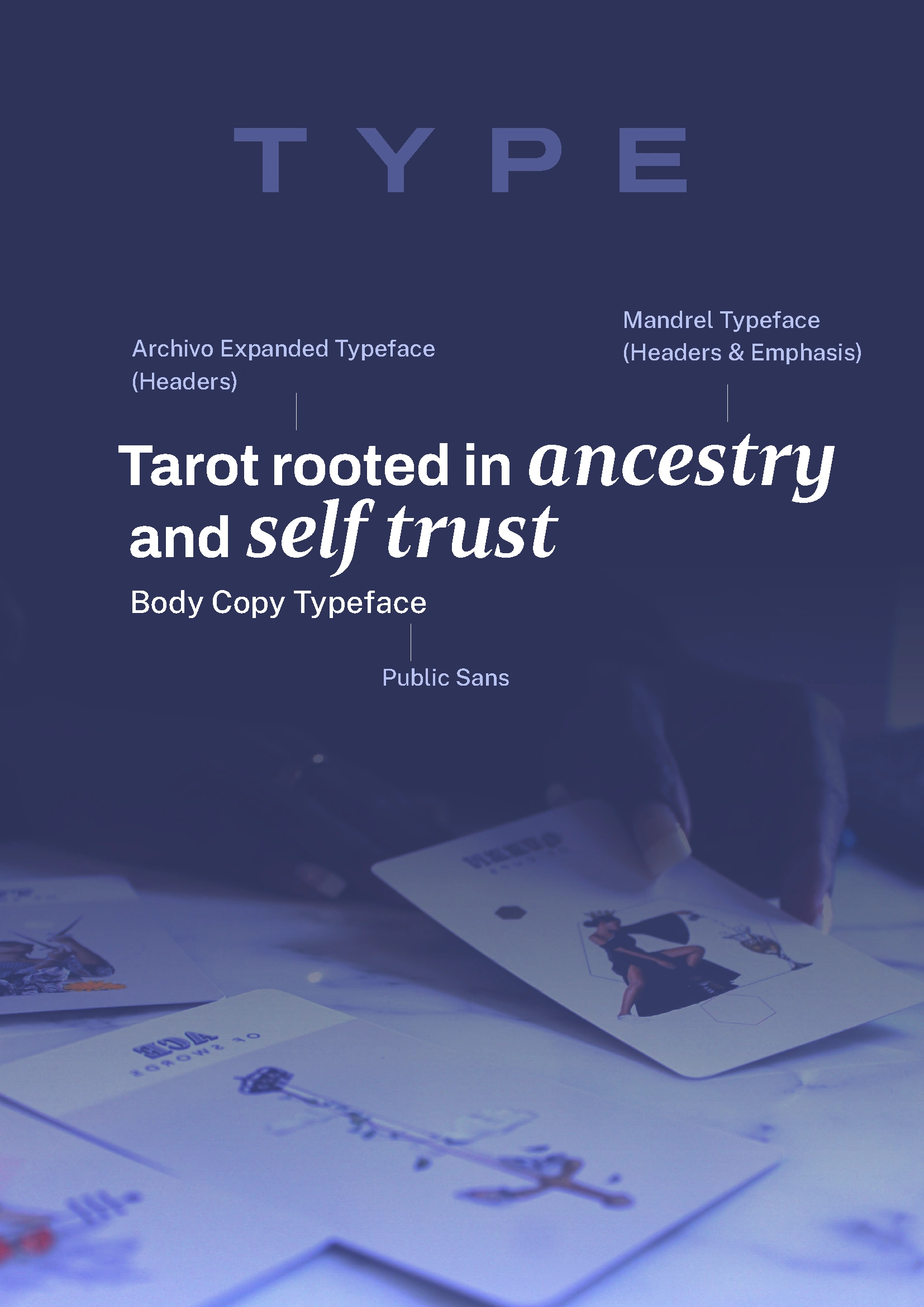
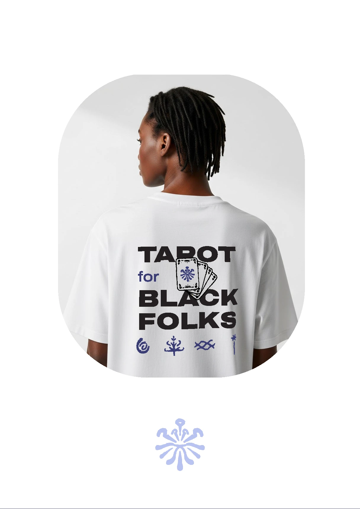
What I handed back to Atima wasn't just a logo but was a visual language that felt like it actually believed something. A custom symbol with real conceptual weight behind it. A palette pulled from earth and fire instead of another crystal-shop gradient. A hand-drawn quality that turns "imperfect" into the entire point instead of something to hide.
Atima wanted a brand that didn't look like everyone else's. I think we got there.
If you're building a spiritual, wellness, or community-rooted brand and you're tired of looking like a template
let's talk.
victor@eleradesign.com
Like this project
Posted Sep 4, 2026
Spiritual brand identity design for Tarot for Black Folks hand-drawn tarot logo, custom color palette & typography for a Black-owned sacred brand.