Shea Moisture Rebrand
Overview 🔎
The redesign of Shea Moisture's branding and package design was a personal passsion project of mine. The goal of the project was to update the outdated packaging of Shea Moisture-a hair care company founded in 1991-and better connect with their target audience of 18-30 year old women, as well as new branding. The new packaging features a more modern and sleek design, with a focus on showcasing the natural ingredients used in the products and what shampoo or conditioner suits your hair type the best.
Problem & Solution 🤝
Problem: Shea Moisture's packaging and branding did not align with their target audience and many people with non-curly hair were unaware that they could also use their products.
Solution: To address this problem, I redesigned their packaging to be more vibrant and friendly. This included incorporating bright colors and fun graphics that appeal to their target audience. Additionally, I clearly indicated on the packaging which hair types the product is suitable for, so that people with non-curly hair are aware that they can also use the product.
Another solution to redesign was to make the Shea Moisture logo to be more modern and to feel more like a hair care company. This was achieved by using curved and flowing lettering, which gave the brand a more professional and polished look. This would also help to attract more customers who are looking for high-quality hair care products.
Overall, by redesigning their packaging and branding to align more closely with their target audience, Shea Moisture can attract more customers and increase sales. This will help them to continue to grow their business and expand their customer base in the future.
Process 🛣
To kick off every project, I conduct a thorough research study to gain a deep understanding of the brand's mission, competitors, target audience, goals, and design solutions. This helps me to get a clear picture of the company and its objectives.
Understanding the target audience is a crucial aspect of creating an effective brand identity. Once I decided what the gender, age, interests and problems were for the targeted audience I then move on to creating preliminary sketches for the logo and other supporting designs, such as patterns and icons. Once I have the dieline dimensions, I design the packaging to align with the brand's overall aesthetic.
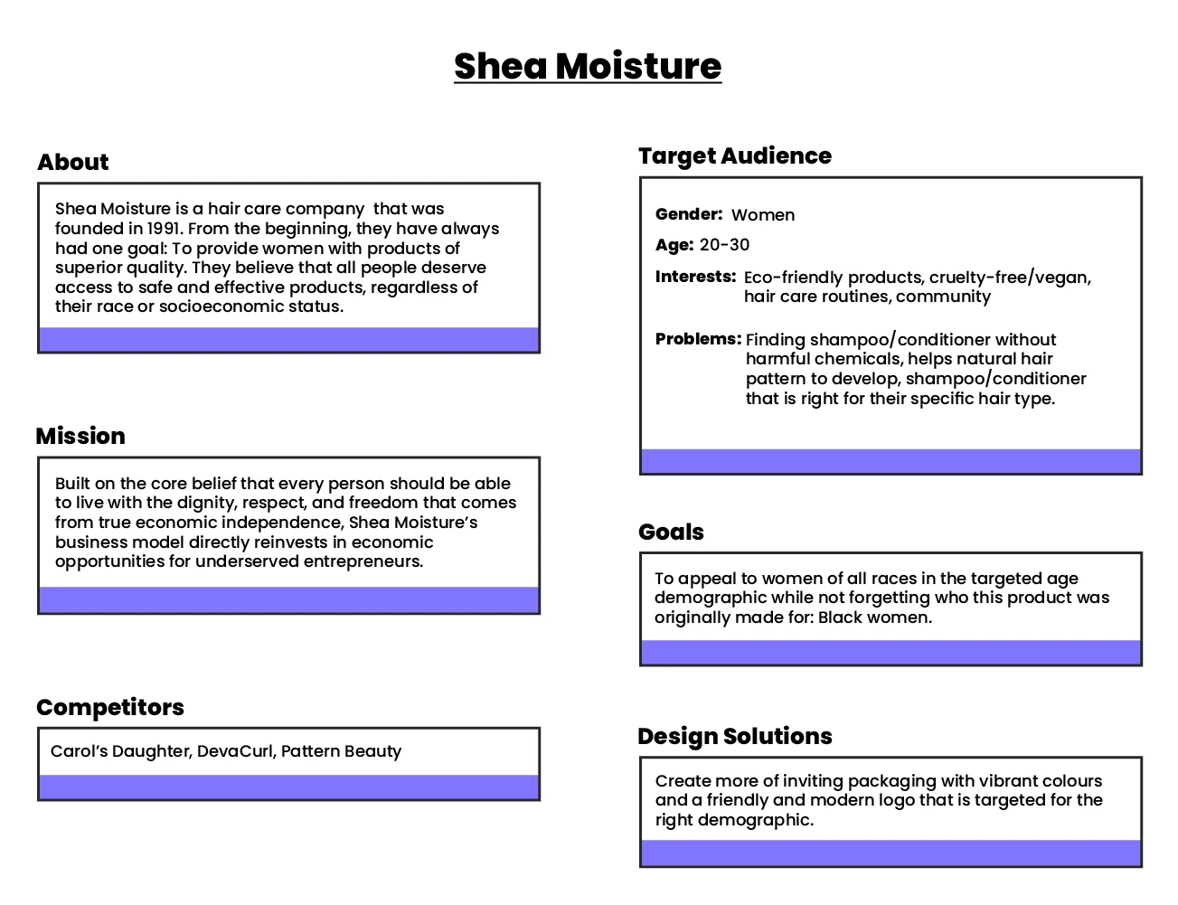
Brand Research Study
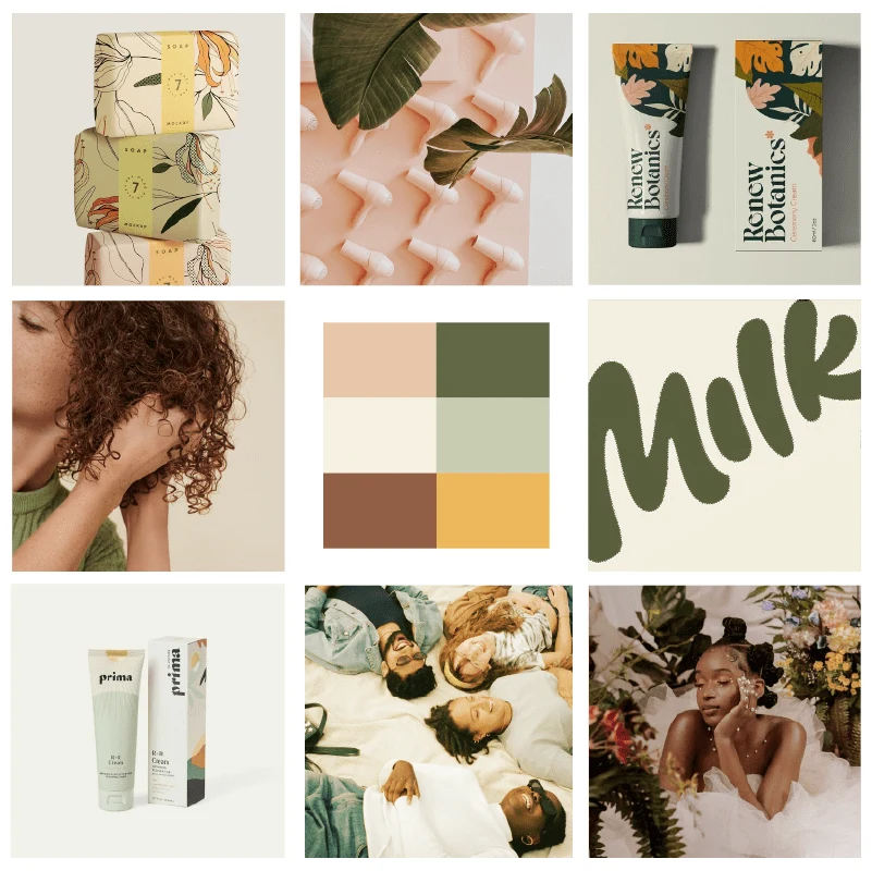
Moodboard
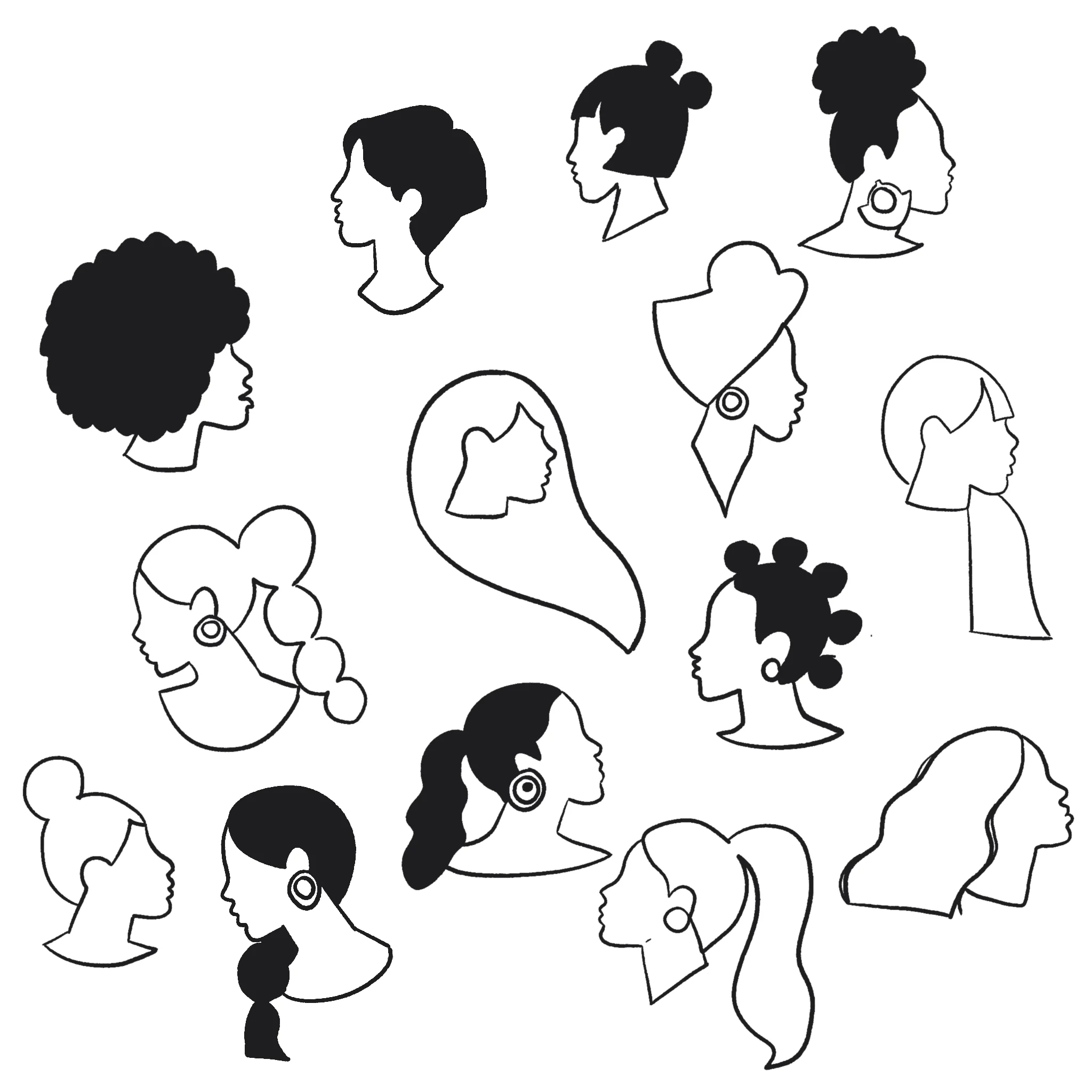
Pattern Sketches
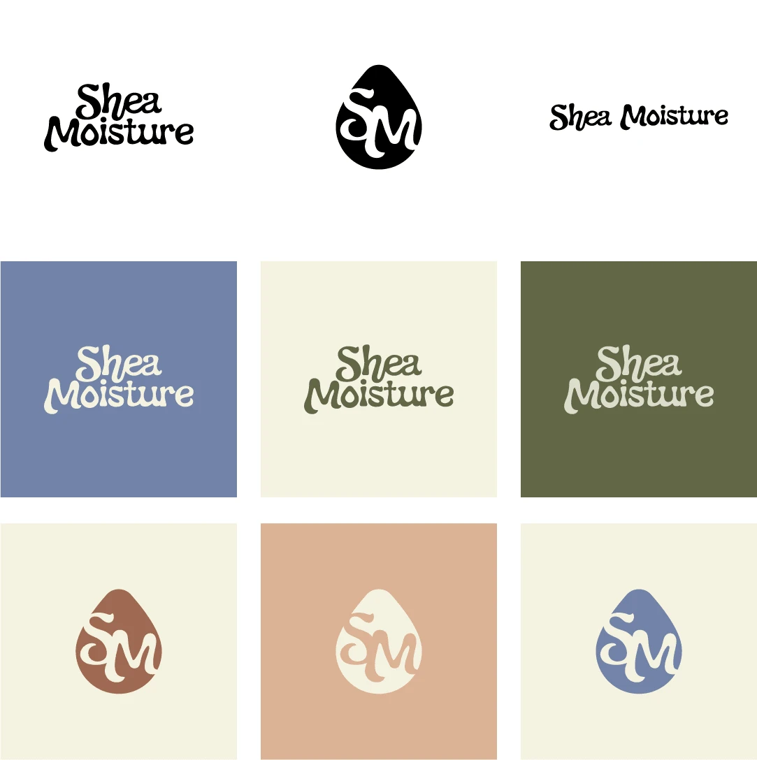
Logo Variations and Colours
Results 🎁
Completed all deliverables such as logo design, patterns, icons, commercial promo video and packaging design.
Takeaways 📣
I am thrilled with the outcome of the rebrand. The new packaging design is spot on and I am confident it will resonate well with our target audience. For future projects, creating a variety of patterns on hand for use in social media and other marketing materials would be extremely benificial.
Like this project
Posted Jan 24, 2023
Revamping Shea Moisture's brand identity and packaging design to reflect their natural, eco-friendly values and appeal to a wider audience.


