Luna & Sage - Full Brand Identity Design
About This Project
Luna & Sage is a crystal and wellbeing shop that sells products and services for holistic health. The brand and logo is inspired by the crystals themselves - their shapes and formations, but also clarity and feeling of calmness they bring.
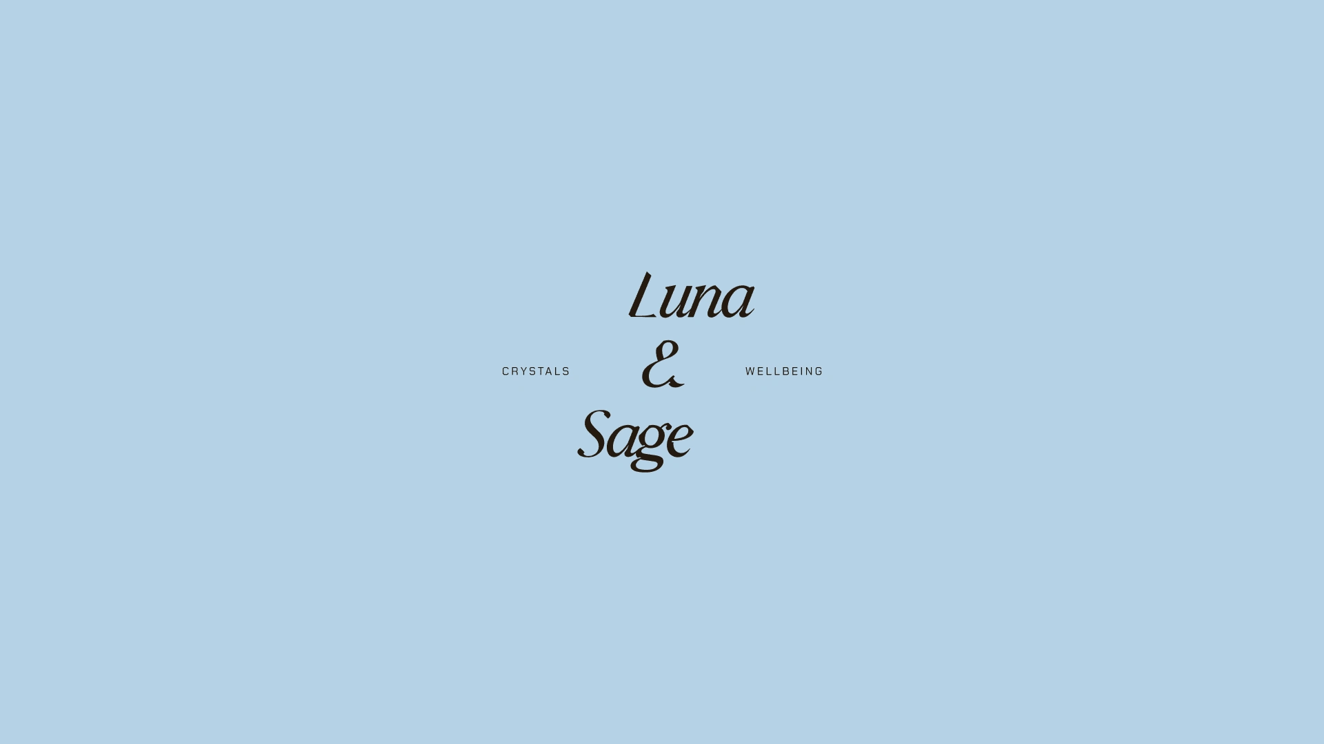
Secondary Logo - Designer after a slanted crystal
Moodboard & Creative Direction
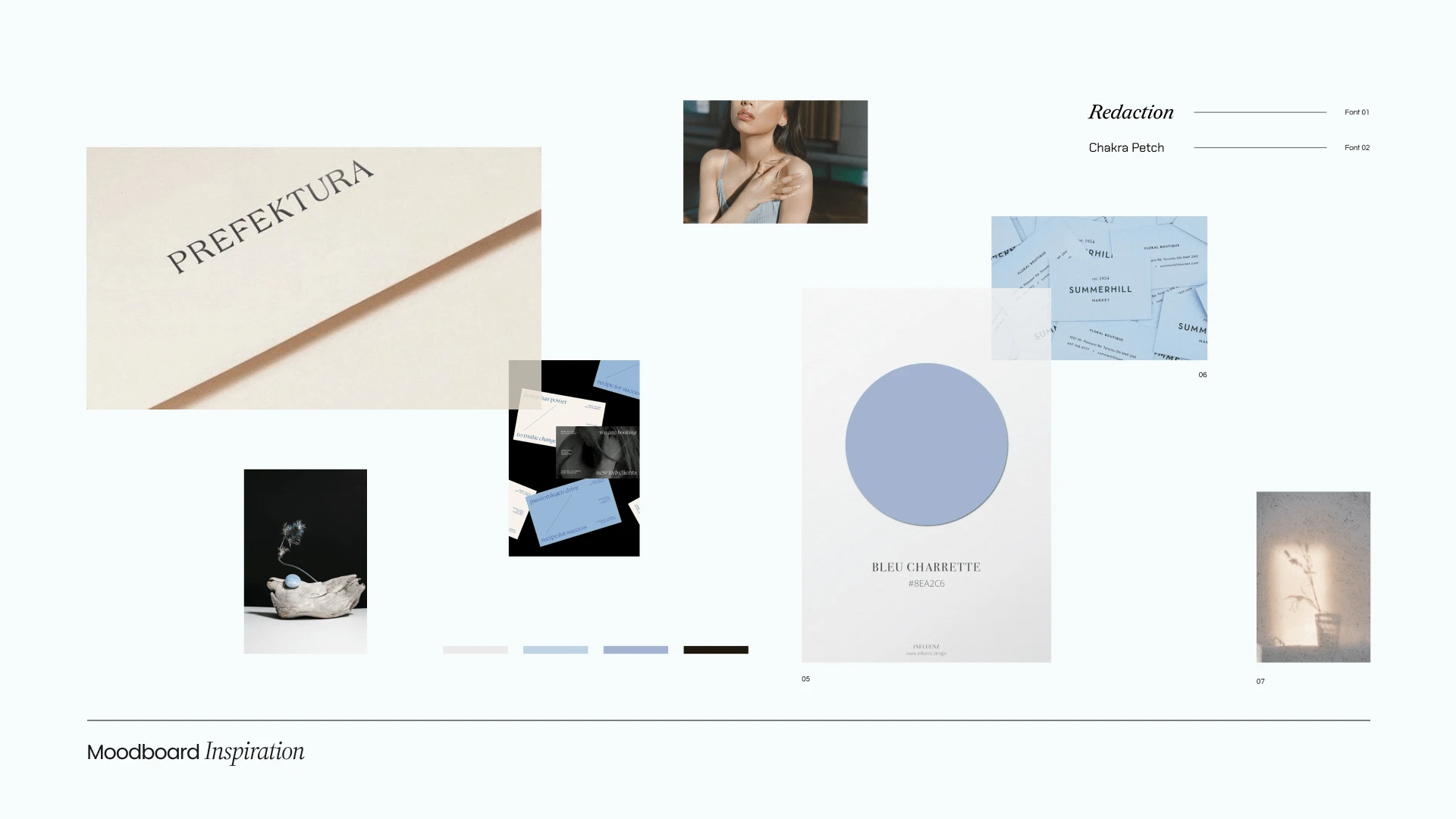
Moodboard & Creative Direction
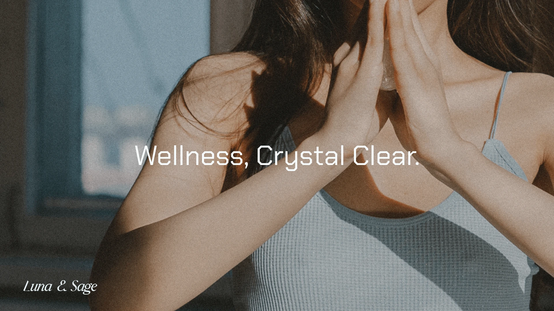
Slogan
Asymmetric layouts while seem random follow a grid system just like the formation of crystals in nature is chaotic yet geometric. The circle graphic through out the designs represents the moon and cycles our bodies go through.
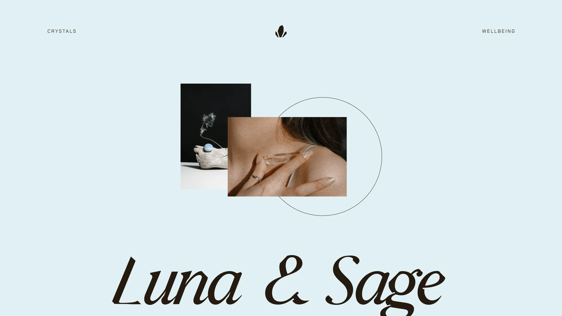
Brand Elements Layed Out
The colour palette for this brand is dominated by a soft blue that is airy and light in its shade, capturing not only a clear crystal, but also a clear mind, body and soul.
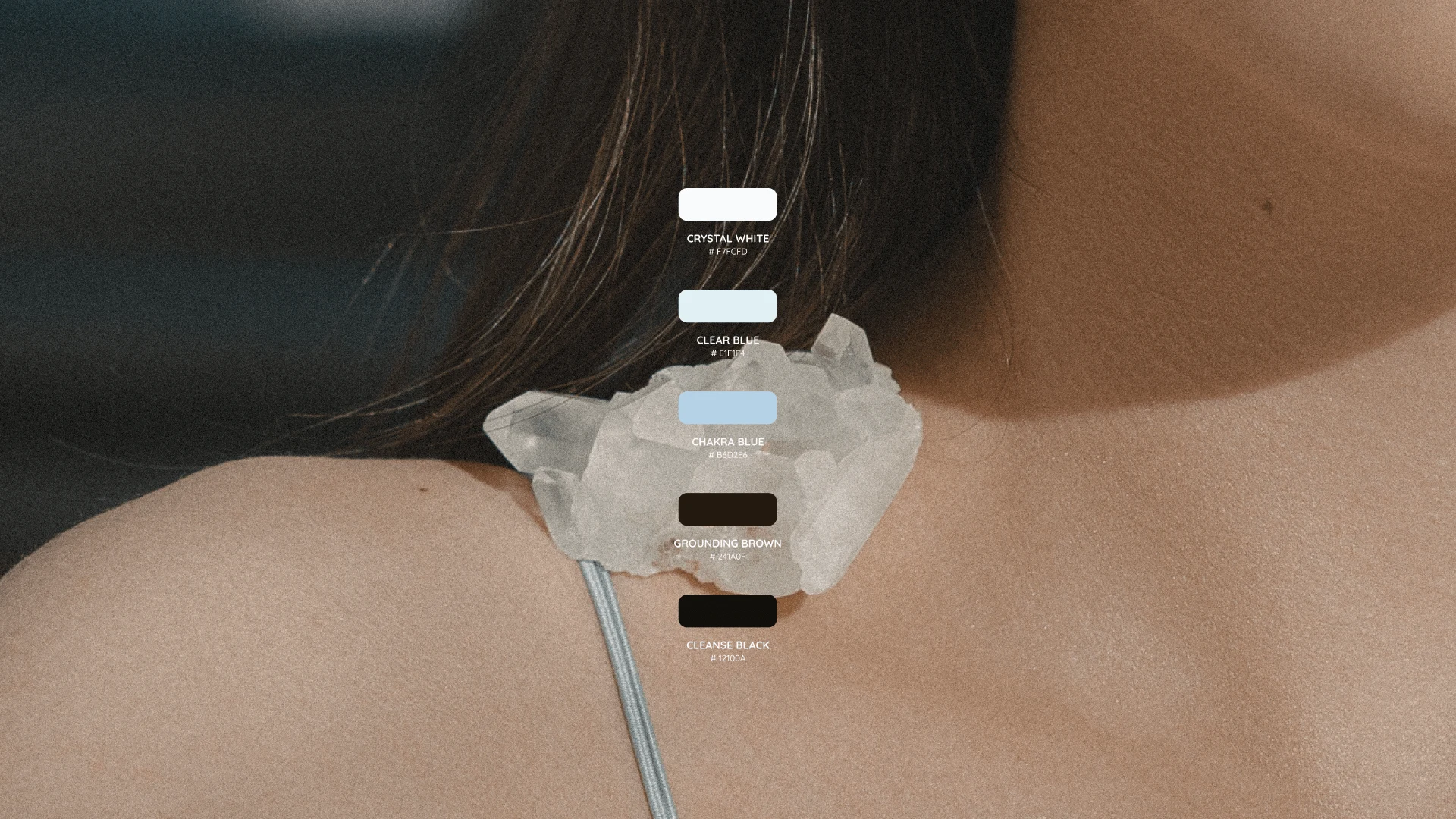
Colour Palette
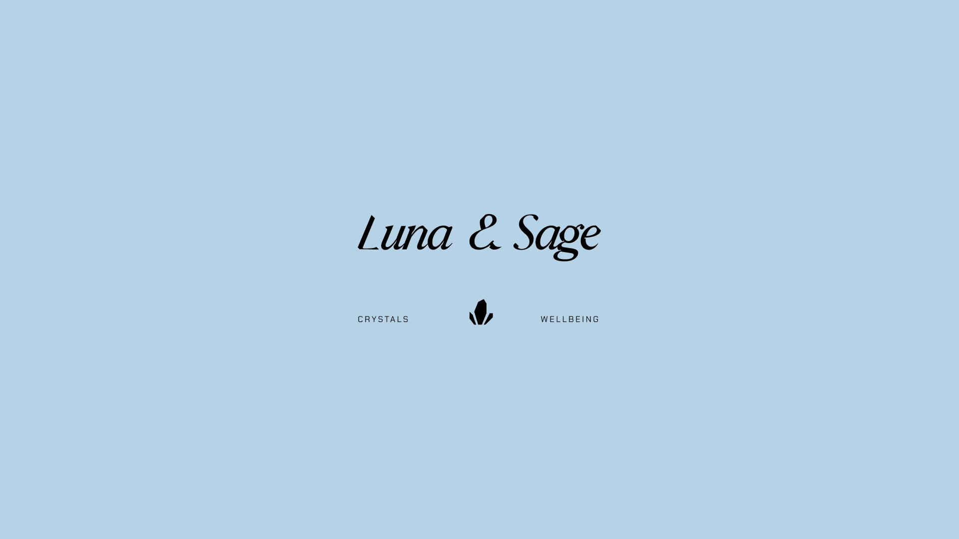
Primary Logo
Logo letters are customised to mirror the shapes of crystal formations in their geometric slanted rectangular shaved edges.
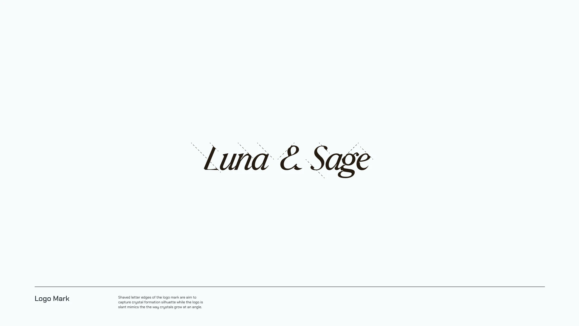
Logo Rationale
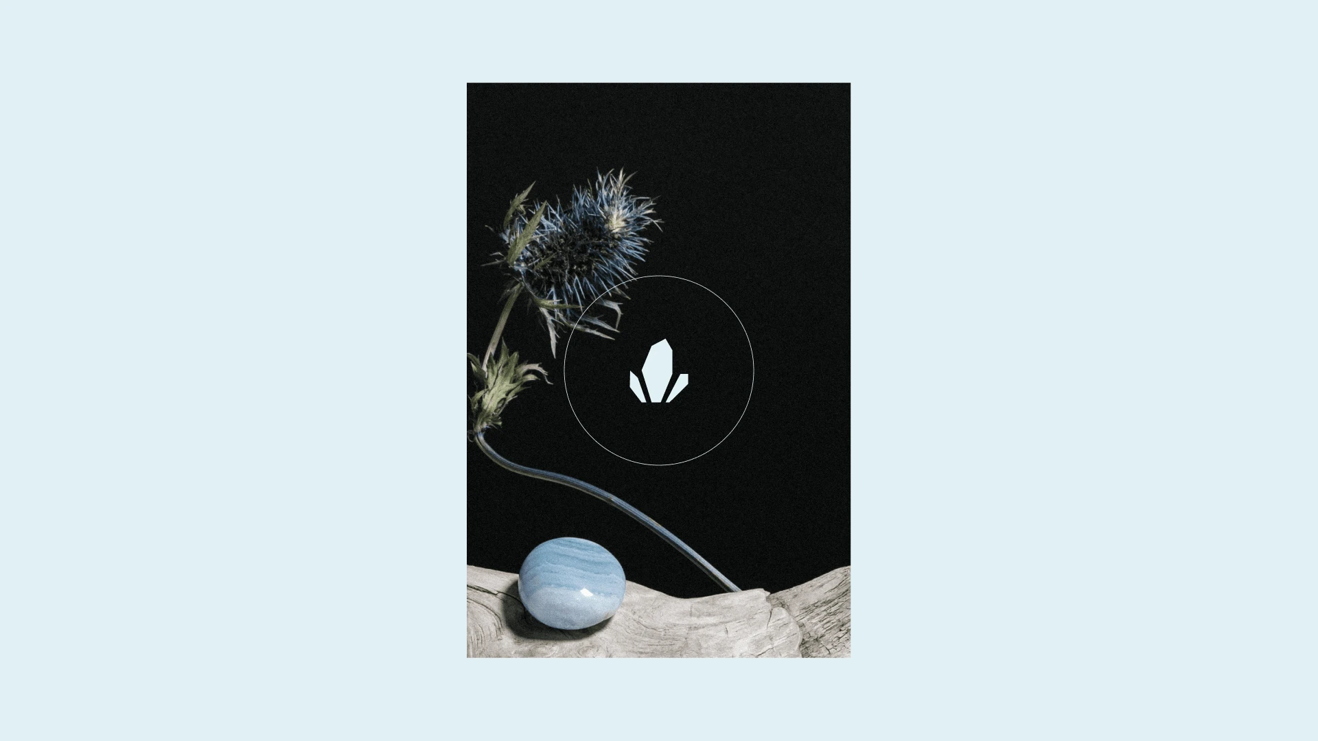
Logo icon
Brand Application - Business Card Design, Web Design & Print Collateral Layouts
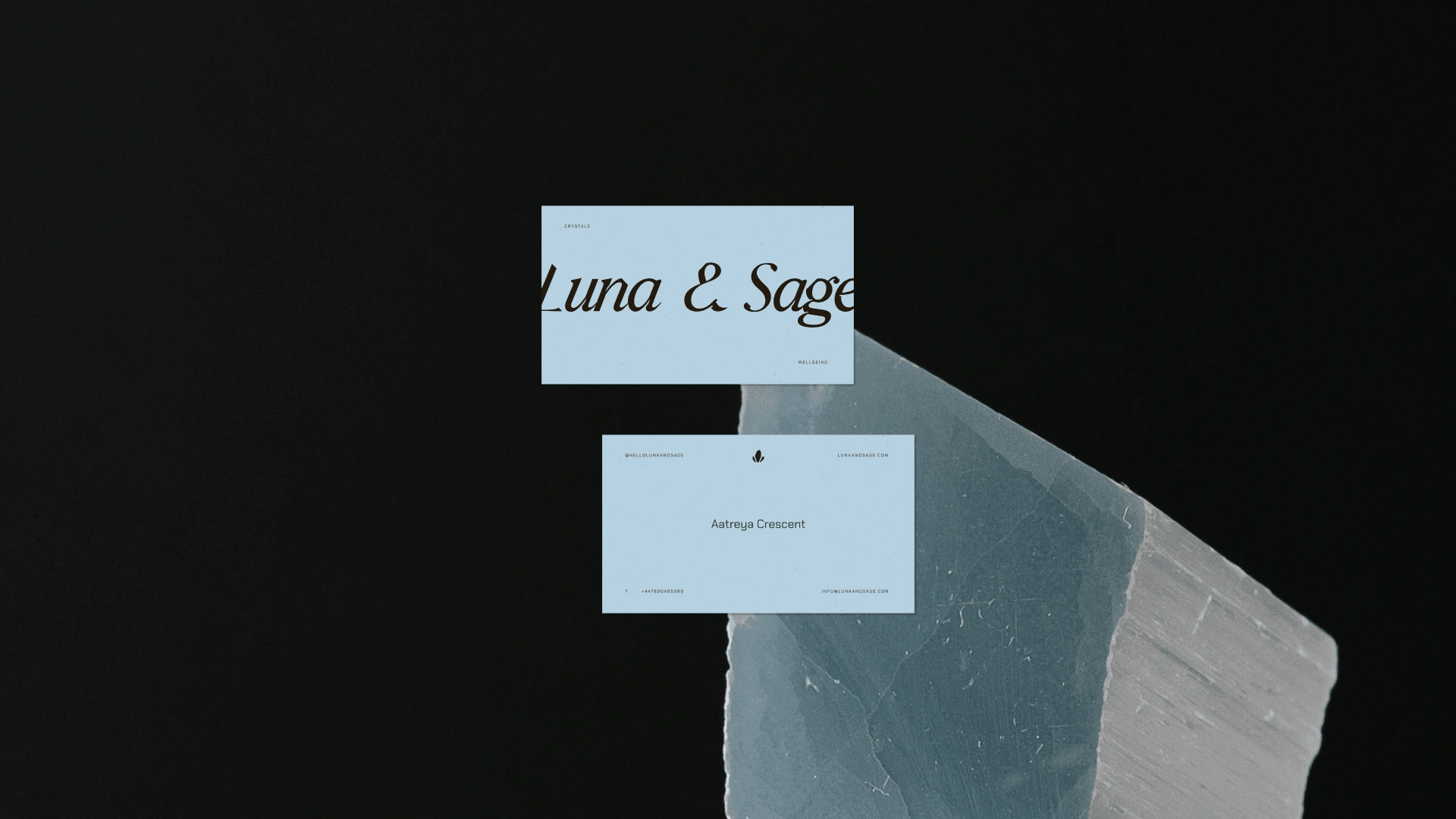
Business Card Design
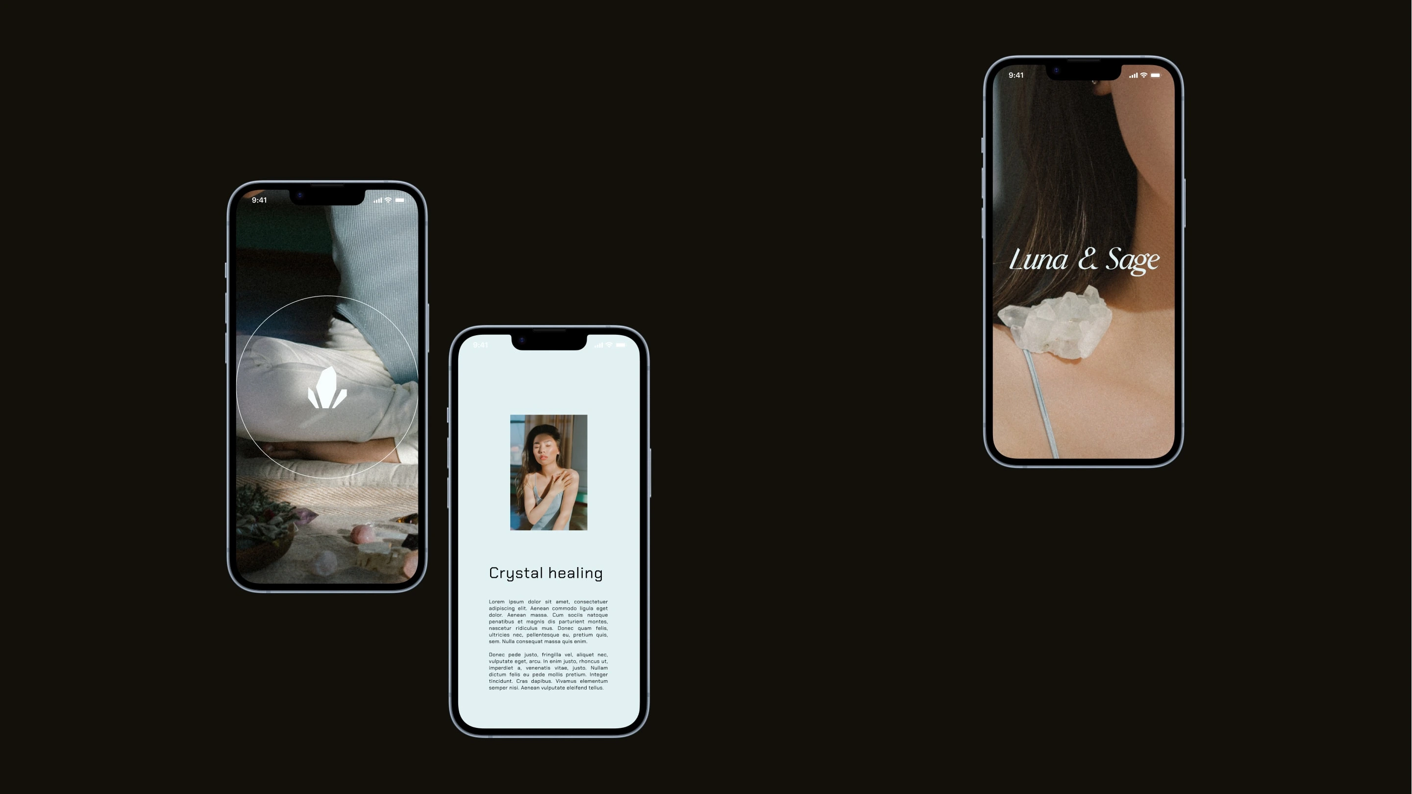
Mobile Web Layouts
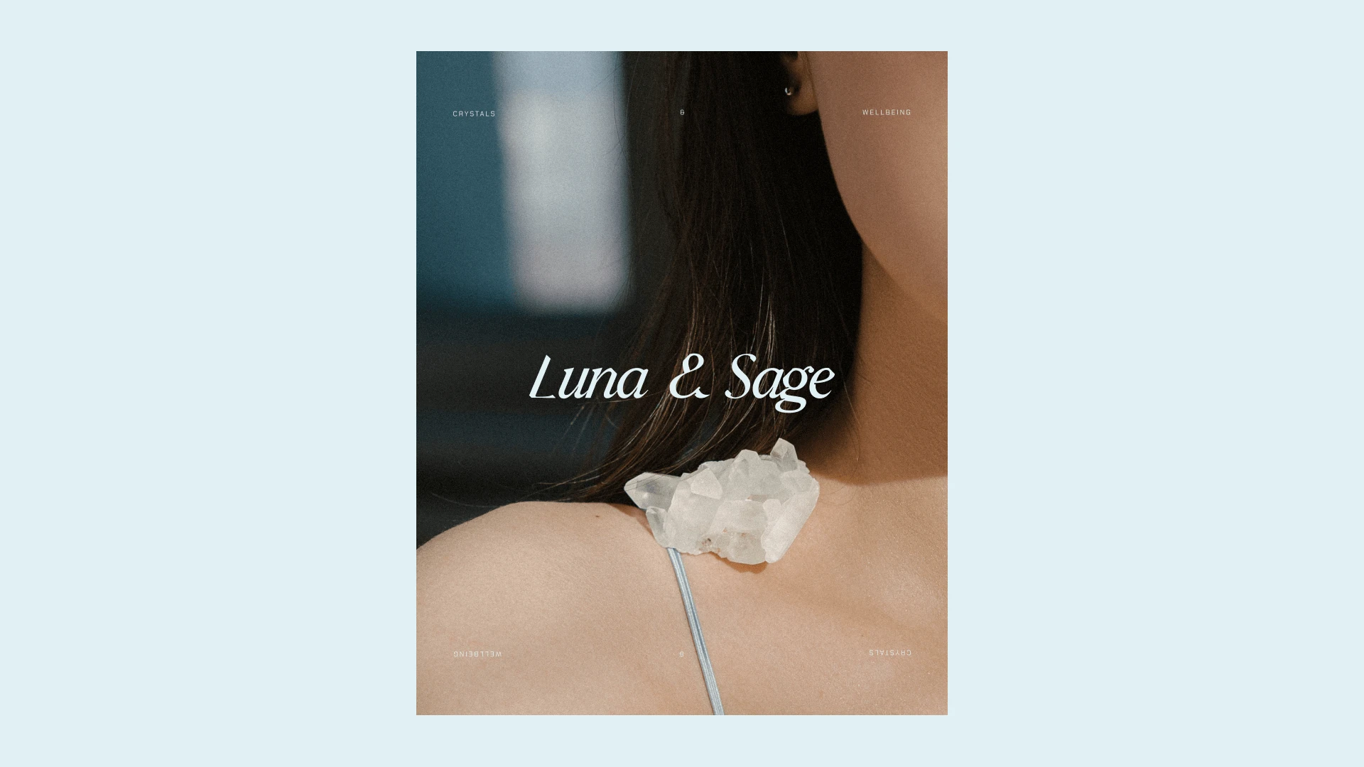
Logo Application
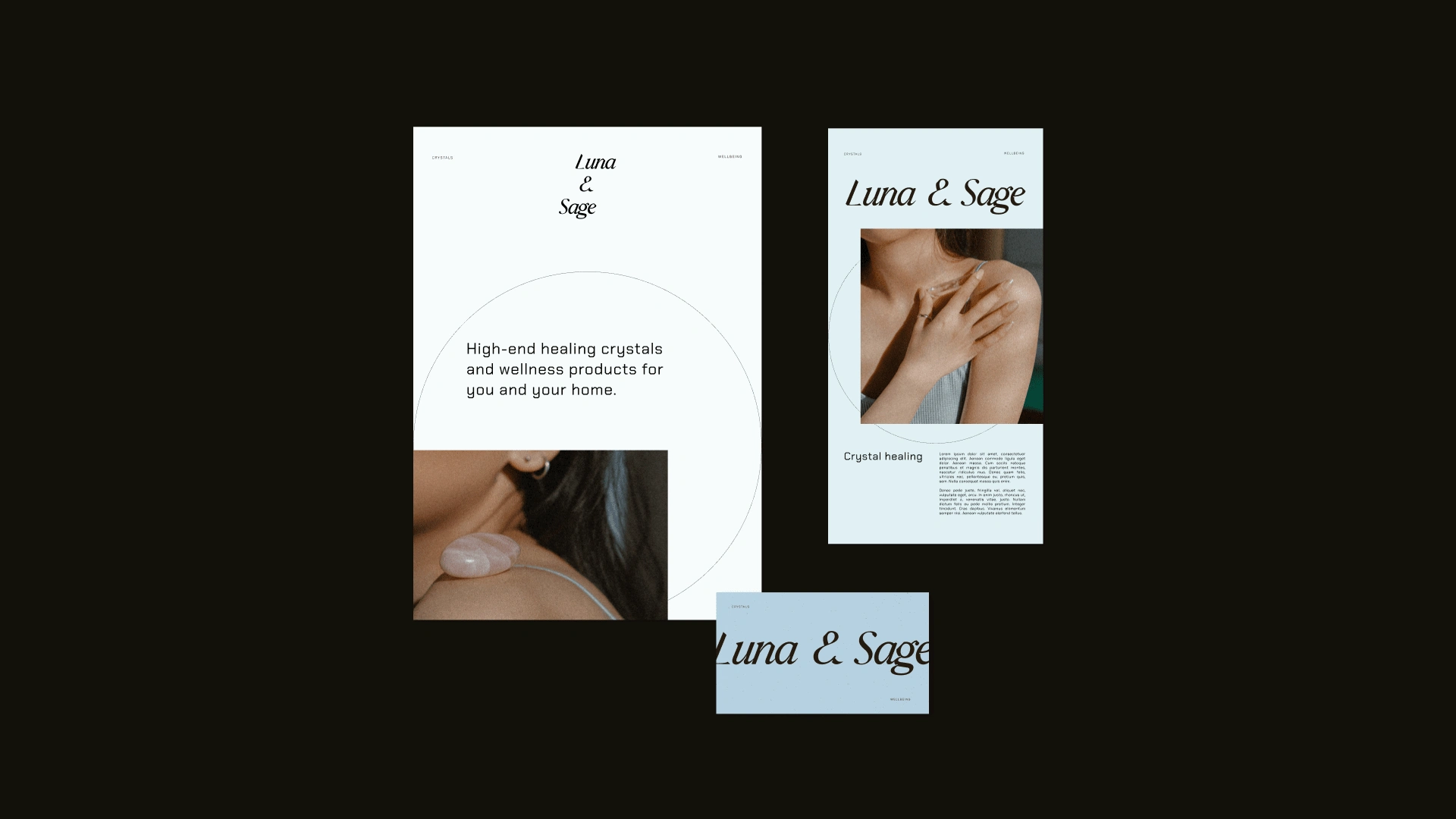
Collateral Design

Web Design
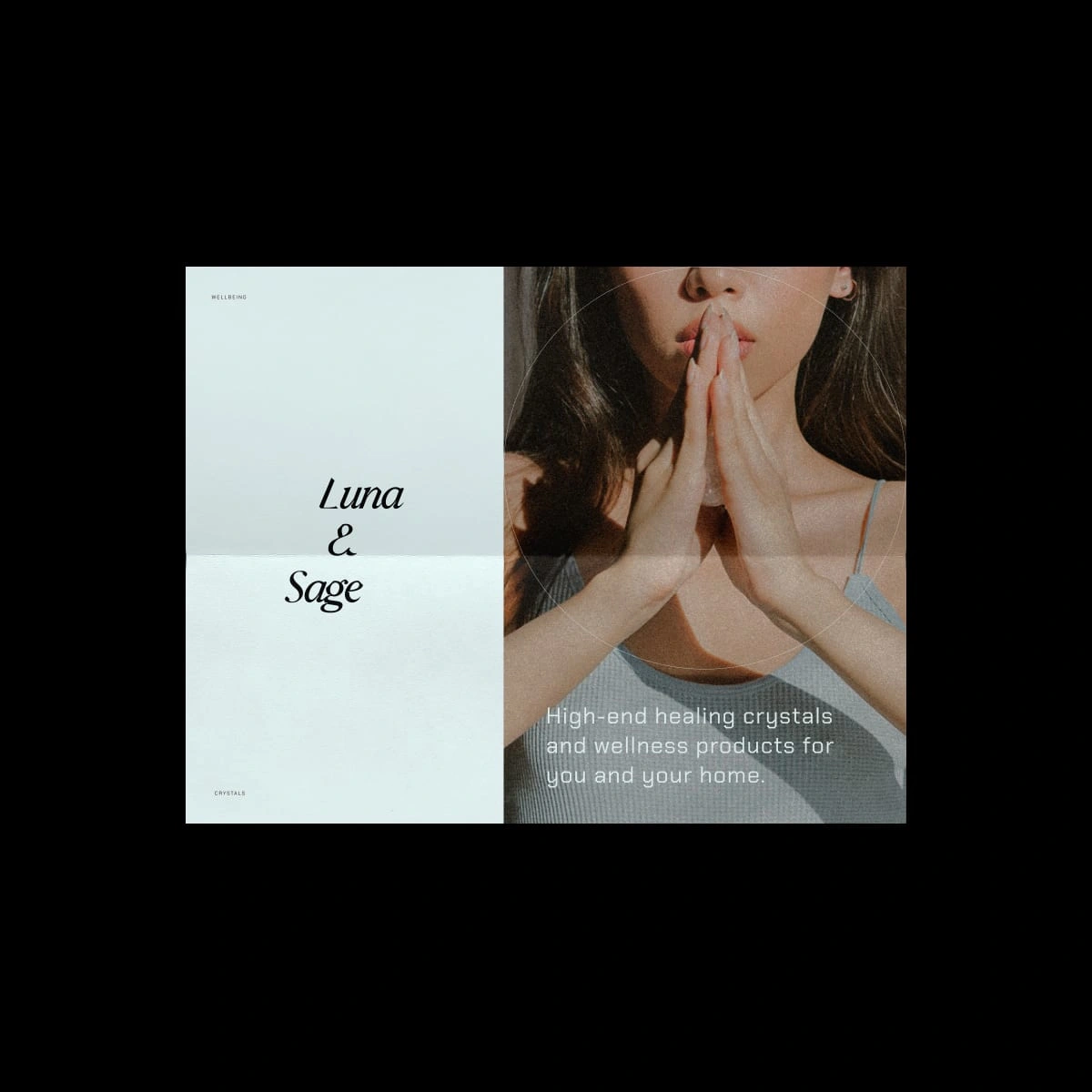
Print Collateral
Like this project
Posted Mar 9, 2023
Luna & Sage is a premium crystal shop that needed a brand identity that would reflect their high-end value and the healing nature of their crystals.

