Architecture Branding

Nathalia Joazeiro
Brand Designer
Brand Strategist
Adobe Illustrator
Adobe Photoshop
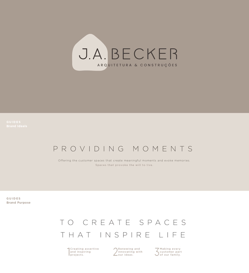
This project is one of my favorite ones, and it was developed for an Architecture & Construction company, which is a family business. It is a complex project that involves all stages of branding; from conceptualization to the final visual design.

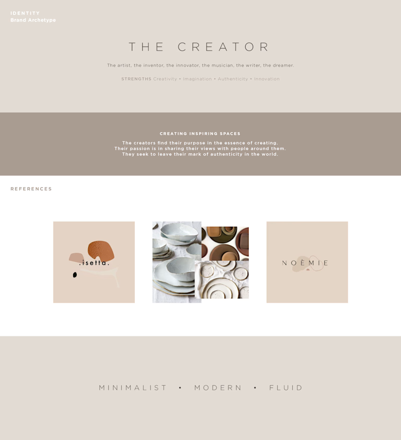
I am a big believer in brand archetypes, and how much they influence and guide the general aspects of brand behavior. For this project, The Creator sets the tone for the brand's purpose: to create and inspire.

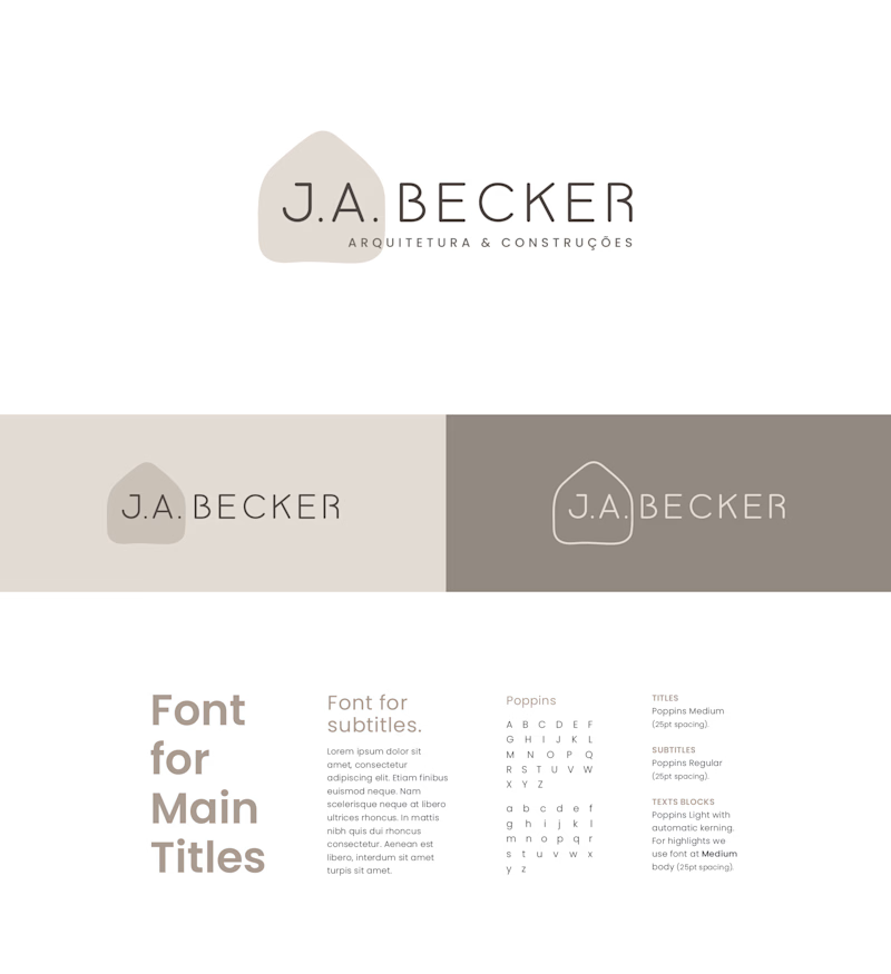
The brand should be fluid in it's shape, minimal in it's composition and modern in it's essence. Even though the designative is a mouthful (Arquitetura & Construções), the design as a whole remains light and low in contrast.

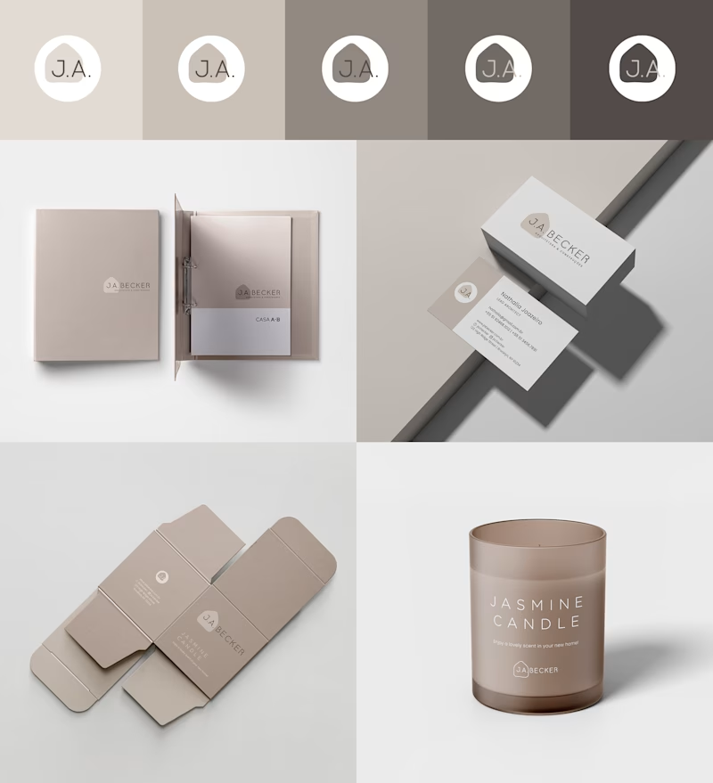
The color palette is inspired by shades that are utilized in most projects developed by the company. They have become a sort of trade mark, and have been incorporated within the branding.

Thank you for checking this project out. I'm very pleased with the outcome and so were my clients. I do hope you have enjoyed it as well!
2019


