Fiona - Modern Banking Done Easy
The Case
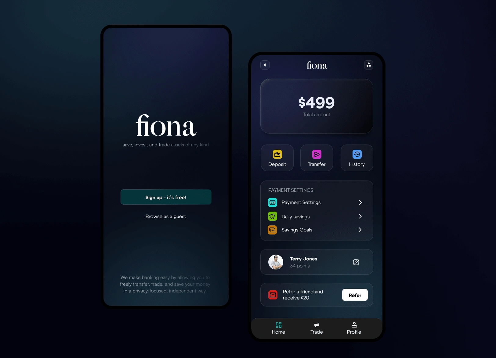
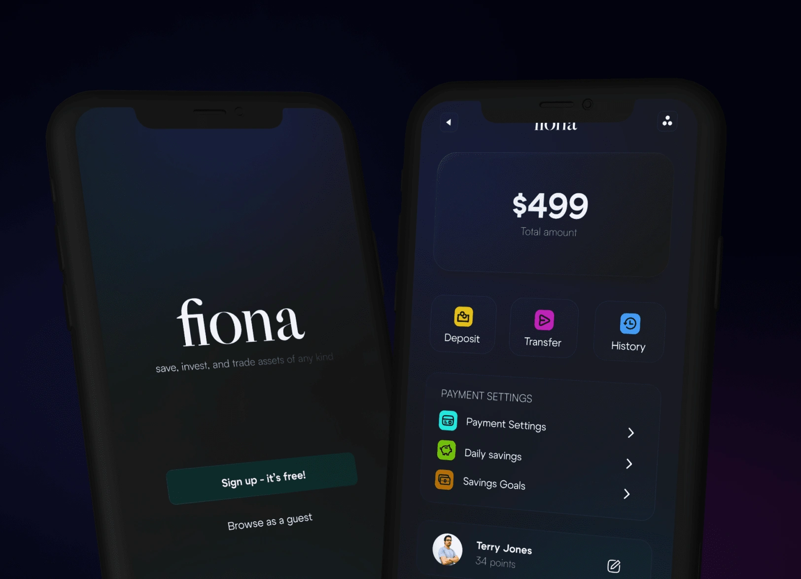
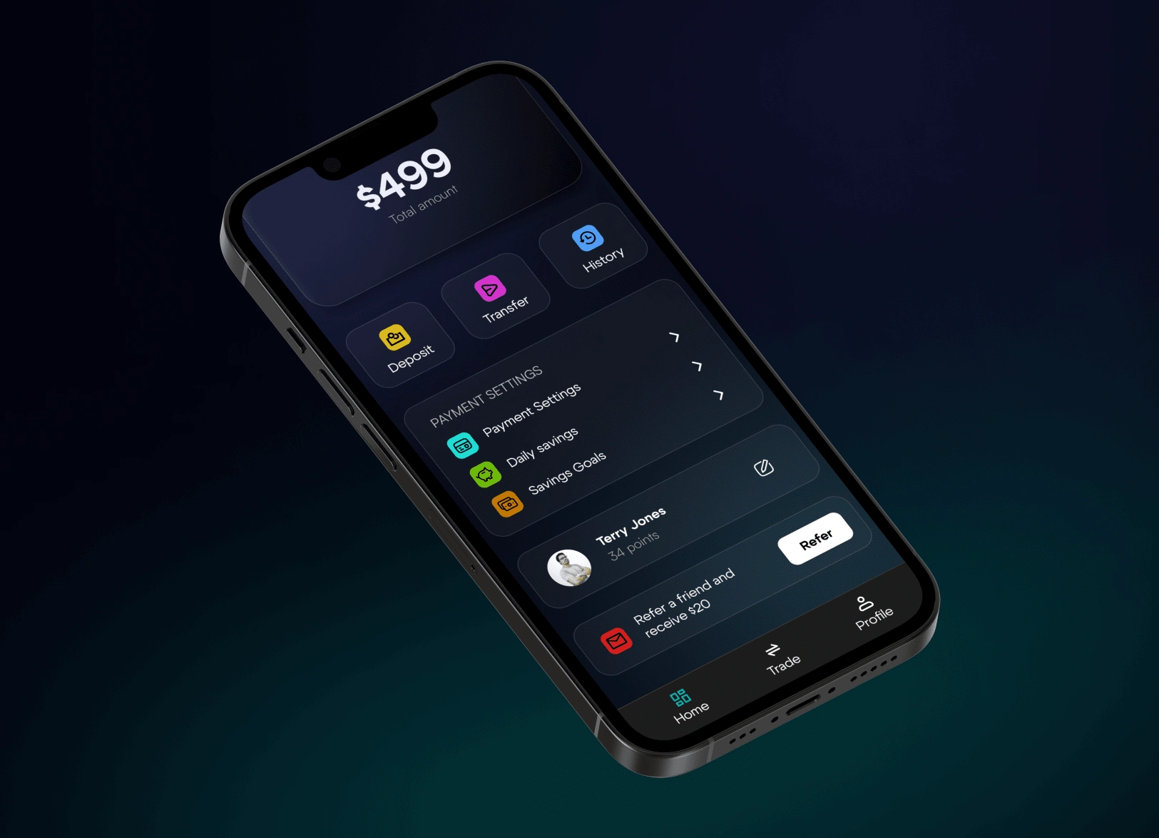
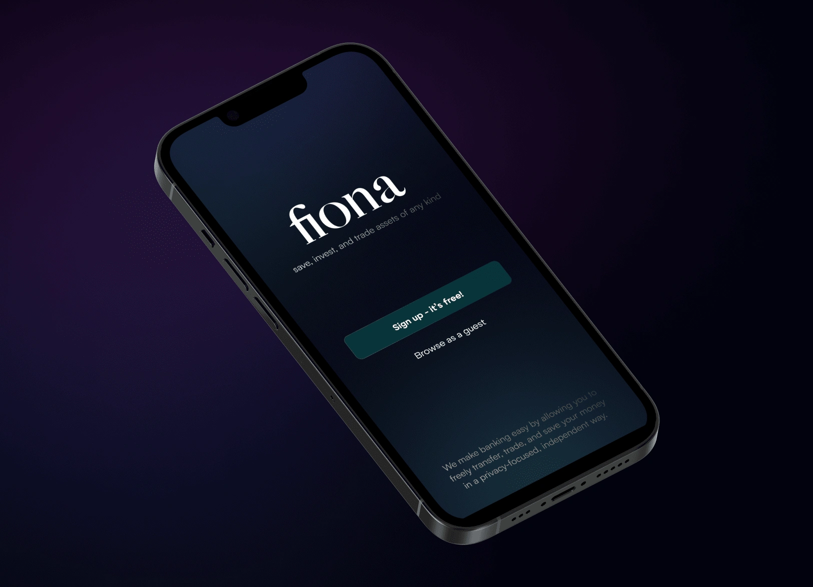
The integration of dark mode aesthetics within our banking app serves a dual purpose, focusing on visual appeal and functional enhancement. While maintaining a modern and visually striking design, this mode prioritizes usability and alleviates eye strain for users, ensuring a seamless and comfortable banking experience.
Key Features
With a modern, dark, and seamless design, one can put these key featuers into place:
Sophisticated Color Scheme:
The dark mode integration incorporates a sophisticated color scheme that prioritizes user focus. A meticulously designed color hierarchy ensures that every element's placement is strategic, facilitating a clutter-free interface.
2. Adaptive User Interface:
Whether in low-light settings or during prolonged usage, the interface's adaptability prioritizes user comfort and convenience, enhancing the overall banking experience.
3. Timeless Design Approach:
The dark design isn't solely contemporary; it also embodies timeless qualities that transcend fleeting design trends. This enduring quality guarantees the app's relevance and visual appeal well into the future.
Like this project
Posted Dec 14, 2023
The incorporation of dark mode in our banking app redefines user interaction by blending aesthetics with functionality.
Likes
0
Views
14
Tags

