KOBRA - Men's Gel Packaging
The Case
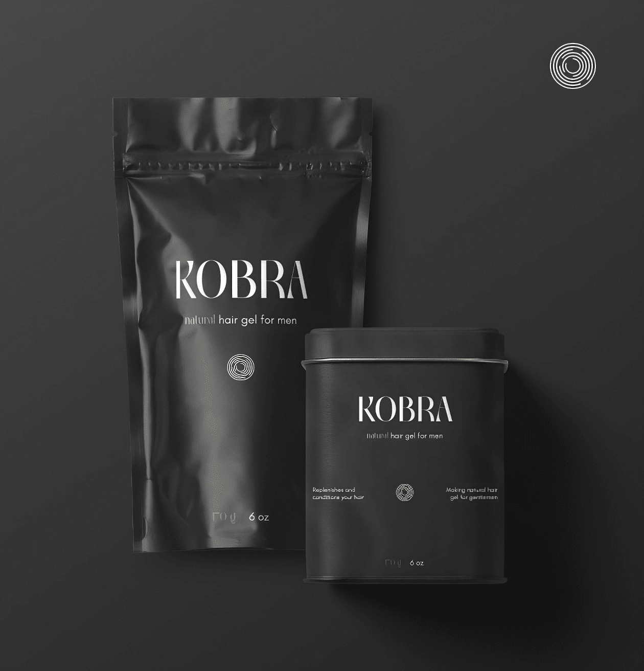
The aim of this project was to design an eye-catching and exclusive packaging for a premium natural hair gel targeted at style-conscious and naturally-conscious men.
Key Features
For this packaging design, I envisioned a sleek and sophisticated approach that harmoniously balances masculinity and natural elements. The overall design is a testament to the product's high quality and commitment to exclusivity.
Minimalism
Embracing the power of simplicity, the packaging design exudes a minimalist aesthetic that captivates through understated elegance. Each element serves a purpose, with clean lines and uncluttered spaces reflecting the product's commitment to purity and natural ingredients. The minimalist approach not only enhances visual appeal but also signifies the brand's dedication to uncomplicated and effective grooming.
Exclusivity
The packaging design exudes an air of exclusivity, inviting the consumer into a realm of refined grooming. Through carefully selected color palettes, premium textures, and restrained design elements, the packaging evokes a sense of luxury and sophistication. The brand's focus on exclusivity is further accentuated by its limited availability, elevating the product to a coveted status among discerning individuals.
Typography
Typography takes center stage in the packaging design, commanding attention with its artful arrangement and choice. A bold and distinctive font for the product name communicates confidence and strength, while refined typography for ingredients and usage instructions exemplifies the product's meticulous craftsmanship.
Like this project
Posted Aug 11, 2023
I envisioned a sleek and sophisticated approach that harmoniously balances masculinity and natural emenents: Kobra.
Likes
0
Views
11

