MALZO - Package Design
William Liedner
The Case
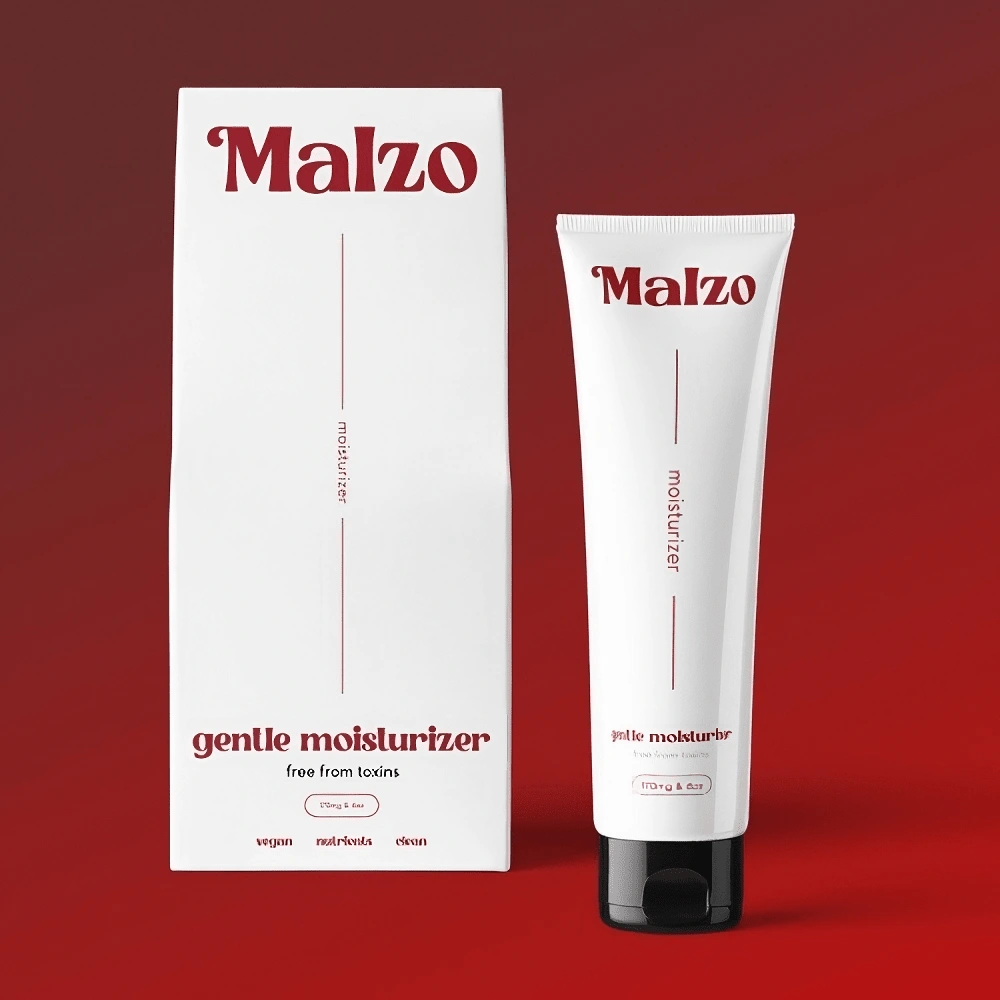
The packaging design is an artful marriage of contrast and modernity. Deep, intense hues juxtapose against luminous accents, creating a visual symphony that captures attention.
Key Features
Experience the art of contrast and fusion with Malzo All-Natural Moisturizer.
Contrast:
The packaging design is a dynamic dance of contrasting tones, capturing the essence of bold transformation. Deep, rich shades interplay with luminous accents, reflecting the powerful fusion within the cream.
Edge:
The packaging design radiates a modern edge, with angular geometries and sharp lines that create a sense of dynamism.
Typography:
Typography makes a bold statement, conveying the cream's potent nature. The product name commands attention in a font that exudes confidence and allure, while ingredient specifics and usage directions are confidently presented in a typography that mirrors the cream's impactful formulation.
Like this project
Posted Aug 11, 2023
The primary objective of this project was to craft an impactful and visually striking packaging design.
Likes
1
Views
8