ZUURU - Web Design for SaaS
The Case
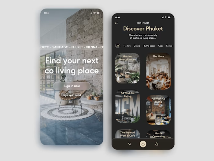
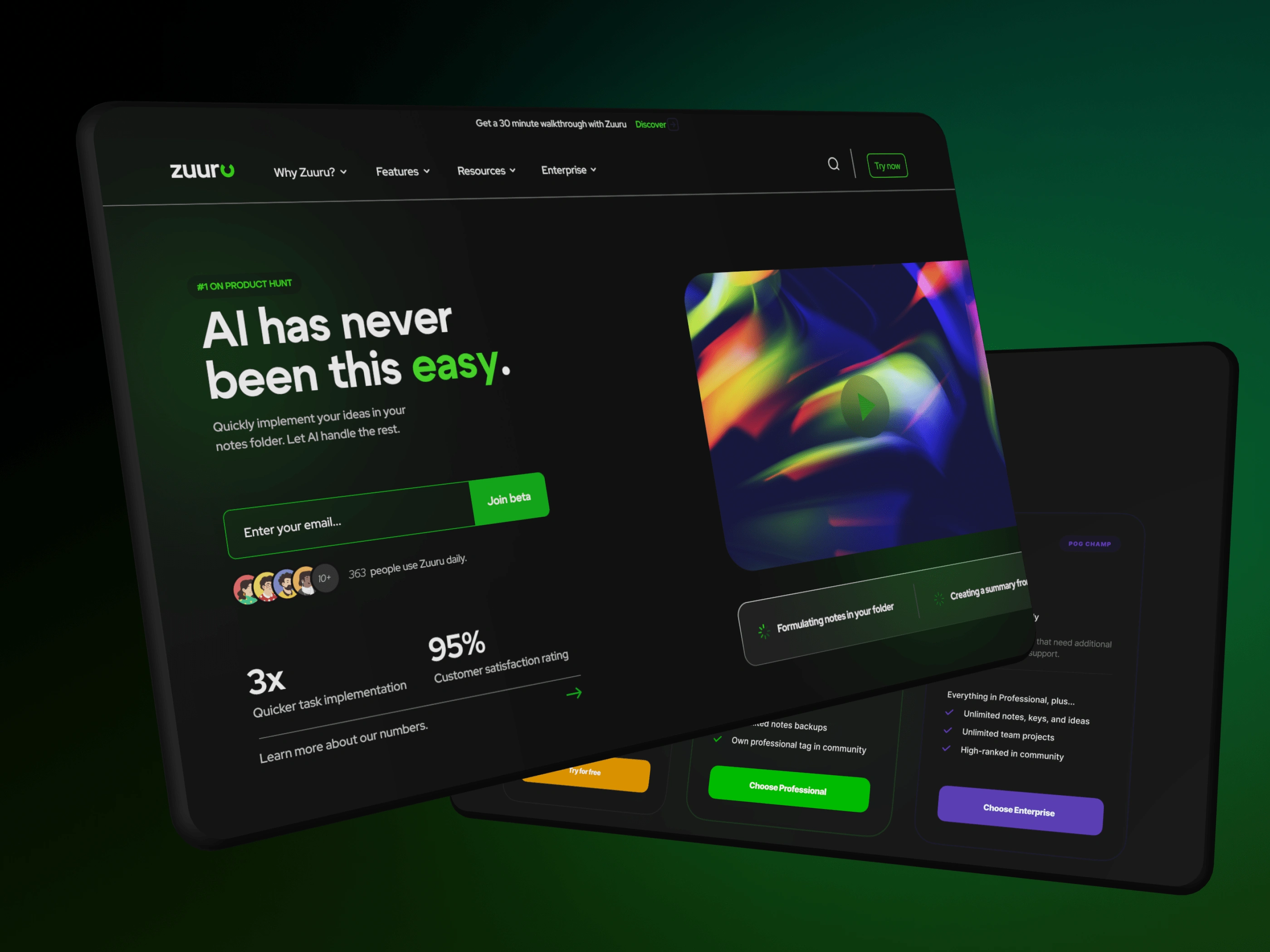
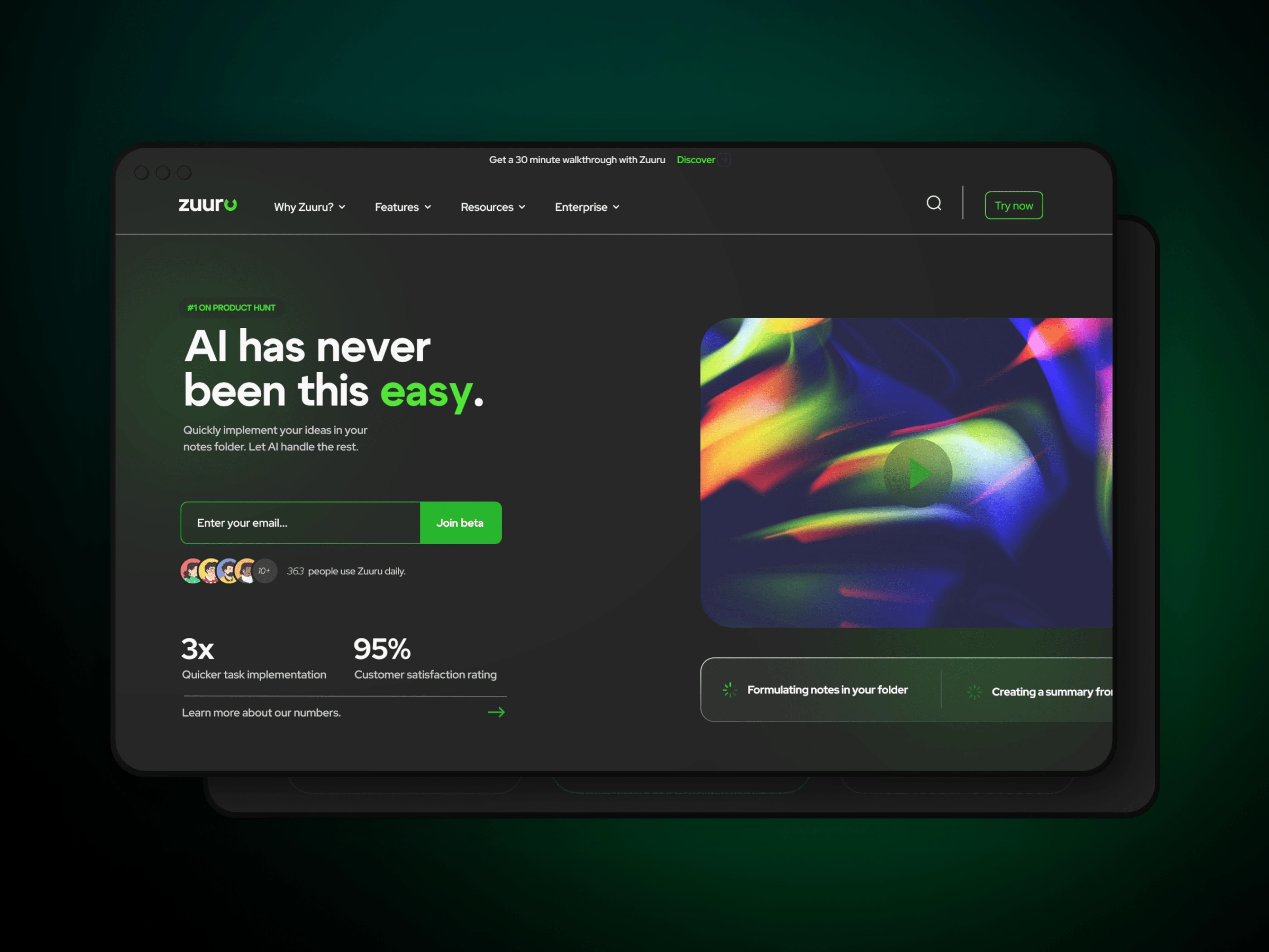
Our modern dark design isn't just visually striking – it enhances usability and reduces eye strain. The sleek interface is carefully designed to create a seamless user experience, where every feature is just a click away.
Key Features
Experience the evolution of design – where structure, color, and interaction converge harmoniously.
Color Hierarchy:
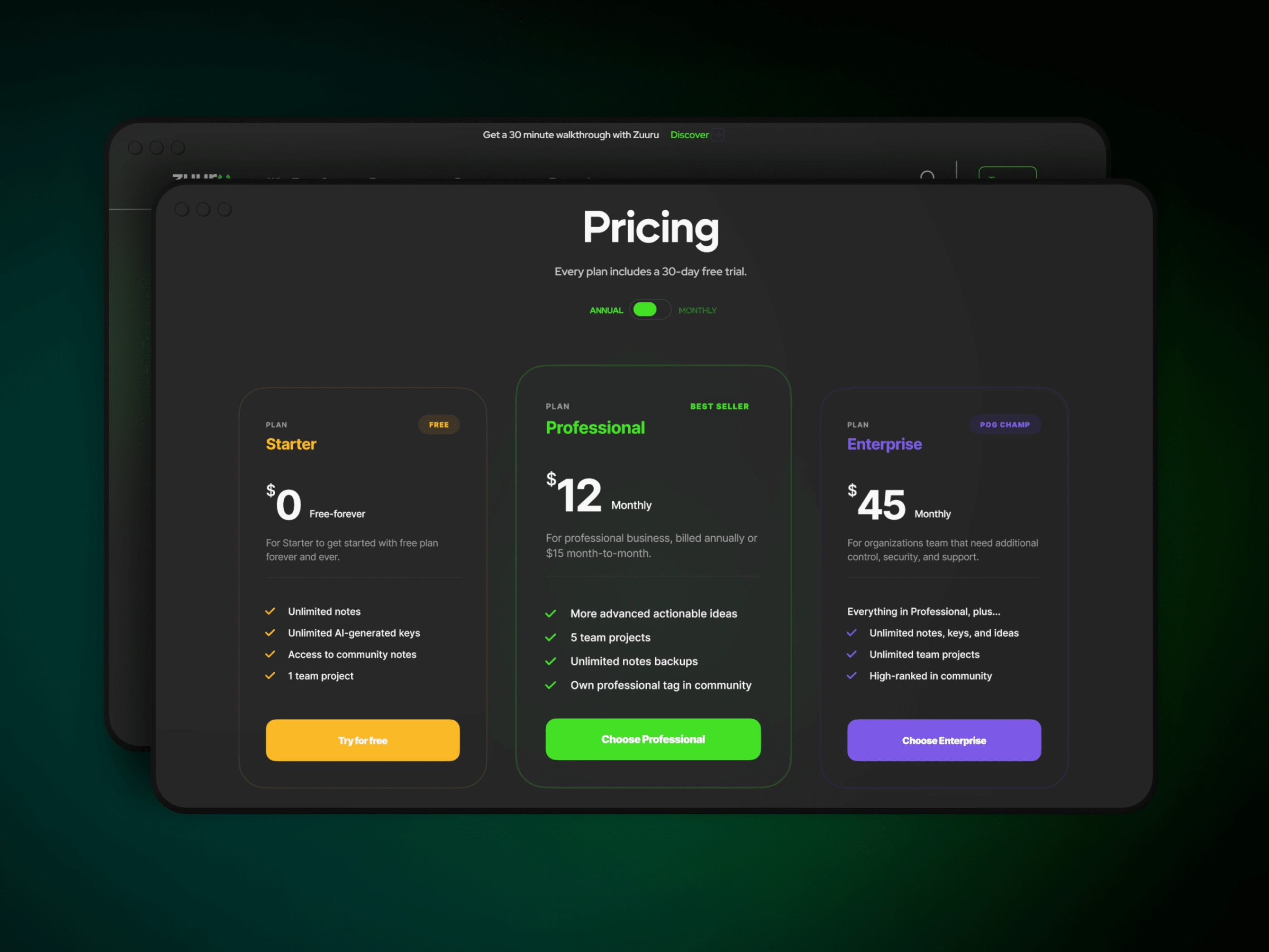
The dark design embraces a minimalistic approach, emphasizing the strategic placement of elements. Each component serves a purpose, contributing to a clutter-free interface that enhances user focus.
Vibrant Accents:
Vibrant accent colors strategically punctuate the design, directing attention to crucial elements.
Timeless:
While embracing a contemporary aesthetic, the dark design also exhibits timeless qualities. This ensures that the design remains relevant and visually appealing well into the future.
Like this project
Posted Aug 14, 2023
Discover the allure of the dark side in user interface innovation.
Likes
0
Views
12

