CleanWise - Full Store Redesign

Tan | Wayrise


The brand
CleanWise is an established Dutch brand selling premium robot and cordless vacuums, with thousands of verified customer reviews and steady traffic behind it.
The problem
The brand sells premium vacuums in a category that one household name already owns. Most visitors arrive on a phone, already comparing, at a price high enough that hesitating feels like the safe choice.
People at that price want to know whether it really works, and whether a brand they have not heard of can be trusted. Most stores answer neither of those quickly enough, and the visitor goes back to the name they already know.
The approach
Every decision on the store came from what CleanWise buyers actually hesitate over, built on deep customer research. Structure, copy and the visual system all work on the same job, which is answering doubt at the moment it appears.
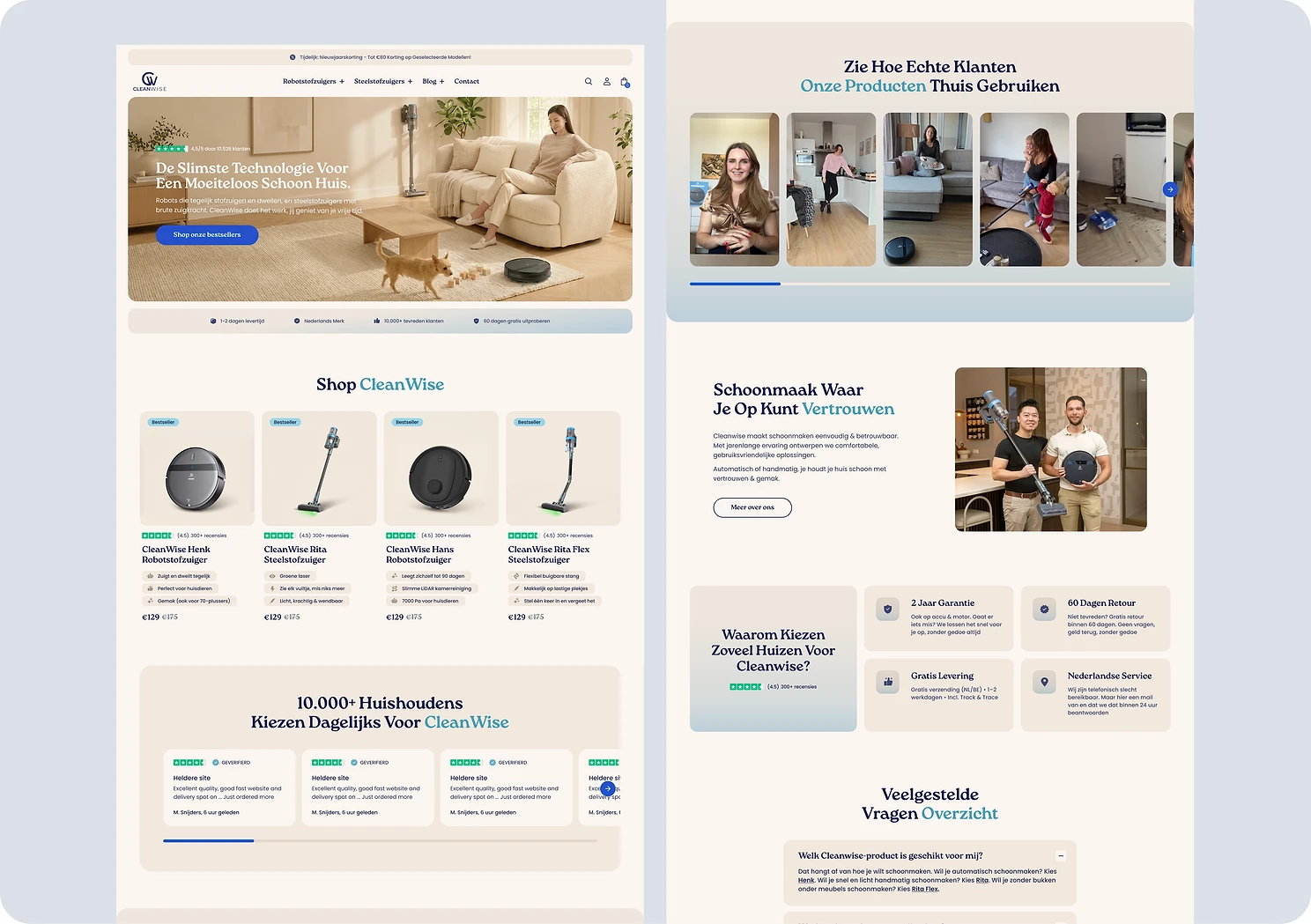
Homepage, the shortest path to the right product
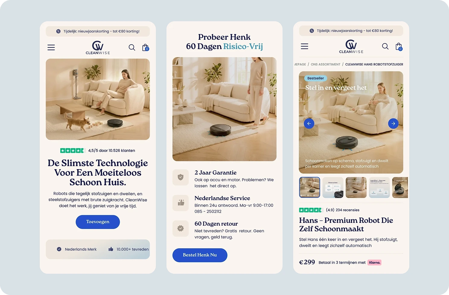
Someone comparing three brands does not read a homepage, they scan it and leave if nothing lands in the first seconds. The top of the page shows a clean home instead of the vacuum, because a clean home is what people are paying for. The reviews sit right there with it, so nobody has to scroll to find out whether the brand is any good. Everything below moves someone to the right product quickly, because a visitor who has to work that out alone usually leaves.
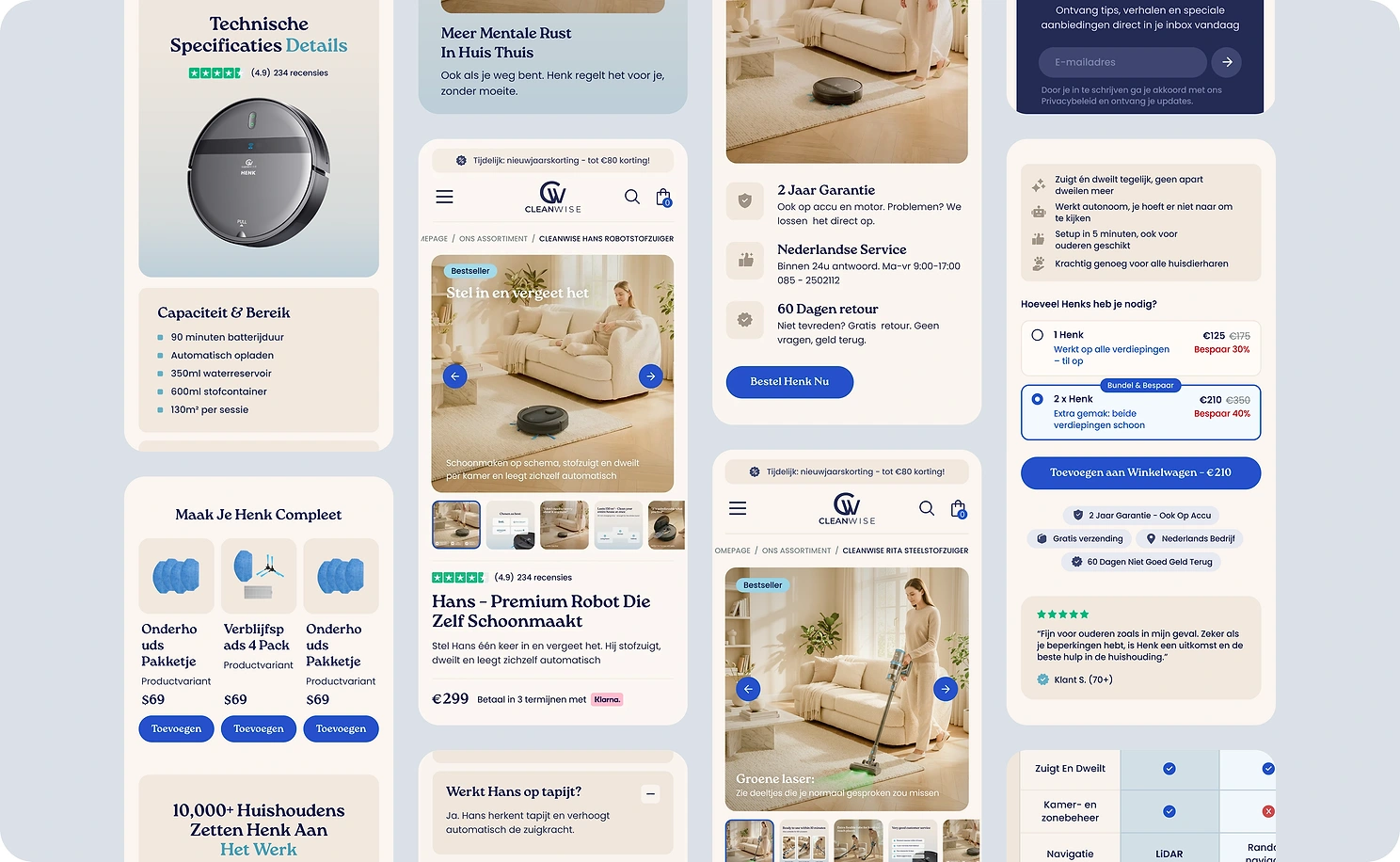
A product page built for the doubting buyer
The buy box is ordered around what a hesitant buyer needs first, so the proof comes before the price rather than after it. The guarantee sits under the button instead of inside a policy page, at the point where someone decides whether the risk is theirs. Real customer videos sit at that same point, because a buyer this far along trusts another buyer more than the brand. The comparison against the better known competitor is on the page, rather than left to a search someone would run in another tab.
A full brand image library without a photoshoot
On a product page the gallery next to the buy button is one of the most looked at things in the whole store. It sells what text cannot, which is the product working, the features proven and the concerns answered while someone is deciding.
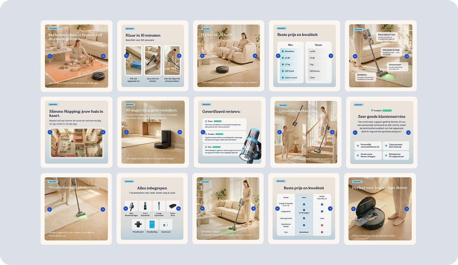
I created over forty creatives for the range, each one doing something a single product photograph cannot do on its own.
All of it was made with AI, and work at this level used to mean hiring a photo team and a marketing team. One product shot became a full premium image library, with no shoot to pay for and no shoot to wait on.
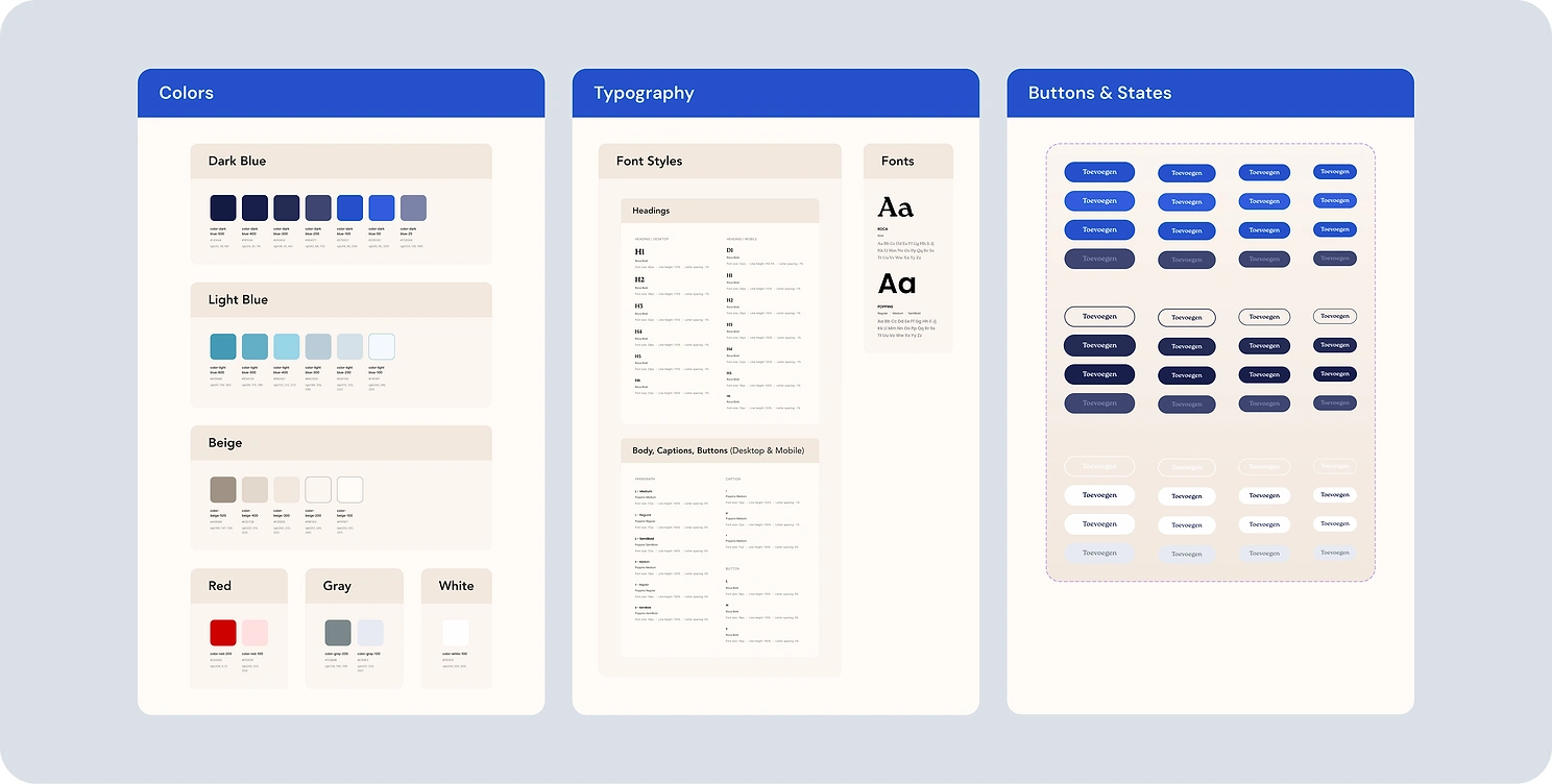
Handed off ready to build
The store was handed over as a complete design system with every button and every state defined. Developer annotations cover interactions, behaviour and links, so the build matches the design without a round of questions and rework.
Hundreds of small decisions make a real difference
Most stores lose the sale long before the price becomes the problem. Hundreds of small decisions add up to whether someone keeps going or closes the tab, and CleanWise now has a store built around them.

Like this project
Posted Aug 4, 2026
Full store redesign for a DTC home-cleaning brand. Homepage, collections, five product page templates, a design system and an image library made with AI.
Likes
14
Views
32
Timeline
Mar 19, 2026 - May 14, 2026