Retouched AI

Izaz Zubayer


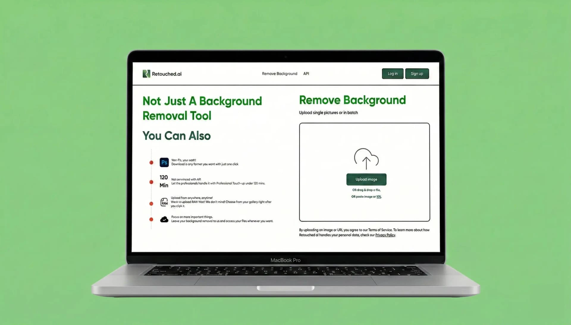
Retouched AI
I Increased Customer Retention by Redesigning the AI Powered Background Removal Tool
I drove the end to end redesign of Retouched.ai, transforming an AI powered background removal tool into an intuitive web app that increased premium conversion by 200% and scaled usage to 60,000 images processed yearly.
The Problem
Retouched.ai possessed a powerful AI image processing engine, but its complex, technical interface was alienating everyday users. The platform suffered from low conversion rates and high abandonment during onboarding because users felt overwhelmed.
Key Results
200% increase in premium conversion
92% workflow task success rate
86% reduction in measured friction
4.6/5 user satisfaction rating
Hats I Wore
Product Manager
Lead Product Designer
UX Researcher
Timeline
3 Months
Team
PMs, Designer, Devs
Strategic Framing & Constraints
Before pushing pixels, I defined the business problem. The goal wasn't just to make the app look better—it was to dismantle technical friction that was actively preventing user adoption and monetization.
01
The Goal: Drive Adoption
A comprehensive UX/UI redesign of Retouched.ai aimed at turning a confusing, overly technical product into a consumer-friendly application. The main goal was to simplify the flow, reduce confusion, and make it obvious what users needed to do next.
02
Strategic Pillars
/ Convert technical friction into a guided introductory flow./ Implement progressive disclosure to reveal advanced AI tools without overwhelming users./ Establish a trustworthy visual identity to drive retention.
03
Operating Constraints
/ Navigating a rigid legacy codebase that resisted structural changes./ Simplifying UI animations to maintain performance under strict ML model limitations./ Designing around API latency for real time capabilities.
Auditing the Friction
To understand why users were dropping off, I audited the existing experience. I led 15 discovery interviews and a competitive teardown of 8 industry leaders. This wasn't about validating features; it was about identifying the emotional and functional barriers driving churn.
15
Discovery interview sessions
"The AI parameters are intimidating." "I do not really see the point of this app." "I’m not trusting this site with my photos." We identified that cognitive overload and lack of trust were our primary conversion blockers.
8
Industry leading tools audited
I benchmarked competitors to define our baseline for modern AI interactions, ensuring our new architecture would outperform industry standards on usability.
Architecting the Solution
I drove cross functional alignment by rapidly prototyping solutions. I utilized journey mapping and structural exercises to define a new product architecture that prioritized user comprehension over exposing raw ML capabilities.
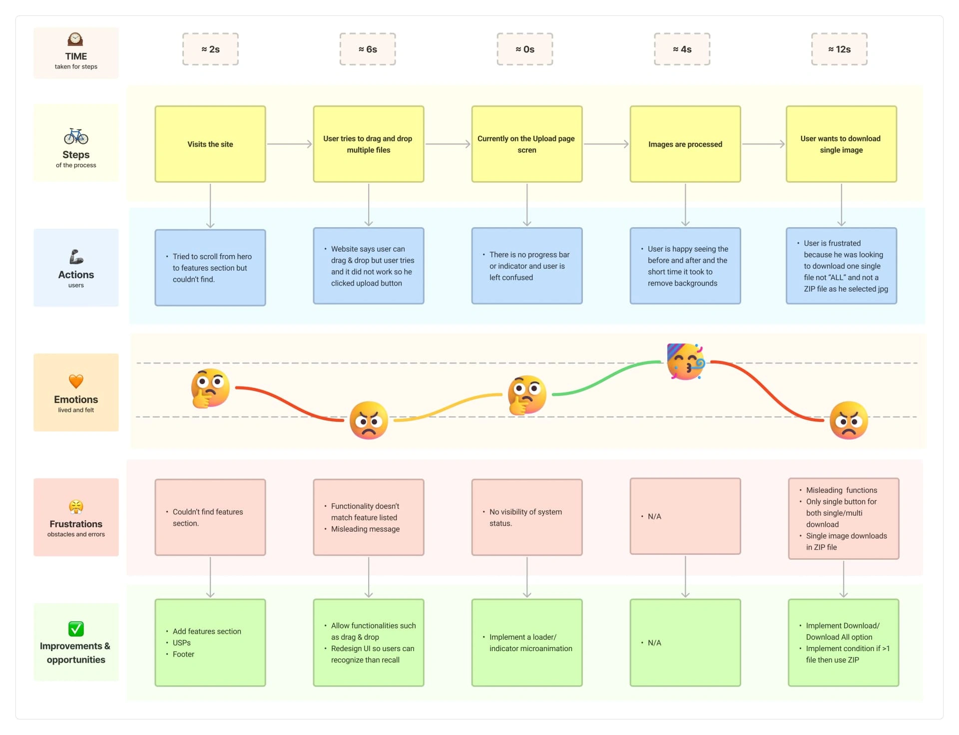
User Journey Mapping
I mapped the end to end flow to identify the exact drop off points. This revealed repeated confusion around broken handoffs, unclear steps, and moments where users did not understand what would happen next.
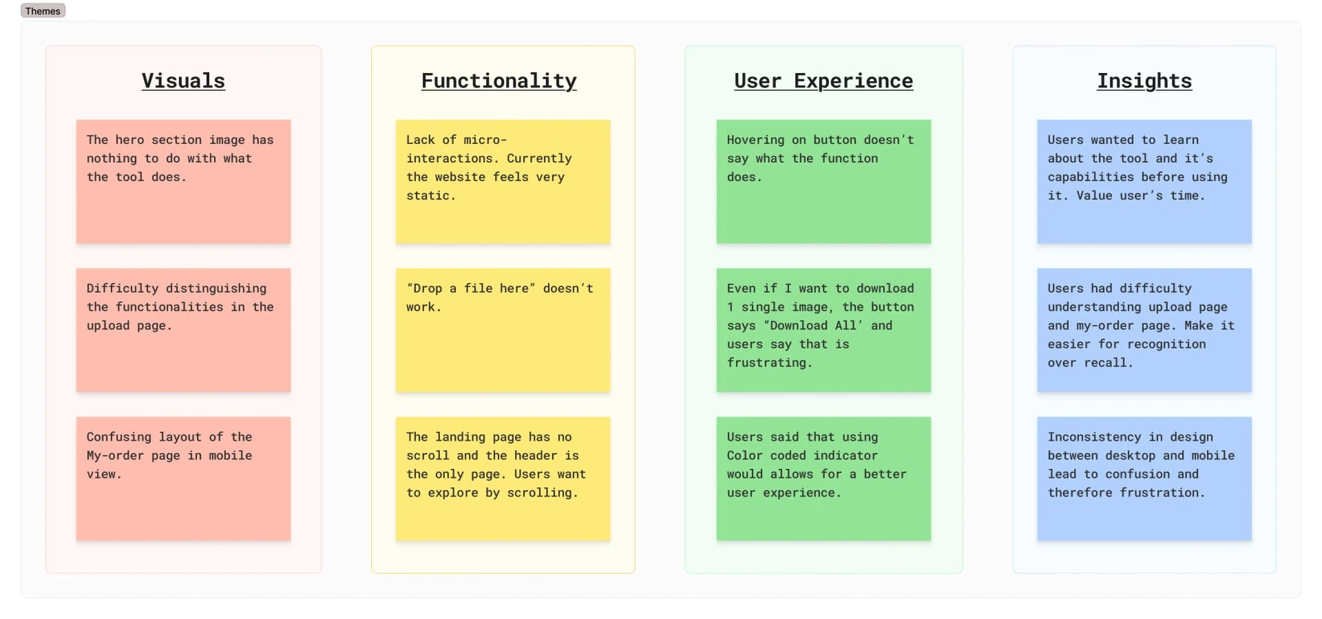
Data Synthesis
I synthesized research data into actionable design themes, driving stakeholder consensus on prioritizing the onboarding flow and a unified editing dashboard.
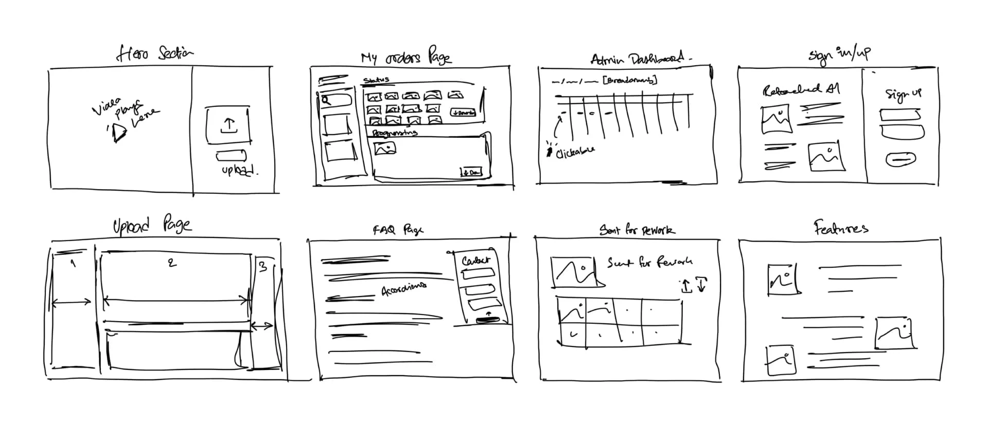
Rapid Ideation
I led rapid ideation sessions to explore multiple layout paradigms, quickly discarding ideas that were technically unfeasible given our API constraints.
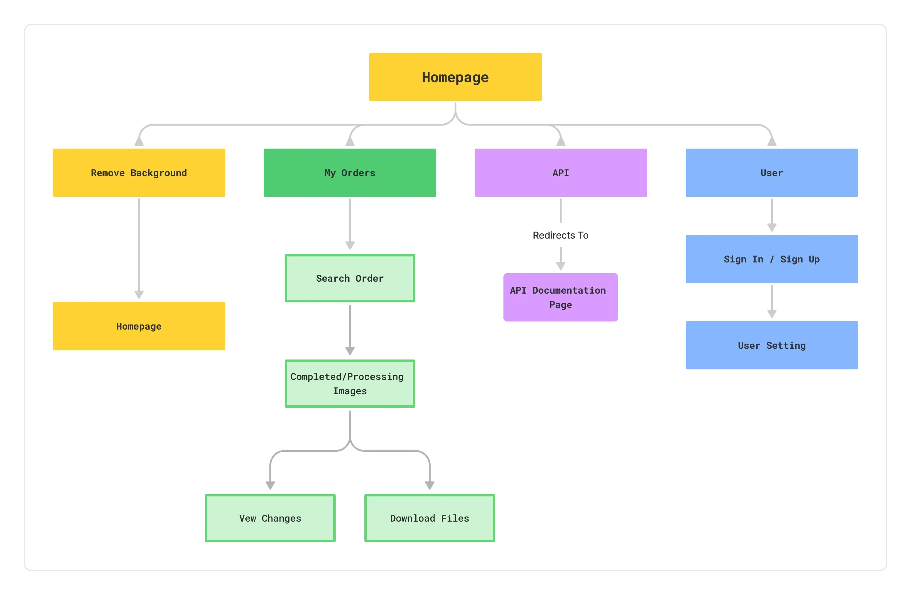
Information Architecture
I completely restructured the app's taxonomy, grouping complex ML capabilities into task based categories to drastically reduce cognitive load for first time users.
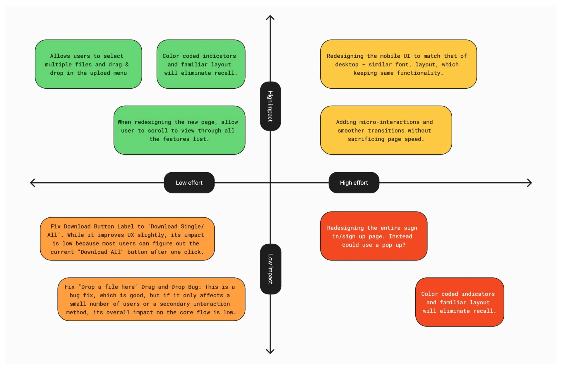
Solution Prioritization
I partnered with PM and Engineering to ruthlessly prioritize features based on user impact and technical feasibility, ensuring we shipped a high quality V1 within our 3 month constraint.
Building a Dev Ready Design System
Leveraging my frontend engineering background, I didn't just design screens—I architected a token based design system in Figma. This shared technical language allowed our lean team of 3 developers to completely overhaul the legacy frontend on schedule.
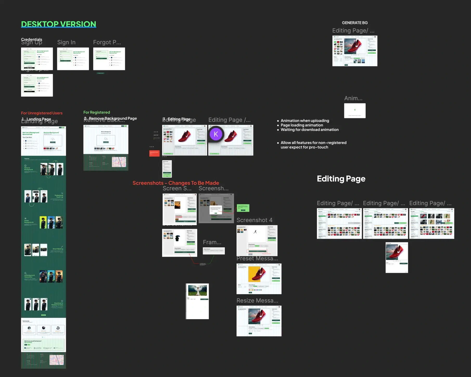
Design Board
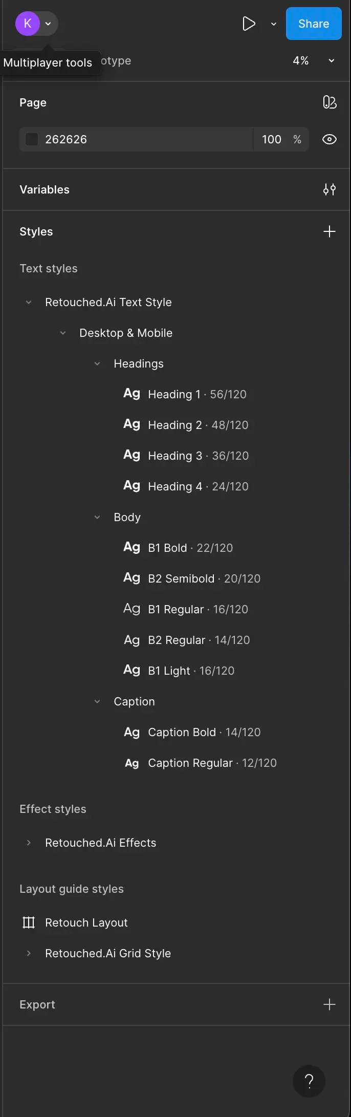
Typography & Style Guide
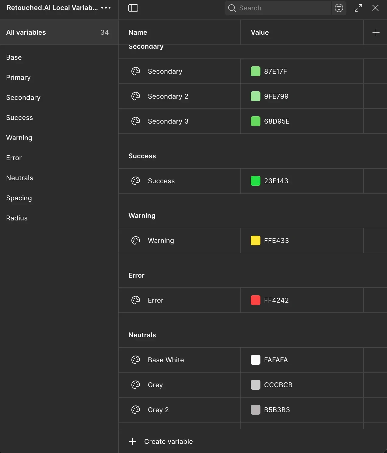
Local Design Variables
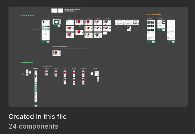
24 Master Components
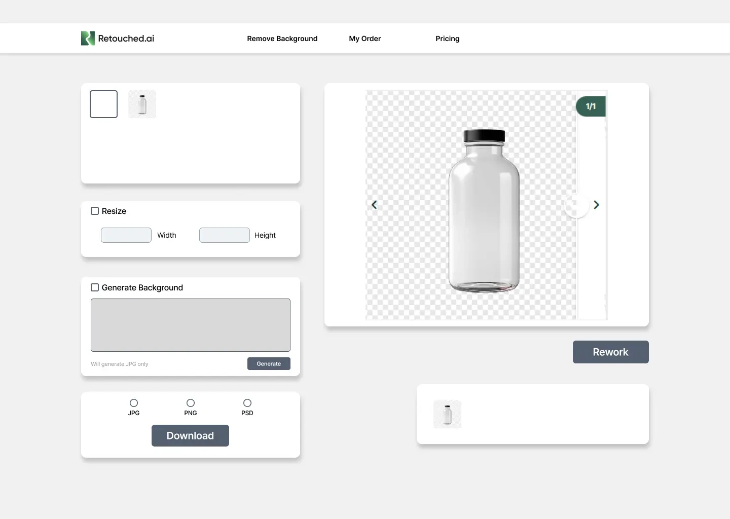
Input Fields
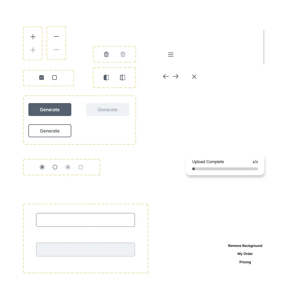
Buttons & Selection
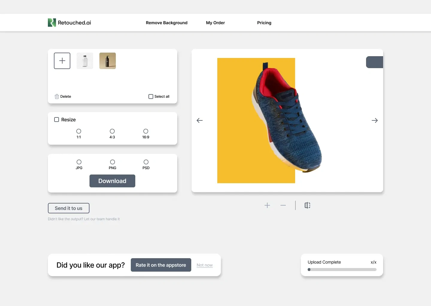
Navigation
Closing the Design to Code Gap
With three engineers and a three month clock, a Figma file alone was not going to get us across the finish line. I stood up a design system that lived in both design and code — using AI tooling and a Model Context Protocol server to push Figma components straight into Tailwind. Engineers could pull a one to one match of what I designed instead of rebuilding each component by hand.
I also ran tight syncs with engineering and stakeholders so we stayed aligned on what shipped first. That collaboration cleared 95% of UI issues on the first QA pass and kept the redesign on schedule.
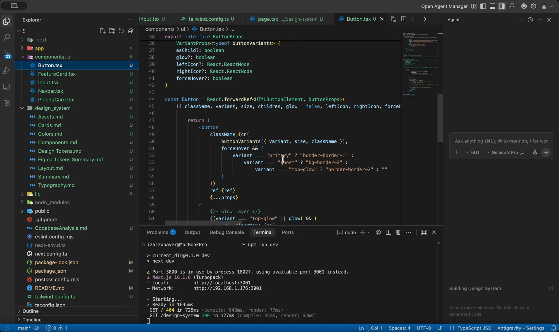
Figma tokens flowing into production Tailwind components via MCP
What Shipped
Here is how we transformed the product. Every design decision was anchored in reducing cognitive load, building trust, and driving users toward successful task completion.
Before: Hero Section
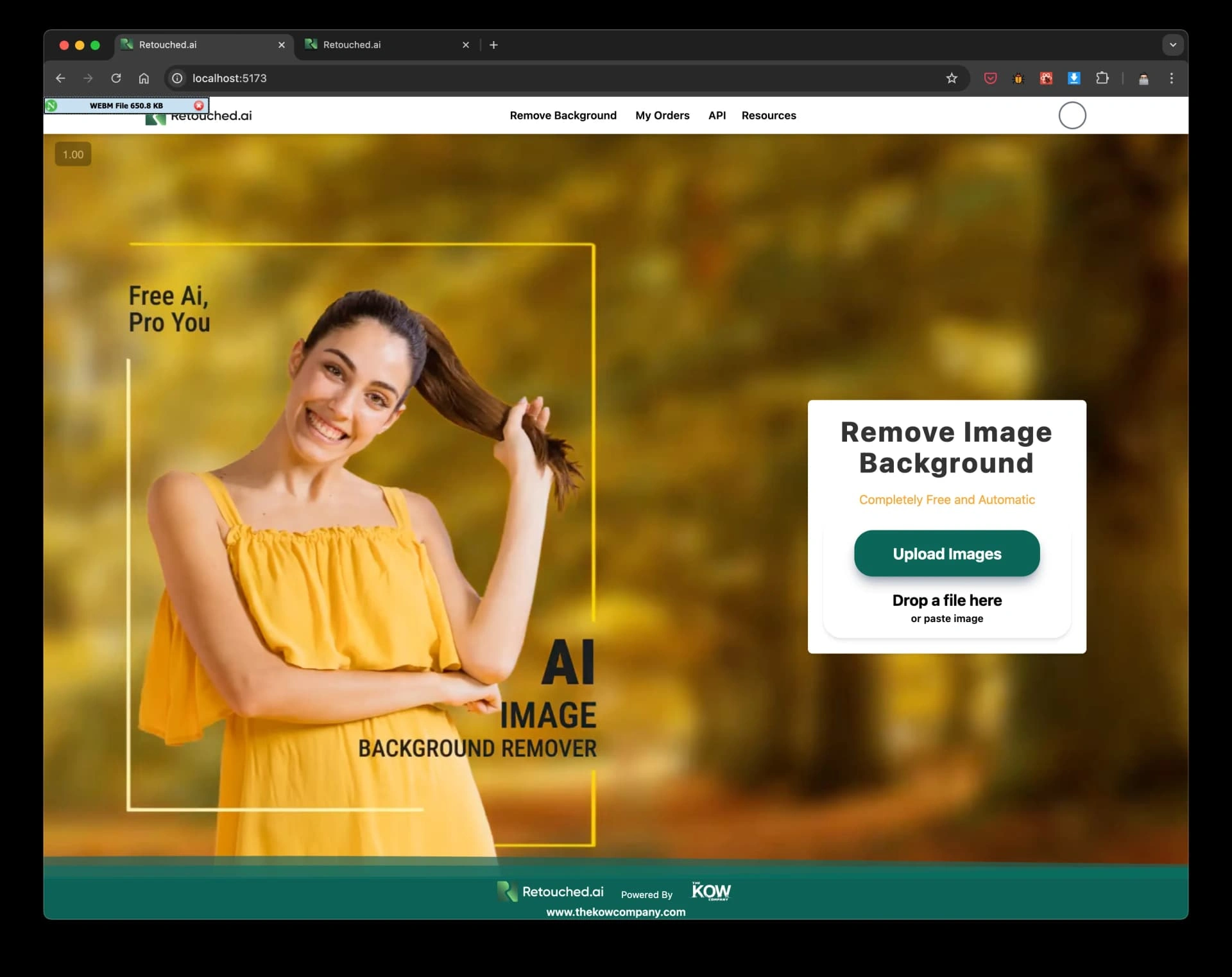
After: Redesigned Hero
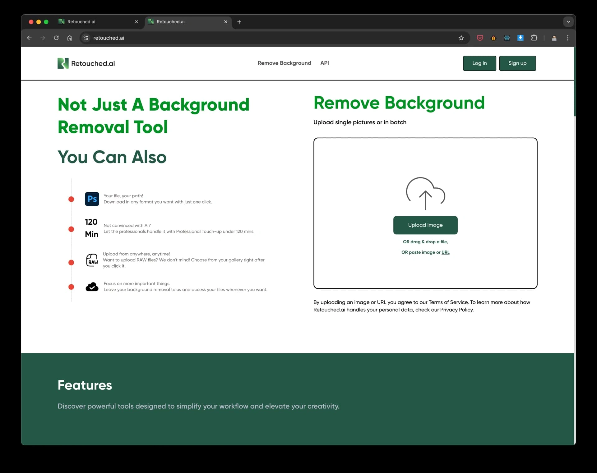
Landing Page
The original landing page failed to communicate value. I owned the end to end redesign of our primary acquisition surface, establishing immediate trust through clear visual hierarchy and guiding users directly into a frictionless conversion funnel.
*This redesign decreased bounce rates by 45% and served as the primary driver for our 200% boost in premium conversions.
After: First Section
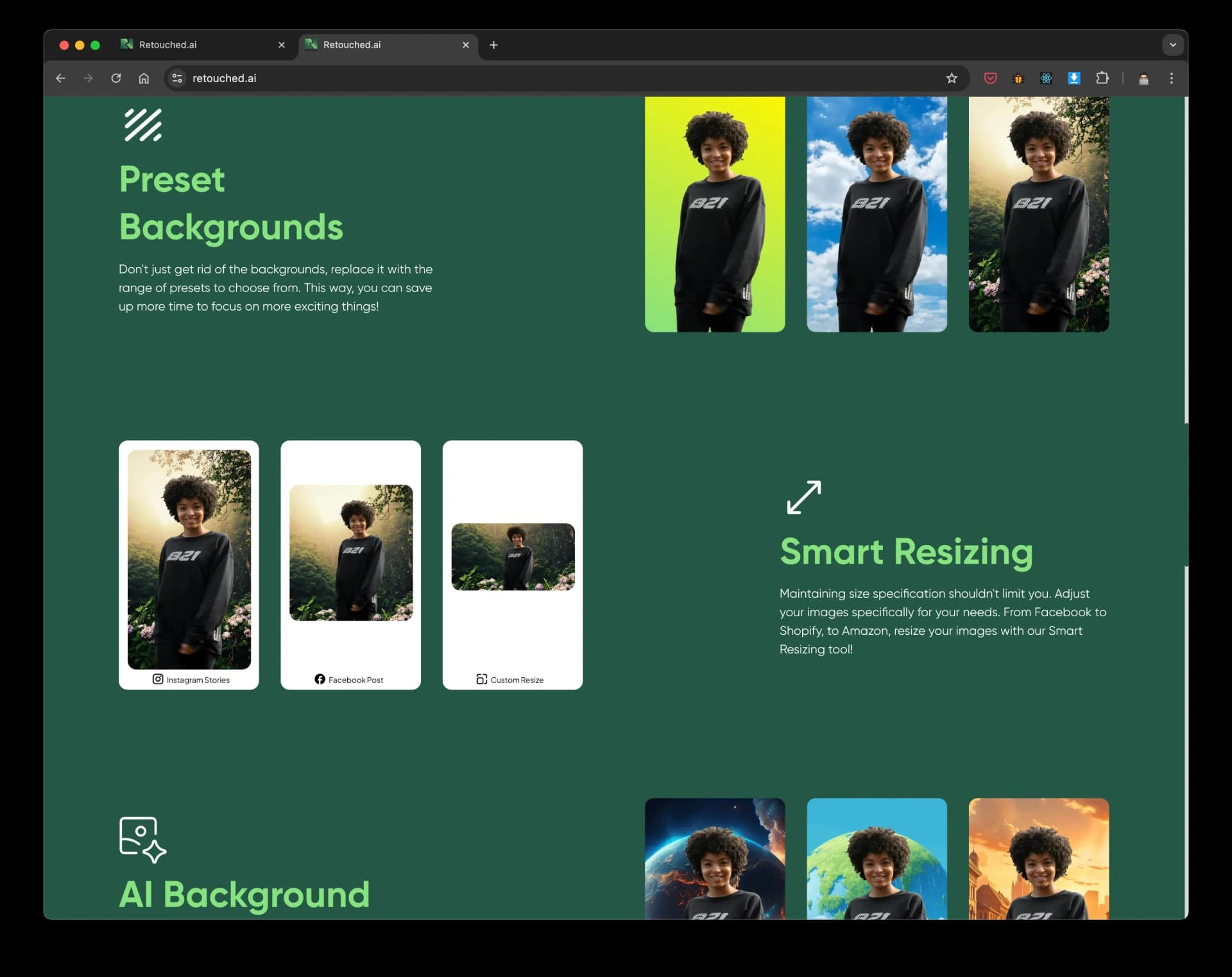
After: Footer
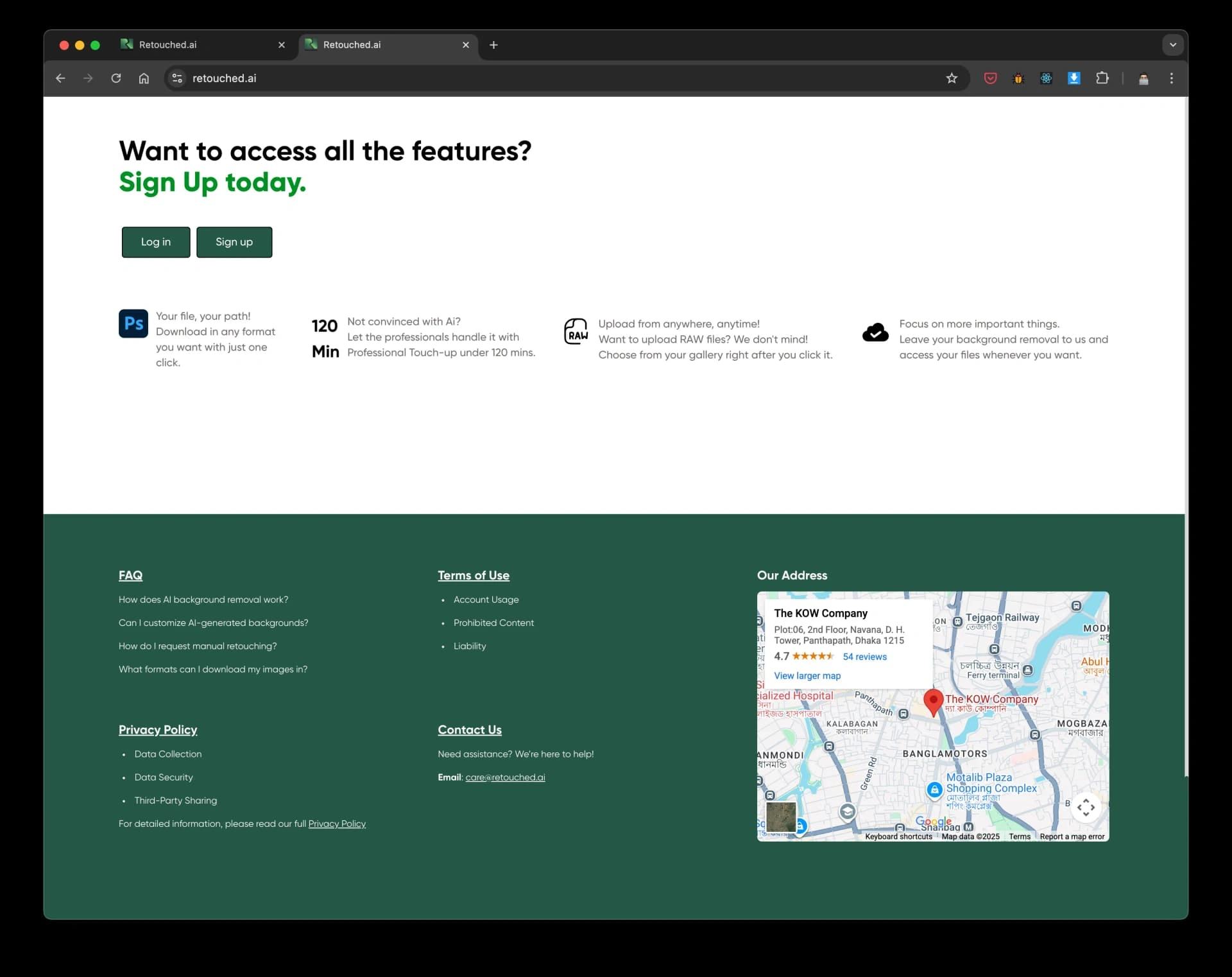
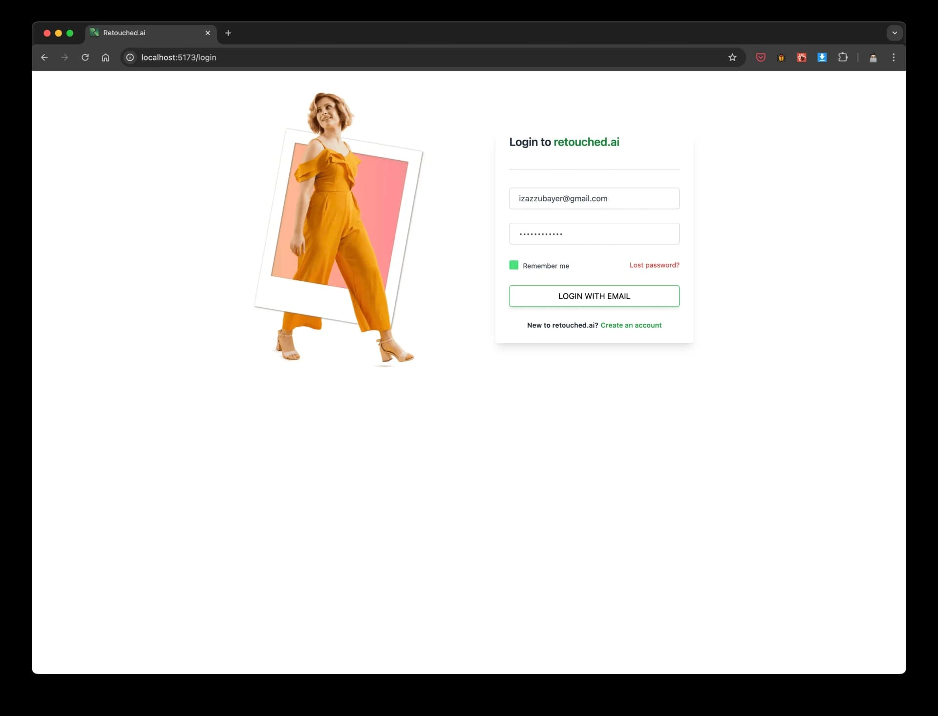
Before: Login
After: Signup Flow
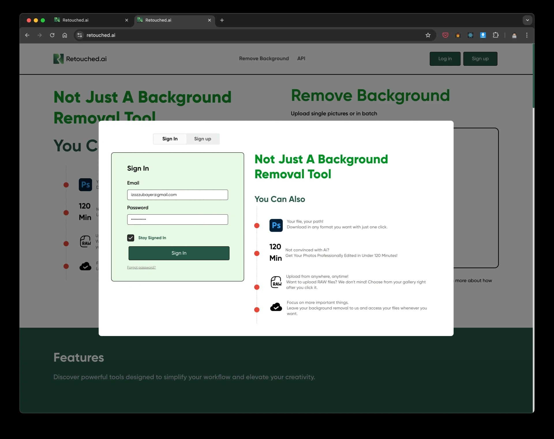
Authentication
I completely replaced the disjointed login flow with a guided signup wizard. By introducing step by step validation, I reduced entry friction and set a professional tone from the first interaction.
*This streamlined onboarding flow directly decreased drop off by 40% and improved sign-up completion rates.
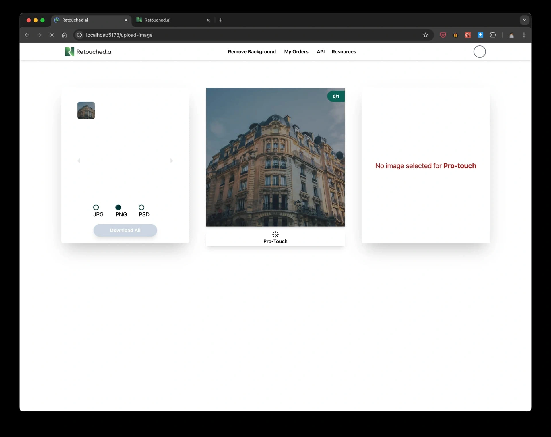
Before: Upload
After: Upload Processing
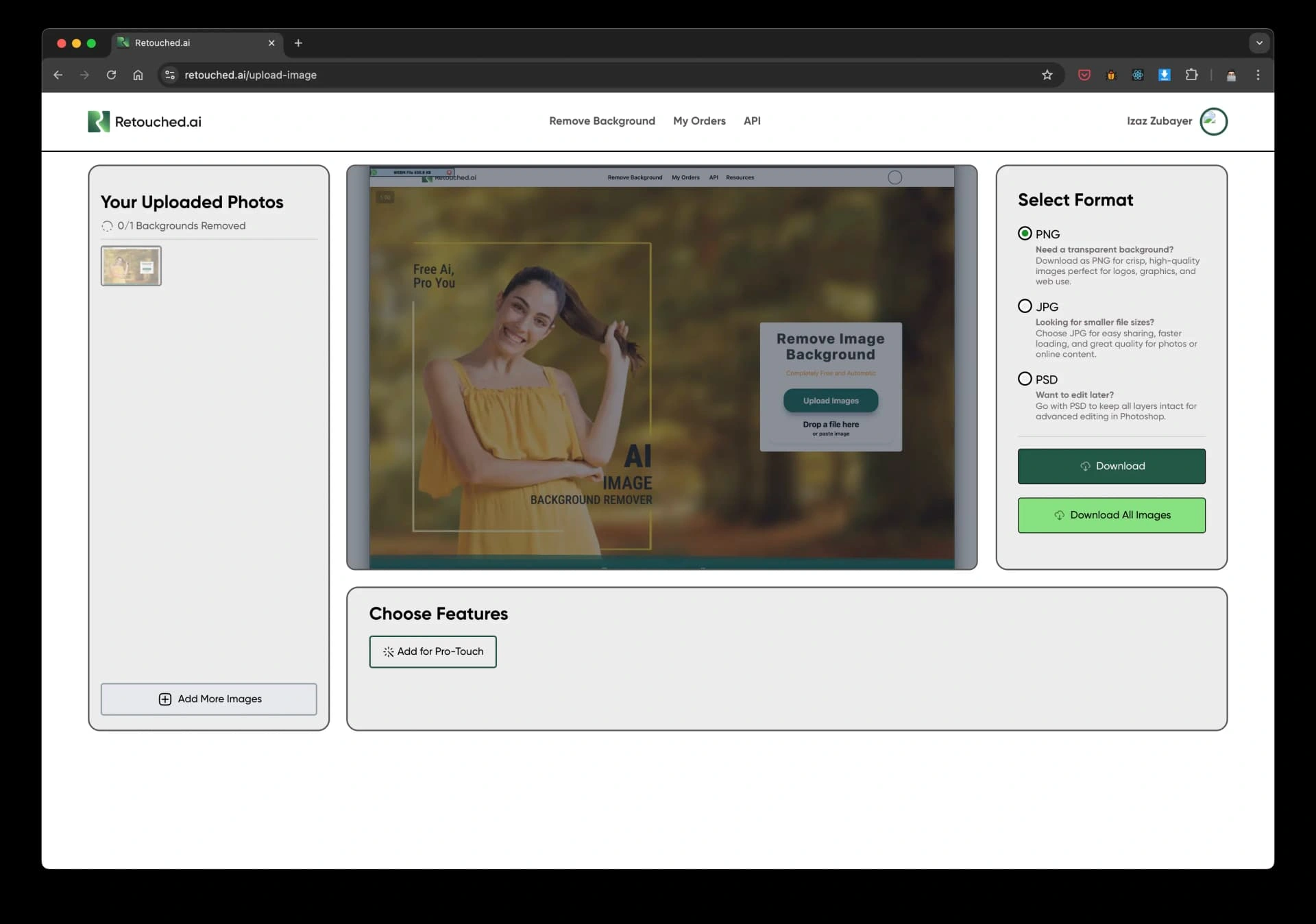
Real Time Visual Feedback
To address the confusion identified in research, I partnered with engineering to introduce instant previews and real time progress indicators, so users could understand what was happening and what to expect next during image processing.
*This transparency reduced upload abandonment by 60% and contributed to the 86% overall reduction in measured user friction.
Before: Dashboard
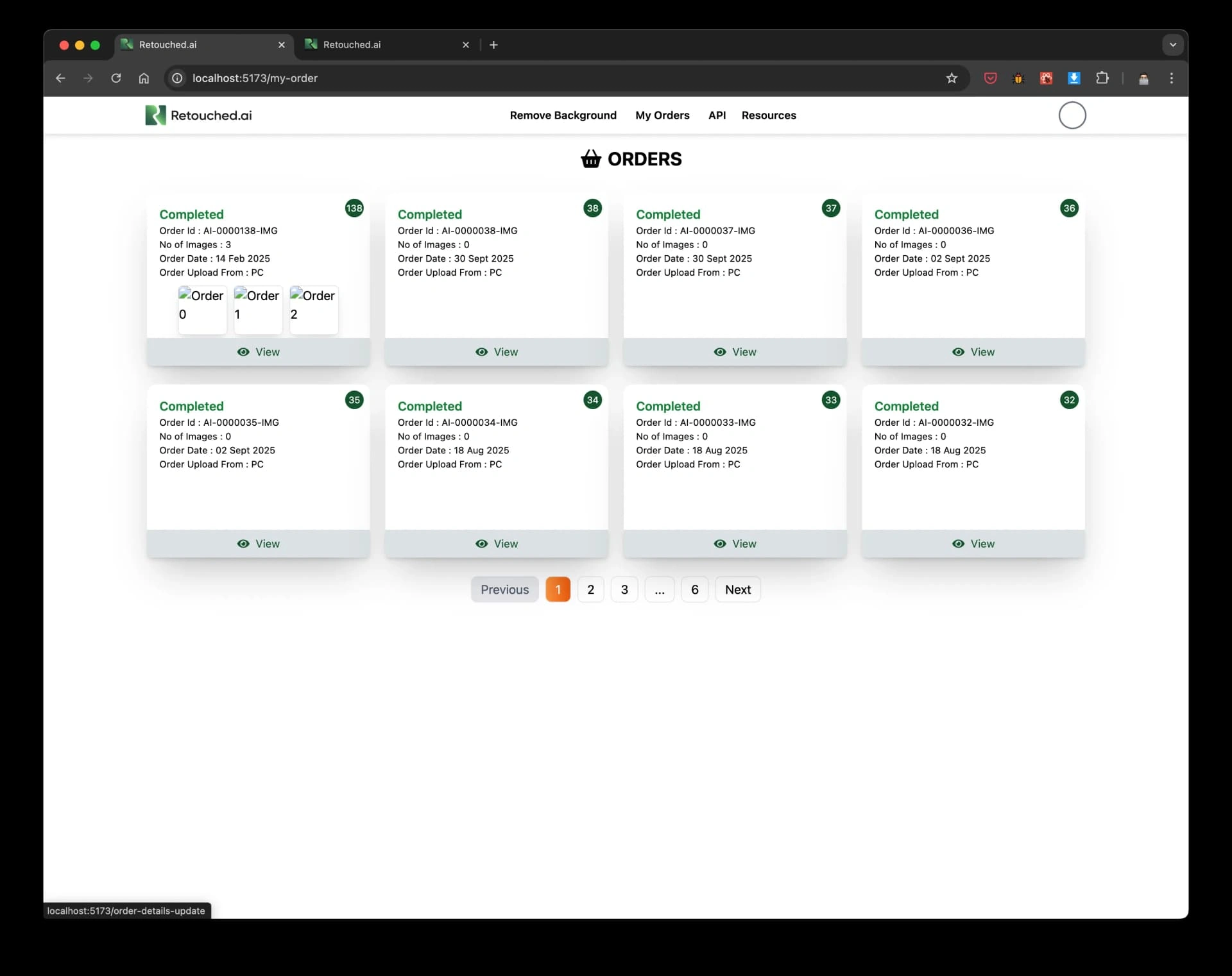
Before: Details
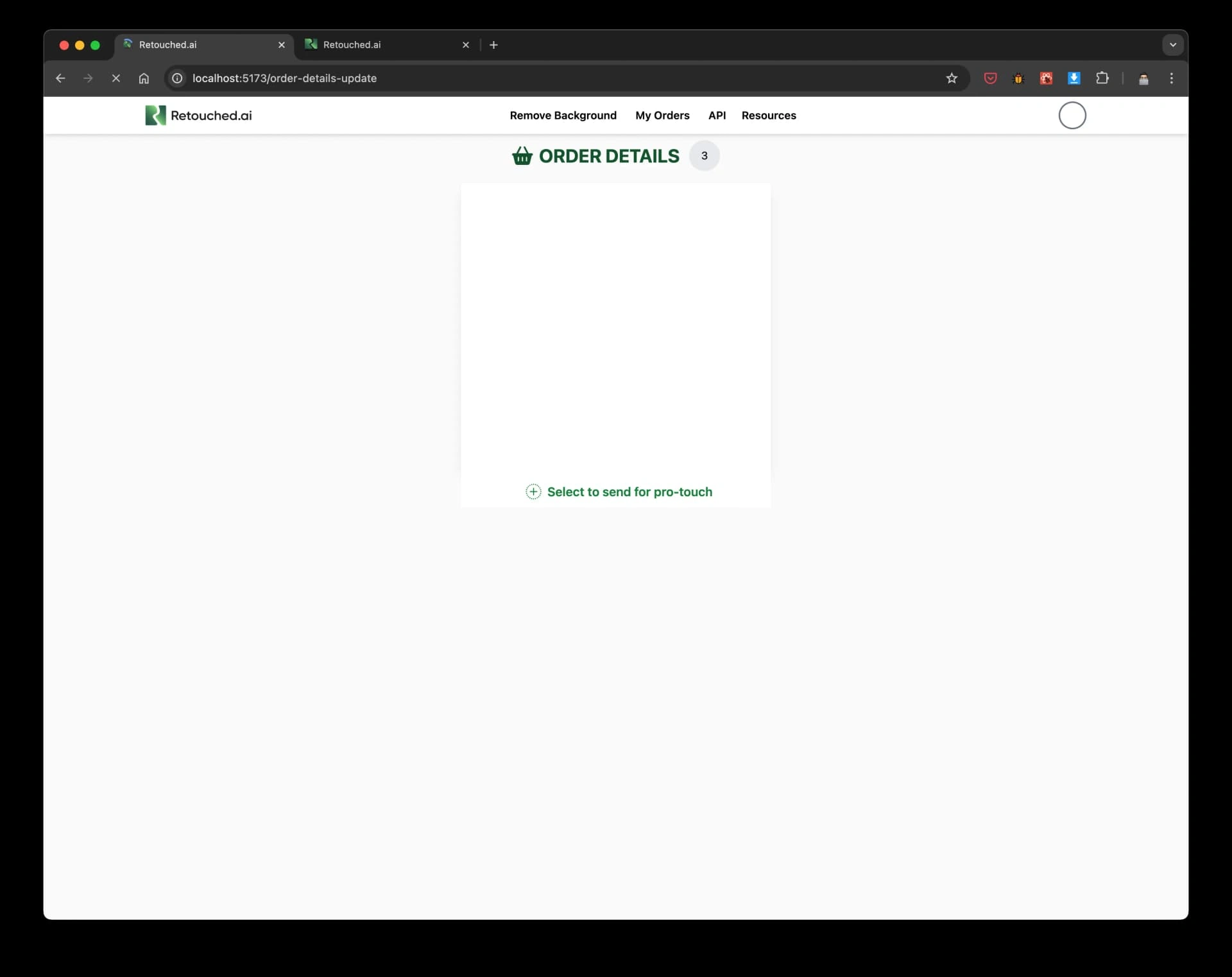
Before: Account
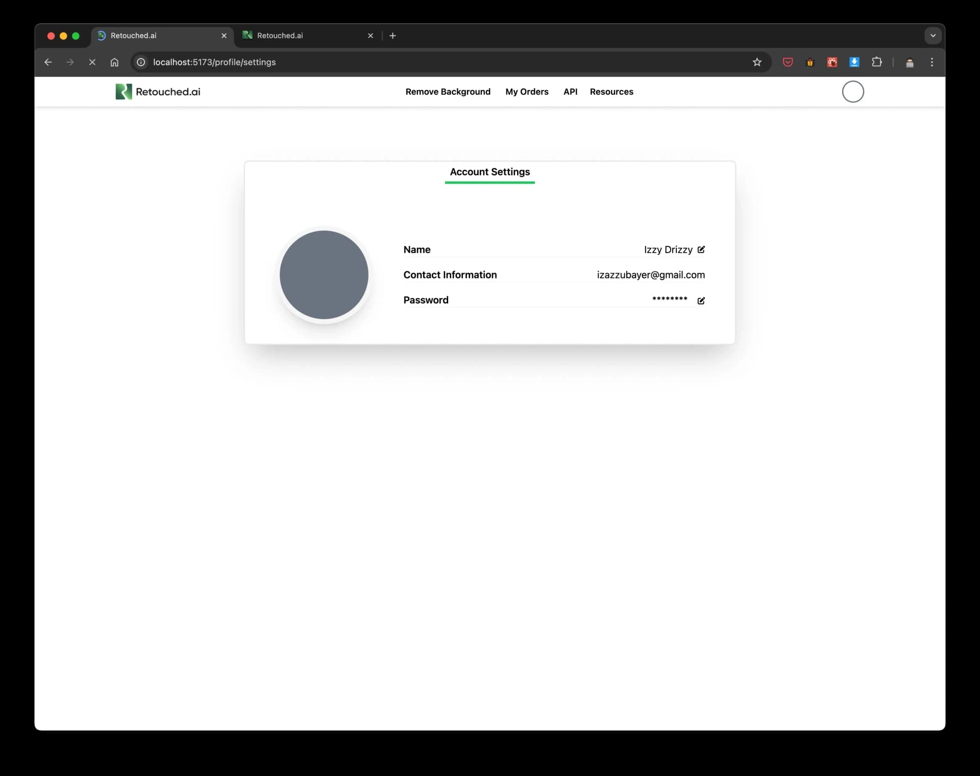
After: Dashboard Overview
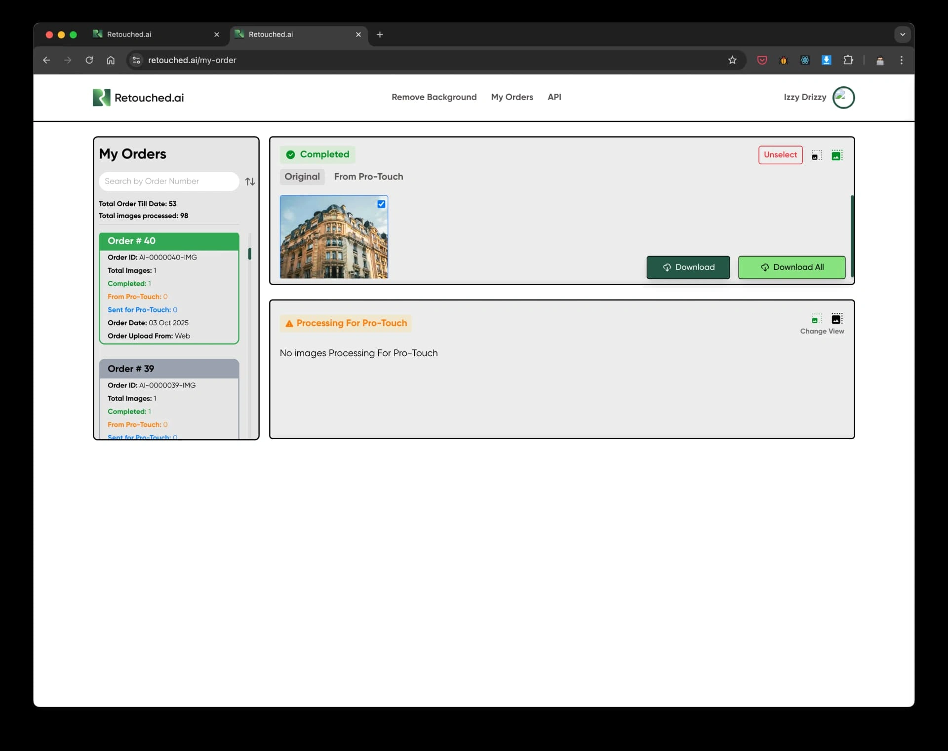
After: Order Details
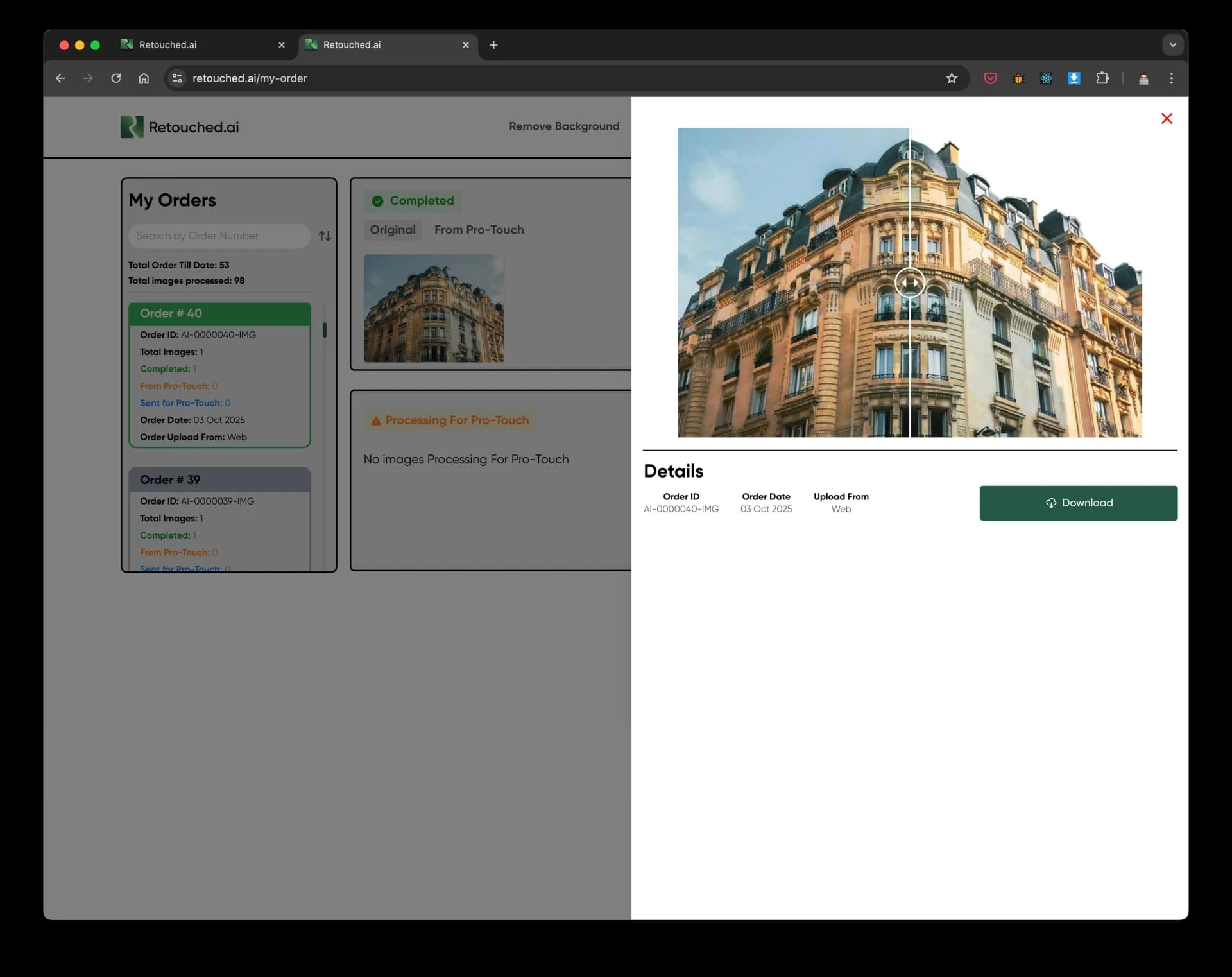
After: Dashboard Expanded
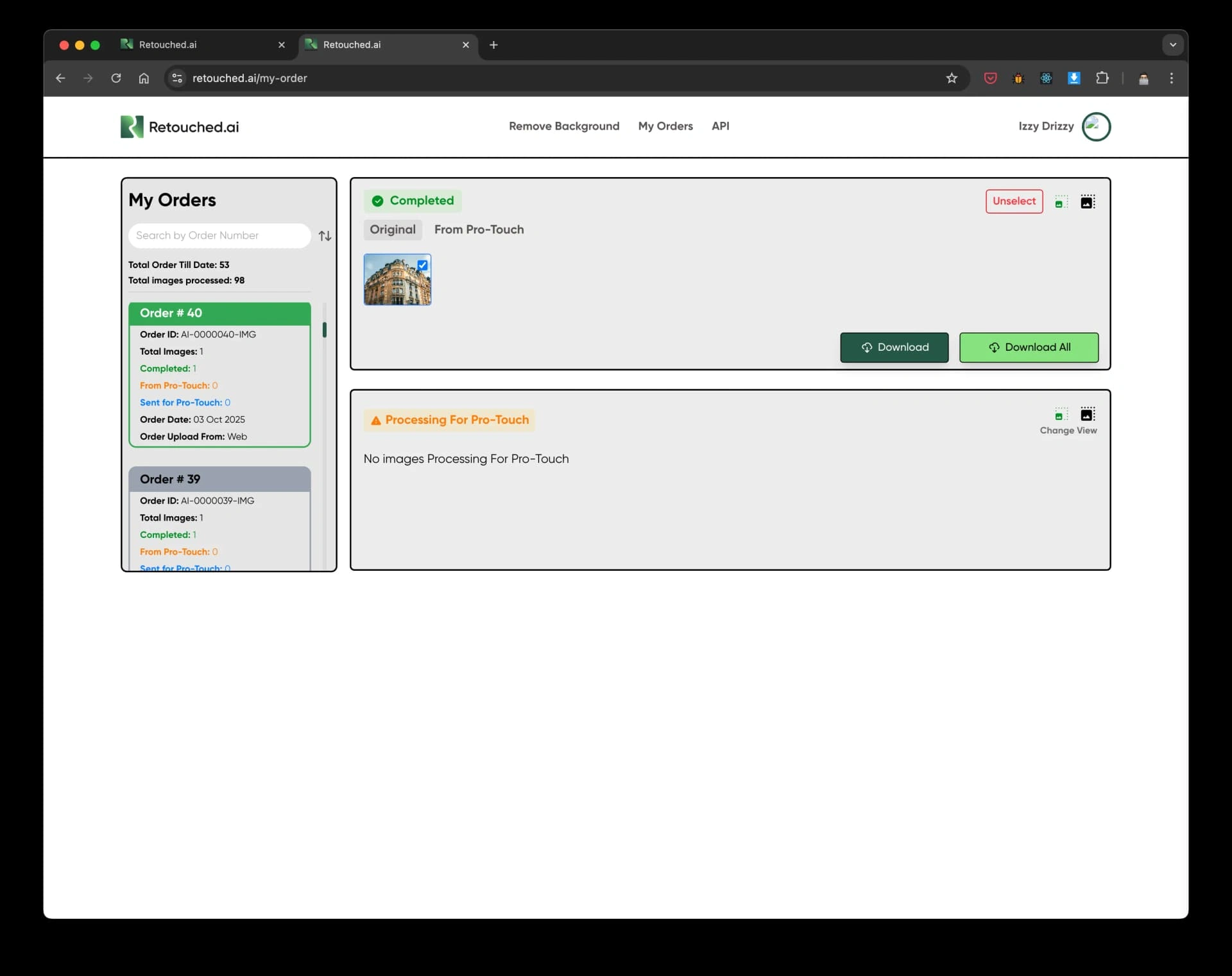
Calibrated AI Controls & Cross Device Fluidity
I replaced the cluttered, intimidating control panel with a "Smart Defaults" system. By utilizing progressive disclosure, users could achieve professional results in one click, with advanced controls hidden until requested. This unified design system ensured a frictionless editing experience from mobile to desktop.
*This ultimately drove our 92% task success rate.
Results & Impact
The redesign directly moved the needle on our core business metrics, successfully scaling platform usage from 40,000 to 60,000 images processed per year.
200%
Premium Conversion
Driven directly by progressively disclosing paid capabilities within the simplified workflow.
92%
Task Success
Achieved for standard editing workflows, representing a 25% improvement over the legacy platform.
86%
Reduced Friction
Achieved by streamlining the ordering pipeline and introducing real time visual feedback.
4.6/5
User Satisfaction
Overall platform user satisfaction scores surged from 3.4/5 post redesign, with a 40% boost in onboarding completion.
What I'd do differently
I would establish deeper technical validation loops with the ML engineers much earlier. We bumped into API latency and model animation constraints midway through high fidelity design, which required pivoting. Getting into the technical weeds of the ML constraints during the initial discovery phase would have accelerated our prototyping cycles.
Like this project
Posted Aug 13, 2026
Led end-to-end redesign of Retouched.ai, increasing premium conversion by 200% and scaling usage to ~60,000 images processed per year.
Likes
0
Views
2