Still North – A Brand Identity Rooted in Quiet Ritual
Mo Kadoura

The Brief
To design a comprehensive brand identity for a new, high-end wellness and skincare brand. The core concept needed to communicate Nordic ritual, elemental purity, and a philosophy of "quiet luxury" that would resonate with a mindful, modern consumer.
The Concept
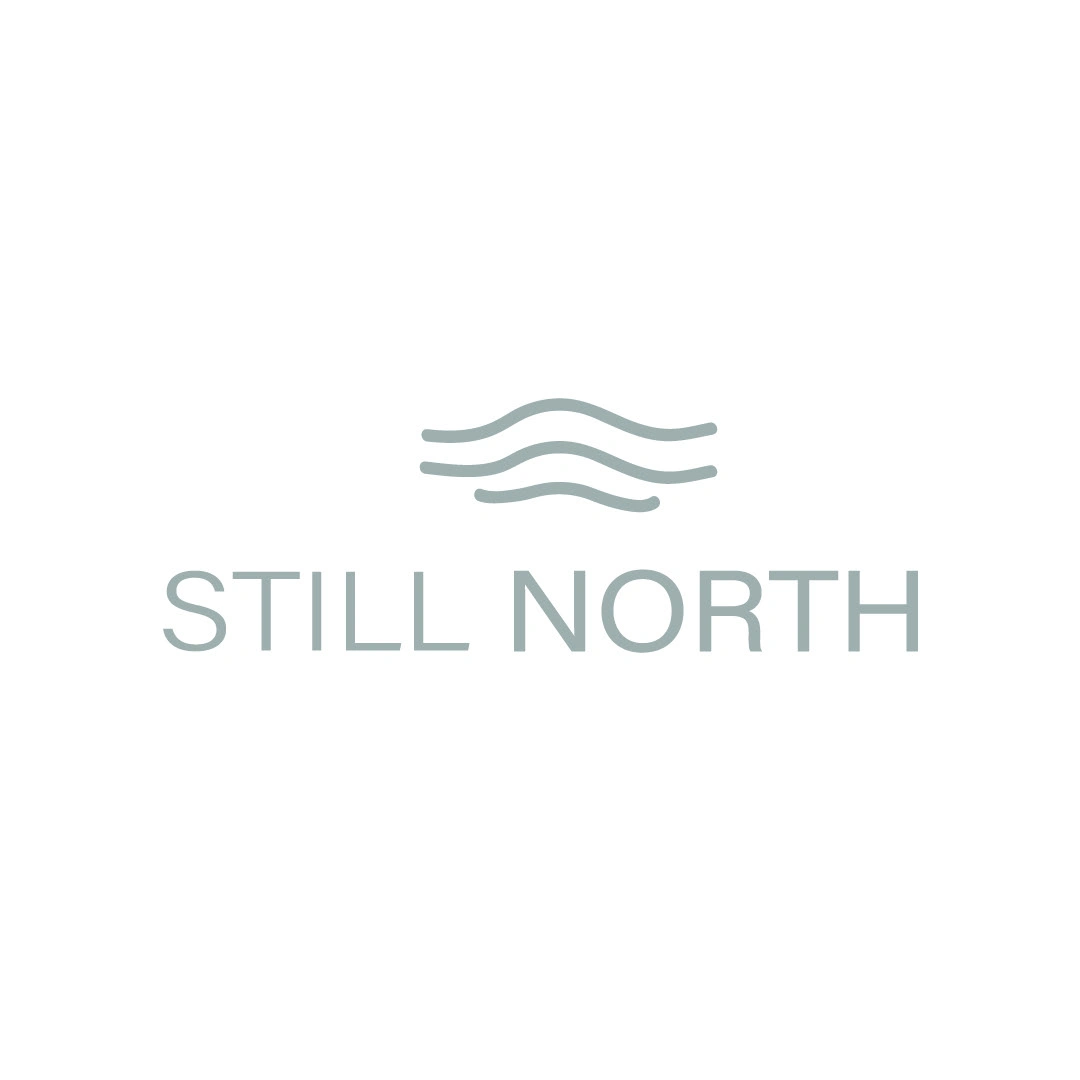
The brand foundation is built upon the name I developed: Still North. This name acts as the brand's guiding principle, suggesting a physical place as well as a mental state of peace, clarity, and stillness. It's a call to return to oneself through simple, meaningful rituals.
The Execution
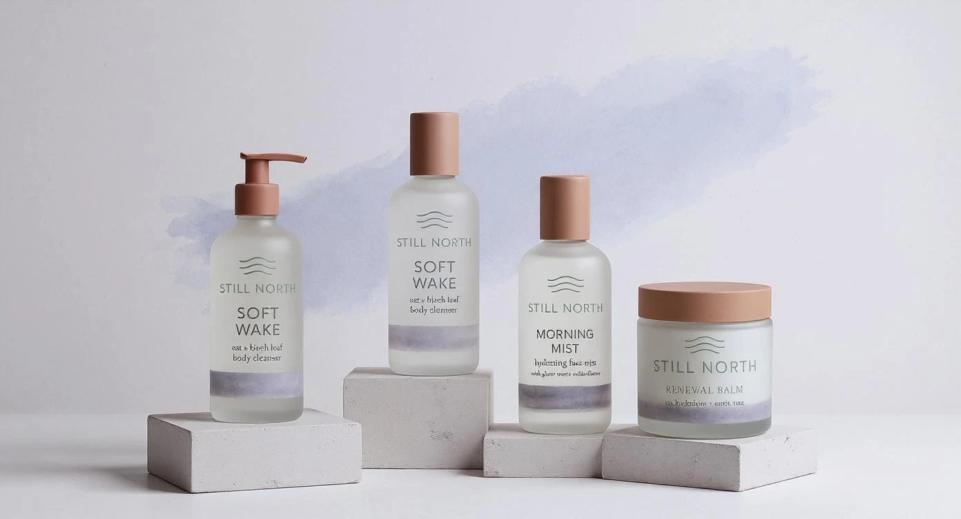
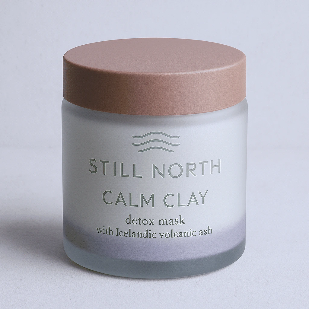
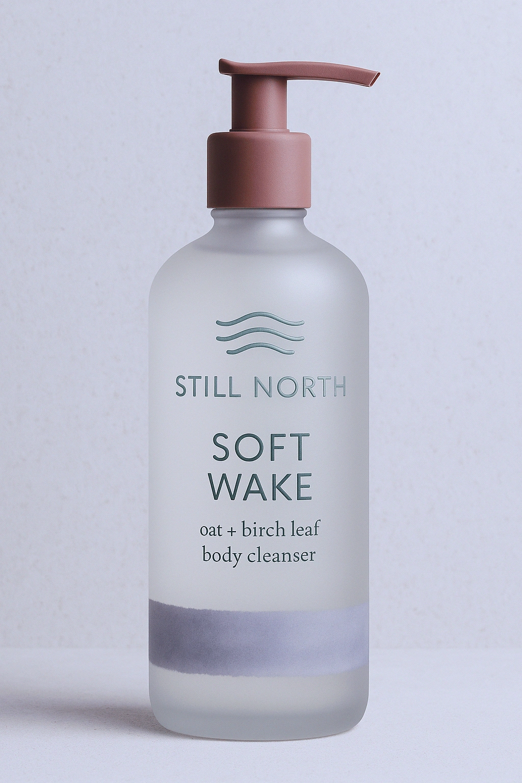
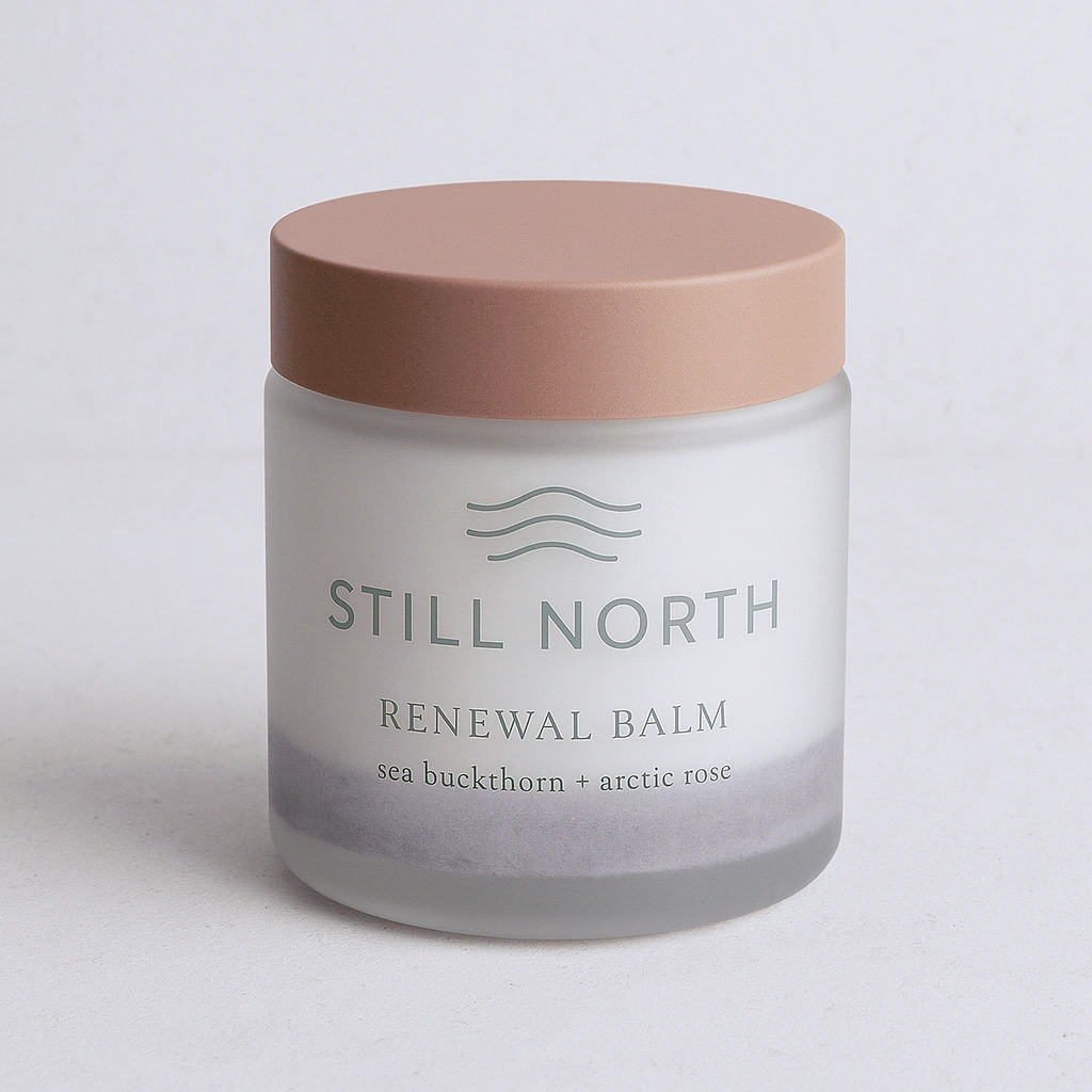
Visual Language: I developed a visual system that embodies Scandinavian minimalism while introducing a layer of emotional softness. The color palette is directly inspired by the Nordic elements—misty lavender gray, stone white, fjord blue, and soft moss green—creating a calming and natural atmosphere. Abstract watercolor textures and gentle gradients were introduced to mimic mist and water, preventing the minimalism from feeling cold.
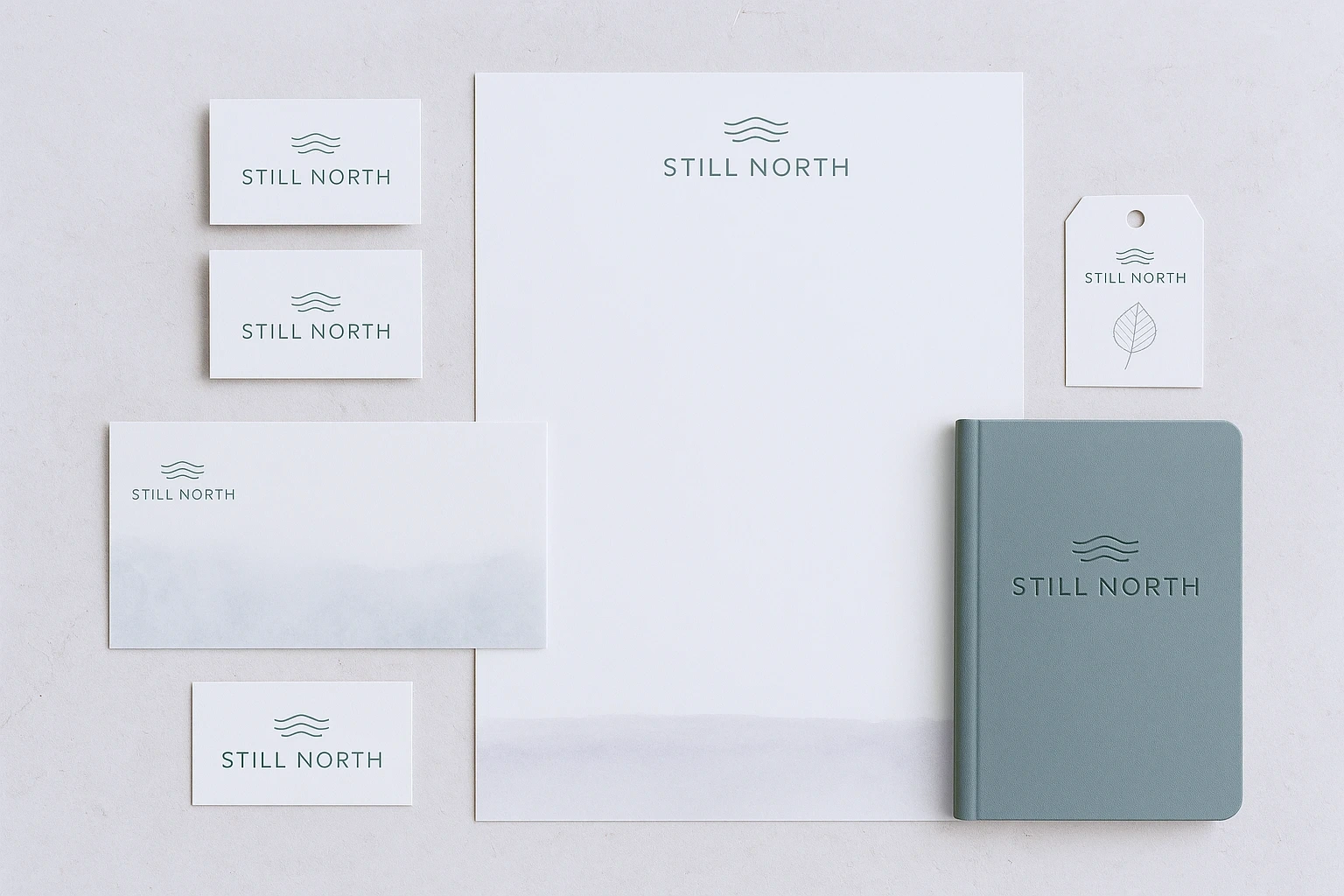
Typography: The typographic system was designed to be both functional and poetic. An elegant humanist sans-serif was chosen for body copy and product information for its effortless clarity. For headlines and brand statements, I paired it with a modern serif (like Canela or Cormorant) to add an editorial, sophisticated feel that aligns with the brand's "Kinfolk meets Aesop" tone.
Packaging & Tactility: The brand’s philosophy of quiet luxury is most tangible in the packaging. I designed a system using recyclable frosted glass bottles to give the products a pleasing weight and a soft, diffused look. Details like embossed text, clay-colored pump caps, and matte paper boxes with a simple foil-stamped logotype create a rich, tactile experience that feels considered and special.
Tone of Voice: The brand voice I crafted is calm, introspective, and sensory. Sentences are short and evocative, focusing on feeling and texture. Copy like, “Let stillness soak in,” and “From fjord to skin,” helps build an intimate connection with the consumer and elevates the product from a simple commodity to a cherished ritual.
The Result
The final brand identity for Still North is a cohesive and immersive world that feels authentic, luxurious, and deeply calming. Every element—from the logotype to the texture of the box—works in harmony to tell the brand's story and deliver on its promise of mindful self-care.
Like this project
Posted Aug 15, 2025
The core concept needed to communicate Nordic ritual, elemental purity, and a philosophy of "quiet luxury" that would resonate with a mindful, modern consumer.