Keystone: a calm, grounded brand for financial planning

Russ Muradov


Keystone is a financial planning platform that helps people make long-term money decisions with confidence: saving for a home, planning retirement, keeping several goals on track.
The challenge
Money is stressful, and many finance brands make it louder. Keystone needed a brand that feels calm and grounded, and that people trust with decisions they'll live with for decades.
The idea
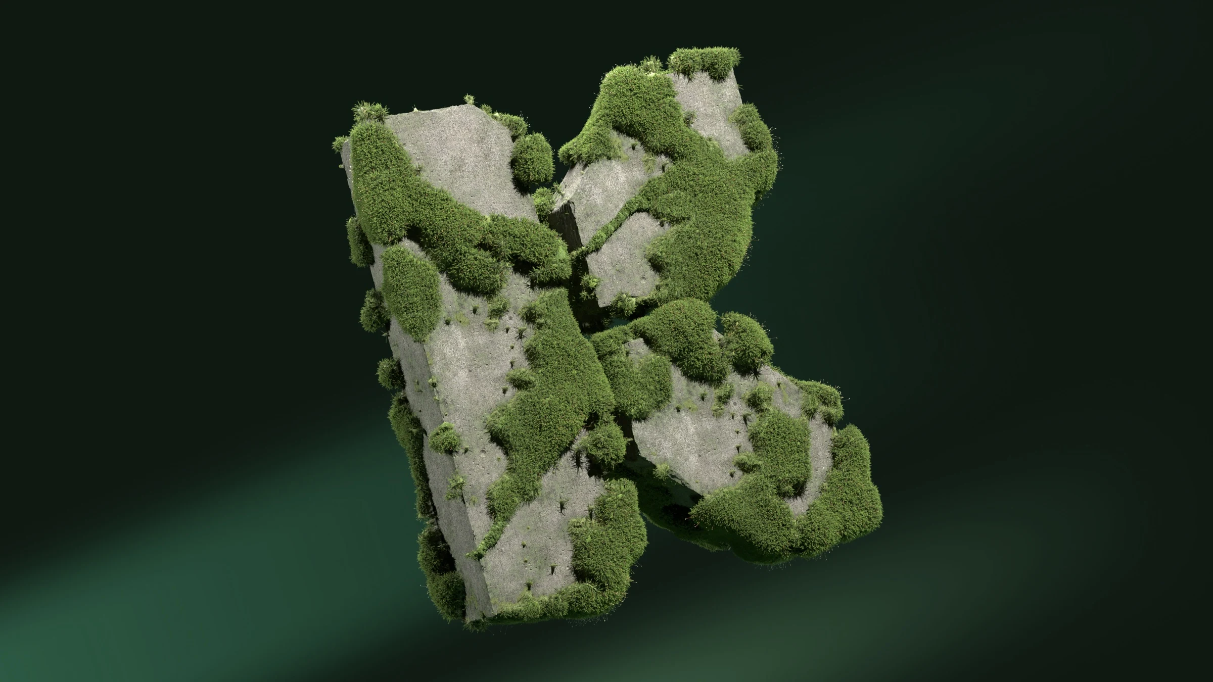
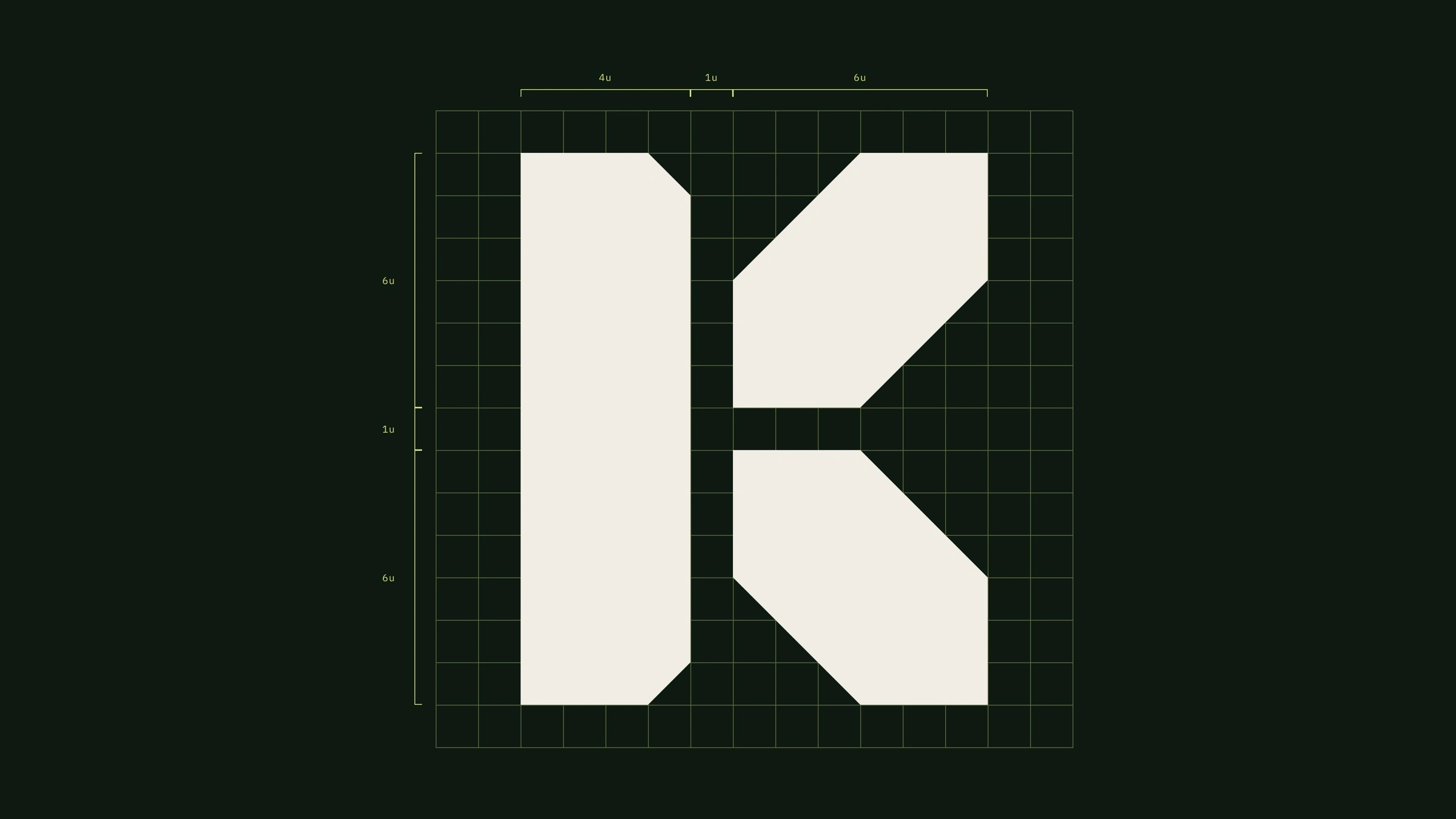
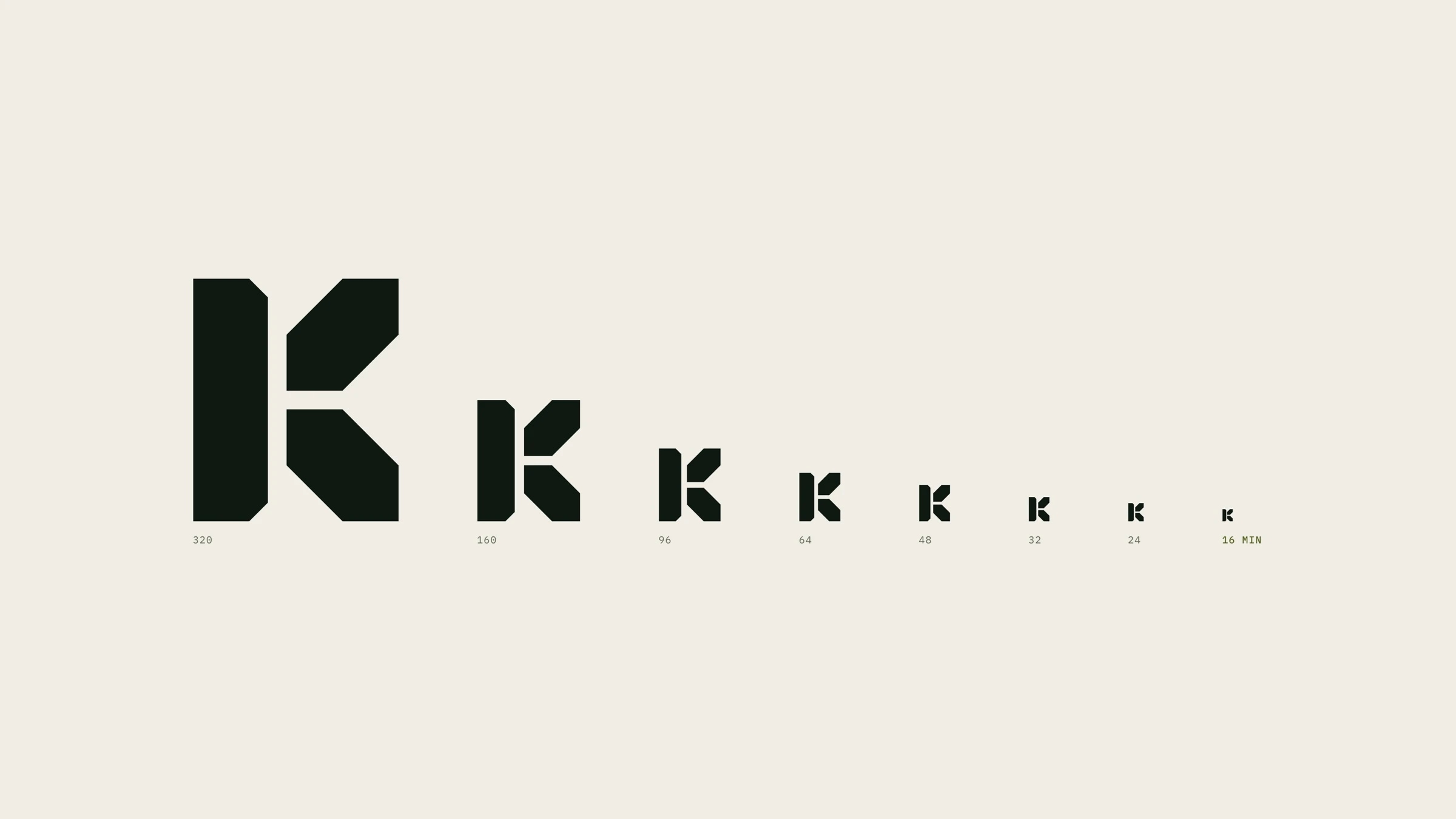
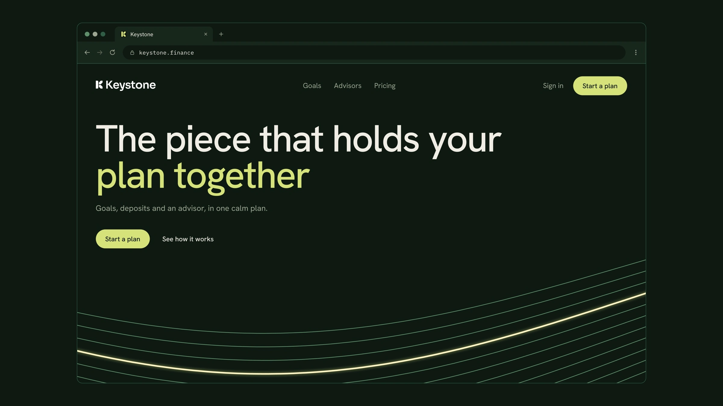
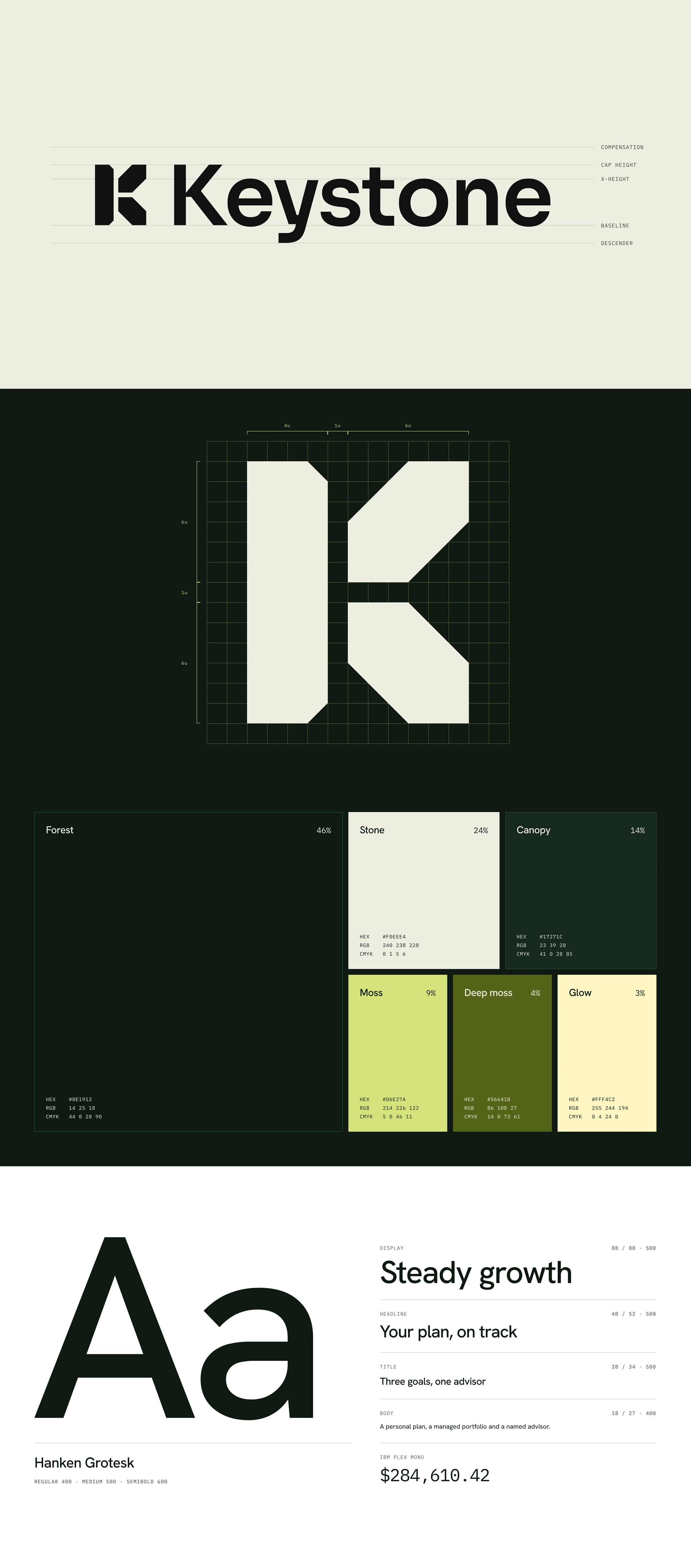
A keystone is the stone at the top of an arch. Take it out and the arch falls. Keystone's job is to be the piece that holds a person's money plan together. So the mark is a single solid K, built like a block of stone and drawn on a strict grid, so it holds from a billboard down to an app icon. The website says it in words: "The piece that holds your plan together."
What we delivered (Brand System, 24 days)
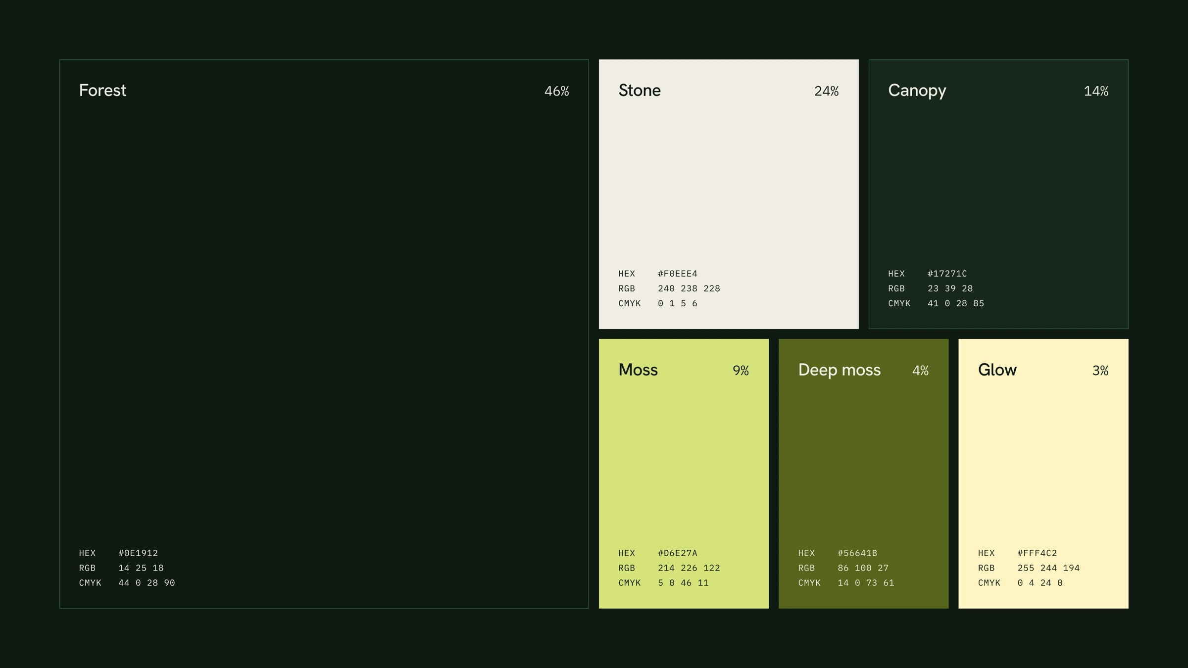
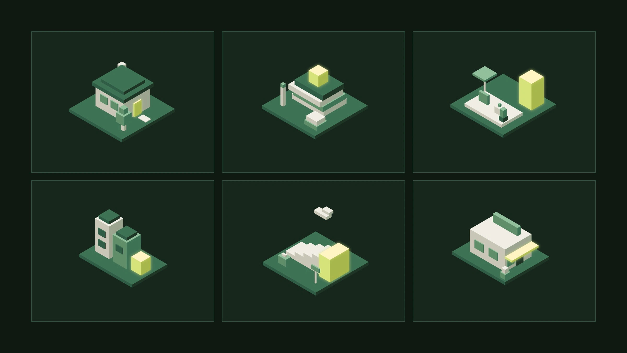
Brand identity: the K mark and wordmark, a named palette (Forest, Stone, Canopy, Moss, Deep moss and Glow), Hanken Grotesk type and isometric home and building illustrations
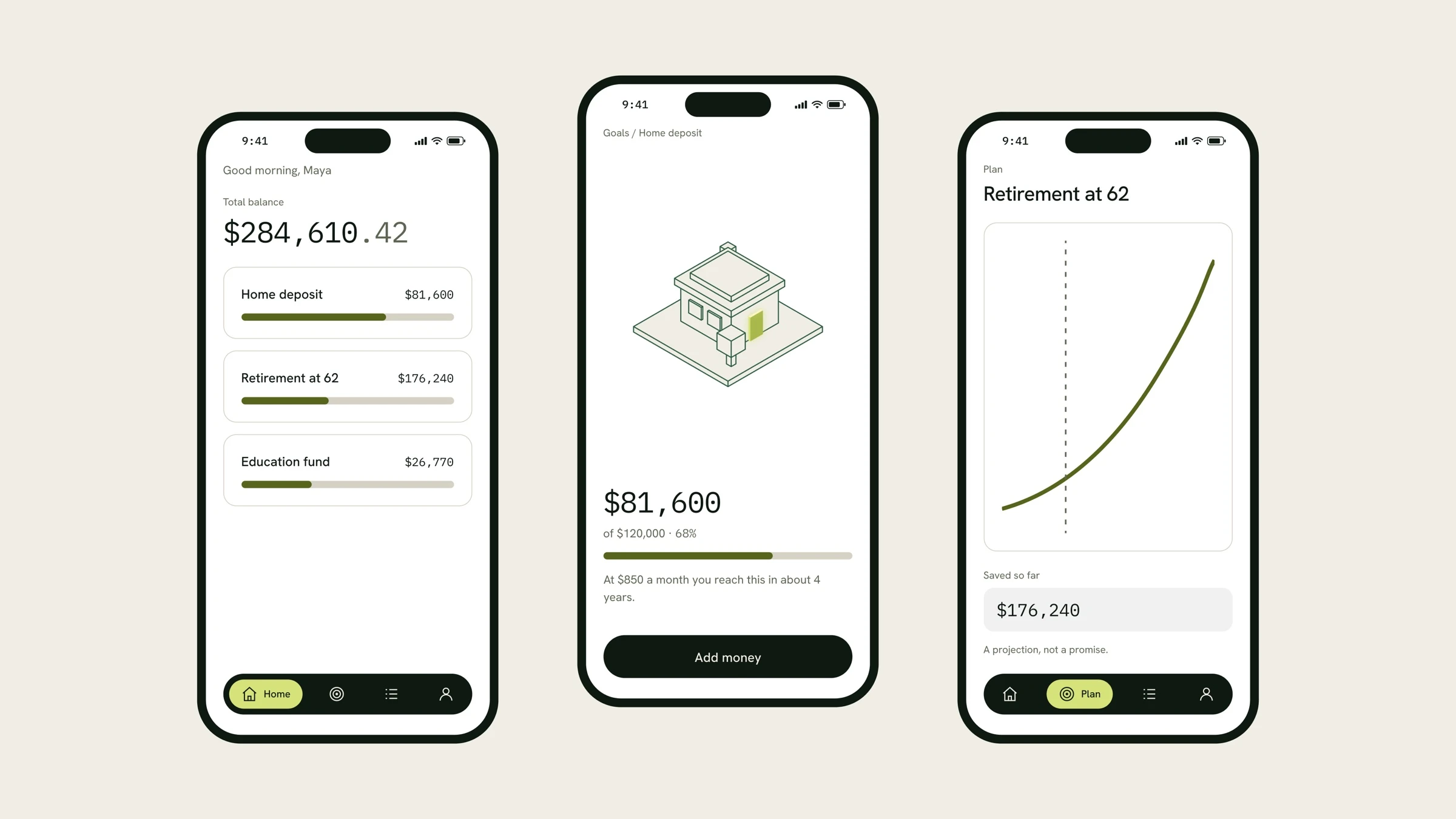
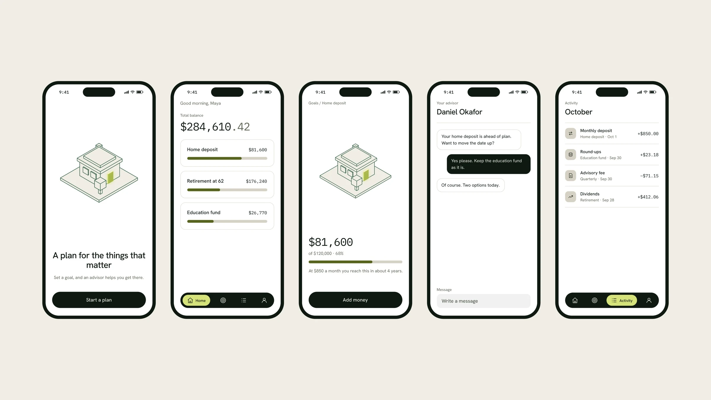
Product UI for the app: balances, goals and progress cards
The website
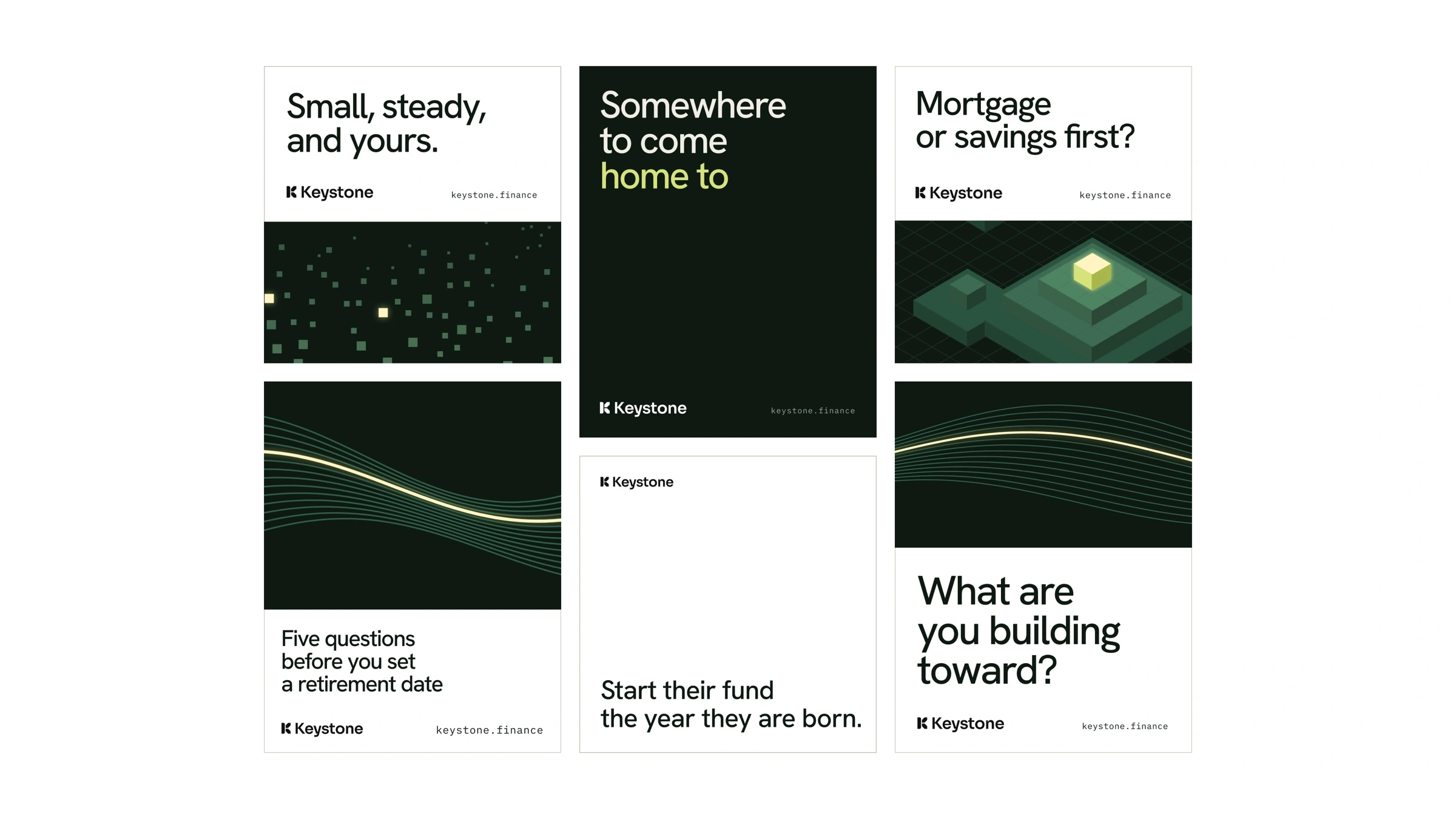
Social and ads: "Small, steady, and yours", "Somewhere to come home to"
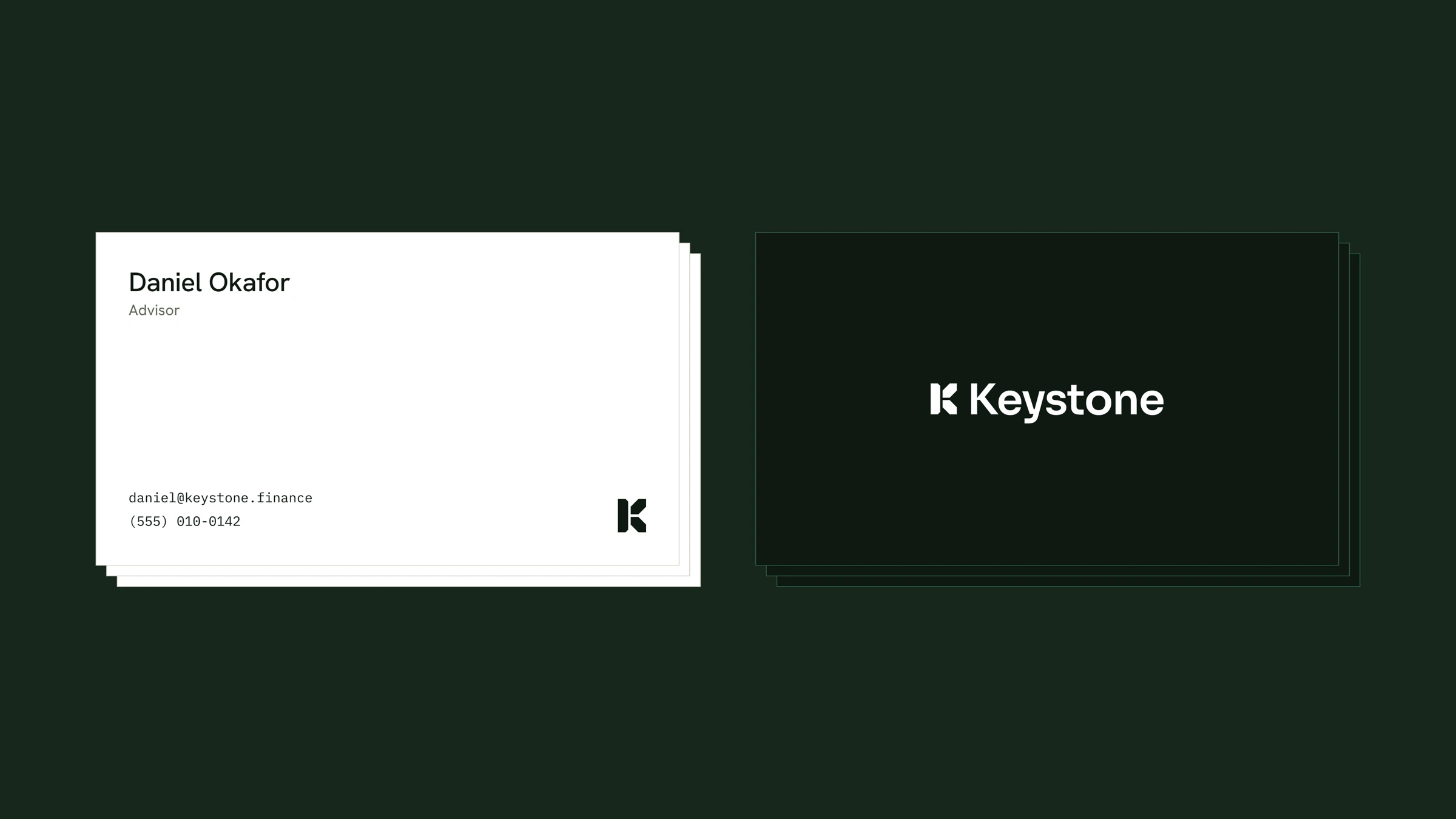
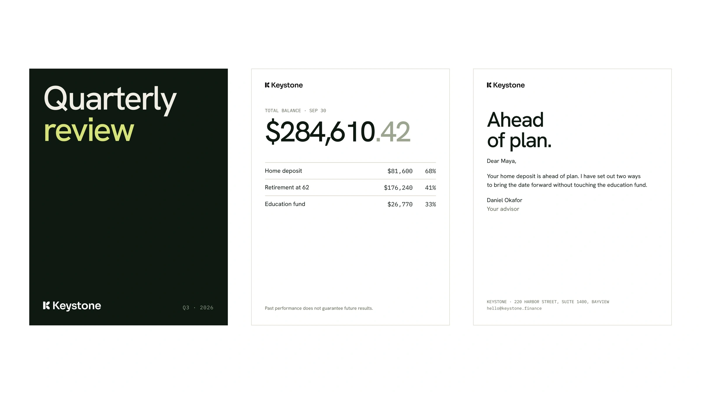
Print: stationery, business cards and quarterly plan reviews
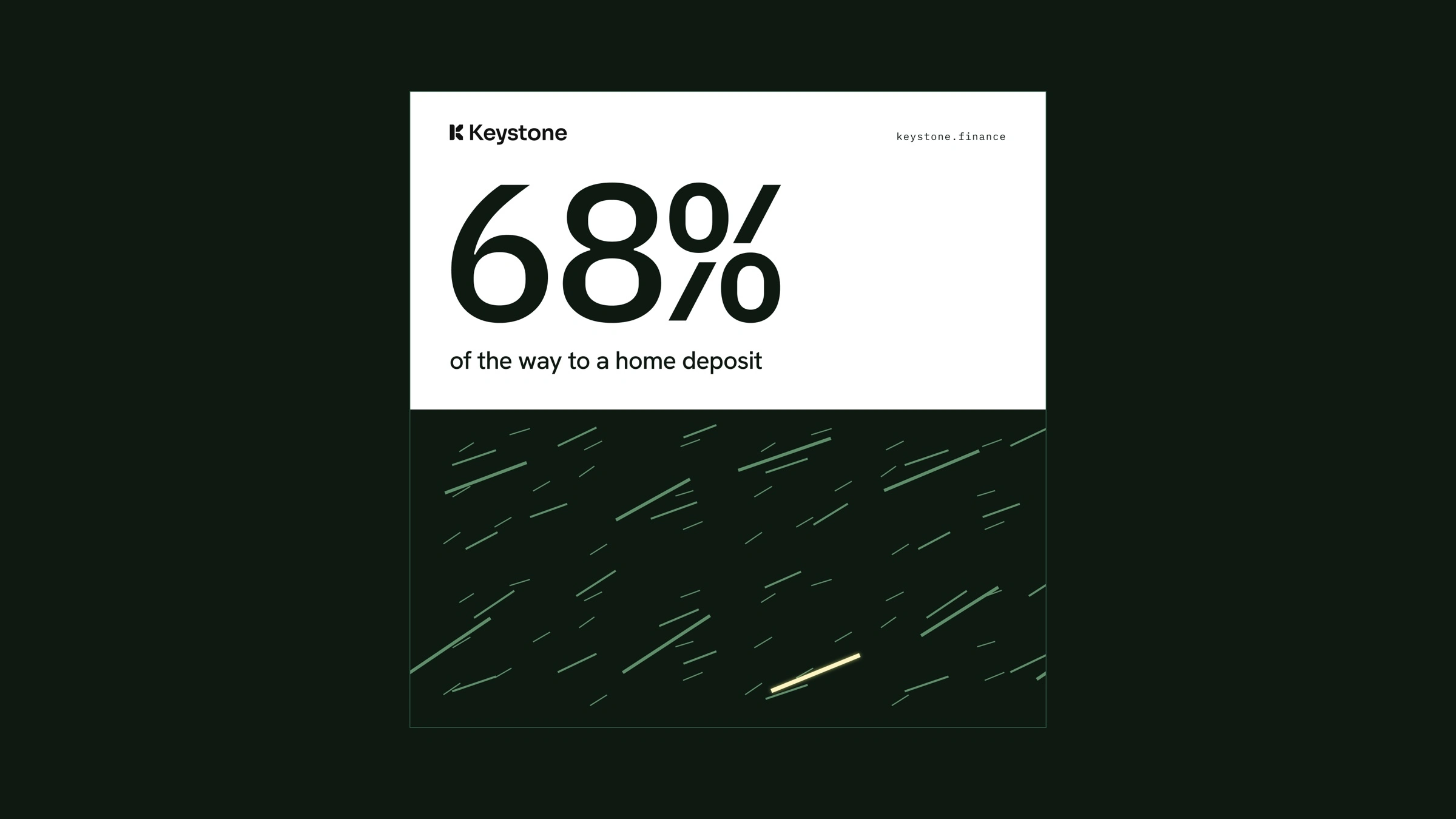
Motion: rising diagonal growth lines that run through the app, the ads and the printed reviews
Ready for AI
The team got guidelines, design tokens, templates and an AI instructions pack, so ChatGPT, Claude and Cursor stay on brand when the team uses them.
How we worked
A free consultation and a brand analysis, then three design directions, two feedback rounds and daily updates.
The result
One system, from the app to a printed plan review, delivered in 24 days, with files the team and its AI tools can use from day one.
Who this is for
Startups and growing teams that need a brand that works everywhere, including in their AI tools. Brand Identity takes 1-2 weeks, Brand System 2-4 weeks. Message me here on Contra to start.
Full case study: logopoint.co/work/keystone
Like this project
Posted Oct 19, 2026
A calm, grounded brand system for Keystone, a financial planning platform: the K mark, palette, app UI, website, print and motion, in 24 days.