How I Built a Fully Interactive Web Experience with Framer
Amanpreet Singh
Most websites look great on desktop but feel like an afterthought on mobile.
I kept seeing the same issues, animations felt dull, layouts broke, and the experience just wasn’t as engaging. But with over 60% of web traffic coming from mobile, that’s a huge problem.
So, when I built the Bright Life Creations website, I had one goal:
Make the mobile experience just as immersive as the desktop.
Framer gave me the flexibility to do that without compromising on performance, interactivity, or creativity.
This case study breaks down exactly how I did it and why Framer was the perfect tool for the job.
But first!
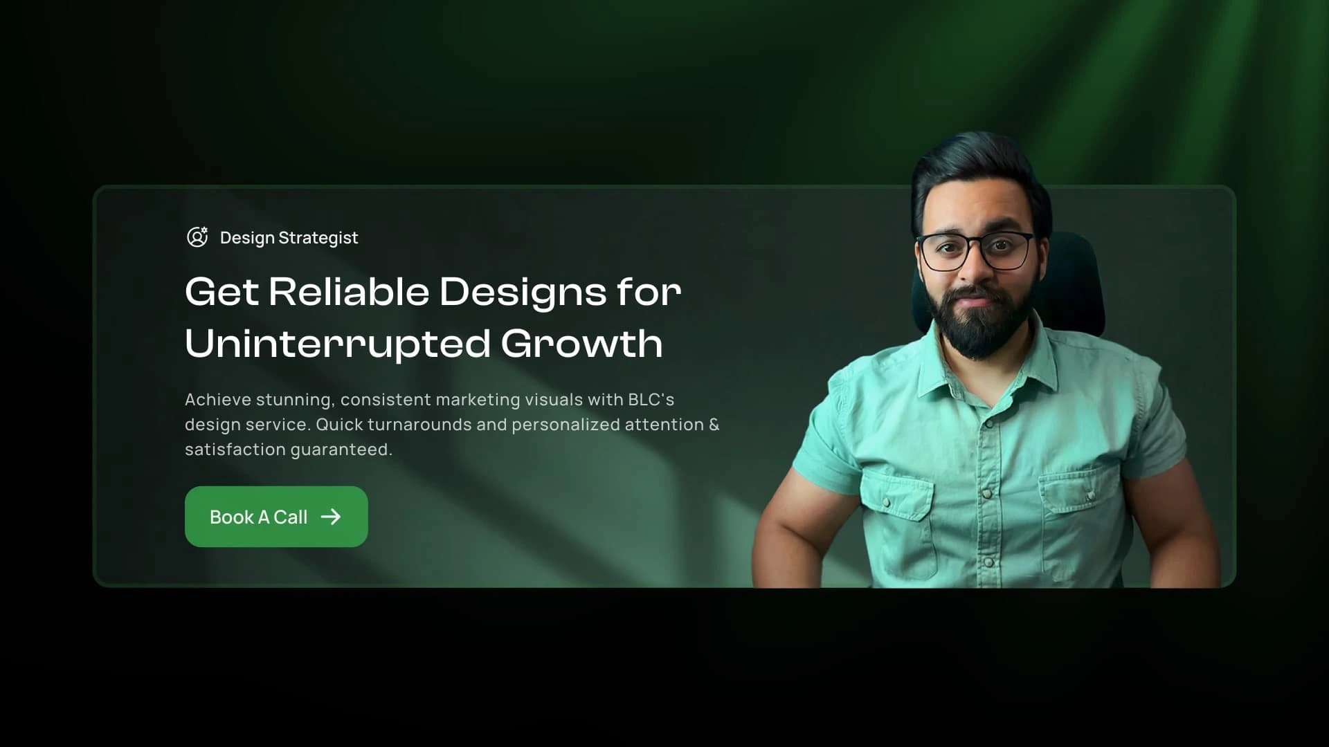
What is Bright Life Creations & Why I Built It
Bright Life Creations is a dedicated design service. It was created to provide business-driven, conversion-focused design solutions for brands that need reliable, high-quality design without the inefficiencies of freelancers or agencies.
I built BLC with a clear goal:
✅ A structured, seamless design experience
✅ Faster, hassle-free execution
✅ Designs that don’t just look good, but drive real business growth
The website reflects this same philosophy interactive, functional, and built for clarity. Now, let’s dive into how it was crafted in Framer.
Most websites are built with a desktop-first mindset, and it shows.
❌ Animations don’t translate well to mobile.
❌ Layouts break or feel cramped.
❌ User experience takes a hit.
This was the challenge I wanted to solve with Bright Life Creations to create a site that wasn’t just responsive but designed for both desktop and mobile from the start.
The goal was simple:
✅ A seamless, interactive experience across all devices.
✅ Custom animations & interactions that adapt beautifully.
✅ High performance without unnecessary complexity.
And I chose framer to build this
Most platforms fall short when it comes to balancing design, interactivity, and speed, but this is where Framer shines—allowing me to build a site that feels smooth, intuitive, and visually engaging everywhere.
Here’s how I built it:
1- Custom Component Structure
• Instead of stacking elements randomly, I used a building block approach each section linked to reusable components.
• This made editing faster and ensured consistent design across the site.
2- Responsive Interactions
• Desktop: Hover-based animations for a smooth UX.
• Mobile: Click-based interactions for a more intuitive experience.
• Navigation Bar: Transforms on scroll for better visibility.
3- Performance Optimization
• No unnecessary code or plugins, just clean, efficient animations.
• Lighter, faster, and more interactive compared to traditional platforms like WordPress.
The result? A frictionless experience that adapts beautifully to any screen size.
Key Features
Framer gave me the freedom to build a site that feels smooth, responsive, and engaging. Here are some of the standout features:
1- Animated Navigation Bar
• Desktop: Starts as a full menu, then shrinks & becomes transparent when scrolling.
• Mobile: Adapts to a compact version for a cleaner UI.
2- Interactive Hero Section
• Designed to feel immersive on both desktop & mobile.
• Animations scale dynamically based on screen size.
3- Hover-Based Work Showcase (Below Hero Section)
• Desktop: Features a 3D flip animation that reacts to hover.
• Mobile: Instead of hover, it uses a click-based interaction for better UX.
• Goal: Showcase my best work in a visually engaging way while keeping interactions seamless.
4- 3D Pain Points & Solutions Cards
• Desktop: Hover effects bring depth to the experience.
• Mobile: Cards stack & reveal content smoothly as users scroll.
5- Work Showcase with Horizontal Scrolling
• Smooth left-to-right scrolling for exploring past work.
• Hovering slows down movement for a detailed view.
6- Comparison Table – Why This is Better Than Freelancers & Agencies
• Interactive & visually structured to make information clear.
• Mobile-friendly scrolling to keep it intuitive.
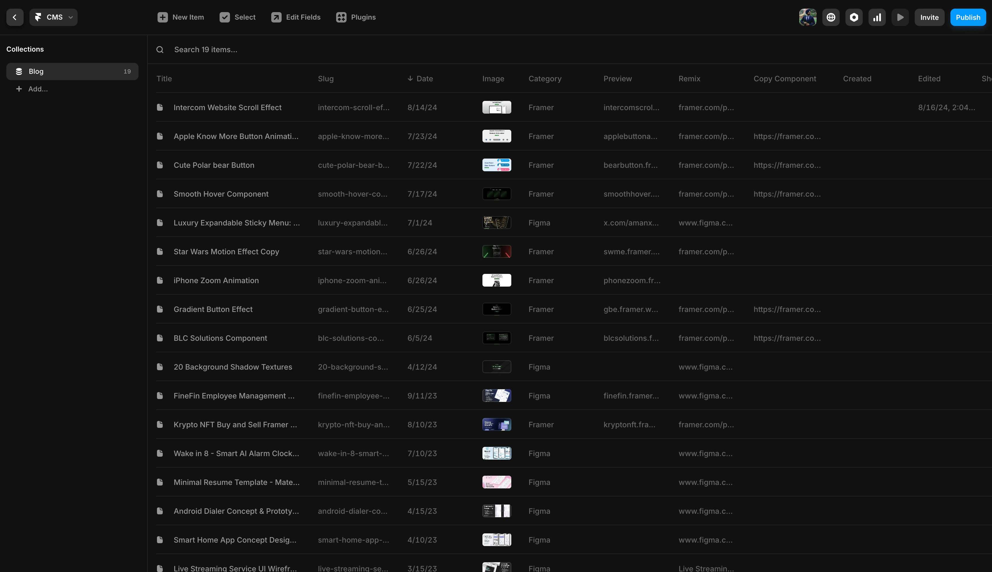
7- CMS to share blogs and my resources
• A custom-built CMS inside Framer to share Framer & Figma resources for free.
• Already published 15+ resources, making it a growing library for designers.
• Optimized for easy management, ensuring new content can be added seamlessly.
Each of these features was carefully designed to enhance engagement, boost usability, and make the site feel premium, without sacrificing speed or performance.
Building Bright Life Creations wasn’t just about designing a beautiful site, it was about crafting a dynamic, interactive, and resource-rich platform that evolves over time.
Here’s what makes it different:
1- A Site That Feels Effortless, Everywhere
Most websites feel like they’re designed for one screen and then “adjusted” for others. This one was built to feel equally premium on desktop and mobile.
• No awkward scaling, no feature compromises.
• Interactions feel natural, whether through hover or tap.
• A smoother, more immersive experience than traditional websites.
2- Interactive, Yet Optimized for Performance
Every animation and effect serves a purpose they aren’t just for show.
• The navigation bar adapts intuitively, guiding users as they explore.
• 3D elements bring depth without slowing performance.
• Every interaction feels snappy, smooth, and intentional.
3- More Than a Website – A Growing Resource Hub
The CMS isn’t just a backend feature it’s a living part of the site that allows me to contribute to the Framer community.
• 15+ free resources for Framer and Figma, accessible to designers.
• Built in a way that makes adding new content quick and scalable.
• A platform that grows over time, rather than staying static.
4- A Future-Ready Web Experience
Unlike most websites that get outdated fast, this one was built to adapt.
• The structure is flexible, so new sections, components, and interactions can be added without breaking the design.
• Framer allows real-time edits and improvements, making the site scalable and future-proof.
Framer is more than just a design tool it’s a game-changer for businesses looking to build, scale, and evolve their online presence without limitations.
Speed & Flexibility: Traditional web builders often feel restrictive. Framer allows for instant changes, real-time design updates, and pixel-perfect layouts without heavy development cycles.
No-Code Meets High Performance: Framer bridges the gap between visual design and functional development, making it easier to create smooth animations, seamless interactions, and ultra-fast pages without bloated plugins or unnecessary code.
Scalability Built In:
• Framer’s CMS makes it effortless to add new content, pages, and sections without disrupting the site.
• Businesses can iterate quickly, whether it’s launching a new landing page, testing a new service, or refining their messaging.
• SEO-optimized and fast-loading, ensuring businesses get the visibility and performance they need to grow.
How I Master Framer to Build Better Websites
I’ve spent countless hours mastering Framer to create:
✅ Highly interactive web experiences without sacrificing speed.
✅ Custom animations & advanced UI effects that bring brands to life.
✅ Scalable CMS-driven platforms that empower businesses to grow.
Unlike traditional website builders, Framer allows me to prototype, design, and launch production-ready websites all in one place.
This means businesses don’t need months of development time to make small changes. They can launch faster, iterate in real-time, and stay ahead of the competition.
Why Work With Me?
I specialize in Framer-powered websites that:
🚀 Are built for growth, not just aesthetics.
📱 Prioritize smooth interactions & flawless mobile experiences.
Give businesses control—so they can update, scale, and evolve without waiting on developers.
If you’re looking for a fast, interactive, and future-proof website, let’s build one that works for you.
Like this project
Posted Feb 5, 2025
Designed for growth—this Framer-powered website combines interactive design, seamless performance, and a scalable CMS to help businesses evolve effortlessly.
Likes
1
Views
59
Timeline
Aug 10, 2024 - Oct 10, 2024
Clients
Bright Life Creations