Built with Replo
Transforming The Supplement Buying Experience With Replo
Introduction: Transforming the Supplement Purchasing Journey
In the dynamic health and wellness market, the demand for convenient and personalised shopping experiences is higher than ever. Our client, a leading Shopify brand specialising in electrolyte drink supplements, recognised the need to enhance their customers' purchasing journey. The objective was clear: increase average order values and conversions, especially for new customer acquisition offers. This case study explores the innovative project we undertook to develop a custom bundle builder, utilising the Replo page builder alongside our expertise in custom HTML, CSS, and JavaScript. By creating a tailored solution, we aimed to enhance user experience and drive sales growth.
The Challenge: Enhancing Customer Experience and Driving Sales
The client’s existing Shopify store featured a straightforward product display and purchasing process; however, they aspired to create a more engaging and personalised experience. The primary objectives were to:
Streamline the Buying Process: Simplify the customer journey from product discovery to checkout, reducing friction and enhancing overall satisfaction.
Encourage Personalised Purchases: Enable customers to curate their own supplement bundles, catering to their unique preferences while promoting higher sales through tiered discounts.
Elevate Brand Identity: Ensure the custom bundle builder seamlessly integrated with the brand's visual identity and messaging, strengthening their online presence.
The Solution: Designing a Dual-Page Bundle Builder
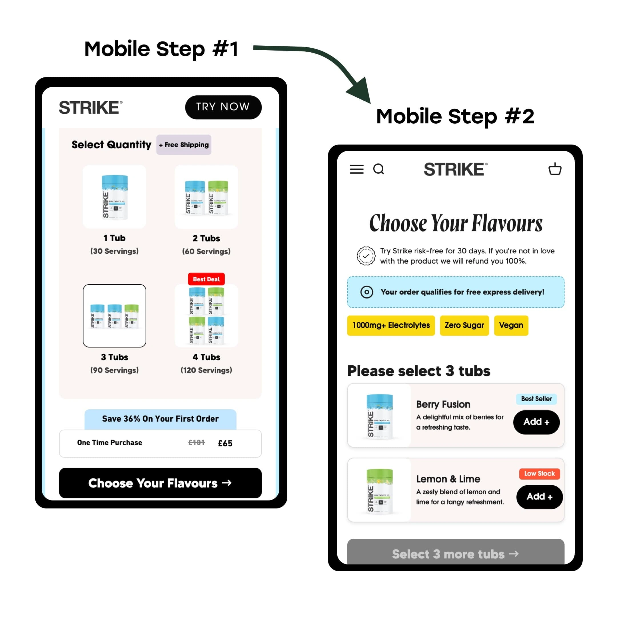
To address the client's goals, we embarked on a collaborative journey, leveraging the versatility of the Replo page builder along with our expertise in custom web development. The bundle builder was structured across two distinct pages to facilitate an intuitive user experience.
Step 1: Page One - Selecting Tub Quantity with Dynamic Discounts
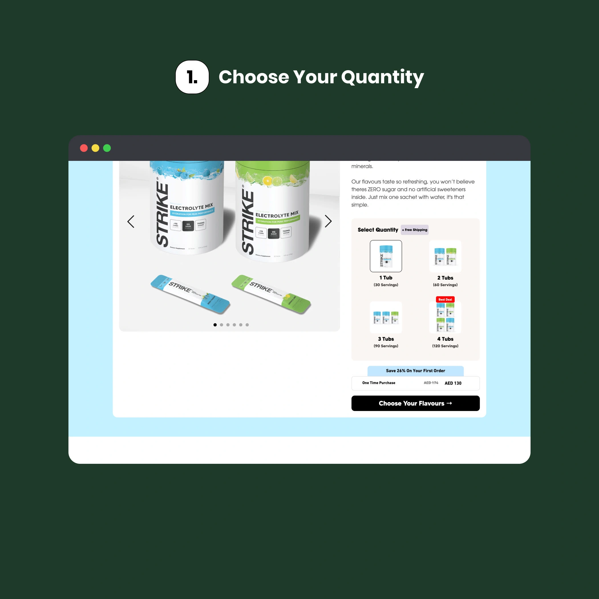
The first page of the bundle builder focused on allowing users to select the quantity of tubs they wished to purchase. We implemented a custom buy box that displayed tiered discounts based on the selected quantity, encouraging customers to buy more by clearly showing potential savings.
Custom Buy Box Implementation
We designed a visually appealing and user-friendly custom buy box using HTML and CSS, ensuring it aligned with the brand’s aesthetic. This buy box displayed available tub sizes and included dynamic elements that updated in real-time as users adjusted their selections.
JavaScript Setup for Quantity Selection
Using JavaScript, we developed functionality that dynamically updated discount information as users changed quantities. For example, if a user selected three tubs, the discount percentage adjusted accordingly, providing immediate feedback that incentivised larger purchases.
Upon finalising their tub quantity, this selection was seamlessly passed to the next page using JavaScript, maintaining continuity in the user experience and reducing drop-off rates during checkout.
Step 2: Page Two - Customising Flavours with Dynamic Placeholders
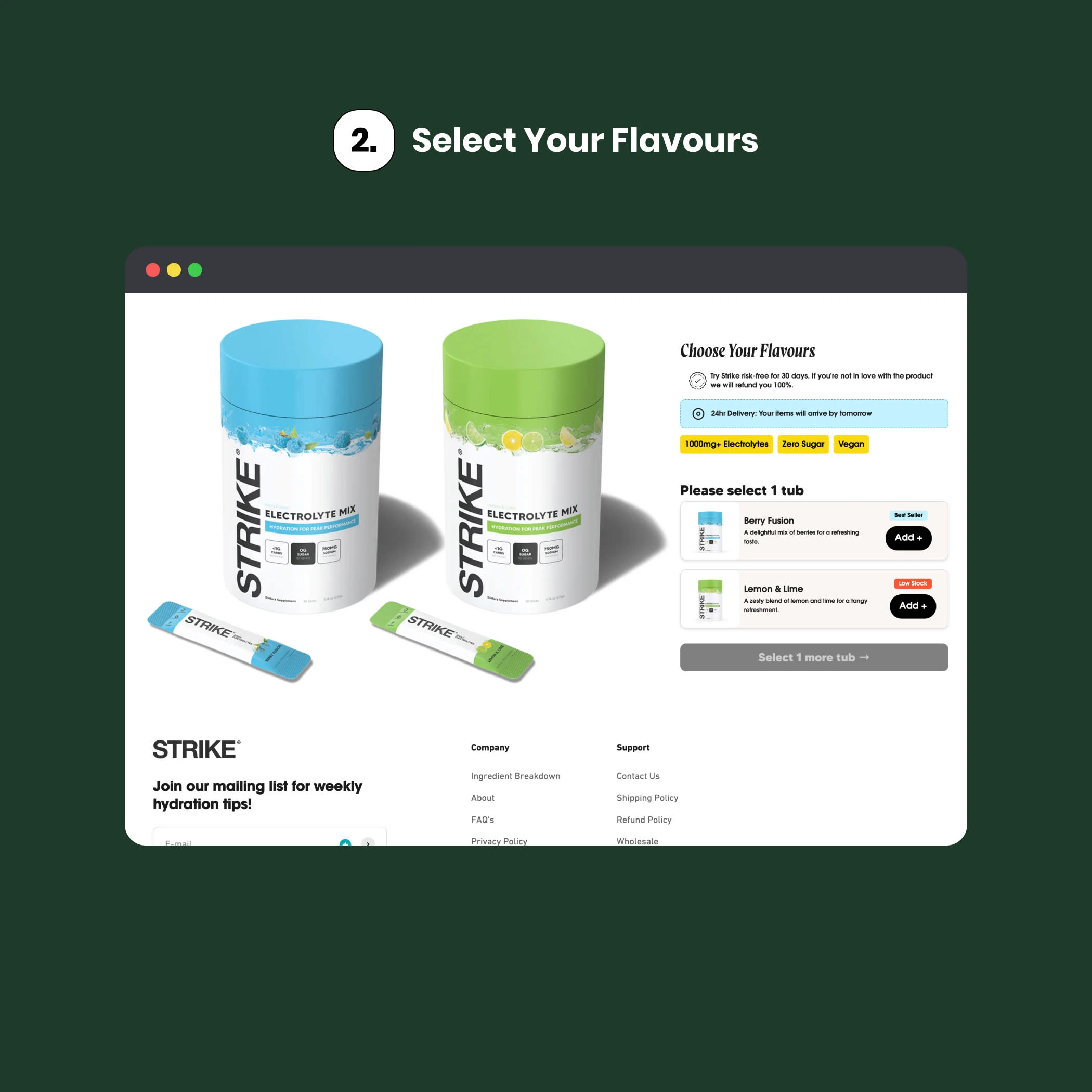
The second page of the bundle builder allowed users to select their desired flavours for the specified quantity of tubs chosen on the first page. This stage aimed to enhance customer satisfaction by offering personalised options while utilising dynamic code for seamless interaction.
Dynamic Code Integration
On this page, we implemented dynamic code that fetched the previously selected tub quantity and integrated it into text placeholders and call-to-action (CTA) buttons. For instance, if a user selected three tubs, the message would read, "Choose your flavours for 3 tubs!" This personalisation connected customers to their choices and reinforced their purchasing intentions.
Flavour Combination Mapping
To facilitate flavour selection, we created a system mapping different flavour combinations to specific bundle variants set up within Shopify. We leveraged JavaScript functions to check user selections against predefined combinations in the backend. When customers clicked on their preferred flavours, those choices were automatically associated with their selected tub quantity.
Step 3: Mobile Responsiveness
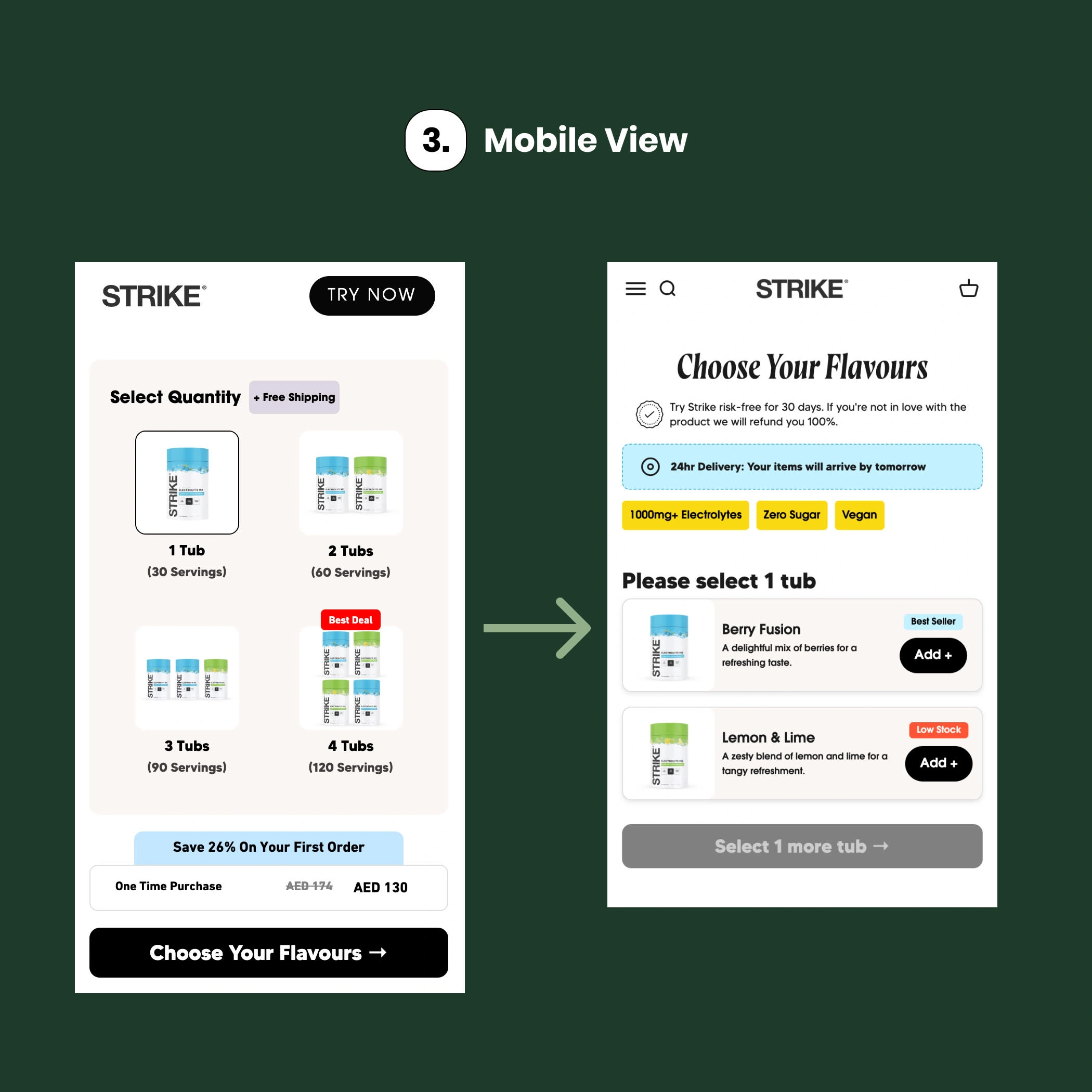
To ensure an optimal user experience across all devices, the custom bundle builder was meticulously designed for mobile responsiveness. Screenshots of the mobile interface demonstrate how the layout adapts seamlessly to smaller screens, maintaining clarity and usability.
Intuitive navigation allows users to easily select tub quantities and flavours without compromising functionality or visual appeal. Key elements such as dynamic discount information and flavour selection options are presented in a streamlined manner that enhances engagement and encourages conversions.
This focus on mobile responsiveness caters to the growing number of customers shopping on smartphones while reinforcing the brand's commitment to providing a user-friendly experience for all visitors.
Step 4: Integrating Shopify Automatic Discounts
To further enhance the purchasing experience, we utilised Shopify's automatic discount feature. This allowed us to implement a new customer discount code applied at checkout without requiring additional input from users.
Streamlined Checkout Experience
As users progressed from selecting flavours back to checkout, they immediately saw their applied discounts reflected. This transparency increased trust and encouraged users to complete their purchases confidently.
The integration of automatic discounts ensured that new customers felt they were receiving value from their first purchase. By creating this sense of reward from the start, we aimed to cultivate long-term loyalty and drive repeat business.
Conclusion: Redefining the Supplement Buying Experience
The custom bundle builder project has been a resounding success, demonstrating how thoughtful web development can transform the supplement purchasing journey. By prioritising user experience through an innovative dual-page approach, leveraging Replo for responsive design, and incorporating custom functionality with HTML, CSS, and JavaScript, we have helped our client establish a competitive edge in the health and wellness market.
Like this project
Posted Sep 13, 2024
I developed a custom bundle builder for a Shopify brand specialising in electrolyte drink supplements to help optimise new customer acquisition efforts.
Likes
0
Views
20


