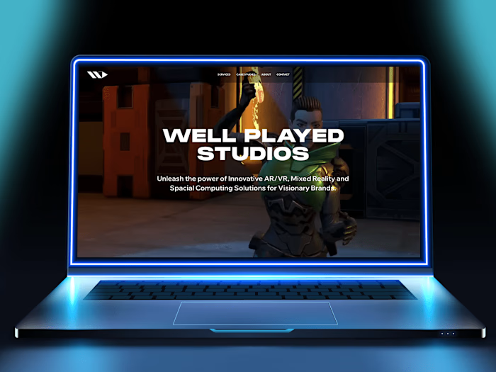
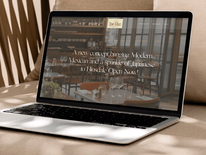
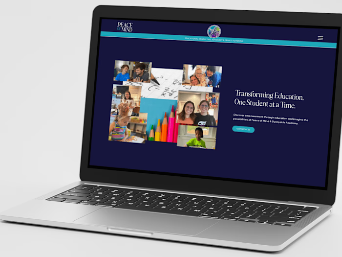
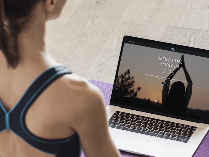
KM Design Featured in FWD’s Blog 27 best agency website examples
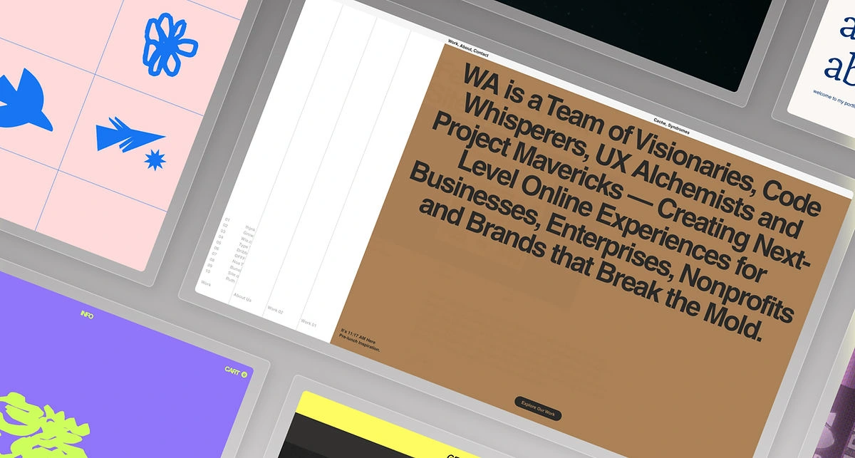
When it comes to establishing a strong online presence for your agency, your website is one of the most powerful assets in your digital arsenal. Yet many creatives find themselves moving "update website" to the bottom of their to-do lists.
That's about to change. These agency website examples—all built on Wix Studio—will inspire you to go beyond basic web design principles and create a website that engages visitors from the moment they land on the page. And perhaps more importantly, they'll inspire you to do it today. Let's go.
27 best agency website examples
01. The Boathouse Agency
With a one-of-a-kind approach to creative media for brands, The Boathouse Agency immediately establishes its credibility through its captivating website design. Immersive parallax scroll and zoom effects engage visitors and highlight the agency's imaginative media. The website skillfully incorporates testimonials, seamlessly blending them with a showcase of commercials and campaigns.
02. WA Studio
WA Studio’s layout effectively breaks up sections of content, offering an immersive experience that invites visitors to interact without feeling overwhelmed. Plus, the bold design combines a minimalistic and earthy color palette with bold typography to ensure readability.
03. Associate Studio
An engaging splash page is a unique way to surprise visitors, as demonstrated by Associate Studio’s agency website. Once clicking through to the homepage, a unique slideshow in the hero section showcases a curated selection of projects. Here, a flawless layout, high-quality images and succinct copy come together to give visitors a glimpse into their creative prowess.
04. Olya Black
Olya Black’s agency site is full of motion, employing an animated radial gradient, quirky hover effects and parallax scrolling. There’s never a dull moment on screen, but the site maintains balance with a cool black-and-blue color scheme accentuated by lime green and white text. The dark palette prevents visual overload and showcases Olya’s work without overwhelming visitors.
05. Lumifig
Simple yet effective, Lumifig’s agency site embraces a modern take on minimalism that showcases their eye for design while prioritizing communication with potential clients. Their copy is strong, confident and to the point. We're also giving this one bonus points for the compelling logo.
06. KM Design Solutions
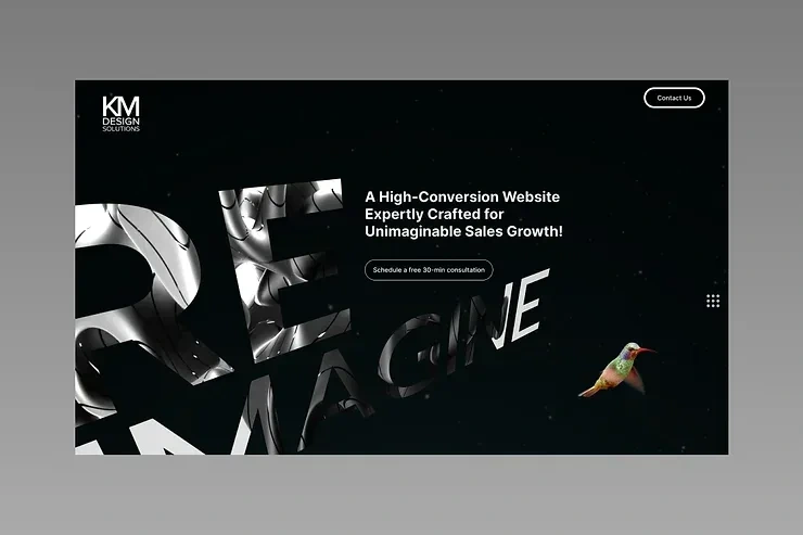
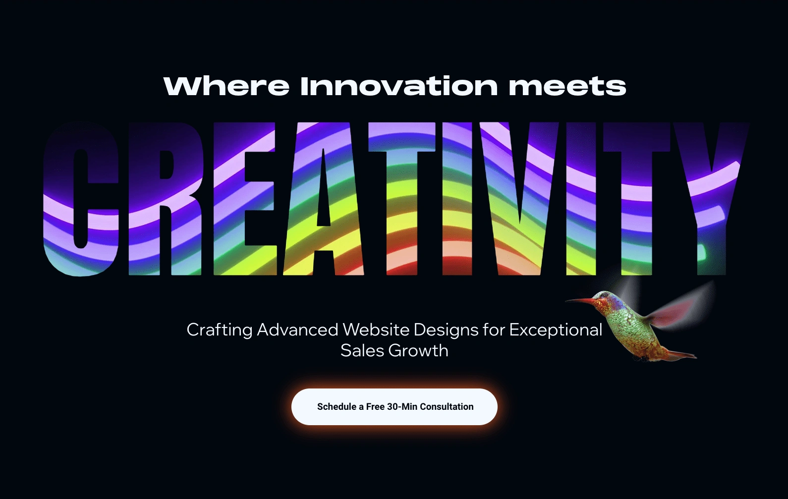
The KM Design Solutions agency website design seamlessly integrates various visual elements, including text masks, transparent videos, video backgrounds and linear gradients. The black-and-white design and clean sans serif fonts keep the site visually balanced and put the calls-to-action in center stage.
07. Outlanders Design Studio
Perfectly reflecting their contemporary design vision, Outlanders Design Studio uses a futuristic theme—including animated effects and modern fonts—to reflect their deep understanding of current design trends. Don't forget to check out the avatars of their team members. Headshots could never.
08. Wow In Group
Wow In Group is a venture capital agency that supports companies with groundbreaking ideas. Understanding that their primary audience is composed of ambitious entrepreneurs in the hi-tech sector, their website employs an encouraging and motivating tone designed to instill confidence in potential clients. The thoughtfully crafted website copy effectively showcases their deep knowledge of the industry and clearly communicates the range of services they offer.
09. Aryz 31
In this agency website example, Aryz 31 uses a well-designed About Us page to build a connection with new visitors. Here, they share their motivations, commitment to excellence and approach to bringing their clients' ideas to life. Visitors interested in more details can navigate to the “Approach” section, which outlines the six steps of their branding services journey to provide visitors with a deeper understanding of what to expect.
10. VMV Studio
A promotional video takes center stage on the VMV Studio agency's website. It showcases the agency's design, media and branding capabilities while setting the contemporary tone for the rest of the site. Immediately below the hero section, visitors can access the agency's portfolio where various images and videos are arranged in an asymmetrical grid layout. The visual arrangement fosters a sense of interest and encourages visitors to learn more about specific branding projects and campaigns.
11. Pixl Splash
Pixl Splash’s well-structured homepage contains ample content that’s framed with white space. It also uses various text sizes to guide visitors. As we scroll through the site, customized text cells are used to separate and structure the information. The site's clean foundations are complemented by expressive elements: a vibrant color scheme, animated effects and abstract shapes.
12. Boos Agency
Once visitors to the Boos Agency website are interested in learning more about their services, they can seamlessly jump to the site’s “packages and pricing” menu to discover the next steps. Here, the agency provides detailed descriptions of their various offerings, ensuring transparency regarding costs. Additionally, an engaging and interactive quiz titled "Are We Your Perfect Match?" allows visitors to assess whether Boos Agency is the ideal partner for their needs.
13. Socially Adept Solutions
Socially Adept Solutions stands out for its commitment to web accessibility. Scroll to the bottom of the site to find an accessibility menu, then select features such as a screen reader, contract control and text resizing.
14. Wix Lab
Wix Lab uses vibrant imagery and compelling copy to communicate their mission: assisting brands in crafting a distinctive personality that adds an authentic, human touch. The creative agency site boasts prominent CTA buttons, using customized designs that encourage visitors to click. For example, their site's menu button uses a bright linear gradient to grab attention, while the chat box button engages us with a colloquial tone.
15. Davy Dov Consulting
Quality imagery, succinct text and a clean design make clients confident that Davy Dov Consulting knows their stuff. Their homepage features information such as their agency’s values, while communicating the various services they offer clients. And speaking of knowing their stuff, their blog offers step-by-step guides and other design tips that demonstrate their authority.

Davy Dov Consulting homepage
16. Dreamworth
Dreamworth’s agency website effectively balances user engagement and business savvy. To captivate potential clients, the website strategically provides both free and paid content. For instance, they showcase their own professionally designed Wix templates, showcasing their design skills firsthand with the option to purchase. This approach not only engages new visitors but also monetizes the site effectively. Plus, their free download of SEO essentials serves as a solid lead generation strategy.
Sign up to build your next site with Wix Studio today.
17. Bella and Bloom
Bella and Bloom immediately highlight their pre-made professional website templates in the hero section of their homepage. To demonstrate their design assets, they generate examples of what they look like on desktop, tablet and mobile devices. Once visitors are engaged, their shop is easily accessible through quick CTAs and within the website menu, where visitors have the option to purchase templates or move forward with a customized design.
18. The Designed Front
An organized and symmetrical portfolio layout sets the stage for The Designed Front’s agency website. Catering to first-time visitors seeking professional design services, the website includes a comprehensive FAQ page that addresses common inquiries regarding website costs, turnaround times, hosting and domains. +1 for transparency.

The Designed Front homepage
19. Aura Studios
Aura Studios leverages their agency website design to prominently showcase their niche focus: luxury travel and lifestyle branding. That translates to an agency website characterized by classy typography, delicate colors and elegant imagery. Also note the “client application” form that helps the studio understand a client's budget and timeline upfront.
20. TRH.CGI
TRH.CGI's website is bold, striking and easy to navigate thanks to a curated portfolio, stand-out imagery and contrasting colors. This agency website example proves you don't need to put every image you've ever created on your website; sometimes fewer pack a stronger punch.
21. Nasir Studio
Nasir Studio's agency website takes a nostalgic approach to web design, aiming to help clients connect to its distinct branding and visual language. The website is aesthetically engaging and relies on visual imagery to communicate, using a menu of icons representing social channels, a chat box and contact link that’s pinned to the page. An emphasis on visual communication not only showcases the agency's talent but also makes the website user-friendly and intuitive.
22. Rony Mosco
Rony Mosco's agency website captivates users with its minimalist design, emphasizing simplicity, personalized language and intuitive navigation. The homepage features a captivating animated list of her qualities, immersing visitors in her professional journey. Another notable element: the custom cursor that adds a touch of delight to the browsing experience.
23. Anzo Studio
We love how Anzo Studio makes use of the top fold, using a full screen headshot as a visual background to effectively introduce the designer and prompt visitors with calls-to-action. The to-the-point design relies on a combination of visual elements and website copy to highlight the designer’s interests and specialties. Since Anzo Studio focuses on dark mode aesthetics, the visual niche is showcased with an eye-catching black and white composition that’s both consistent and intriguing.
24. Visual Identity
Visual Identity's agency website example captivates visitors with a sleek black-and-white design that includes high-quality imagery, minimalist typography and captivating effects. The hero section features mouse scroll effects that enhance the section's visually striking layout, adding an interactive layer to the experience. Meanwhile, parallax scrolling and animations keep visitors engaged and invite them into the agency's creative world. We're in.
25. Maya Lynne Adar
Scroll effects. Clever animations. Playful interactions. Maya Lynne Adar's site has it all, yet it's not overwhelming thanks to the organized layout and succinct messaging.
26. Kristina Horan Website Designs (KHWD)
The KHWD site complements bold, contrasting colors with lighthearted imagery and fonts for an aesthetic that's both striking and approachable. One thing that's consistent: the energy. That's in part thanks to the text marquee, interactive buttons and blurred visuals that imply action.
27. Change the Game
You might expect a studio called "Change the Game" to have a unique website. Yet you'll still be pleasantly surprised by the bright colors, super-cool cursor effects and interactive animations. More importantly, you immediately know what the studio is about—color, abstract shapes and patterns—before you read a word of copy.
Ready to build your next (and best) site? Sign up for Wix Studio today.
RELATED ARTICLES
How to start a web design business in 2024—the right way
AARON GELBMAN
30 black and white websites that show design constraints spark creativity
AARON GELBMAN
12 principles of good website design
LILLIAN XIAO
Like this project
Posted Nov 13, 2024
"It's hardly a hot take, but agencies that build websites should have stunning websites to highlight their services. These go the extra mile... #6

