Designing B2B E-Procurement Platform for Tokopedia — Buyer OM
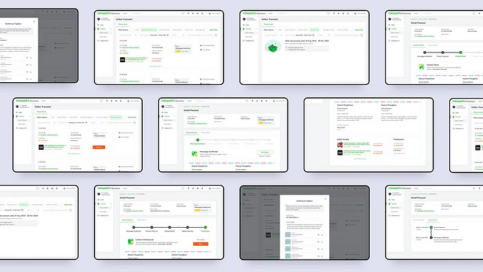
How digitalization helps the procurement process
Tokopedia is the biggest customer-to-customer (C2C) e-commerce marketplace in Indonesia, Southeast Asia. B2B E-Procurement itself is initiated by Tokopedia’s internal procurement team to help them digitalize the procurement process to make it easier, efficient & effective when executing the procurement process from discovery to purchasing & billing.
It started at the late of 2019 when our stakeholder, who is Procurement Team needs to achieve above goals. They want us to identify existing procurement process so that we can discover the current pain points and provide solutions or able to suggest improvements.
My Role
I worked as UI Designer and teaming up with 1 UX Designer, Mario Yaputra and 1 Researcher, Nabila Fajriani. I was responsible contributing perspective as UI Designer in early wireframe ideation stage and designing high fidelity prototype including pixel-perfect design, icons, illustrations, and its interactions.
What is Buyer Order Management (BOM)?
Buyer Order Management (BOM) is one of the most important tools in e-commerce’s product management experience. This feature allows buyers to manage the purchased products or goods, both when the product is still being processed by the seller or has been received by the buyer. However, the challenge is this feature will manage large-value transactions, as is typical for B2B which is different from the current C2C type transactions at Tokopedia.
So, it is important to play this with full understanding and empathy, remembering this B2B’s thing is not our everyday language, so that this feature can be seamlessly help and meet the needs of the user in managing their transactions.
Before we start, let me give you the context, that the BOM explained below is the refinement version as the the mvp-old BOM couldn’t cover the basic-needed features to execute the first internal transaction. To be honest we saw it already enough to meet our objective. But well, it is not.
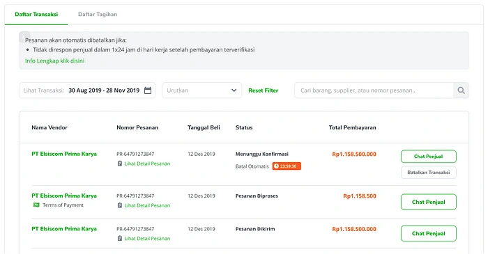
MPV — Old Buyer Order Management
The Design Method
It’s all about how we go out, watch and talk to real user’s facing the problem, and synthesize our understanding to be design or concept. At last, We talk again to the users, shows our works, carefully watch them using the solutions, and hear how they feel while using it.
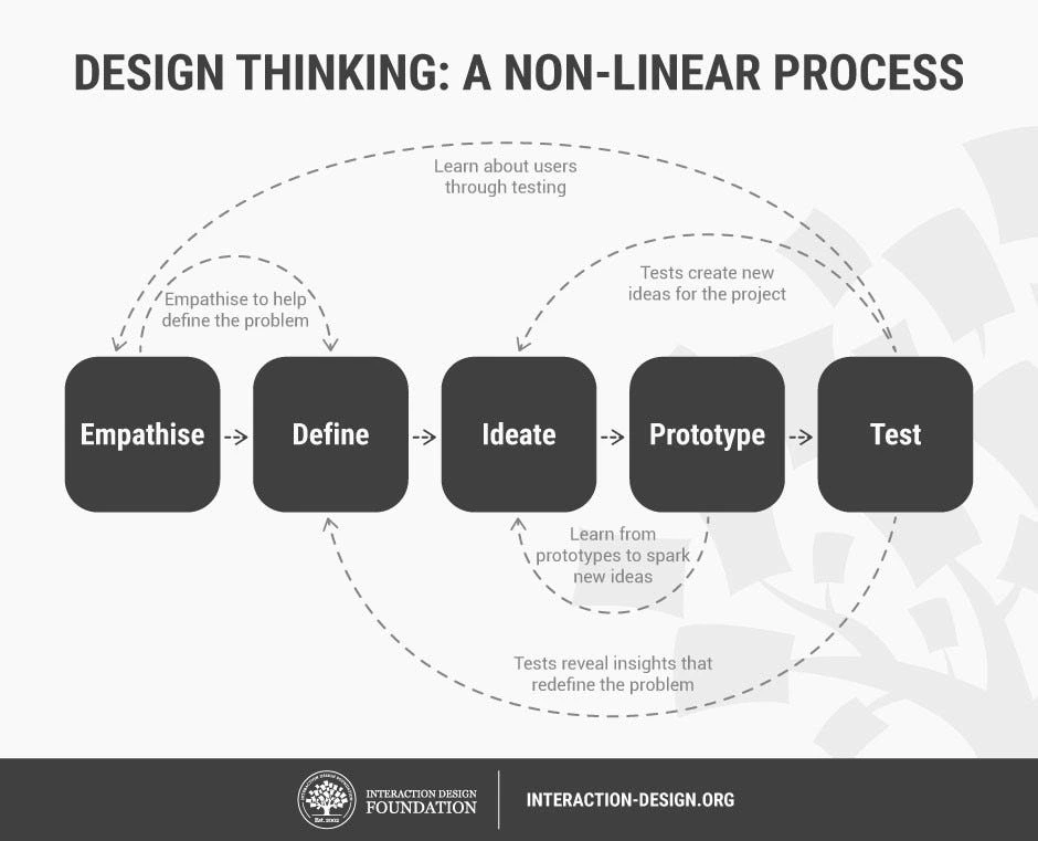
Source: www.interaction-design.org
Baseline
To get started, we defined backgrounds, objectives, and challenges as our project baseline to make everyone involved got the same perspective along this solution discovery process.

Empathize
In order to get the context to the product and help understand the problem we are trying to solve, we were talking to 13 participants (8 internal, 5 external) who are in-charge of purchasing goods/services in their respected company. We conducted in-depth interview to understand journey and pain points from buyer’s end-to-end procurement process and then describe it in the buyer journey below:
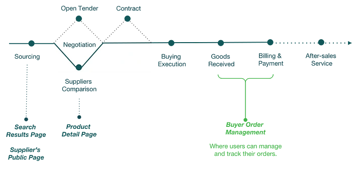
Existing Buyer Journey provided by Procurement Team
Define
After the interview, we discovered pain points that led us to divide them into two procurement sub-processes under BOM Module. Then we rewrite them along with our proposed recommendation as follows:
1. Good Receive
Pain Point: Inefficient communication between suppliers, procurement, and users to confirm goods received.
Recommendations: Confirmation for Goods Received by procurement on platform.
2. Billing and Payment
Pain Point: Ineffective communication for incomplete invoice documents.
Recommendation: Accept or reject uploaded invoice documents on platform.
Competitive Analysis
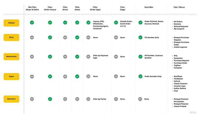
Competitive Analysis to 5 Competitors
B2B E-Procurement platform relatively new in this marketplace industry, so competitive analysis is beneficial to us to understand where our product stands in the market and know the strengths and weaknesses of the competitor.
We did it to 4 local and 1 international competitors. The things we benchmarked are buyer’s entry point to manage their orders, how buyer track their orders, and competitor’s transaction flow end to end process. Our analysis result is explained below:
Order Timeline
Buyer needs a timeline history of their order when dealing with billing/legal cases for speed up their work.
Dashboard
Buyer needs an all in one space in terms of ease of navigation where they can manage their company data (next development), billing & payment for their order management.
We also developed the big picture of the overall flow that we’ve defined & agreed for this module.

Buyer Order Management Flow
Information Architecture
Then, the information architecture is designed to fulfill the following needs:
Back-end engineers need skeleton for the BOM’s database design, and it will be a backlog for them before the front-end develops its hi-fi design
It’s the easiest form of communication for stakeholders to understand the required information so far, but also the fastest method for use to discuss revision/improvement based on alignment with all stakeholders, before entering the wireframe and hi-fi design stage.
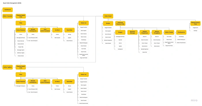
Information Architecture of Buyer Order Management
Ideate
After some research was conducted, we learned that users are actually already familiar and feel comfortable with the current dashboard to manage transactions in Tokopedia C2C. So instead of introducing something new, that require users to learn again, we decided to use some parts of Tokopedia C2C’s design element to start designing BOM for this platform, with some adjustments, of course.
Wireflow
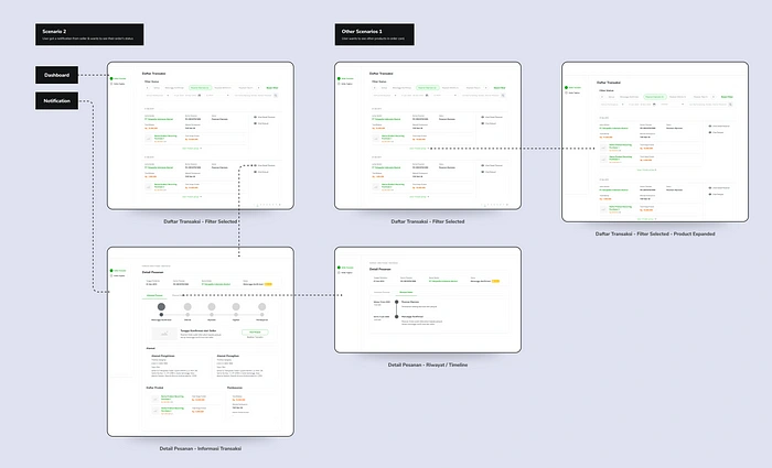
Wireflows are a design-specification format that combines wireframe-style page layout designs with a simplified flowchart-like way of representing interactions (1). Besides using wireflow to organize and communicate our ideas through wireframes, we also grouped them by scenario defined before. We used this approach because we understood that a platform surely contains numerous and complex workflows, and at the same time we had to make sure that our design caters every possible cases.
Our wireflows also look colorful if you are noticed, very different from ordinary wireframes which are usually grey and even just drawn on paper. In fact, since we started designing, we used to using a design system that really speeds up our pace in making wireframes. So we believed using colored wireframes is not a problem, because our time spent is the same as making a greyed one.
In fact, the user has a better context understanding of the design we created during our wireflow usability testing.
Usability Testing
As the proposed wireflow of BOM for Tokopedia B2B is different and more complex than BOM in the Marketplace, thus we need to conduct usability testing to the potential users (buyers). We test the wireframe to 5 Procurement Specialists in Tokopedia who frequently use Tokopedia Marketplace as buyers.
Below is the brief conclusion from our UT:

Prototyping
Still hanging around here? Let’s get the design part started.

Solution 1: Revamping from Table to Dashboard
Drastically we’ve transform whole layout of our BOM from “a table” in the previous design phase to be “high-functional and expandable dashboard”. Hence we could develop it to cater wider discovered problem.
Solution 2: Accurate Navigation
We took consideration to improve existing C2C sidebar navigation. We found that its hover interaction make user cursor be misplaced when moving from one menu to another because of the problematic hover interactions. And we solve this problem by simply changing the interaction from hover to click.
Solution 3: Button Re-positioning
We decided to place all CTA buttons placed towards the right of content (order list) for buyer to easily scan all the information in the left instead of full-width content (all content in the dashboard is full width & different with marketplace which has a centered container)
Solution 4: Visibility Improved Timer + Status
Most participants stated that the timer was too small and was not clear enough to tell what kind of information it tried to imply.
For iteration, we’ve decided to combine the timer, status & ticker into a new component for buyer to create a more sense of urgency.

Solution 1: Revamping from Pop-up to Page
From research and analysis earlier, order details are designed to be pages instead of pop-up, pages also have better expandability in future design and development than pop-ups like in C2C.
Solution 2: Clearer Progress Bar + Personalized Dynamic Message
We find that users need effective ways to find out the status of their transactions and quickly decide what next relevant actions they can take. Therefore we make a new Progress Bar along with messages and relevant actions that change based on the status of the order.
Solution 3: Envelope-styled address card
We played a bit this section by mimicking the address section similar to envelope design with red-blue stripe to emphasize that it contains mailing information.
Icons & Illustrations
To maintain the professional and business style concept in this project, instead of using Tokopedia Universe illustration concept we designed icon and illustration by ourselves as follows:
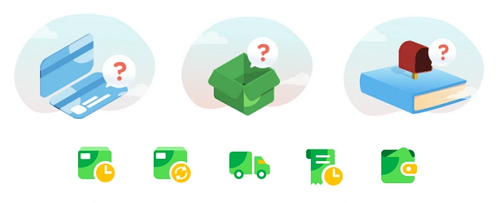
Final Prototype
Result
Our users find that the new design is concise and easy to comprehend. They do not need to learn much to use it. Unfortunately, until I write this article, the platform is still under heavy development. We actually got many thanks from especially the procurement team, but the impact’s exact number is still not available. But one thing we have to know is that the work is well done.
Learnings and Overcomes
What did We learn?
It’s a must to find who is our real user, because they’re the one who’ll use our product
Whether it’s not suitable or if it’s slowing the team, speak up to find the sweet spot of collaboration
Talk & negotiate instead of say “yes” to everything
Documentation is also one of the most important tools of transferring your thoughts & processes.
Overcomes
Speak Up
We decided to be brave enough to speak up to engineers & PM about our current collaboration situation. We agreed to experiment to find our “ideal” collaboration style & pace
Getting The Big Picture
We decided to discuss with all of B2B team including stakeholders to really getting the big picture of our product, who are the users & what are their real problems
Experimenting
We try different approach to our documentations, learning from other team, learning from mentors & learning how to make our PRD useful to PM, engineers, etc.
The Team
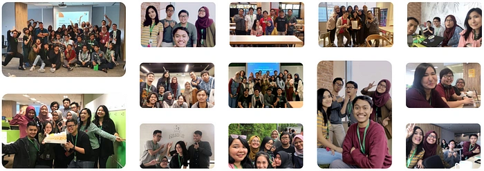
Even though this project was created by only 3 designers, we have to admit that the people below influenced us a lot. We asked for feedback, we learnt, we argued, we experienced ups and down together with them. It’s an honor spent 9 months with those amazing people. Thank you and see you again.
Like this project
0
Posted Jan 14, 2024
Tokopedia is the biggest customer-to-customer (C2C) e-commerce marketplace in Indonesia, Southeast Asia. B2B E-Procurement itself is initiated by Tokopedia’s i…


