Bru Coffee Rebranding
Subrata Singhdeo
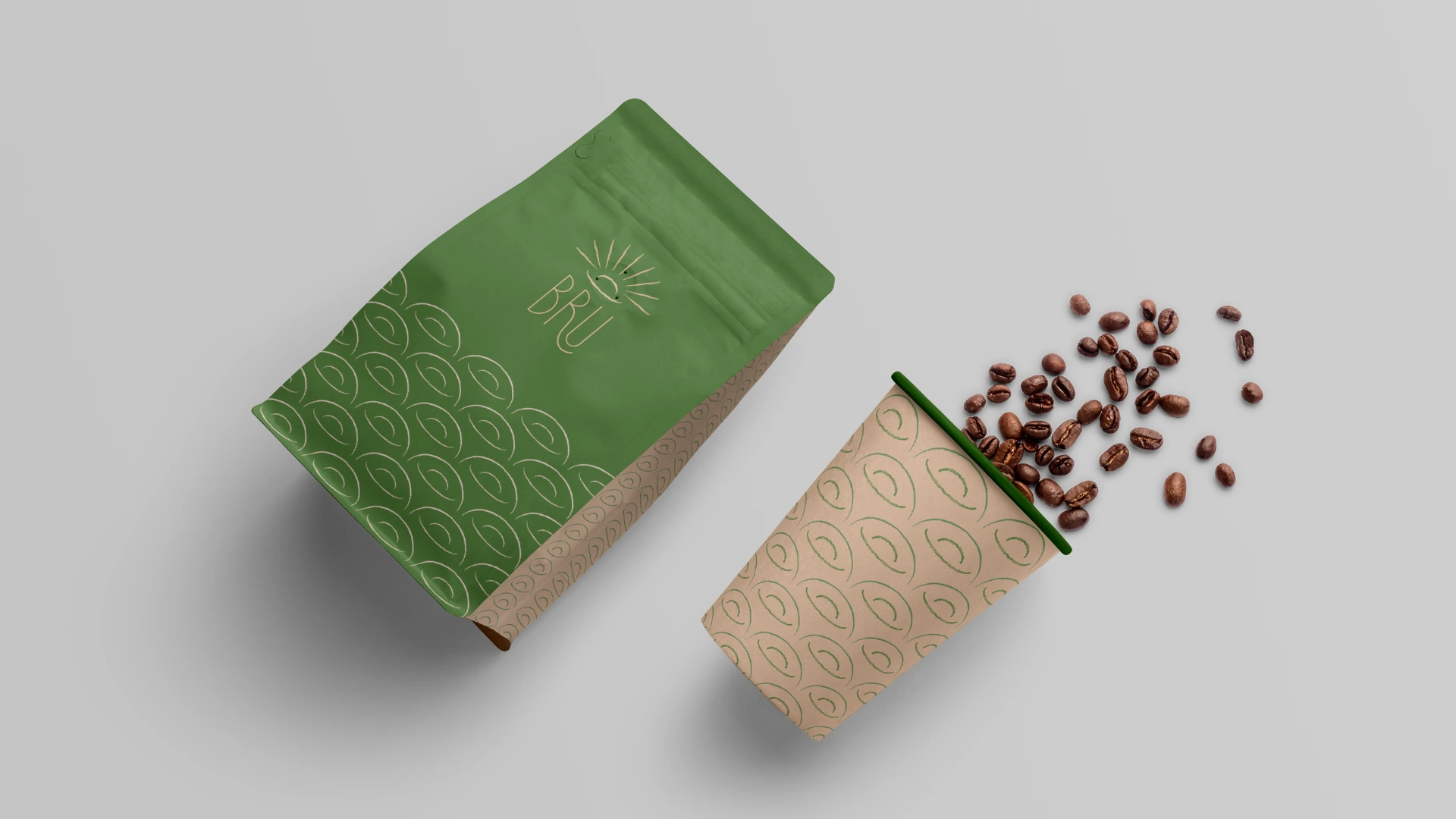
Bru Coffee
Revolutionary Rebranding (a passion project)
About the brand
BRU Instant Coffee was launched in 1968 and was India’s first coffee-chicory instant coffee. It is made from a fine blend of the choicest plantation and Robusta beans.
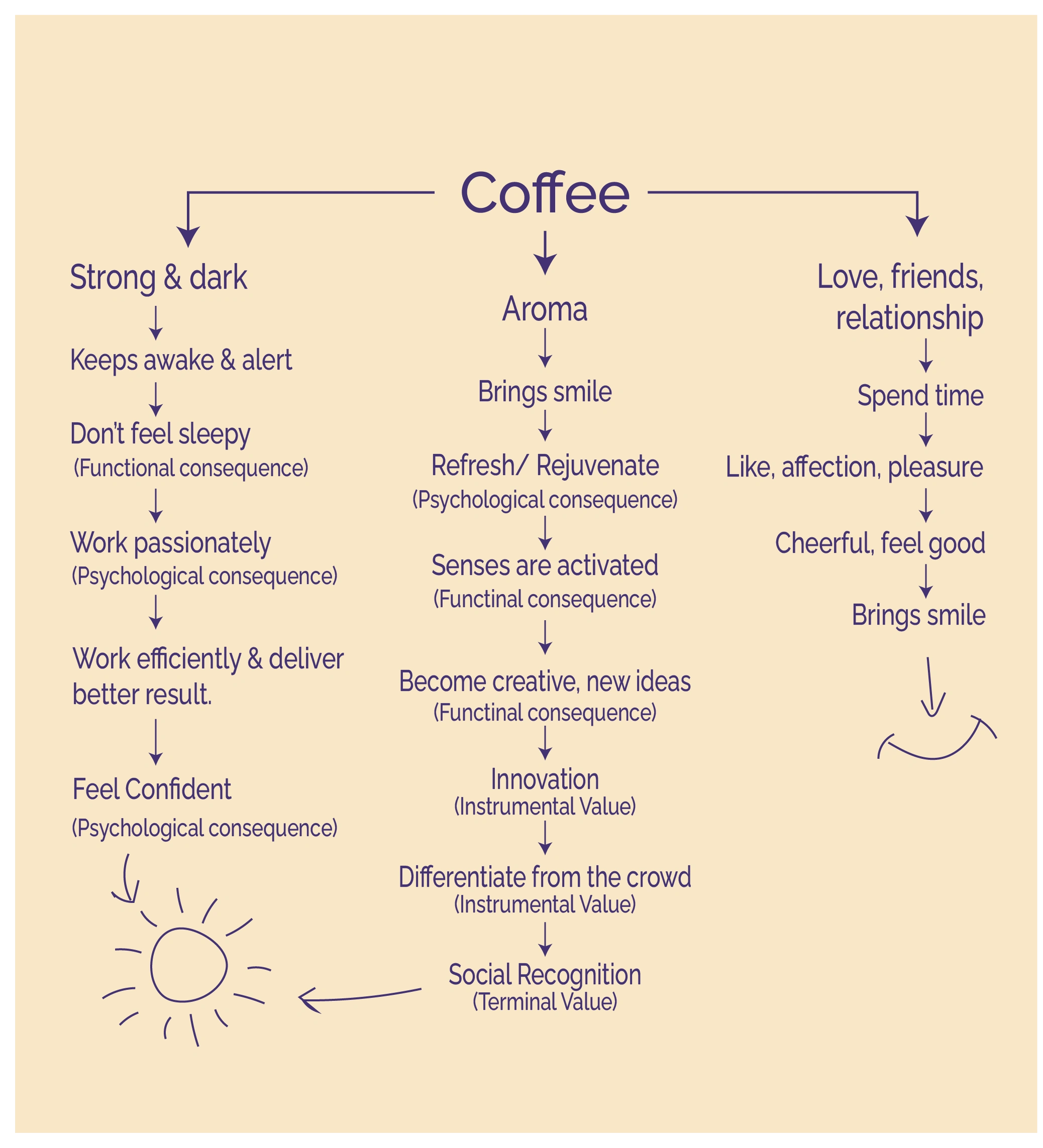
BRU Coffee celebrates authenticity in coffee and relationships.
Tagline
Bru se hoti Hain Khushiyan shuru.
BRU-ed with love and blended with passion, BRU Coffee celebrates authenticity in coffee and relationships.
Bru’s philosophy is – “Livening up every moment by stimulating conversations.”
Why to rebrand?
The logo was made in 1968 and has remained unchanged ever since. But the audience's preferences and outlook has changed.
The logo has obsolete elements like too many gradients. The usage of green and brown in a 50:50 ratio makes the logo look dull, which goes against the brand messaging.
The brand's messaging is emotion and passion-driven. Brand design is dry and does not reflect upon its USP and emotions that it wants to communicate with its audience.
What elements to preserve to maintain Brand Equity?
o Authenticity
o Intimacy
o Passion
o Celebration with relationships
Concept

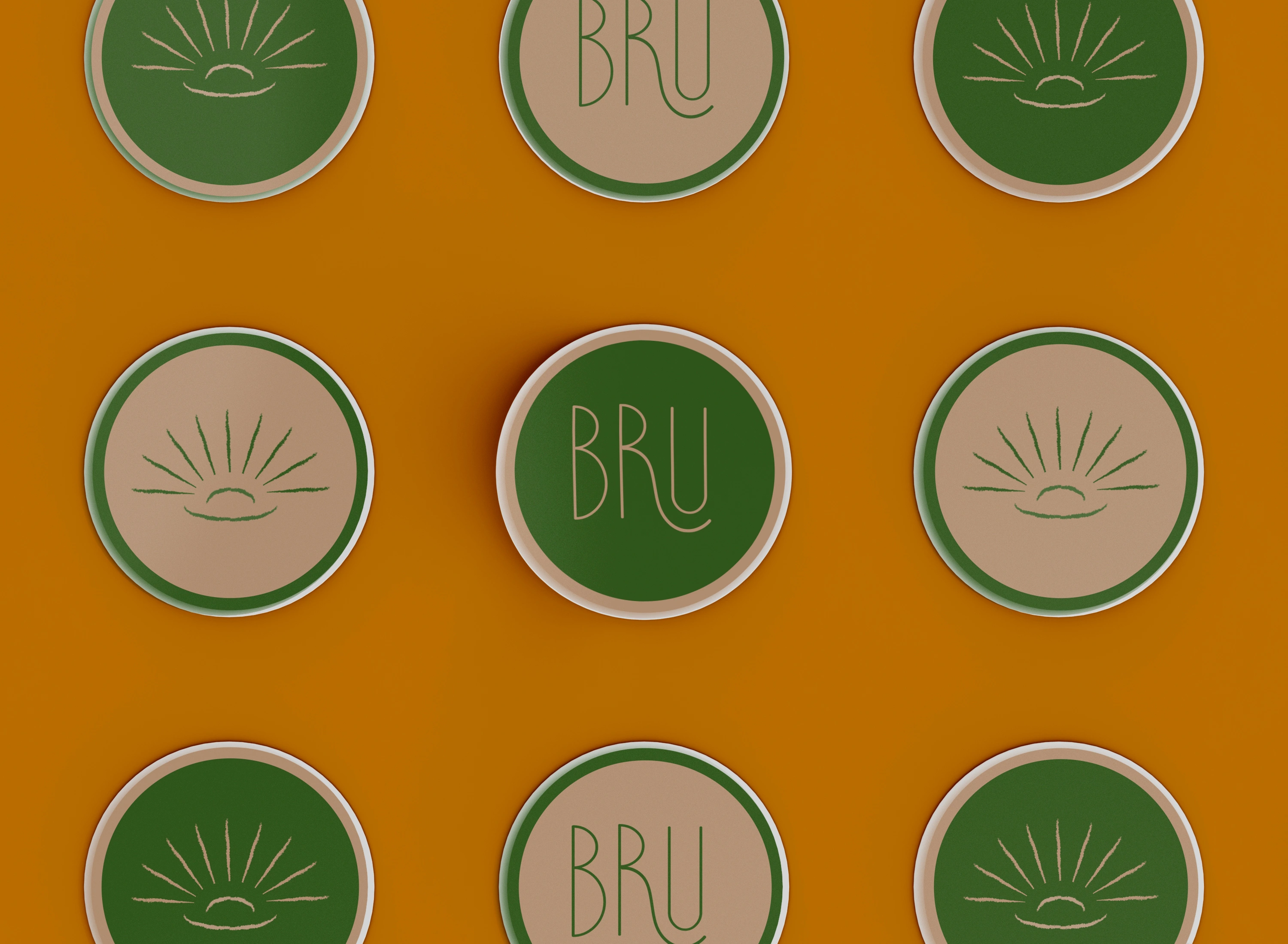
Logo Variations

Icon version

Horizontal version

Vertical version

Wordmark


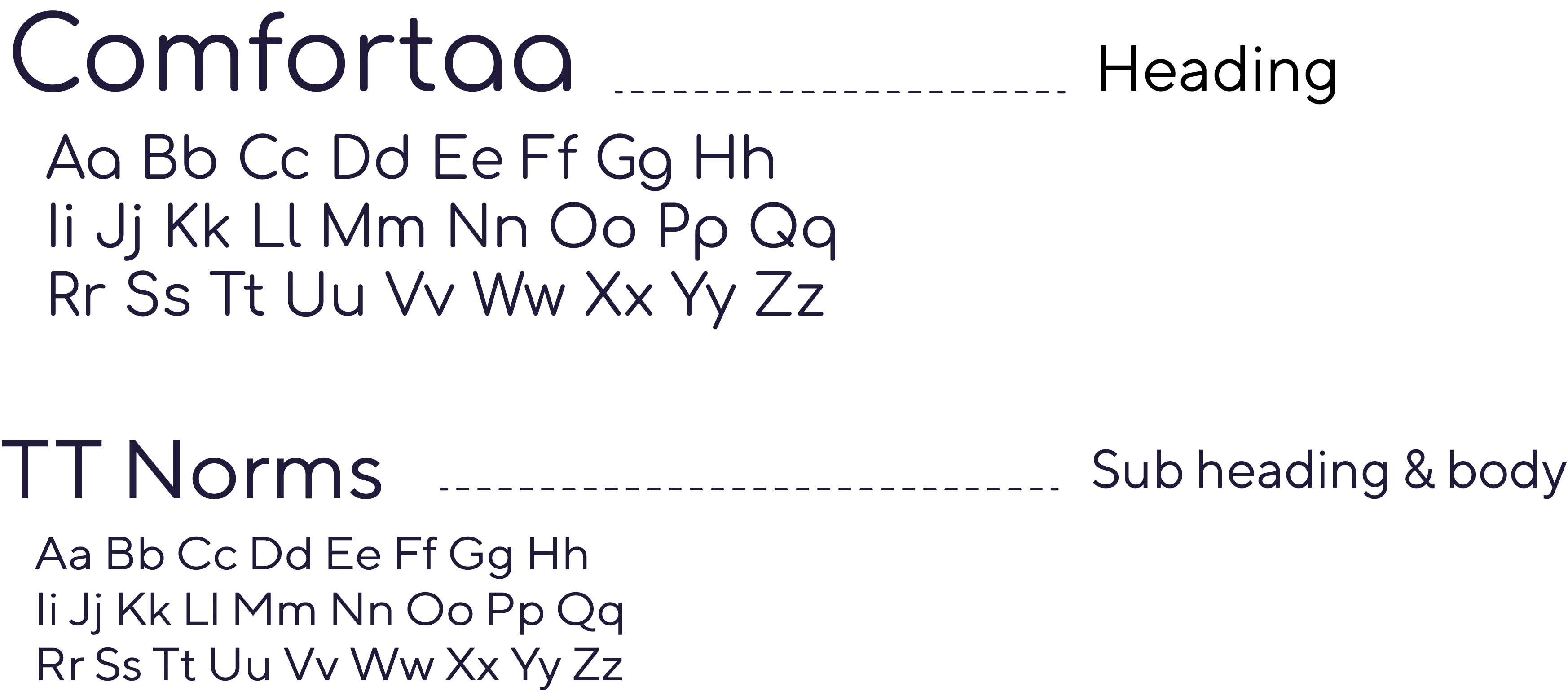
Typeface

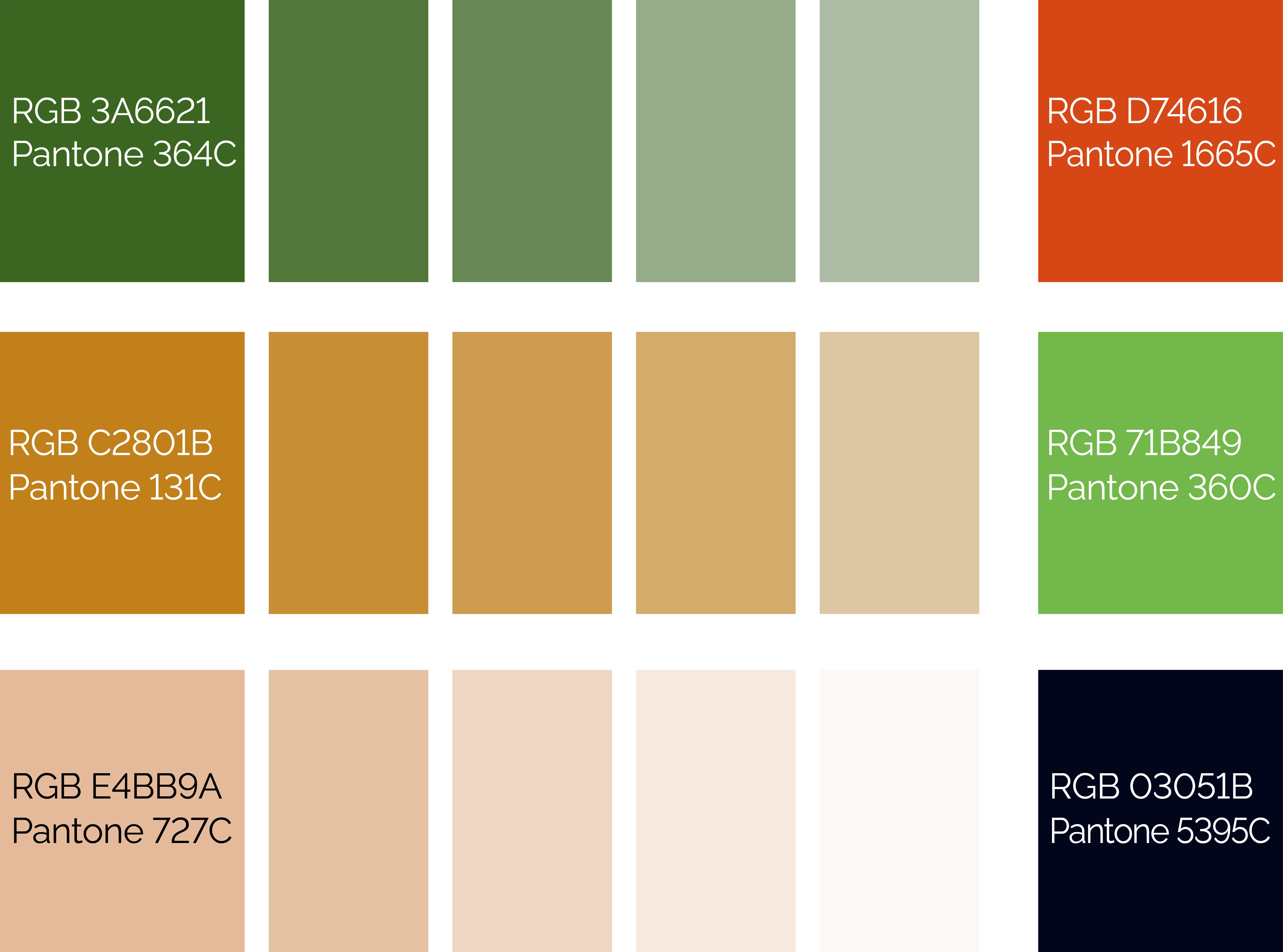
Color Palette
Brand Pattern


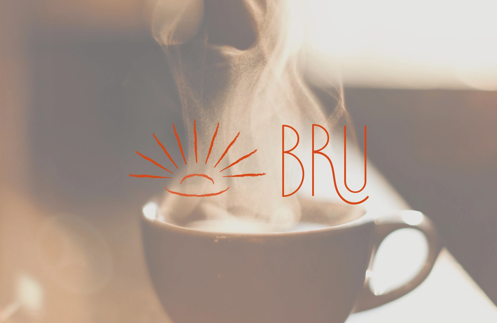
Brand in action
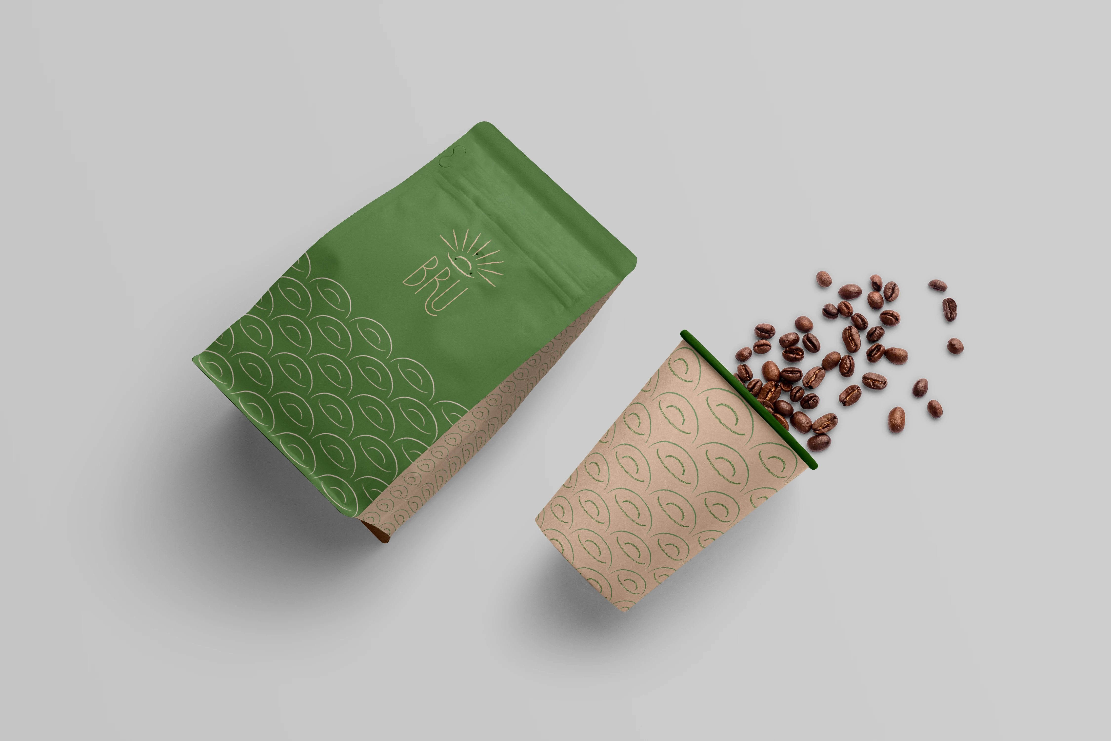
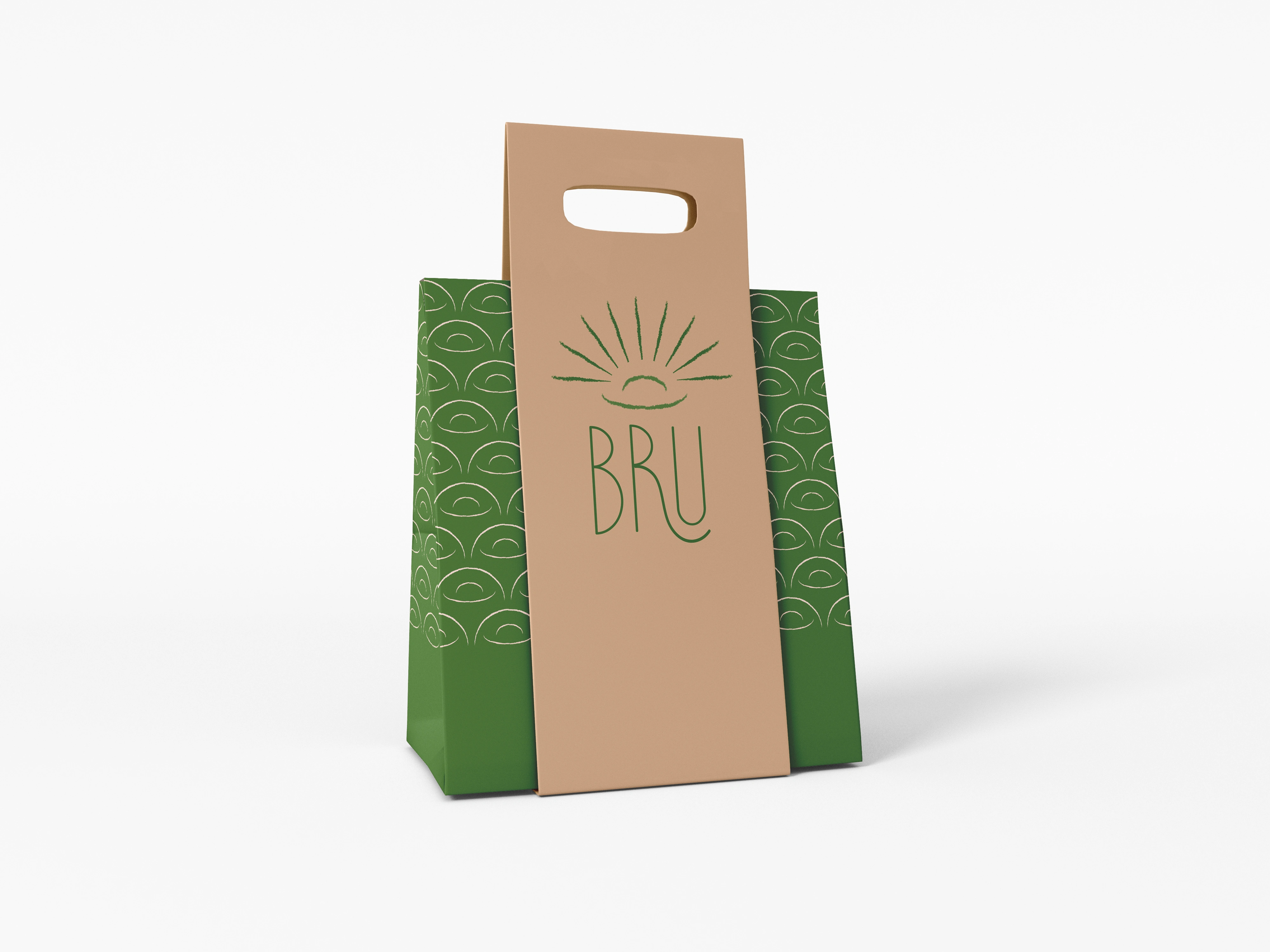

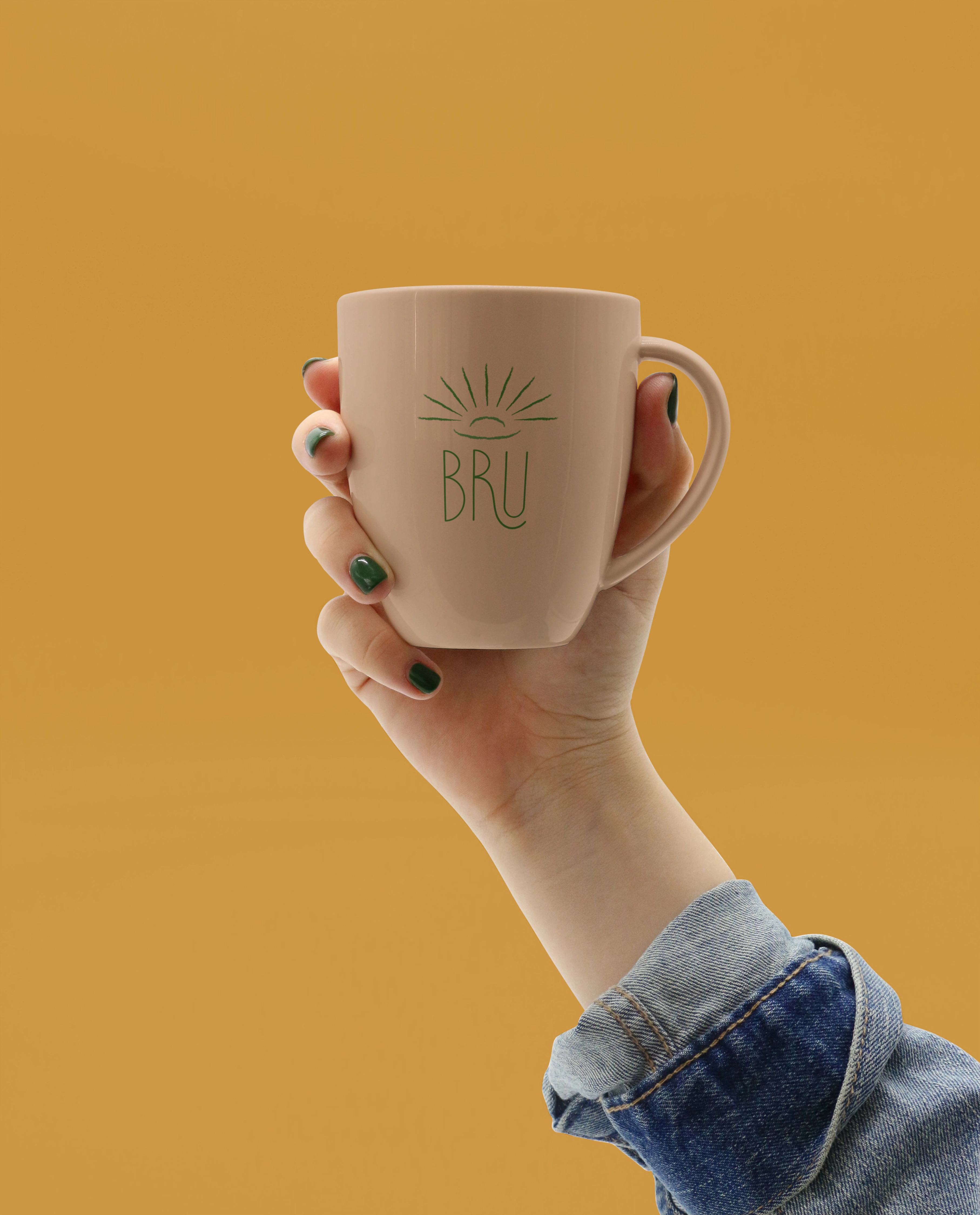


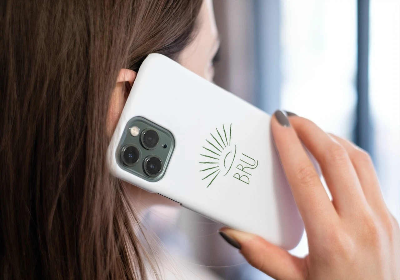
Brand Visuals


Like this project
Posted Jul 3, 2025
Aligned Brand Identity for evolved audience