Toon Bikes
Himan Bora
Overview:
Toon is a company on a mission to revolutionize cycling through technology. They approached us looking for a logo that embodied their brand identity: modern, professional, and tech-forward.
Challenges:
The key challenge was to encapsulate these multifaceted qualities – modern, professional, and techy – into a singular logo design. We needed a logo that would resonate with tech-savvy cyclists while maintaining a level of sophistication.
Results:
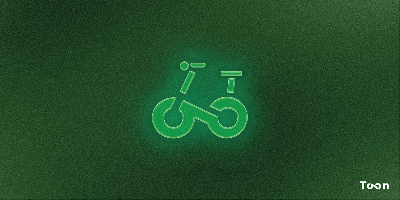
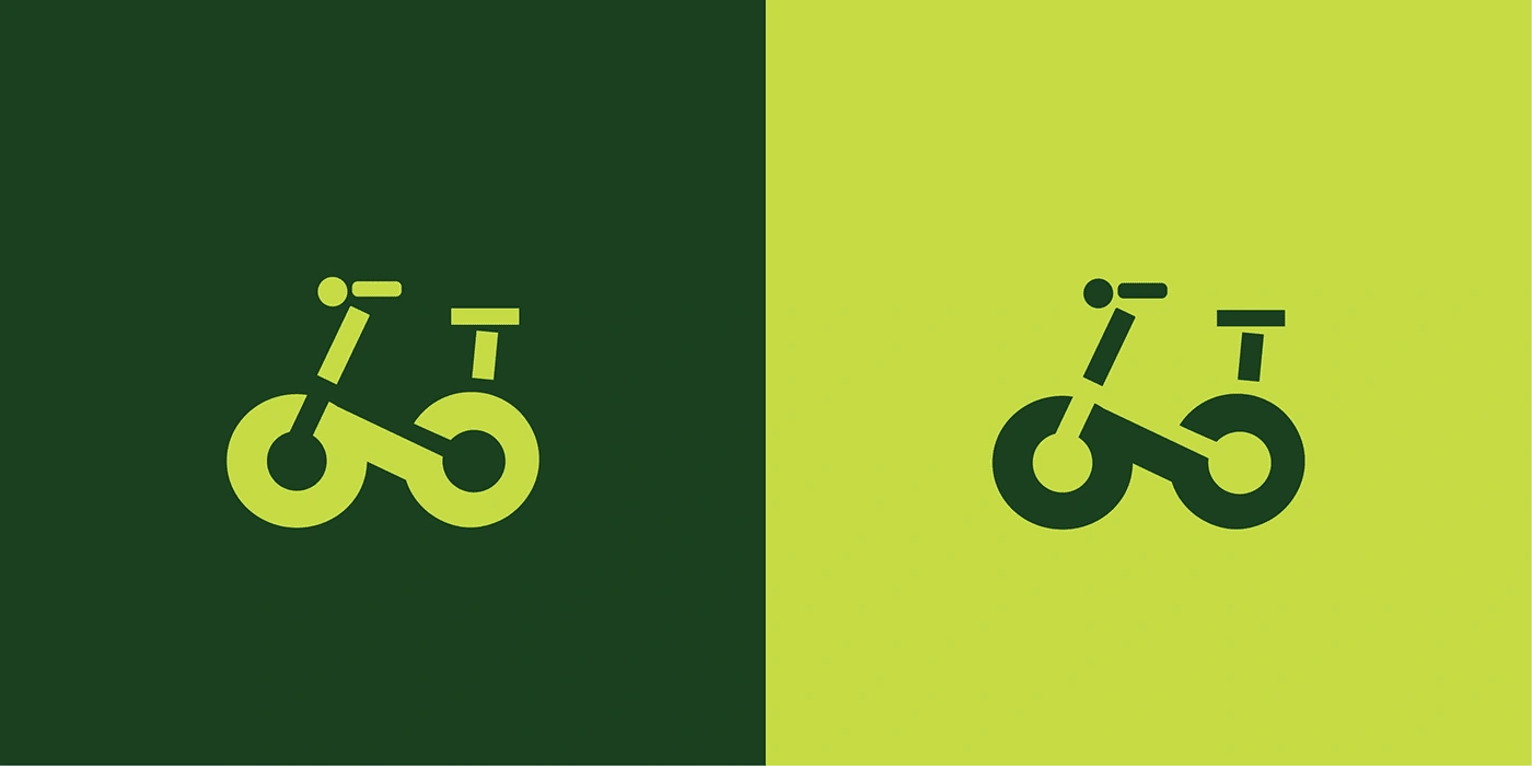
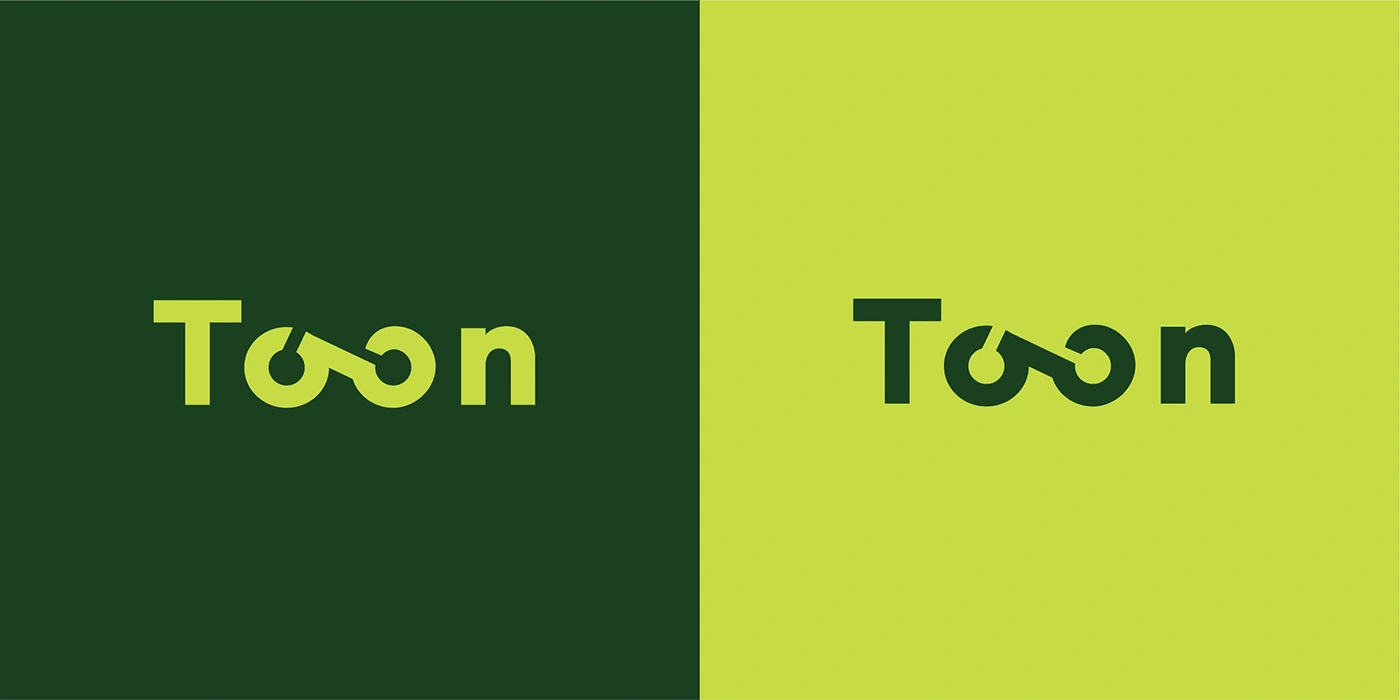
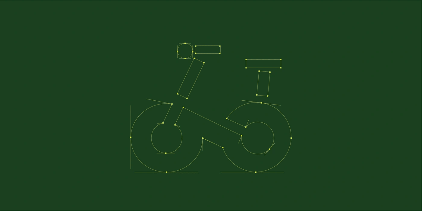
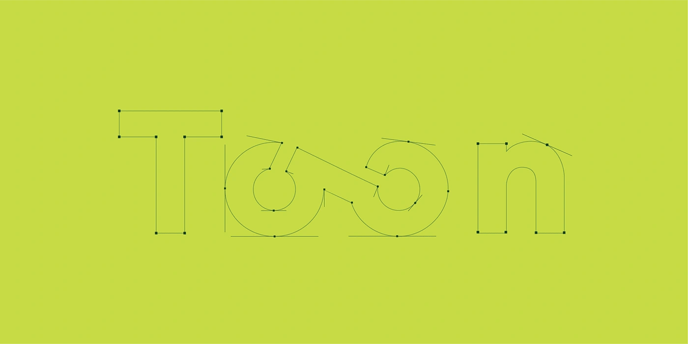
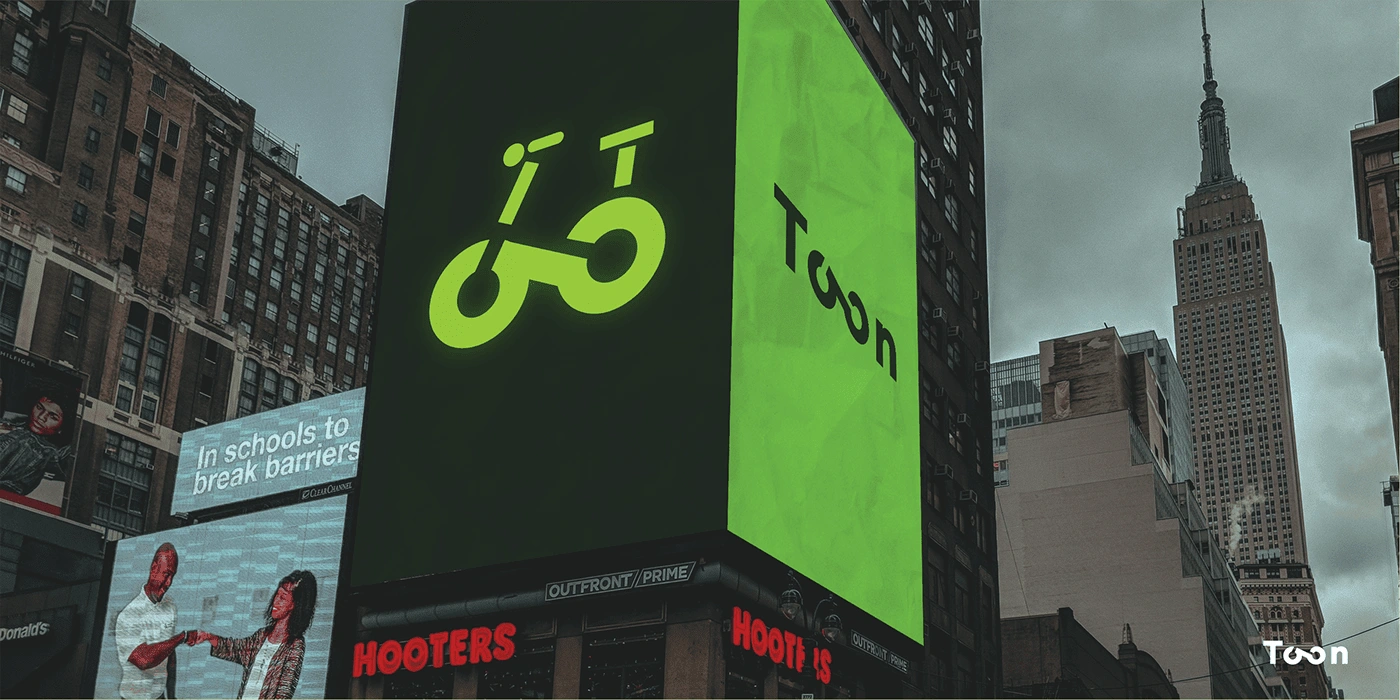
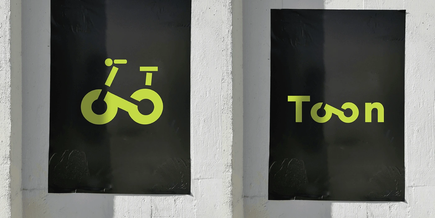
Our solution played on the inherent visual potential within the Toon name itself. We utilized the two Os to create a design that cleverly resembled a bicycle's two wheels. This subtle yet effective approach instantly conveyed the brand's connection to cycling.
Furthermore, we incorporated basic primary shapes to construct a clean and modern bicycle icon. This minimalist approach accentuated the logo's professional look and ensured scalability across various applications.
Conclusion:
The final logo design for Toon strikes a perfect balance between modern and professional aesthetics, with a tech-inspired twist. The clever use of the double Os and the clean, geometric shapes effectively communicate Toon's core values and their position at the forefront of cycling technology.
Like this project
Posted May 8, 2024
Toon is a company on a mission to revolutionize cycling through technology. They approached us looking for a logo that embodied their brand identity.