K8 Studio


About Client:
K8 Studio isn't your average film production company. They're a powerhouse of creativity, dedicated to crafting unforgettable cinematic experiences. Their focus lies at the intersection of groundbreaking ideas and captivating narratives.
Brief:
They wanted a designer who can create a unique, minimilastic logo design which separate them from their competitor who are still using the old similar logos for example see the picture bellow

The episode were family guy made fun of movie company/studio logos
The Mood Board:
Check out the designs from where I took my inspiration from

Logo Design Process :
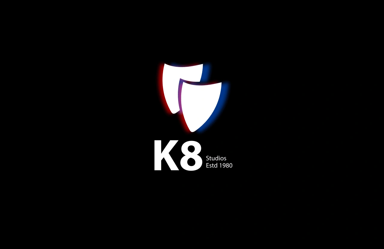
Lets start from the icon, it is a minimalistic approach to represent 2 masks which symbolizes the theatre, which was the precursor of movie. and drama. for this icon we used the overall outline of the mask and placed them thoughtfully to create a proper and beautiful negative space.

The Icon Represents 2 Masks
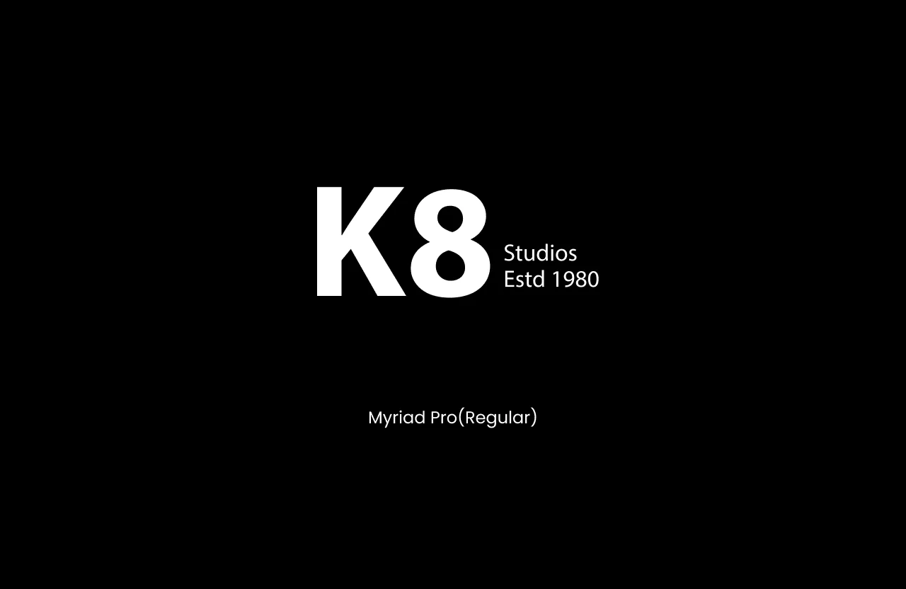
For the word mark the major change that we have done is the layout of the text which as you can see in the image, the name of the studio is taking the maximum space and the other miscellaneous info in its side but in a small font size. There were no font customization was done as the font was perfectly encapsulating the modern feel and the layout making it unique.

Social Media
Check out how the design would look like in social media plateforms

Like this project
Posted May 7, 2024
A logo design I did for a film making studio called K8 studio. they were seeking a logo which is modern, minimalistic and unique.
Likes
0
Views
2
Tags


