Unifying Waitr, Delivery Dudes, and BiteSquad
Overview
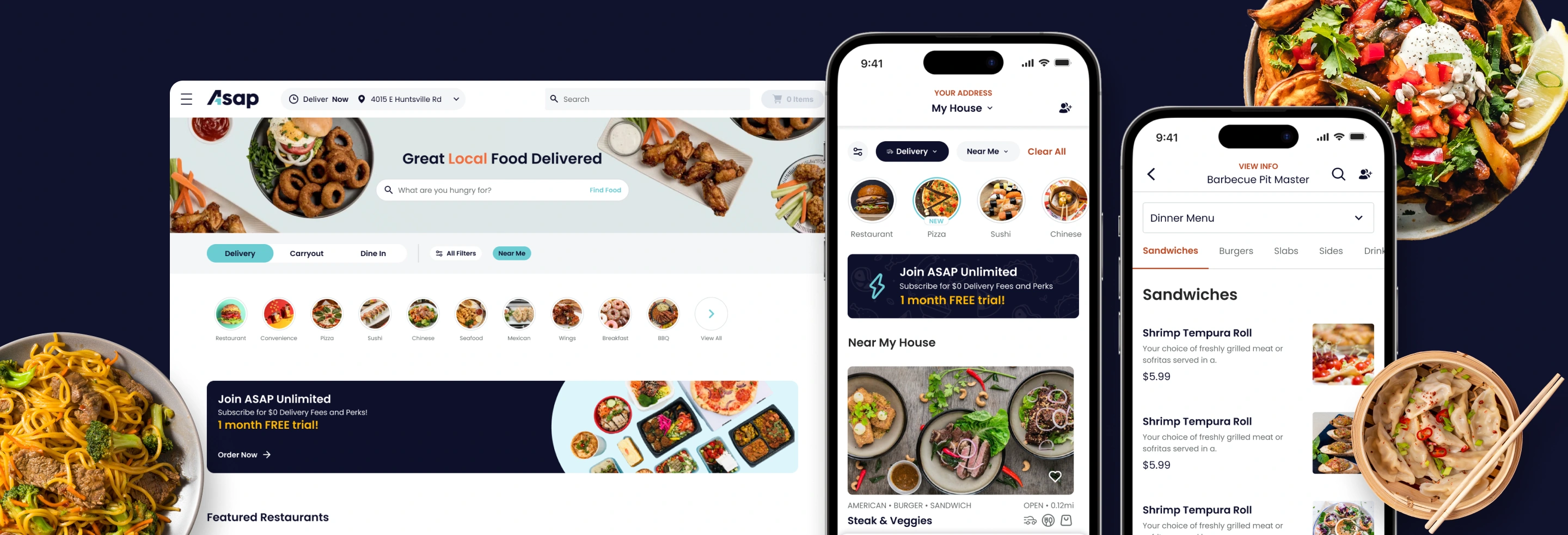
ASAP is an American online and mobile prepared food ordering, delivery, and grocery delivery company.
In a strategic move to consolidate their market presence, Waitr, Delivery Dudes, and Bitesquad merged to form ASAP.
Goal
The primary goal of the project was to rebrand the Waitr app as ASAP, aligning it with the new company identity while ensuring a seamless transition for users.
How might we efficiently proceed with the rebranding despite the absence of a proper design system and the presence of inconsistent and uncategorized design files?
As a newcomer to Waitr, I encountered several challenges. The absence of a flow map complicated understanding the app's navigation and user journey, requiring additional effort to map user flows. Outdated design techniques in the files highlighted the need for modernization and alignment with industry standards. Disorganized design files made it time-consuming to understand the app's structure and identify components and flows. The lack of auto-layout in components led to non-scalable designs, emphasizing the need for scalable design practices. Inconsistencies in spacing across the UI detracted from visual coherence and user experience. Additionally, the initial task communication via Slack lacked systematic tracking and management, complicating task prioritization and progress tracking.
The Process
I conducted a UI inventory audit to thoroughly assess the existing interface.
This initial step allowed me to gain insights into the current state of the UI, identify areas of inconsistency, and lay the groundwork for subsequent design decisions and improvements.
I collaborated closely with the product manager to understand the app's flow, especially since there was no existing flow map. Organizing screens by flows and adding clear flow titles at the beginning of each sequence ensured easy identification and navigation through the interface.
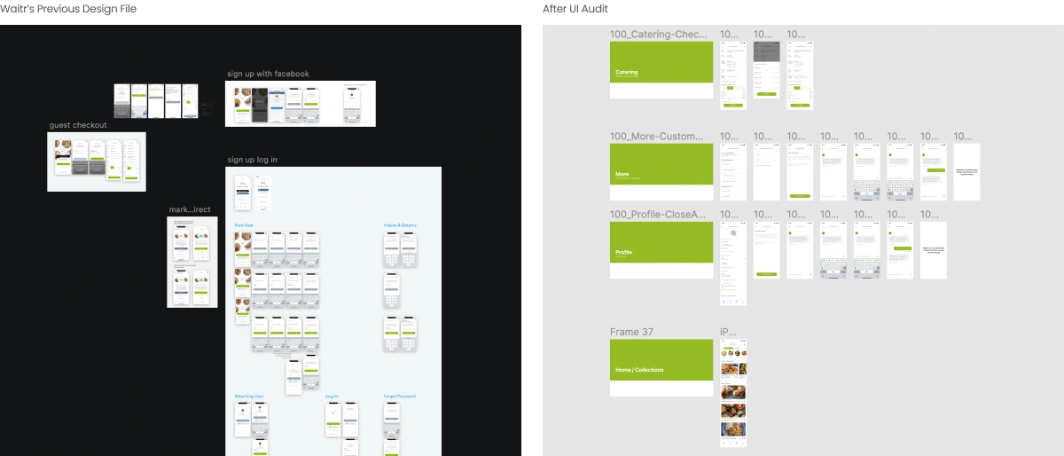
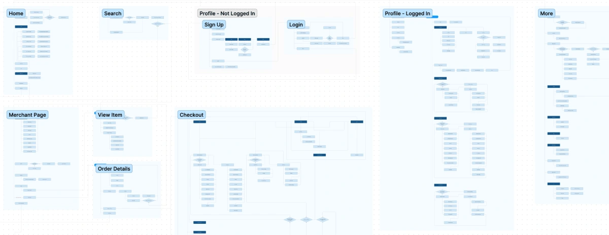
Following the UI audit, I began crafting a user flow map
After meticulously assessing the UI through the audit process, I embarked on the creation of a user flow map. This comprehensive visualization served as a blueprint to understand the intricate navigation paths and user journey within the app.
Next step is to build a design system
A design system is important because it ensures consistency, efficiency, and scalability in product design and development, fosters collaboration, promotes accessibility, encourages innovation, and simplifies maintenance.
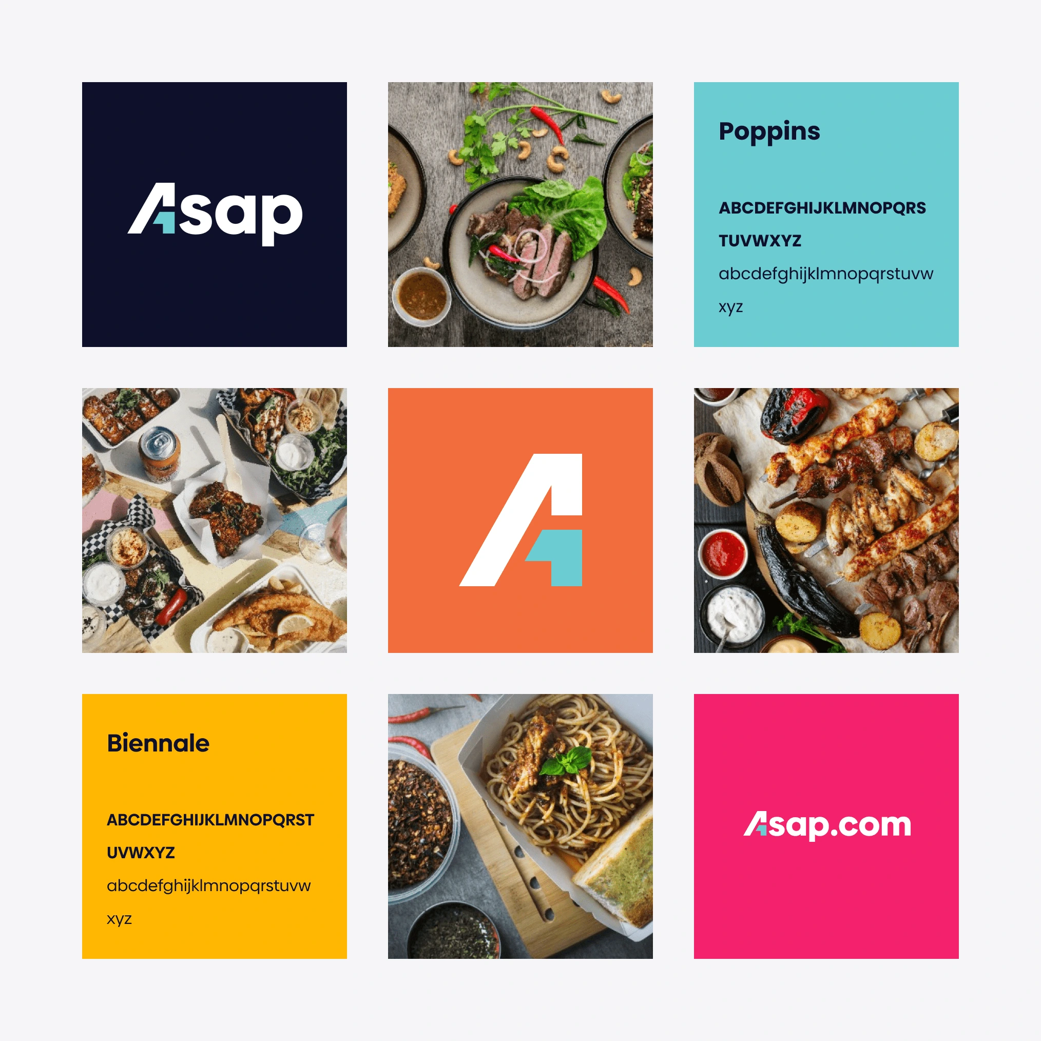
Gathering Brand Assets
At the outset of the rebranding endeavor, I initiated communication with the marketing team to procure essential branding assets vital for the transformation. This involved requesting comprehensive branding materials including colors, fonts, logos, and imagery that encapsulated the essence of the new ASAP identity.
Creating Design Standards
Upon reviewing the previous Waitr files, several issues were identified, including the absence of a cohesive design system, outdated design methods, and inconsistent spacings and components.
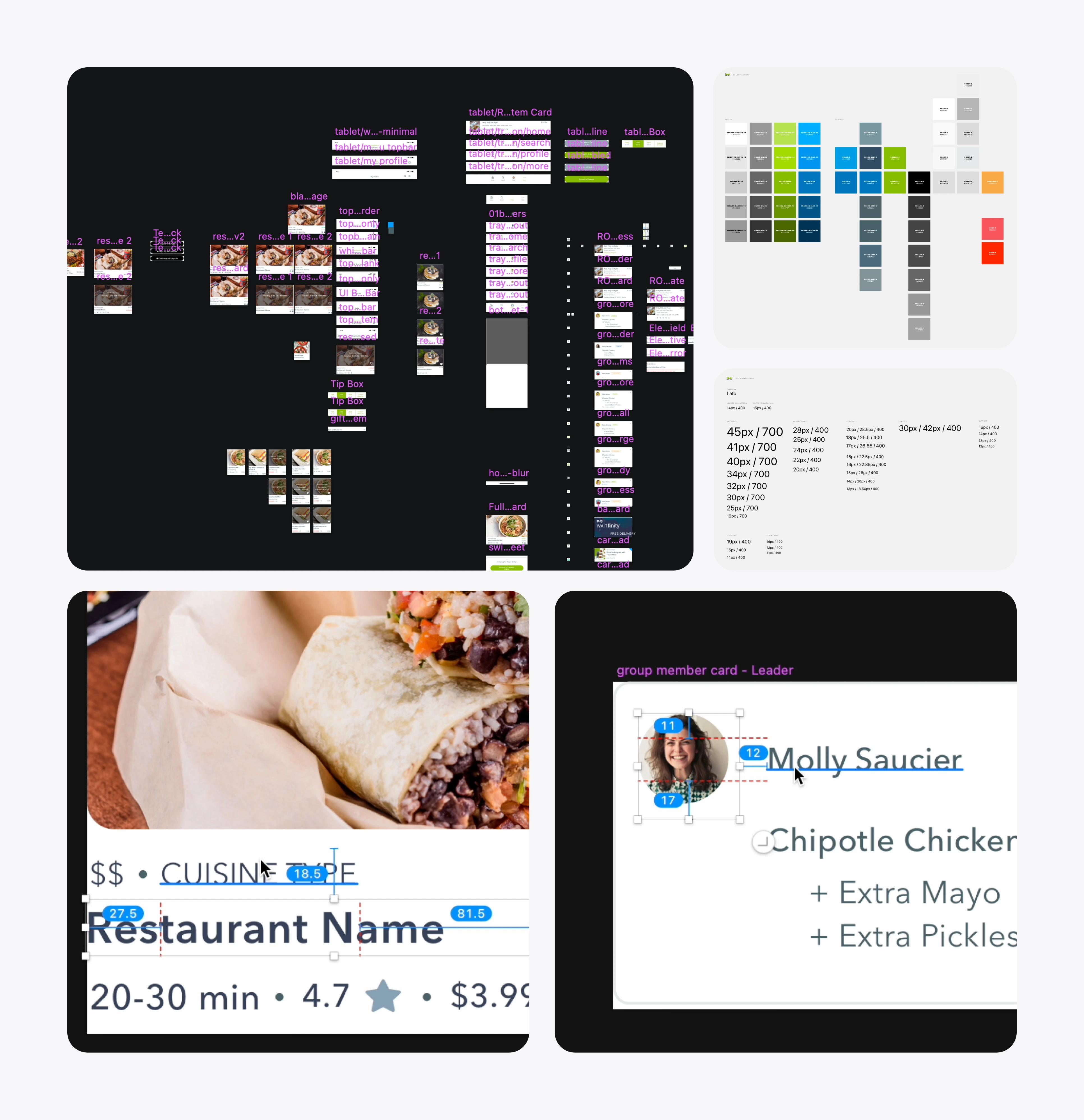
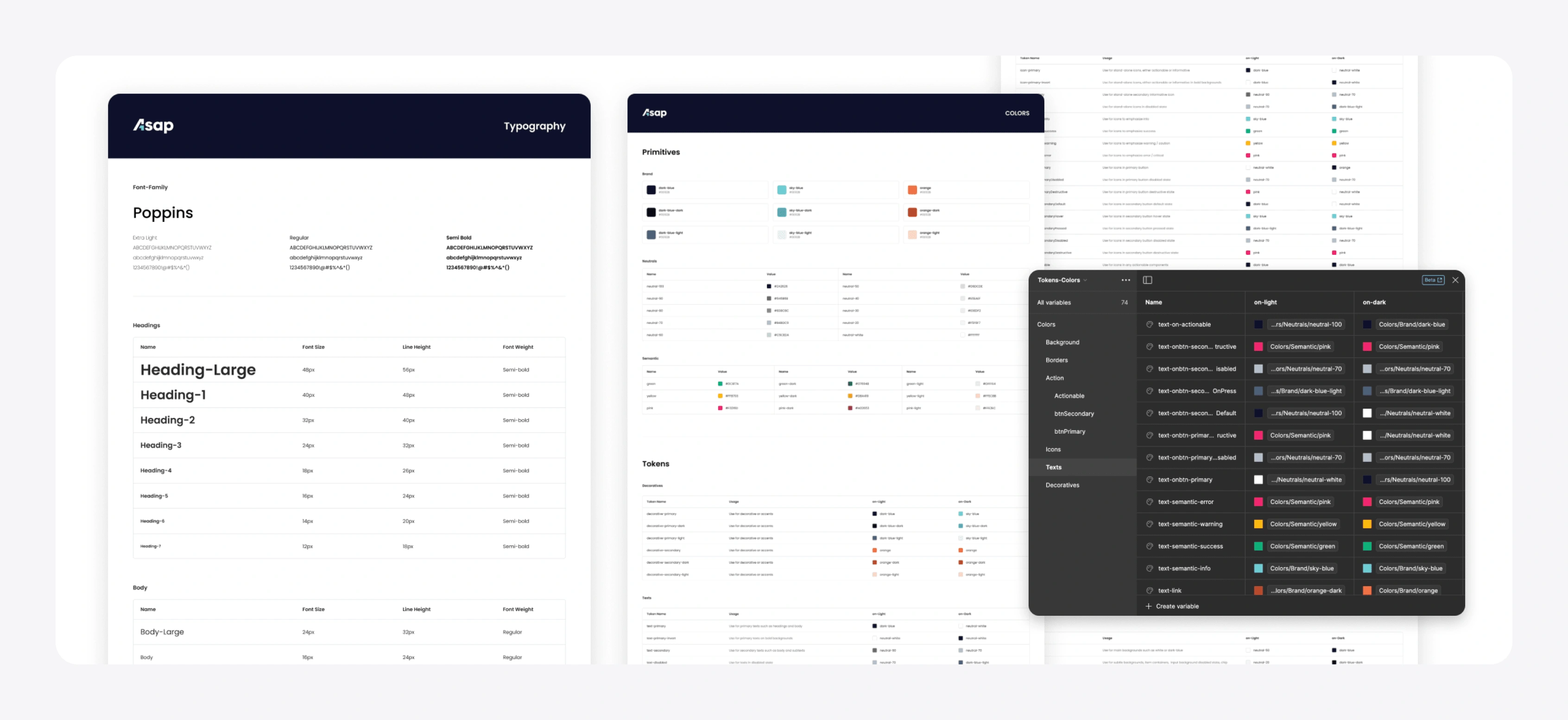
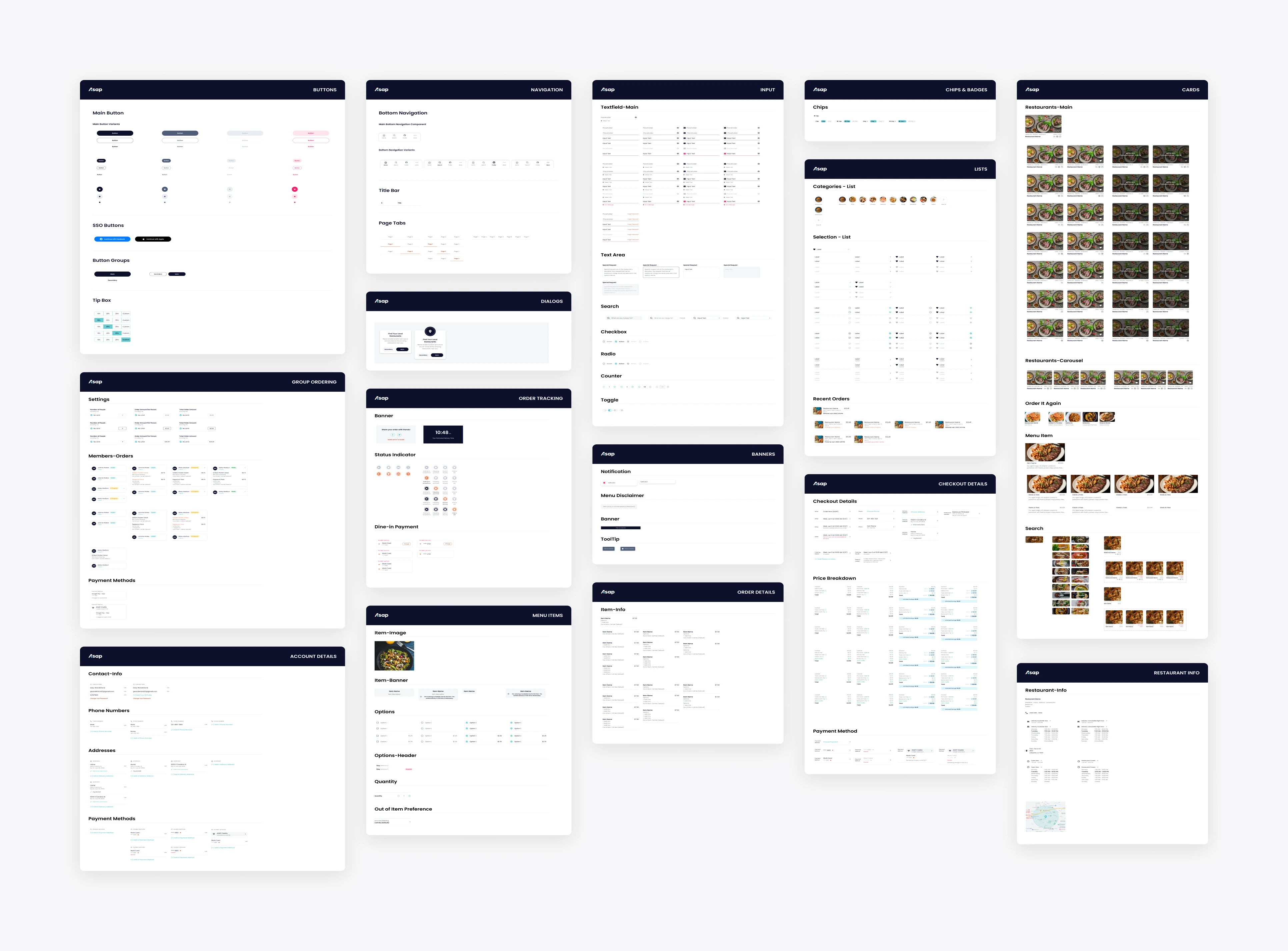
Prioritizing consistency and visual coherence, I began by creating comprehensive design standards encompassing typography, colors, sizes, and border radius. By defining these foundational elements upfront, I ensured a unified and harmonious visual language throughout the app.
Building the Components
With design standards established and color styles defined, I created modular design components that could be easily reused and adapted across various screens and functionalities. Auto-layout and variants were utilized to ensure scalability and flexibility, allowing for swift iterations and updates as needed.
Final Design
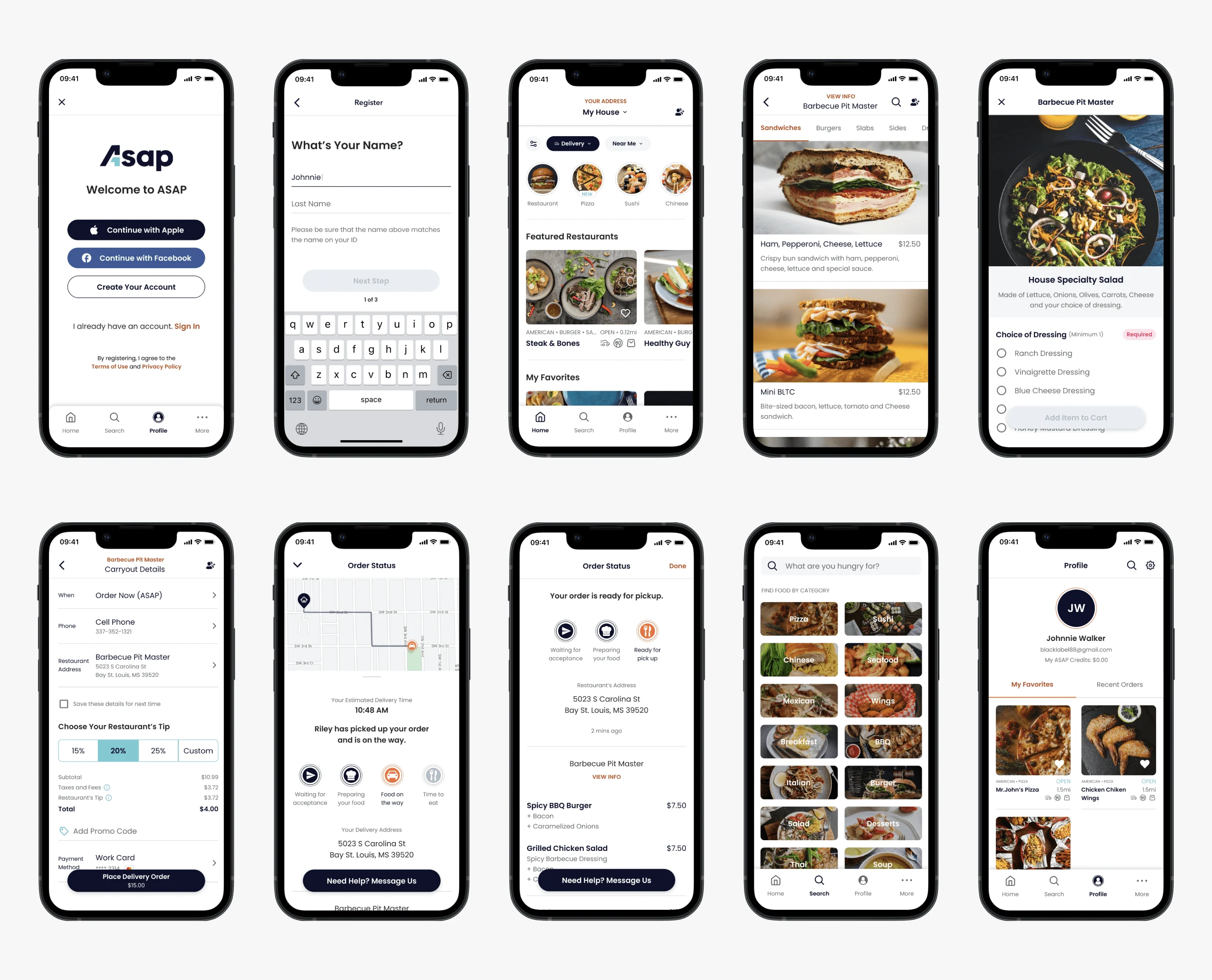
Following the finalization of the design system, I transitioned to creating the screens. Utilizing the flow map and UI Inventory Audit as my guides, I systematically gathered all required screens and proceeded to design them, ensuring comprehensive coverage and adherence to established design principles.
Outcome
Enhanced Internal Experience
The meticulously designed UI elements and streamlined flow mapping resulted in a vastly improved internal experience. Users navigated the app with ease, leading to increased engagement and satisfaction.
Consistent Brand Representation
By establishing a cohesive design system and rebranding all associated products, ASAP achieved consistent brand representation across its entire ecosystem.
Increased Efficiency
The implementation of Figma's Variables feature and auto-layout functionalities allowed for greater efficiency in design iteration and maintenance. Designers could easily update design tokens and components, resulting in time savings and streamlined workflows.
Seamless Integration
The reworked designs seamlessly integrated with existing backend systems, minimizing disruptions during the transition phase. Users experienced uninterrupted service continuity, ensuring a smooth transition to the rebranded app.
Positive Stakeholder Reception
Stakeholders, including management and product teams, responded positively to the redesigned UI and enhanced functionality. The alignment of design with business objectives and user needs garnered praise and recognition across the organization.
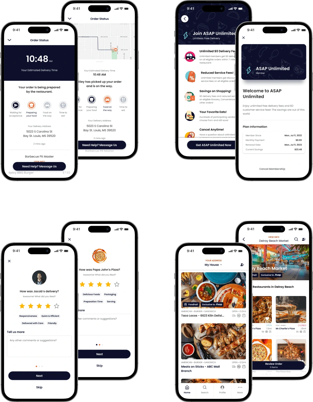
Released New Features
Like this project
Posted May 28, 2024
The primary goal of the project was to rebrand the Waitr app as ASAP, aligning it with the new company identity while ensuring a seamless transition for users.


