Enhancing Visitor Experiences: The Arches National Park App

Mariah Foerster
UX Designer
Product Designer
UI Designer
Adobe XD


Figma

Wix

Arches App is a mobile prototype designed to enhance the visitor experience at Arches National Park. I was tasked with creating an intuitive, immersive app for a national park and chose Arches for its unique beauty and opportunities. My goal was to design an app that reflects the natural wonder of the park, remains simple enough for users to navigate while on trails, and introduces visitors to all the activities and attractions Arches has to offer.
Research and Early Design Exploration
Before diving into design, I conducted research to understand the existing digital resources for Arches National Park. Surprisingly, I found very few—just the official park website, a couple of Utah Big 5 resources, and some scattered blogs. None of these options offered a truly interactive mobile experience, which confirmed the need for a dedicated app.
With this gap in mind, I began sketching initial concepts. I focused on creating an intuitive design where users could easily navigate information while on the trails. After completing my sketches, I moved on to gray comps. This stage is where my ideas took shape, and I could identify potential issues early.
One challenge was the size of the buttons, which initially took up too much space and required extra scrolling. Instead of reducing the button size, I opted to organize the buttons into clearly defined sections, making navigation easier. Another challenge involved overly large headers, which I corrected by adjusting their scale for mobile screens, and testing the design to ensure proper visual hierarchy and readability.
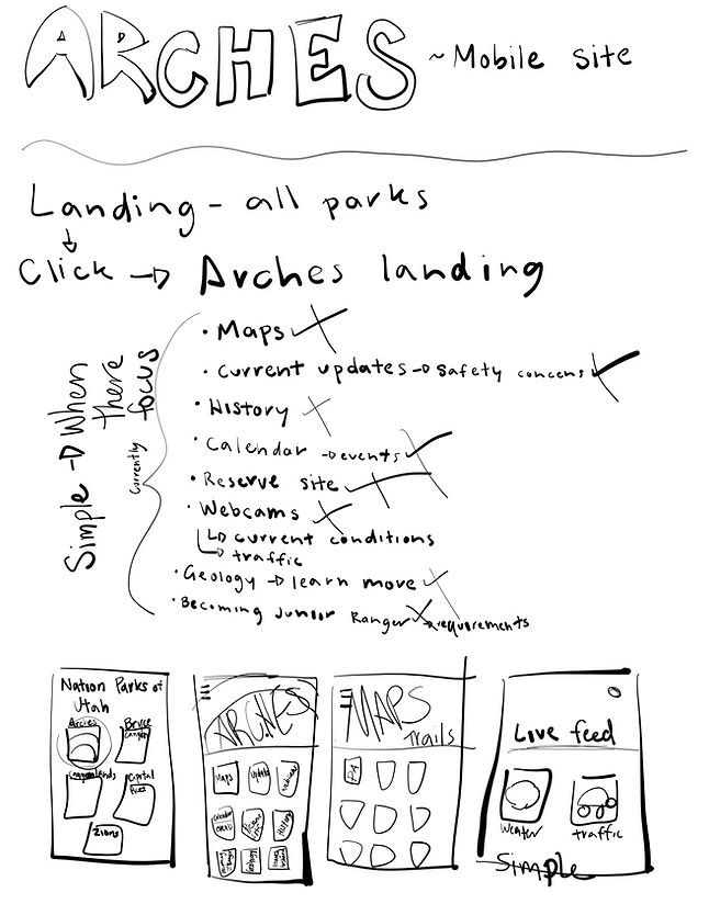
List of Needs for App
Visual Design and Prototyping
After finalizing the wireframes, I moved on to the visual design phase, where the app began to take on the natural beauty of Arches National Park. My goal was to reflect the park's iconic landscapes through the color palette, using earthy tones like reds, browns, and subtle desert hues to create an immersive experience. Initially, I made the mistake of not developing a style guide, which slowed the process. However, once I defined a cohesive set of colors and fonts, the app’s design came together, reinforcing the Arches theme.
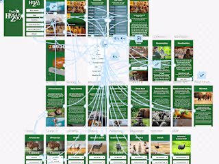
With the color comps complete, I started building the prototype. This phase was more challenging than anticipated, as I had to map out the entire user flow, ensuring that screens were logically connected and easy to navigate. I also incorporated key features from the official Arches site, such as trail maps, real-time updates, and events. One unique addition was the "Share Your Photos" feature, which encourages community engagement by allowing users to upload their own park photos.
User testing was a crucial part of this process. I gathered feedback from peers and potential users, which helped me refine both the design and functionality. These tests led to small but impactful changes in layout and interaction, ensuring a smoother user experience. You can view the prototype here.
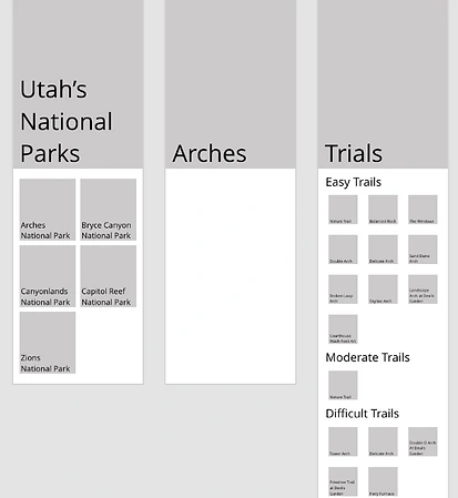
Gray Comps
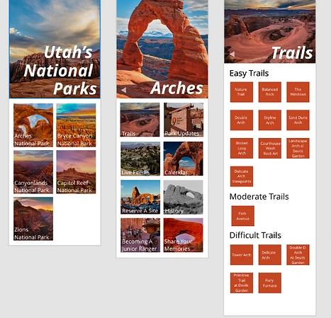
Color Comps
Conclusion
This project taught me invaluable lessons about the importance of consistency and thorough research in the design process. From the start, I aimed to create an app that captured the natural beauty and simplicity of Arches National Park while remaining functional for users navigating the park in real time. One of the key takeaways was the need for design consistency—not just in visual elements like colors and typography, but also in how users interact with the app. Establishing a style guide earlier in the process would have streamlined the design phase, ensuring cohesive branding across all screens.
Additionally, this project reinforced the importance of research. Understanding the existing digital landscape for Arches, as well as what users typically look for in a national park app, was essential for making informed design decisions. This research guided everything from feature prioritization to user flow and helped me better address the specific needs of park visitors.
Finally, prototyping and user testing provided critical feedback, allowing me to fine-tune the app and improve both usability and aesthetics. I gained practical experience in linking design decisions to user needs and learned how even small adjustments, like refining typography or button sizes, can elevate the overall experience.
This project sharpened my skills in creating user-centered designs and strengthened my ability to translate research into effective, consistent design solutions.