BAEK Bakery Branding Project

Ash


About the brand
BAEK is a modern Korean bakery branding project focused on creating a soft, memorable, and emotionally warm identity through minimal design, expressive typography, and hand-drawn illustrations. The bakery specializes in traditional Korean breads, pastries, cakes, and sweets while presenting them through a contemporary visual language inspired by modern Seoul café culture.
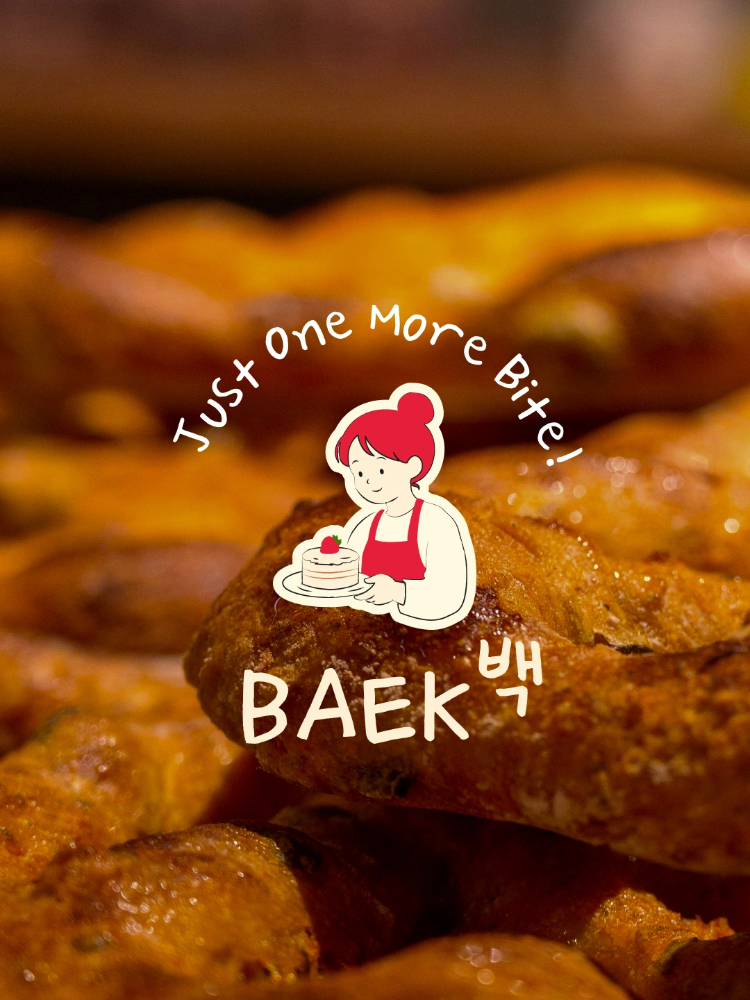
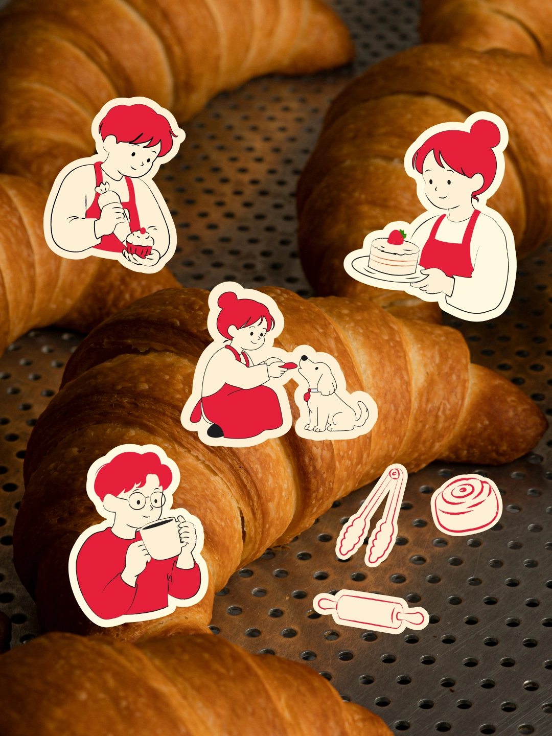
Brand illustrations
Goal
The primary goal behind BAEK was to break away from that repetition. I wanted to create a bakery identity that instantly stands out while still maintaining softness and warmth. The project was designed to feel modern and minimal, but also emotionally human and approachable.
The branding focuses on creating small emotional moments through color, typography, illustration, and packaging experience.
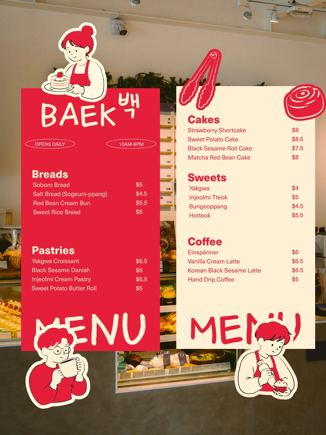
menu card
Color Palette
One of the strongest visual decisions within the project was the color palette.
Rather than using conventional bakery colors such as brown, muted beige, or overly pastel tones, BAEK uses a velvet red combined with cream-white and soft charcoal black. This decision was intentional. The velvet red creates immediate visual recognition and emotional impact while still maintaining warmth and softness. Since very few bakery brands use deep velvet red tones as a primary brand color, the palette helps BAEK stand out and become more memorable to customers.
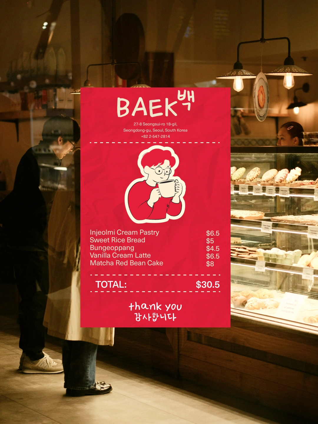

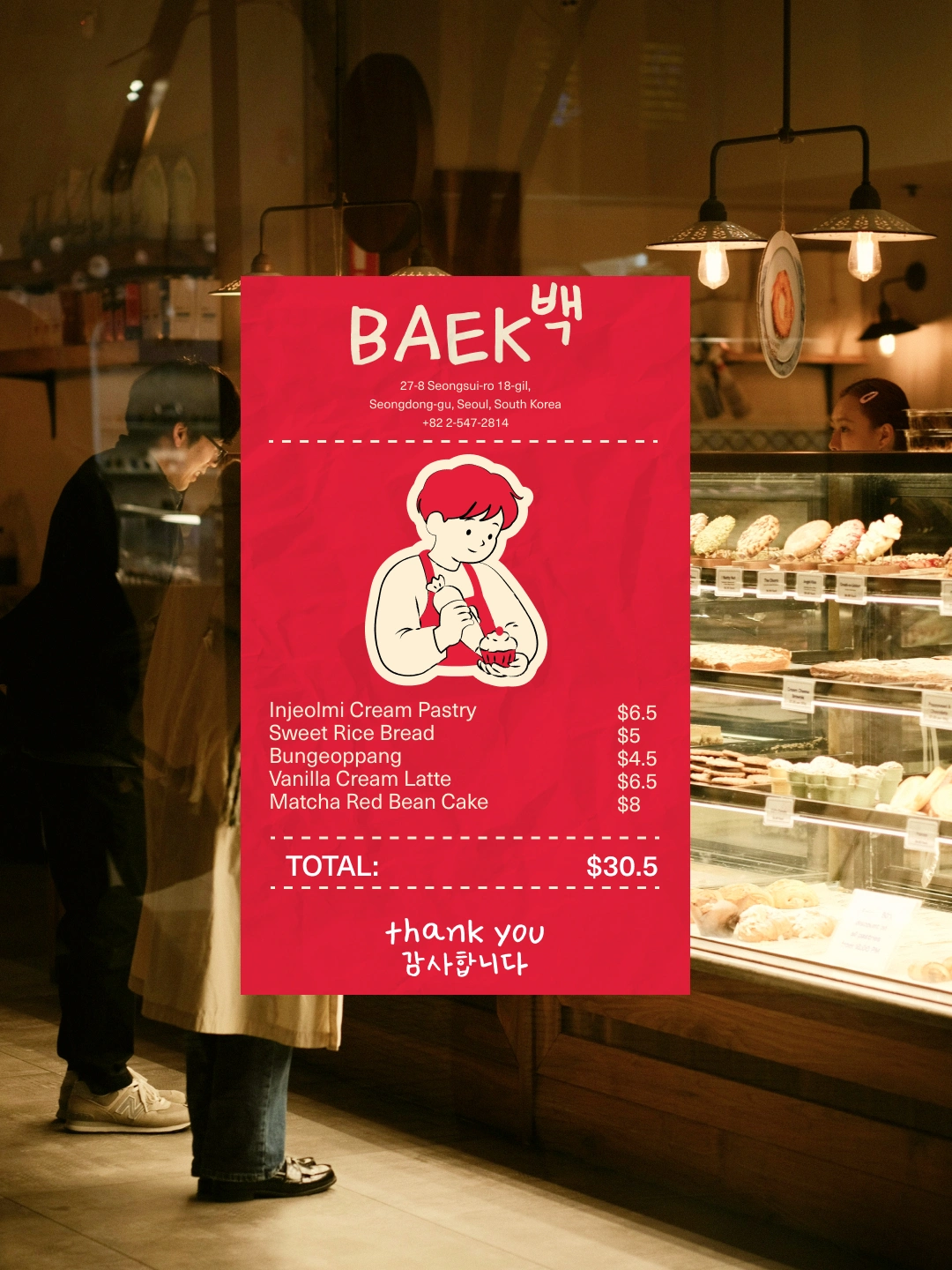
One of the unique elements within the project was the concept of creative receipts. Instead of treating receipts as purely functional items, the bakery experience extends into small, printed brand interactions that customers receive after purchasing products.
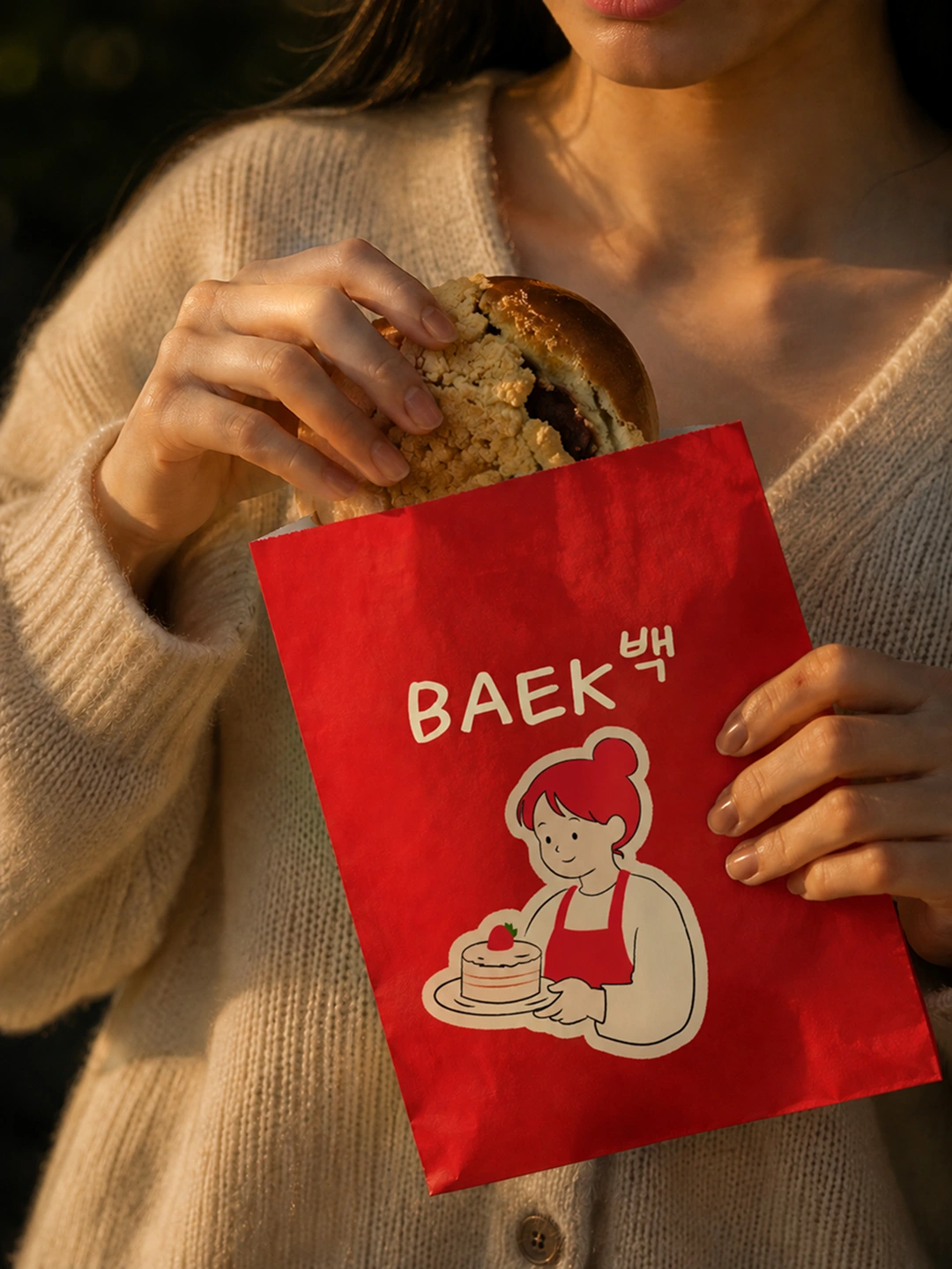
paper bag
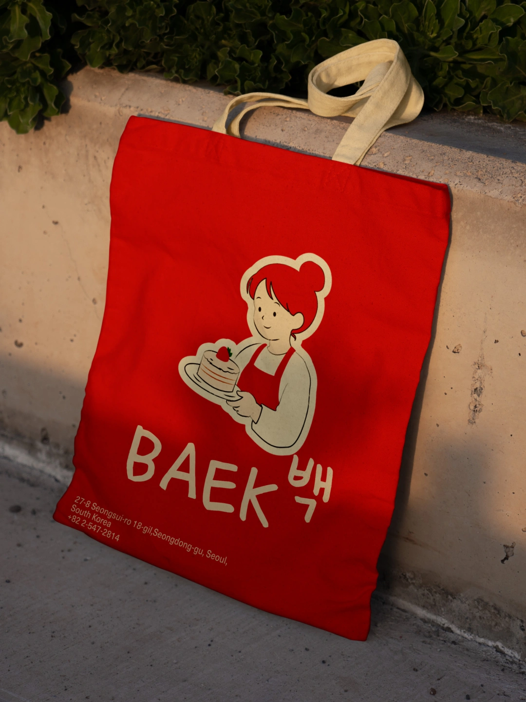
Tote bag
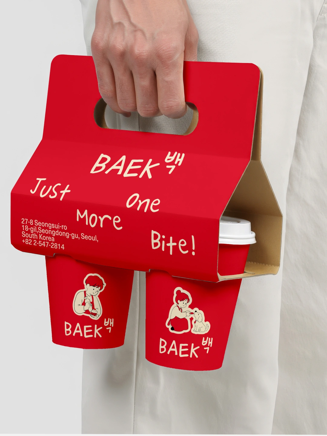
coffee cup holder
Like this project
Posted Jun 2, 2026
Created a unique, modern branding identity for BAEK bakery with a memorable color palette and creative design elements.