DARO Rebranding 2022
Arda Kilic
I had the opportunity to completely rebrand DARO, a Germany-based web development company that also specializes in UI and brand design. The goal was to create a fresh visual identity that reflects DARO’s innovative spirit and forward-thinking approach.
The rebranding included the development of a new logo, tagline, typographic system, custom iconography, and a full suite of business equipment, both in print and digital formats.
This project was about giving DARO a clean and confident new start, built on a system that’s not only visually striking but also versatile, modern, and future-proof—a strong foundation for everything DARO stands for today and going forward.
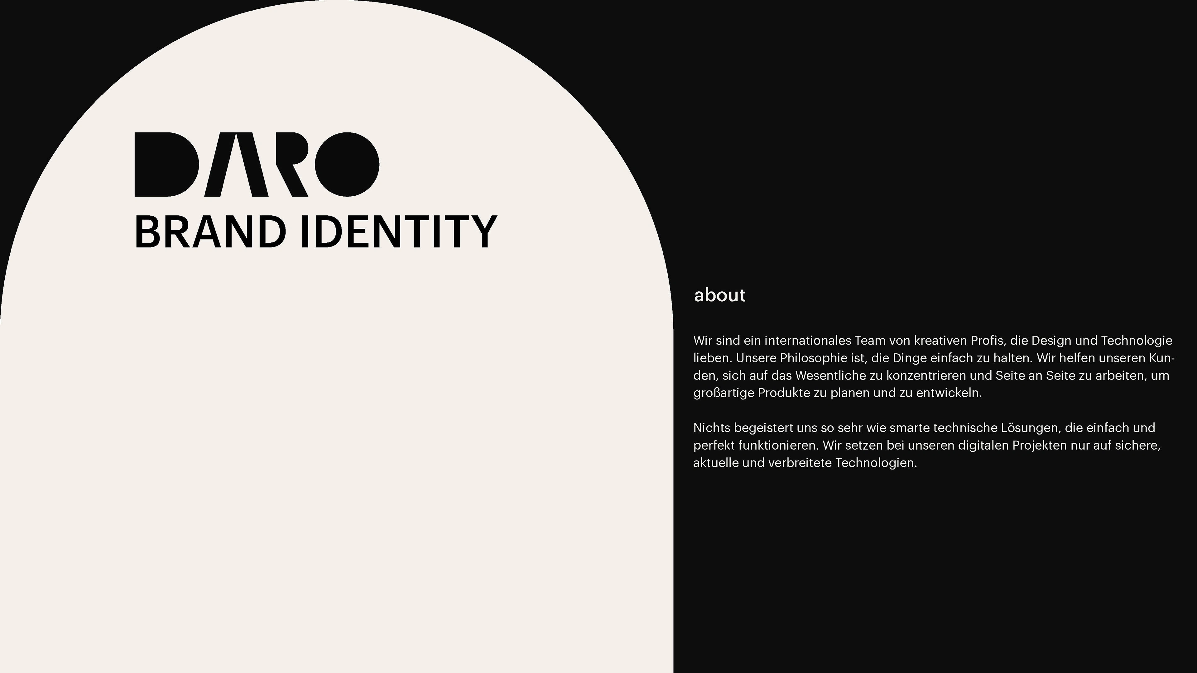
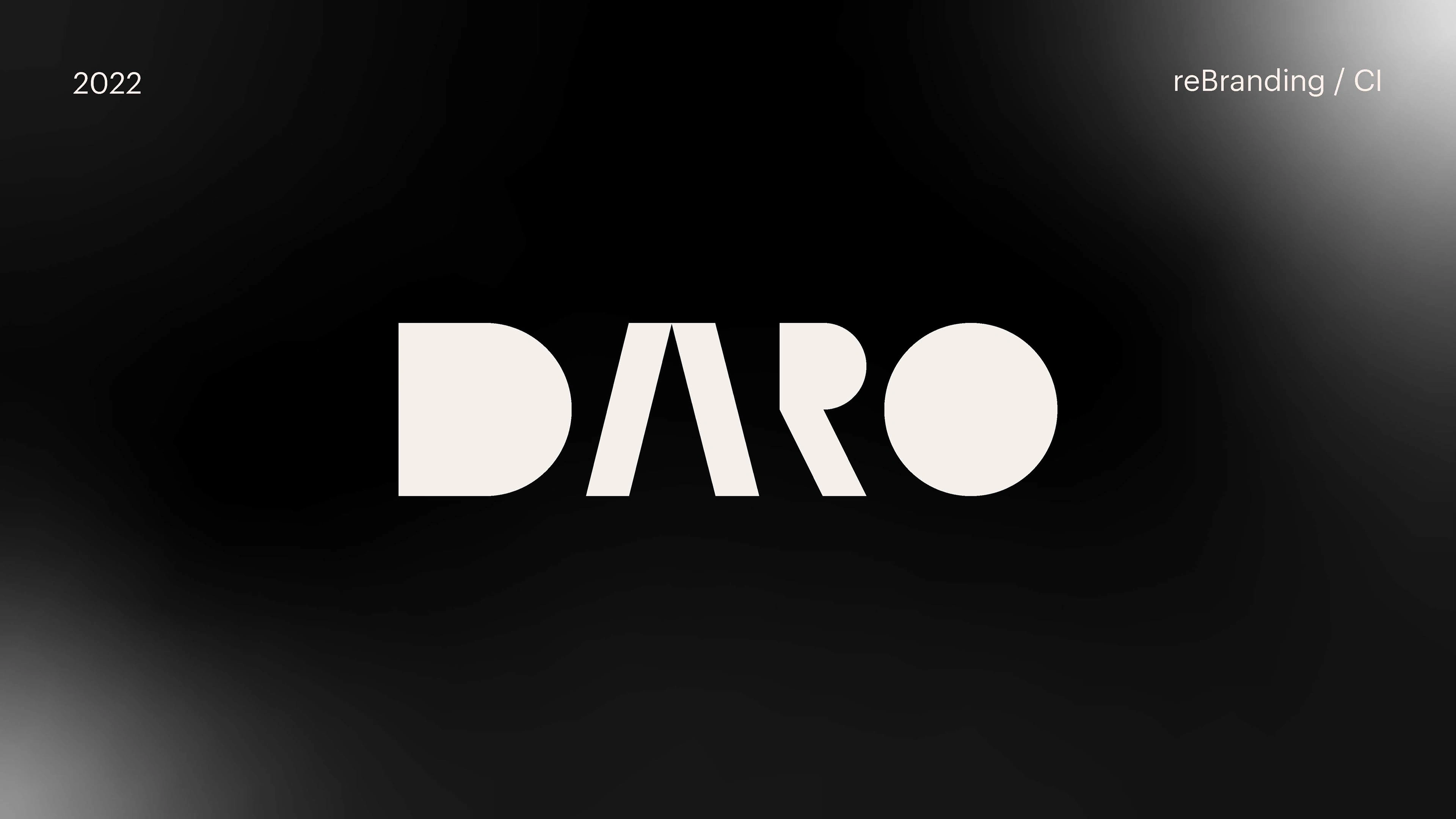
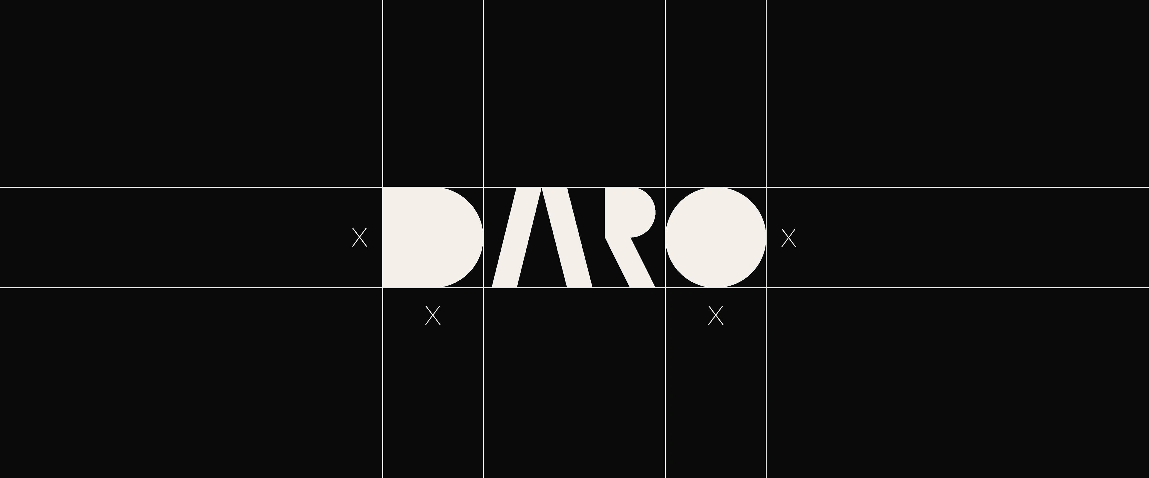
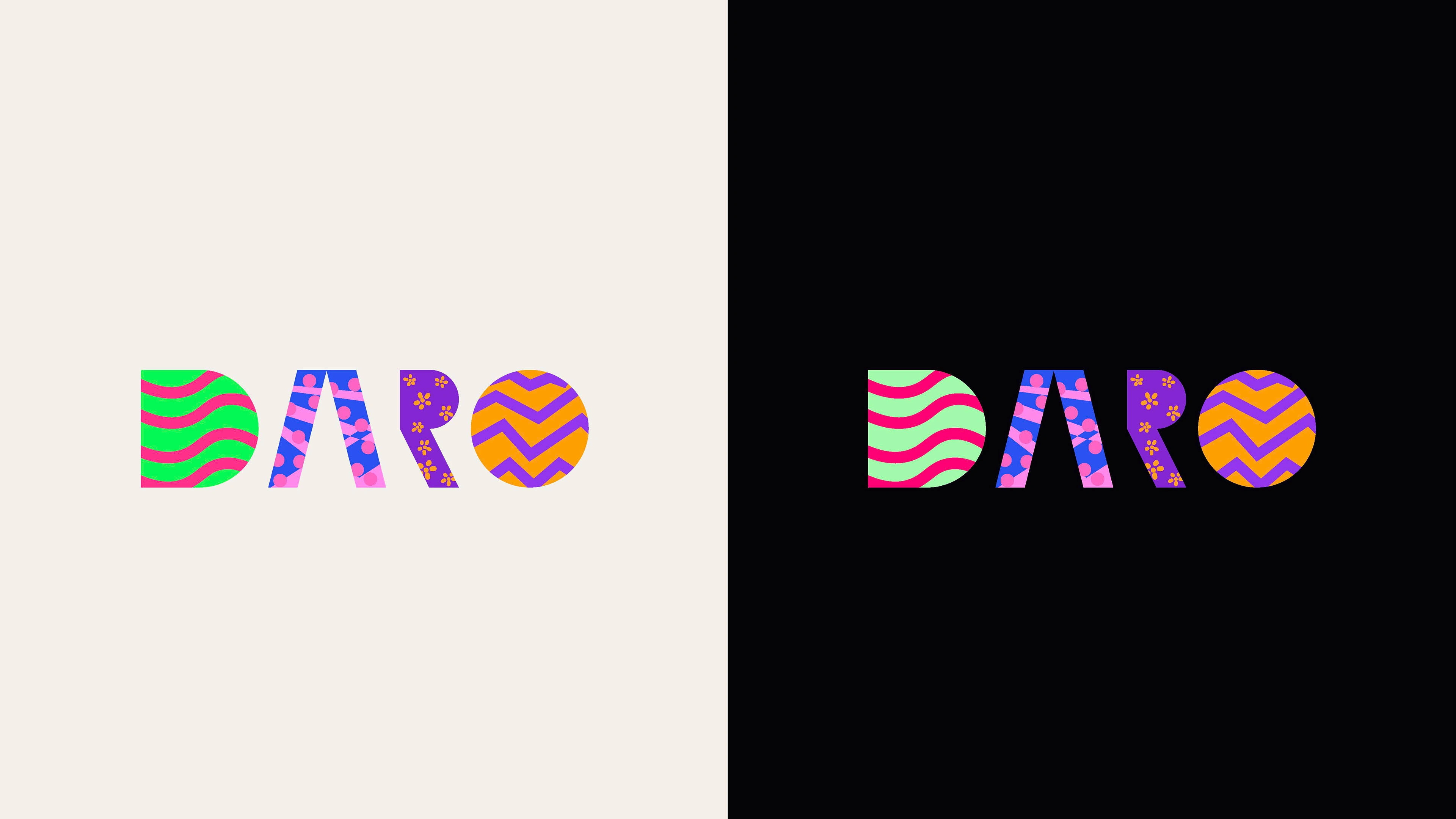
The logo itself is both bold and intentional, acting not just as a mark but as a statement. The design approach was grounded in integrating coding elements directly into the logo, with subtle references like the "A" echoing a classic HTML tag, giving the identity a smart, technical edge without being too literal.
The form is geometrical and precisely balanced, creating a modern and composed visual language that reflects clarity and structure—core qualities in both development and design work.
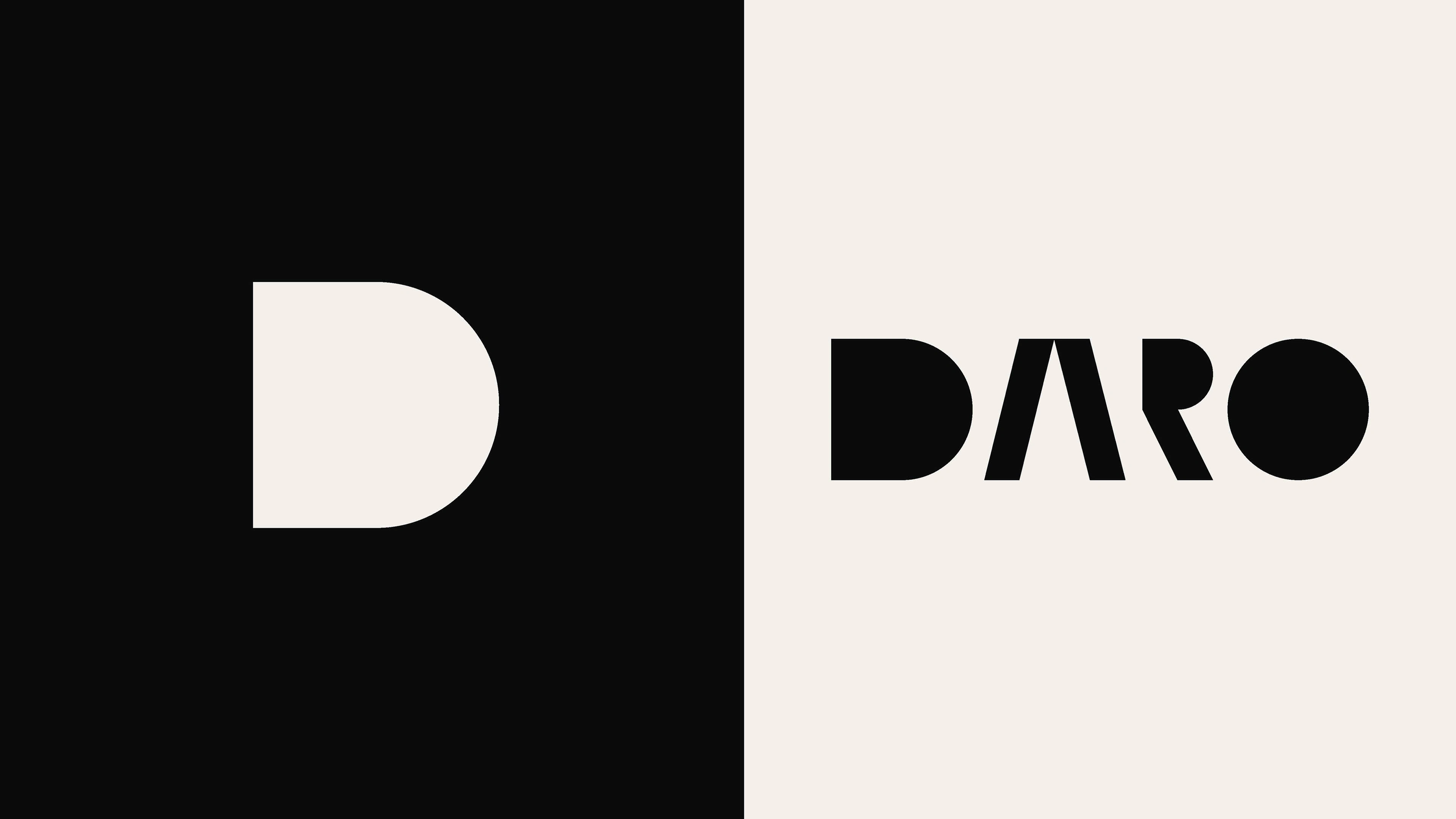
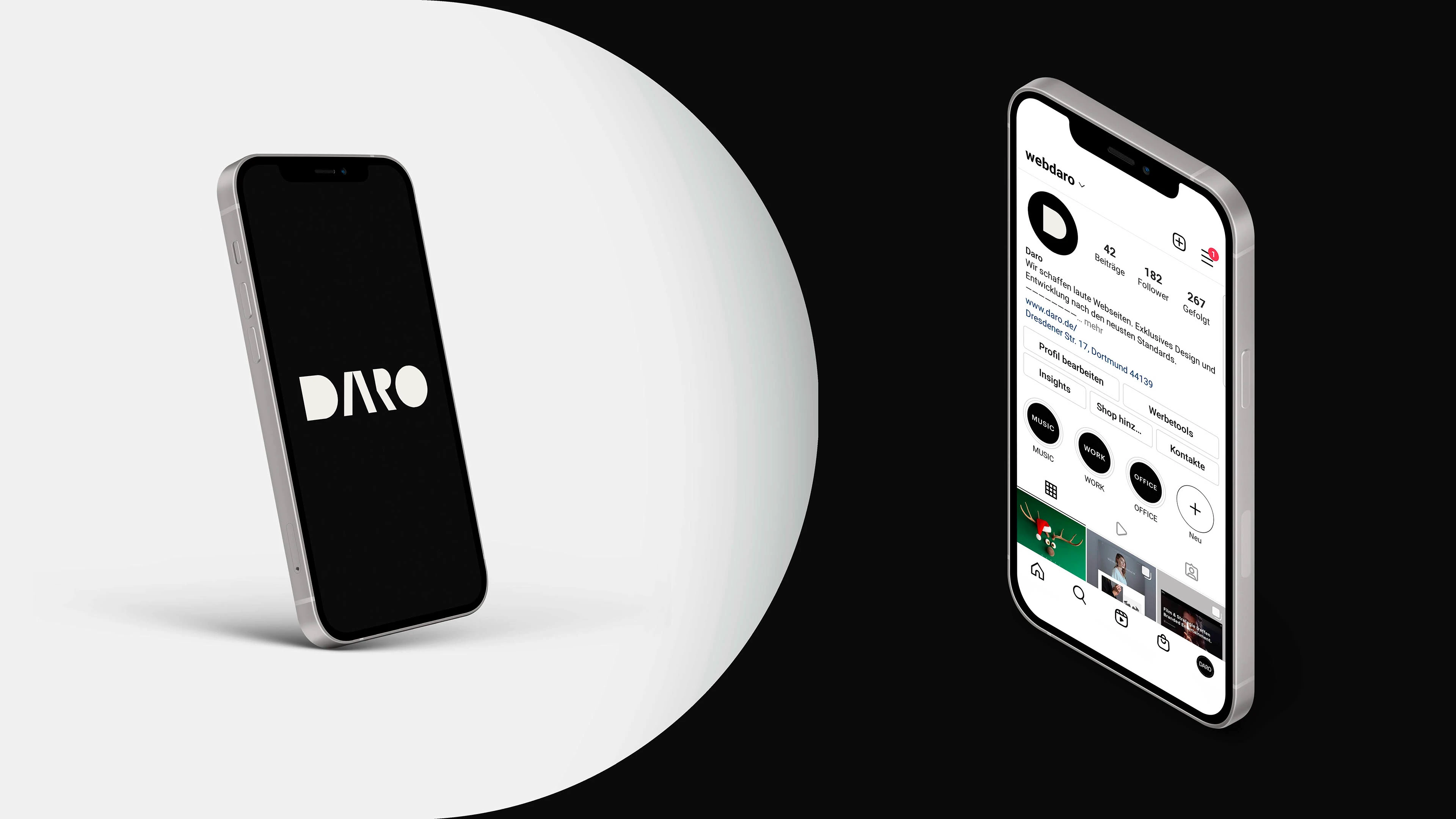
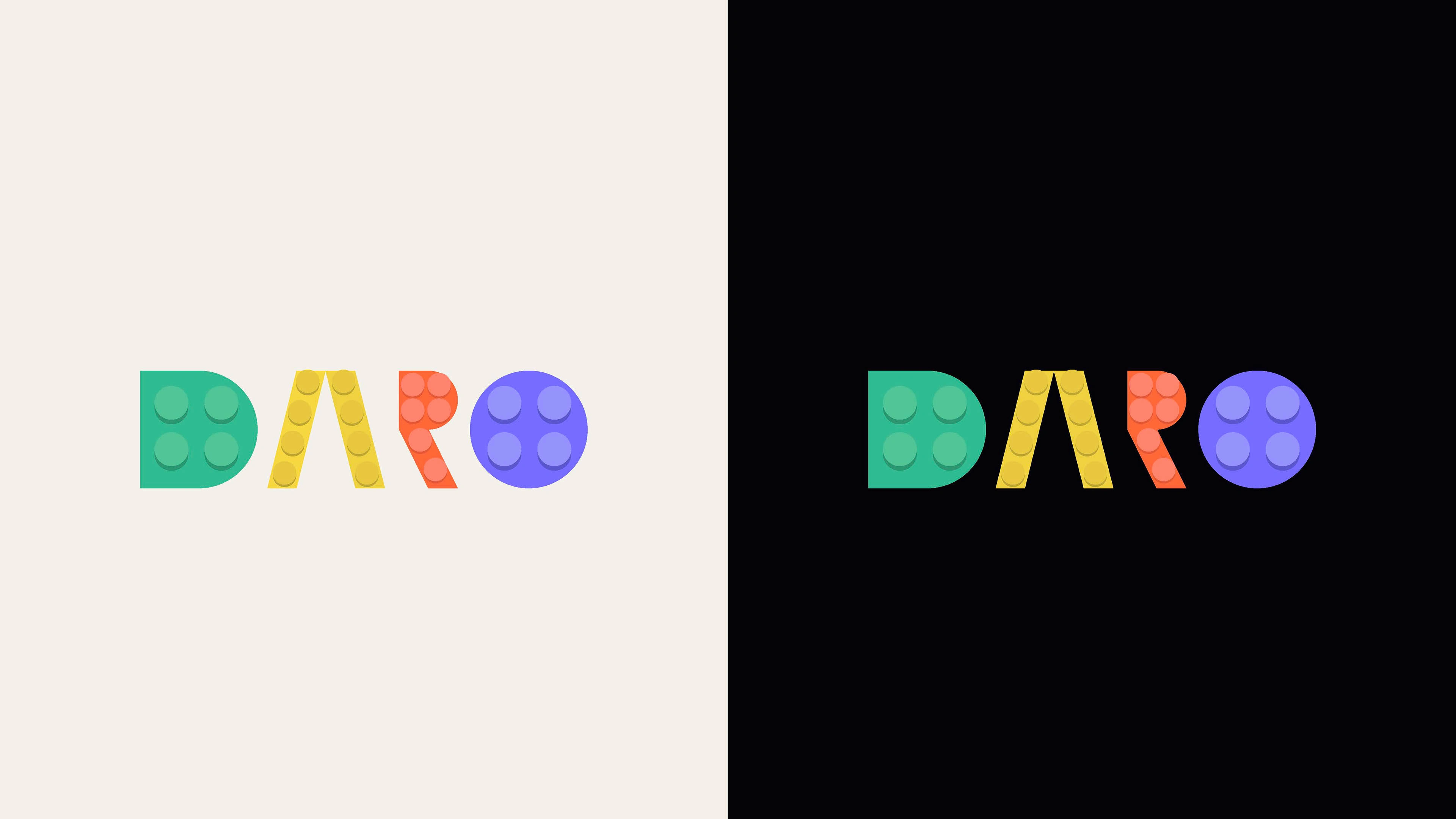
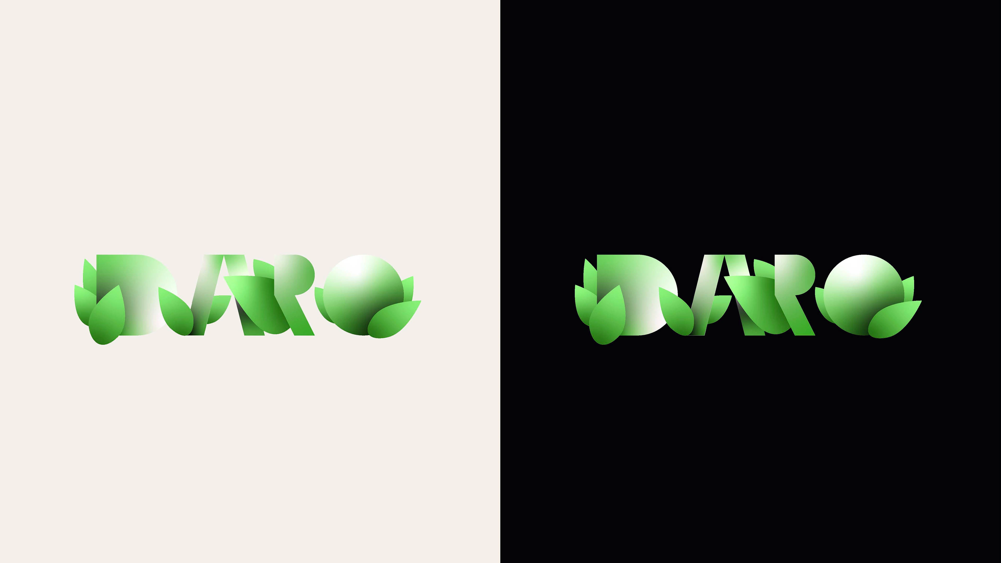
A key feature of the logo is the capital “D”, which stands out as a strong, distinctive shape. It holds enough visual weight to be used independently as a graphic symbol, extending the identity beyond the full logo—whether in social icons, branded visuals, or environmental design.
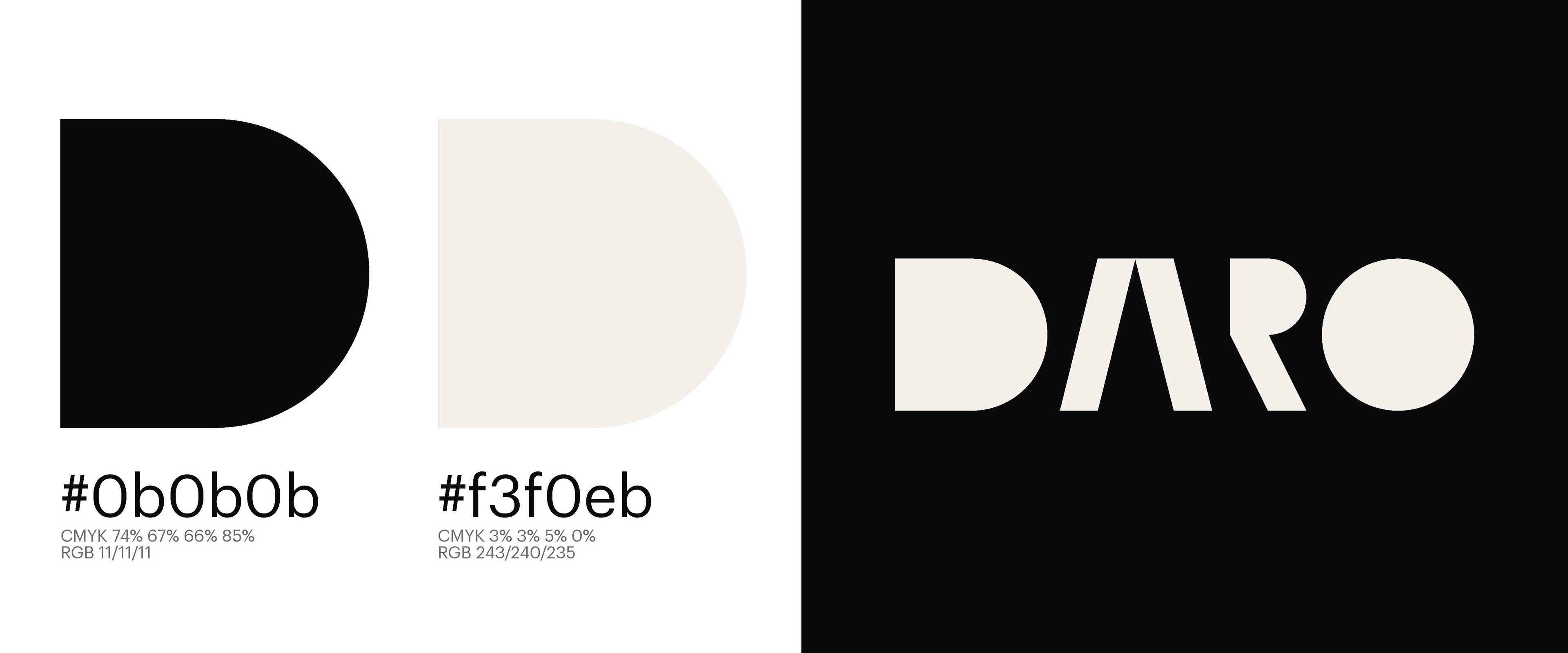
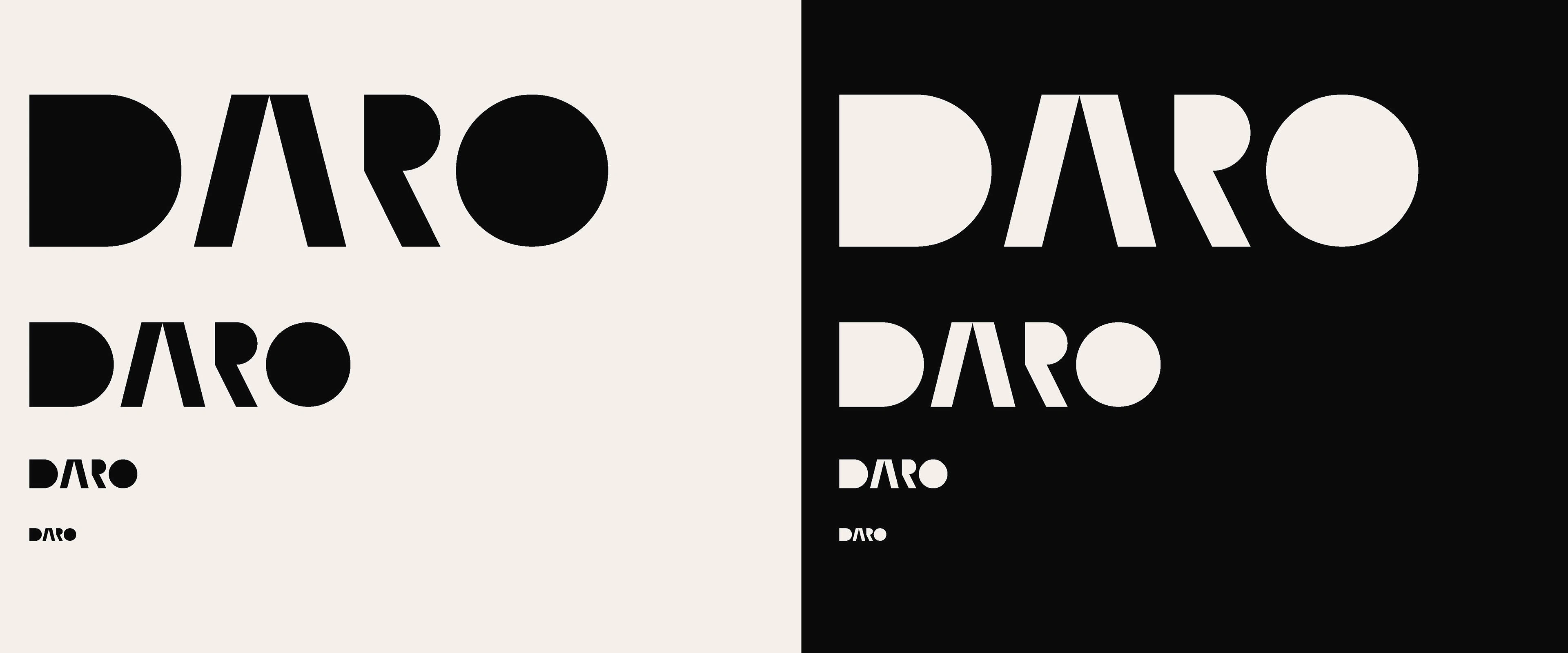
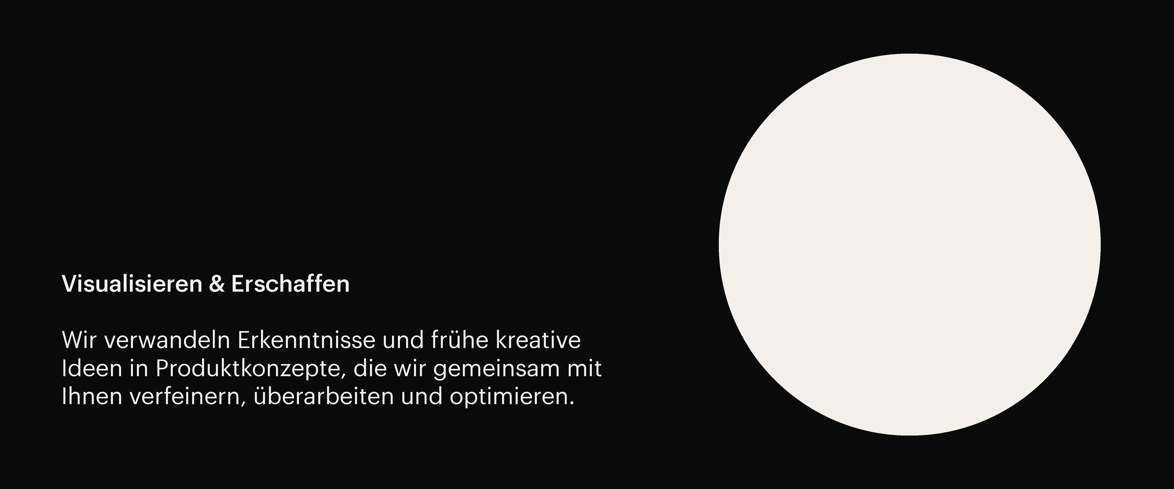
When it came to color, the primary tones were carefully selected to strike the right mood. A deep black-anthracite gives the branding weight and sophistication, while an eggshell white adds a softer contrast—elegant but not sterile. This pairing creates a cinematic atmosphere, making the identity feel refined, bold, and confidently minimal.
Further expanding on the logo’s design language, elements like the tag-shaped "A" and other individual letters are built to function beyond the logo itself. These forms can be scaled, isolated, and creatively integrated into layouts, allowing the identity to adapt across different mediums while keeping a strong, cohesive visual tone. This flexibility adds depth and engagement to the brand, opening up more possibilities in communication and design.
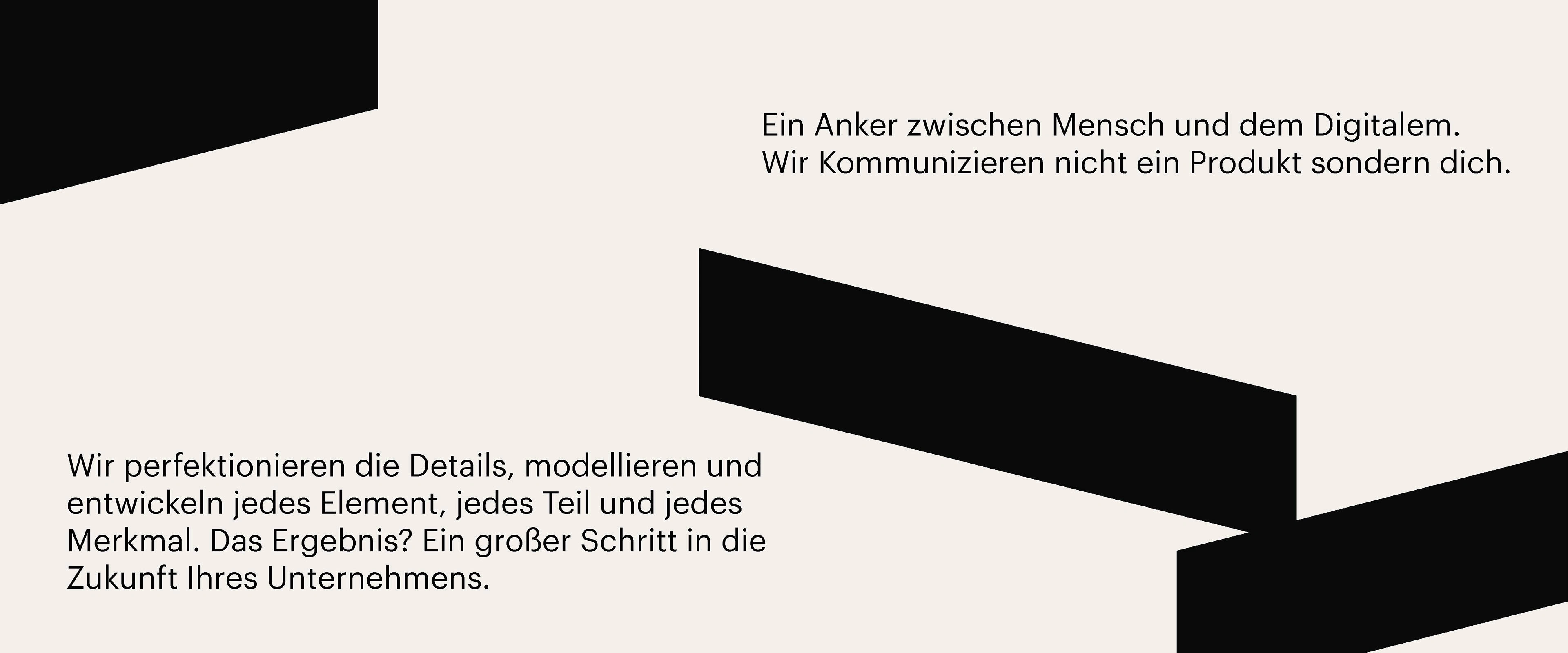
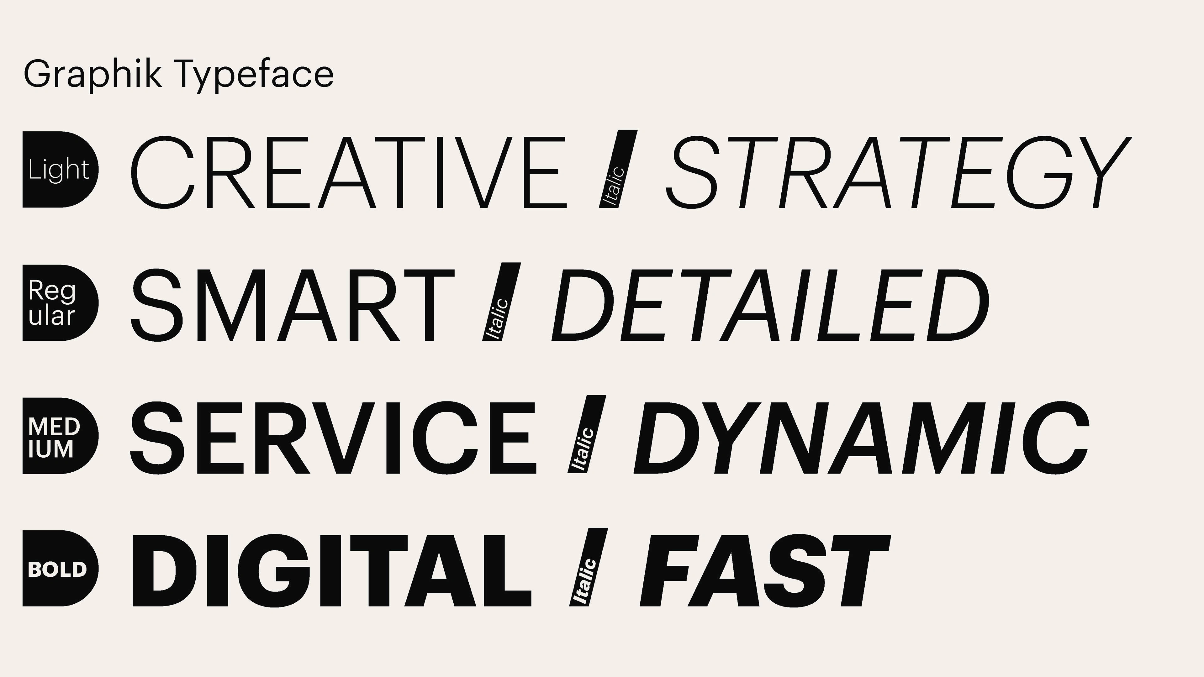
The typeface Graphik forms the typographic backbone of the DARO brand. It represents the perfect symbiosis between the brand’s message, the visual structure of the logo, and the supporting color palette. Its geometric nature gives it a strong foundation—modern and precise—while remaining highly readable, especially on digital interfaces.
Graphik supports the brand’s tone by balancing professionalism with a cinematic feel, helping to create a consistent and immersive experience across all touchpoints. The type system includes four weights: Light, Regular, Medium, and Bold—with Regular and Medium being the most frequently used across applications for optimal clarity and tone.
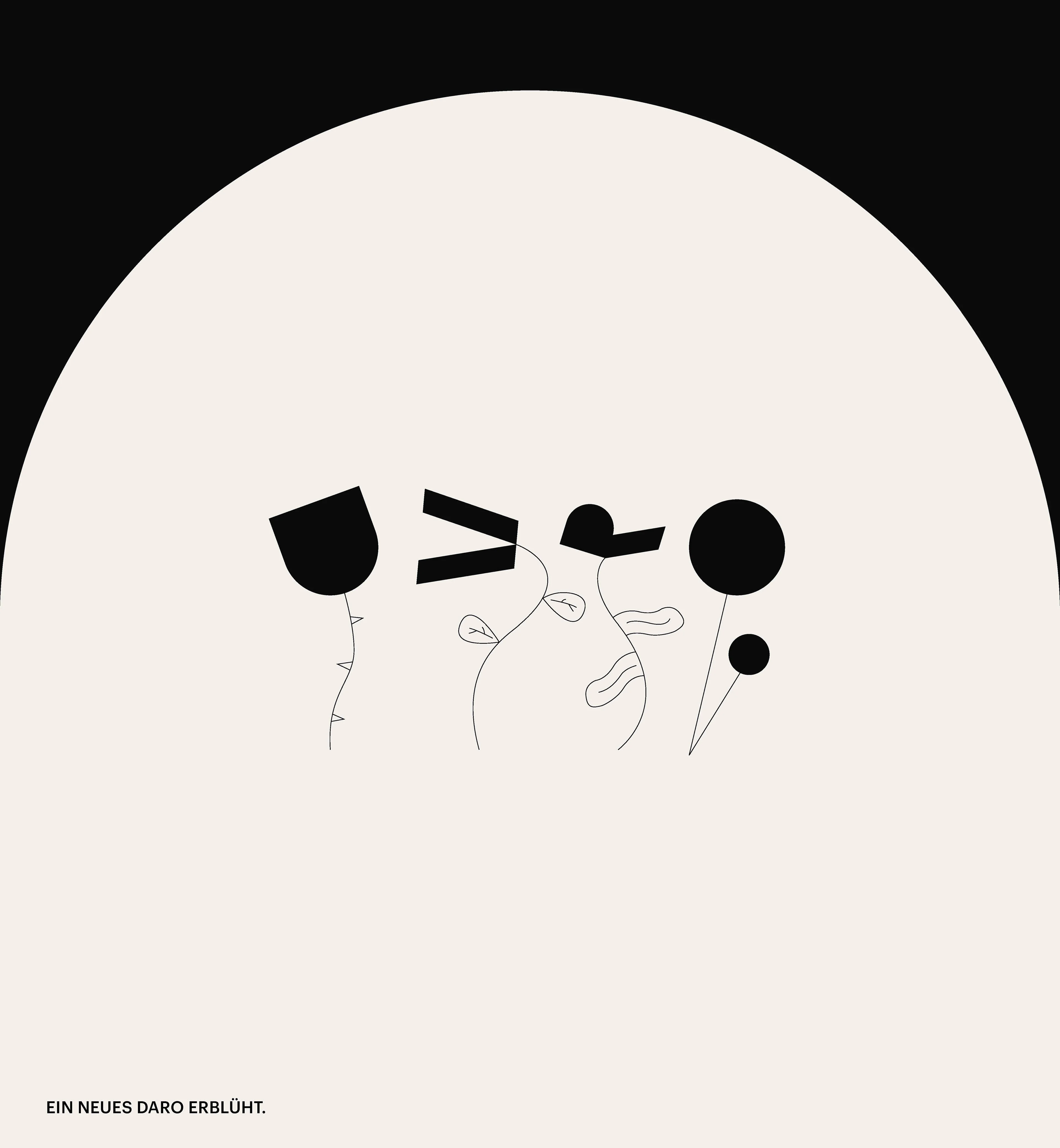
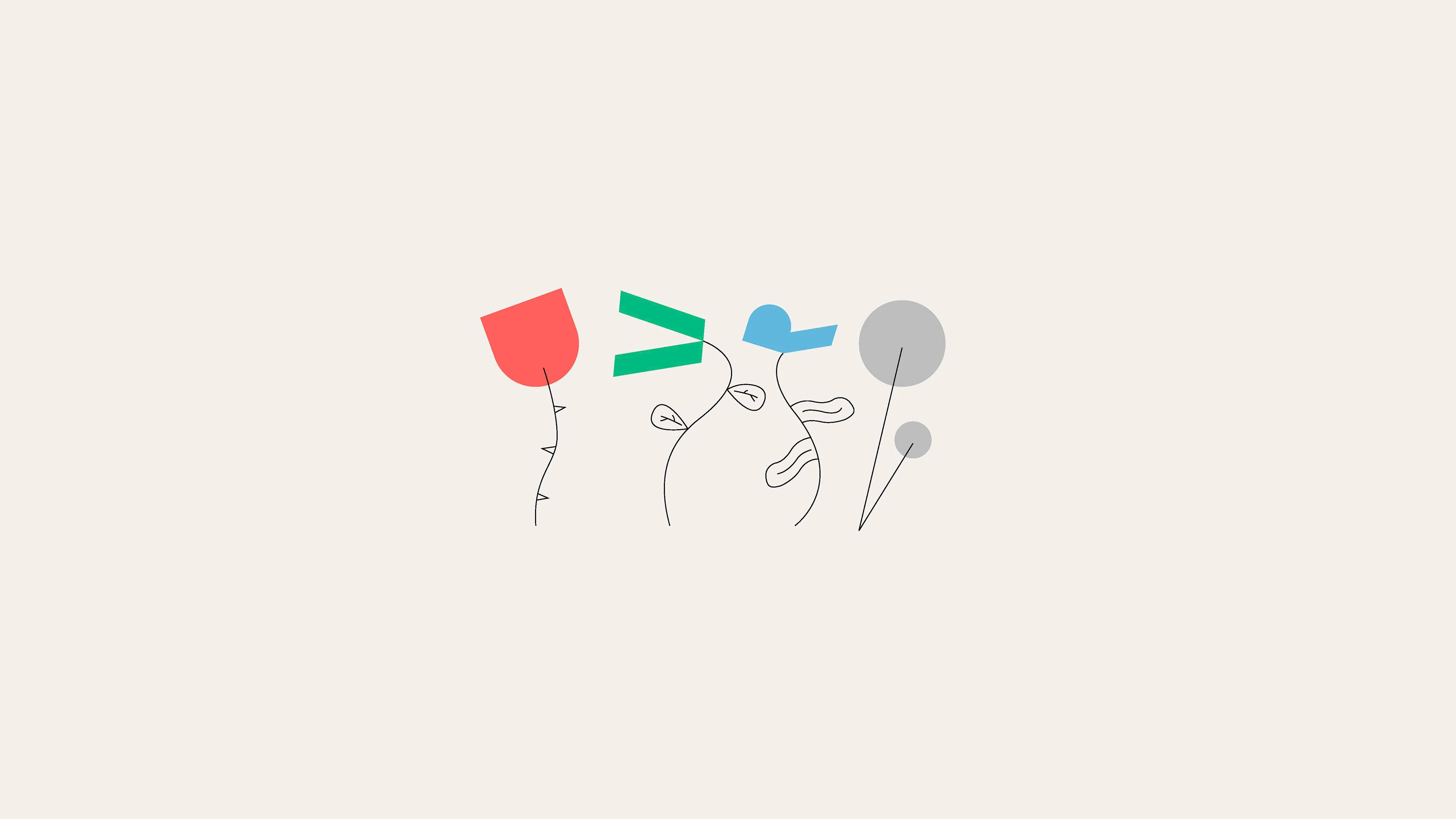
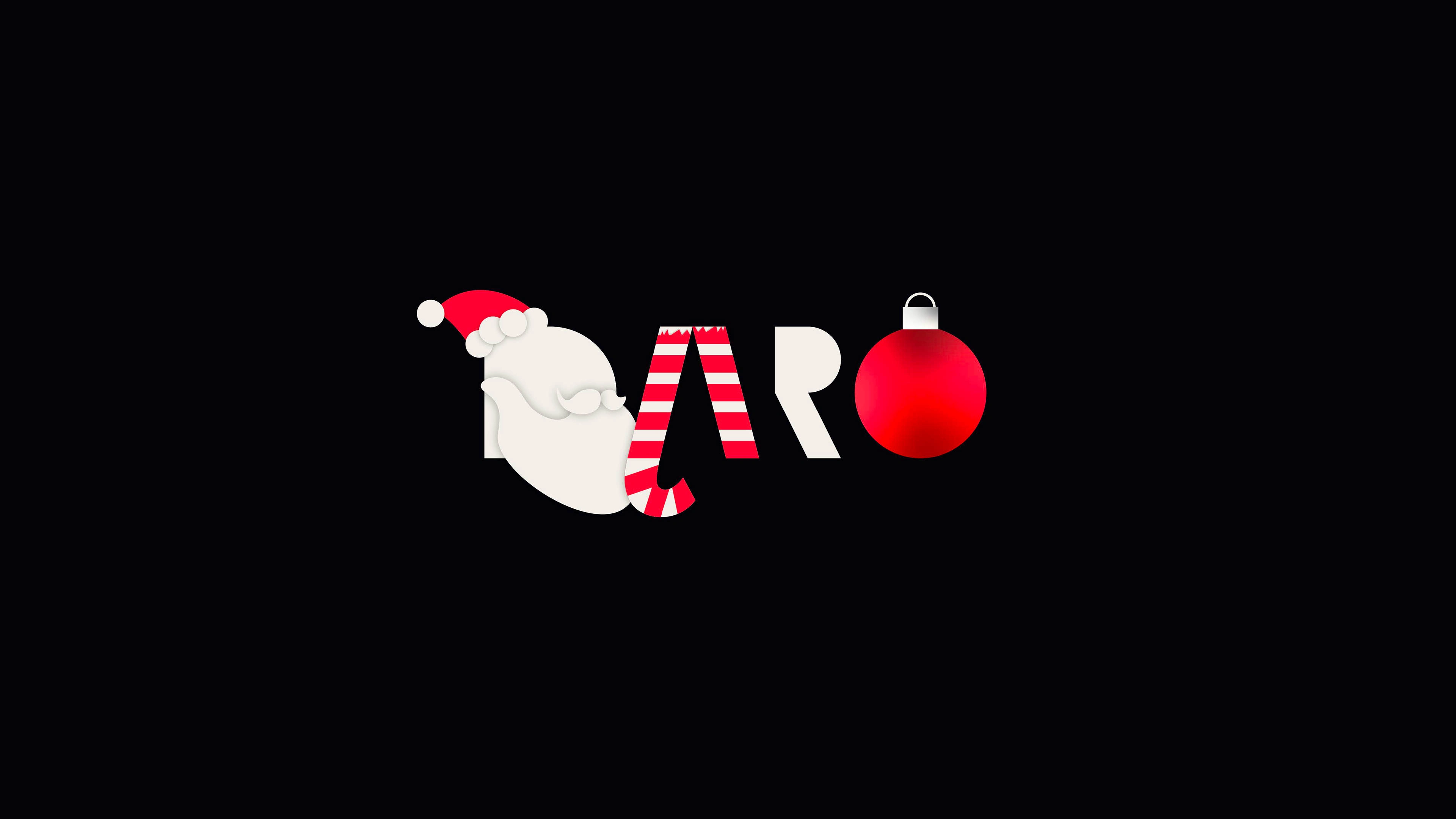
While the overall branding remains simple and clear, the logo itself offers multiple ways to play and experiment. Thanks to its boldness and solid shapes, the logo becomes a kind of canvas—allowing room for playful, creative expression that still fits within the brand’s system. It shows that even within simplicity, there’s space for imagination and character.
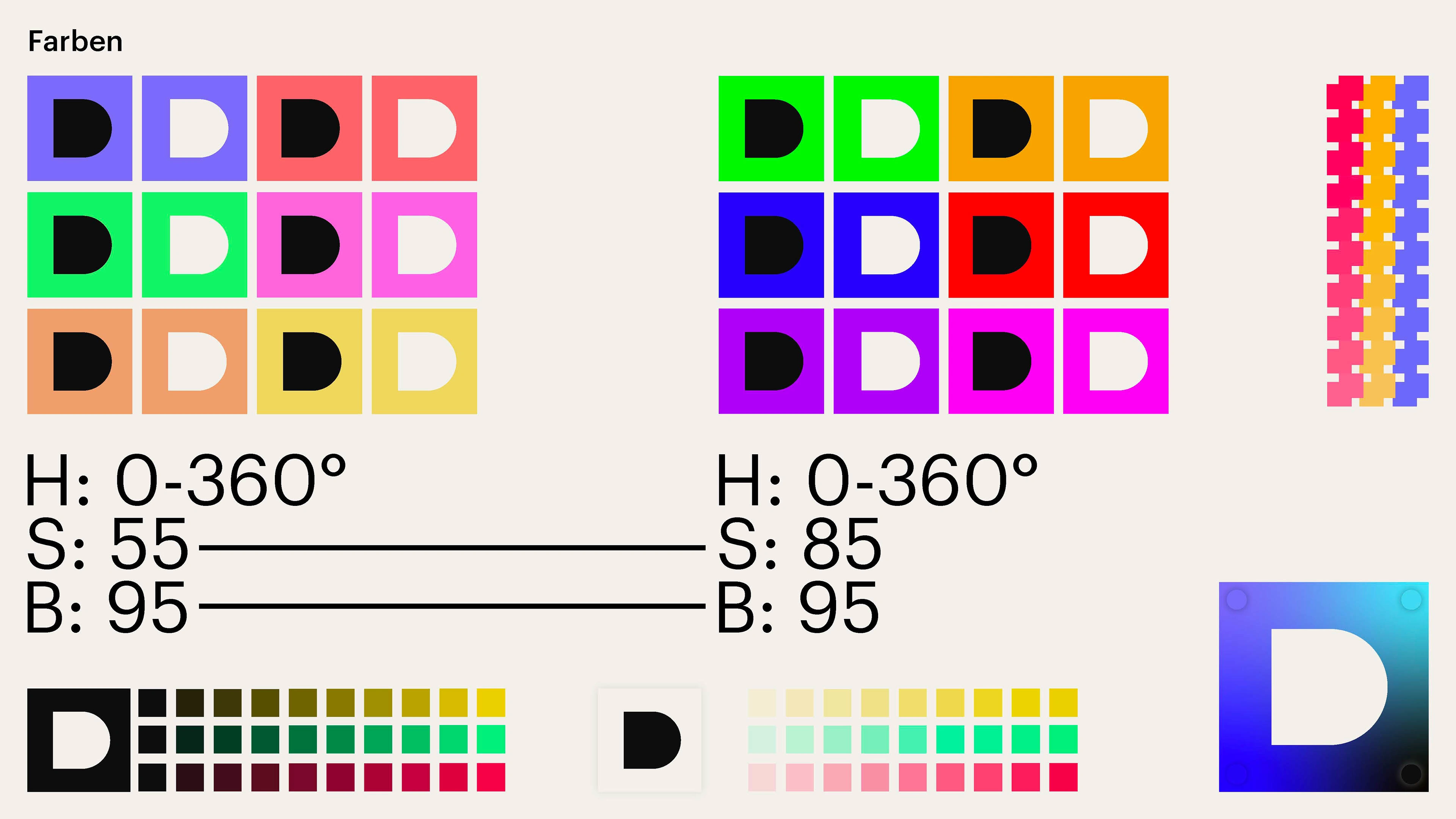
To communicate this effectively, certain use cases highlight a more creative and illustrated approach, using the logo as the base. This works in harmony with a carefully chosen color palette, based on color theory, balanced hues, and specific saturation levels tailored for each context.
These playful interpretations not only reflect the brand’s visual flexibility, but also the spirit and individuality of the people behind it—showing how creativity can exist even within a structured and minimal design system.
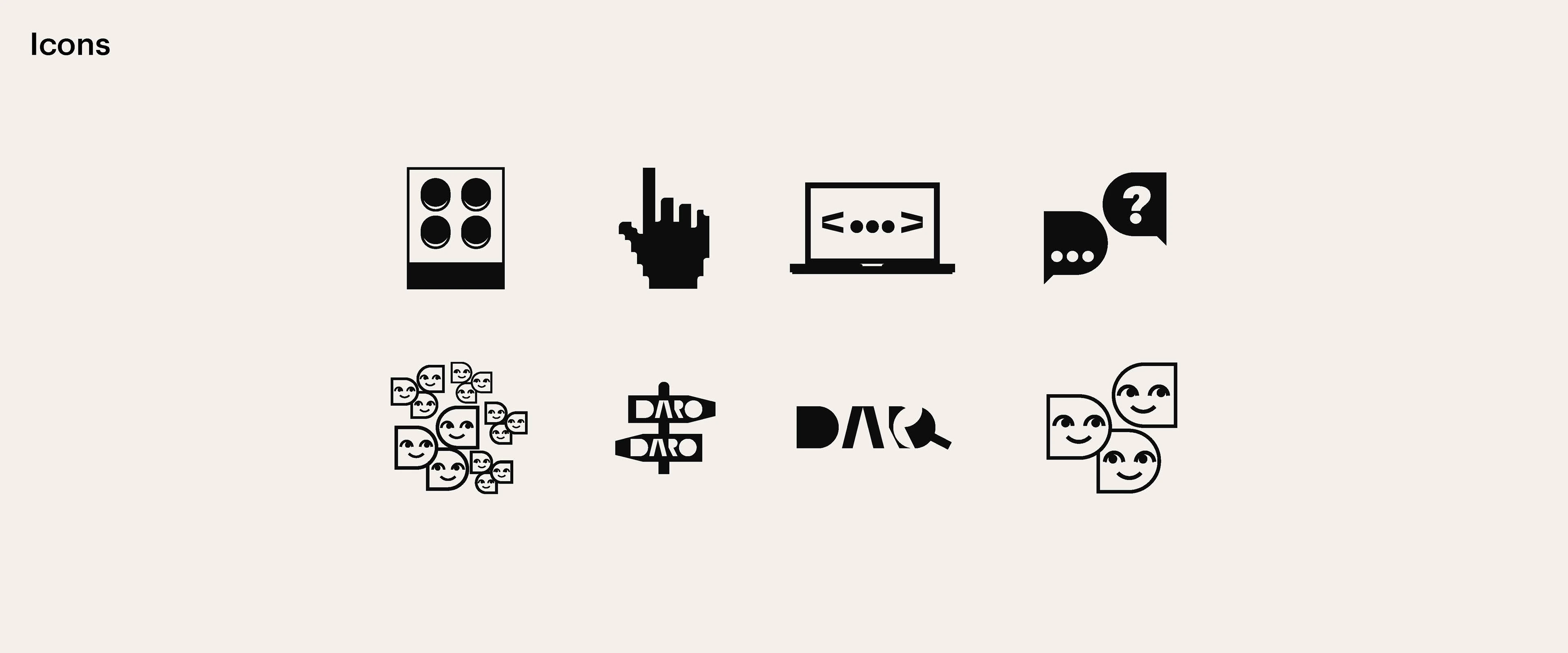
The icon system is directly derived from the logo’s visual language. It builds on the forms and shapes already present in the logo, making sure the design elements stay consistent and recognizable across all assets.
By reusing key elements, the icons feel naturally integrated into the brand while still maintaining their own clarity and function. Each icon carries the brand’s character while remaining intuitive and easy to understand, striking a balance between visual cohesion and practical usability.
Like this project
Posted Aug 2, 2023
Bold, modern, and versatile—DARO's rebrand fuses tech-savvy design with a sleek identity system, blending code-inspired visuals and cinematic elegance.
Likes
0
Views
63
Timeline
Mar 3, 2022 - Dec 12, 2022