Feeroma | Brand Identity
Yolanda Costa
Info
Client: Feeroma - Coffee Shop Drinks Scented Candles
Service: Brand Identity & Packaging Design
Year: 2020
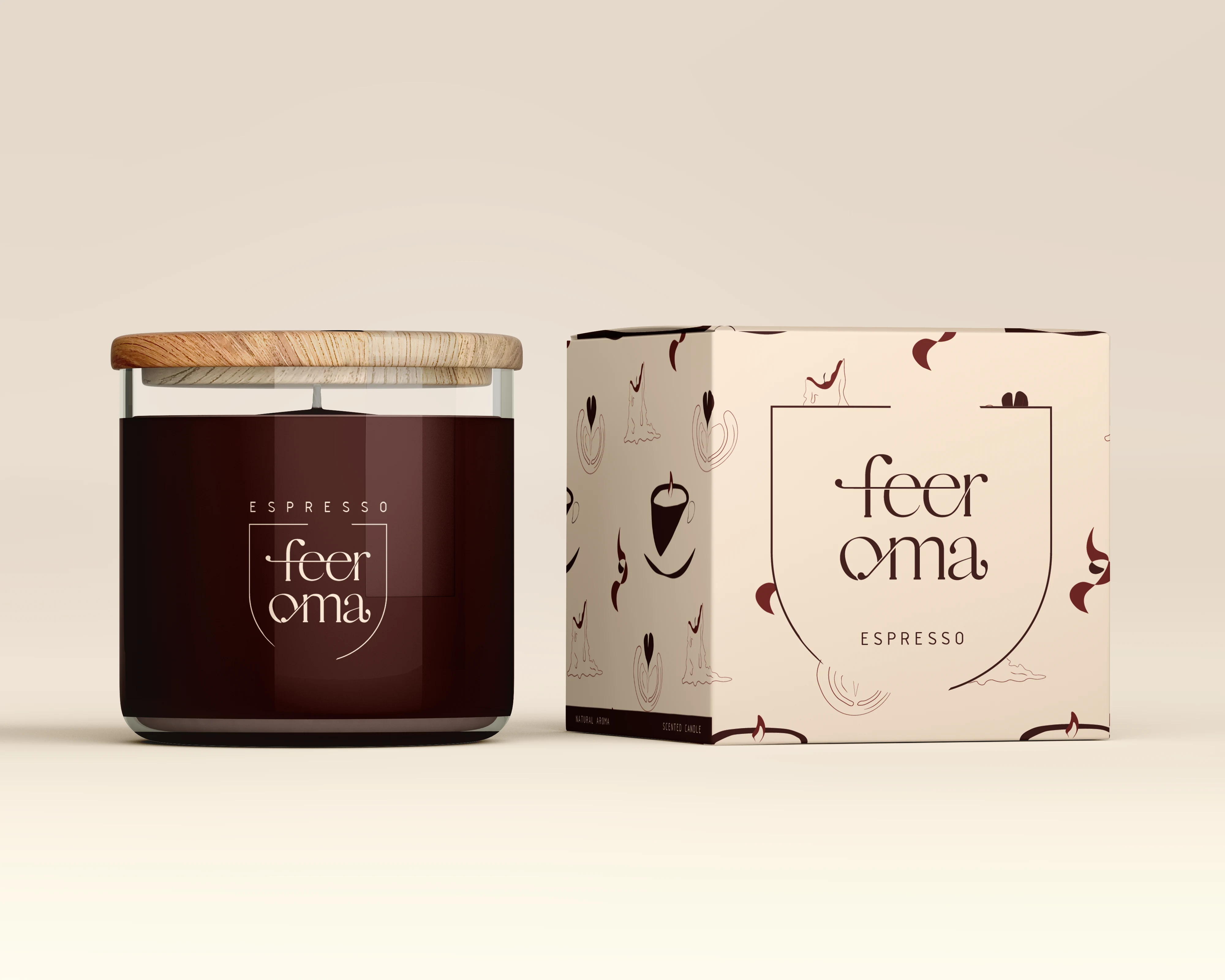
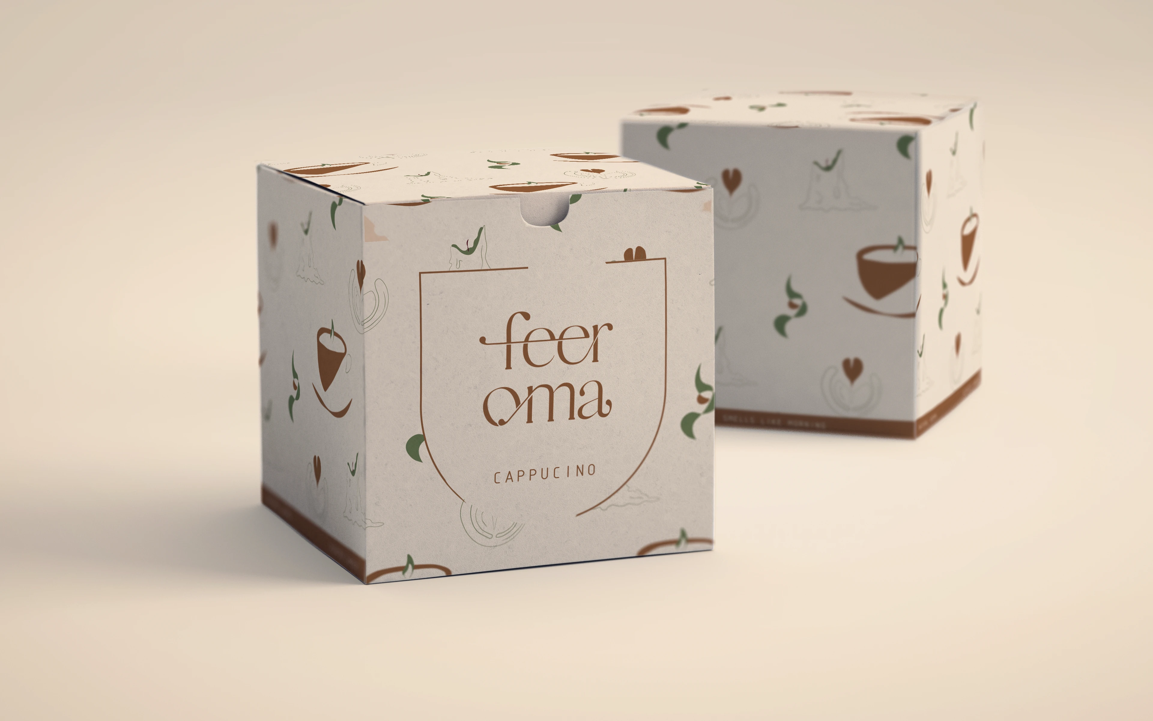
Packaging Design for the Espresso Candle
Getting to know Feeroma
Feeroma is a scented clandle brand. It was born from the fact that life is getting busier and new habits are being created in our routines. Having coffee, tea and/or milk drinks in the morning is a very common habit around the world. But grabbing one on the way to our daily activities became more the norm in the past decade. So Feeroma is suggesting we bring the aroma of the mornings back into our homes, anytime.
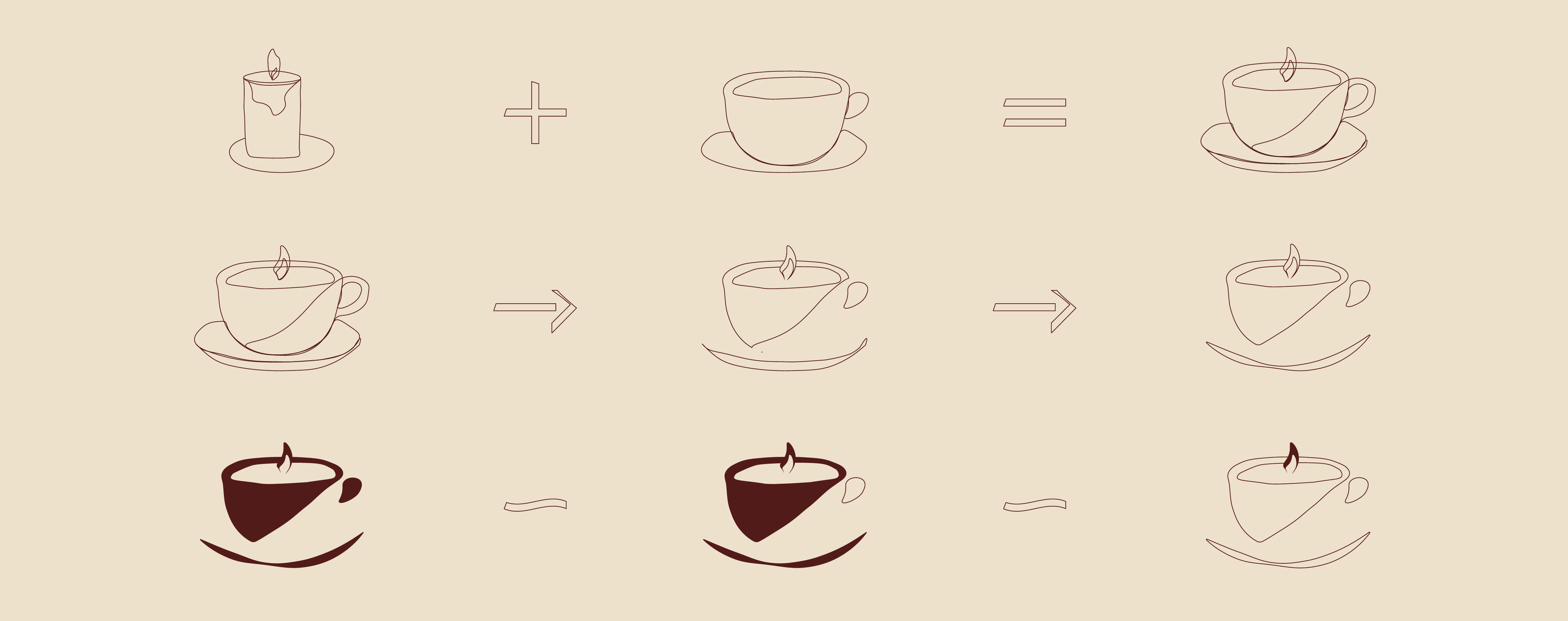
Logo Creation Process
The Branding
The brand values - Comfort, Relaxation, and Simplicity - validated who the target demographic would be. And in order to reach the Millenials and Gen Z we had to make the brand look interesting in a plain way.
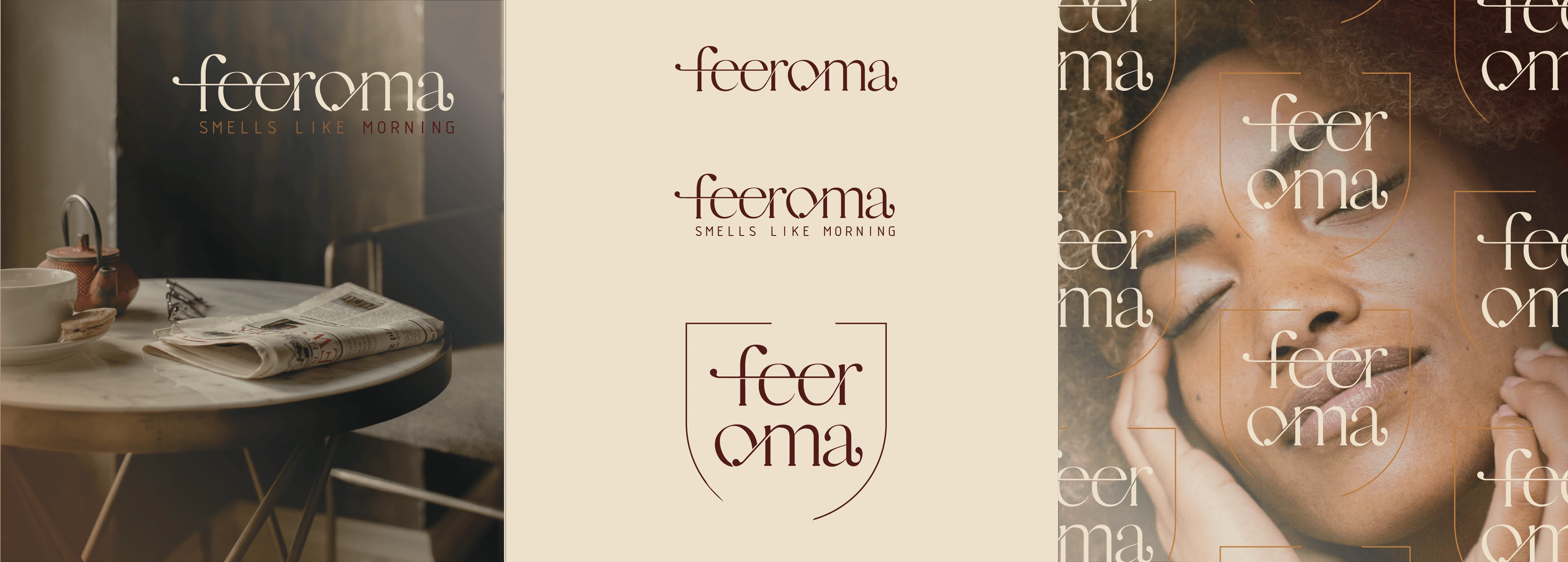
Logo Variations
Typography, Color Palette, and Graphic Elements
There is a sense of playfulness and ease in the chosen typeface for the logo. And it's paired well with a more structured sans serif font. The color palette is easily associated with the drinks on which each candle is based - Espresso, Matcha Latte, and Cappucino. As well as bringing feelings of welcome and intimacy. And last graphic elements were all drawn by hand, once again communicating the homely and grounding intentions of this item.
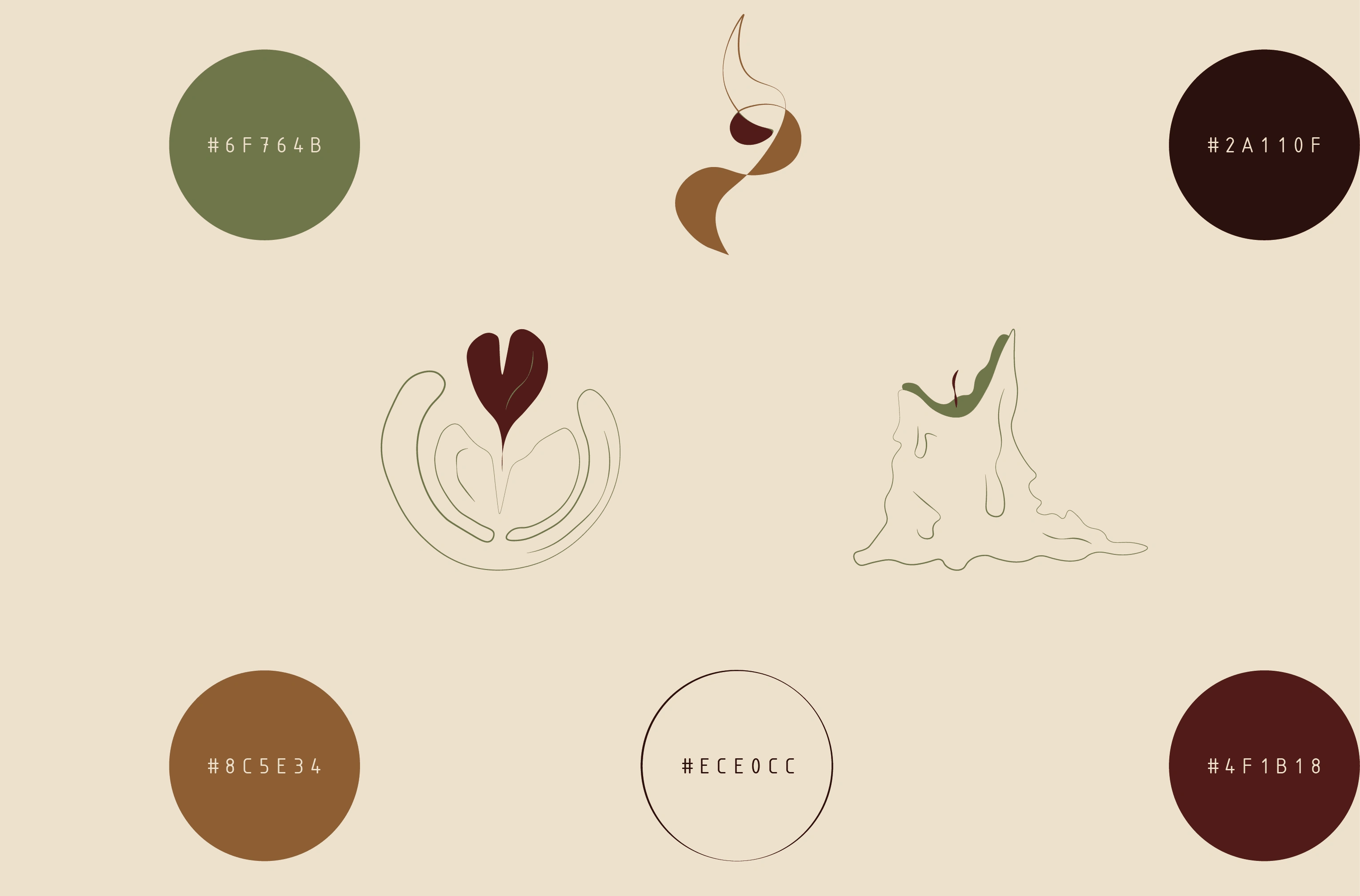
Graphic Elements and Color Palette
Packaging Design
This was the most challenging part of the whole process. Thinking about how a product can stand out on a shelf full of similar, in essence, ones took a lot of experimenting. The fact that each candle should be able to be picked apart and as a part of the same brand also came to play. In the end, the result wasn't as complicated as it seemed to be through the process. A pattern with the brand elements and color variation was the final design.
Packaging Design for the Cappucino Candle
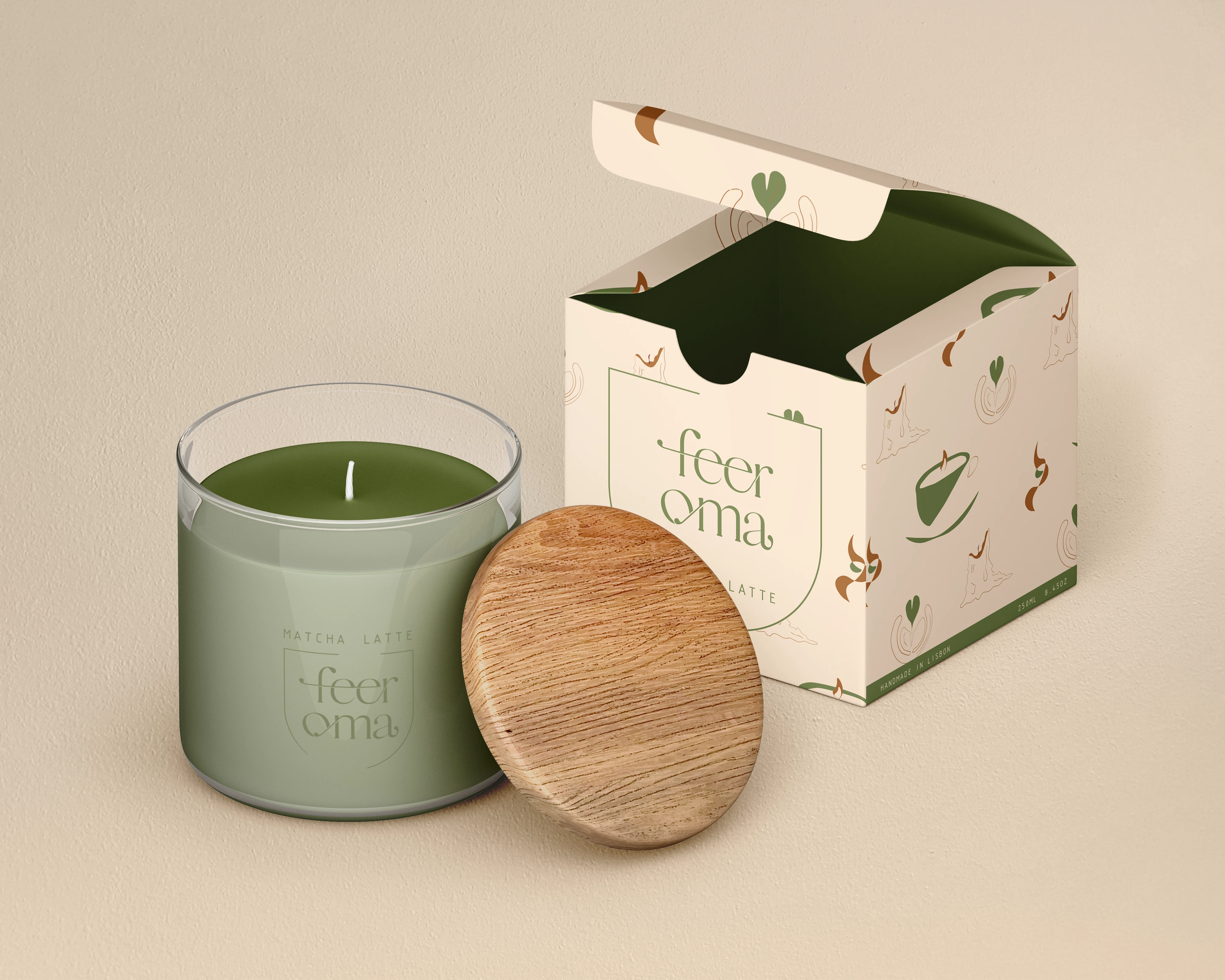
Packaging Design for the Matcha Latte Candle
Like this project
Posted Jan 15, 2022
Strategy, Brand Identity, and Packaging Design for Feeroma. Feeroma is a scented candle brand that brings the smell of morning drinks into our homes.