Visual Identity Design for Prisma Software House

Brenda Bacelar


Prisma Software House was built around a simple idea: bringing clarity and structure to businesses that have outgrown disorganized internal processes.
The company develops and implements management solutions that help growing businesses organize workflows, centralize information and operate more efficiently. The brand needed to communicate this technical expertise while still feeling clear, trustworthy and approachable to business owners and managers.
The name Prisma became the foundation of the concept. Just as a prism receives light and reorganizes it into a clear spectrum of colors, the company takes fragmented processes, information and workflows and transforms them into structured systems.
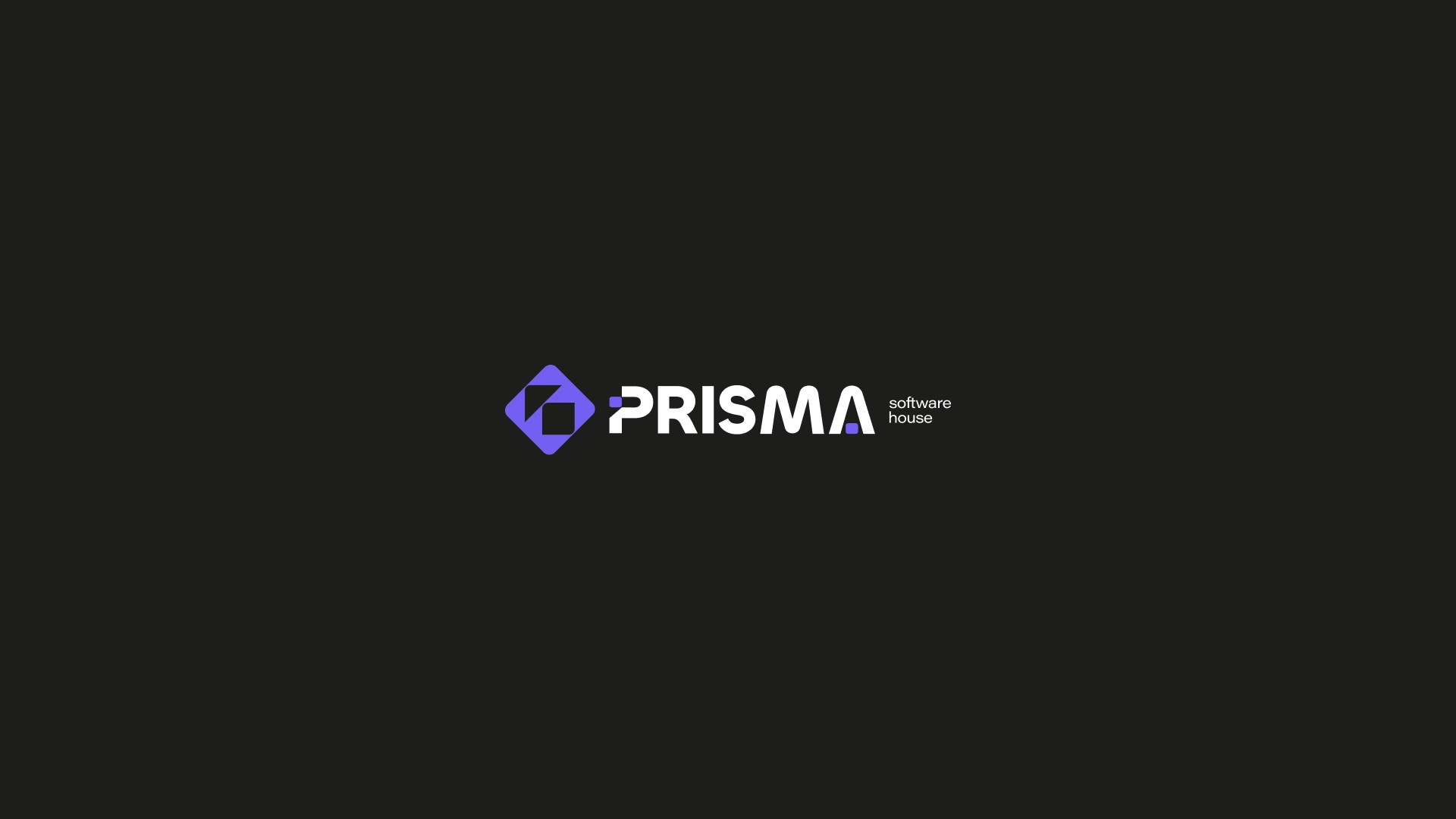
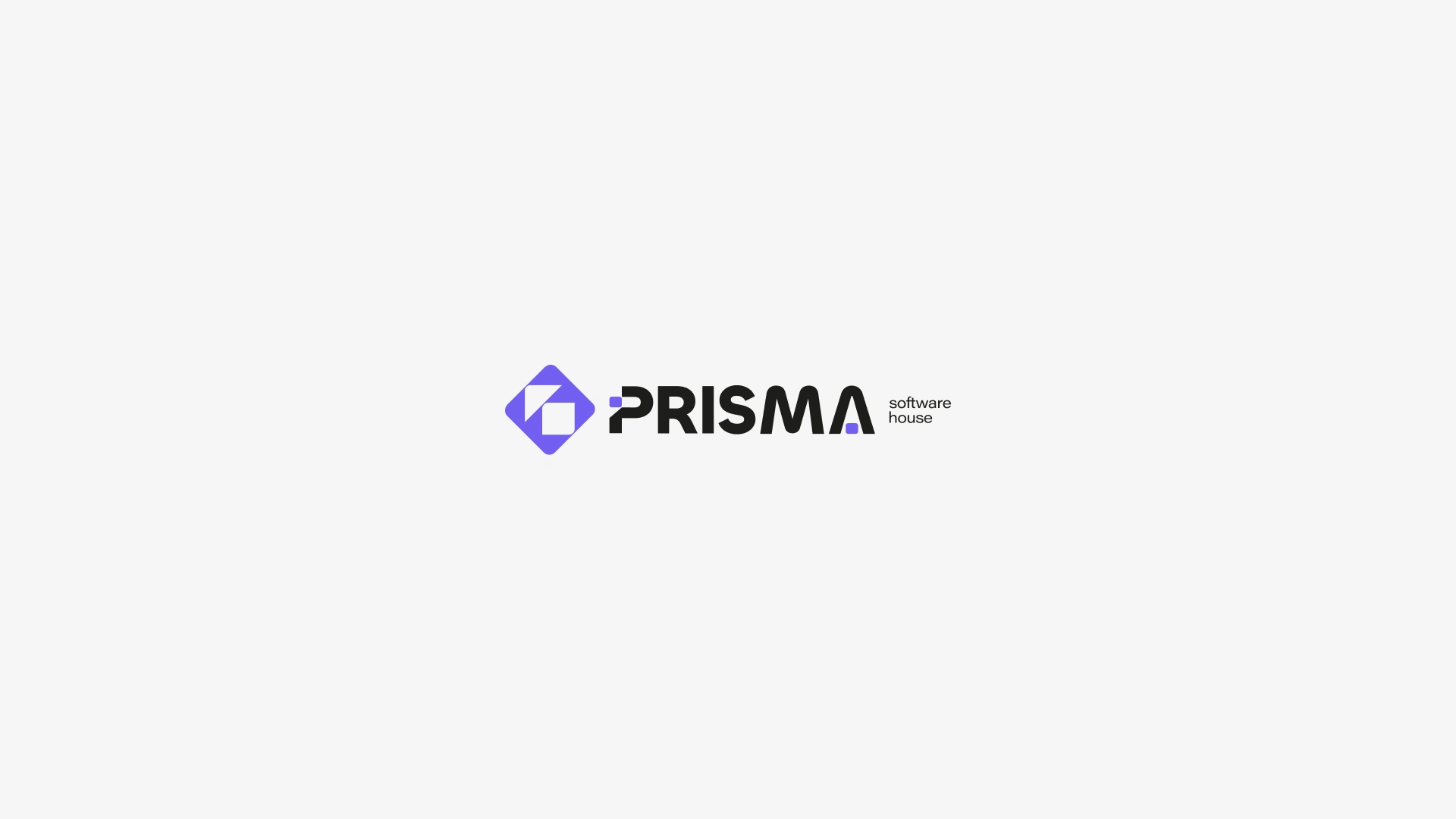
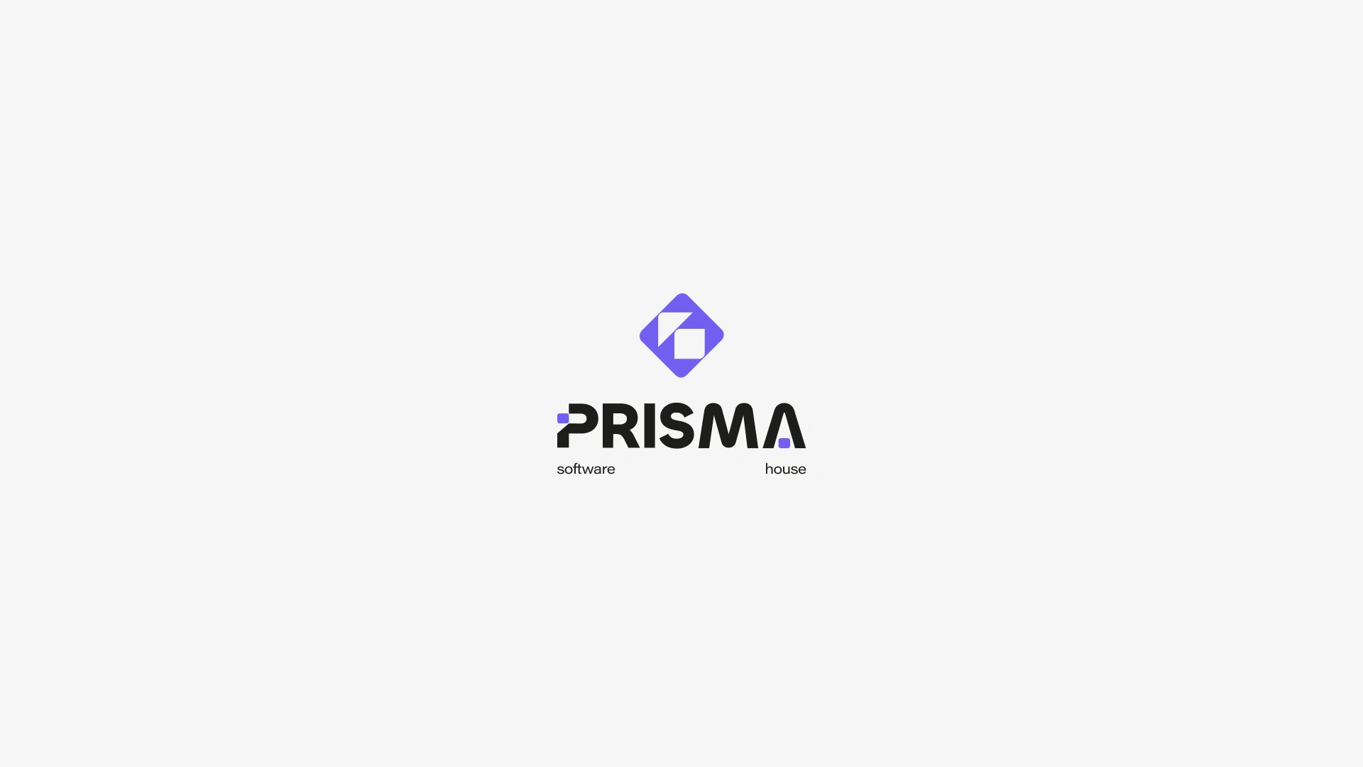
I translated this idea into a geometric and minimal visual identity built around organization, transformation and operational clarity. The symbol combines a structured diamond shape with negative space at its center, representing the relationship between complexity and order, while the custom wordmark reinforces precision, maturity and technological expertise.
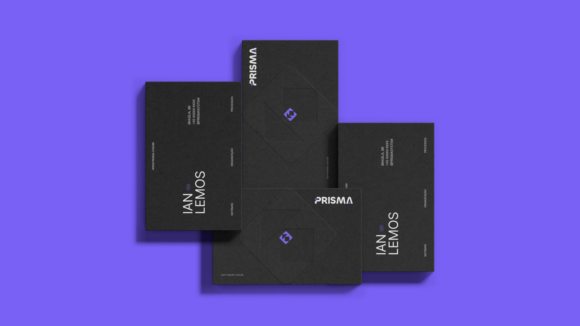
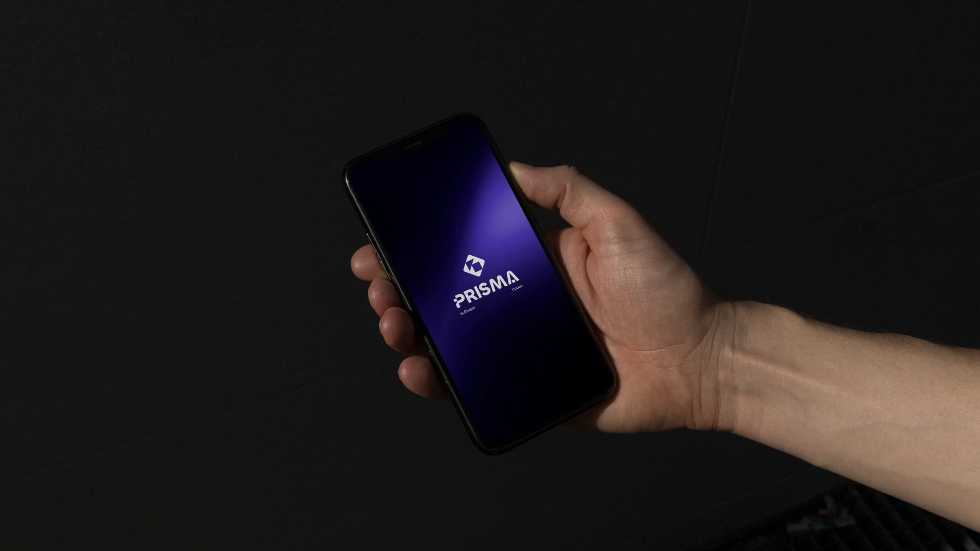
The visual system balances a strong purple palette with clean typography and structured compositions, creating an identity designed to feel contemporary without relying on the typical visual clichés of technology companies.
The result is a brand that positions Prisma as more than a software provider: a partner that turns operational complexity into clarity, structure and better ways of working.

Like this project
Posted Aug 17, 2026
Developed a geometric and minimal visual identity for Prisma Software House.