Clara: Enhancing the Dining Experience
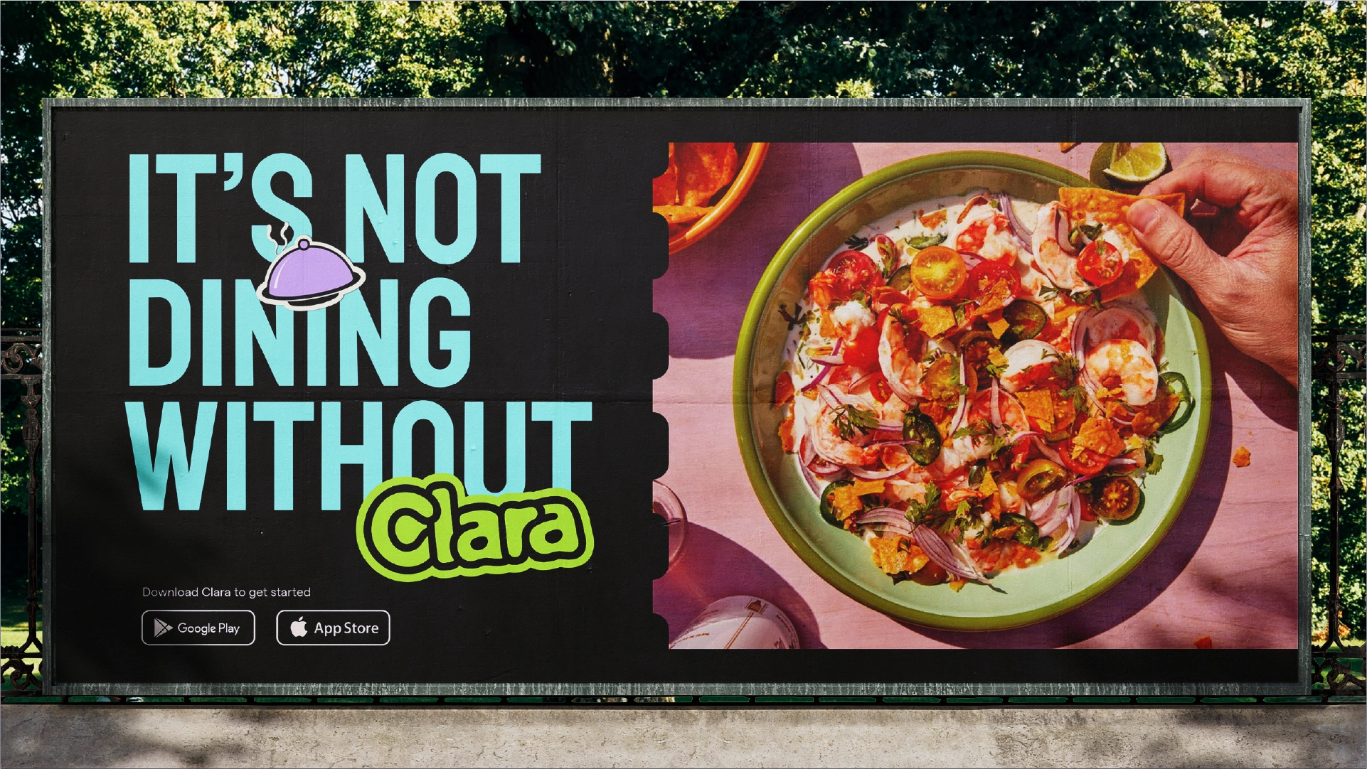
Advertisement
Intro
Have you ever been to a restaurant where your order was mixed up or took a long time to arrive, leaving you wondering "where the f@#$ is my order?"
This isn't usually intentional on the restaurant's part. However, during peak hours, managing the chaos behind the scenes—handling payments, addressing complaints, preparing meals—can be challenging. Restaurants need a system to manage this chaos and deliver the experiences they promised to their customers.
This is the problem that Clara aims to solve.
Brand Story
Elevating Experiences; Enabling Moments
Dining at a restaurant isn’t just about the food, nope, it's also about the ambiance and the memories created, which make it worth the tax compared to eating at home.
Two key words from the brand discovery were "focus" and "organized chaos". "Focus" because Clara helps both the restaurant and its patrons prioritize what's most important, creating and enjoying a great experience, by clarifying the processes. "Organized chaos" because Clara assists you in navigating the complexities of managing a busy restaurant.
Logo
Usually, because it makes explaining the reason behind a logo design easier, I like to add some story to the logo. I tried a bunch of icons that I thought showed Clara's message, but none of them worked. Sure, it's nice to have a story in a logo, but it's not a must.
I had a talk with Kem, and we agreed to go for a logo with a ‘cool vibe’. That's when we found the logo that we both really loved.
The final logo happened by accident. You see, I meant to use the 'simplify' option in Adobe Illustrator, but I clicked the 'smooth' tool instead. And just like that, history was made.
anti-climatic, innit? but that's the nature of logo design some times.
Colour
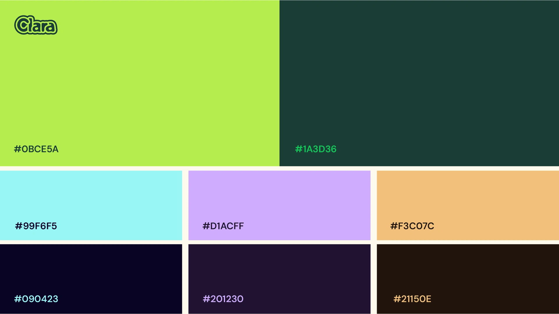
Once the logo was finalized, color was the next element needed to set the right mood. The brand's aim was to feel semi-formal, modern, and endearing. Green was chosen as the starting point for the palette, as it was strongly favored by Kem. From there, I primarily used the analogous color scheme to develop the palette.
Typography
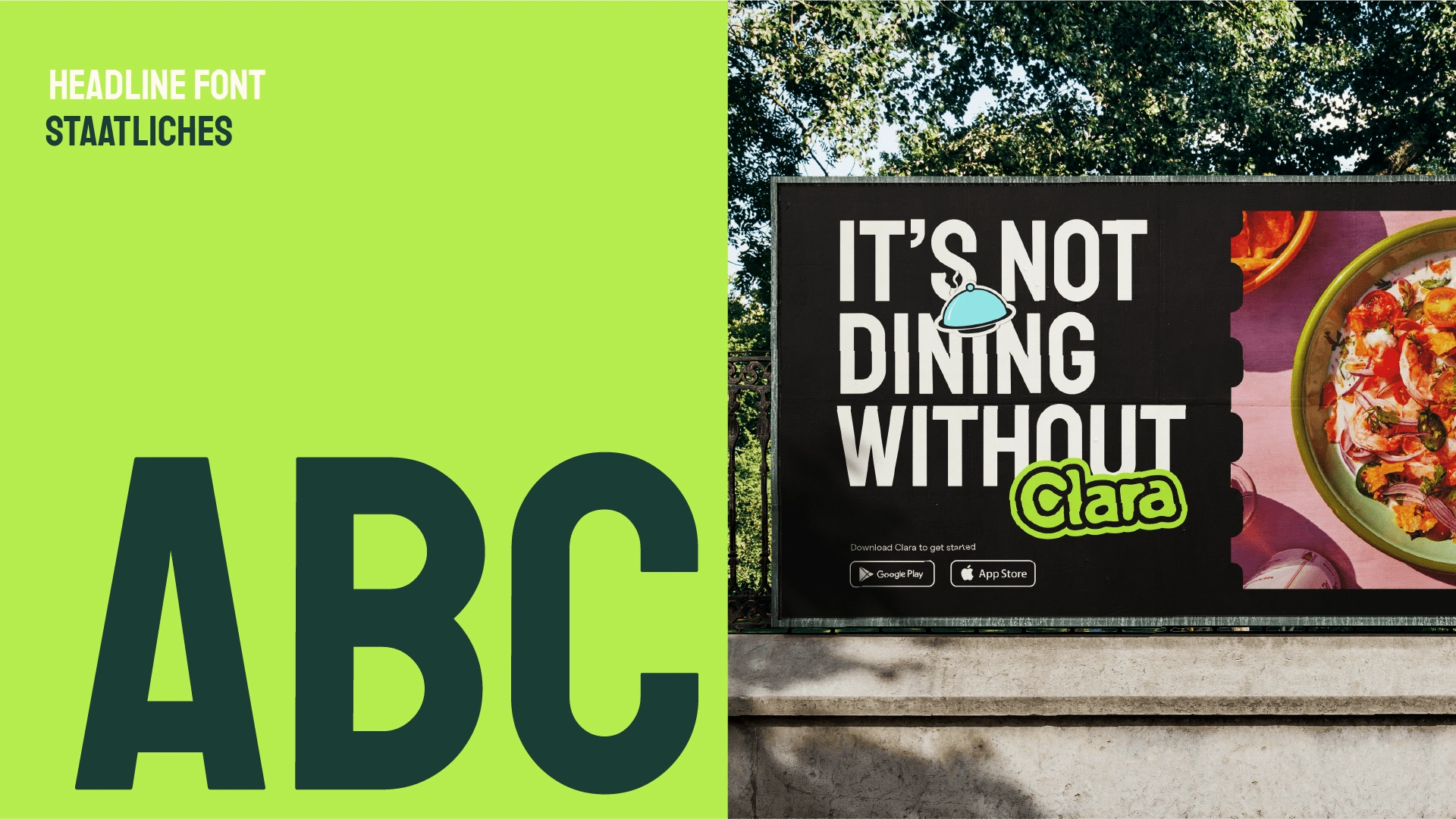
I didn't make many changes to the typography because it was already well-established. There wasn't much room for alteration. The pairing of DM Sans and Staatliches worked excellently and fit the identity system I was trying to create.
Visual Devices & Photography
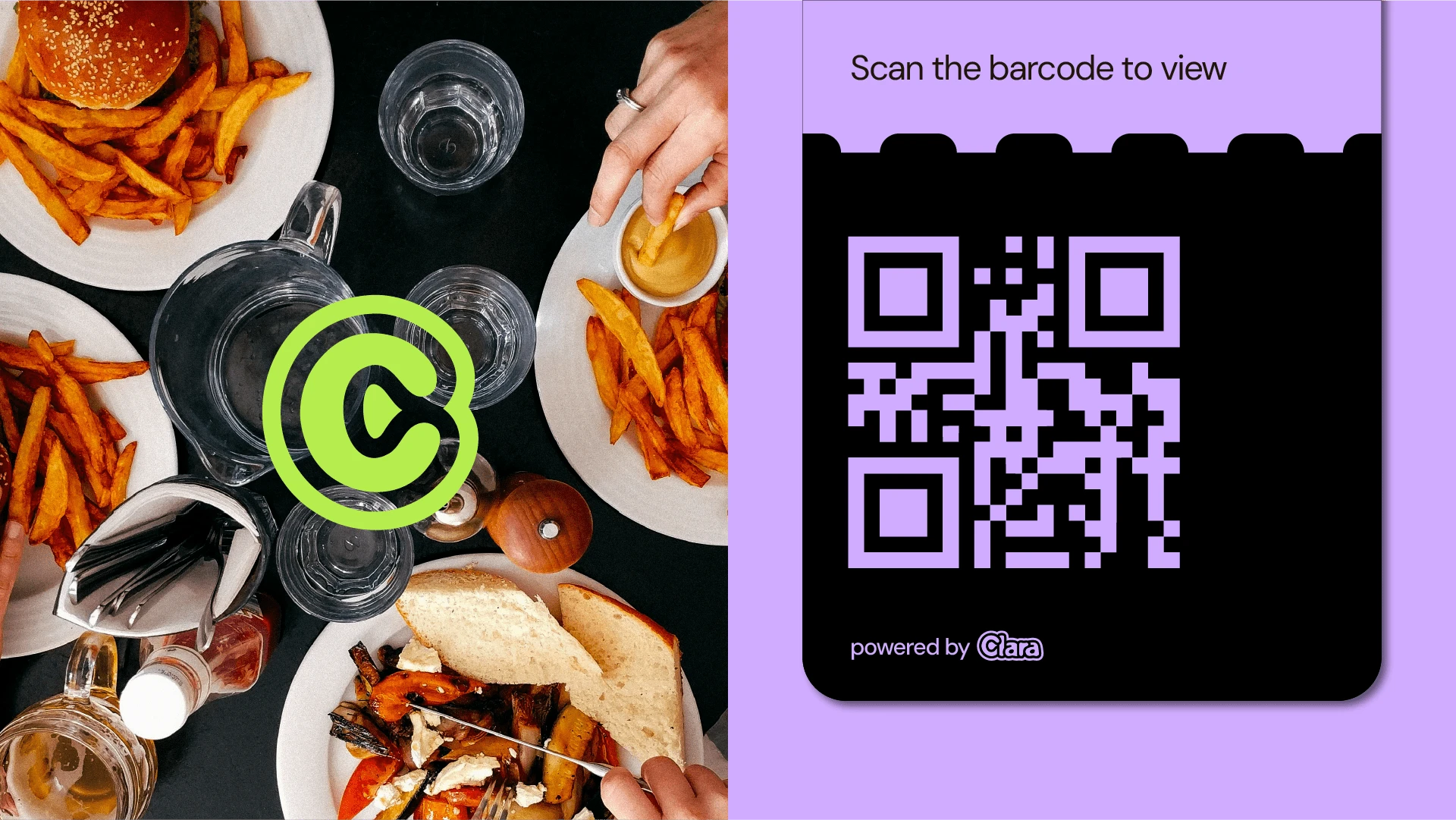
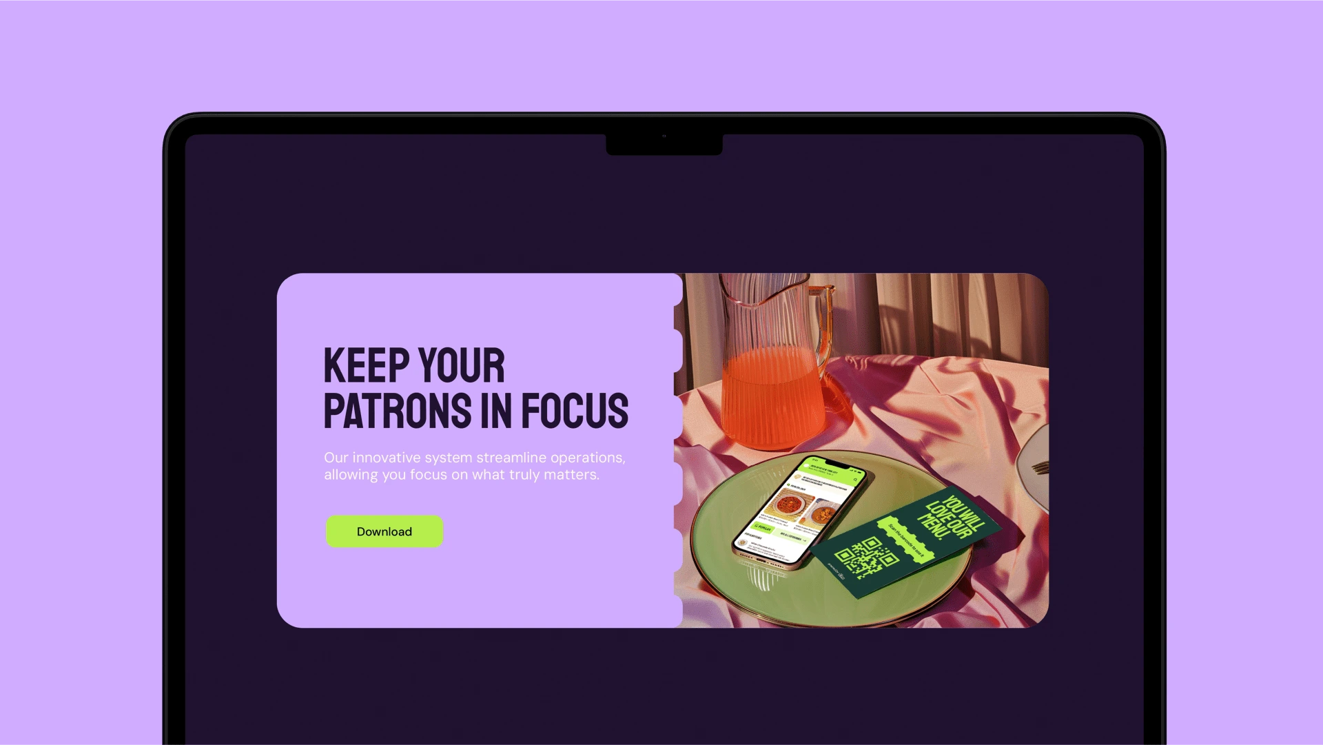
When I joined the project, the digital product was already in its design phase, with an established creative direction that made sense to follow. The design had a paper aesthetic, resembling traditional menus. To enhance this, I introduced motifs found on tickets.
Why tickets? They are commonly associated with managing orders. Whether booking a flight or waiting in a room to be attended to, you often receive a ticket.
The driving force behind the photographic treatment for Clara was to highlight experiences and the people who help create them. How can one depict focus in a photograph without using depth of field?
From my experience, I learned that to create focus in predominantly image-based collage artwork, you can either enlarge the focal piece or make it break the frame. This is how I developed the photographic treatment.

Like this project
Posted Mar 4, 2024
I helped shape Clara's distinct perspective on what dining and managing a restaurant should be like. Our creations were crafted to underscore this narrative.

