Robin: Fostering Meaningful Connections
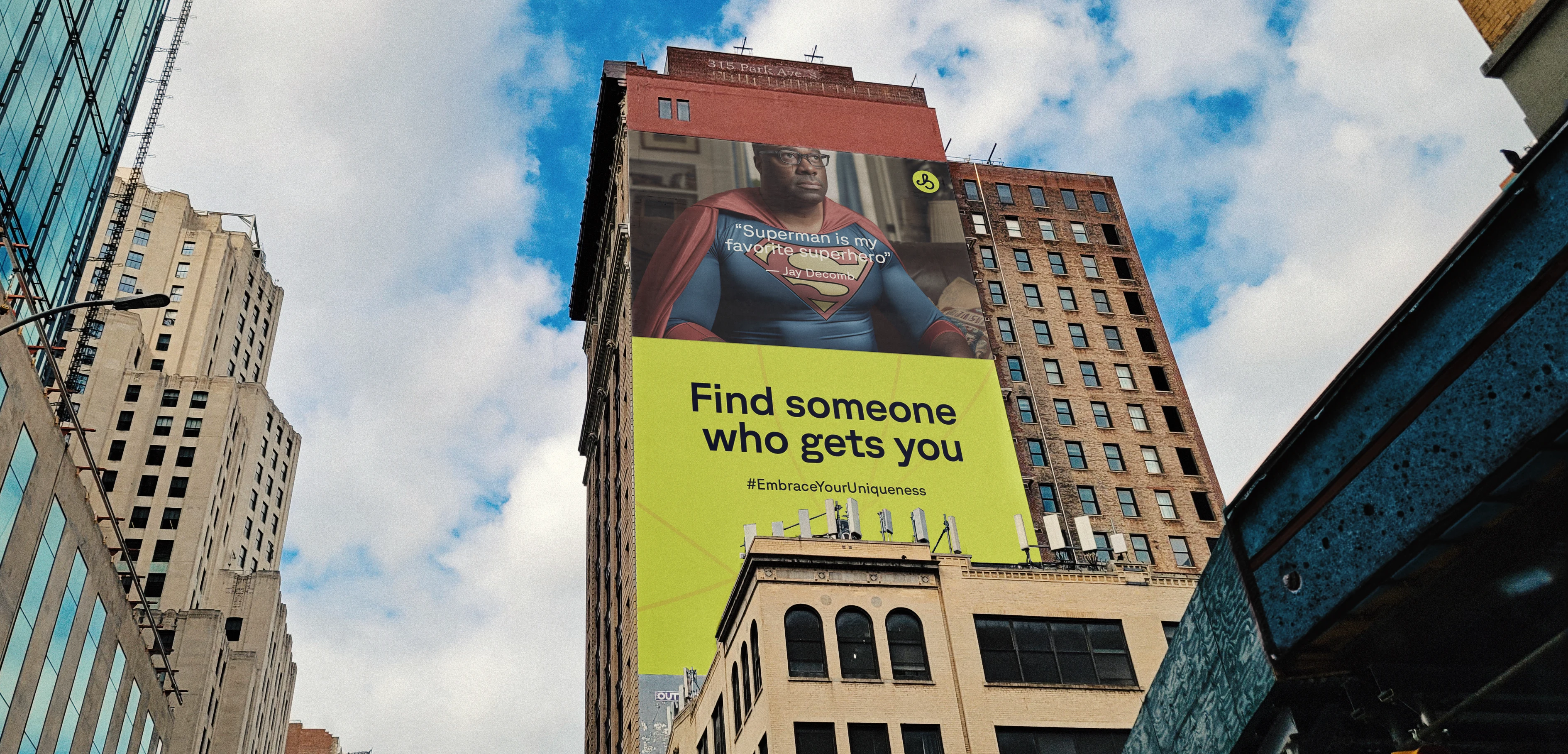
Campaign Billboard Advertisement
INTRO
During the Yuletide season, Sola and Chichi approached me with an intriguing idea to reimagine how dating apps function. We'd all heard complaints or skeptical comments about the reliability of modern dating platforms. They believed that current dating apps have strayed from their original purpose and need to evolve to meet expectations.
Prior to our conversation, I had never used a dating app, let alone design for one. However, it was a challenge I was eager to explore, and so I did.

Brand Tagline
FORMING DEEP BONDS
We've all had people enter our lives and make a positive impact, forming relationships based on shared bonds. This was a topic I discussed with Sola and Chichi about Robin. Imagine an app that highlights the intangible qualities that define us and connects individuals with shared interests and values - these would serve as the foundations for relationships.
This is the central concept behind Robin: assisting people in finding meaningful, lifelong connections.
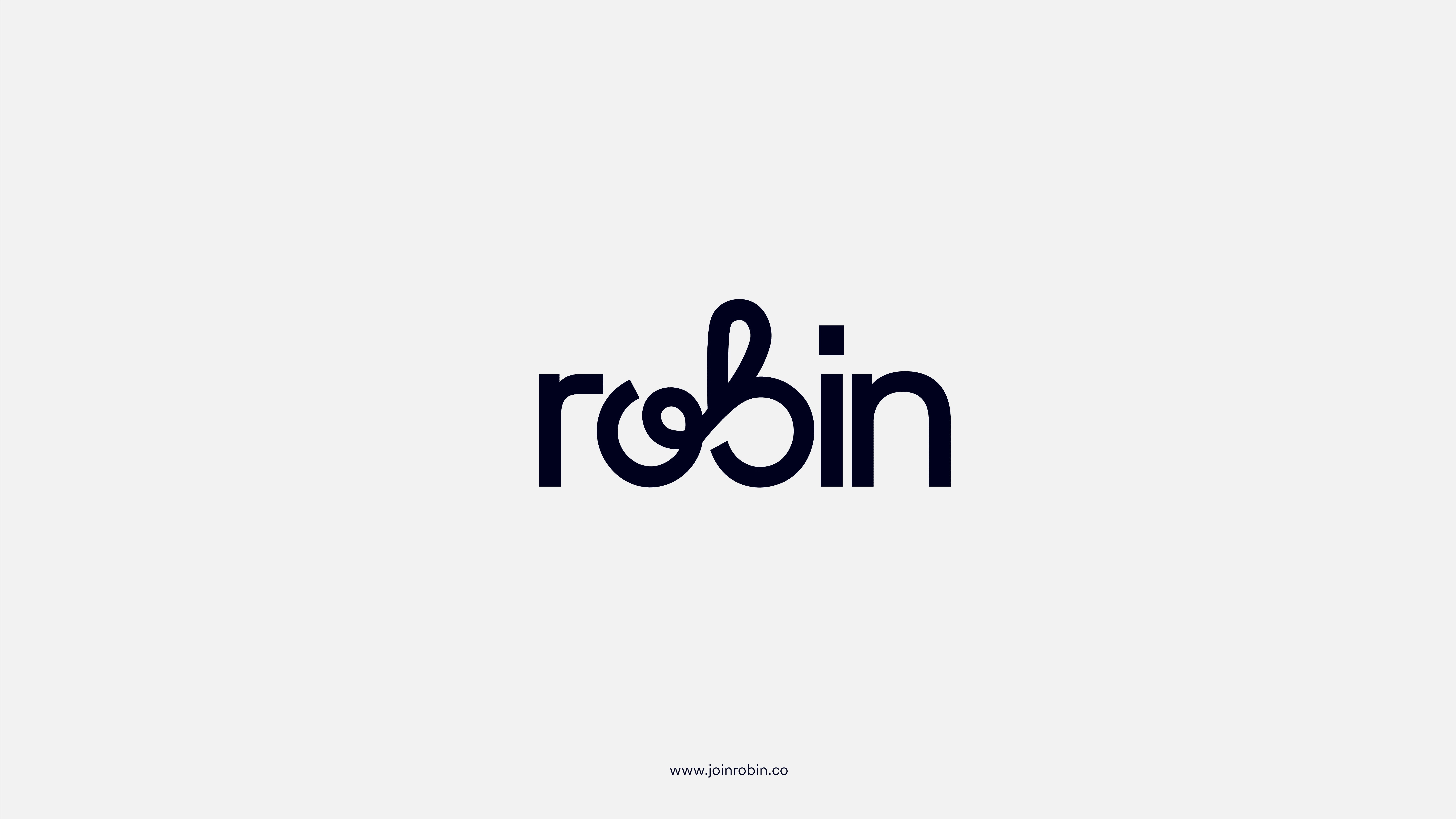
Brand Wordmark Logo
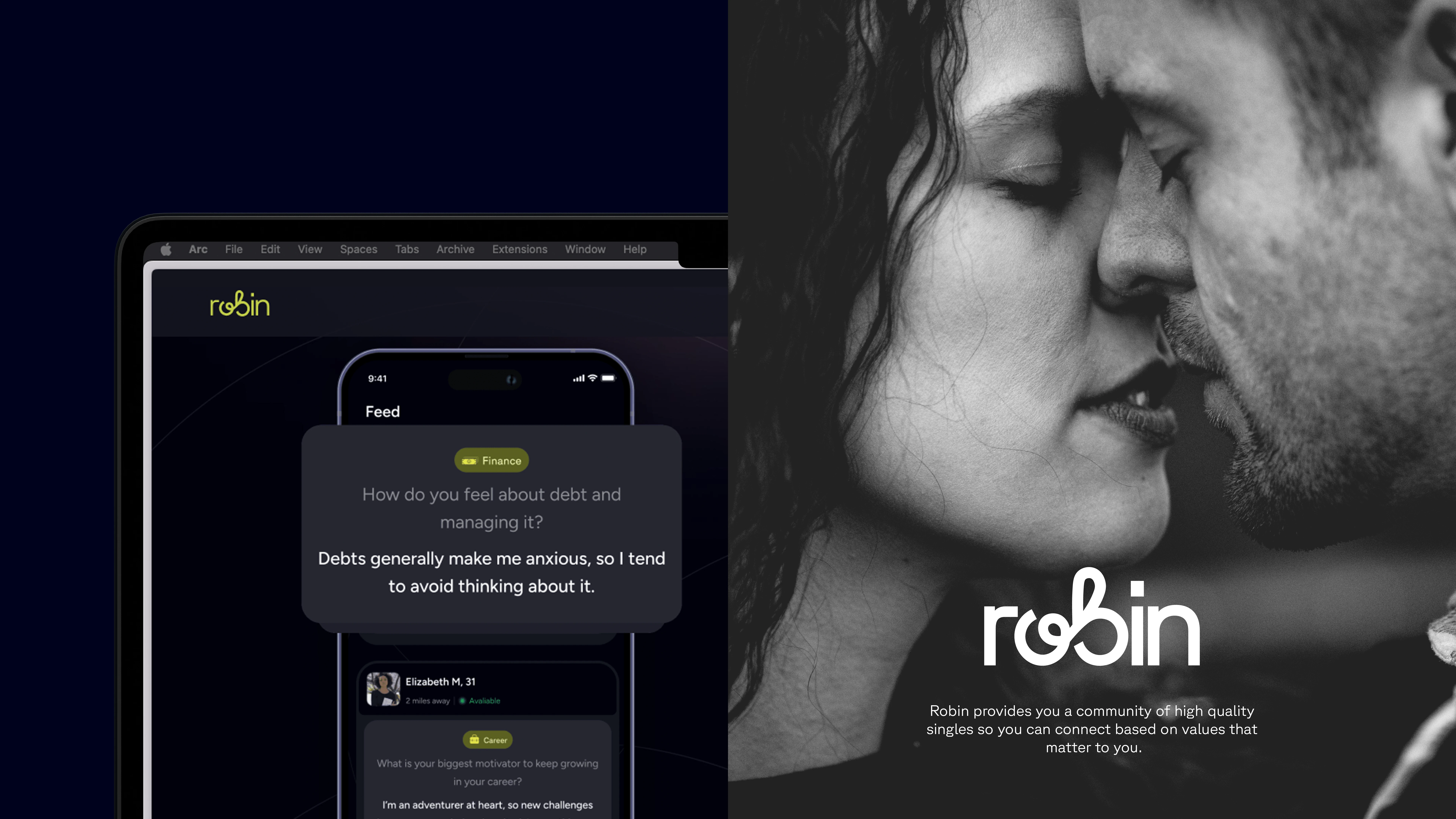
Wordmark Usages
WORDMARK
During the brand discovery session with Sola and Chichi, we agreed that Robin should feel refreshingly new, bourgeois and friendly.
To create something refreshingly new, I analyzed commonalities among logos of most dating apps. It turns out that most use icons as their primary logo—a trend I'll refer to as "zigging". It seemed logical to differentiate ourselves by "zagging", which led me to focus on creating a word mark.
From the start of this project, the word "CONNECTION" appeared more frequently than any other, inspiring the logo's creation. A clever way to visualize this concept was to draw a ligature between the letters O and B.
The wordmark combines the elegance typically found in Script or Serif typefaces with the simplicity and approachability of Sans Serif typefaces.
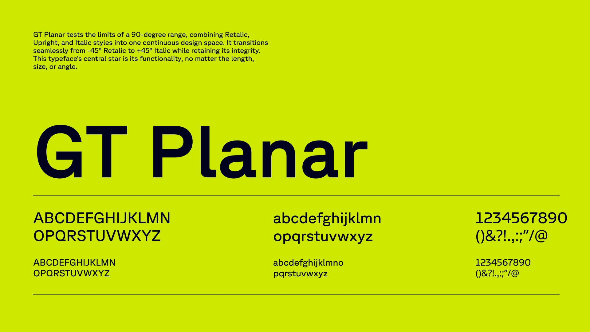
Typography
TYPOGRAPHY
I sought simple elegance in a typeface for Robin. I desired a font that was not overly complicated, yet had sufficient visual interest to command attention. GT Planar fit the bill perfectly; the flat ascenders, descenders, and terminals of the F, Y, and T respectively, exemplified this character.
Another reason why GT Planar was an excellent choice was its ‘retalic’ font style. I believed this would serve as a great visual element for highlighting words that diverge from the norm.
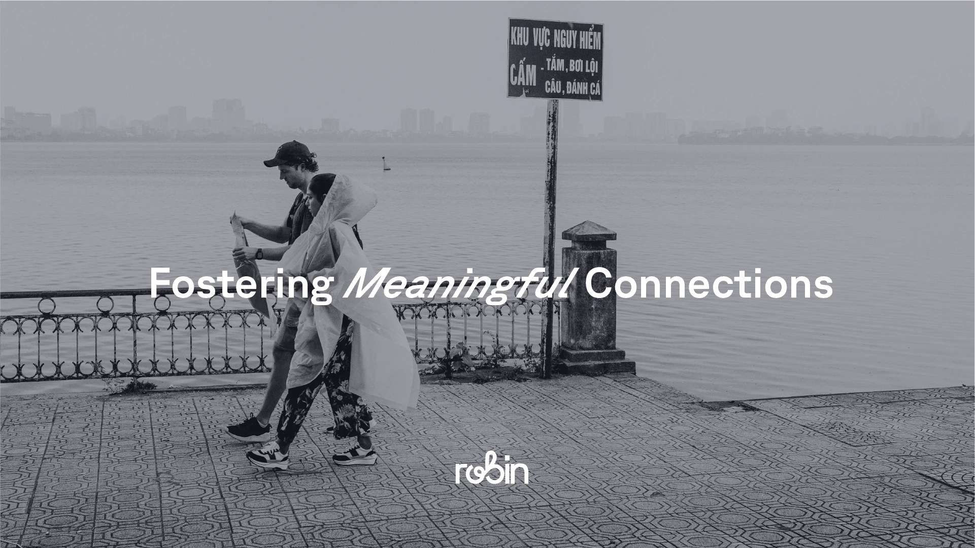
Typography Usage in Emphasizing Deeper Words
COLOUR
The application UI, designed before I joined the project, featured a predominantly dark theme. This meant that the color palette needed to be effective both in-app and for marketing purposes. I was also aware of the need to bring a fresh perspective to the existing color scheme commonly used in the dating app industry.
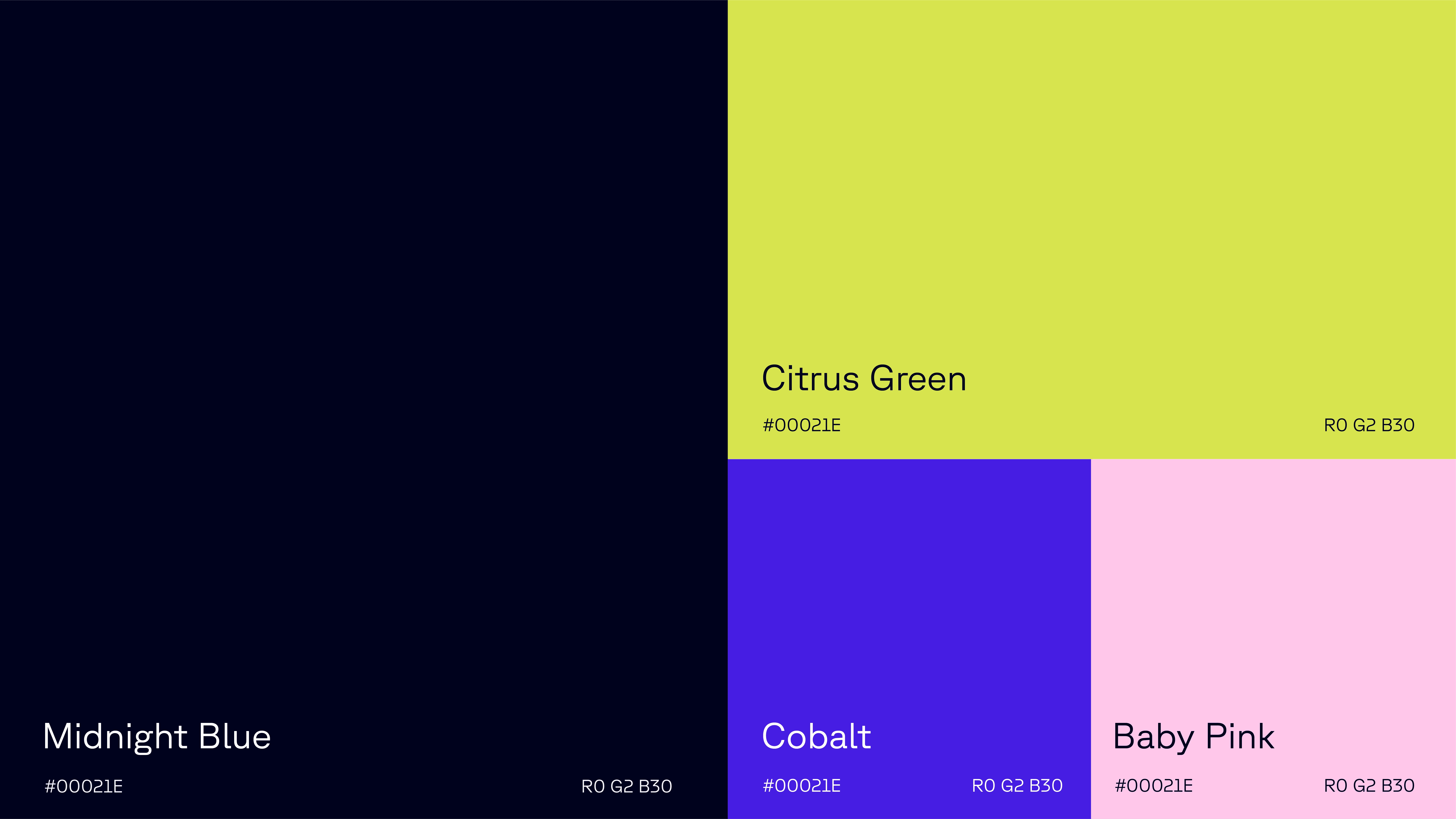
Brand Colours
PRODUCT ICONS
These were designed based on the ligature created from the O and B letter forms. The aim was to generate icons that reflect the connection's look and feel. The ultimate goal was to keep the icons simple yet unique, to distinguish them from generic ones.
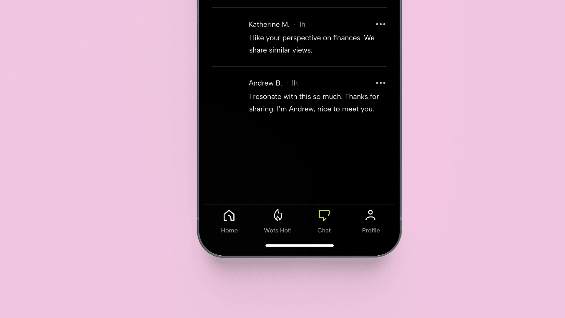
Product Icons in Use
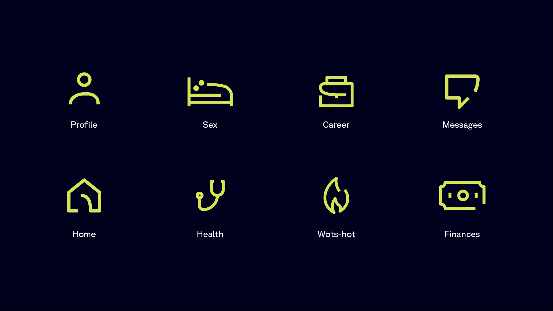
Product Icons Exploration
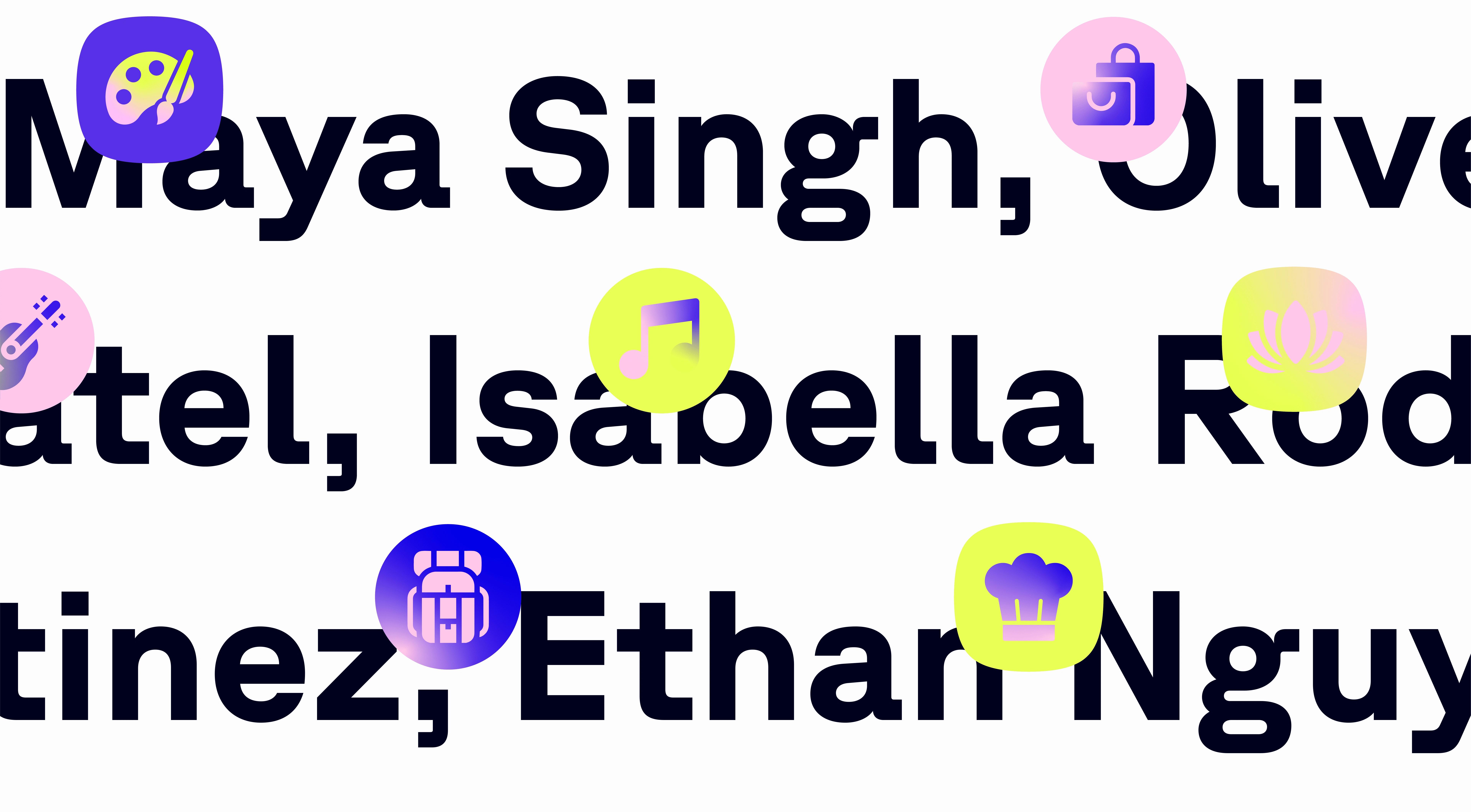
MESSAGING ICONS
Since Robin is a dating app that matches people based on shared interests and values, I thought it would be useful to visualize these aspects using icons, essentially creating ‘interest emojis’. The main challenge was the sheer volume of icons needed, which could potentially make this feature overwhelming and difficult to use. To address this, a method was devised to streamline the icon creation process.
OTHER ELEMENTS
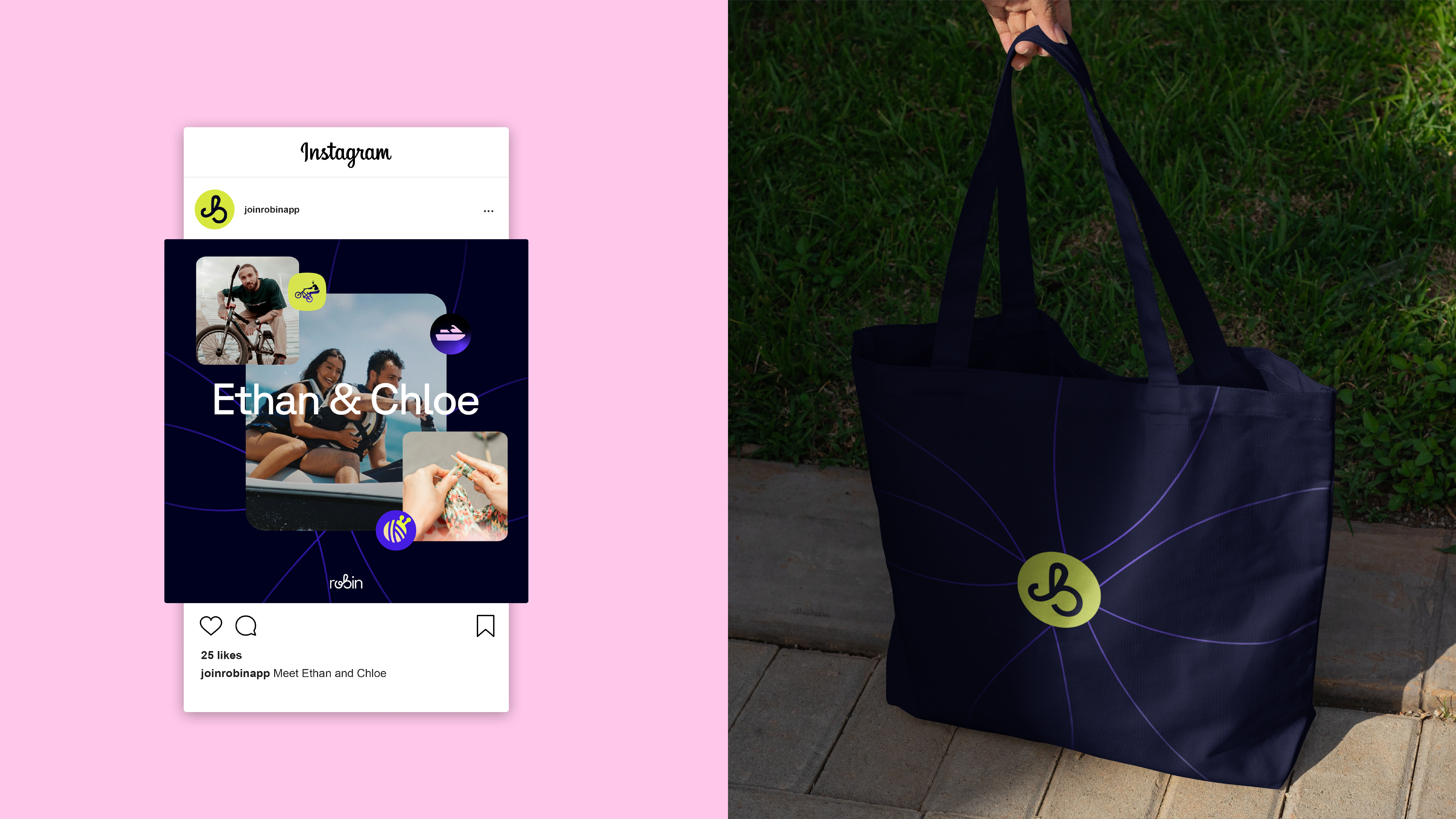
Lastly, I created an element called "CONNECTING LINES". The purpose is to use it as a background filler to enhance visual interest.
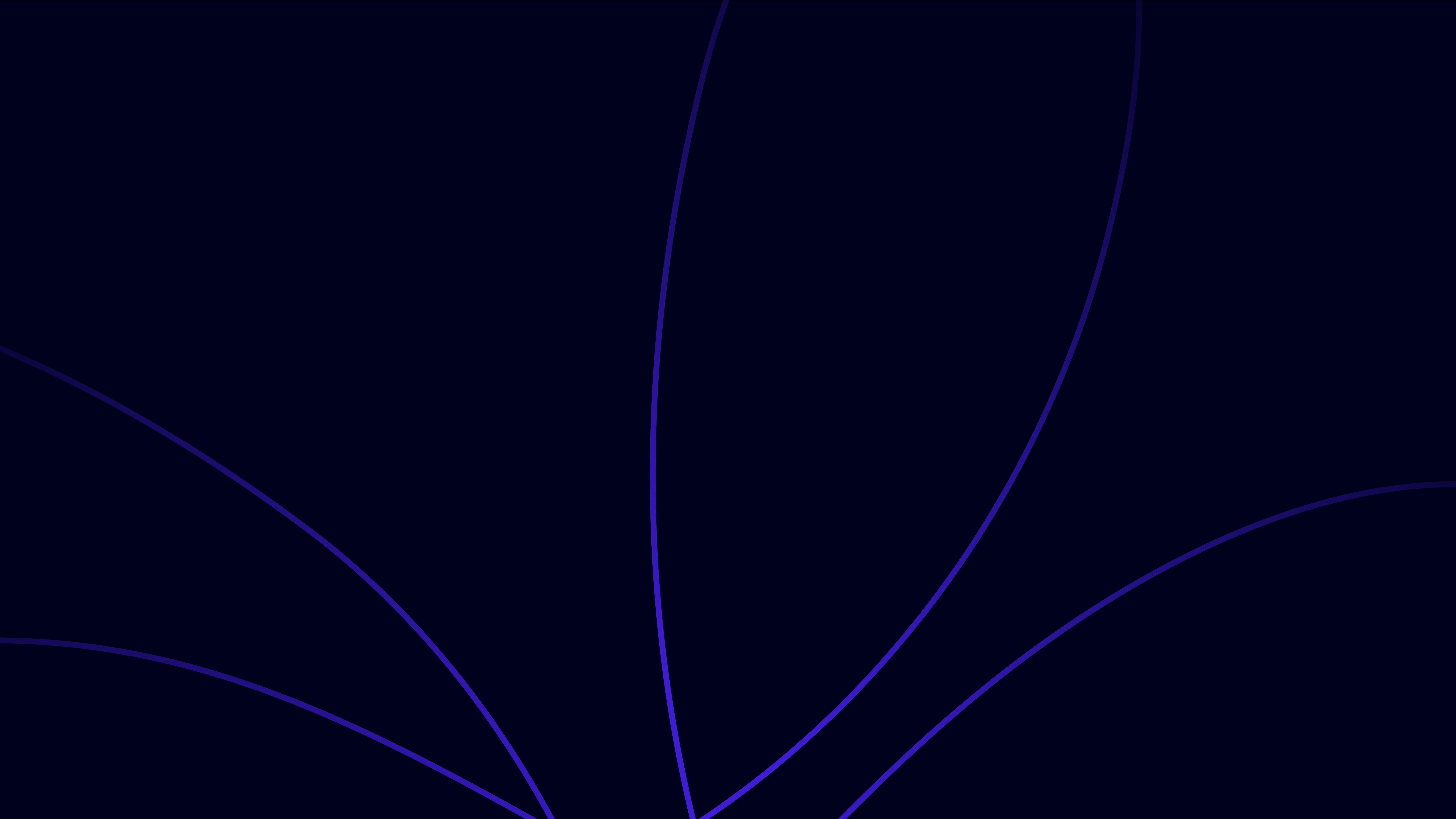
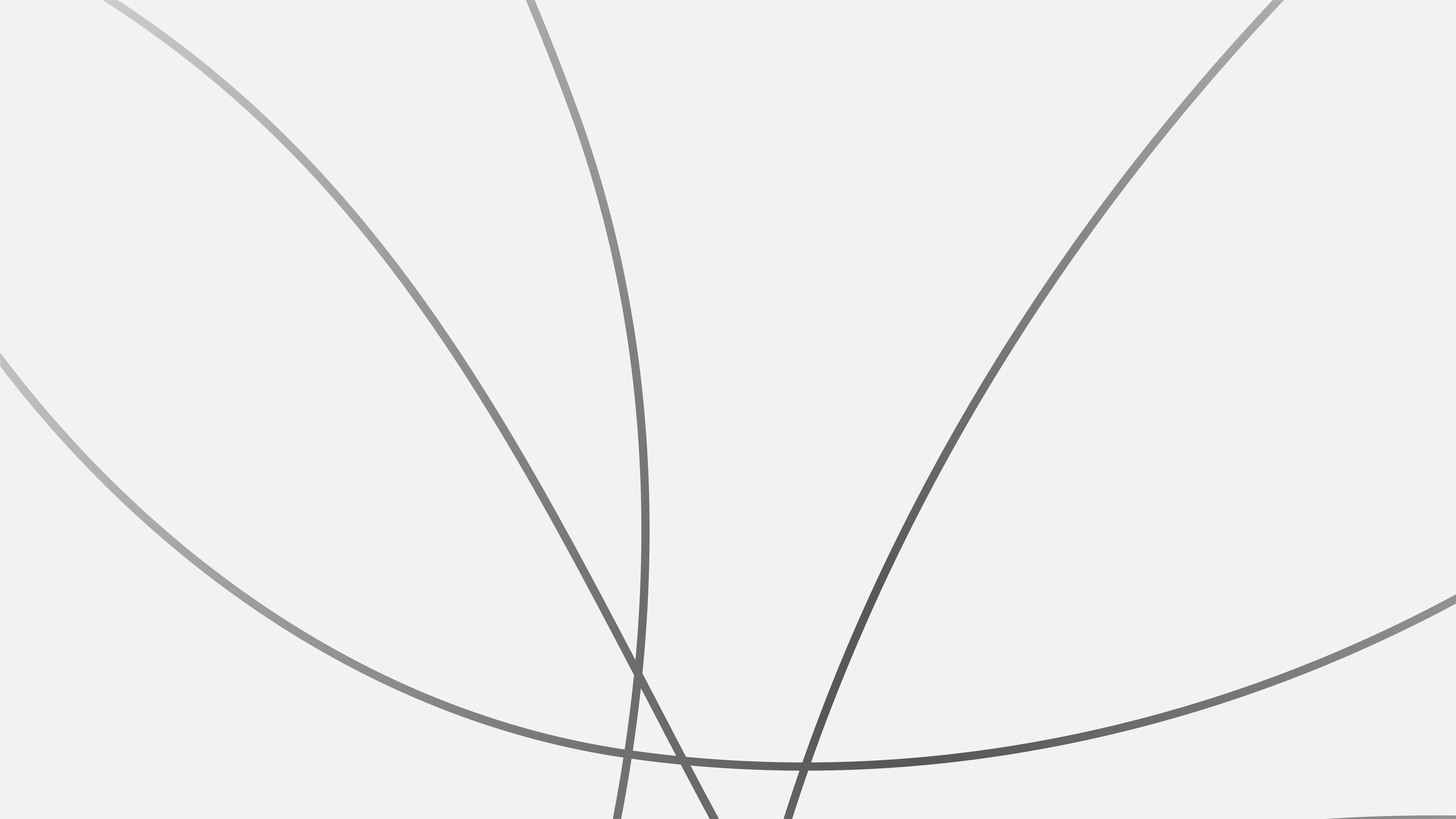
Connecting Lines
Like this project
Posted Mar 3, 2024
Dating app fostering meaningful connections through shared interests. Crafting lasting relationships with a unique brand story.

