Turning Complexity into Clarity: The Paymont Website Redesign
Ayogu Jennifer
Paymont came to me at an exciting moment, the platform was ready to enter the market, but their digital presence wasn’t. They had built a powerful HR tool that could streamline everything from leave tracking to team communication, but without a website that matched its potential, their product risked being overlooked.
From the first conversation, it was clear they wanted more than just a site. They wanted a stage—a way to tell their story, highlight their features, and position themselves as a serious contender in the HR tech space.
A video mockup created on Jitter
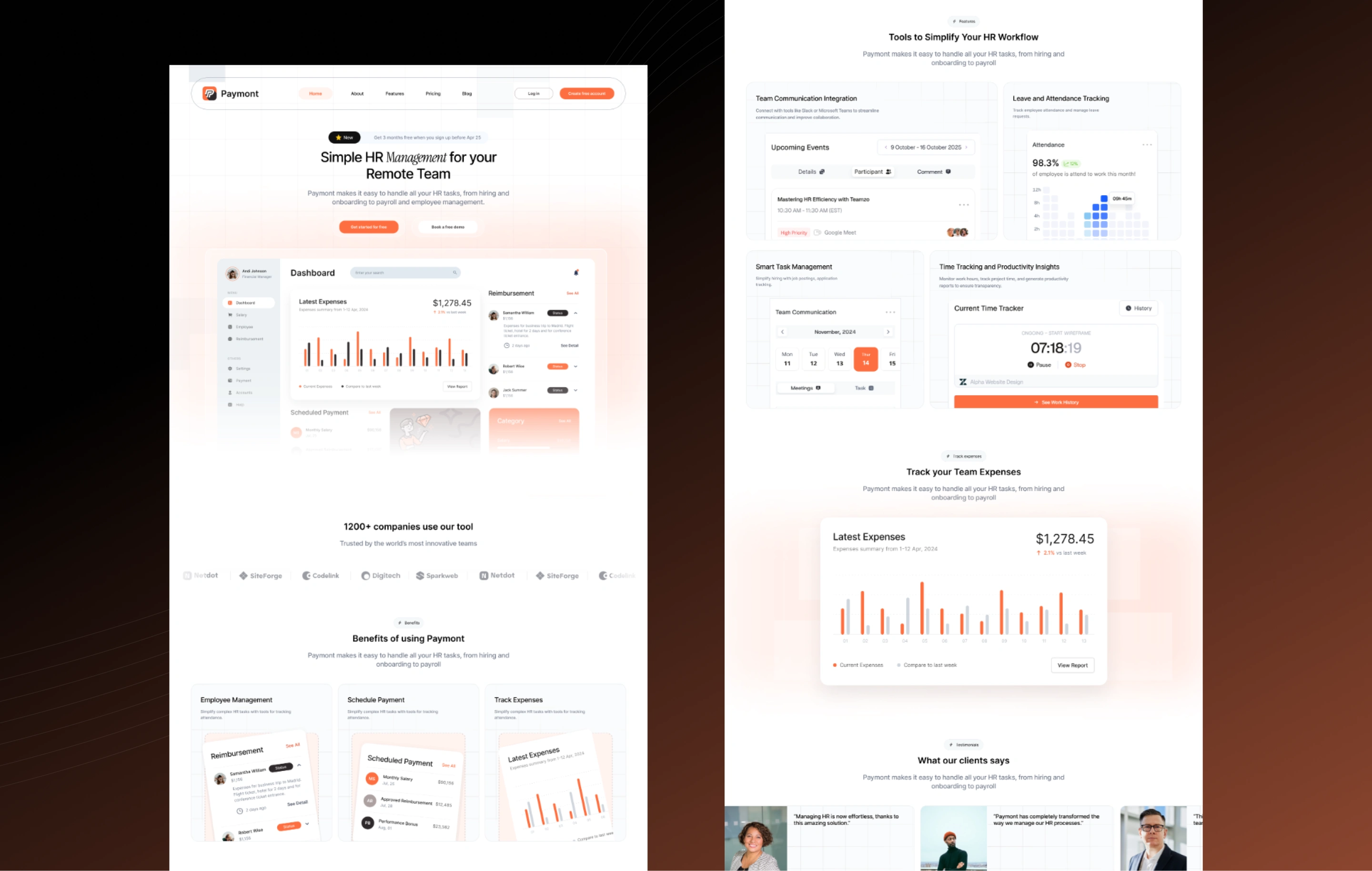
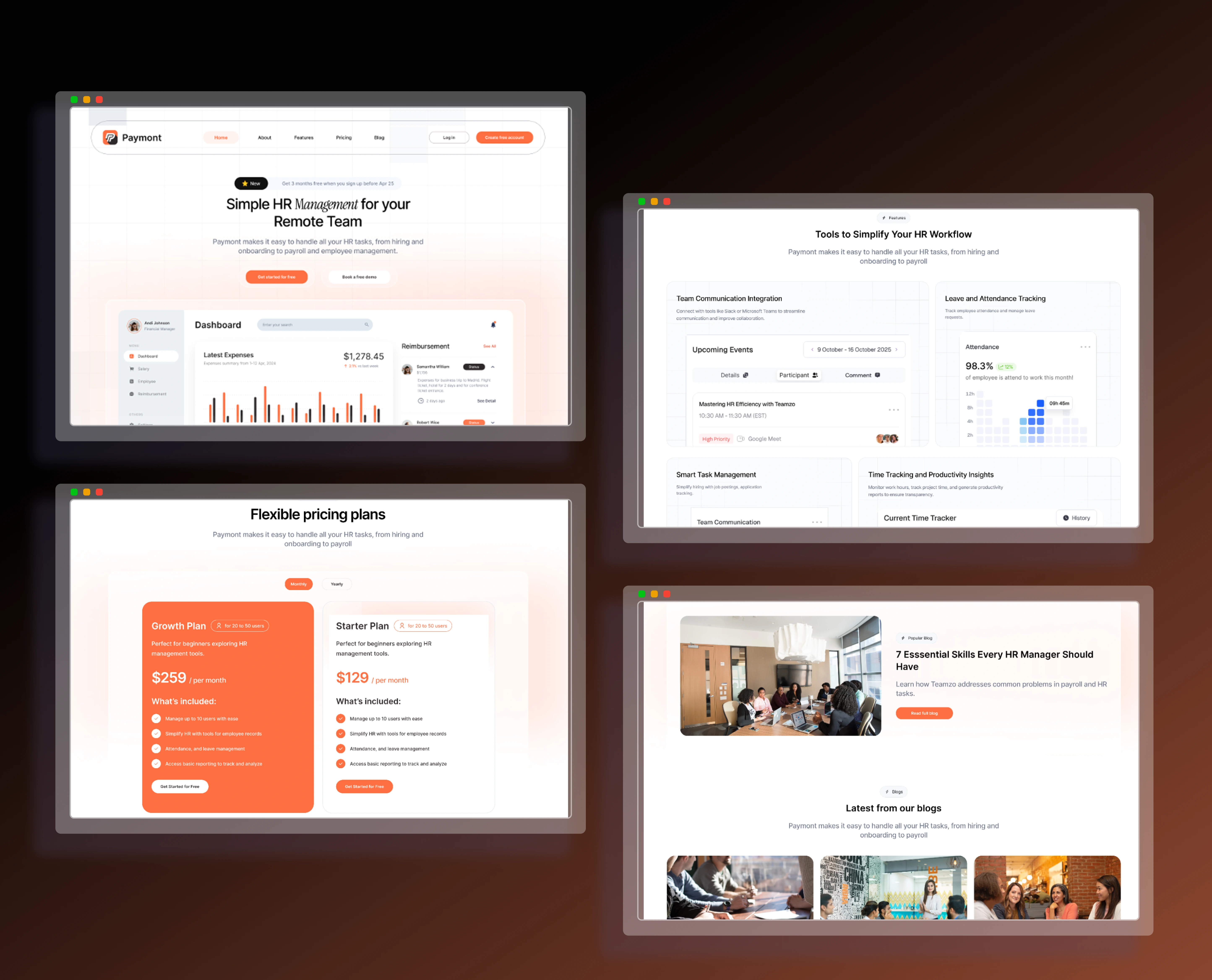
Paymont’s homepage design, introducing the platform with a bold value proposition
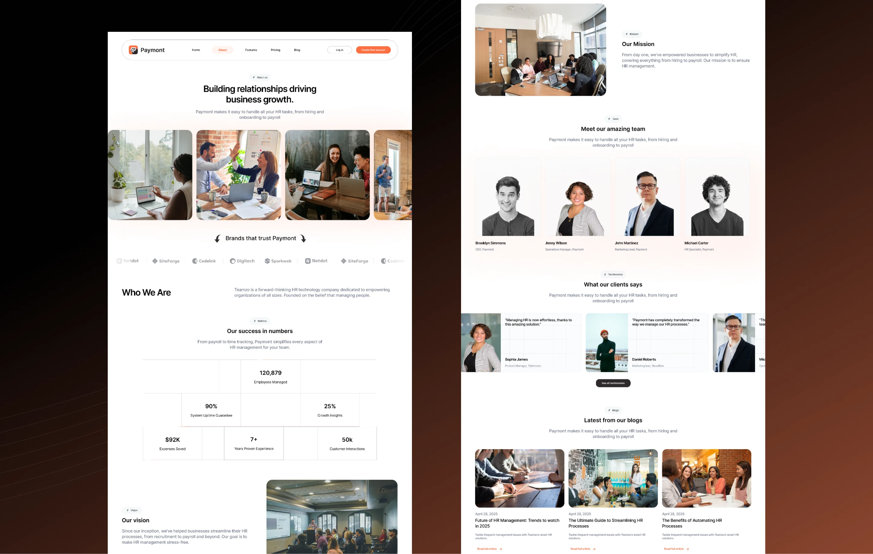
About page design, presenting Paymont’s story, vision, and brand personality
I kicked off the process by digging deep into Paymont’s brand personality. They weren’t just another software company; their vision was to make HR human again—efficient, yes, but also approachable and easy to adopt. That insight shaped every design decision.
I designed a flow that worked like a guided introduction:
Starting with a bold hero section that communicated who Paymont is and why they matter.
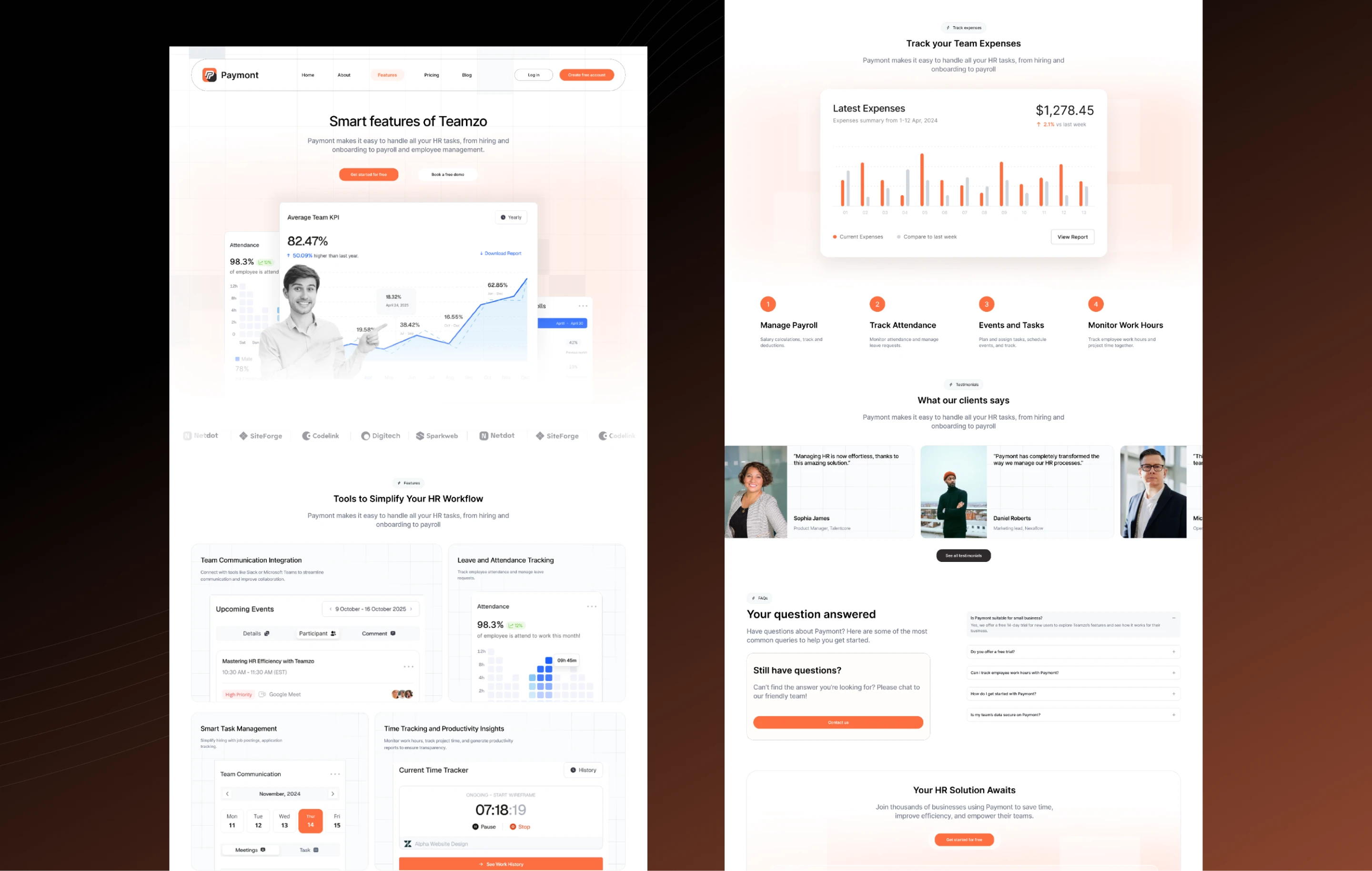
Leading into clear, visually distinct highlights of each core feature—Team Communication, Smart Task Management, Leave & Attendance Tracking, and Productivity Insights.
Ending with a strong call to action that nudged users toward signing up or booking a demo.
The design leaned into clean visuals, soft interactions, and a confident color palette that reflected both professionalism and warmth. Instead of overwhelming visitors with technical jargon, the site walked them through the product story step by step.
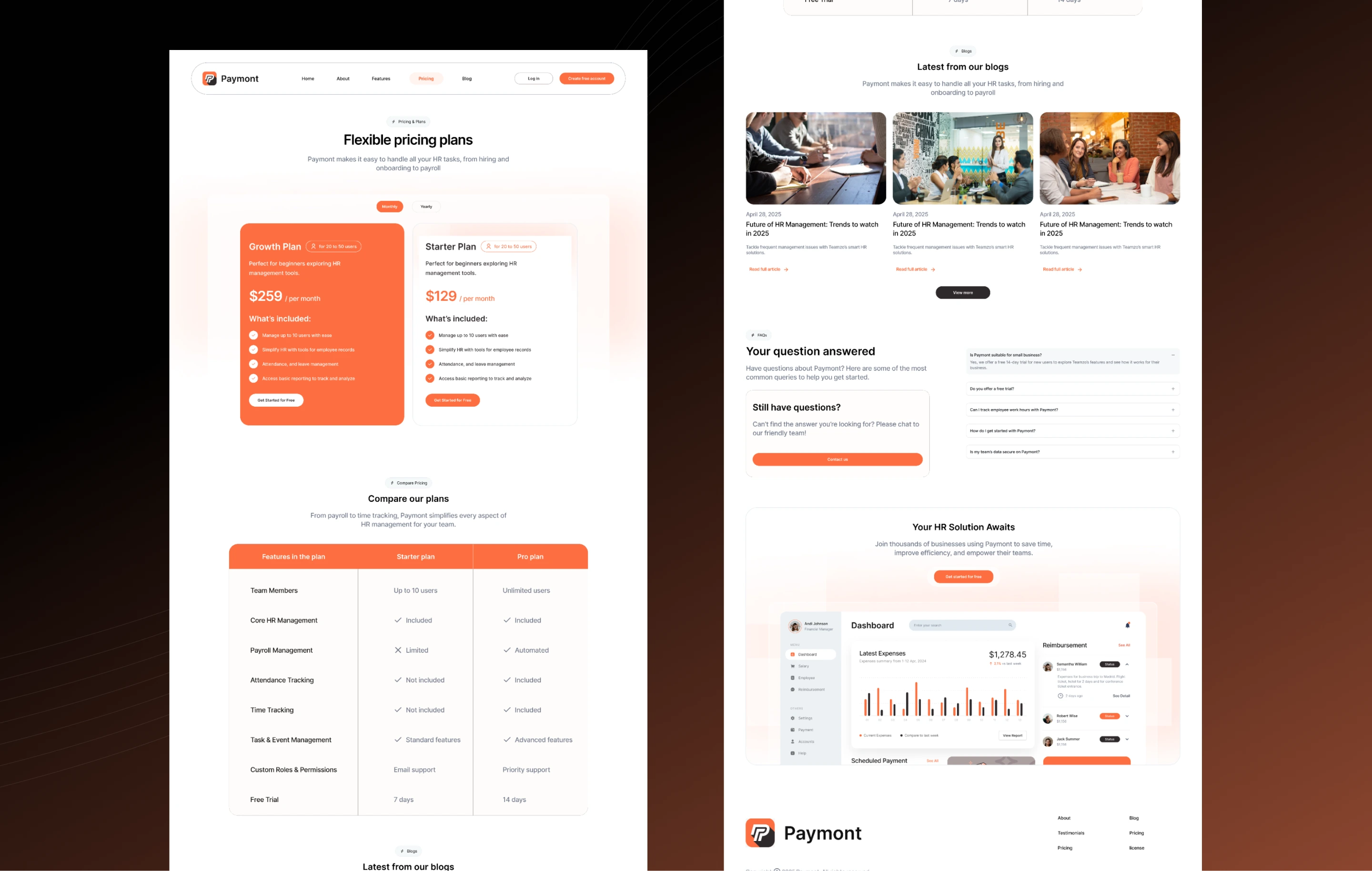
Pricing page layout, offering flexible plans tailored to different team sizes
Feature highlights page, showcasing Paymont’s core HR tools in a simple, scannable format
The impact was immediate. Within weeks of launch, Paymont’s site became their strongest sales tool, driving a significant increase in demo requests and drawing in companies that might have otherwise scrolled past. Metrics showed more time spent on feature pages, stronger engagement rates, and a meaningful drop in bounce.
For Paymont, the site wasn’t just a digital front, it became their brand voice. And for me, it was a chance to transform a complex product into an experience that felt simple, modern, and persuasive.
Like this project
Posted Sep 10, 2025
I partnered with Paymont to craft a sleek, conversion-driven website that simplifies complex HR tools into a clear, engaging digital experience.
Likes
1
Views
8
Timeline
Mar 10, 2025 - Sep 8, 2025
Clients
Paymont