Zenora — where meditation meets modern design.
Ayogu Jennifer
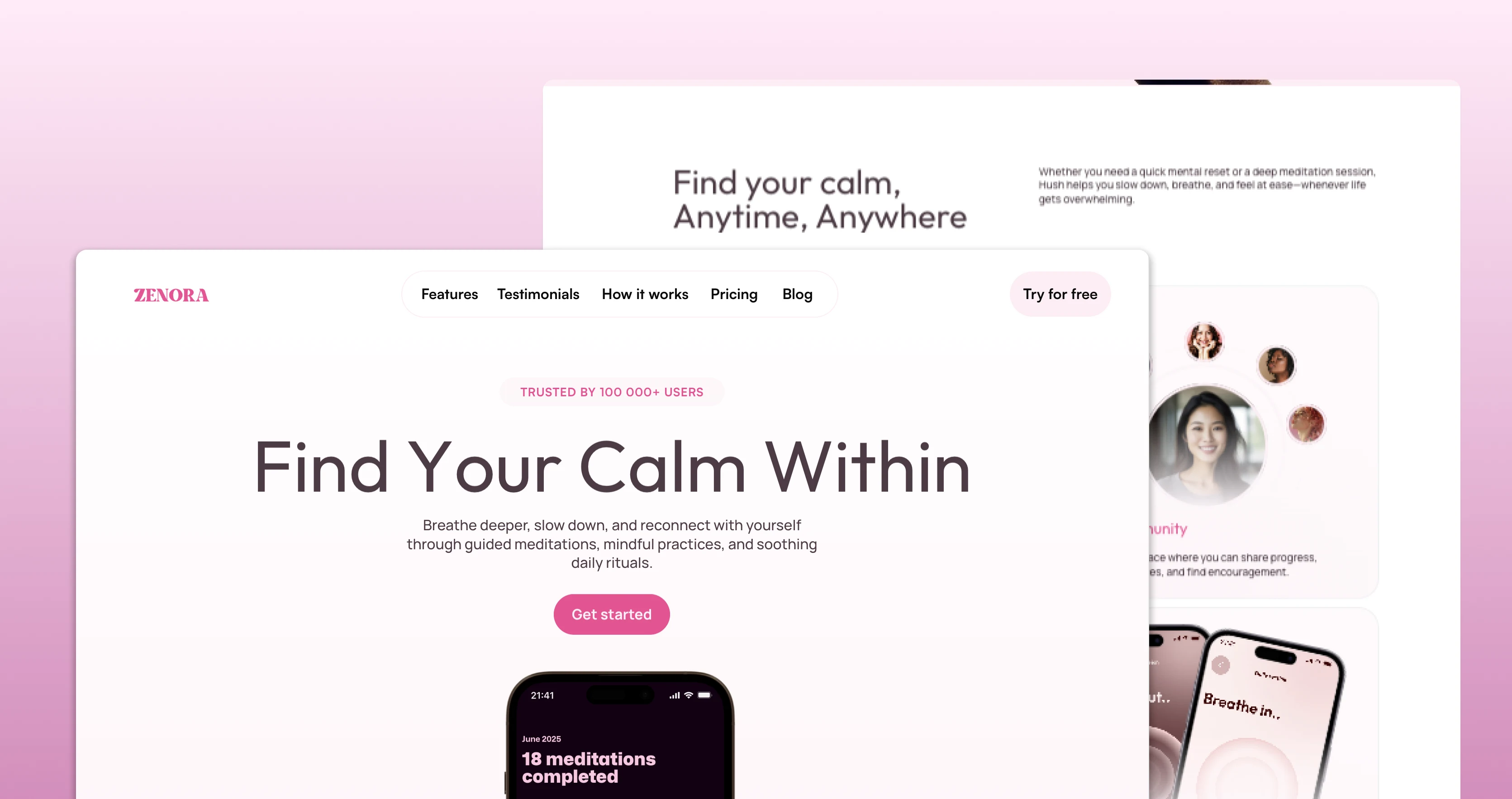
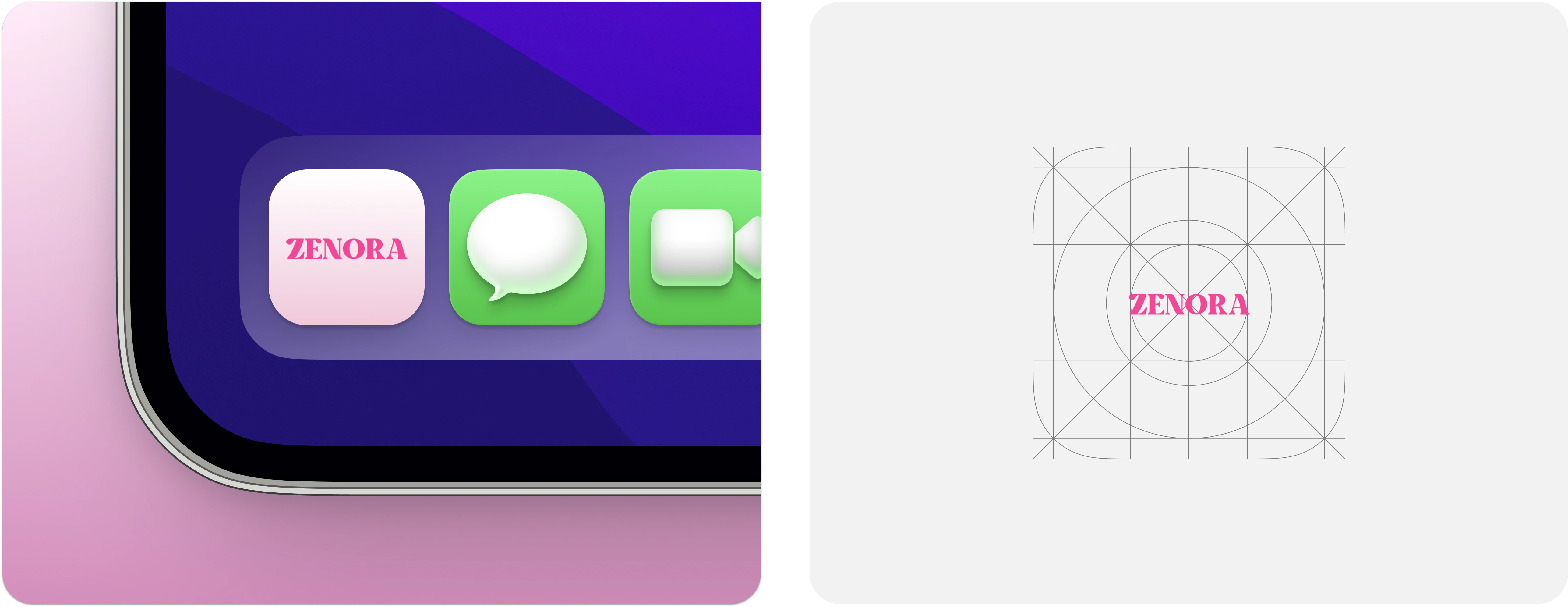
Zenora Social Preview
The Vision
Zenora set out to make mindfulness accessible for everyone. They wanted a website that felt calm, credible, and inviting something that mirrored the essence of meditation itself.
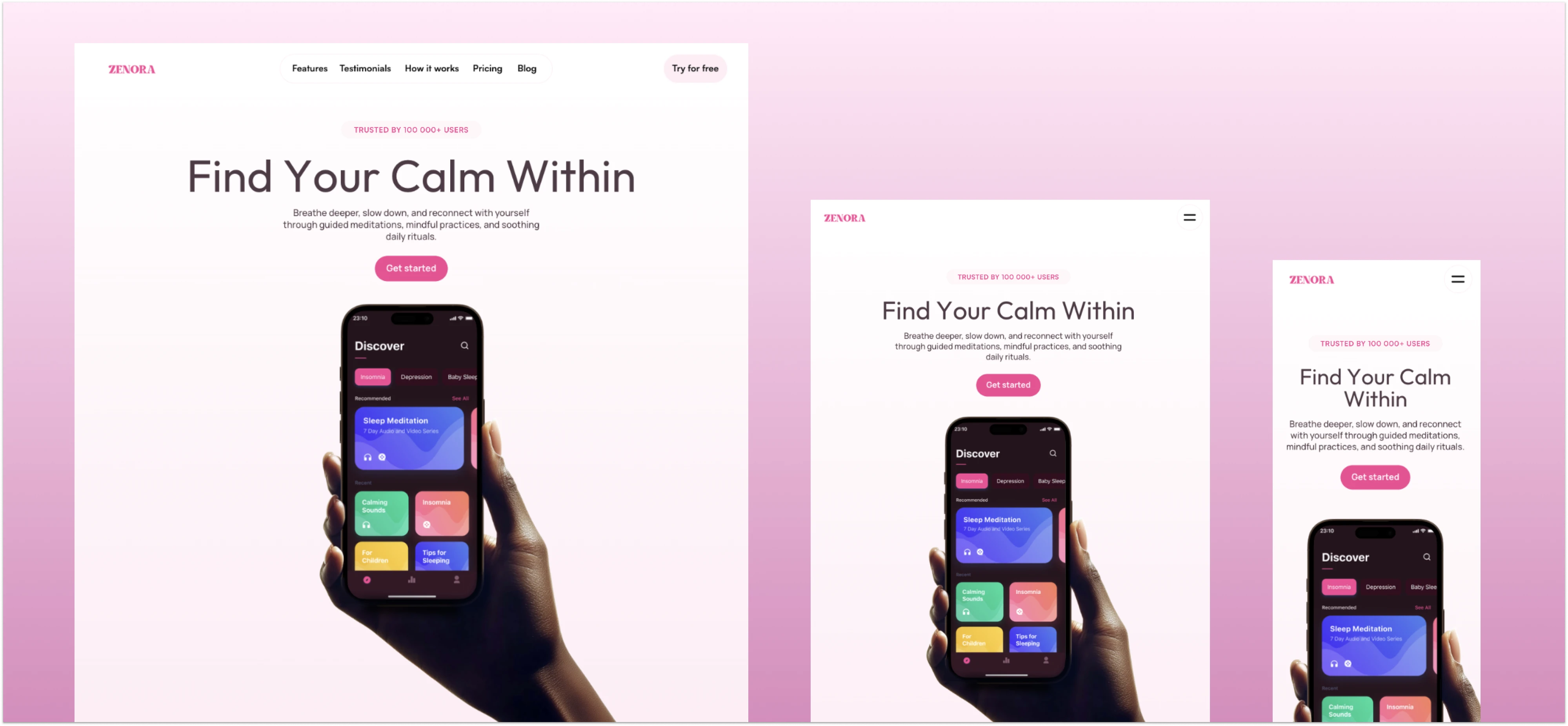
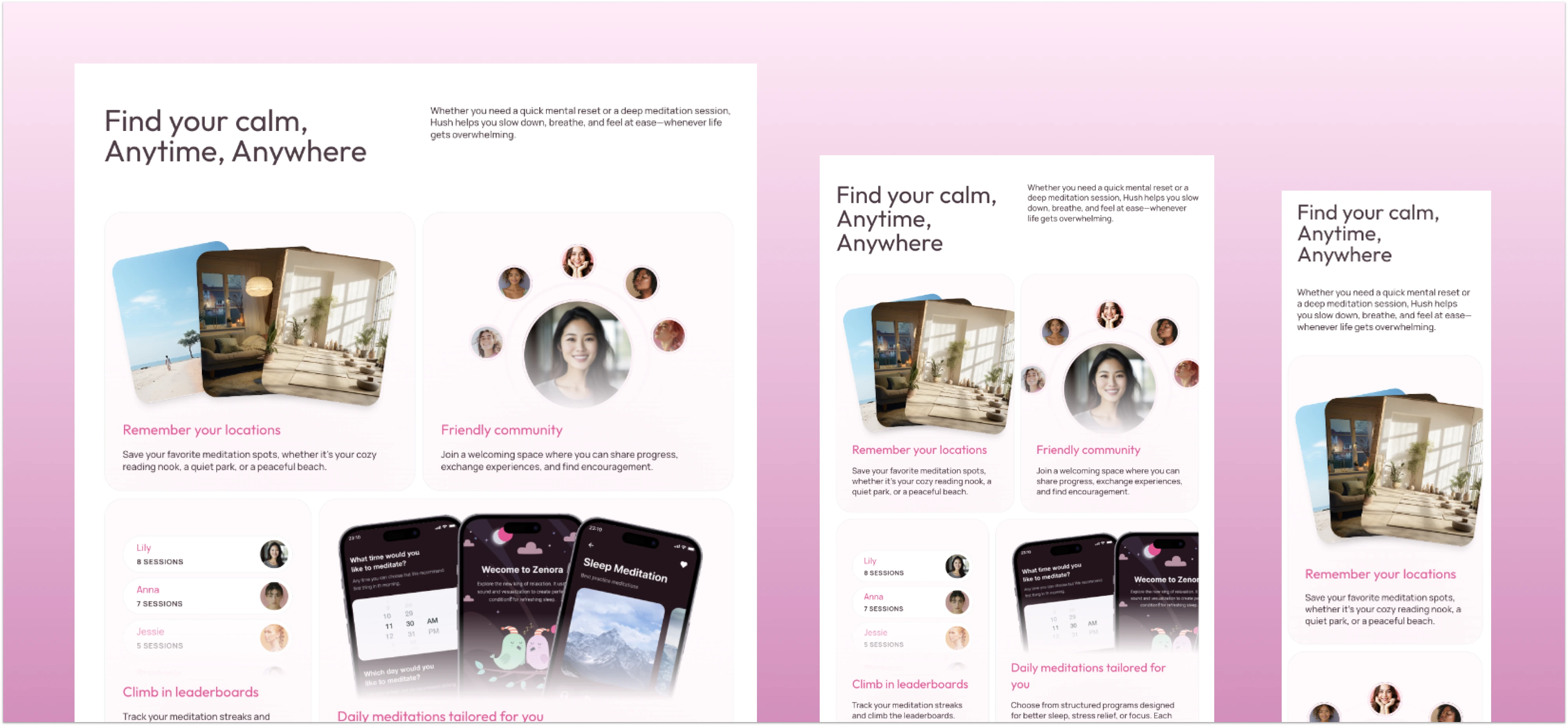
Zenora’s homepage design setting the tone for calm and mindfulness.
The Challenge
Wellness spaces are saturated. Zenora needed to stand out with a design that didn’t overwhelm users with features, but instead created a sense of trust, ease, and focus.
Showcasing Zenora’s core tools with a clean, digestible layout.
The Design Journey
Immersive Landing Page → A soft, minimal hero that set the tone from the first second.
Clear Feature Highlights → Icons, simple copy, and structured layouts that explained value without noise.
Human-Centered Proof → Testimonials that felt like real stories, not just marketing copy.
Effortless Conversion Flow → A pricing page that was clean, transparent, and CTA-driven.
Content Hub → A blog designed to nurture curiosity and boost organic reach.
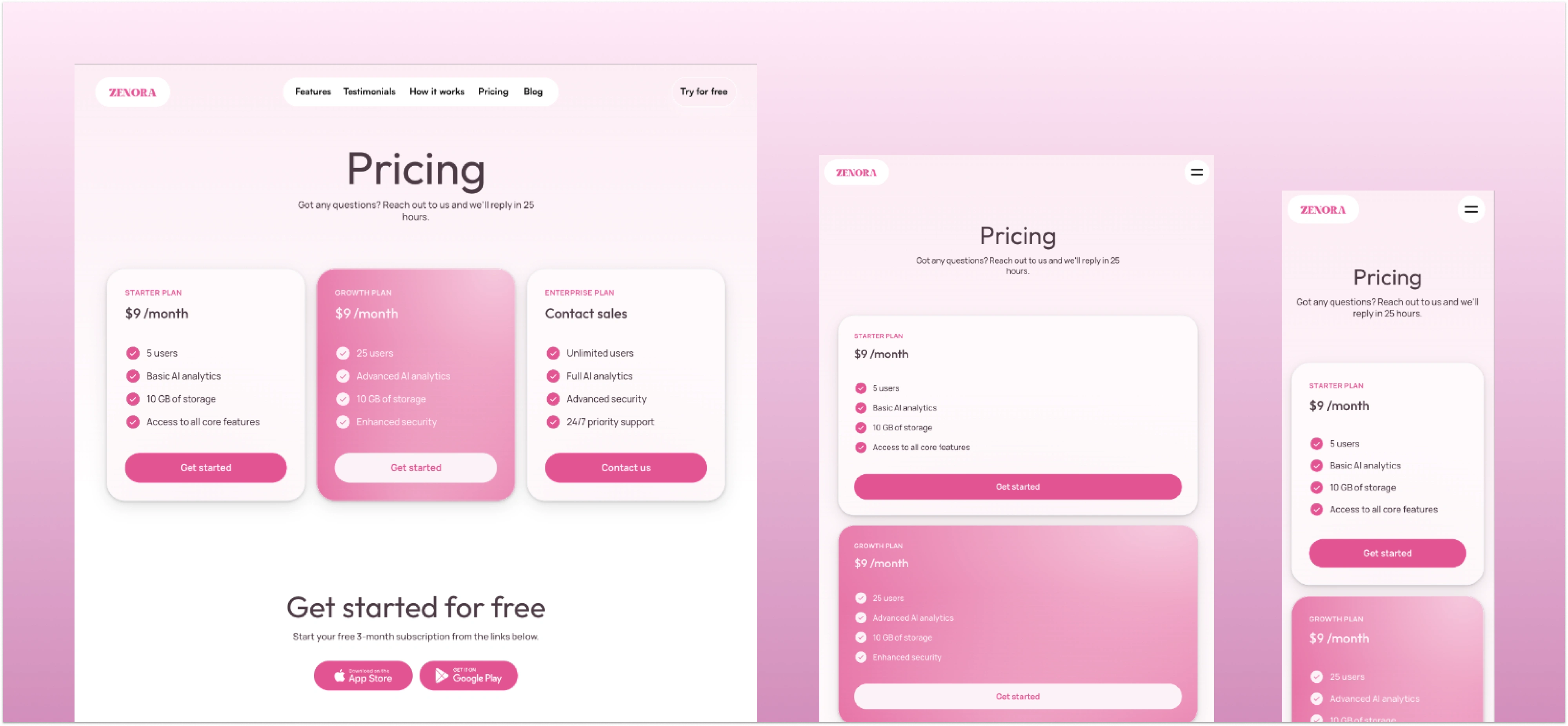
A transparent pricing page designed for clarity and easy conversion.
The Outcome
✨ Average session time grew by +60%
✨ Subscriptions exceeded launch projections by 35%
✨ Bounce rates dropped noticeably, with more users exploring multiple pages
✨ Early feedback: “Soothing, easy to use, and calming to browse”
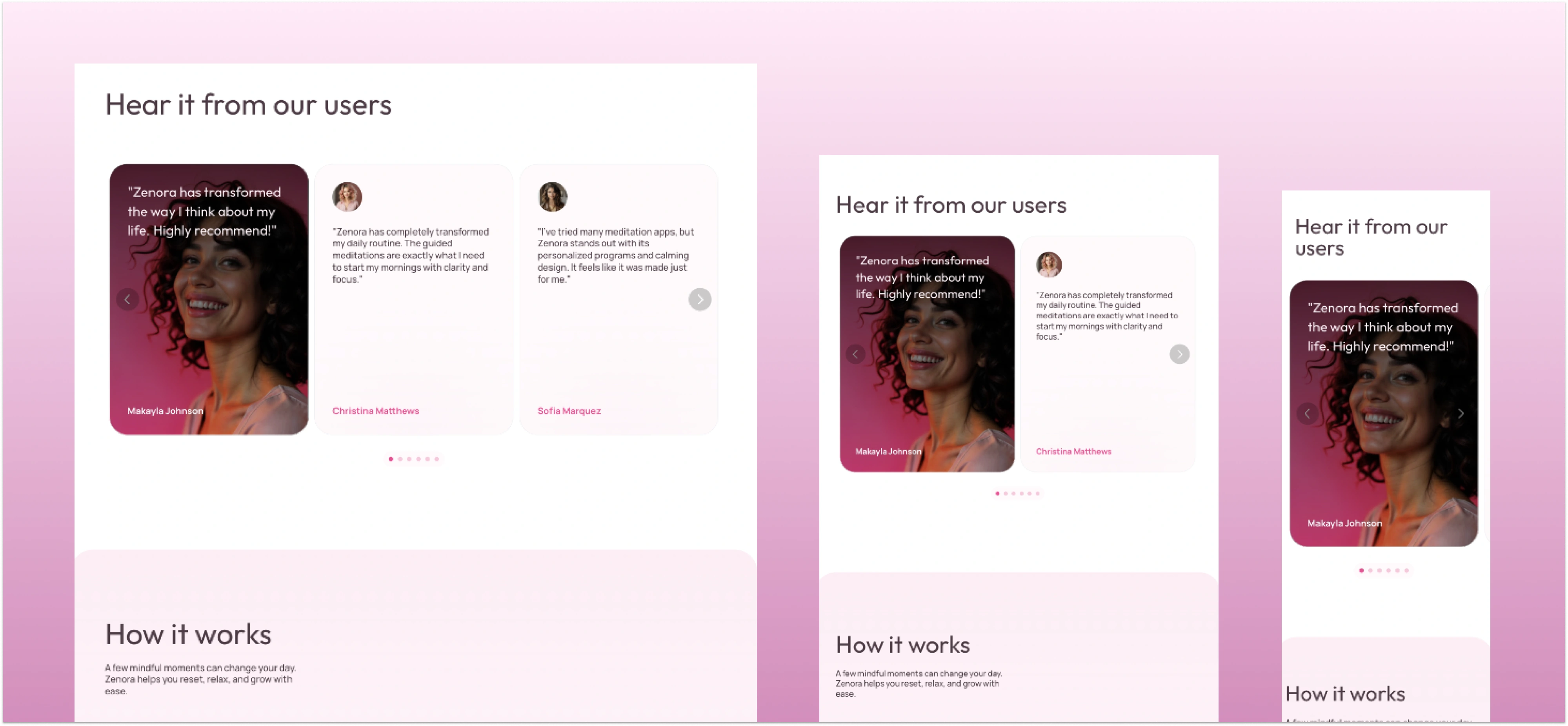
Highlighting authentic user stories to build trust and credibility.
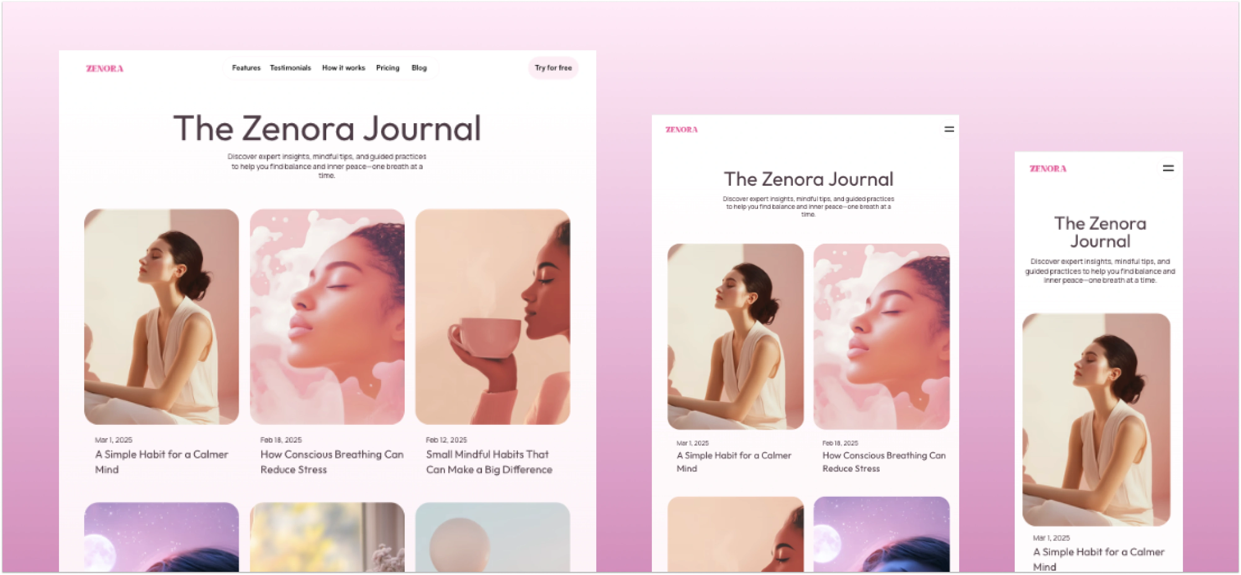
A content hub crafted to share insights and grow organic engagement.
Like this project
Posted Sep 8, 2025
Designed Zenora’s meditation platform with a calm, user-focused experience, delivering engaging pages, consistent design, and stronger user sign-ups.