Fountain of Knowledge School: A Brand Reimagined

Fountain of Knowledge School: A Brand Reimagined
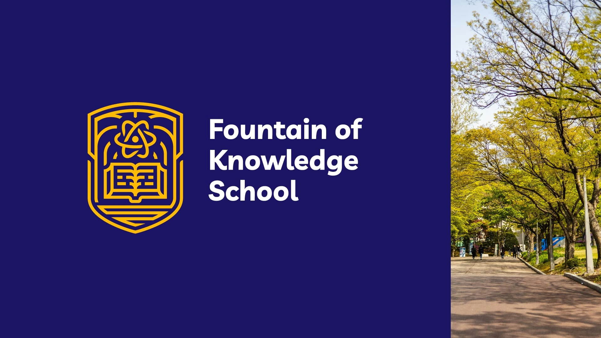
Fountain of Knowledge School, a private institution in Addis Ababa since 2001, needed a brand update to reflect its modern educational approach while honoring its core values. The project encompassed a full logo redesign, brand ethos expansion, and visual identity modernization—all while preserving the school’s legacy.
Honoring Legacy, Embracing Modernity
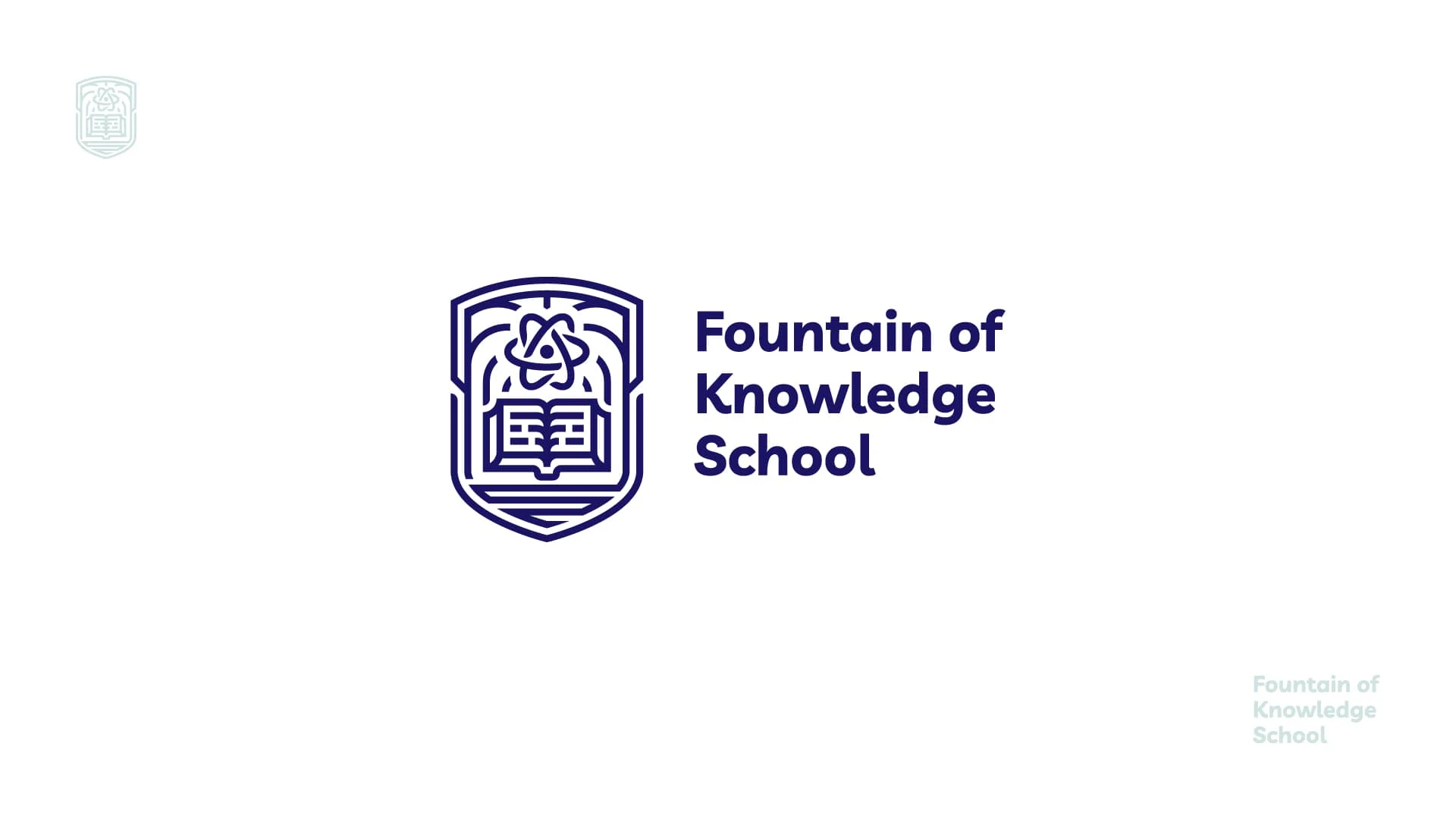
Early brainstorming sessions focused on elevating the original logo’s strongest elements. The solution? A refined logomark and wordmark that balance tradition and innovation.

old vs. new
logo Concept
Key Logo Elements
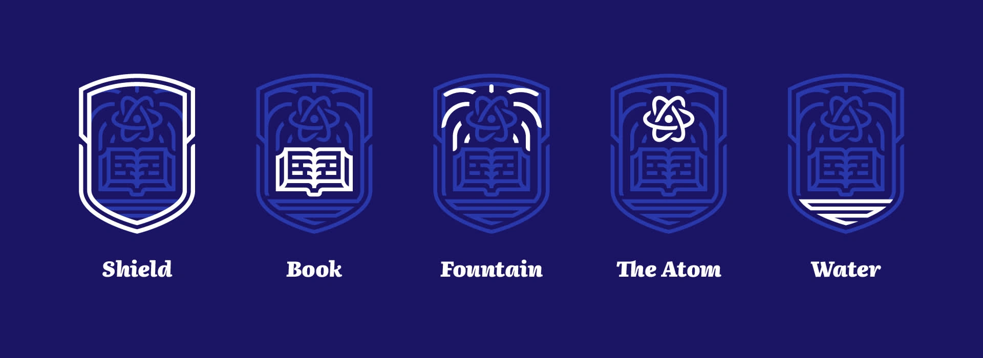
Symbolism: The logomark combines five core icons:
A book (knowledge foundation)
An atom (scientific curiosity)
A fountain (lifelong growth)
Water (flow of learning and purity of purpose)
A shield (protection, integrity, and academic rigor)
Design Approach:
Simplified shapes for clarity and scalability
Modern, professional typography
Fresh yet timeless aesthetic
Color Pallet and Logo Variations
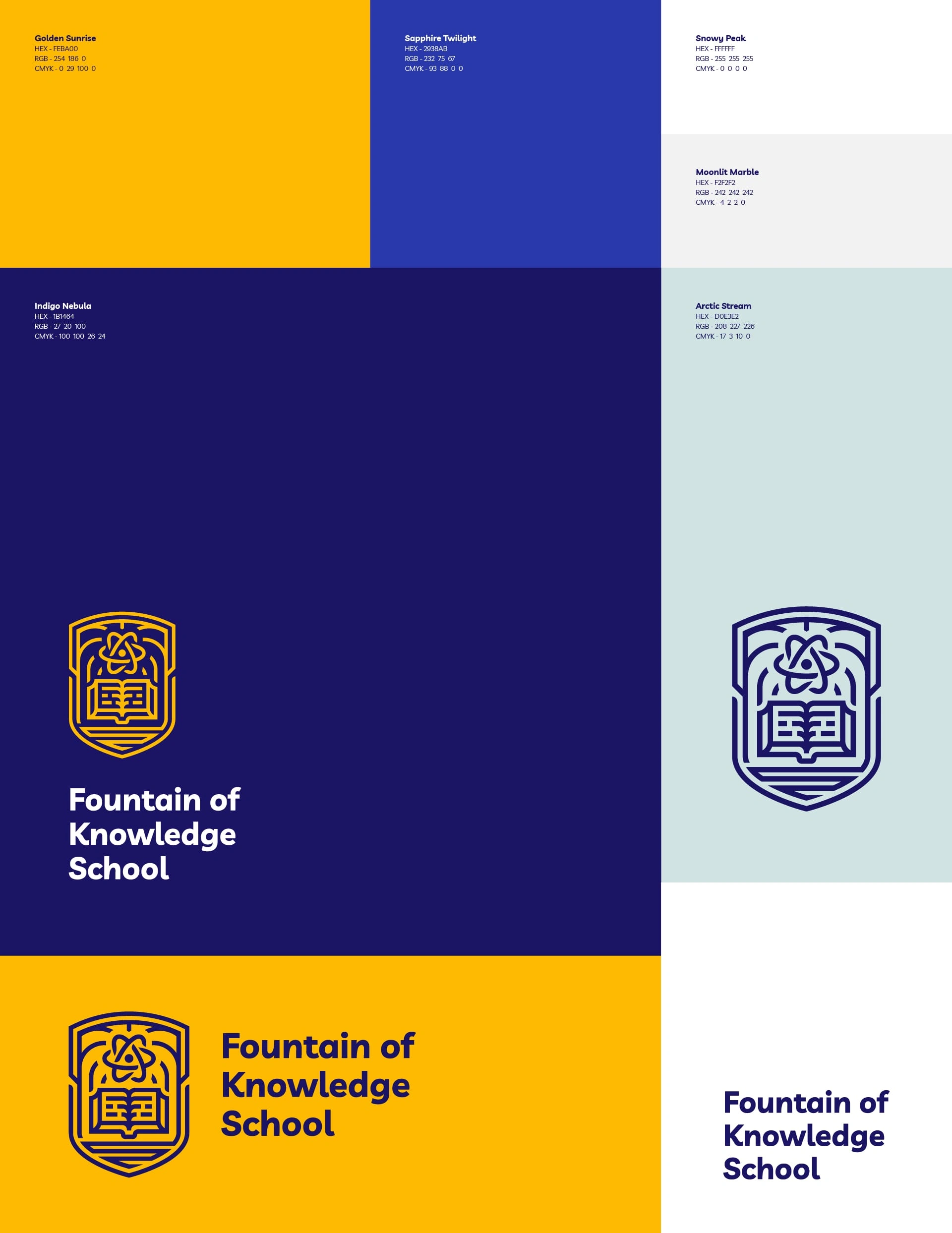
Color Palette: Purposeful & Balanced
Classic blue embodies trust, focus, and academic rigor. Sunny yellow sparks creativity and joyful learning. Together, they reflect the school’s balance of stability and innovation—proven hues that enhance concentration (blue) and collaboration (yellow). A visual metaphor for holistic education.
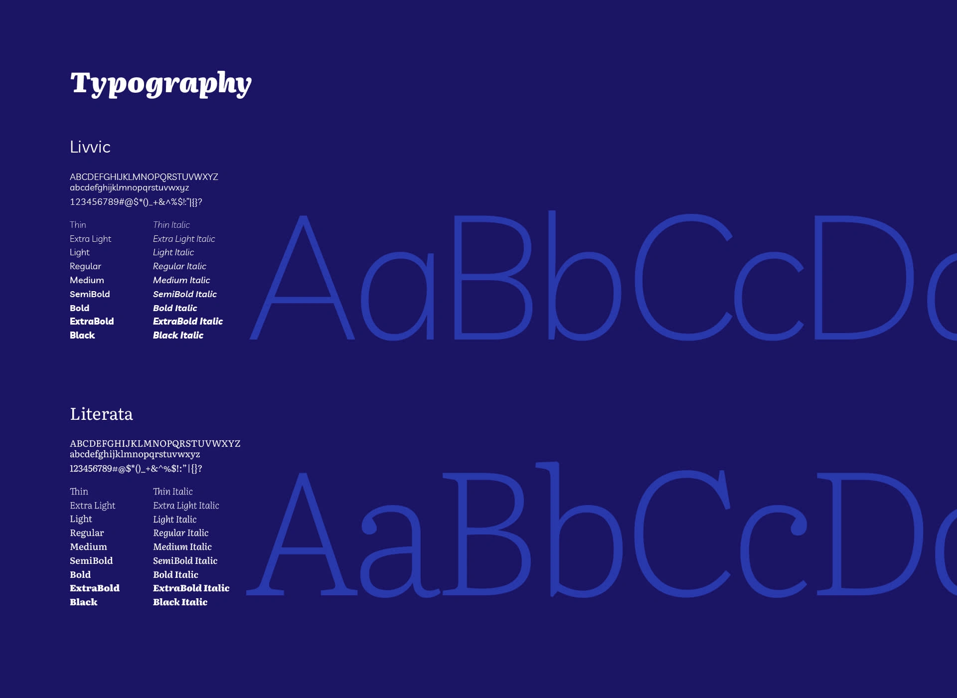







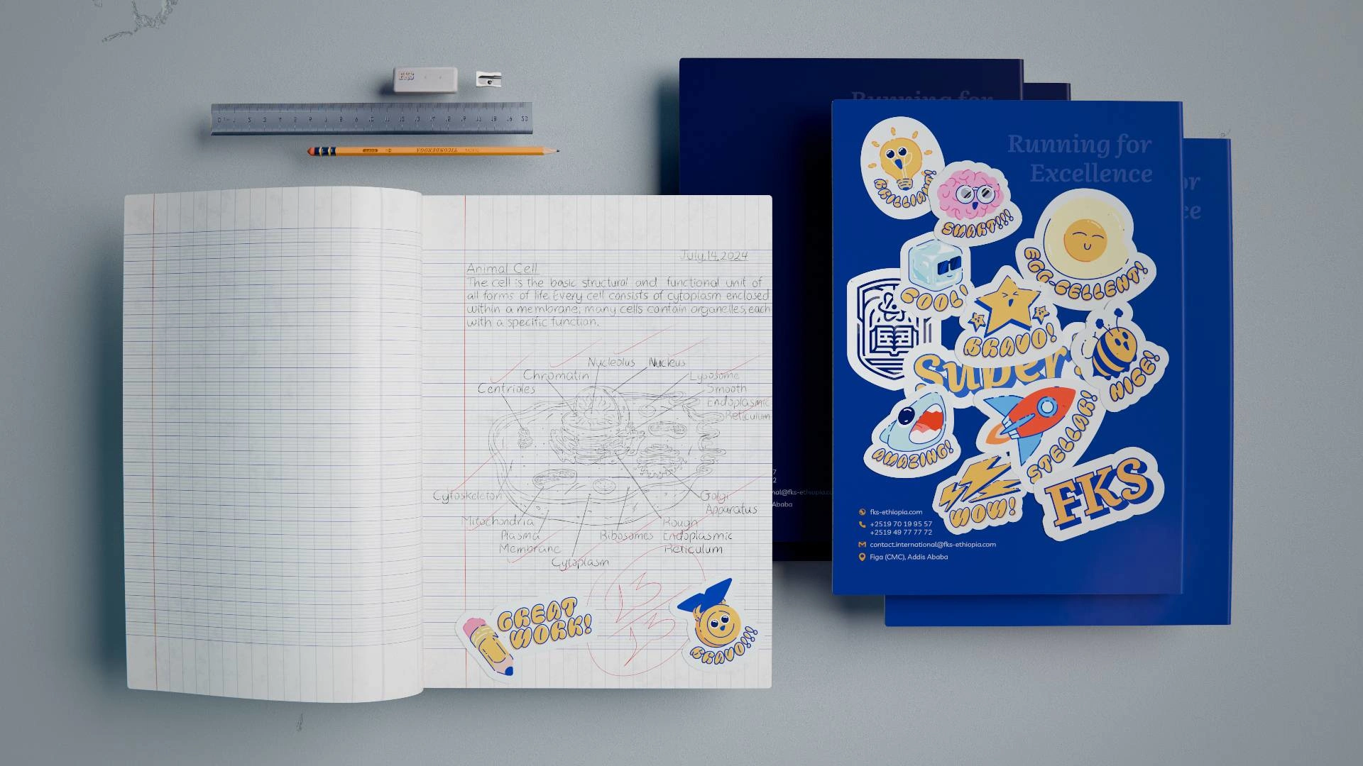
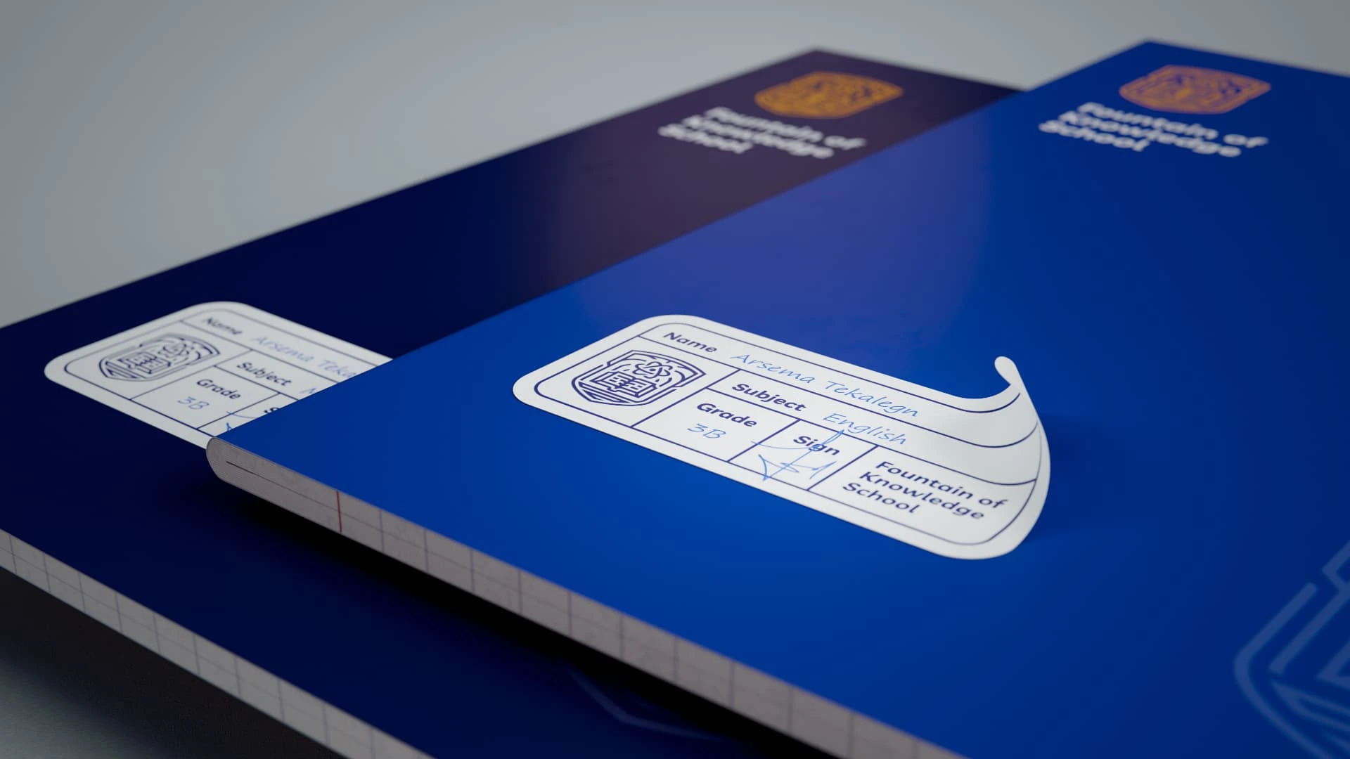
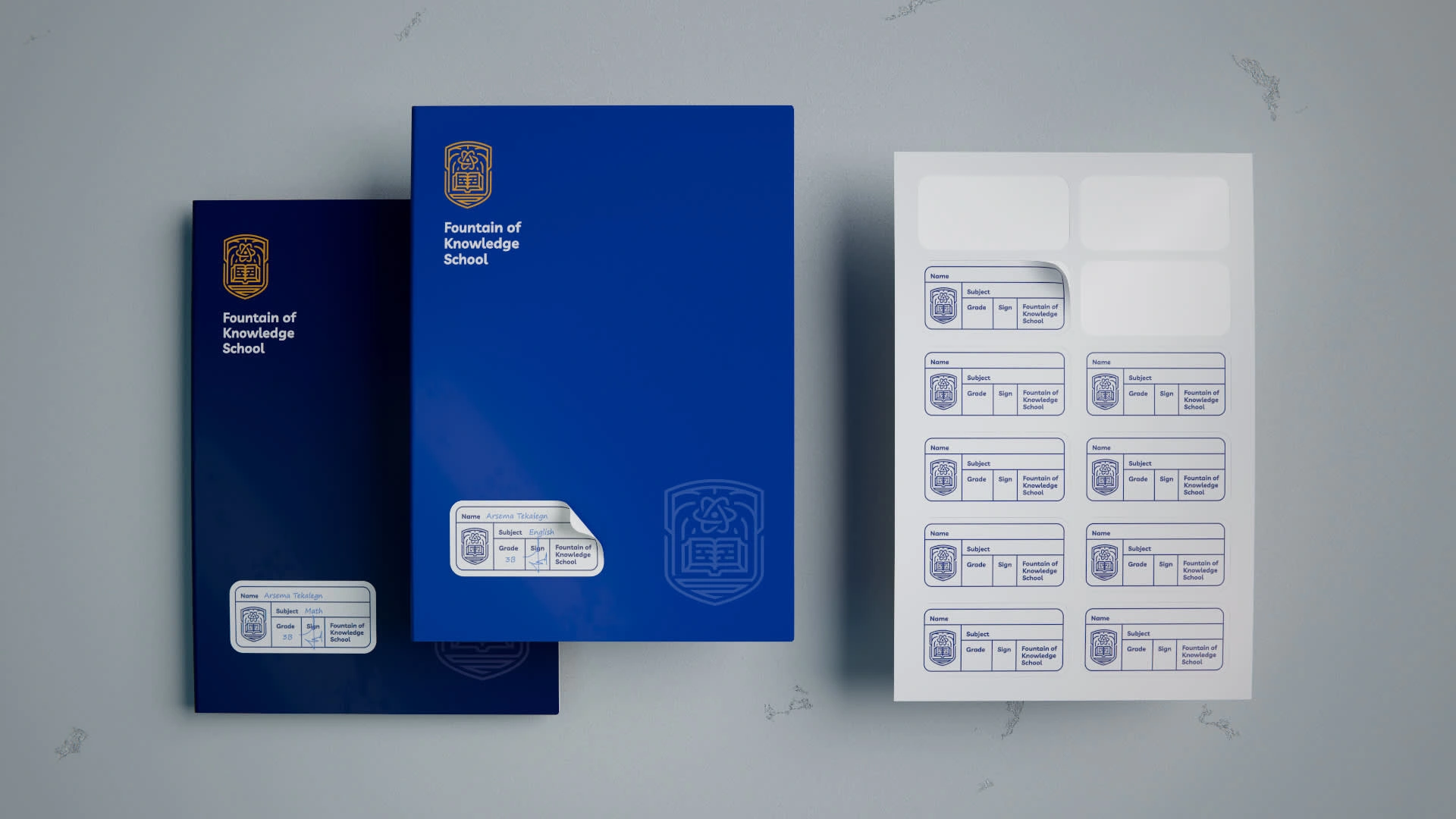
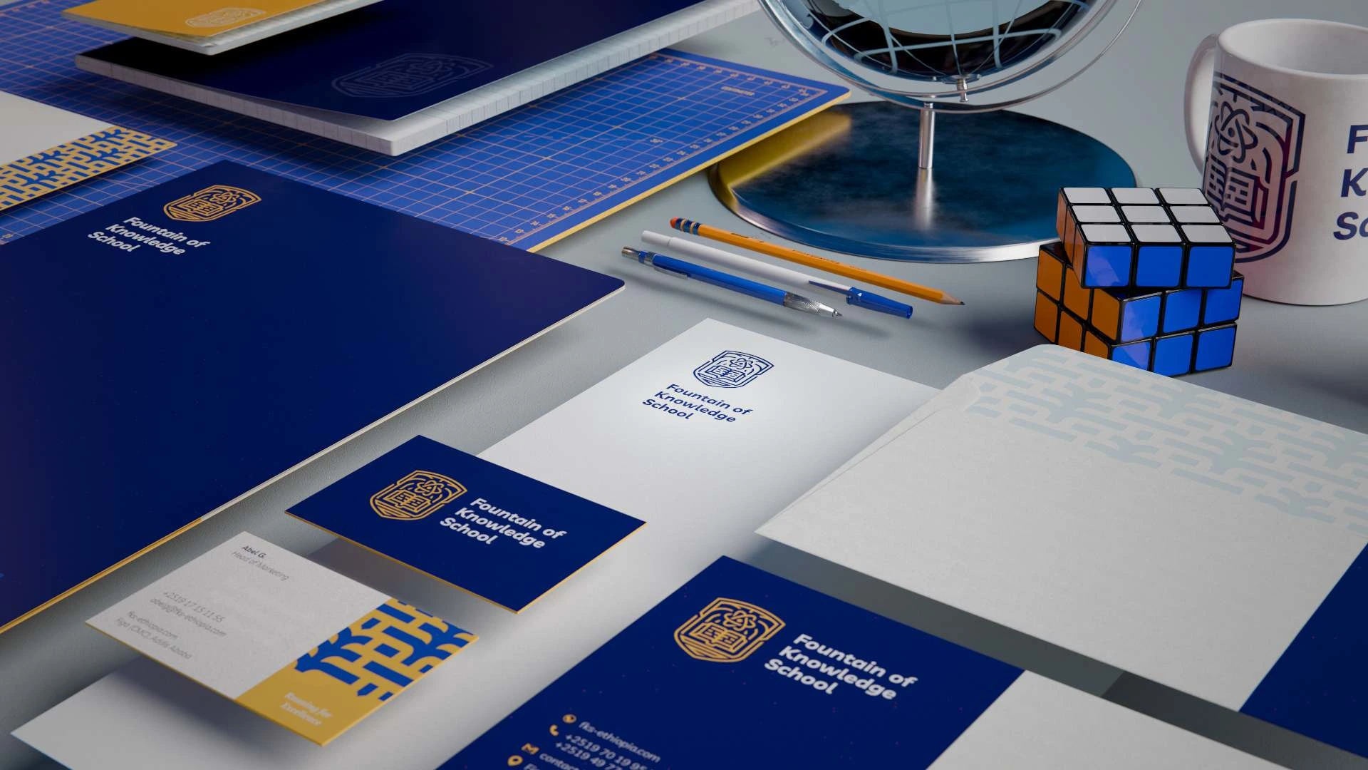
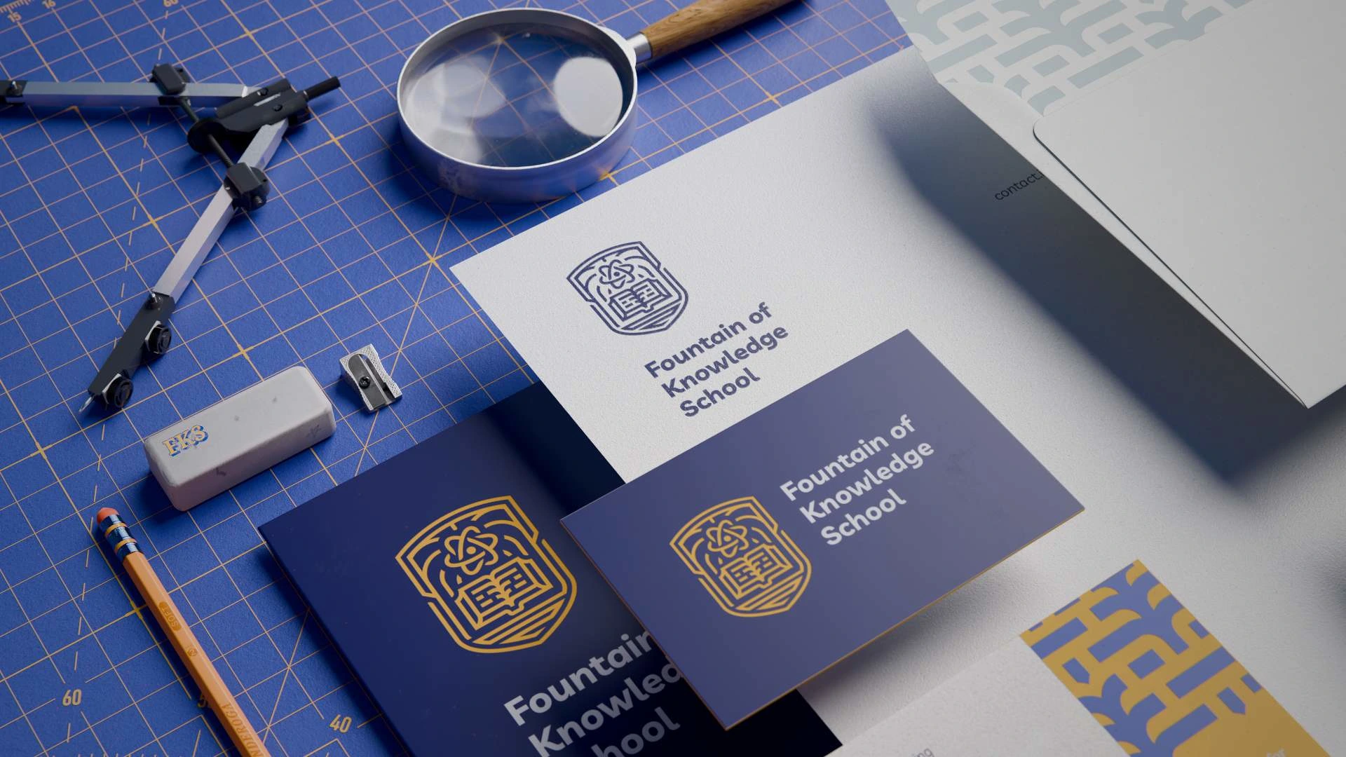
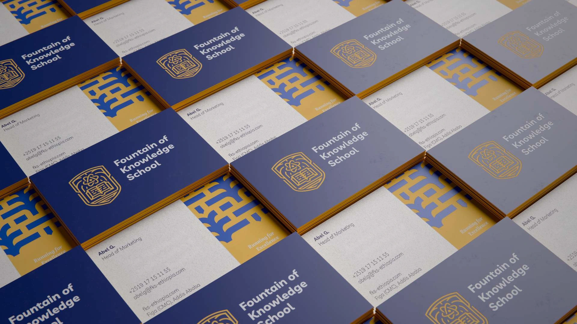

Graphic Language: Strength Through Structure
The brand’s visual identity is built on the "Big, Medium, Small" design principle, creating hierarchy and harmony across all assets. This approach is paired with solid, sturdy shapes—primarily squares and rectangles—to reflect the school’s stability and structured learning environment.

Key Applications:
Layouts: Designs use a clear progression of large, medium, and small elements for the best possible readability and aesthetically pleasing layout.
Shapes: Squares and rectangles anchor the composition, symbolizing:
Foundation (education as a cornerstone)
Balance (holistic development)
Strength (resilience and academic rigor)
Adaptability: The system scales seamlessly, from brochures to digital platforms, while maintaining visual cohesion.

Why It Works: The geometric rigidity is softened by the logo’s fluid elements (water, fountain), striking a balance between discipline and creativity—mirroring the school’s ethos.

Outcome: A Cohesive Brand for Tomorrow’s Leaders
The new identity achieves:
Recognition: Instantly familiar yet contemporary
Versatility: Works across all school divisions and materials
Mission Alignment: Visually embodies the school’s values

Key Takeaways
Symbols Matter: The logomark tells the school’s story at a glance.
Simplicity Wins: Clean lines ensure legibility across applications.
Values-Driven Design: Every choice reflects the school’s educational philosophy.
Like this project
Posted Mar 28, 2025
Fountain of Knowledge School rebrand encompassed a full logo redesign and visual identity modernization all while preserving the school’s legacy.
Likes
0
Views
28
Timeline
Sep 2, 2024 - Dec 24, 2024


