
Every Quint team ran on one admin tool, built for developers, with the same 21-item menu for everyone.
Role: UX/UI Designer · Year: 2026 · Platform: Internal Web App
Services: Research, Information Architecture, UI Design, Design System
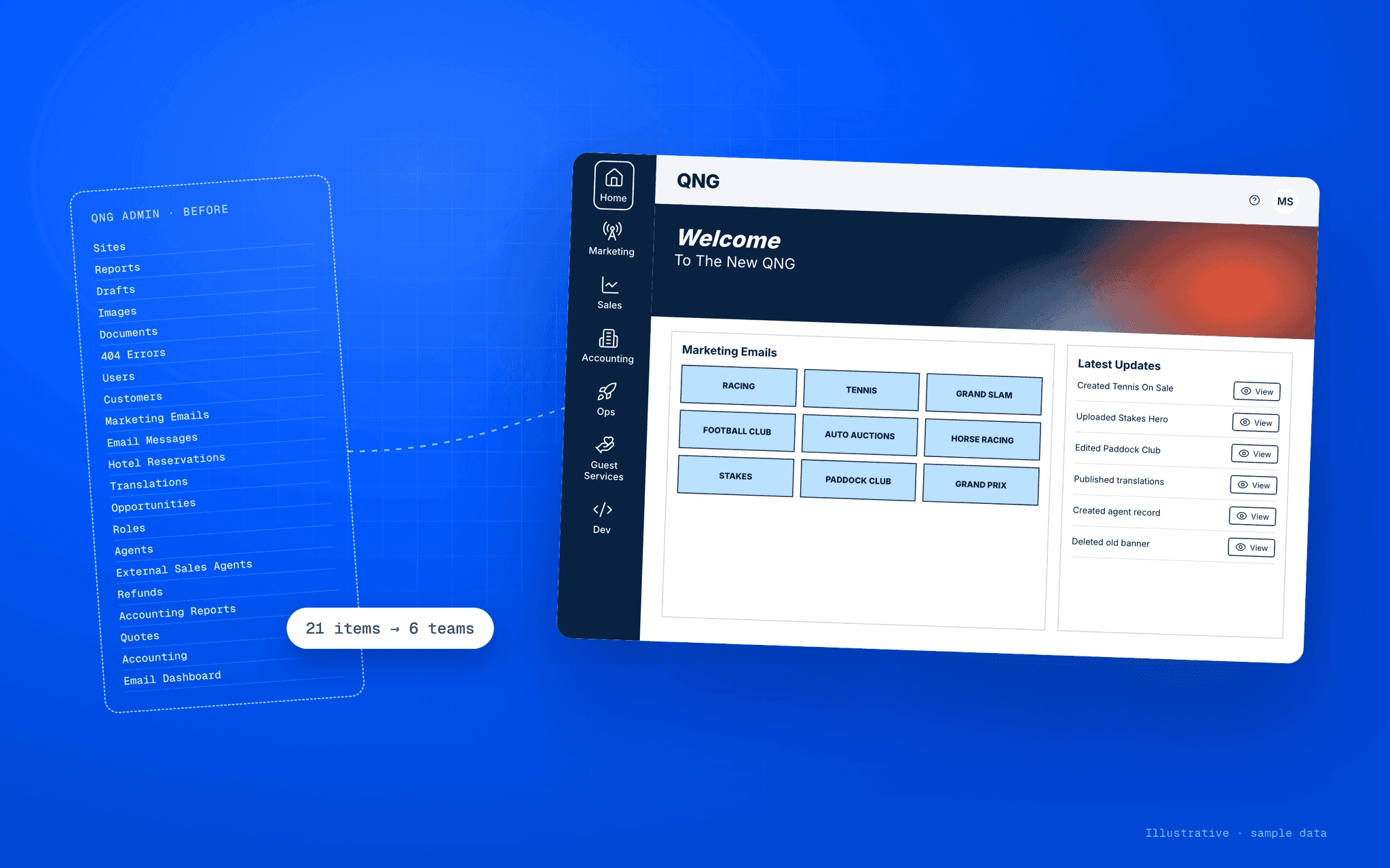
The short version
Problem: A stock admin template ran 25+ brand sites with one flat menu and unlabeled actions.
What I did: Interviewed six teams, rebuilt navigation around them, and redesigned the email builder.
Outcome: A full V2 handed to development in two months. I left before it was built.
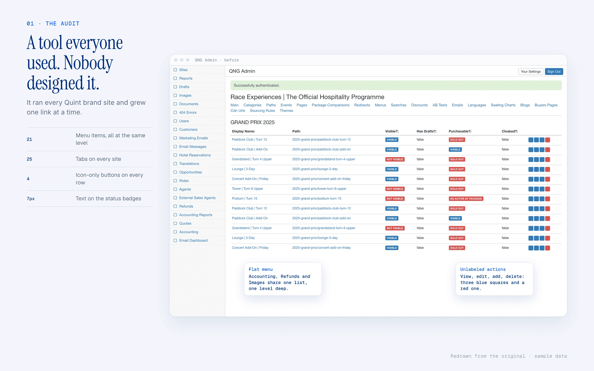
A tool everyone used. Nobody designed it.
QNG ran the sites, packages, emails and reports for every Quint brand. It grew one link at a time: 21 menu items, no hierarchy, unlabeled buttons.
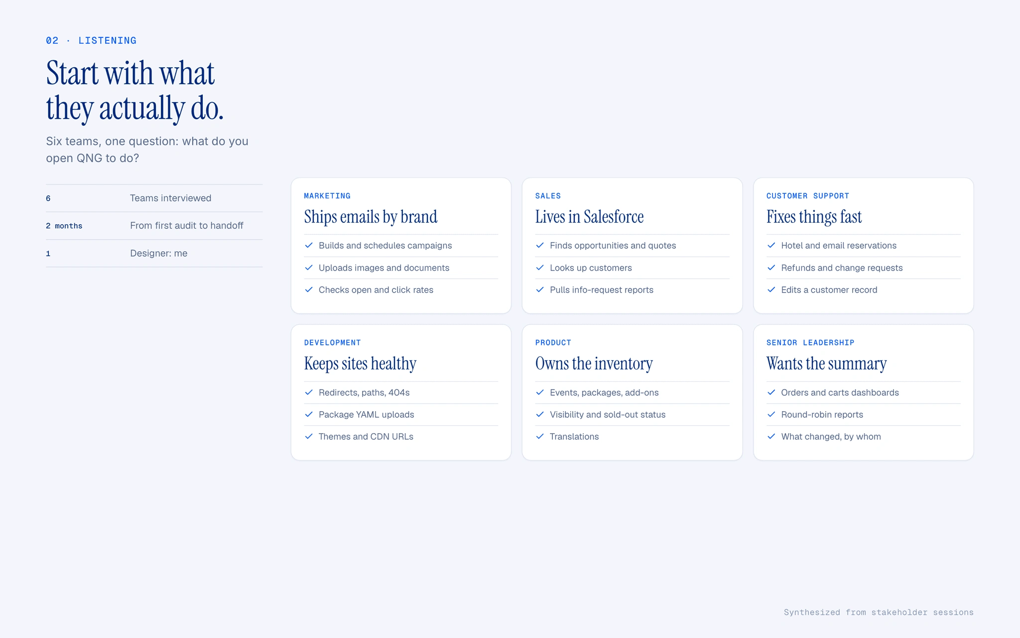
Start with what they actually do.
I met with six teams and asked what they open QNG to do each day. The goal was to make that work faster, not add more of it.
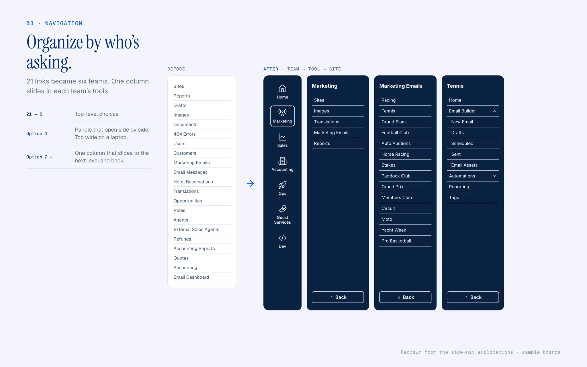
Organize by who’s asking.
21 links became six teams. One column slides in each team’s tools, with Back always in the same place.
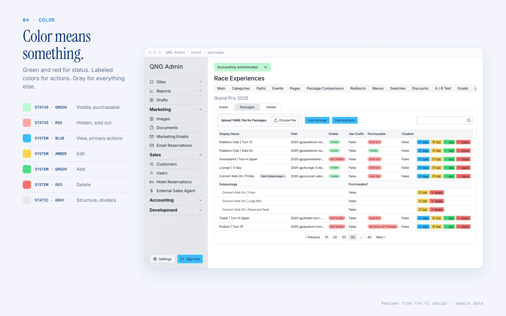
Color means something.
Green and red show status, and only status. Every action gets its own color and a text label. Everything else stays gray.
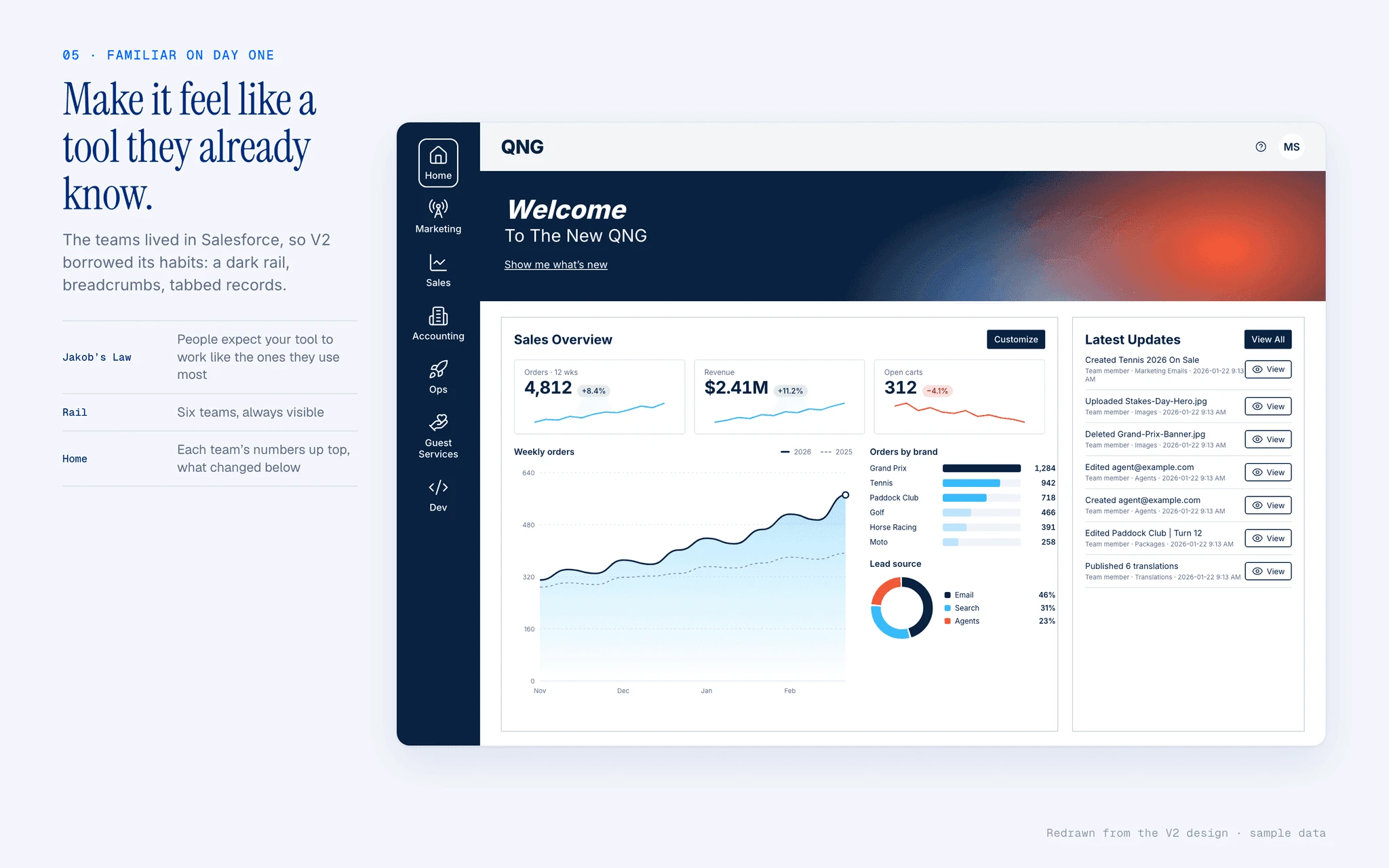
Make it feel like a tool they already know.
Sales and support already worked in Salesforce all day. V2 borrows its habits so the new QNG feels familiar from the first login.
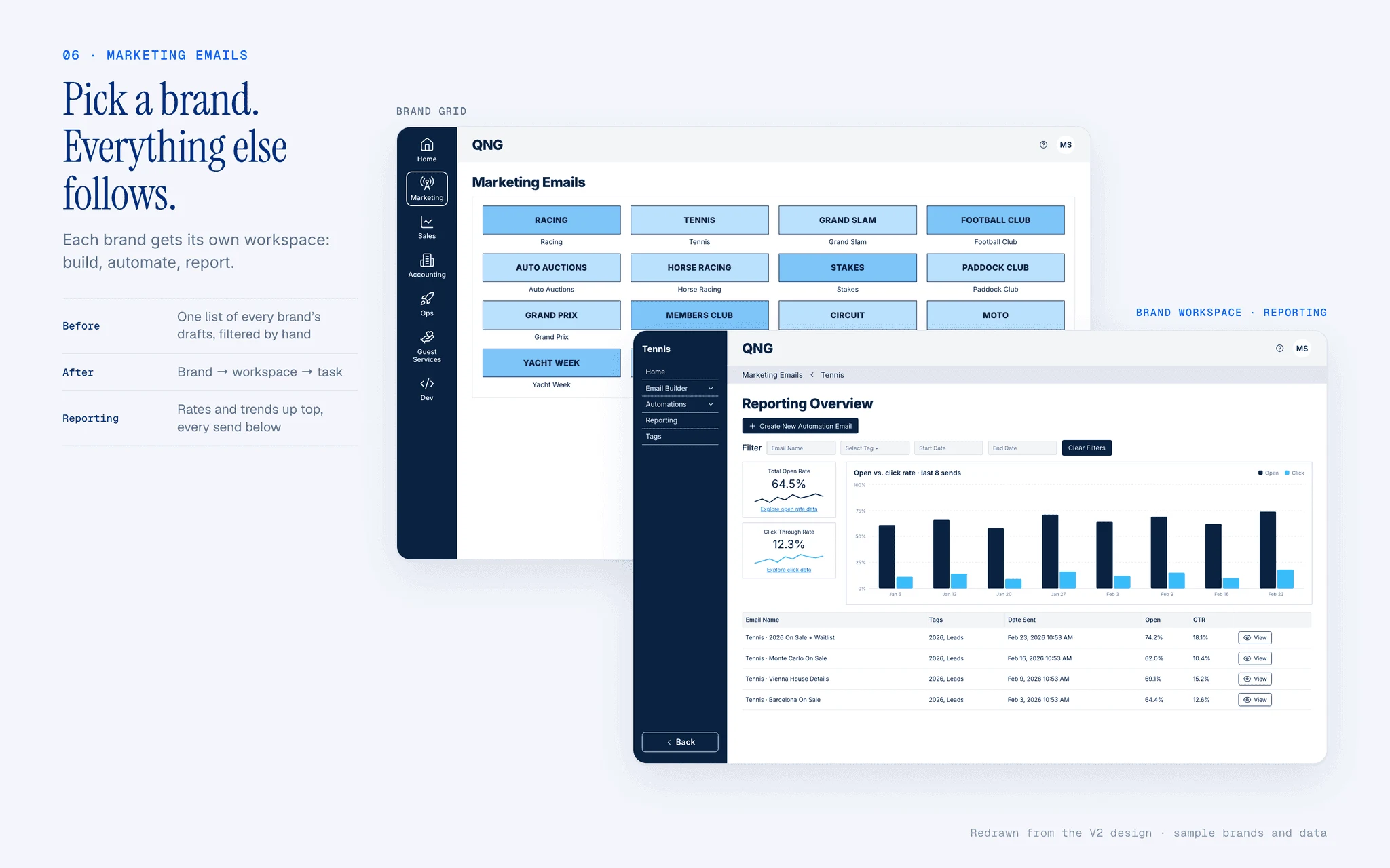
Pick a brand. Everything else follows.
Each brand opens its own workspace for building, automations and reporting. Breadcrumbs show which brand you’re sending as.
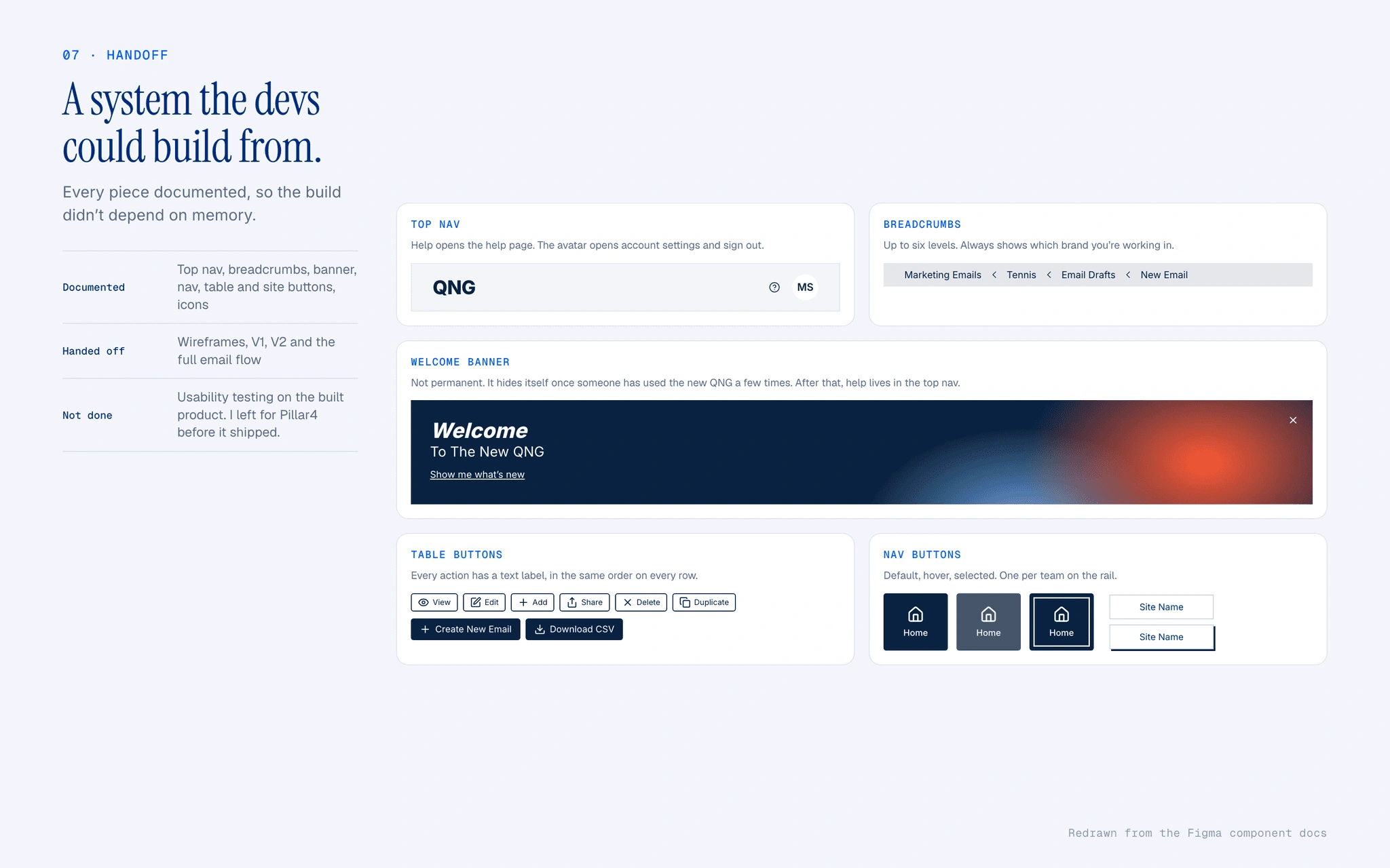
A system the devs could build from.
Every component was documented and handed to development. I left before it shipped, so testing it is the one thing I didn't get to do.
Results
6 teams interviewed
21 → 6 top-level menu items
2 mo audit to handoff
0 likes · 0 views · Nov 20, 2026
Researched and redesigned QNG’s admin tool, reorganizing navigation for six teams and handing off a documented V2 design system in two months.