ProteGO

Josue Perez


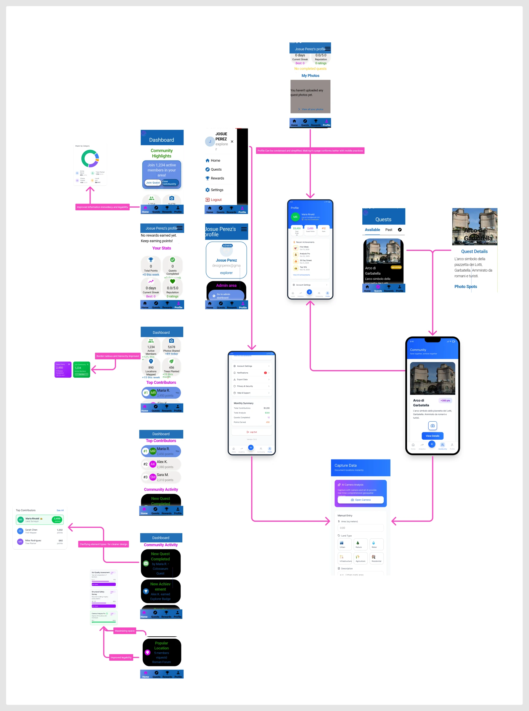
NDA project. Shown here: design process, interaction patterns, and structural decisions. Full case study — including brief, research, client context, and outcomes — available on request during the interview process.
Context
The Platform
ProteGO is a mobile platform for environmental community action — users earn points and rank by completing location-based quests: documenting sites, planting trees, mapping hotspots, contributing photos. The community dimension is core: leaderboards, group activity feeds, and shared impact stats give individual contributions collective meaning.
When I came on, the platform was functional but struggling to communicate its value fast enough. New users couldn't see what the community had accomplished. The gamification mechanics were present but not legible. And the most technically ambitious feature — an AI-assisted multi-step camera capture flow — hadn't been designed yet.
Design Work
What I Designed
Dashboard hierarchy redesign — Restructured the impact data display: community metrics (active members, trees planted, photos shared, locations mapped) moved from flat lists to a prioritized visual hierarchy with a donut chart for at-a-glance category breakdown. Community Highlights, Top Contributors, and Activity Feed each got distinct visual treatment.
Navigation simplification — Collapsed a multi-level drawer navigation into a persistent 4-tab bottom bar (Home · Quest · Profile · Community). Reduced the average tap count to reach any primary surface from 2–3 to 1.
Gamification legibility — Points, Streak, and Rank displays redesigned to scan instantly. Daily Quest progress elevated to profile header. Achievement system structured to give new users an early win within their first session.
Quest detail + capture entry — Designed the browsing → detail → capture handoff so the transition from "see a quest" to "start capturing" requires one decision, not several.
AR capture flow (designed and handed off — not in MVP) — A 5-step angle-detection camera flow for location documentation. Each step handles one micro-decision: approach, frame, detect angle, confirm, submit. Designed and handed off to engineering; didn't reach the MVP build.
Early design proposals — three directions explored before converging on the final system
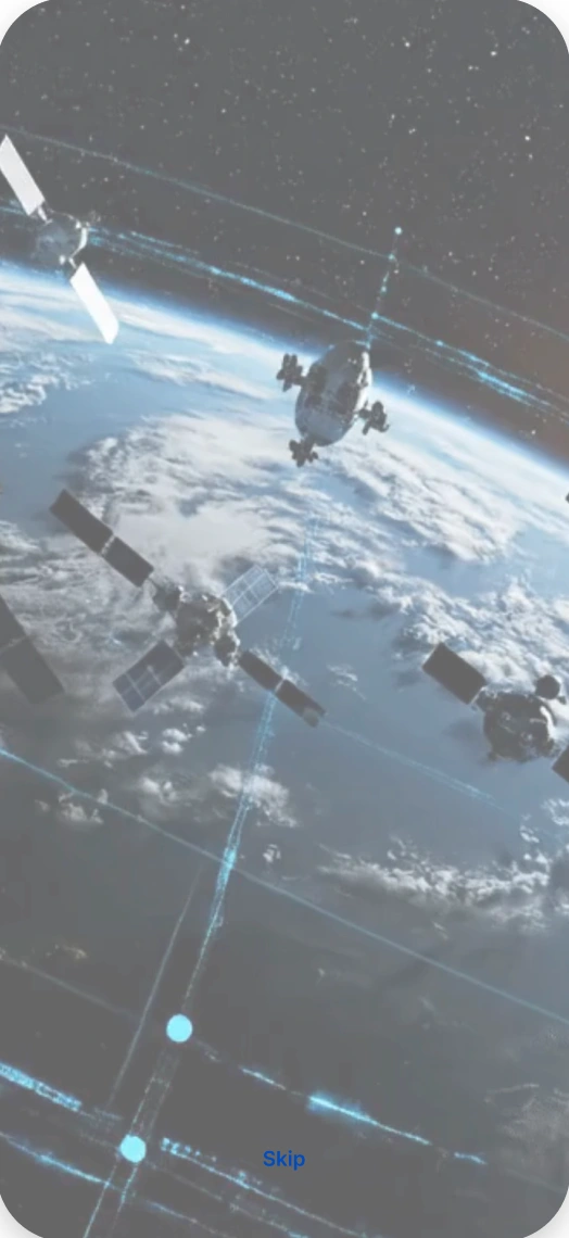
Onboarding
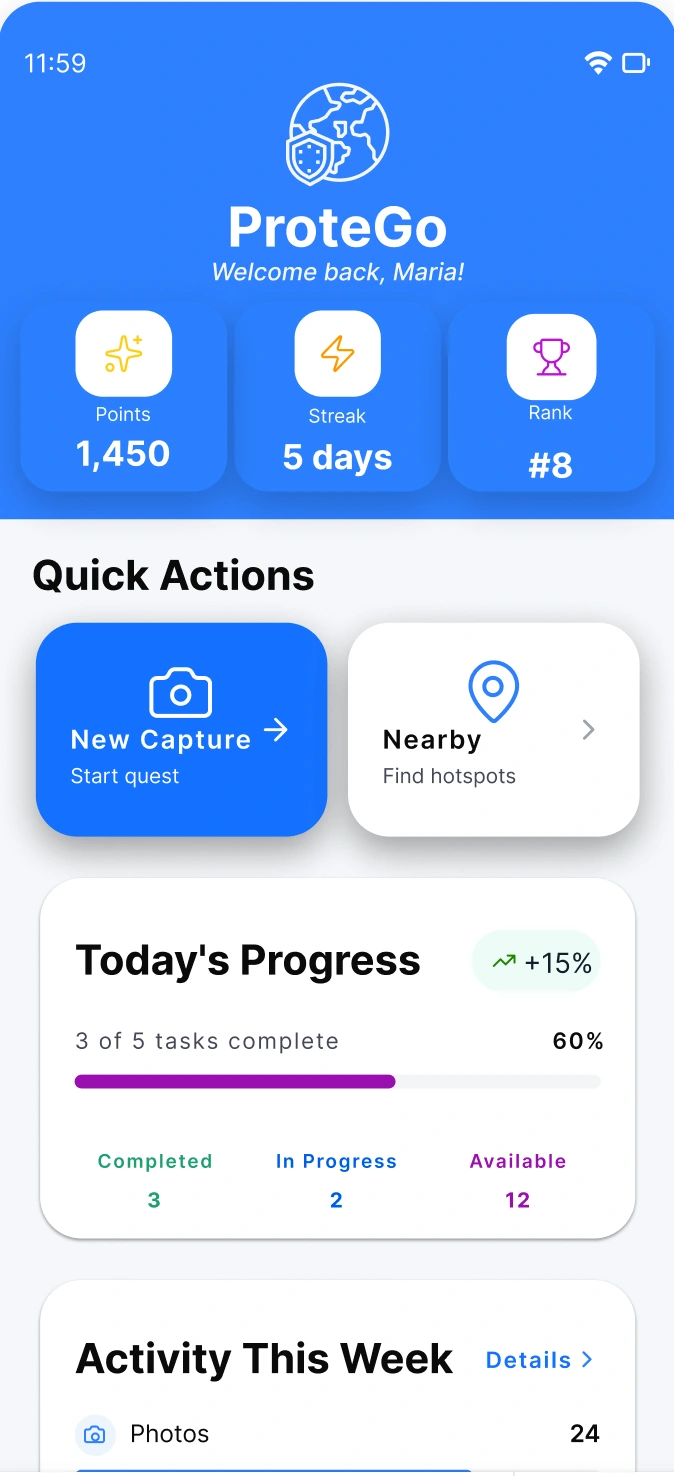
Dashboard
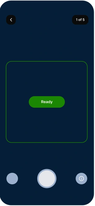
Camera — ready state
Flow
Core User Flow
The quest completion loop is the primary value cycle — the design work focused on reducing friction at every handoff point in this sequence.
Onboarding splash + skip Dashboard impact + actions Browse quest list + map Quest Detail location + start Capture Flow 5-step AR camera designed · not in MVP handed off to eng. Reward points + rank Shipped to MVP Designed + handed off Reward loop
Design Decisions
Key Decisions
One leading metric, not five equal ones
The original dashboard showed all impact stats (trees planted, active members, photos shared, locations mapped) at equal visual weight. For a new user, this read as noise. The redesign established a reading order: a single donut chart for category distribution at the top, with supporting stats beneath. The leading question — "what has this community actually done?" — now has a one-second answer.
5-step AR flow over a single complex screen
The AI camera capture feature required users to detect angles, confirm positioning, and submit documentation in one interaction. The first instinct was a single camera screen with overlaid controls. The design problem: that collapsed multiple distinct decisions into one overwhelming moment. I proposed a progressive 5-step flow — each screen handles exactly one micro-decision — keeping the cognitive load per step near zero. This was designed, spec'd, and handed off. It didn't ship to MVP, but the architecture is there.
Bottom nav over drawer for a quest-completion loop
The existing slide-out navigation required two interactions to switch surfaces — open drawer, select. In a quest-completion flow where users move between Home, Quest, and Profile frequently, this doubled the navigation cost. The bottom tab bar made every primary surface reachable in one tap. Small change, meaningful reduction in navigation cost for a task-completion product.
Early win within the first session
The gamification system had meaningful long-term rewards but nothing that activated immediately. I redesigned the onboarding and first-session quest entry to surface a completable quest within the first two minutes — giving new users a first achievement before they had a reason to leave. The Daily Quest progress bar was elevated to the profile header to keep the near-term goal visible at all times.
Outcome
State of the Work
Professional engagement. The dashboard redesign, navigation simplification, gamification legibility improvements, and quest capture entry all shipped to MVP. The 5-step AR camera capture flow was designed, fully specified, and handed off to engineering — it didn't reach the MVP build but remains in the roadmap.
Full case study available under NDA: includes the original brief, before/after comparisons with the existing product, research inputs, design rationale for every decision, iteration history, and handoff documentation. Get in touch to see the full work.
Like this project
Posted Jul 17, 2026
NDA-bound mobile platform redesign for environmental community action: dashboard, nav simplification, gamification legibility, and a handed-off AR capture flow.