Tabstudio Brand Identity and Guideline Project
Richard Enoch
Tabstudio
Brand Identity, Brand Guideline
Tabstudio is a creative-forward company serving startups, creators, media teams, and tech brands. The goal was to establish a modern, scalable identity system that communicated clarity, creative versatility, and a strong digital presence. My responsibility was to design the brand identity, develop the logo system, and produce a concise guideline that outlined its usage.

Understanding the Problem
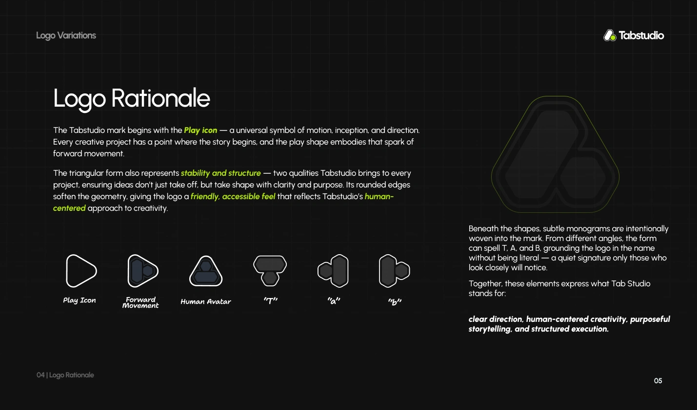
Tabstudio needed a visual identity that not only looked modern but also reflected the core of what they do — bringing clarity, structure, and creativity to their clients’ work. The previous design direction lacked cohesion and visual meaning, so my first task was to define the brand’s essence and identify visual territories that aligned with their industry and audience.

Exploring Concepts
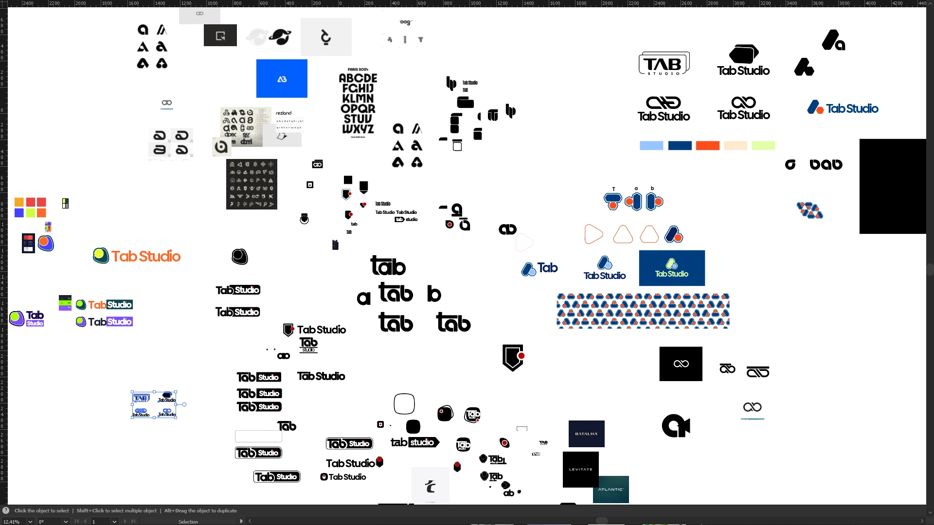
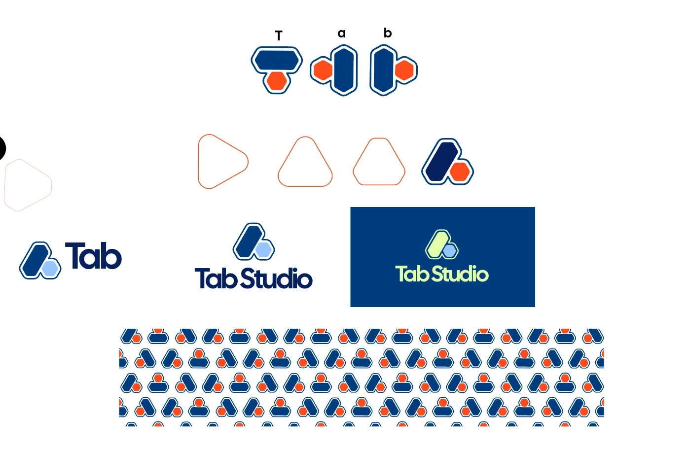
The logo design stage was the most demanding part of the project. I explored multiple directions — geometric, fluid, symbol-based, typographic — pushing through numerous iterations to find a mark that felt intuitive and distinct. The challenge was striking a balance between simplicity, symbolism, and recognizability. After refining several rounds, we arrived at a mark that captured the brand’s identity with precision.
Bringing the Concept to Life
With the final mark selected, I expanded the identity into a visual system:
A color palette that blends digital vibrance with professional depth
Typography choices that are modern, readable, and expressive
Layout and spacing rules that create a balanced visual rhythm
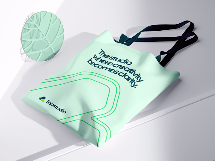
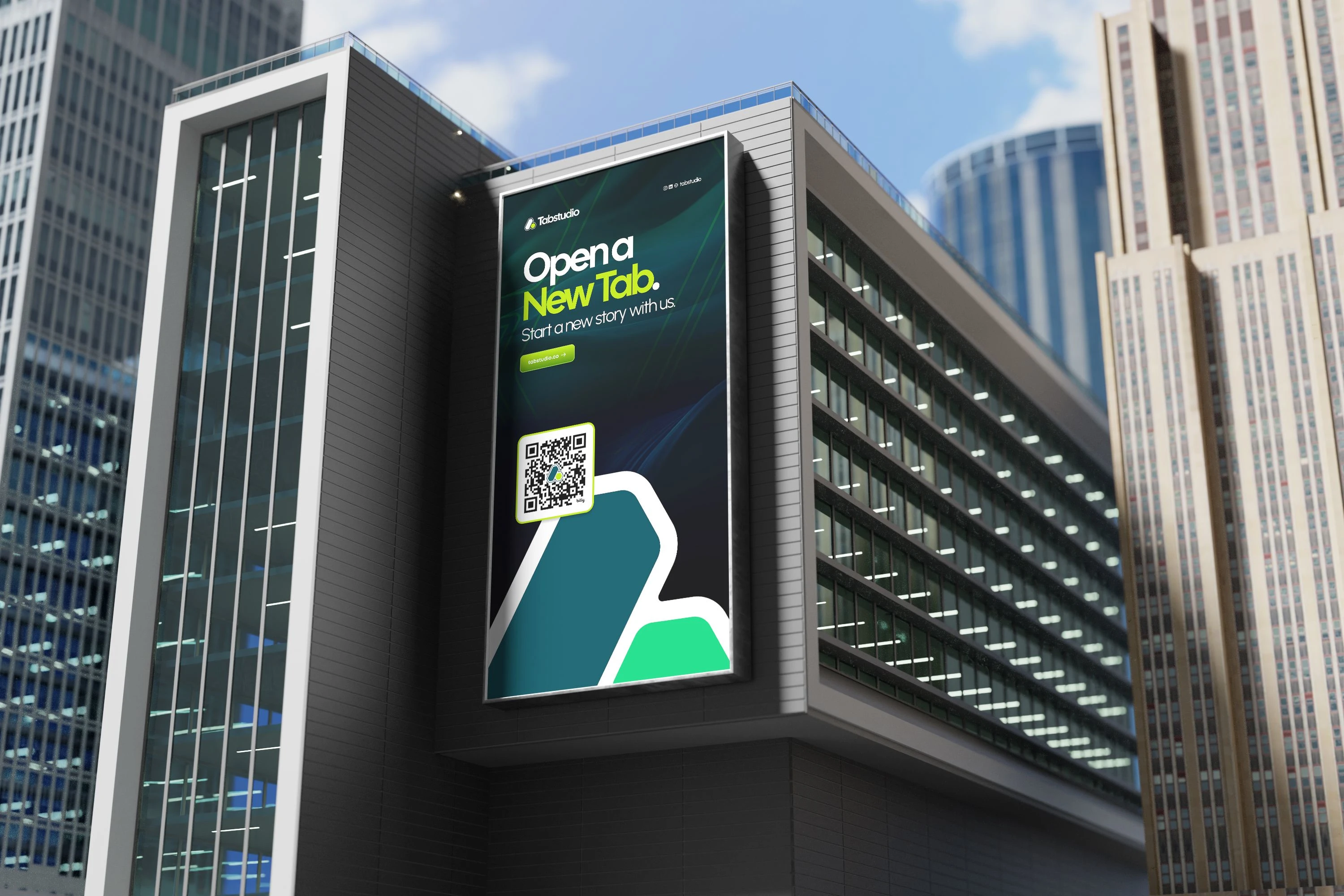
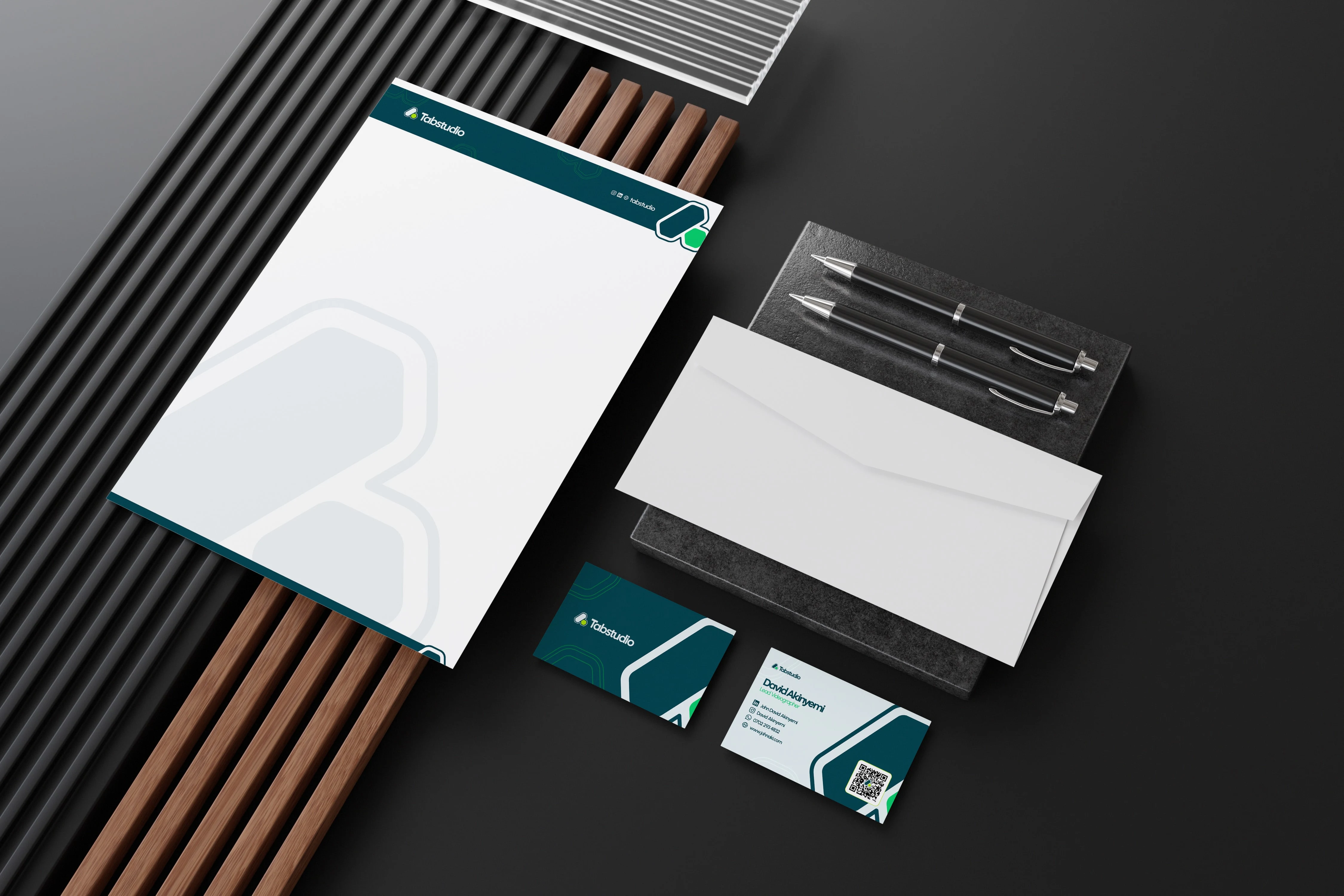
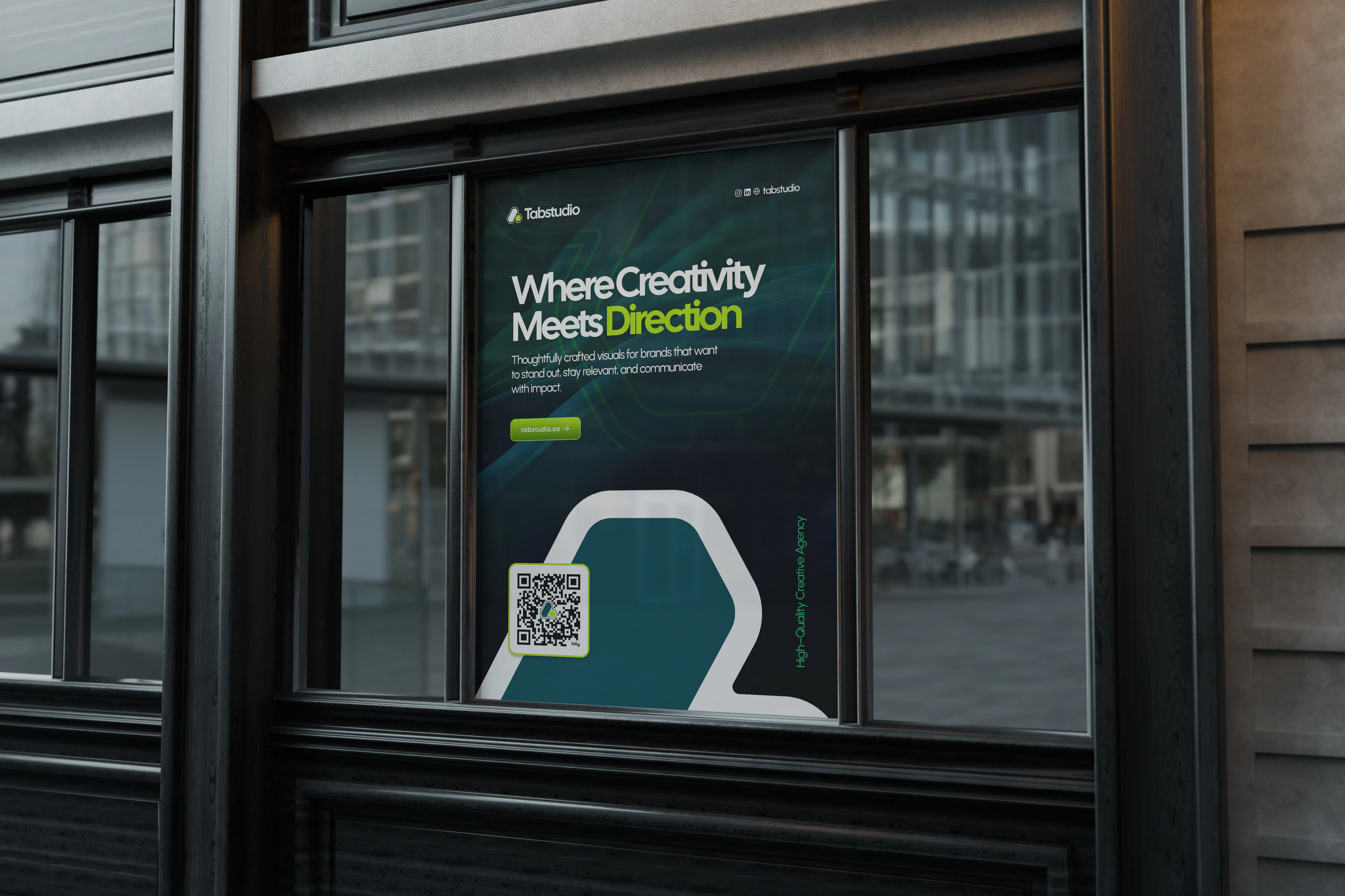
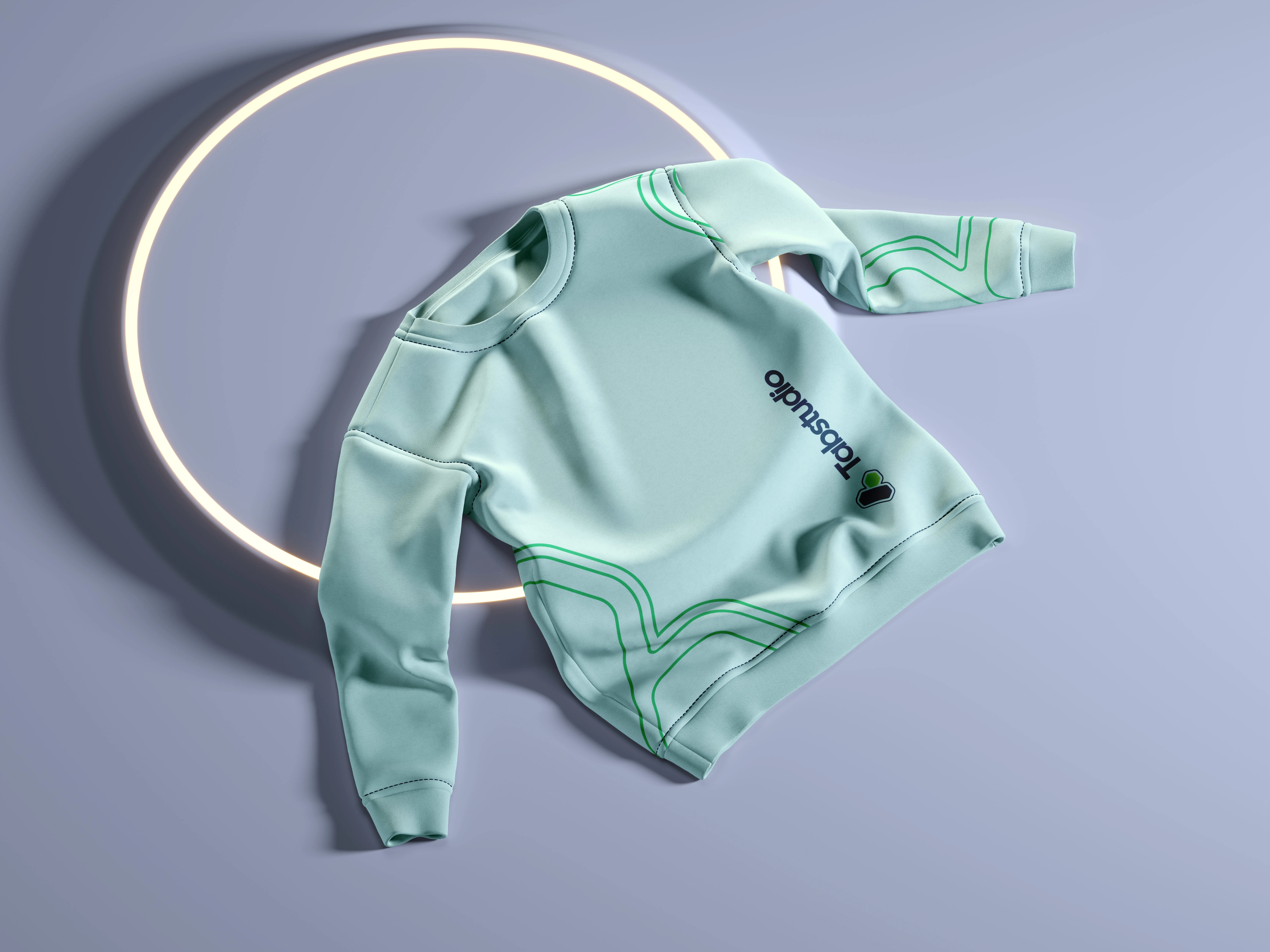
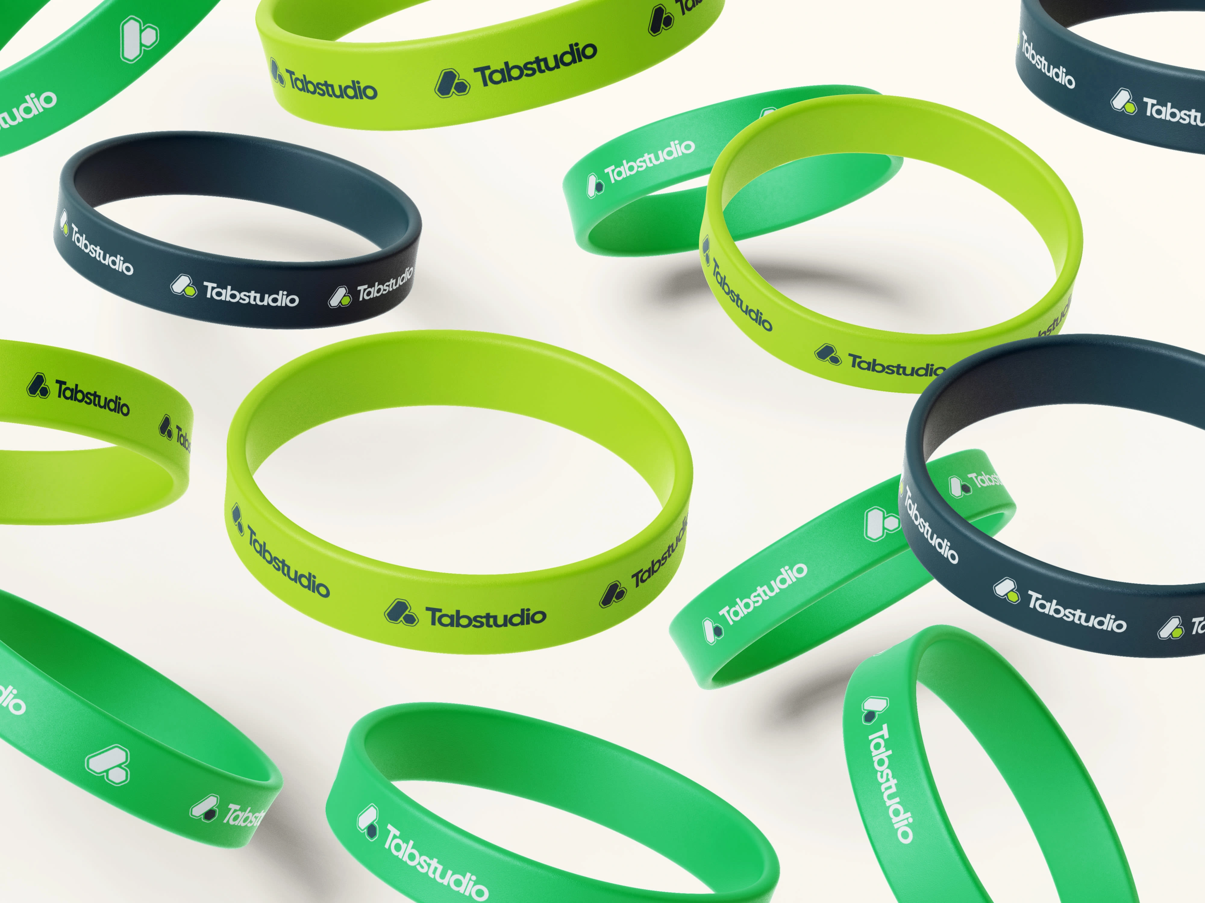
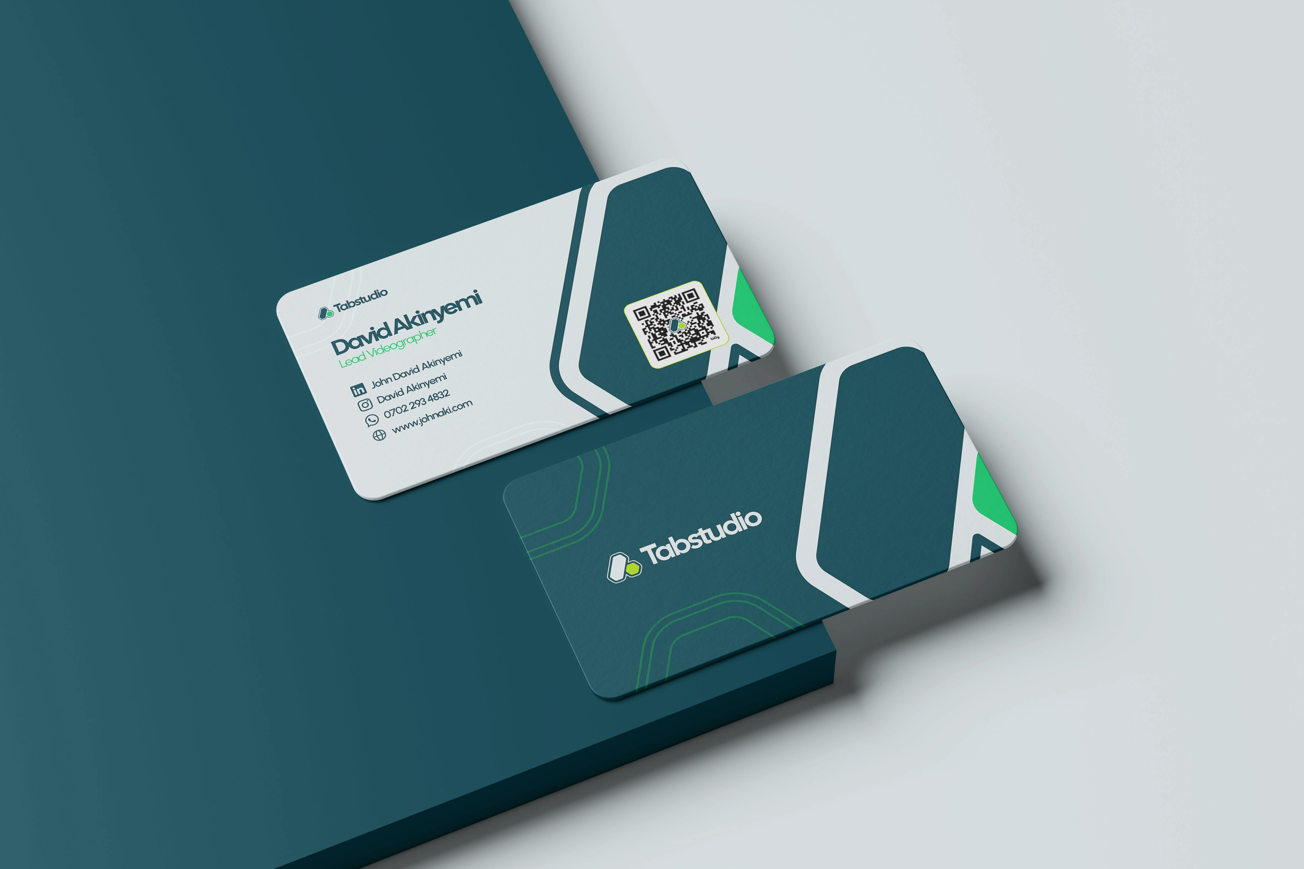
Practical mockups to show real-world usage across startup, creative, and tech environments
This stage ensured consistency and adaptability across different touchpoints.
Perfecting the Details
I proceeded to build a concise brand guideline, outlining logo construction, spacing rules, color applications, text pairing, and usage examples. Though intentionally minimal, the document provides a clear blueprint for consistent brand expression across media.
Conclusion
Tabstudio now has a distinctive and scalable identity system that communicates clarity, creativity, and digital readiness. The project strengthened my belief in iterative exploration — especially during logo development — and reinforced the value of creating visual systems that remain flexible, timeless, and easy for teams to adopt.
Swearshirt
Thanks for going through this project,
Let's work on yours!
Like this project
Posted Jan 28, 2026
Designed a modern, flexible brand identity and clear guidelines to help Tabstudio communicate consistently and scale confidently.