Student-Focused Savings and Budgeting Platform Design.
Richard Enoch
Designing a student-focused savings and budgeting platform for life after school
Overview
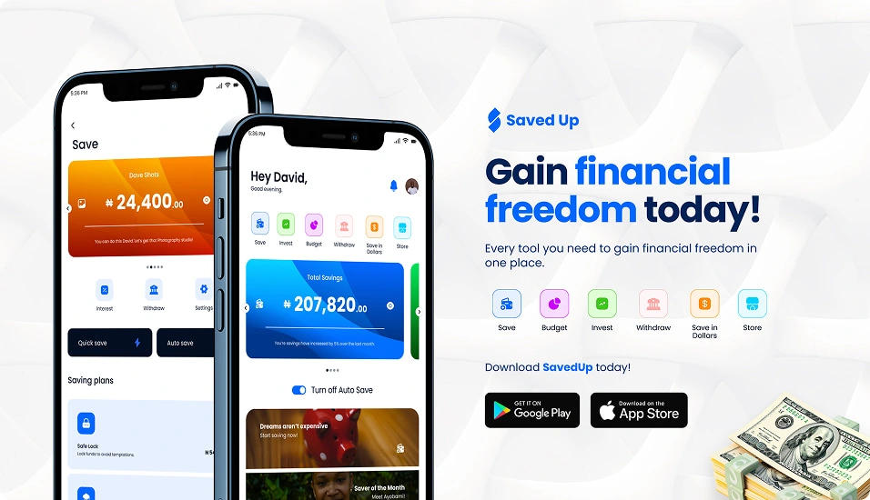
SavedUp is a mobile savings and budgeting platform designed to help university students and recent graduates prepare financially for life after school. Unlike traditional savings apps that focus on short-term goals or general wealth building, SavedUp is centered on post-school outcomes—relocation, further education, business setup, and career transition.
The product helps students build disciplined saving habits early, while giving them structure, accountability, and visibility into long-term financial goals.
What’s the problem?
Most students graduate without meaningful financial preparation for life after school.
From research and real-world observation, three core issues stood out:
Students lack a dedicated system for saving toward long-term, post-school goals.
Poor financial habits formed during school often lead to mismanaged spending and delayed independence after graduation.
Funding major transitions—relocation, further education, or starting a business—feels overwhelming and unstructured.
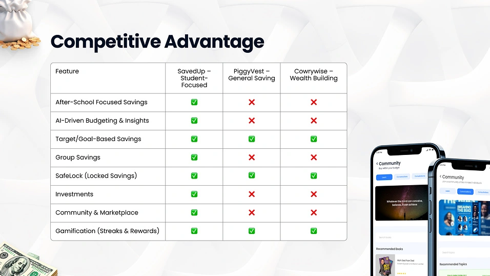
Existing savings platforms focus on general savings or wealth accumulation but fail to address the specific realities of students preparing for post-school life.

Meet our Ideal Users
SavedUp is designed for students and recent graduates planning their next chapter.
Primary user types include:
Recent graduates saving toward business capital or relocation with irregular income.
Undergraduates planning long-term goals like masters tuition or certifications.
Final-year students needing structured savings for tools, devices, or career preparation.
Across all users, the shared challenges were:
Inconsistent income
Low saving discipline
Impulse spending
Lack of accountability
Difficulty staying committed to long-term goals
Research & Insights
Research combined surveys, informal interviews, and usability testing.
Key findings:
78.65% of students validated the problem, confirming the lack of student-specific savings solutions.
Accountability and discipline were recurring concerns.
Students wanted savings tools that felt motivating, not restrictive.
Long-term commitment was easier when progress was visible and goals were clearly defined.
These insights shaped both the product strategy and interaction design.
Defining the Product Strategy
SavedUp was designed around one core principle:
Help students save with purpose, structure, and accountability for life after school.
This led to three strategic decisions:
Focus on goal-based savings, not generic wallets.
Use behavioral design (streaks, progress, feedback) to build consistency.
Support both local and dollar savings to address inflation and currency concerns.
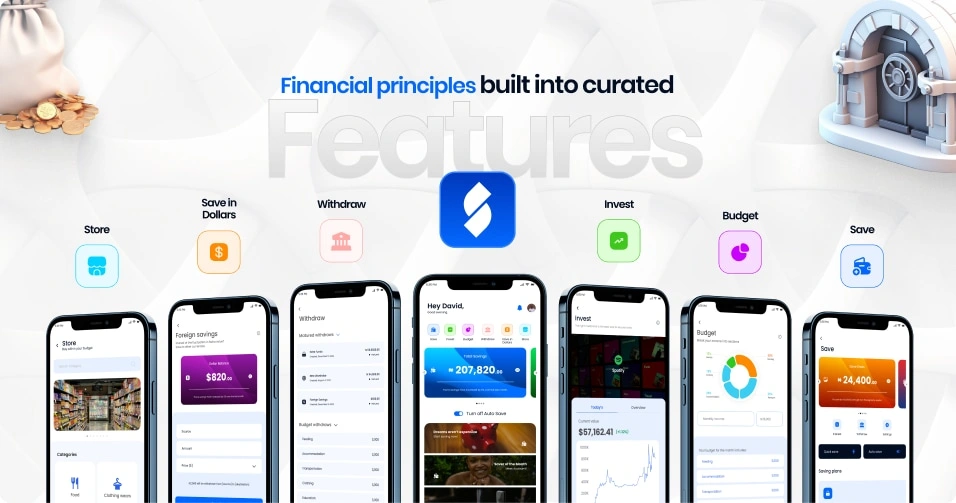
Key Features & Design Decisions
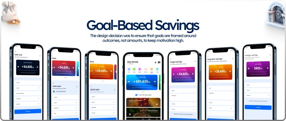
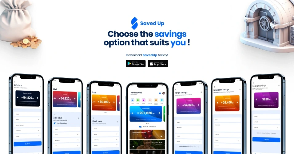
Goal-Based Savings
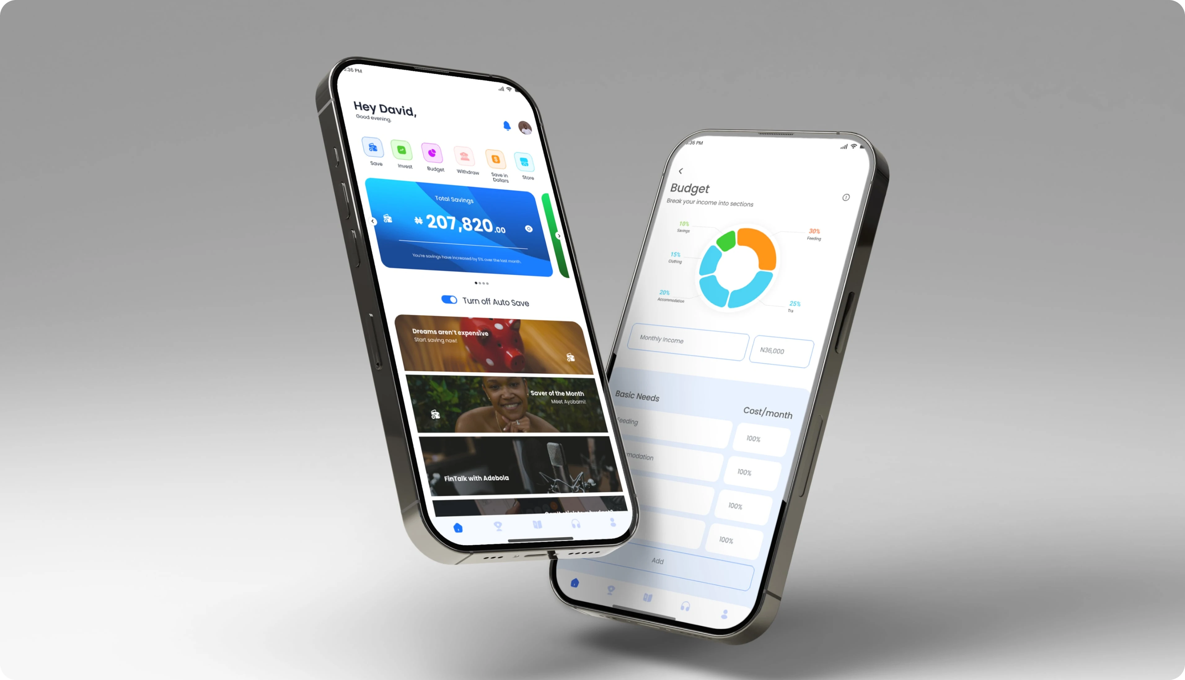
Users create savings goals tied to real post-school plans—relocation, education, or business setup. Progress tracking reinforces commitment and clarity. The design decision was to ensure that goals are framed around outcomes, not amounts, to keep motivation high. So a user can create multiple savings and have a level of control on how they want it to serve them.
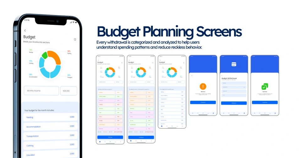
AI-Driven Budgeting & Spending Analysis
When it comes to financial freedom, budgeting is key in managing finances, so every withdrawal is categorized and analyzed to help users understand spending patterns and reduce reckless behavior. The feedback is informative, not judgmental, to encourage habit change without discouragement.
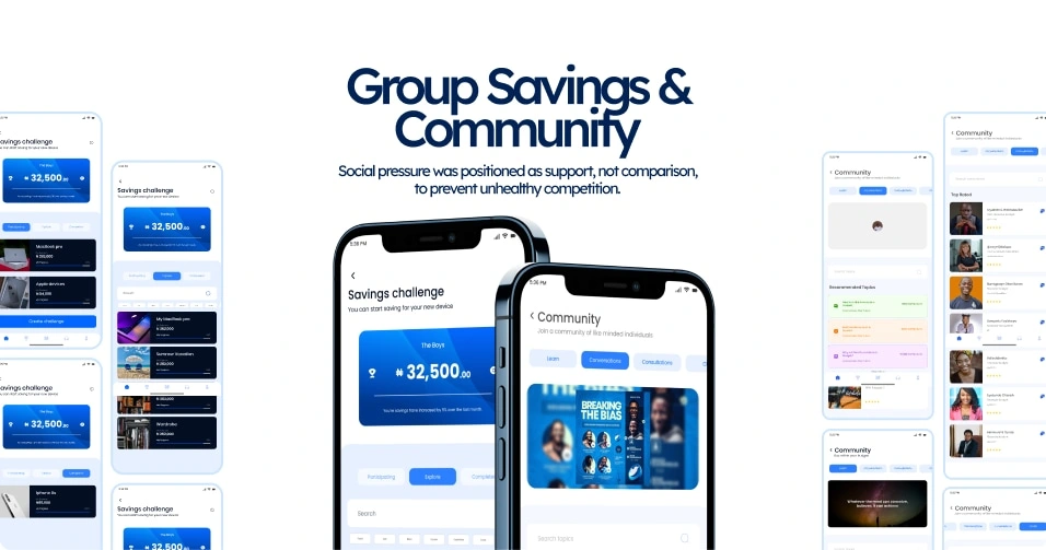
Peer & Group Savings and Community
This feature fosters interaction with peers and other users. Users can save with friends or peers for shared accountability and motivation. Social pressure was positioned as support, not comparison, to prevent unhealthy competition. This also provides the opportunity for users to interact with experts or people who can give more financial guidance or insights.
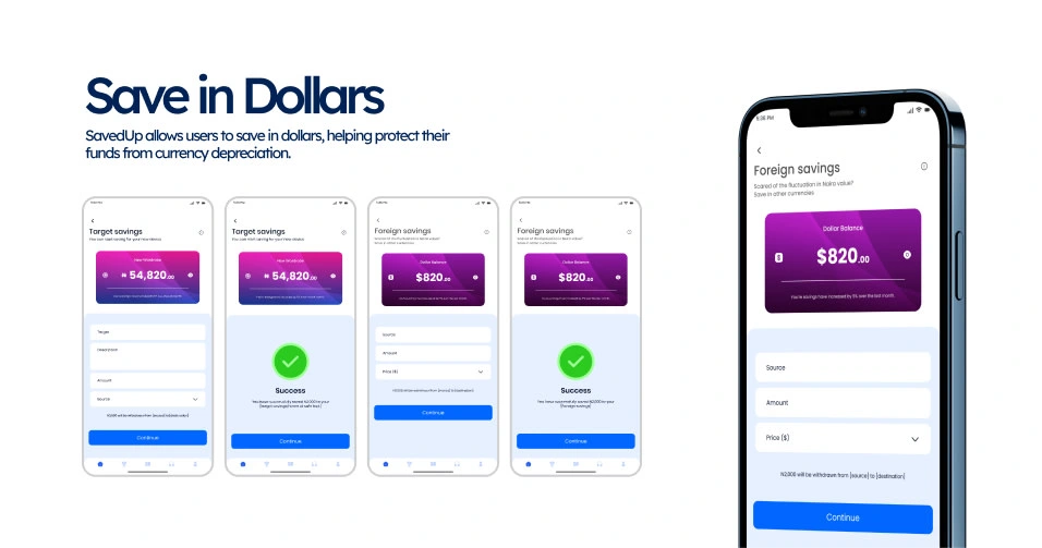
Save in Dollars
Currency fluctuation is a common challenge, especially in emerging economies, and it can significantly affect long-term savings goals. To address this, SavedUp allows users to save in dollars, helping protect their funds from currency depreciation. This feature is surfaced contextually to users with long-term or international goals, ensuring it feels relevant and supportive rather than overwhelming.
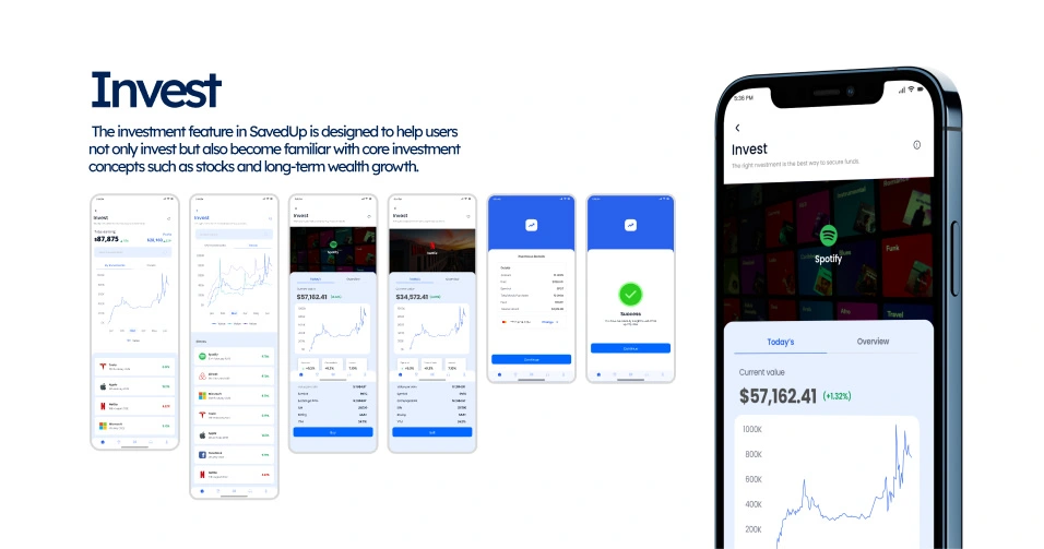
Invest
Investment plays a critical role in building long-term financial freedom, and introducing students and young adults to it early creates a strong foundation for future financial independence. The investment feature in SavedUp is designed to help users not only invest but also become familiar with core investment concepts such as stocks and long-term wealth growth. By making investment accessible and understandable at an early stage, SavedUp empowers users to develop informed financial habits that extend beyond saving and into sustainable wealth building.
User Flows & Experience
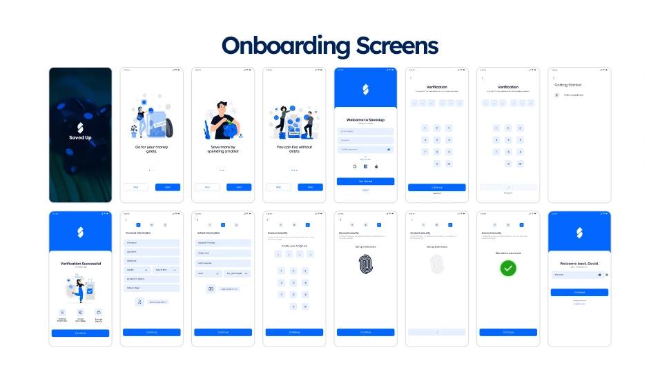
The SavedUp experience was designed to feel simple, intentional, and supportive, especially for students who may already feel overwhelmed by money decisions. From onboarding, users are guided to define clear savings goals tied to real post-school plans, helping them immediately understand why they are saving, not just how. Core flows were structured to reduce friction and cognitive load, with clear separation between saving, budgeting, and spending activities. Visual hierarchy, consistent layout patterns, and straightforward language were used across screens to ensure users could move through the app confidently without second-guessing their actions. The overall experience prioritizes clarity and momentum, making it easier for users to build and maintain healthy saving habits over time.
Testing & Iteration
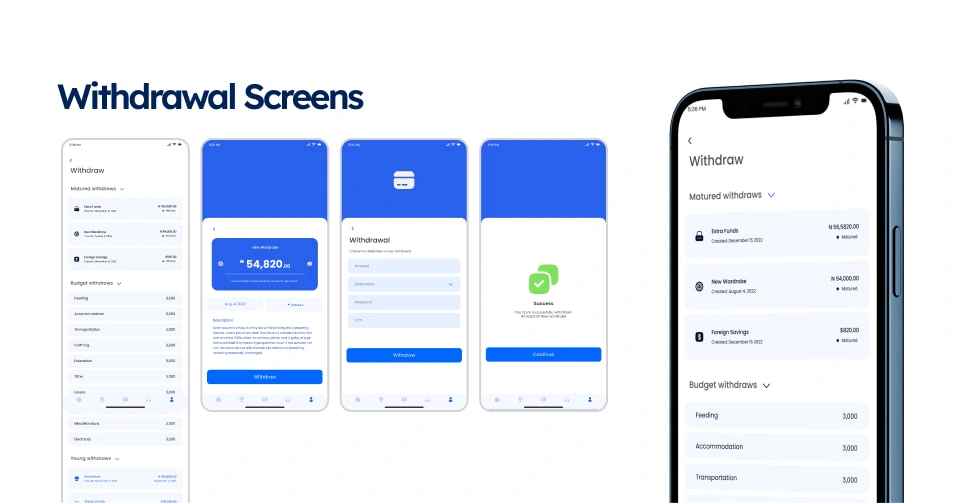
Usability testing focused on validating whether users could move through critical flows without confusion or hesitation. Particular attention was given to onboarding, savings goal creation, and withdrawal actions, as these moments directly impact trust and long-term engagement. Feedback from testing revealed areas where labels were unclear and where transitions between budgeting and savings felt abrupt. These insights informed refinements in copy, flow sequencing, and feedback messaging, resulting in a more intuitive experience that better aligns with how students naturally think about money. Each iteration aimed to remove friction while reinforcing confidence in the product.
Impact & Success Metrics
The success of SavedUp would be measured by its ability to influence real financial behavior, not just feature usage. Key indicators include improved saving consistency among students, higher completion rates for long-term savings goals, and a noticeable reduction in impulsive withdrawals. Engagement with features such as streaks, peer savings, and budgeting insights would signal growing discipline and commitment. Over time, strong retention and repeat usage would reflect SavedUp’s effectiveness as a trusted financial companion during the transition from school to post-school life.
Learnings & Reflections
This project reinforced the importance of designing beyond surface-level usability and focusing on behavior change. I learned that effective financial products must balance structure with encouragement, especially for users navigating uncertainty and limited resources. SavedUp challenged me to think deeply about motivation, accountability, and long-term commitment, not just interface design. It also strengthened my belief that student-focused products deserve the same level of rigor and intentionality as enterprise tools. Ultimately, this project reflects my approach to product design: grounding decisions in real user needs, designing with purpose, and building systems that support long-term growth.
Like this project
Posted Jan 25, 2026
Designed a student-focused savings and budgeting platform that helps users manage expenses, set goals, and build healthy long-term financial habits.
Likes
1
Views
3