dipndip Visual Branding Reimagined
Milan Arsenovic

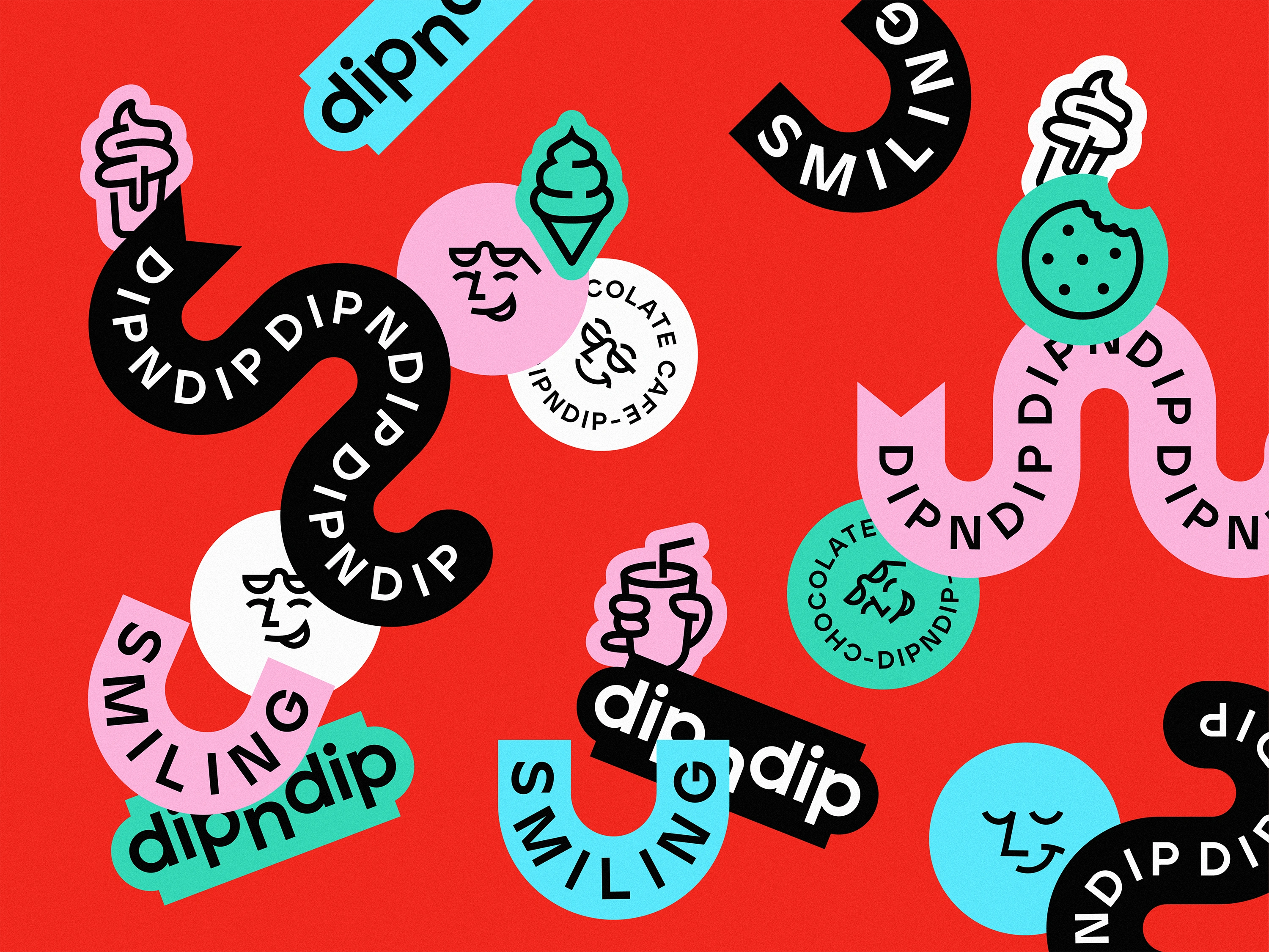
dipndip Visual Branding
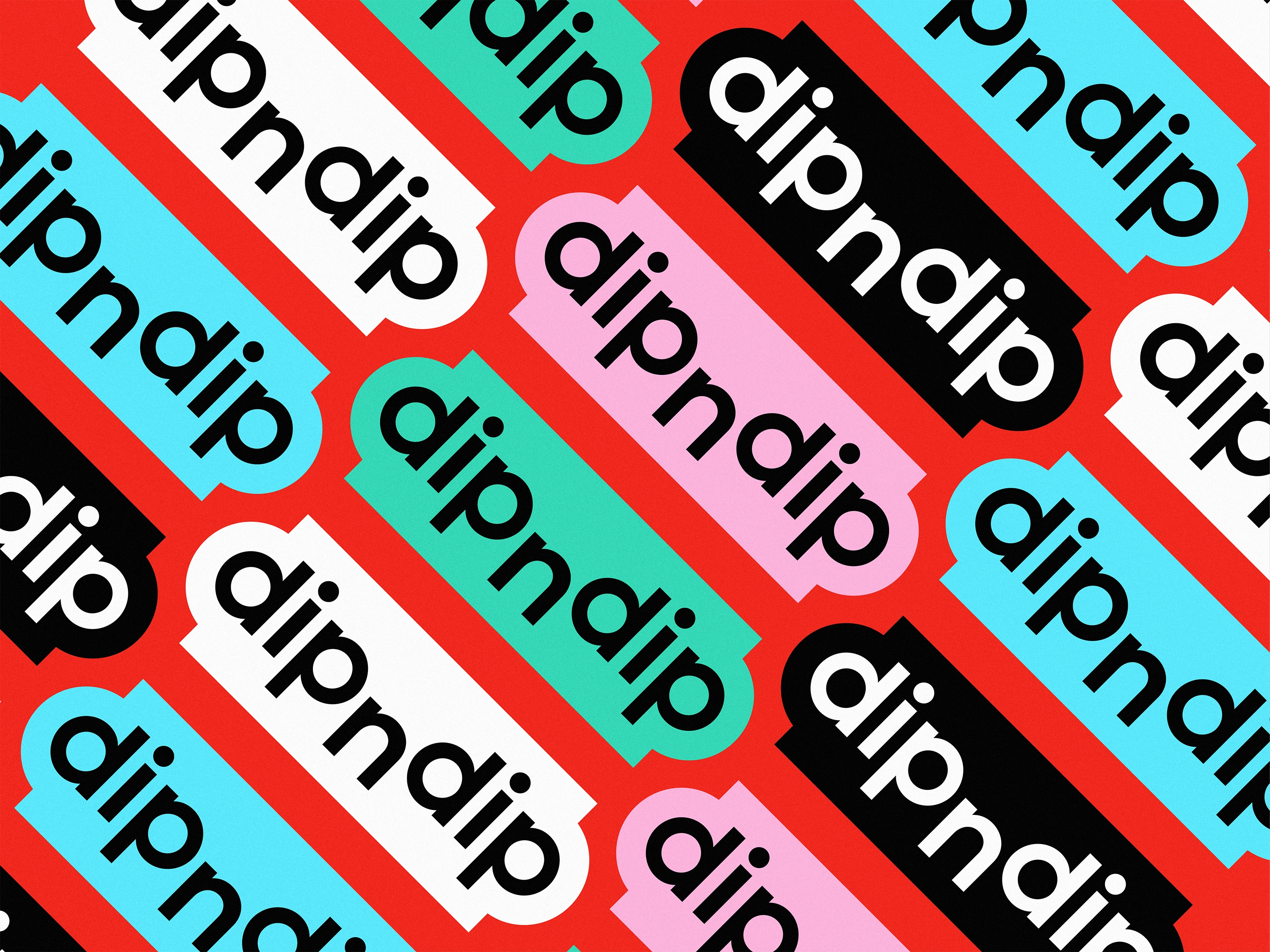
dipndip is a playful rebranding project for a chocolate café concept, combining a minimalistic design approach with bold, expressive energy. I reimagined the logo and introduced a system of smiling face icons, vibrant sticker-like graphics, and slogan-driven elements to create a more engaging and upbeat brand presence. While the design remains clean and minimal, the use of bright red as the core color, paired with high-energy accent tones, adds warmth, personality, and a distinct visual punch.


Thank you! Hope you like it!
Like this project
Posted Aug 5, 2025
Rebranding project for dipndip chocolate café with a playful, minimalistic design.
Likes
8
Views
34
Clients
dipndip