Ossie AI-Native OS Website Design

Onyerikam Godwin


Ossie.... Designing a Website for an AI-Native Operating System
A product website concept for Ossie, a new kind of operating system built around AI, collaboration, and the way people actually use computers.
Role: Product Designer · UI/UX Designer · Framer Designer
Tools: Figma · Framer
Project type: Self-initiated concept
Focus: AI · Operating Systems · Product Design · Web Design
Overview
Most operating systems are built around the same basic idea: you open an application, then figure out what to do inside it.
Ossie explores a different direction.
The concept is an operating system where AI sits much closer to the core of the experience — helping people work across applications, understand what they're doing, and collaborate with the computer instead of simply controlling it through menus and windows.
I designed the Ossie website as an extension of that idea.
The goal wasn't to make another generic “AI startup” landing page. It was to make the website feel like a glimpse into a different kind of computer.
The project was designed in Figma and brought to life in Framer.
The Idea
The starting point was simple:
What would an operating system look like if AI wasn't an application running on top of it, but part of the system itself?
That question shaped the entire visual direction.
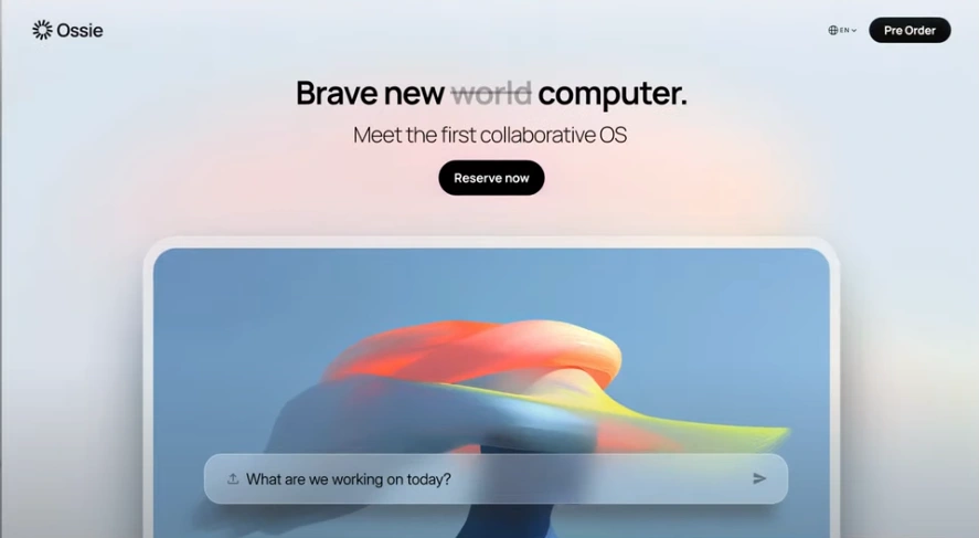
Instead of leading with technical specifications, the website introduces Ossie through the experience of using it.
The headline:
“Brave new world computer.”
followed by:
“Meet the first collaborative OS.”
sets up Ossie's central idea without trying to explain everything at once.
The Challenge
Operating systems are complicated products.
There are applications, files, settings, windows, permissions, notifications, accounts, and countless other systems working underneath the interface.
AI makes that even more complicated.
A website for an AI-native OS therefore has two jobs:
explain an unfamiliar product quickly
make the product itself feel understandable before someone has even used it
I wanted the design to avoid the usual visual language of AI products — endless gradients, floating robot imagery, and walls of technical copy.
Instead, the interface needed to feel calm, premium, and slightly futuristic without becoming science fiction.
Designing the Experience
I started the interface around one central idea:
The computer should feel approachable.
The main interaction is deliberately simple.
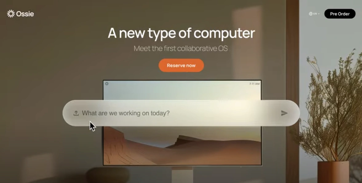
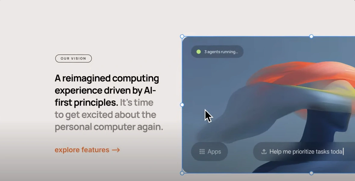
Rather than presenting visitors with a traditional dashboard filled with buttons and navigation, the hero focuses attention on a single question:
“What are we working on today?”
That question is important to the concept because it changes the relationship between the user and the computer.
You're not necessarily telling the computer which application to open.
You're describing what you're trying to accomplish.
A Softer Visual Language
For the visual system, I explored a combination of:
soft gradients
large rounded surfaces
generous spacing
subtle shadows
minimal typography
translucent interface elements
abstract computer-generated imagery
The intention was to make Ossie feel advanced without making it feel complicated.
The UI has enough structure to communicate that this is an operating system, while the softer visual treatment gives it a more human personality.
From Figma to Framer
The interface was first developed in Figma, where I worked through the visual hierarchy, spacing, typography, components, and responsive structure.
Once the design direction was established, I moved the experience into Framer.
Framer was particularly useful for translating the static concepts into something that actually feels like a product rather than a collection of screens.
I used it to build:
responsive layouts
interactive sections
navigation
product-focused animations
hover states
visual transitions
reusable components
responsive typography and spacing
The goal was to keep the implementation close to the original Figma system rather than designing something that would only work in a static mockup.
Making the Product Feel Real
One of the biggest design decisions was showing enough of Ossie without pretending that the website was the operating system itself.
The product visuals therefore act as windows into the experience.
The large hero artwork gives the computer a physical presence, while the interface layered over it communicates the AI interaction model.
Further down the page, features are presented through larger visual blocks instead of dense feature grids.
This gives the website more of a product-launch feel than a conventional SaaS landing page.
Privacy as a Product Principle
AI operating systems introduce an obvious question:
What happens to everything the computer can see?
That became an important part of the fictional product's positioning.
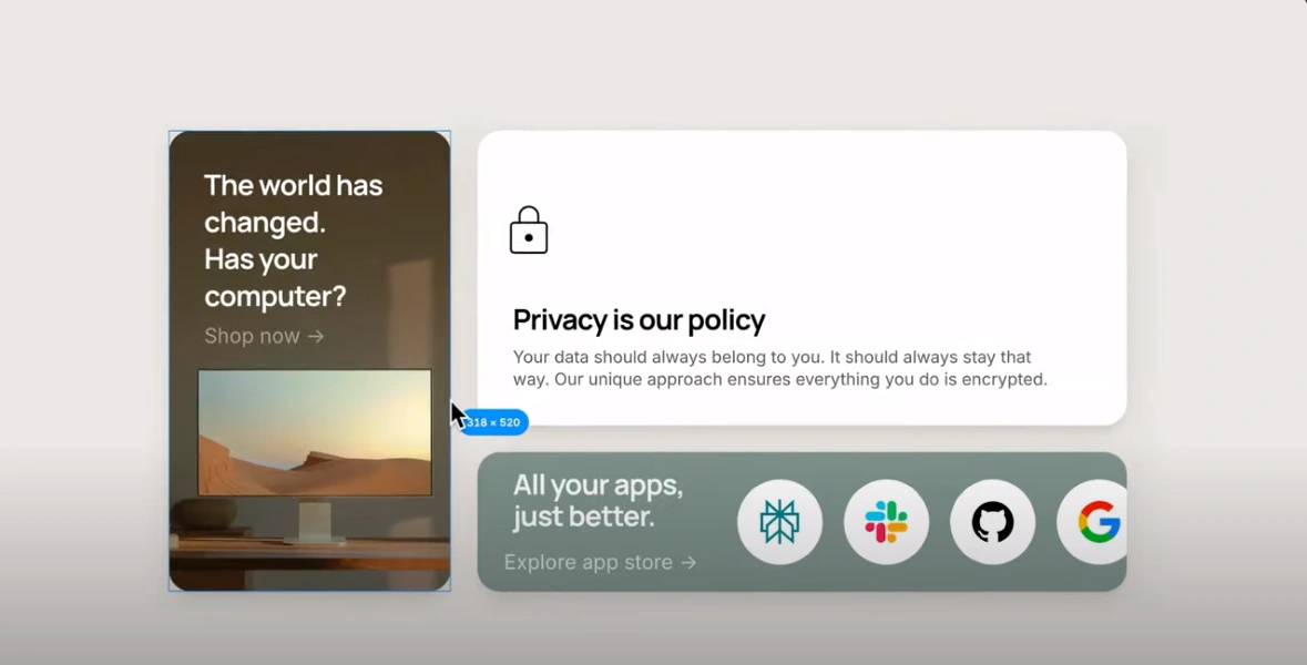
The privacy section communicates the idea simply:
“Privacy is our policy.”
Rather than filling the section with legal language, the design presents privacy as one of the fundamental principles of the operating system.
The supporting message reinforces the concept of keeping user data protected and encrypted.
An OS Built Around Your Apps
Another part of the concept was avoiding the idea that an AI operating system needs to replace everything.
People already use tools they love.
So instead of presenting Ossie as an isolated ecosystem, the website introduces the idea of bringing existing applications into a more intelligent computing environment.
The “All your apps, just better.” section communicates that idea visually.
The familiar application icons are placed inside Ossie's visual system, suggesting that the OS works with the software people already use.
This also gives the concept a more believable product direction: Ossie isn't necessarily asking users to abandon their existing workflows.
Building the Brand
I wanted Ossie to sit somewhere between consumer technology and experimental computing.
The branding therefore avoids overly technical language.
There are no huge architecture diagrams on the homepage.
No list of model benchmarks.
No “revolutionary AI-powered paradigm” type of copy.
Instead, the product is allowed to communicate through the interface itself.
The result is a brand that feels closer to a new computer company than another AI SaaS startup.
Responsive Product Thinking
The layouts were designed with responsiveness in mind from the beginning rather than treating mobile as an afterthought.
Large visual compositions were structured so that the hierarchy could collapse naturally across smaller screens.
Typography, spacing, cards, and interactive elements were designed as part of the same system.
That meant the Framer implementation wasn't simply a desktop page scaled down — the underlying layout logic was designed to adapt.
What I Learned
The most interesting part of this project wasn't actually the Framer implementation.
It was figuring out how to communicate a product that doesn't completely exist yet.
When you're designing a familiar product, people already understand the basic mental model.
An operating system built around AI is different.
You have to give people enough familiarity to understand the concept while still showing them something new.
That pushed me to think more carefully about product storytelling, visual hierarchy, interaction design, and how much information a landing page actually needs.
Final Result
Ossie became a concept for more than an operating system.
It became an exploration of what the relationship between people, software, and computers could look like when AI becomes part of the computing environment itself.
The final website combines a minimal visual system with product-focused storytelling, interactive Framer development, and a visual language designed around the idea of a calmer, more collaborative computer.
Designed in Figma. Built in Framer. Imagined from the ground up.
An OS Built Around Your Apps
Another part of the concept was avoiding the idea that an AI operating system needs to replace everything.
People already use tools they love.
So instead of presenting Ossie as an isolated ecosystem, the website introduces the idea of bringing existing applications into a more intelligent computing environment.
The “All your apps, just better.” section communicates that idea visually.
The familiar application icons are placed inside Ossie's visual system, suggesting that the OS works with the software people already use.
This also gives the concept a more believable product direction: Ossie isn't necessarily asking users to abandon their existing workflows.
Building the Brand
I wanted Ossie to sit somewhere between consumer technology and experimental computing.
The branding therefore avoids overly technical language.
There are no huge architecture diagrams on the homepage.
No list of model benchmarks.
No “revolutionary AI-powered paradigm” type of copy.
Instead, the product is allowed to communicate through the interface itself.
The result is a brand that feels closer to a new computer company than another AI SaaS startup.
Responsive Product Thinking
The layouts were designed with responsiveness in mind from the beginning rather than treating mobile as an afterthought.
Large visual compositions were structured so that the hierarchy could collapse naturally across smaller screens.
Typography, spacing, cards, and interactive elements were designed as part of the same system.
That meant the Framer implementation wasn't simply a desktop page scaled down — the underlying layout logic was designed to adapt.
What I Learned
The most interesting part of this project wasn't actually the Framer implementation.
It was figuring out how to communicate a product that doesn't completely exist yet.
When you're designing a familiar product, people already understand the basic mental model.
An operating system built around AI is different.
You have to give people enough familiarity to understand the concept while still showing them something new.
That pushed me to think more carefully about product storytelling, visual hierarchy, interaction design, and how much information a landing page actually needs.
Like this project
Posted Oct 3, 2026
Designed a website for an AI-native OS concept using Figma and Framer.
Likes
0
Views
0