Brand Copywriting Offer (example)
Hey Bois!
It’s Kim Kawaguchi again, with an example of the copywriting I referred to in my first email.
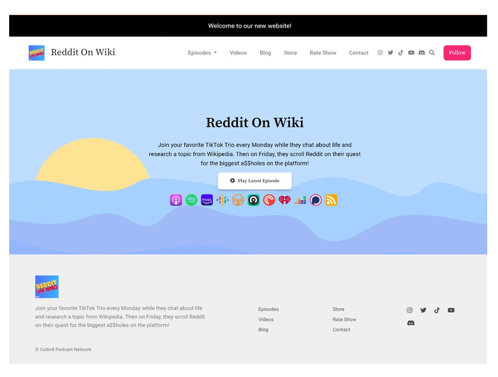
Below is a screenshot of your current landing page, though I did skip some of the reviews and video thumbnails to make it smaller and easier to take a quick look at.

Screen shot of www.redditonwiki.com December 2023
My understanding of your brand colors is these primary colors in your logo: sky blue, magenta red, and a soft but vibrant yellow. The background ties these colors in well but seems a bit random regarding your theme of Reddit / Wikipedia. Also, there are a lot of buttons available. Visitors might get a bit stressed out from all the choices provided to them right off the bat.
In particular, from the header to the footer, there are many redundant buttons, such as the social media icons, and the follow button that leads to the podcasts buttons, which are also on centerstage display. Some of the links are not described well and can be confusing to visitors. In all honesty, I did not know what to expect when I selected the buttons for ‘Videos’, ‘Blog’, or even ‘Rate Show’. And, while I did know the store would lead to your merchandise,
the pop-up of a different site was slightly unexpected.
But I did notice that the phrase on top said “new website” and I definitely understand how overwhelming each and every aspect of a website can be, hence me reaching out with this free offer.
So please continue reading to have an understanding of how I can work with you and for you to solidify your brand style: message, tone, and presentation.
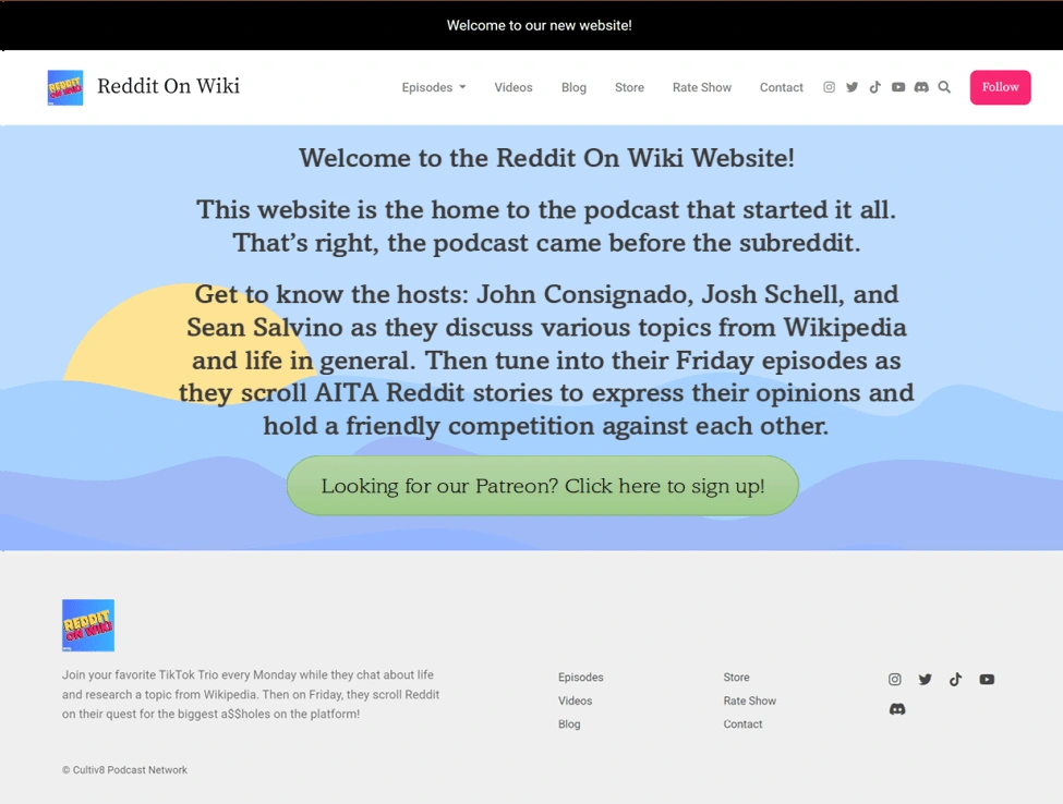
Here is another screenshot, but with some small changes that I made to clean it up and make it welcome to both old and new listeners.

Example of a redesigned www.redditonwiki.com by Kim Kawaguchi
Of course, this is only an example, and would certainly need input from all three of you to be
the best version it can be.
My suggestion is to leave the landing page as simple as this, without the video thumbnails and reviews immediately presented. It gives the visitor reasons to explore the website, driving traffic up increasing traffic boosts, etc. If possible, I suggest exploring options on a side menu/navigation bar that has Patreon Sneak Peaks, Upcoming Events, and similar topics. Including the podcast buttons that I completely neglected to include in this copywriting sample.
Unsurprisingly, I removed the social media icons from the header and kept them at the bottom. My understanding is that anyone interested in such links looks for those in places such as the footer and will find them without fail. And, while I did remove an easy way for people to ‘Leave a Review’ from this homepage, I would in turn add a page solely for reviews, testimonials, and comments in general, while also including a link (or two) that could provide a more in-depth survey, a quick review, etc.
Whichever type of feedback would best benefit you guys and your ability to grow.
Thank you for your time (hopefully you’ve read this far 😊).
Looking forward to hearing a reply.
Sincerely,
Kim Kawaguchi
Like this project
Posted Jan 29, 2024
This is a mock-up I created to demonstrate the brand copywriting I can offer to clients. I took screenshots of a real website's landing page for discussion.
Likes
0
Views
3

