🤔 Improving customer's appraisal experience
Redbubble is a complex, three-sided marketplace, with thousands of artwork and product combinations that customers can purchase. Due to this large scale and similarity of products, it can be incredibly difficult for customers to effectively understand the products, evaluate which is right for them, and ultimately make a decision that leads to purchase. This is obviously frustrating for customers who are looking to buy, but also, from a business perspective, has a significant impact on the conversion rate of these customers.
This work sought to improve this experience, focussing on the product detail page. This is the most impactful page in the appraisal journey, with over 40% of customers landing on this page. There were also many known gaps on this page, where we were lagging behind competitors and best practices seen in the industry.
In 2022, I worked as part of a cross-functional team, closely pairing with Product Management, Research and Engineering, to define and build experiments to test on the product page, with the view to improve the experience holistically.
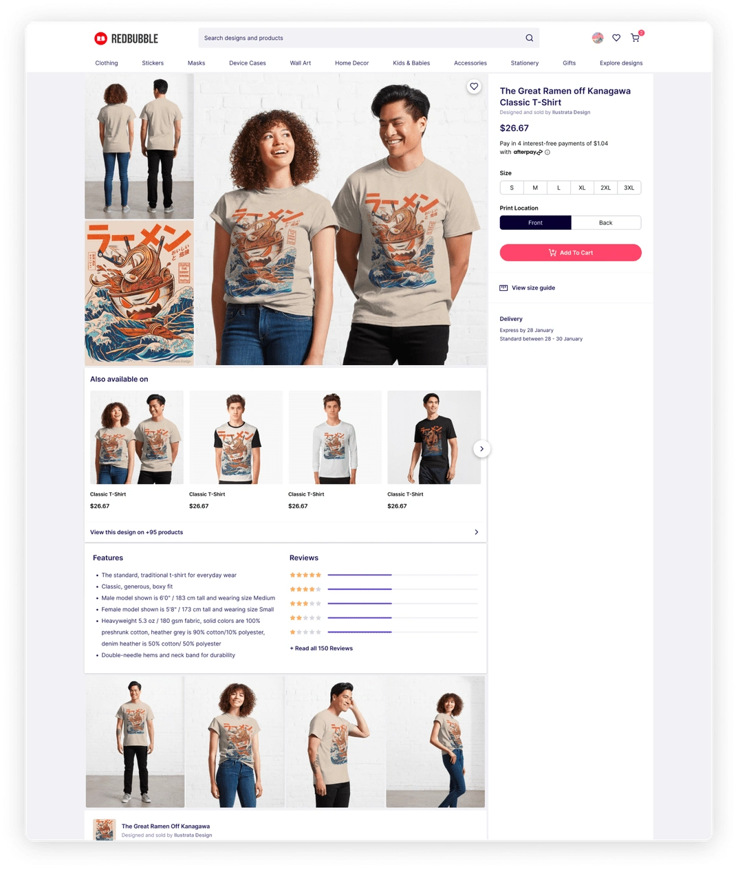
The product page experience before our changes
Our first step was to understand our customers and their expectations from an appraisal experience. I worked closely with our dedicated team researcher to pull together existing customer feedback, review user interactions on Fullstory, and conduct a competitor review to understand best practices in the space. There was a lot of existing information that allowed us to form a vision-type of what we wanted the product page to be. This allowed us to share our thinking across the business for alignment, and to align our own understanding of the experience goals for this page.
Around the same time, we ran exploratory Kano research to further optimise and prioritise the features we were talking about as a team. This allowed us to get a better view of which features were essential for customers, and where we most lagged behind.
From here, we wanted to run some rapid experiments in the built experience to test our hypotheses from the vision work and Kano analysis. We ran 6 experiments, focussing on experience enhancements and information hierarchy to bring the most valuable features to the forefront, and increase our key metric of conversion rate. These included changes such as moving the placement of the size guide and returns information, and adding better communication of promotions to the page.
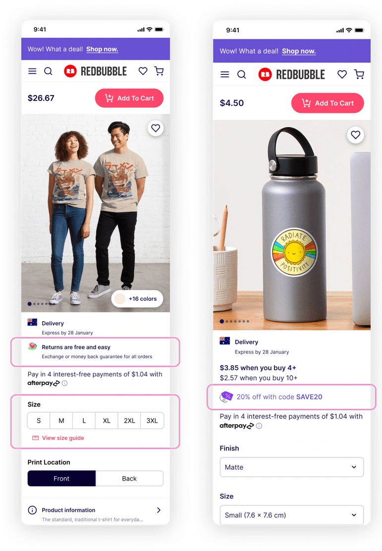
Returns trust signal, more visible size guide, and more visible promotions
Our largest and most successful experiment helped customers understand the difference between similar products on the site. For example, Redbubble sells 19 different types of shirts, many of which are simple t-shirts with slightly different cuts or fabrics. This is something that ultimately needs to be addressed by simplifying the range, but for now, customers are left to figure out the difference by themselves. We wanted to provide guidance around these popular products so that users could quickly determine the difference between the options and choose the best one for them.

The ideal experience for comparison and switch
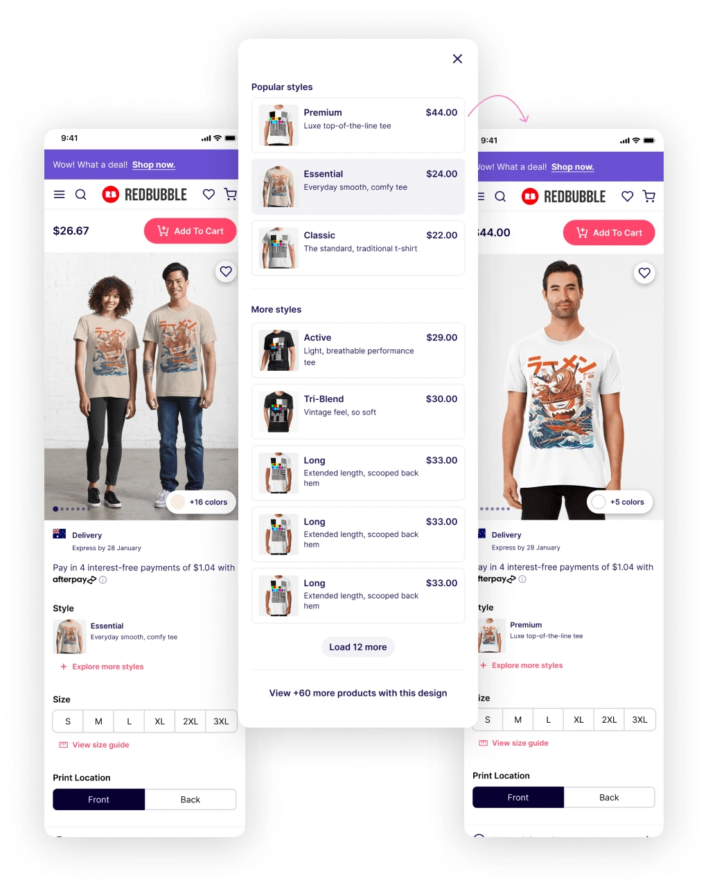
A second design iteration of this experience, considering engineering limitations
After exploring several ways of communicating the difference between products, we landed on a solution that allowed customers to quickly switch between styles on the product page. I designed two versions of this experience - one with multiple styles exposed on the page (a common pattern, especially in Print On Demand sites like Redbubble), and one with a single style on the page, with a secondary modal experience to view alternate options. Both these experiences were designed to show a thumbnail image of the product, a small byline of descriptive copy beneath the product name so that users can understand the difference between each option, and the price of the product so that they can also factor that into their decision.
The version with multiple styles exposed was preferable from an experience viewpoint, as it better allows users to quickly review the most popular products and switch between them to understand the differences. It is also more similar to competitor experiences. However, when collaborating with engineers, we realised that the way products are structured within the Redbubble database wouldn’t be able to support this ‘quick switch’ experience. From previous experience working with this product structure, I had a feeling this might be the case, and had the second experience ready as a backup so we could effectively continue conversations as a team. As this was an experiment, we decided to move forward with this secondary experience, focussing on t-shirts for our first release.
I then collaborated with the Merchandising Manager for t-shirt products to finalise the copy around each t-shirt. We ensured that the copy was structured in a consistent way across each product - fabric description, neckline, fit - to make it easy for customers to scan through and determine the differences.
I also collaborated with engineers to build the experience. We had new people in the team at the time, so I gave guidance on the design system and how we could make effective use of components.
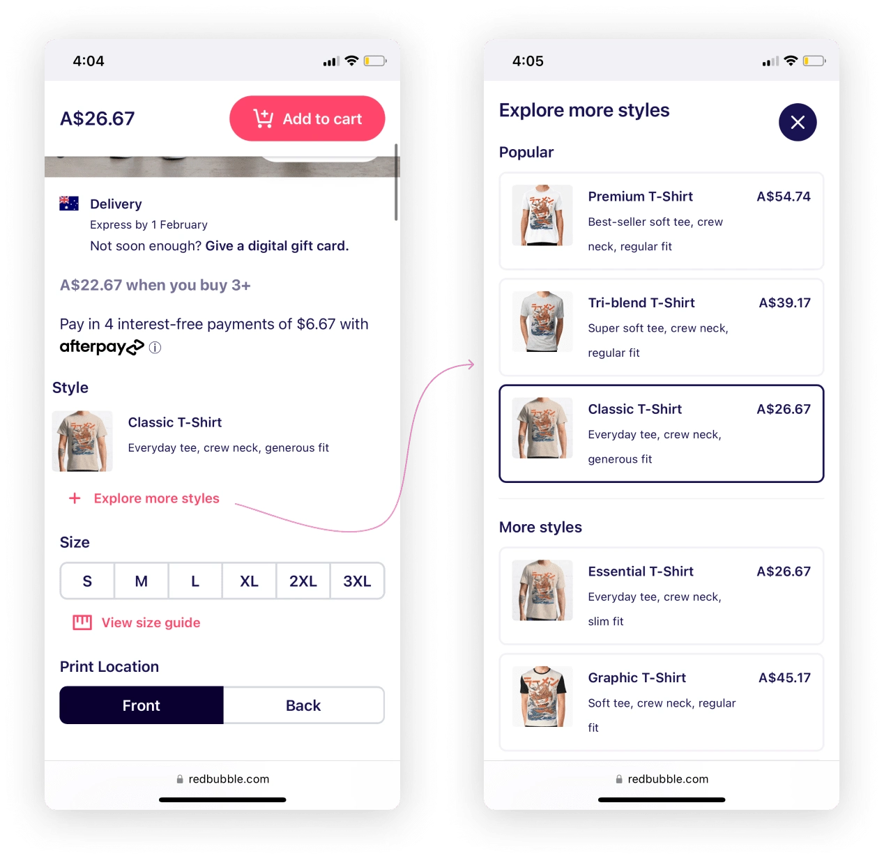
Built 'quick switch' experience
The experiment was initially released to 50% of t-shirt customers, so that we could measure engagement and impact of the feature. As a result, we saw 4% of all t-shirt sessions interacting with the experience, and 60% switching to a different t-shirt style. This saw a 2.5% uplift on the average order value for t-shirt customers - meaning that customers were switching to higher priced shirts, with an estimated impact of $2.6million earnt annually.
Following the success of this initial experiment, we decided to roll it out to 100% of customers, and extend it out to a further three product types with similar existing issues for customers - premium wall art, standard wall art, and hoodies. For each of these products, both conversion and average order value increased.
From experiments such as these, we learnt that it is possible to improve the metrics around the product page, but significant experience improvements are limited by our existing technical frameworks. These results helped us advocate for this deeper change, and we are currently working to replatform this product page with significant design improvements, so that customers have a consistent, speedy and best-in-class appraisal experience.
Like this project
Posted Sep 25, 2024
Improving the Product Detail Page experience on Redbubble, increasing customer's average order value by 2.5%.


