Marathon LS - Brand Identity
Henry Amoah
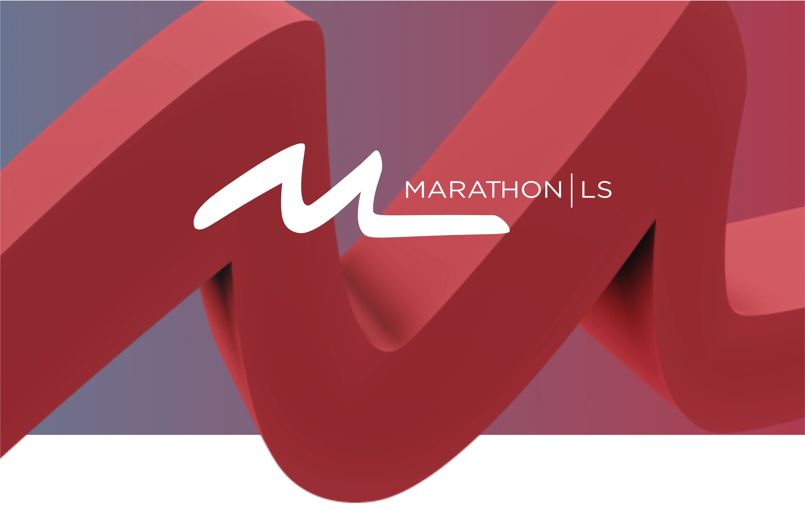
Designing Brand Cohesion
Meet Marathon LS, a Boston-based partner that keeps labs running like clockwork. They’re the behind-the-scenes heroes—fixing lab equipment, managing inventories, and supplying a vast array of plastics and tools that scientists rely on daily. Their brand is already well-established, and they weren’t looking for a complete overhaul or a new logo. Instead, they wanted to breathe new life into their existing brand, creating assets that could seamlessly connect across all their touchpoints—whether it’s a sales pitch, a website, or a trade show booth.
They came to me with a clear goal: to help them achieve brand cohesion and build a strong, guiding identity system. Their main pain points? Their brand felt somewhat scattered and didn’t quite reflect their current position as a trusted, innovative partner in the laboratory world. Additionally, they lacked a consistent set of brand guidelines to maintain alignment. They needed a way to unify their look and feel, so their brand could truly showcase the quality and reliability they bring to the table every day.
Services
Polishing The Mark
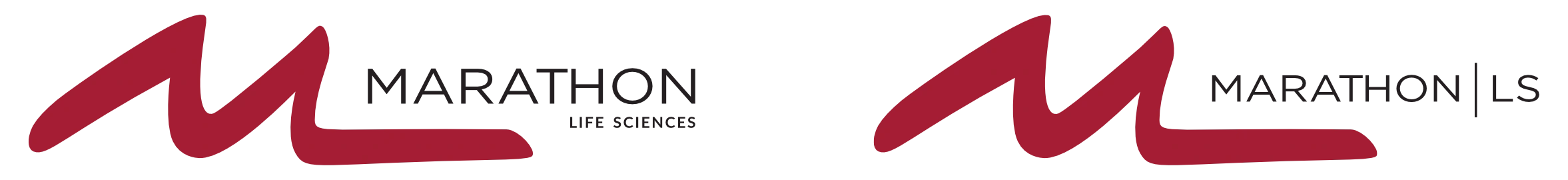
The first thing I tackled was cleaning up their current logo mark. Keeping to the logo's original form, I removed imperfections that didn't contribute to a clean, professional, modern look, followed by fixing kerning issues in their logotype.

Logo Variation
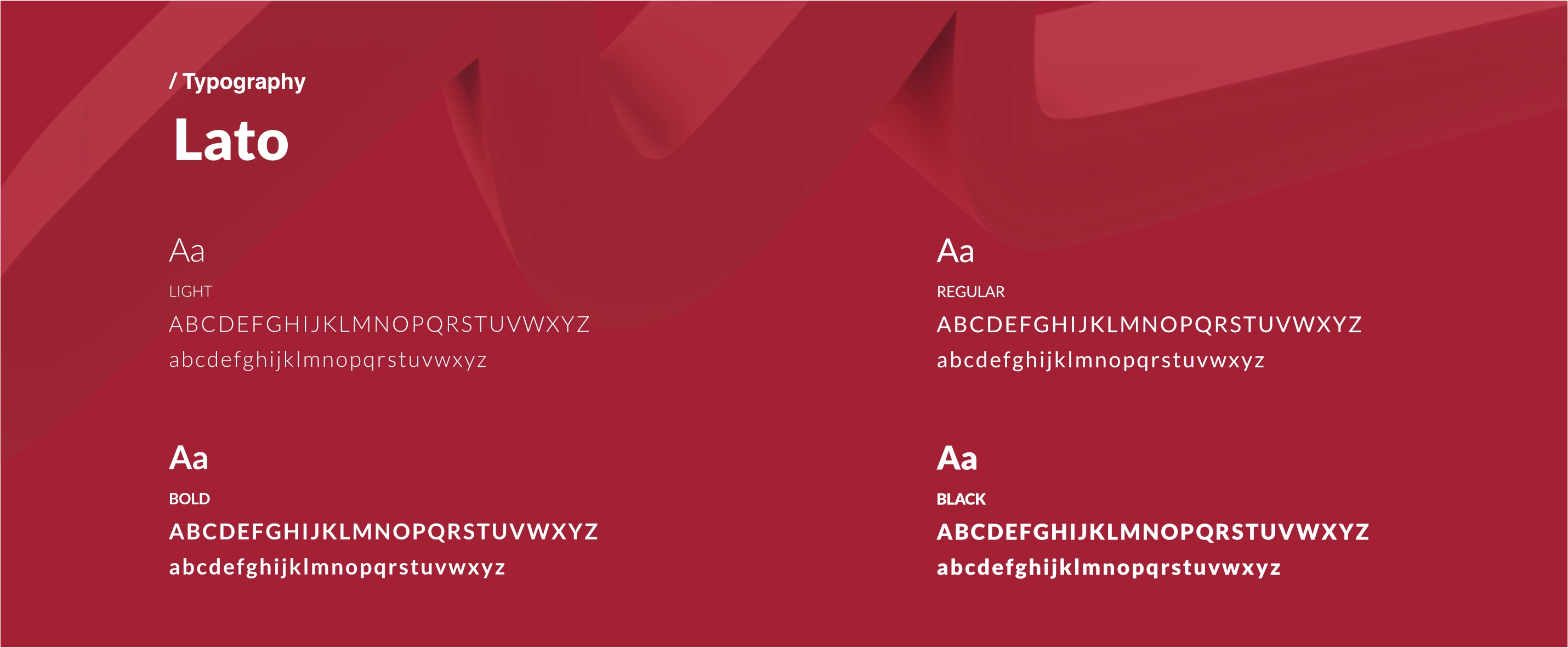
Typography
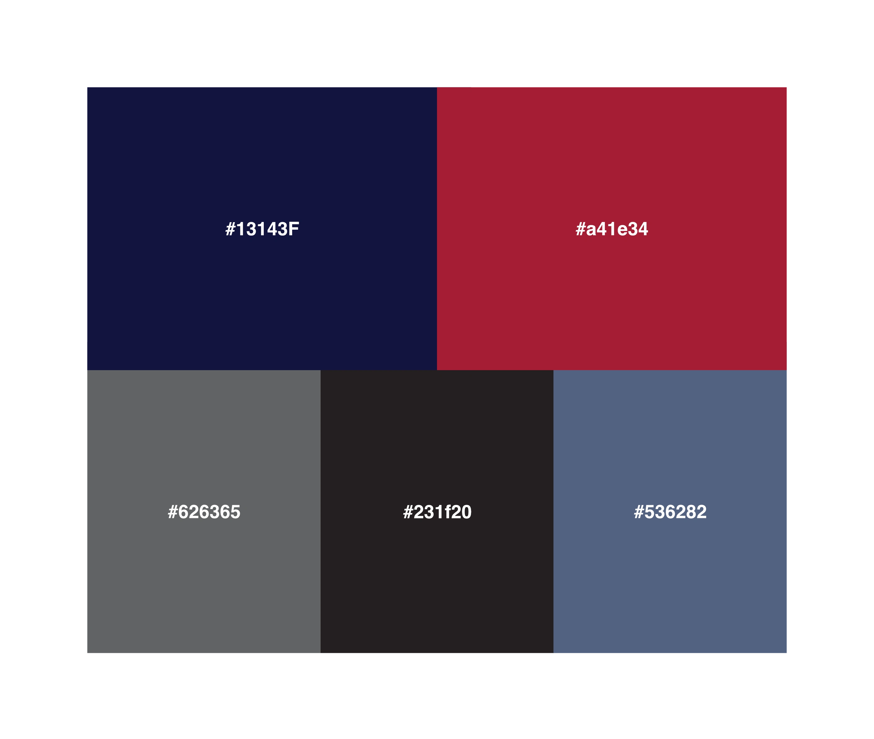
Setting Brand Rules
With the logo, typeface, and brand colors locked in as the foundation, it’s time to set the rules. Think of it as giving the brand clear guidelines on how to shine consistently and avoid any awkward missteps. These boundaries help ensure that the Marathon LS brand looks professional and stays cohesive no matter where it’s shown.
Logo Guidelines
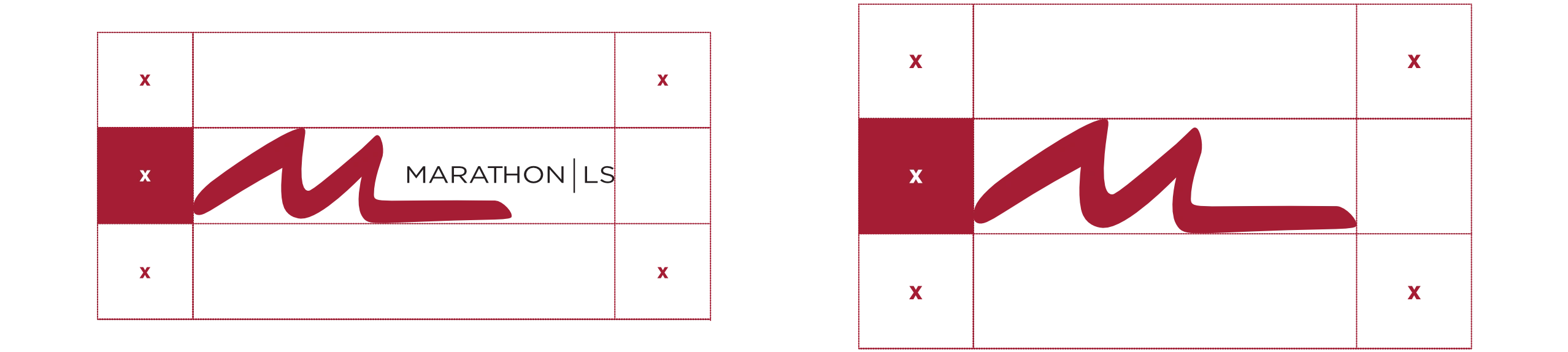
Logo Clear Space Rules
Typeface Usage
Typography Hierarchy
Additional Assets
Finally, I crafted some extra assets to give their brand a little extra "Pop". This included digital illustrations of all their products for packaging, a set of custom icons, and an abstract pattern to tie everything together. I kept things simple and clean because consistency is key when it comes to branding. The goal was to create versatile, easy-to-use elements that would make their brand look polished and professional, no matter where they show up.
Digital Product Illustrations (Sample)
Abstract Pattern & Icons (Sample)
Brand Application
Like this project
Posted Jun 11, 2025
Marathon LS supports Boston labs with repairs, supplies, and inventory. I helped unify their brand to reflect their trusted, innovative role.