Matè: Real Estate Branding and Visual Identity

Philipe Bastos


Matè: A New Chapter in Real Estate Branding
Visual identity and art direction for a residential development, shaped by warm colours, editorial typography and the idea of a life well considered.
By Philipe Bastos · Visual identity / Art direction
The project
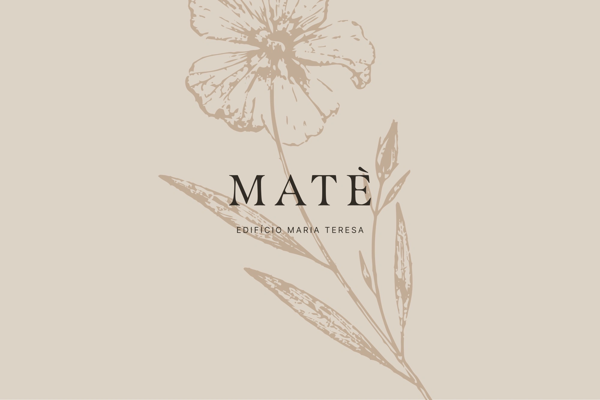
Matè is a residential real estate identity built around a simple idea: “Uma vida bem resolvida.” The phrase brings the conversation closer to everyday life: making considered choices, finding comfort and having room for what comes next. The visual identity translates that idea into an editorial language, combining a distinctive wordmark, warm colours, botanical illustration and imagery of lived-in moments.
The challenge
The creative challenge was to give the development a recognisable presence while expressing the kind of life it represents. The audience described in the presentation values experiences over excess, appreciates architecture and design, and looks for a home that accommodates work, rest and time with friends. The identity needed to connect those aspirations with the building itself.
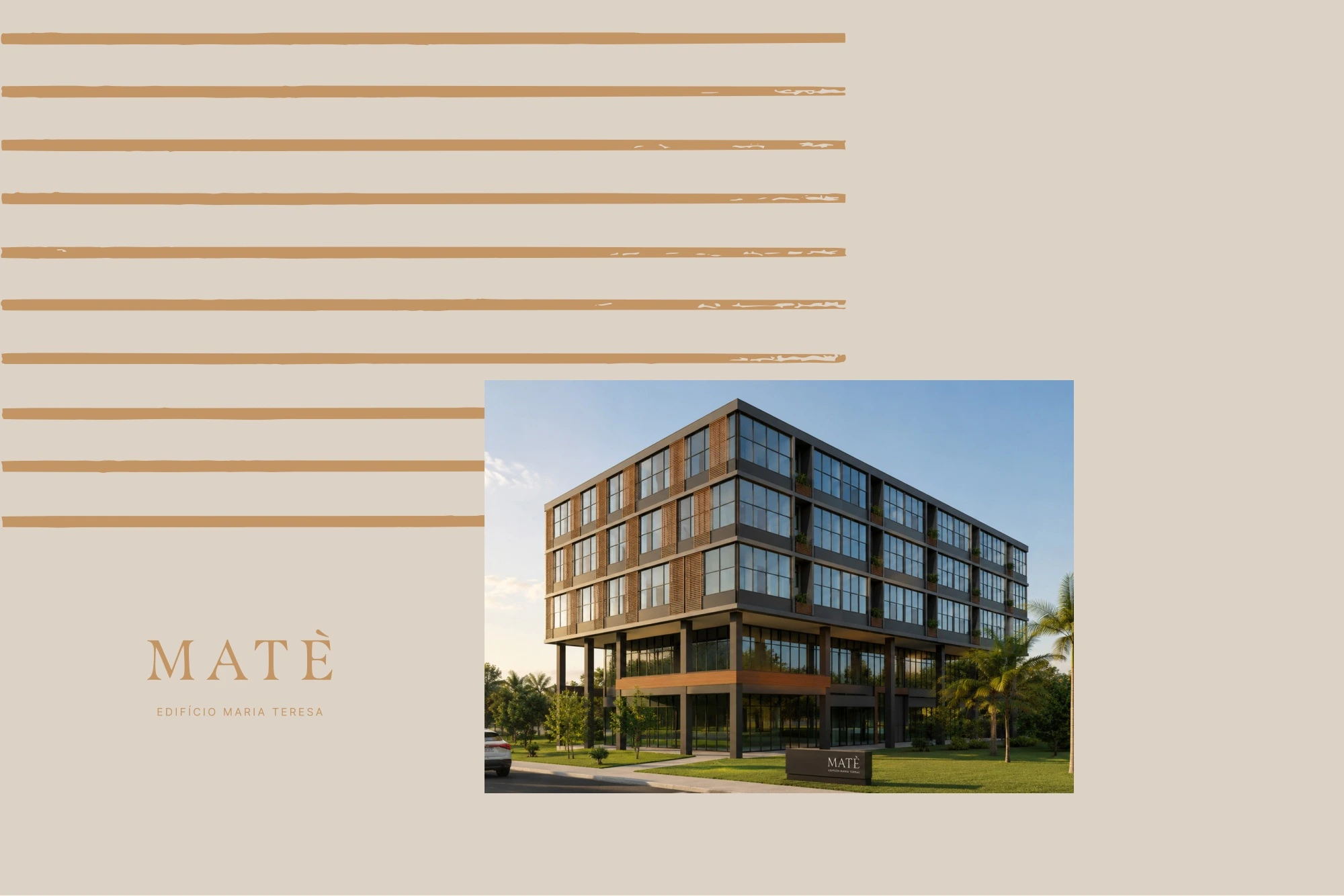
The central idea: a new chapter
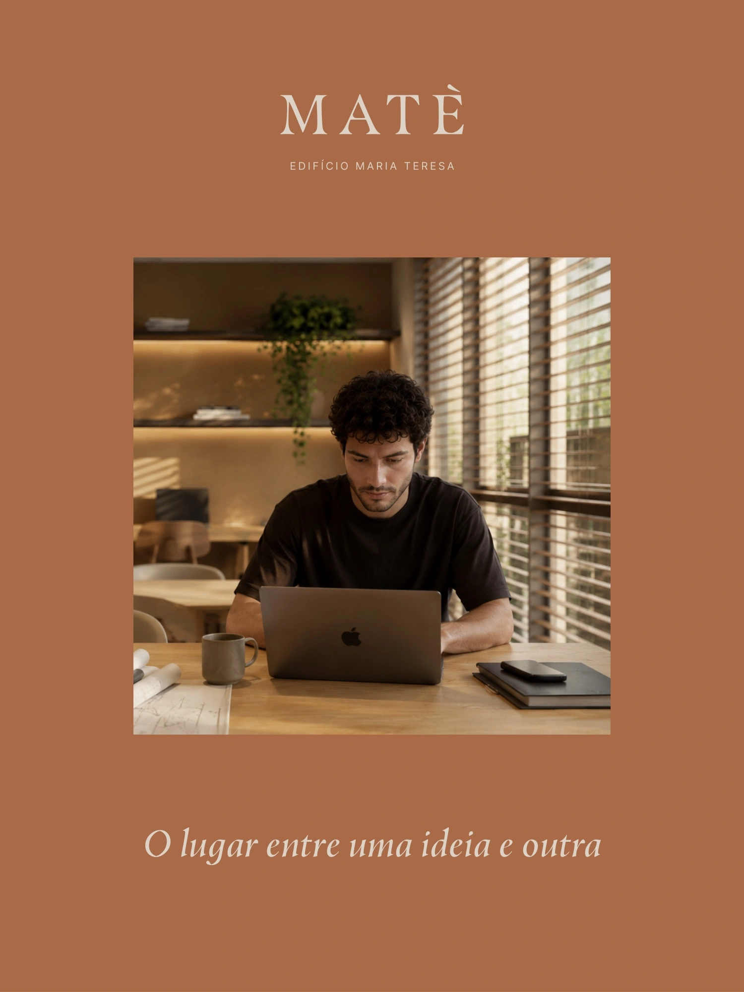
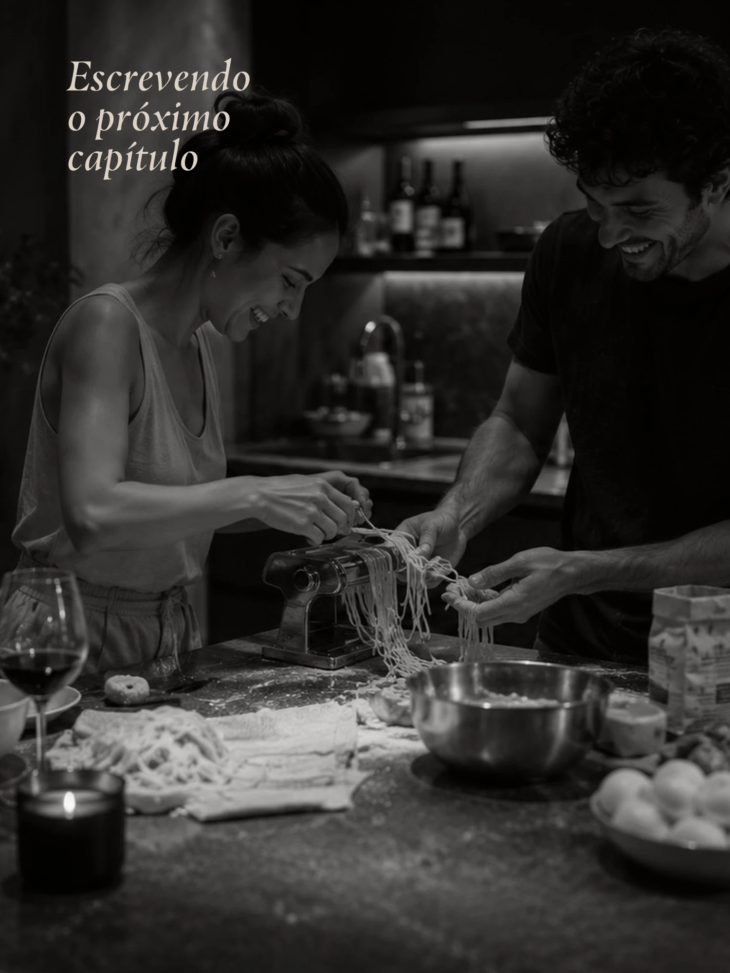
The brand narrative treats life as a sequence of chapters. A new home becomes the setting for the next one. This idea provides a thread for the communication, from “Escrevendo o próximo capítulo” to “O lugar entre uma ideia e outra.” It also gives the project an editorial rhythm: generous margins, deliberate changes of scale and compositions that feel like pages in a larger story.
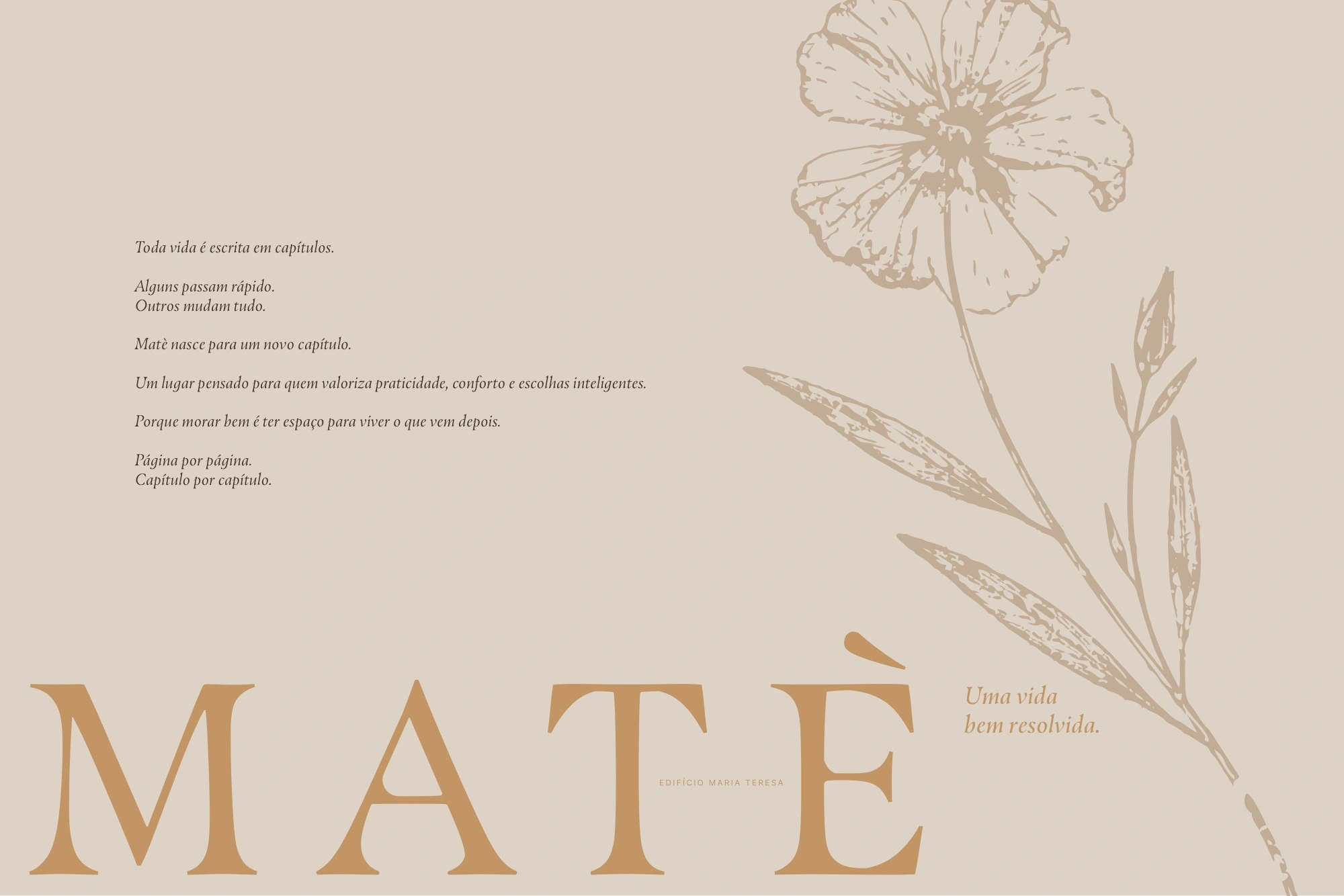
A warm, restrained visual system
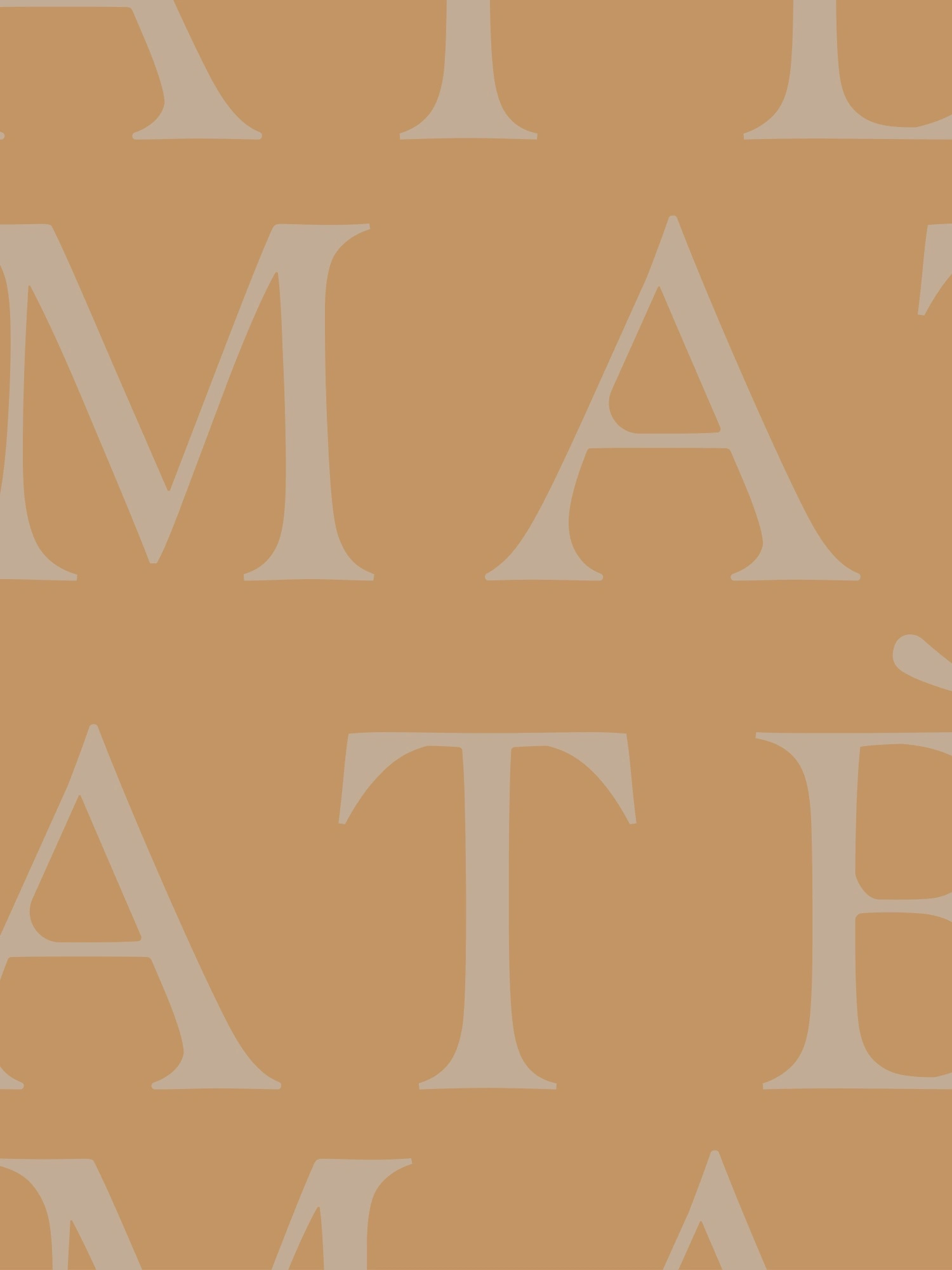
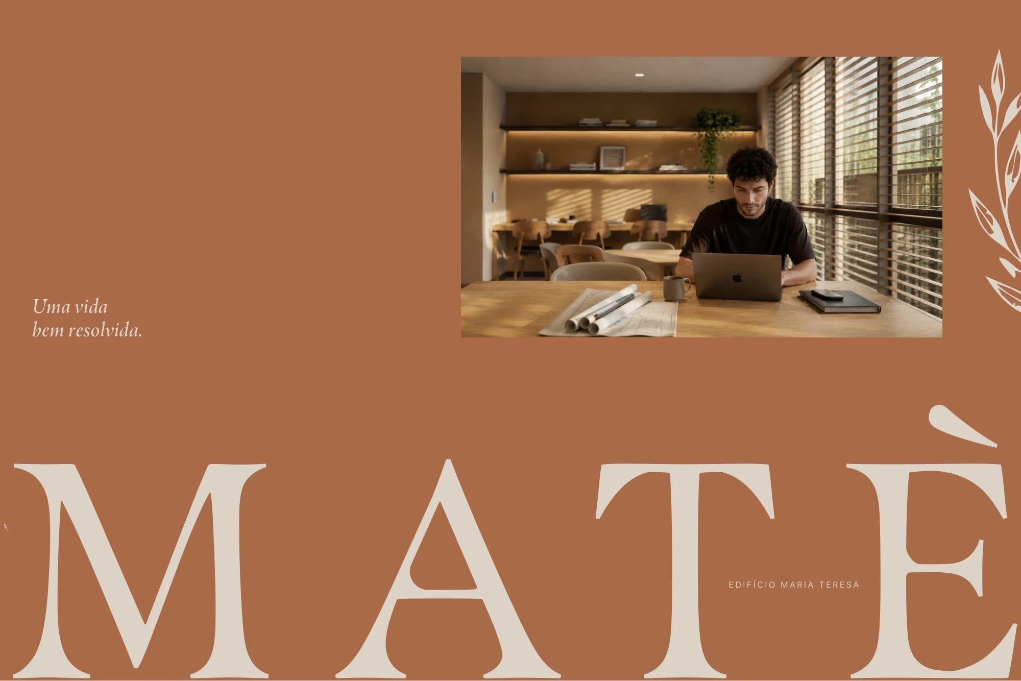
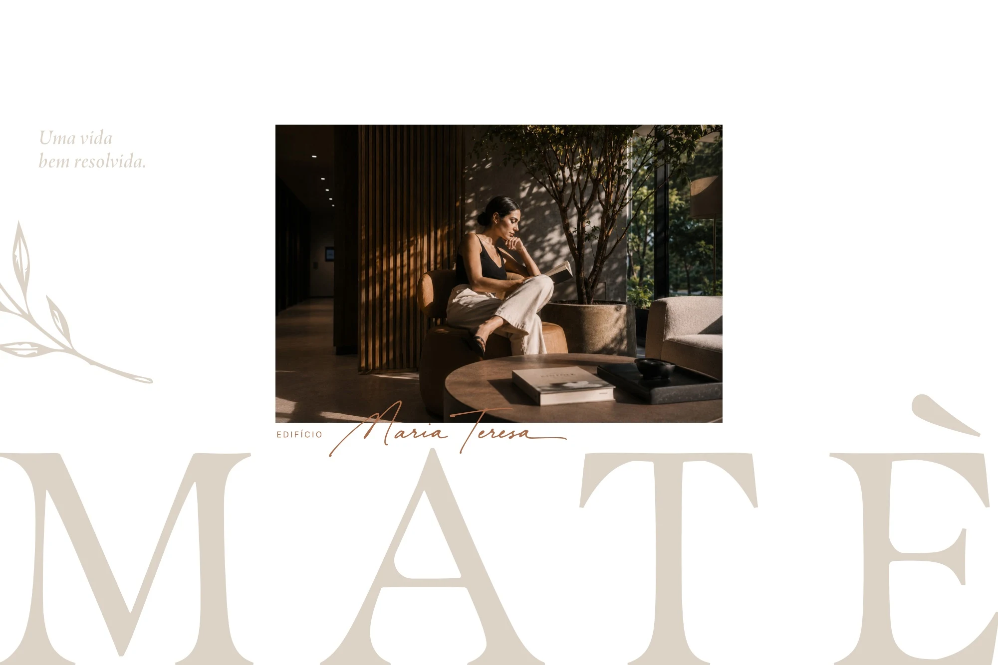
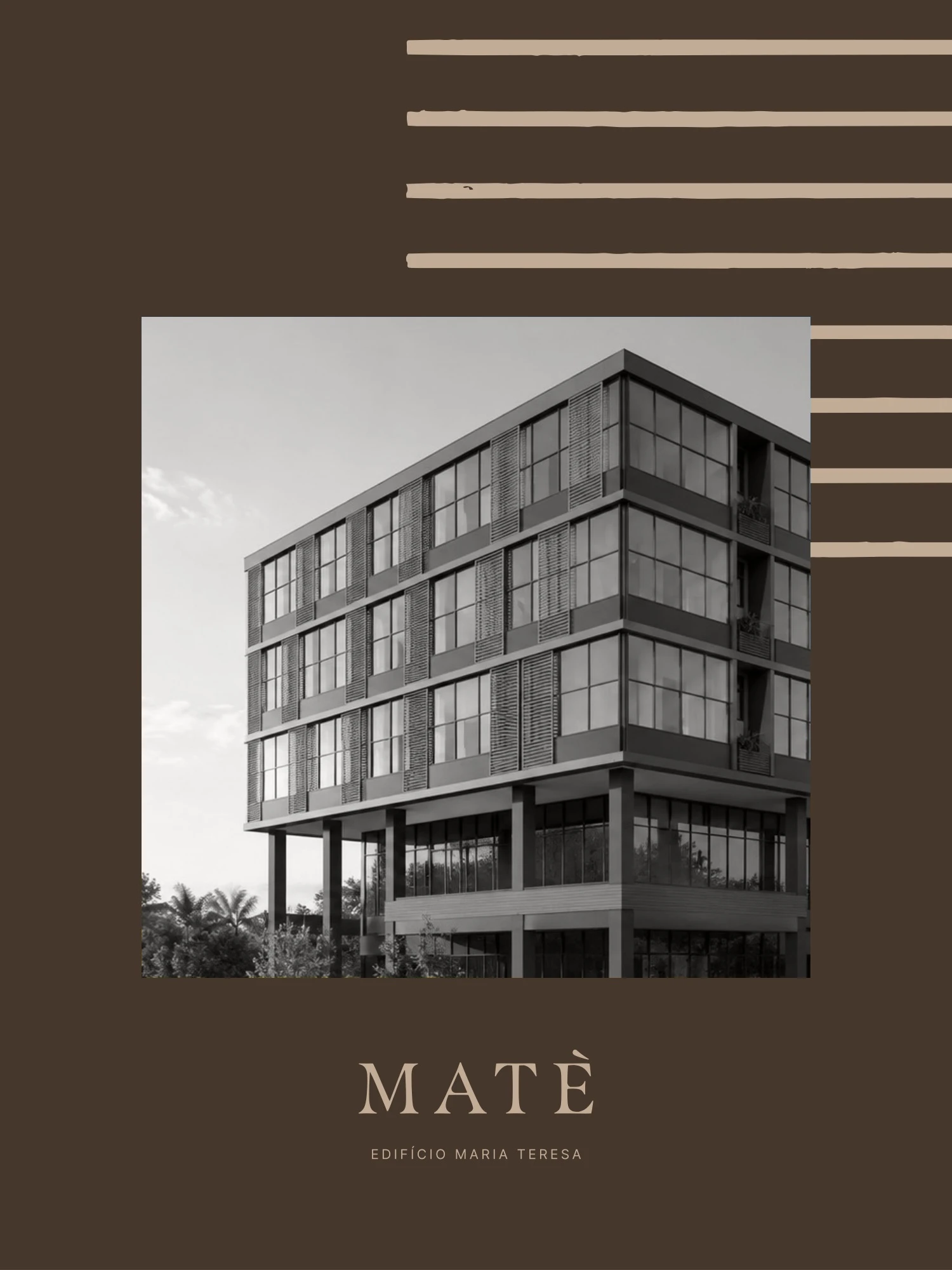
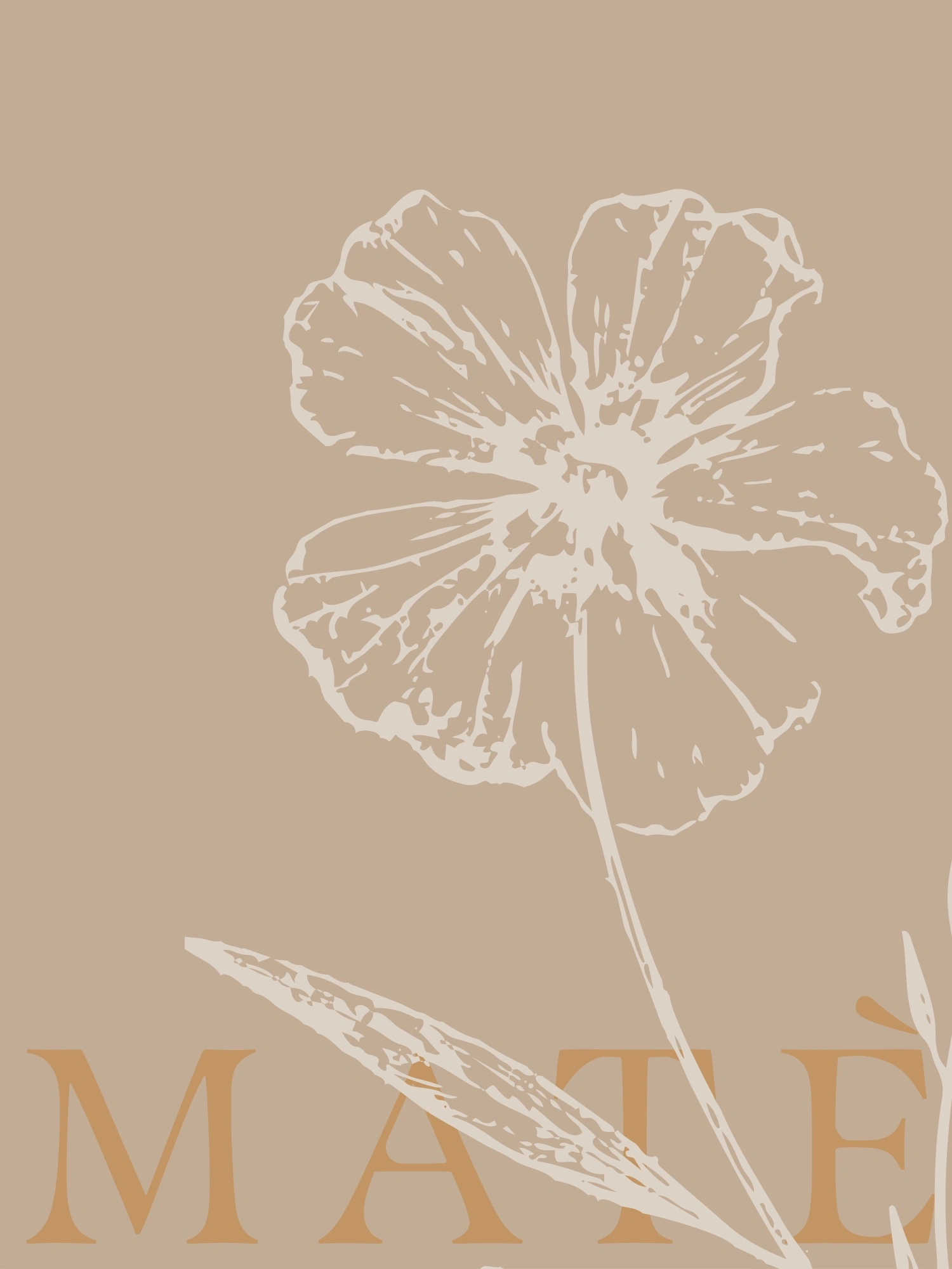
The wordmark is set in expressive serif letterforms. Enlarging, rotating and repeating it turns the name into a graphic element while retaining its character. Fine botanical drawings add detail and softness; parallel lines introduce order and contrast. These elements work alongside five earthy colours, allowing the communication to move between light, open layouts and darker, more intimate compositions.
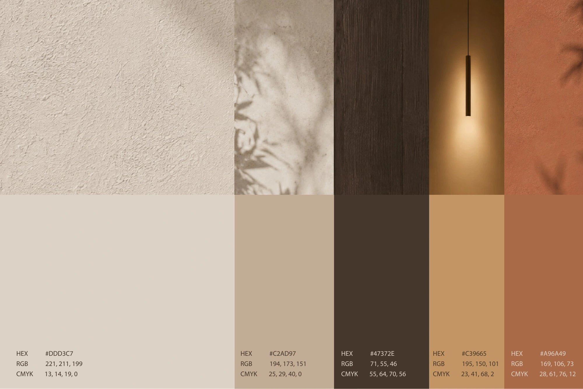
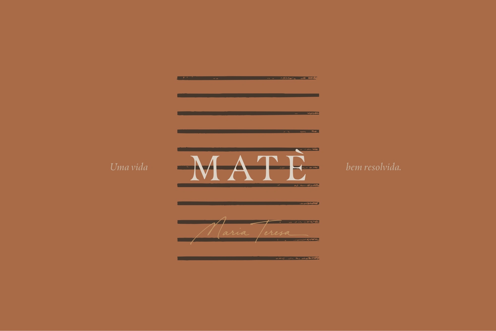
Art direction for everyday life
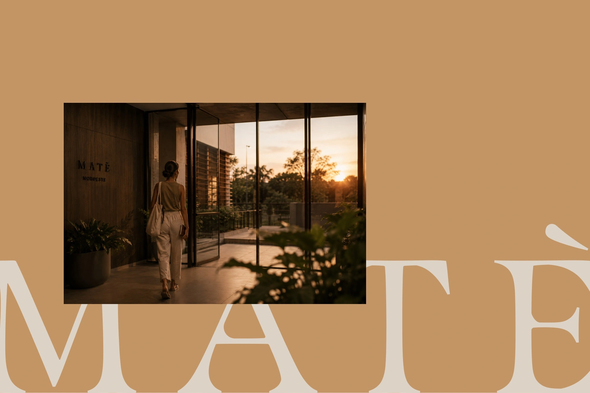
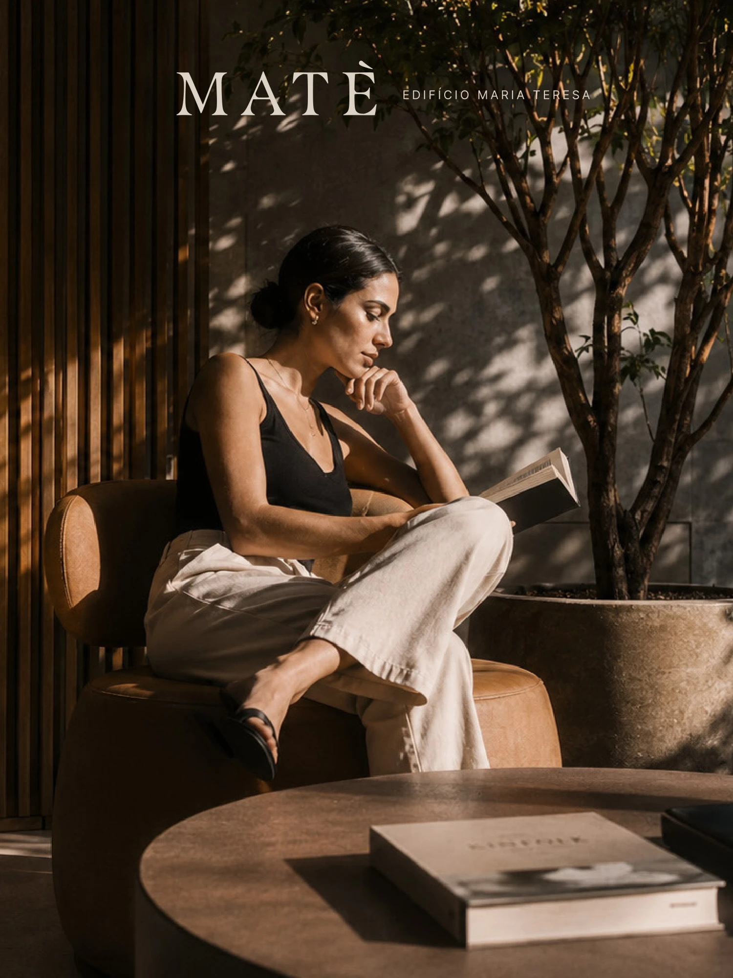
Reading, cooking, quiet interiors and moments of pause give the brand a human context. Warm light and natural textures connect these scenes to the palette. The architectural image anchors the presentation in the physical development, while the lifestyle imagery expresses the atmosphere around it. Typography and image placement create continuity across both.
From identity to communication
The presentation explores the system across landscape layouts and vertical communication pieces. Some compositions rely on a large wordmark and a small image; others give photography the leading role. Repeated colours, typographic contrast and recurring graphic elements make these variations feel related without requiring every piece to follow the same arrangement.
The design outcome
Matè brings together an identity and a communication language around one consistent idea of home. The work demonstrates how typography, colour, illustration and image direction can connect a real estate project to the aspirations of its audience. The case is presented through the visual system and its applications; no commercial performance claims are attached to it.
Like this project
Posted Sep 9, 2026
Developed branding for Matè using warm colors, editorial typography, and lived-in imagery.